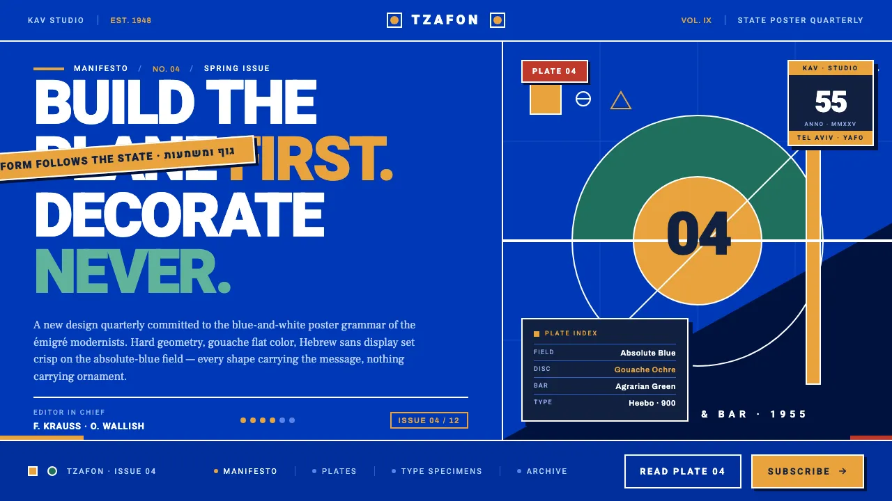
About Israeli Bezalel Modernism
After the 1948 declaration of statehood, a generation of European-trained designers built a visual identity for the new nation from imported Bauhaus grammar. Franz Kraus and Otte Wallish — émigrés who carried Central European functionalism with them — composed tourism and national posters as hard geometric planes: circles, bars and diagonals locked over a saturated absolute-blue field.
The work is gouache-flat and high-contrast. Crisp Hebrew sans display type, ancestors of Frank-Ruehl and Narkis Block, sets the slogans in white against national blue, warmed only by gouache ochre and agrarian green. Nothing is decorative; every shape follows the message. This system rebuilds that blue-and-white state poster language for the screen — flat, functional, unapologetically modern.
- Origin
- Middle East / Israel
- Era
- 1948–1960s (post-statehood modernism)
- Key figures
- Franz Kraus · Otte Wallish
- Movements
- Bauhaus · European Functionalism · Israeli National Poster Design
Israeli Bezalel Modernism design spec
Colors
Typography
The other 11 sections — buttons, cards, spacing, motion, techniques and more — open once you unlock. Download the DESIGN.md or send it to your AI in one click. Unlock once, yours forever.
Sign up nowStyles similar to Israeli Bezalel Modernism
Also inspired by design movements, with a close feel.
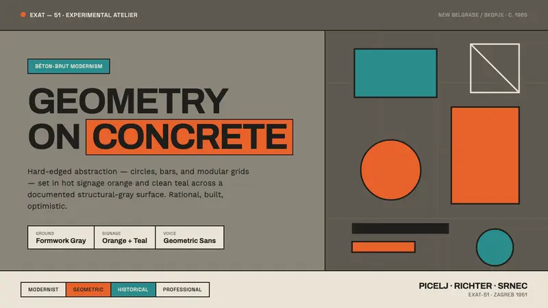 Yugoslav Socialist ModernismGeometry on concrete. EXAT-51 circles and bars in hot orange and clean teal, ruled on formwork gray.
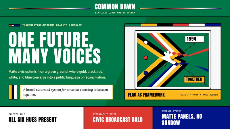 South African Rainbow Nation 1994Compromise looks triumphant. Flag green grounds a six-color Y with Anton civic type.
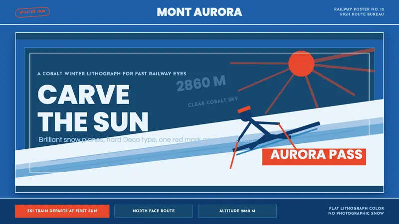 Alpine Ski PosterCold speed sells winter. Cobalt sky, snow planes, sun rays, and one resort-red slash.
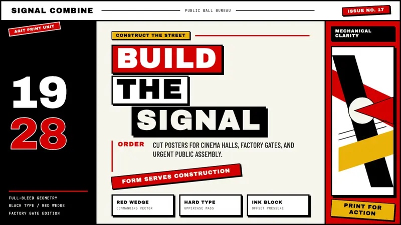 Russian ConstructivismRevolution red, slashed across black and white. Diagonal sans-serif, photomontage collisions.