What is Richard Meier White Architecture?
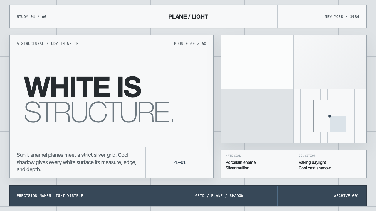
Richard Meier makes white do architectural work: a cool luminous field, divided by silver-gray grids and made legible by blue-gray shadow.
Richard Meier White Architecture in brief
Richard Meier White Architecture is a high-modernist language built around an unusually strict commitment to white. The white is not soft, domestic, or nostalgic. It is cool and luminous, a broad field whose apparent simplicity depends on fine differences between directly lit planes, silver-gray structural lines, glass, and shadow. White is therefore not the final decorative layer. It is the condition that allows the architecture’s organization to be read.
Its visual identity comes from repeated relationships rather than expressive variation: large flat white surfaces, porcelain-enamel steel panels, thin mullion lines, square-grid order, glass openings, and the regular cadence of brise-soleil. A façade can appear almost abstract from a distance, then become increasingly articulate as light exposes seams, frame edges, recesses, and screen-like layers. The eye reads the building as a composed sequence of planes rather than as a single sculptural mass.
The style spans projects from the Smith and Douglas Houses to the High Museum and the Getty Center. Across these works, whiteness remains disciplined by structure, daylight, and negative space. The result is exacting without being visually crowded: every line has a job, every shadow reveals an edge, and large unoccupied areas make the built elements feel more deliberate.
Where does Richard Meier White Architecture come from?
The style belongs to the period from the 1950s through the Getty era, when High Modernism and the International Style remained active reference systems for American architecture. Its geographic center is New York, where Meier was associated with the New York Five. Within that setting, the commitment to clarity, planar order, and modern architectural discipline became the basis for a recognizably personal vocabulary.
Richard Meier’s career is defined here by sustained concentration rather than by a changing palette. The same cool white field reappears across domestic, cultural, and civic-scale projects. This continuity matters because it makes the style cumulative: a house, museum, or campus does not simply wear white, but uses white to establish a shared visual grammar of planes, frames, openings, and voids.
Le Corbusier is named as a key figure in the style’s source lineage. In this context, that reference locates Meier’s work within a modern architectural conversation rather than outside history as an isolated personal signature. The relevant inheritance is not imitation of a single motif, but a belief that architecture can be organized through light, proportion, structure, and clearly articulated surfaces.
The 1984 Pritzker Prize marks Meier’s place within the Getty-era account of the style. Yet the visual language is more enduring than any individual accolade: its identity rests on repeatable architectural decisions. Cool white planes gain force through restraint, and their apparent purity depends on silver-gray transitions, blue-gray shadows, glass rhythms, and the careful preservation of empty space.
What defines the Richard Meier White Architecture look?
White as Structure
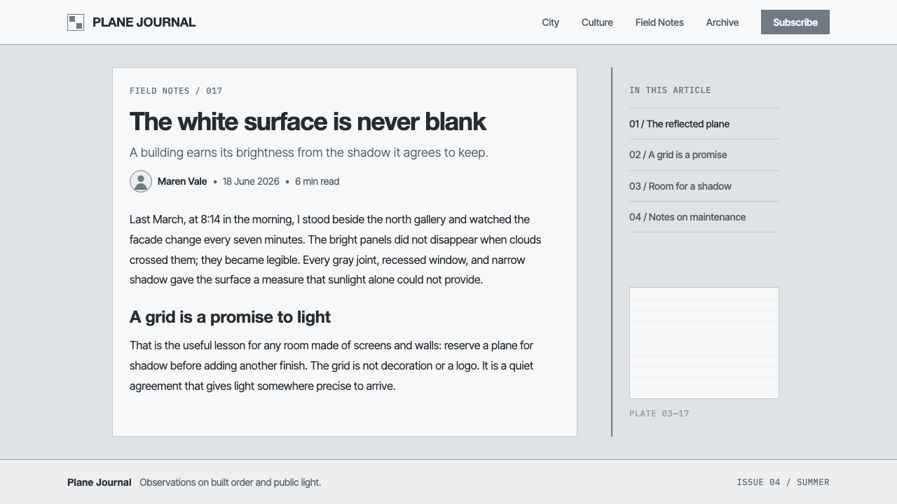
White is the primary architectural field, not a neutral background. Its cool luminosity makes joins, recesses, frames, and shadows perceptible. A successful composition lets white hold the largest visual area while allowing adjacent gray, glass, and shadow to define its limits.
Silver-Gray Grid
Fine mullion lines articulate a strict square grid across broad surfaces. The grid should feel precise rather than heavy: it divides, measures, and gives scale to the white field without becoming decorative pattern. Its cool gray presence is essential to the style’s restraint.
Raking Daylight
Light is treated as an active drawing instrument. Raking daylight separates a white plane into bright exposure and blue-gray recession, making depth visible without added ornament. Shadow is crisp enough to disclose form, but quiet enough to preserve the overall calm of the composition.
Plane and Panel
Large, flat porcelain-enamel steel panels establish an even, controlled surface. Their value lies in continuity and reflectance rather than texture. The architecture should read as assembled with disciplined precision, where panel seams and structural edges contribute to the rhythm instead of interrupting it.
Glass and Brise-Soleil
Glass openings and brise-soleil create a measured alternation between transparency, enclosure, and shade. They are not applied as visual flourish. Their repeated rhythm gives a façade a legible cadence, balancing the opacity of white planes with narrower, darker intervals of reflection and depth.
Negative Space
Abundant negative space is structural, not leftover. Empty white areas slow the eye, isolate important lines, and prevent the grid from becoming busy. The composition gains authority by withholding visual information, allowing a small shadow or a thin frame to carry disproportionate emphasis.

Who shaped Richard Meier White Architecture?
Meier is the central author of this white architectural language. From the Smith and Douglas Houses to the High Museum and the Getty Center, his work sustains a remarkably consistent discipline of luminous white planes, fine silver-gray articulation, glass, shade, and negative space. His Pritzker Prize in 1984 belongs to the same Getty-era account.
Le Corbusier is identified as a key figure in the source lineage. His presence positions Meier’s work in the broader tradition of modern architecture, where clear surfaces, structural order, and light are treated as primary architectural concerns rather than secondary visual effects.
The New York Five provides the American and New York context named for Meier’s work. As a reference point, it helps explain why this architecture reads as part of a shared modernist conversation while retaining an unusually uncompromising focus on cool white, grid articulation, and controlled daylight.
How do you use Richard Meier White Architecture today?
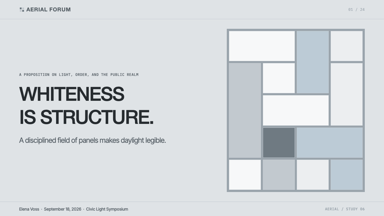
For presentation covers, use a broad cool-white field as the main compositional space, then introduce a restrained silver-gray grid, a narrow glass-like reflective band, or one blue-gray shadowed plane. Keep the title calm and clearly separated from the architectural elements. The cover should feel illuminated and measured, not merely minimal or blank.
For content and data slides, treat the grid as an organizing instrument. Let headings, captions, charts, and labels align to fine structural lines, while preserving wide empty regions around the most important information. Data visuals should use white ground, cool gray structure, and reserved shadow tones so that the hierarchy comes from placement and contrast rather than visual noise.
For web interfaces, the language works especially well for dashboards, analytical tools, and pricing pages that benefit from calm authority. Build the interface from white surfaces, delicate silver-gray divisions, glass-like panels, and controlled blue-gray recesses. Cards and navigation should feel framed and articulated rather than inflated; shadow should reveal separation without making the interface feel soft or theatrical.
For editorial and marketing work, use generous margins, quiet image treatment, and repeated horizontal or vertical alignments. A campaign page can alternate between expansive white panels and more recessed gray or glass sections, using brise-soleil-like rhythms to structure dense information. The tone is most convincing when copy, imagery, and interface elements all leave room for light and space to operate.
The common mistake is to mistake this style for plain white minimalism. Warm white, dense black accents, expressive curves, decorative texture, and arbitrary translucent layers undermine its logic. White must be made visible through disciplined gray structure, crisp daylight relationships, and purposeful empty space; if every area competes for attention, the architecture’s essential calm disappears.
Richard Meier White Architecture — FAQ
Is Richard Meier White Architecture simply minimalist white design?
No. Minimalism can describe reduction in many visual languages, but this style depends on a specific architectural system: cool luminous white, silver-gray grid articulation, porcelain-enamel panels, glass, brise-soleil rhythm, raking daylight, and blue-gray shadow. A blank white composition without these relationships may be minimal, but it does not carry the same structural logic.
Why are gray and shadow so important when white is the dominant color?
White becomes legible through difference. Silver-gray mullions establish measurement and division, while blue-gray shadows reveal recession, depth, and the effect of daylight. Without these restrained contrasts, broad white surfaces can lose their architectural definition. Gray and shadow do not weaken the whiteness; they give it edge, scale, and spatial force.
Can this style work in a dense interface or information-heavy document?
Yes, provided density is organized rather than decorated. The square grid, fine divisions, and generous negative space offer a strong framework for dashboards, pricing comparisons, editorial layouts, and data slides. The key is to let structure absorb complexity: align information carefully, group it through clear planes, and avoid adding competing visual effects to every module.
What most quickly makes an application feel inauthentic?
Treating white as a generic surface is the fastest failure. The style weakens when white becomes warm, when gray lines are too heavy, when shadows are soft and atmospheric, or when glass and screens are added as decoration. The more convincing approach is stricter: preserve coolness, make every division purposeful, and let daylight-like contrast explain the architecture.
Related design styles
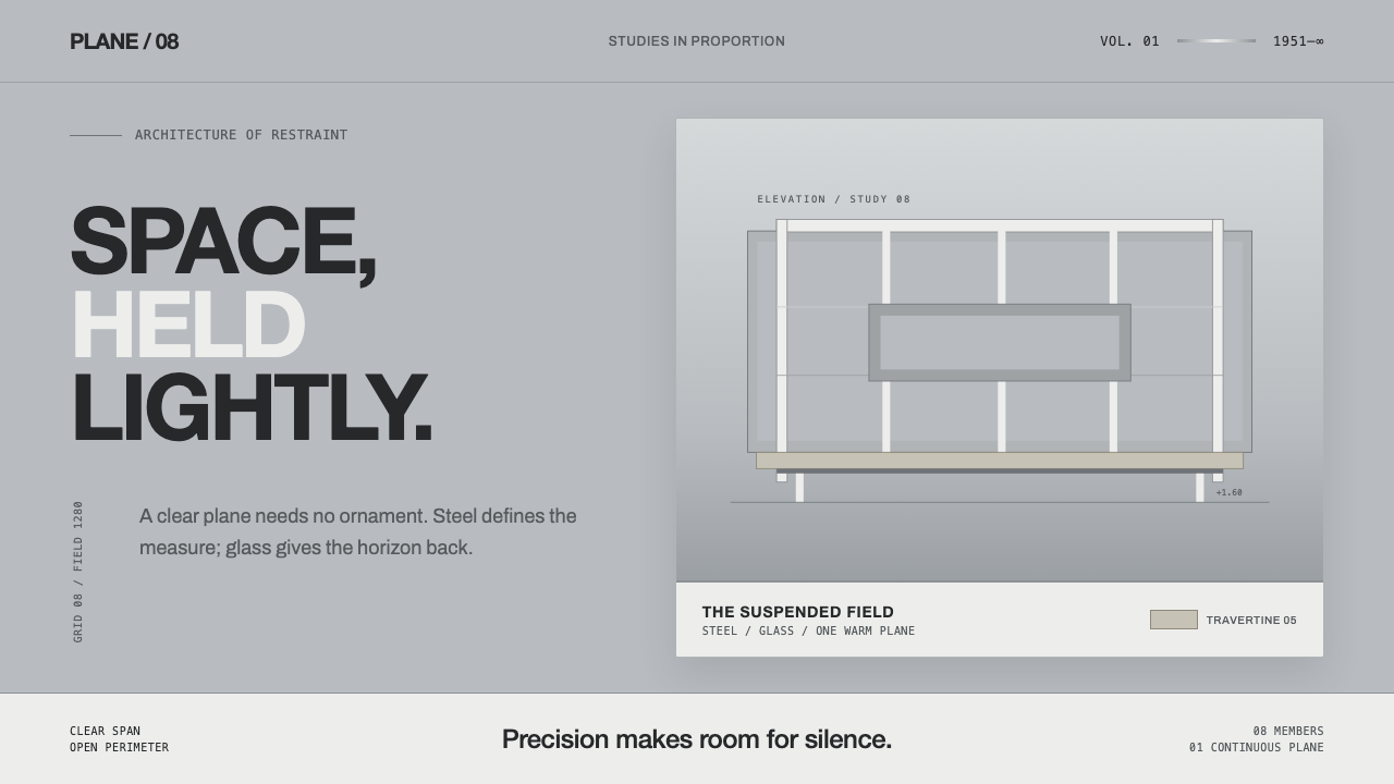 Farnsworth HouseWeightless by precision. White steel planes float across reflective gray with…
 Doctor's Clinical Lab CoatSterile by design. Cool clinical white, teal signals, and seam-line grids enf…
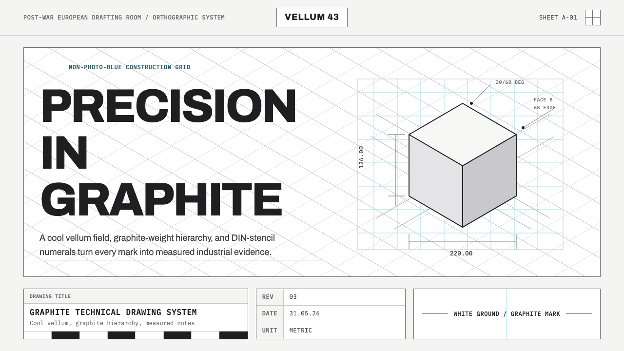 Graphite Technical DrawingDrafting-room precision. Non-photo-blue grid and graphite DIN lettering do th…
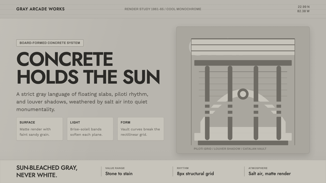 Havana Modernist GrayQuiet monumentality. Jost type, louver bands, and concrete grays hold tropica…
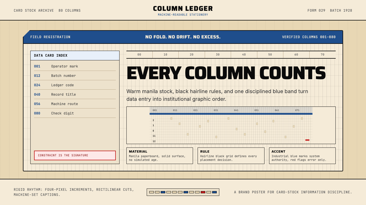 IBM Punchcard 029 (1928)Constraint becomes authority. Manila stock, hairline grid, industrial blue.
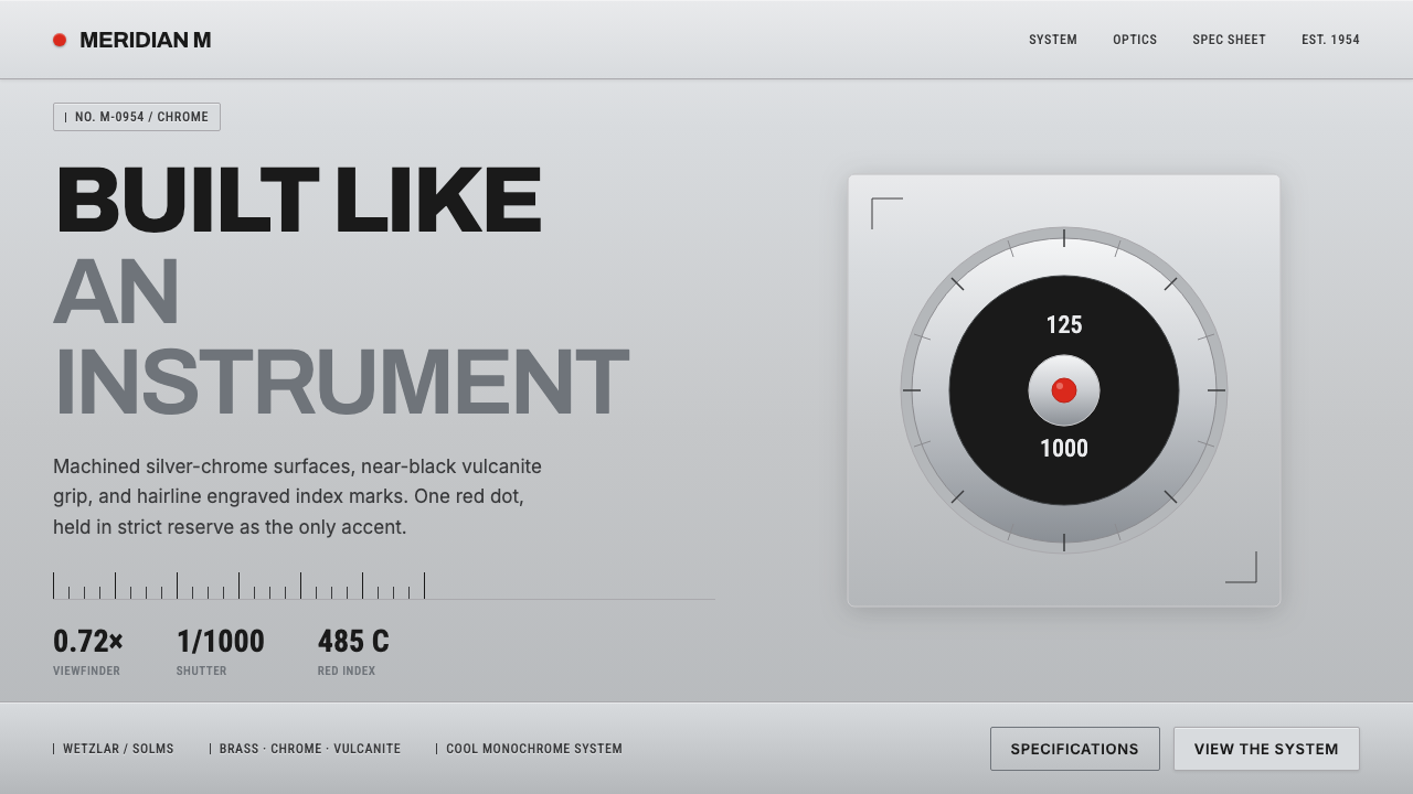 Leica M Silver ChromeBuilt like an instrument. Brushed silver-chrome on near-black vulcanite, one…