What is Amapiano?
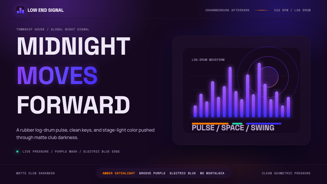
Amapiano is the sound of Johannesburg's townships turned into a visual language: matte-black darkness, groove-purple and electric-blue stage light, warm amber catchlights, and the log-drum waveform as a recurring graphic motif — confidence and cool, never nostalgia.
Amapiano in brief
Amapiano — 'the pianos' in Zulu — is a music-rooted visual aesthetic that emerged from the townships of Johannesburg and Pretoria in the 2010s and reached global awareness around 2019. Its look mirrors the sound: deep, unhurried, and contemporary. The visual language is dark-first, built on near-black grounds rather than light ones, with color arriving as controlled bursts of stage light rather than broad washes.
At its core the style is minimal and modern without being sterile. Clean geometric sans-serif type is used with confident scale contrast. The log-drum waveform — the defining sonic shape of the genre — recurs as a decorative-structural motif: a rhythm you can see. Color is used in tight, intentional pools: a groove purple for mystery and depth, an electric blue for motion and club-light energy, warm amber as a single focal catchlight. Together they suggest the experience of a darkened venue illuminated by a DJ's rig.
Unlike retrospective aesthetics that borrow vintage textures or grain, the Amapiano visual system is forward-looking. There is no distress, no retro palette, no skeuomorphic warmth. The darkness is digital and matte, the glow is precise rather than diffuse, and the negative space is generous. It is the aesthetic of a generation that grew up with smartphones and club culture simultaneously, and whose artistic ambition is global from the start.
Where does Amapiano come from?
Amapiano grew out of kwaito — South Africa's 1990s township house sound — and gqom, the darker, repetitive Durban club style of the early 2010s. The key innovation was the introduction of the log drum: a pitched, resonant bass instrument drawn from traditional African percussion, reprogrammed as a digital bass synth and layered under jazzy piano runs and slow-groove house tempos. This fusion produced something recognizably South African yet immediately dancefloor-compatible with international club music.
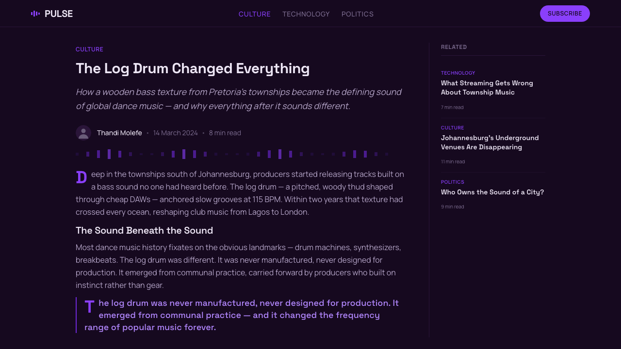
The sound crystallized in the townships of Soweto, Vosloorus, and Tembisa around 2012 to 2015, circulating first through WhatsApp voice notes and informal DJ sets rather than through record labels or radio. Its decentralized, peer-to-peer origin shaped its visual culture: there was no art director, no central label aesthetic, no official look. Artists and producers designed their own artworks — mixing dark photography, bold sans-serif type, and night-sky or club-interior imagery — and the shared mood across thousands of independent releases created a coherent aesthetic by convergence rather than by design.
By 2019, the international breakthrough was underway. Kabza De Small and DJ Maphorisa's Scorpion Kings project went platinum in South Africa and drew attention from UK grime producers, Nigerian Afrobeats artists, and American streaming algorithms simultaneously. Focalistic's 'Ke Star' remix with Davido in 2021 demonstrated that amapiano had become a global genre with full commercial infrastructure. This global turn reinforced the visual language's forward-looking character: the aesthetic spread internationally not as an exotic export but as a contemporary, confident design system.
The movement's visual identity has never been formally codified by a single authority, which is part of its strength. It is a living aesthetic that individual artists, photographers, and graphic designers continue to evolve — but the gravitational center has remained consistent: dark grounds, geometric precision, pulsing light as color, and the log-drum waveform as recurring mark.
What defines the Amapiano look?
Color
The palette is anchored by near-black grounds — not pure printer's black, but a deep, slightly warm darkness that reads as matte and velvet rather than flat and digital. Against this ground, color arrives in three controlled voices: a deep groove purple that implies depth and low-frequency energy, an electric blue that carries the kinetic brightness of club lighting, and a warm amber that functions as a single catchlight or focal highlight. These three are not used simultaneously at full saturation; they appear sequentially, one dominant and the others as accents, so the darkness is never overwhelmed.
Typography
Type is geometric and contemporary — clean sans-serif letterforms with no trace of humanist warmth or retrograde calligraphic influence. Scale contrast is aggressive: artist names and titles appear at headline sizes that dominate the composition, while supporting text recedes to fine, widely tracked secondary lines. All-caps setting is common, lending a monolithic, poster-like authority to the primary text. Letter-spacing is tight at large sizes and generous at small ones, reflecting club-poster and digital-thumbnail legibility demands simultaneously.
The Log-Drum Waveform
The most genre-specific visual motif is the waveform: a horizontal band of frequency peaks and troughs, often rendered in the electric blue or groove purple, that appears as a decorative element behind or alongside the primary text. It functions simultaneously as graphic texture, as cultural identifier, and as a rhythm made visible. Unlike generic audio waveforms, the amapiano version is characteristically deep and rounded at its peaks — the visual signature of the log drum's resonant, sub-heavy bass profile.
Glow and Light
Rather than using soft gradients or ambient shadows to create depth, the Amapiano system uses glow: a tight, controlled luminosity applied to type, shapes, or the waveform motif that suggests a backlit LED panel or a stage spot rather than natural sunlight. The glow is precise — it halos an edge rather than flooding a field — and is typically restricted to one of the accent colors per composition. This restraint keeps the darkness intact and gives the glowing element maximum visual presence.
Negative Space
Despite the sense of visual density that the dark ground creates, successful Amapiano-styled design uses negative space generously. Text elements are isolated, not crowded; the waveform motif appears in deliberate placement, not as a wallpaper fill; color bursts are separated by zones of pure darkness. This approach is essential — it prevents the composition from collapsing into murk and gives each element the breathing room to register individually. The darkness is not emptiness to be filled but a material in its own right.
Photography and Imagery
When photography is used, it is typically high-contrast night or low-light imagery — crowd shots from club floors, close-ups of musicians with dramatic rim-lighting, or abstract motion-blur captures that dissolve into the surrounding darkness. Images are usually blended into the dark ground rather than placed as discrete rectangular windows, ensuring they become part of the atmosphere rather than interrupting it. Vintage grain or analog processing is avoided; the photography reads as contemporary and digital.
No Vintage, No Retro
A defining constraint of the Amapiano aesthetic is what it refuses: aged paper textures, distressed type, warm analog grain, sepia toning, or any visual language that implies the past. The style is emphatically forward-looking, reflecting a generational attitude. Where other music-adjacent visual aesthetics romanticize their roots (vinyl record warmth, cassette tape nostalgia, VHS degradation), Amapiano embraces the present — the matte darkness of a contemporary smartphone screen, the precision of digital tools, the cool confidence of a culture that sees itself as a current world force.
Who shaped Amapiano?
Often called the 'King of Amapiano', Kabza De Small (Kabelo Motha) is the genre's most prolific and influential producer. His output from 2018 onward — particularly the Scorpion Kings collaborative albums with DJ Maphorisa — established the sound's international template: layered log-drum bass, intricate jazzy piano runs, and a production aesthetic of patient, rolling groove. His visual presence on album artwork and promotional material helped fix the dark, minimal design language as the genre's dominant look.
Themba Sekowe, known as DJ Maphorisa, is the genre's most connected creative broker — a producer and DJ who has collaborated across gqom, Afrobeats, and amapiano and helped establish the sound's commercial infrastructure. His Scorpion Kings partnership with Kabza De Small produced some of the genre's most-streamed recordings. As a curator of talent and a bridge between township origins and international audiences, Maphorisa's aesthetic choices — favoring the dark, confident visual register — have been widely influential across the scene.
Lindokuhle Nguyane, known as Vigro Deep, is notable for beginning his career as a teenager and for his Baby Boy album series, which helped push amapiano's more melodic, introspective dimension into the mainstream. His artwork and promotional imagery leaned into the genre's dark visual language from an early age, establishing the aesthetic as consistent across both the harder, log-drum-heavy sound and the gentler melodic subgenres. He represents the style's organic emergence from young township talent rather than from established music industry structures.
Lethabo Sebetso, performing as Focalistic, represents the genre's boundary with hip-hop and rap. His 2021 collaboration 'Ke Star' (remix with Davido) was a landmark crossover moment that brought amapiano to West African and diaspora audiences at scale. As a rapper operating within the amapiano production framework, Focalistic demonstrated that the visual language — dark grounds, geometric type, controlled color — could accommodate lyrical, personality-driven branding without losing its design coherence. His success accelerated the genre's international commercial growth.
The Scorpion Kings is not an individual but a collaborative brand identity shared by Kabza De Small and DJ Maphorisa. Its visual branding — dark photography, bold typographic treatments, and deliberate use of purple and blue stage-light tones — became a reference point for the genre's aesthetic. The Scorpion Kings represented amapiano's first genuinely branded artistic project, demonstrating that the music's visual language could operate at a level of design intentionality comparable to major international acts, while remaining rooted in its South African township origin.
How do you use Amapiano today?
Applying the Amapiano visual system starts with committing to darkness as the primary material. The background is not a neutral field — it is an active presence, a velvet matte darkness that shapes every element placed on it. Everything else follows from this commitment. If you begin with a light background and try to add dark accents, you will not arrive at this aesthetic; the relationship between light elements and dark ground is foundational, not decorative.
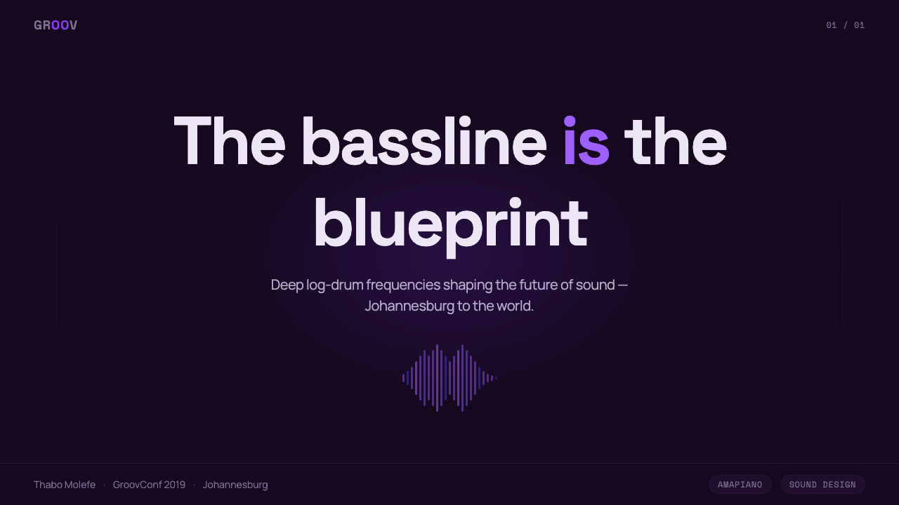
For presentation slides, the style works powerfully for music, entertainment, events, fashion, and any creative or cultural brand that wants to project contemporary authority. A cover slide should commit to the dark ground with the title in high-contrast geometric type — either light against black or one accent color at maximum weight. The log-drum waveform can be used as a subtle background band behind the title text, adding genre-specific texture without competing with the words. Content slides should keep color use disciplined: one accent color per slide, used only for the most important data point, label, or call-to-action.
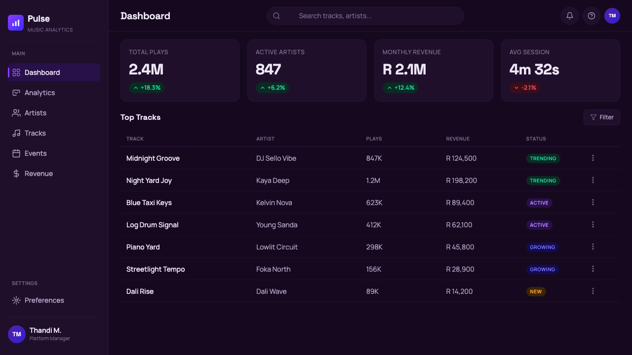
For web and app interfaces, the style suits music streaming dashboards, event ticketing platforms, cultural brand pages, and any digital product that wants the visual gravity of a club environment. Dark-mode UI components work naturally here: cards with subtle inner glow on their edges rather than soft drop shadows, type in near-white or the groove purple against the near-black ground, interactive states revealed through a brief pulse of electric blue rather than a conventional hover state color shift. Keep the waveform motif for intentional accents — section dividers, background textures behind hero areas — rather than as a repeated pattern across every component.
For marketing and editorial work, the Amapiano aesthetic excels in event posters, album artwork, brand campaign imagery, and editorial spreads for music or culture publications. The key is controlling the three-color palette: choose which of the three accent colors dominates the composition and relegate the others to supporting roles. An event poster might lead with the amber catchlight on a performer's face, the rest of the composition in pure darkness; a cover might use the electric blue as the sole light source illuminating geometric type.
The most common mistake when working with this style is reaching for warmth where the aesthetic demands cool restraint — adding grain, noise, or analog-style texture because dark digital fields feel empty. Resist this. The darkness in Amapiano is intentionally clean and matte; it is not compensating for anything. A second common error is crowding the composition with too many type elements, too many waveform instances, or too much color, collapsing the darkness into busy-ness. Every element added should be tested against the question: does this increase or decrease the sense of controlled energy?
Amapiano — FAQ
Is this style only suitable for music-related projects?
No, though music and entertainment contexts are its natural home. The Amapiano visual system is a complete, transferable design language built on dark grounds, geometric type, controlled color, and glow — these principles apply cleanly to fashion brands, sports equipment, gaming interfaces, creative agency portfolios, cultural institutions, and any product or service that wants to project contemporary confidence and a non-nostalgic identity. The style struggles in contexts requiring warmth, accessibility for elderly users, or the established trust signals of financial and healthcare products — those contexts demand the light, the familiar, and the calming, none of which are this style's register.
How does Amapiano's visual language differ from generic dark-mode or nightlife design?
Generic dark-mode design tends to be utilitarian — dark backgrounds chosen for eye comfort and battery efficiency — and nightlife design often defaults to neon brightness and high-gloss textures. Amapiano's visual language is neither. Its darkness is cultural, not ergonomic: a matte, velvet ground that speaks to a specific aesthetic tradition. Its color is controlled and restrained — groove purple, electric blue, amber — rather than the saturated neon spectrum of generic club graphics. And its most distinctive element — the log-drum waveform — is genre-specific rather than generic. The combination of these three choices creates something immediately recognizable as belonging to this particular cultural moment rather than to 'nightlife design' as a category.
Can the style work in a light or white background version?
A light inversion is technically possible but loses most of what makes the Amapiano aesthetic distinctive. The style's characteristic qualities — the glow, the pulsing color against darkness, the sense of a club environment materializing from a black ground — depend entirely on the darkness. On a white ground, you are left with geometric sans-serif type and a purple-blue-amber palette, which reads as generically contemporary rather than as this specific aesthetic. If a light version is required for accessibility or brand reasons, treat it as a separate design problem: borrow the palette and the waveform motif, but do not expect it to carry the same cultural weight as the dark-ground original.
How do I use the waveform motif without it looking like a generic audio-tech brand element?
The key is specificity and restraint. Generic audio-tech waveforms tend to be symmetrical, spiky, and high-frequency — they represent the visual idea of 'sound' in the abstract. The amapiano waveform has a specific sonic profile: it is deep, rounded at its peaks, low-frequency in its rhythm, reflecting the log drum's resonant, sub-heavy character. Use it at lower visual frequency (fewer, broader peaks rather than dense spiky clusters), render it in one of the style's specific accent colors rather than white or gradient, and position it as a compositional element with specific placement — a band across the lower third of a poster, a subtle texture behind a title — rather than as a centered hero graphic. Restraint matters: one well-placed waveform reads as genre-specific; three competing waveforms read as decoration.
Does this style suit Chinese or non-African cultural contexts?
Yes. The Amapiano visual system is not ethnically prescriptive — it is a set of design decisions (dark grounds, geometric type, controlled glow, specific color accent vocabulary) that can be applied to any content. The cultural origin gives the style its specificity and authority, but the design principles generalize cleanly. In Chinese-language contexts, the geometric sans-serif approach pairs well with contemporary Chinese display typefaces that share similar structural clarity. The style is already visible in Chinese club culture, streetwear branding, and music scene design in cities like Shanghai and Chengdu, where its forward-looking darkness resonates with a similar generational attitude.
Related design styles
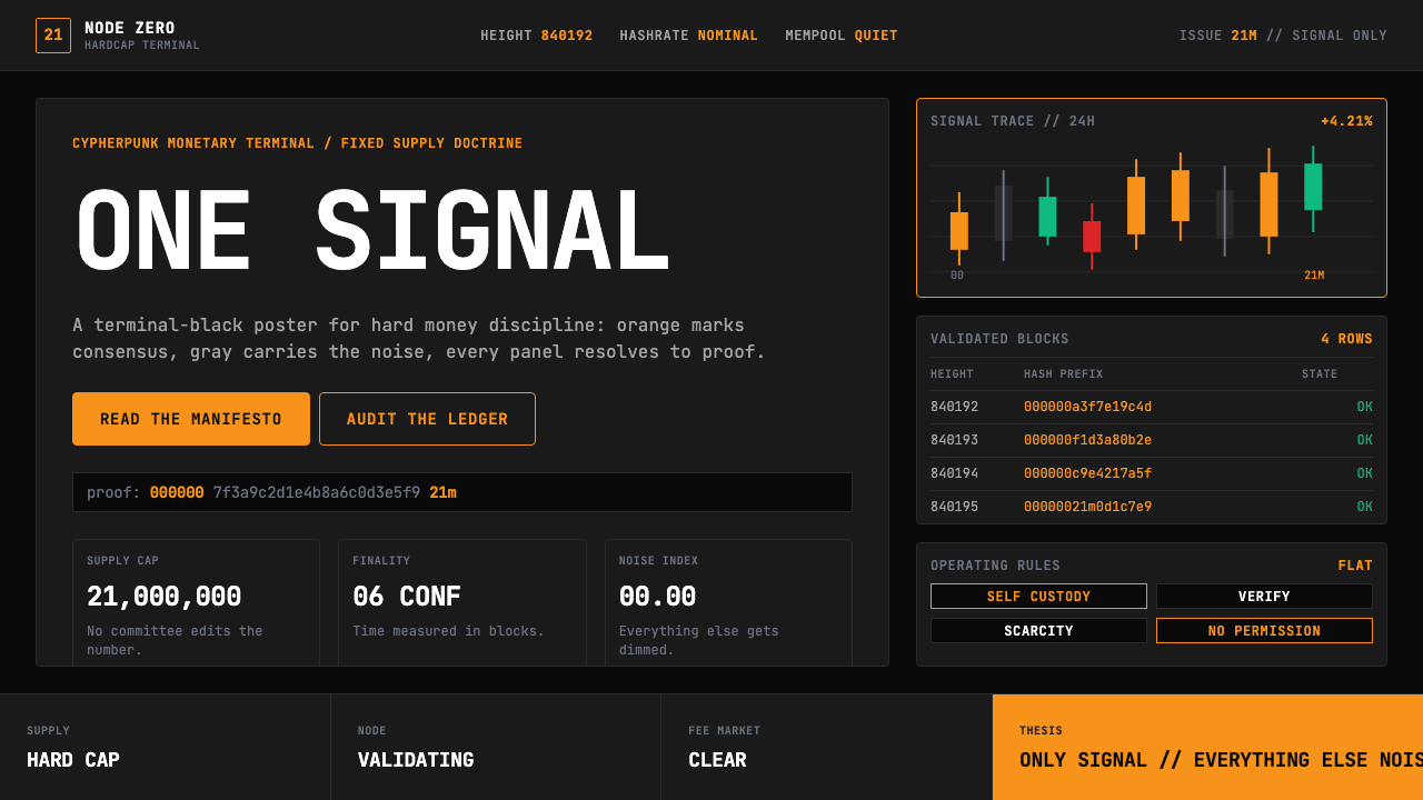 Bitcoin Maximalist OrangeOnly signal, zero spectacle. Orange mono data grids on terminal black enforce…
 Cash App 2024Fintech that talks like a record label. Pure black, dollar-bill green, type a…
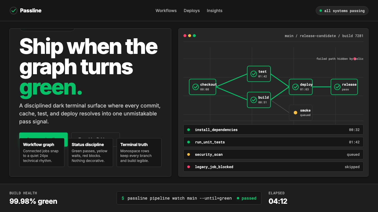 CircleCI Pipeline-GreenConfidence goes green. Emerald status lines cut through terminal-black pipeli…
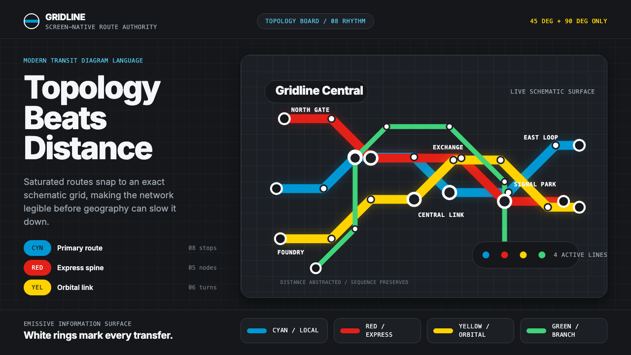 Transit Diagram (modern)Topology over geography. Cyan, red and yellow routes lock to 45-degree angles…
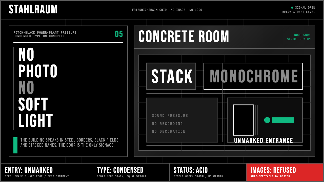 Berlin Techno (Berghain era)Refuses spectacle. Black grid, steel rules, condensed type, one acid-green si…
 Mistral AI OrangeSovereign AI with restraint. Orange, black, and white lock the grid.