What is Stefan Sagmeister?什么是 Stefan Sagmeister?
Stefan Sagmeister turned the body into a canvas — cutting event details into his own torso, building type from bananas and stitched thread — to prove that design should make you feel something, even if that something is discomfort.斯蒂芬·萨格梅斯特把身体变成画布——将活动信息刻入自己的胸膛,用香蕉和缝线堆砌字体——只为证明设计应当让人有所感受,哪怕那感受是不适。
Stefan Sagmeister in briefStefan Sagmeister 速览
Stefan Sagmeister is an Austrian-American graphic designer whose practice rejects the screen as a primary authoring surface. Where most contemporary design is conceived digitally and printed or published as a final step, Sagmeister begins in the physical world — with skin, fruit, thread, torn paper, inked stamps, street installations — and the camera is the last tool invoked, not the first. The result is a body of work that carries the weight and unpredictability of material reality: surfaces bleed, edges are imprecise, letterforms are alive.斯蒂芬·萨格梅斯特是一位奥地利裔美国平面设计师,他的实践拒绝将屏幕作为首要的创作表面。大多数当代设计在数字环境中构思、以印刷或发布为最终步骤,而萨格梅斯特则从物质世界出发——皮肤、水果、缝线、撕裂的纸张、盖印、街头装置——相机是最后一件工具,而非第一件。由此产生的作品携带着物质现实的重量与不可预知性:表面会渗透,边缘不精准,字形是有生命的。
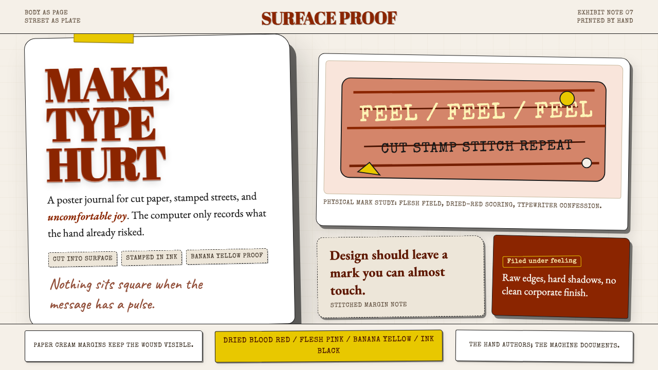
His visual language is built on material derivation. Colors are not sampled from a swatch library; they emerge from the substances that produce them — flesh pink from skin, dried blood from wounds, banana yellow from overripe fruit, paper cream from aged stock, ink black from stamps and stencils. Grids are present but broken, their authority undermined by the organic logic of the material. Scale shifts dramatically, from the intimate size of a journal entry to the monumental footprint of a public installation, and this range gives the work an uncanny ability to operate across formats without losing its identity.他的视觉语言建立在材料衍生之上。颜色不是从色板库中采样的,而是从产生它们的物质中涌现——皮肤的肉粉、伤口的干血红、过熟香蕉的明黄、陈年纸张的奶油色、印章与模板的墨黑。网格存在,但被打破,其权威性被材料的有机逻辑所瓦解。尺度剧烈变化,从日记手记的私密尺寸到公共装置的巨大体量,这种跨度赋予作品一种跨越形式而不失身份的非凡能力。
The studio produced some of the most discussed album covers, posters, and exhibitions of the 1990s and 2000s. Clients included the Rolling Stones, Lou Reed, Jay-Z, and David Byrne. The work is not merely provocative for its own sake — the discomfort or wonder it generates is calibrated to the content it communicates. Sagmeister's famous personal diary rule — that every few years he closes the studio for a year-long sabbatical to feed his own curiosity — is itself a design principle: work that loses contact with lived experience loses its capacity to move people.工作室创作了1990至2000年代最受讨论的部分唱片封面、海报与展览。客户包括滚石乐队、卢·里德、Jay-Z 与大卫·拜恩。这些作品并非为挑衅而挑衅——它们所激发的不适或惊奇,是经过校准的,与所传达的内容相对应。萨格梅斯特著名的个人规则——每隔几年关闭工作室、用一年sabbatical喂养自己的好奇心——本身就是一个设计原则:与生活经验失去联系的作品,也就失去了打动人心的能力。
See the Stefan Sagmeister design system查看 Stefan Sagmeister 完整设计系统
Where does Stefan Sagmeister come from?Stefan Sagmeister 从何而来?
Stefan Sagmeister was born in 1962 in Bregenz, a small lakeside city in the Austrian state of Vorarlberg. He began publishing his own magazine at fifteen, a project that taught him graphic production before any formal instruction. He studied at the University of Applied Arts Vienna, then won a Fulbright scholarship to study at the Pratt Institute in New York in the late 1980s. New York, with its visual density, its music culture, and its willingness to treat street surfaces as design territory, became his permanent base.斯蒂芬·萨格梅斯特1962年生于奥地利福拉尔贝格州博登湖畔的小城布雷根茨。十五岁时他便开始自己编辑出版杂志,这段经历在任何正规教育开始之前就已教会了他平面生产的方法。他就读于维也纳应用艺术大学,随后于1980年代末获得富布赖特奖学金,赴纽约普拉特艺术学院深造。纽约——以其视觉密度、音乐文化,以及将街道表面视为设计领地的开放态度——成为他永久的根据地。
His early career included a formative period working for Tibor Kalman at M&Co in New York. Kalman was already legendary for design that provoked, questioned, and occasionally offended — work that used the visual language of commerce against commercial complacency. Sagmeister absorbed Kalman's conviction that design had an obligation beyond service delivery: it could be an ethical and emotional act. After a stint at Leo Burnett in Hong Kong, he returned to New York and founded Sagmeister Inc. in 1993.他的早期职业生涯中有一段关键时期:在纽约 M&Co 为 Tibor Kalman 工作。卡尔曼以挑衅、质疑、偶尔冒犯的设计而享有传奇声誉——那些作品将商业视觉语言用来对抗商业自满。萨格梅斯特从卡尔曼那里吸收了一种确信:设计承担着超越服务交付的义务,它可以是一种伦理行为,也可以是一种情感行为。在香港李奥贝纳短暂工作后,他回到纽约,于1993年创立了 Sagmeister Inc.。
The studio's reputation was established almost immediately. In 1999 he designed a poster for the AIGA Detroit conference by having an intern use an X-Acto knife to carve the event's typographic information directly into his torso. The resulting image — raw, methodical, unflinching — circulated through the design world as a kind of manifesto. It said: the body is a material. Pain is a medium. Design that does not cost the designer something is design that will not cost the audience anything either. The poster won numerous awards and became one of the most cited works in late twentieth-century graphic design.工作室的声誉几乎立即建立起来。1999年,他为 AIGA 底特律设计大会设计了一张海报:让实习生用手术刀将活动的排版信息直接刻进他的躯干。那张照片——生猛、有条不紊、毫不回避——在设计界流传,成为某种宣言。它说:身体是一种材料,痛苦是一种媒介,不令设计师付出代价的设计,也不会令观者付出任何东西。这张海报赢得了众多奖项,成为二十世纪末平面设计中被引用最多的作品之一。
Through the 2000s, Sagmeister continued pushing the boundary between design and fine art. The 'Things I Have Learned in My Life So Far' project, begun around 2004, translated personal aphorisms into large-scale typographic installations using whatever materials the site or occasion suggested — coins pressed into a lawn in Kansas City, bananas arranged on shelves in New York, text painted across an entire building facade in Lisbon. In 2012, he formed Sagmeister & Walsh with Jessica Walsh, expanding the studio's reach into branding, motion, and digital work. The partnership dissolved in 2019 when Walsh relaunched the studio as &Walsh; Sagmeister returned to solo practice and to the ongoing research into beauty, happiness, and the relationship between aesthetics and well-being that continues to define his later career.在2000年代,萨格梅斯特持续推动设计与纯艺术之间的边界。约从2004年开始的项目《我在生命中学到的事情》,将个人格言转化为大型排版装置,所用材料因地因时而异——堪萨斯城草坪上铺排的硬币、纽约货架上摆放的香蕉、涂满里斯本整栋建筑立面的文字。2012年,他与杰西卡·沃尔什共同成立了 Sagmeister & Walsh,将工作室的业务拓展至品牌、动态影像与数字领域。这段合作于2019年终结,沃尔什重组工作室更名为 &Walsh;萨格梅斯特则回归独立实践,继续围绕美、幸福,以及美学与福祉关系的持续研究——这一主题至今仍界定着他晚期事业的走向。
What defines the Stefan Sagmeister look?Stefan Sagmeister 的视觉特征是什么?
Material-Derived Color材料衍生的色彩
Sagmeister's palette is not selected from a color system but pulled from the physical world. The tones are those of skin at different temperatures and states, overripe fruit, dried biological fluids, aged paper, and industrial ink. This means the colors carry associative weight that sampled palettes lack: flesh pink reads as vulnerability, blood red as consequence, banana yellow as abundance or decay depending on context. The palette is narrow and often unexpected, but always traceable to a source material rather than a swatch.萨格梅斯特的色板不从色彩系统中选取,而是从物质世界中提炼。那些色调来自不同温度与状态下的皮肤、过熟的水果、干燥的生物液体、陈年纸张与工业墨水。这意味着这些颜色携带着采样色板所缺乏的联想重量:肉粉色传达脆弱,血红色意味着代价,香蕉黄则根据语境读作丰盛或腐朽。色板窄而出人意料,但始终可以追溯到某种源材料,而非色卡。
The Body as Surface身体作为表面
No other designer of his era used the human body as a primary design substrate with such consistency and seriousness. Sagmeister's body-based work is not shock art — it is an argument about design's relationship to lived experience. When type is scratched into skin, it carries risk, time, and physical cost that computer-set type cannot simulate. The body also introduces organic imprecision: letterforms carved by hand are never identical, and that irregularity is the point. The warmth of the material guarantees the warmth of the response.在他同时代的设计师中,没有人如此一贯且严肃地将人体作为首要设计基底。萨格梅斯特的身体系作品并非震惊艺术——而是一个关于设计与生活经验关系的论点。当字形被刻入皮肤,它所携带的风险、时间与身体代价,是电脑排版无法模拟的。身体还引入了有机的不精准:手工刻划的字形从不相同,而那种不规则性正是重点所在。材料的温度保证了回应的温度。
Handmade Type Construction手工字体构成
Typography in Sagmeister's work is routinely constructed rather than selected. Letters are assembled from coins, bones, bent wire, stacked books, arranged food, or living plants. This physical construction process means that the letterforms are inseparable from their substance: banana-letter type implies ripeness and transience; coin-letter type implies accumulation and weight. The method forces a fundamental question at the start of every typographic decision — what material should these words be made of, and what does that material say about the words?在萨格梅斯特的作品中,字体排印通常是被建造出来的,而非被选取的。字母由硬币、骨骼、弯曲的铁丝、叠放的书籍、摆布的食物或活体植物组装而成。这一物质建造过程意味着字形与其材质不可分割:香蕉字体暗示着成熟与短暂;硬币字体暗示着积累与重量。这种方法在每一个排版决策之初就迫使一个根本性的问题:这些文字应当由什么材料构成,而那种材料又对这些文字说了些什么?
Broken Grid and Raw Edge破格与原始边缘
Sagmeister's layouts acknowledge grid structure but refuse its authority. Elements exceed their boxes, bleed into adjacent areas, or are tilted, stacked, or scattered in ways that register as intentional disruption rather than error. The raw edge — torn paper, uneven ink, the frayed boundary of a stamped letterform — is preserved rather than cleaned up. Where conventional production design would route these imperfections to final correction, Sagmeister's process treats them as evidence of authentic making. The imperfect edge is proof that a human was present.萨格梅斯特的版面承认网格结构,但拒绝其权威。元素超出边框、溢入相邻区域,或以倾斜、堆叠、散布的方式被处理,这些被解读为刻意的破格,而非失误。原始边缘——撕裂的纸张、不均匀的墨水、盖印字形毛糙的轮廓——被保留而非清除。常规生产设计会将这些不完美导入最终修正,而萨格梅斯特的流程将它们视为真实制作的证据。不完美的边缘证明了一个人的在场。
Intimacy at Monumental Scale巨大尺度中的亲密感
A distinctive quality of Sagmeister's work is its ability to maintain a private, confessional tone regardless of scale. A journal entry scratched into skin becomes a poster seen by thousands; a personal aphorism spelled out in coins on a city lawn is experienced by passers-by who may not even recognize it as design. The content is always personal — drawn from his own journals, his own fears, his own observations about happiness — and this personal origin survives translation into the monumental. The viewer senses that a specific human being made this specific claim, even when the substrate is a building facade.萨格梅斯特作品的一个独特品质是:无论尺度如何,它都能维持一种私密的、告白式的调性。刻入皮肤的日记手记成为数千人看见的海报;用硬币在城市草坪上拼写的个人格言,被路人偶然经过时所感知,他们甚至可能不会认出这是设计。内容始终是个人的——取自他自己的日记、他自己的恐惧、他对幸福的亲身观察——而这种个人起源在转化为宏观尺度时得以留存。观者能感知到,是某个具体的人提出了这个具体的主张,即便承载它的基底是整栋建筑的外立面。
Confessional Content Strategy告白式内容策略
Sagmeister's most influential works use his own biography and psychological state as primary content. This is not autobiography for its own sake — it is a method for achieving specificity. A claim drawn from direct experience carries a different weight than a claim assembled from research. The 'Things I Have Learned in My Life So Far' series, his documented sabbaticals, and his published diaries all function as design demonstrations: showing, rather than arguing, that authenticity and craft are inseparable. The confessional mode is a structural choice with aesthetic consequences.萨格梅斯特最具影响力的作品以他自身的传记与心理状态作为首要内容。这并非为自传而自传——而是一种实现具体性的方法。源自亲身经验的主张,与通过研究拼凑的主张,携带着不同的重量。《我在生命中学到的事情》系列、他记录在案的sabbatical,以及他出版的日记,都发挥着设计示范的功能:以展示代替论证,说明真实性与工艺是不可分割的。告白模式是一种带有美学后果的结构性选择。
Ephemeral and Perishable Materials短暂与易逝的材料
Fruit rots. Skin heals. Thread unravels. The materials Sagmeister favors resist permanence, and this resistance is meaningful: it foregrounds the temporal dimension of design, insisting that a piece exists in time, not just in space. Work made from perishable substances cannot be fully captured in a photograph — the photograph is always a record of a moment, not the thing itself. This awareness of decay and ephemerality connects the design practice to a broader philosophical position: that designed objects, like all living things, derive some of their meaning from their transience.水果会腐烂,皮肤会愈合,缝线会松散。萨格梅斯特偏爱的材料抗拒永久性,而这种抗拒是有意义的:它将设计的时间维度推至前景,坚持认为一件作品存在于时间之中,而不仅仅存在于空间之中。用易腐材料制作的作品无法被照片完整捕捉——照片始终是某一瞬间的记录,而非事物本身。这种对衰败与短暂的觉知,将这种设计实践与一种更宽广的哲学立场联结起来:被设计的物体,如同所有生命体,从其短暂性中获得部分意义。

See the Stefan Sagmeister design system查看 Stefan Sagmeister 完整设计系统
Who shaped Stefan Sagmeister?谁塑造了 Stefan Sagmeister?
Born in Bregenz, Austria in 1962, Sagmeister founded Sagmeister Inc. in New York in 1993 after studying in Vienna and at Pratt Institute. He designed covers for the Rolling Stones, Lou Reed, Jay-Z, and the Talking Heads, and produced exhibition work shown at galleries and museums worldwide. His practice spans print, installation, film, and writing. He has taken several year-long sabbaticals — in Bali, in Europe, and elsewhere — which he documents publicly and treats as a fundamental part of his working method. His books, including 'Things I Have Learned in My Life So Far' and 'The Happy Film,' document the intersection of design, happiness research, and personal philosophy.萨格梅斯特1962年生于奥地利布雷根茨,在维也纳及普拉特艺术学院求学后,于1993年在纽约创立 Sagmeister Inc.。他为滚石乐队、卢·里德、Jay-Z 与Talking Heads设计封面,并在全球画廊与美术馆展出装置作品。他的实践跨越印刷、装置、影像与写作。他曾多次休整一年——在巴厘岛、在欧洲及其他地方——并将这些sabbatical公开记录,视之为工作方法的基本组成部分。他的书籍,包括《我在生命中学到的事情》与《快乐电影》,记录了设计、幸福研究与个人哲学的交汇。
Walsh joined Sagmeister's studio in 2010 and became a partner in 2012, forming Sagmeister & Walsh. During the partnership, the studio expanded into branding, motion design, and social-platform–native work, bringing a more vibrantly chromatic and surrealist sensibility alongside Sagmeister's material-physical approach. Walsh's contribution broadened the studio's demographic and formal range considerably. In 2019 she relaunched the studio independently as &Walsh, while Sagmeister returned to solo practice. Their collaborative period represents one of the more documented creative partnerships in contemporary graphic design.沃尔什于2010年加入萨格梅斯特的工作室,2012年成为合伙人,共同组建 Sagmeister & Walsh。合作期间,工作室将业务扩展至品牌、动态设计与社交平台原生内容,将更为浓艳色彩化与超现实主义的感性融入萨格梅斯特的物质-身体取向。沃尔什的加入显著拓宽了工作室的受众群体与形式范围。2019年她独立重组工作室为 &Walsh,萨格梅斯特则回归个人实践。他们的合作时期是当代平面设计中记录最详尽的创作合伙关系之一。
Kalman was the founding design director of M&Co in New York and Sagmeister's most formative early employer. Kalman believed that design had a social and moral responsibility, and he used his studio's client relationships — which included the Restaurant Florent, Talking Heads, and eventually Colors magazine for Benetton — to make work that challenged assumptions rather than confirmed them. His influence on Sagmeister was primarily philosophical: the insistence that discomfort, ambiguity, and provocation are not failures of communication but legitimate design strategies. Kalman died in 1999; Sagmeister has cited him as the single most important influence on his practice.卡尔曼是纽约 M&Co 的创始设计总监,也是萨格梅斯特早期最具塑造力的雇主。卡尔曼相信设计肩负社会与道德责任,他借助工作室的客户关系——包括 Restaurant Florent、Talking Heads,以及后来为贝纳通创办的《Colors》杂志——制作挑战假设而非印证假设的作品。他对萨格梅斯特的影响主要是哲学层面的:坚持认为不适、模糊与挑衅并非传达的失败,而是合法的设计策略。卡尔曼于1999年辞世;萨格梅斯特曾多次将他列为对自己实践影响最大的单一人物。
The Talking Heads frontman and solo artist was among Sagmeister's most sustained and adventurous clients. Their collaboration extended across multiple album covers and visual projects, and Byrne's willingness to embrace unconventional, labor-intensive design solutions gave Sagmeister room to develop his material-based approach in a commercial context. The working relationship illustrated that the boundary between art direction and fine-art collaboration could be deliberately blurred, and that a client's intellectual ambition could function as a design brief in itself.Talking Heads 主唱兼独立艺术家大卫·拜恩是萨格梅斯特最持久、最勇于冒险的客户之一。他们的合作跨越了多张唱片封面与视觉项目,拜恩愿意接受非常规、劳动密集型设计方案,给予萨格梅斯特在商业语境中发展其材料取向的空间。这段工作关系说明,艺术指导与纯艺术合作之间的边界可以被刻意模糊,而客户的智识野心本身就可以充当一份设计任务书。
Sagmeister designed several visual identities for Lou Reed, including work associated with Reed's late-career releases. Reed's subject matter — gritty urban experience, emotional extremity, the underside of bohemian life — aligned naturally with Sagmeister's interest in using discomfort as a design resource. The collaborations demonstrate how a designer's sensibility and a client's thematic preoccupations can reinforce each other to produce work neither would generate independently. Reed's cultural authority also helped validate Sagmeister's more extreme formal experiments to a mainstream music audience.萨格梅斯特为卢·里德设计了数个视觉形象,包括里德晚期专辑相关的作品。里德的主题——粗粝的都市经验、情感极限、波希米亚生活的阴暗面——与萨格梅斯特将不适作为设计资源的兴趣天然契合。这些合作展示了设计师的感性与客户的主题关切如何相互强化,产生双方单独都无法生成的作品。里德的文化权威也帮助萨格梅斯特更为极端的形式实验得到主流音乐受众的认可。
How do you use Stefan Sagmeister today?今天怎么用 Stefan Sagmeister?
Sagmeister's aesthetic is among the most distinctive and least generic in contemporary design history, which makes it both powerful and demanding to apply. It works best when the brief itself calls for authenticity, emotional intensity, or the communication of a personal stake — when the goal is not merely to inform but to make the audience feel the weight of the message. Applied to the right context, it is unforgettable; applied to the wrong one, it reads as gratuitously edgy or incoherent.萨格梅斯特的美学是当代设计史上最具辨识度、最不通用的风格之一,这使它既强大又苛刻。它最适合用于任务本身呼唤真实性、情感强度或传达个人投入的场合——当目标不仅仅是告知,而是让受众感受到信息的重量。用在正确的语境中,它令人难以忘怀;用在错误的语境中,它则显得无谓地刺激或语焉不详。
For presentation slides, the Sagmeister approach challenges conventional deck structure productively. A cover slide benefits from a single bold material gesture: one idea expressed through a constructed or photographed typographic object rather than a digital layout. The typographic image should dominate the frame, with title text subordinated or integrated into the image itself. Content slides work best when they commit to a single idea per page and express hierarchy through dramatically contrasting scale rather than through color coding or icon sets. Data slides can adopt a handmade quality — sketched charts, annotated diagrams — that signals human interpretation over automated output. The risk on content slides is inconsistency: once the aesthetic establishes an expectation of handmade warmth, a suddenly polished slide reads as an error.对于演示文稿,萨格梅斯特的方式对常规幻灯片结构提出了富有成效的挑战。封面幻灯片适合一个单一的大胆材料姿态:一个通过构建或拍摄的排版物体表达的单一想法,而非数字版面。排版图像应主导画面,标题文字处于从属位置或被整合进图像本身。内容页在每页只传达一个想法、以戏剧性的尺度对比而非色码或图标组来表达层级时效果最佳。数据页可以采用手工感质量——手绘图表、注释示意图——以此发出人工解读而非自动化输出的信号。内容页的风险在于不一致:一旦美学确立了手工温度的预期,一张突然精致的幻灯片就会被读作错误。
For web interfaces and digital products, the style requires careful translation. Full material-photography implementation is appropriate for editorial landing pages, cultural institution sites, or artist portfolios where the brand can absorb the visual weight. Dashboard and tool interfaces can borrow selectively: a typographically bold hero section with a material texture photograph, transitioning to a cleaner grid for functional content. Pricing pages can use the confessional tone — short, specific, first-person-adjacent copy — without the full visual intensity. The key constraint is that interactive states (hover, focus, active) must remain legible and predictable; material ambiguity that reads as intentional in static work can read as broken in interactive contexts.对于网页界面与数字产品,这种风格需要细心转译。完整的材料摄影实施适用于编辑落地页、文化机构网站或艺术家作品集——品牌能够承载这种视觉重量的场合。仪表板与工具界面可以有选择地借用:一个排版大胆、带有材料质感照片的英雄区块,过渡到功能内容区域更清洁的网格。定价页可以采用告白式调性——简短、具体、接近第一人称的文案——而不需要完整的视觉强度。关键约束在于:交互状态(悬停、聚焦、激活)必须保持清晰可辨;在静态作品中被读作有意为之的材料模糊,在交互语境中可能被读作程序错误。
For editorial and marketing work, the style is at its most transferable. A campaign built around a central material typographic image — words constructed from the product's own substance, or from a material that metaphorically represents the brand's values — can carry the Sagmeister logic without requiring physical risk or extreme production. Posters and out-of-home advertising benefit particularly: the style's bold scale contrast and material specificity read clearly at distance and reward closer inspection. Long-form editorial can use the confessional content strategy structurally, framing analysis as personal observation rather than impersonal authority.对于编辑与营销内容,这种风格最具可移植性。围绕一个核心材料排版图像——用产品自身材质、或用在隐喻上代表品牌价值观的材料构建的文字——建立一个活动,可以在不需要身体风险或极端制作的情况下承载萨格梅斯特的逻辑。海报和户外广告尤其受益:这种风格大胆的尺度对比与材料具体性在远处清晰可辨,近观时又有所回报。长篇编辑内容可以将告白式内容策略用于结构层面,将分析呈现为个人观察而非无人格的权威。
A common mistake when referencing Sagmeister is mistaking provocation for shock. His most extreme works — the carved torso poster, the installations involving bodily risk — were not designed to disturb for disturbance's sake; the discomfort was proportional to the content. Designers who apply surface-level edge (bloody textures, confrontational typography) without the corresponding intellectual and emotional content produce work that reads as imitative rather than authentic. A second mistake is treating the handmade aesthetic as an excuse for sloppiness: Sagmeister's physical constructions are meticulously executed; the rawness is controlled rawness, not uncontrolled mess. The warmth of the material does not substitute for craft — it requires it.参考萨格梅斯特时最常见的错误,是将挑衅与震惊混淆。他最极端的作品——刻字躯干海报、涉及身体风险的装置——并非为扰动而设计扰动;其中的不适与内容是成比例的。在缺乏相应智识与情感内容的情况下施用表面层面的锋芒(血腥质感、对抗性排版),所产出的作品被读作模仿而非真实。第二个错误是将手工美学视为草率的借口:萨格梅斯特的物质构建是精心执行的;那种原始感是受控的原始感,而非失控的凌乱。材料的温度无法替代工艺——它需要工艺。
See the Stefan Sagmeister design system查看 Stefan Sagmeister 完整设计系统
Stefan Sagmeister — FAQStefan Sagmeister · 常见问题
Is Sagmeister's approach only for cultural clients, or can it work for commercial brands?萨格梅斯特的方式只适合文化客户吗,还是也能用于商业品牌?
His studio worked with major commercial clients including a global sportswear brand and several financial institutions, so the approach is not inherently restricted to cultural work. The relevant question is whether the brand's identity can support the emotional and material intensity the style demands. Brands built around craft, authenticity, personal narrative, or experiential quality — independent spirits, specialty food producers, independent publishers, performance venues — are natural fits. Brands whose identity rests on precision, neutrality, or institutional scale tend to resist the style's organic irregularity. The confessional content strategy, however, translates more broadly: specific, first-person–adjacent copy is an effective alternative to generic brand voice in almost any category.他的工作室曾与包括一家全球运动品牌及数家金融机构在内的主要商业客户合作,因此这种方式本质上并不局限于文化领域。关键问题在于:品牌身份能否承载这种风格所要求的情感与材料强度。以工艺、真实性、个人叙事或体验质量为核心的品牌——独立烈酒、精品食品生产商、独立出版社、演出场馆——是天然的契合点。以精确性、中立性或机构体量为身份基础的品牌,往往对这种风格的有机不规则性产生抵触。然而,告白式内容策略具有更广泛的可移植性:具体的、接近第一人称的文案,在几乎任何品类中都是通用品牌语气的有效替代。
How do you apply this aesthetic digitally when the whole point is physical material?当整个核心在于物质材料时,如何在数字环境中应用这种美学?
The most effective digital translations begin in the physical world and end in the camera. Design the typographic element physically — construct the letters from a relevant material, photograph it with care — and then use that image as the primary visual asset in the digital layout. The digital layer handles spacing, type hierarchy, and interactivity; the material layer provides the emotional and sensory texture. This hybrid approach is used routinely in editorial photography, luxury brand campaigns, and cultural institution communications. What does not translate is the simulation of material texture through digital filters: a digitally applied grain or scratch overlay reads as pastiche, not authenticity. If physical production is genuinely impossible, a closely related strategy is to use materials that already carry associative weight — aged paper, printed letterpress textures — through high-quality documentary photography.最有效的数字转译从物质世界出发,以相机结束。在物理层面设计排版元素——用相关材料构建字母,精心拍摄——然后将这张照片作为数字版面的核心视觉资产。数字层处理间距、排版层级与交互性;材料层提供情感与感官质感。这种混合方法在编辑摄影、奢侈品牌活动与文化机构传播中被例行使用。不可移植的是:通过数字滤镜模拟材料质感——数字化叠加的颗粒或划痕纹理被读作仿制品,而非真实。若物理制作确实不可能,一个密切相关的策略是:通过高质量的纪实摄影,使用已经携带联想重量的材料——陈年纸张、活版印刷质感。
Does the style work for systematic brand identities, or is it inherently one-off?这种风格适合系统性品牌识别吗,还是它本质上是一次性的?
Sagmeister himself has argued that the impulse toward systematic identity is often at odds with authentic communication — systems can become formulas, and formulas cannot surprise. That said, several brand applications derived from his approach have been systematic at the level of principle rather than template: the same material logic is applied to each touchpoint, but the specific material and construction may vary by context. An event series might spell its name in a different material each year; a publication might use the same handmade typographic approach but with locally sourced materials for each edition. The system is a method, not a kit, and that distinction is crucial. Designers expecting a set of components to deploy will be frustrated; designers who internalize the underlying principle — material reflects content; specificity builds trust — can maintain coherence across a broad range of applications.萨格梅斯特本人曾论证,追求系统性识别的冲动往往与真实传达相悖——系统可能变成公式,而公式无法制造惊喜。话虽如此,从他的方式衍生出的若干品牌应用,确实在原则层面而非模板层面上是系统性的:相同的材料逻辑被应用于每个接触点,但具体的材料与构建方式可能因语境而异。一个活动系列可以每年用不同的材料拼写其名称;一本出版物可以在每个版本中使用相同的手工排版方式,但以当地采购的材料完成。这个系统是一种方法,而非一套组件包,这一区别至关重要。期待部署一套组件库的设计师会感到沮丧;内化了底层原则的设计师——材料反映内容;具体性建立信任——则能在广泛的应用范围内保持连贯性。
How does Sagmeister's approach relate to the contemporary maximalism or craft revival trends?萨格梅斯特的方式与当代极繁主义或手工艺复兴潮流有何关联?
Sagmeister's work predates both trends and is distinct from them in its motivations. The current craft revival is often aesthetic in its primary orientation — letterpress, risograph, and hand-lettering are chosen because they look a certain way, generating a retro or artisanal visual signal. Sagmeister's material choices are semantic: the material is chosen because of what it means, not how it looks. Similarly, contemporary maximalism tends to be additive — more color, more pattern, more layering — whereas Sagmeister's work, despite its intensity, is often highly focused: one strong material gesture, one clear message. The apparent similarity to craft-revival aesthetics is a surface convergence; the underlying logic is different. Applying the Sagmeister approach means asking 'what should this be made of?' before 'how should this look?' — a sequence most trend-driven design reverses.萨格梅斯特的作品早于这两种潮流,且在动机上与它们截然不同。当前的手工艺复兴往往以美学为主要取向——活版印刷、risograph 与手写字体被选用,是因为它们具有某种外观,传递出复古或工匠感的视觉信号。萨格梅斯特的材料选择则是语义性的:选择某种材料,是因为它意味着什么,而非它看起来如何。同样,当代极繁主义倾向于加法——更多色彩、更多图案、更多分层——而萨格梅斯特的作品,尽管强度很高,往往高度聚焦:一个强烈的材料姿态,一个清晰的信息。与手工艺复兴美学的表面相似,是一种表层上的汇聚;底层逻辑是不同的。应用萨格梅斯特方式意味着在「这应该看起来如何?」之前先问「这应当由什么制成?」——而大多数趋势驱动的设计将这一顺序颠倒了。
What distinguishes authentic Sagmeister-influenced work from imitation?真正受萨格梅斯特影响的作品与模仿之作有何区别?
The clearest marker is whether the material choice is motivated. In authentic applications, you can answer the question 'why this material?' with a specific answer rooted in the content — the words are made of coins because the project is about economic value; the type is carved into wood because the client is a forest-products company; the letters are assembled from broken crockery because the brief is about a restaurant that failed. In imitations, the material is chosen for its visual texture or shock potential without a corresponding conceptual anchor. The second distinguishing marker is execution quality: Sagmeister's physical constructions are made with the same obsessive precision that conventional designers apply to digital layouts. The rawness is chosen, not defaulted to. Imitations often mistake coarse production for authentic physicality. The test is simple: if you replaced the material with a different one of equal visual interest, would the meaning change? If not, the choice was aesthetic, not semantic.最清晰的标志是:材料选择是否有动机。在真正的应用中,你能够以扎根于内容的具体答案回答「为何选择这种材料?」——这些文字用硬币制成,因为这个项目关乎经济价值;字体被刻入木材,因为客户是一家林产品公司;字母由破碎陶器拼砌,因为任务书关乎一家倒闭的餐厅。在模仿之作中,材料的选择基于其视觉质感或震惊潜力,缺乏对应的概念锚点。第二个区别性标志是执行质量:萨格梅斯特的物质构建以与常规设计师处理数字版面同等的强迫性精确度完成。那种原始感是被选择的,而非被默认的。模仿者往往将粗粝的制作误认为真实的物质性。检验方式很简单:如果你将这种材料替换为视觉上同样有趣的另一种材料,意义会改变吗?如果不会,那么这个选择是美学性的,而非语义性的。
Related design styles相关设计风格
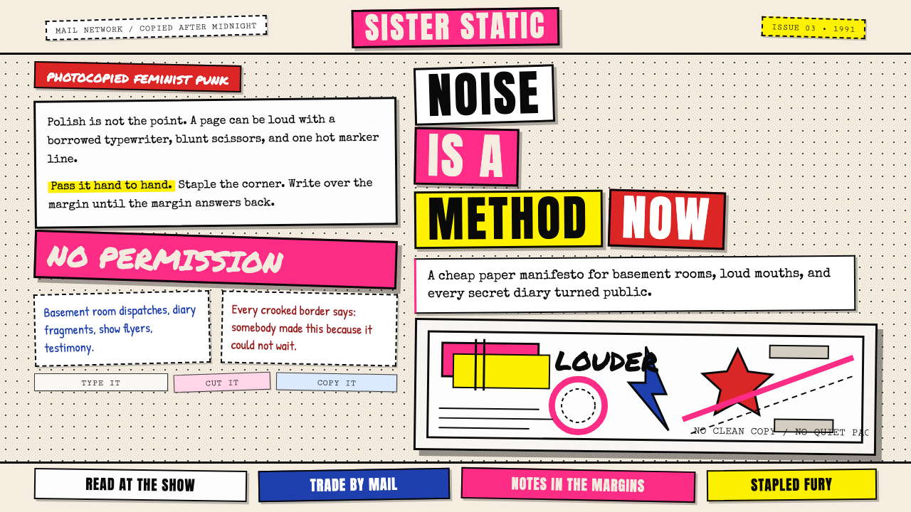 Riot Grrrl Zine (1991)DIY fury, unpolished. Cream Xerox grain, black toner type, hot-pink marker co…DIY怒火,拒绝精致。米色复印颗粒、黑碳粉字与荧光粉拼贴。
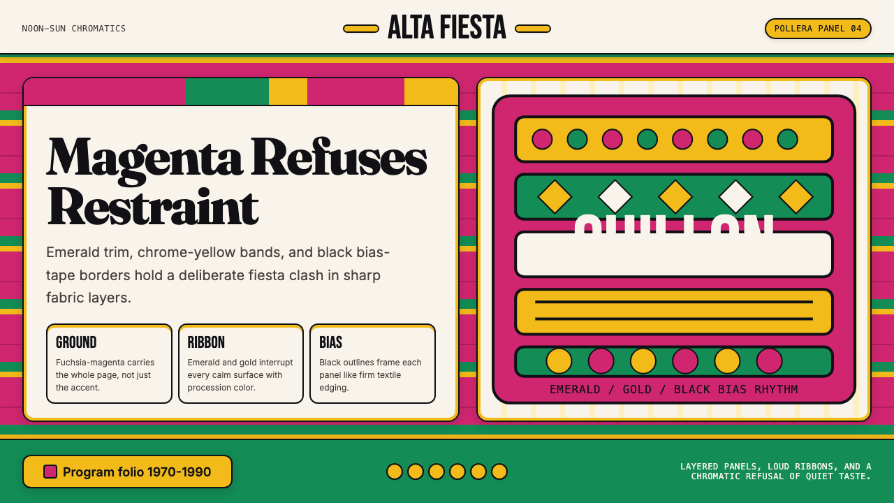 Bolivian Pollera Fiesta MagentaChromatic defiance. Magenta ground, emerald bands and black outlines clash li…色彩拒绝克制:品红底、翡翠带、黑滚边制造节庆撞色。
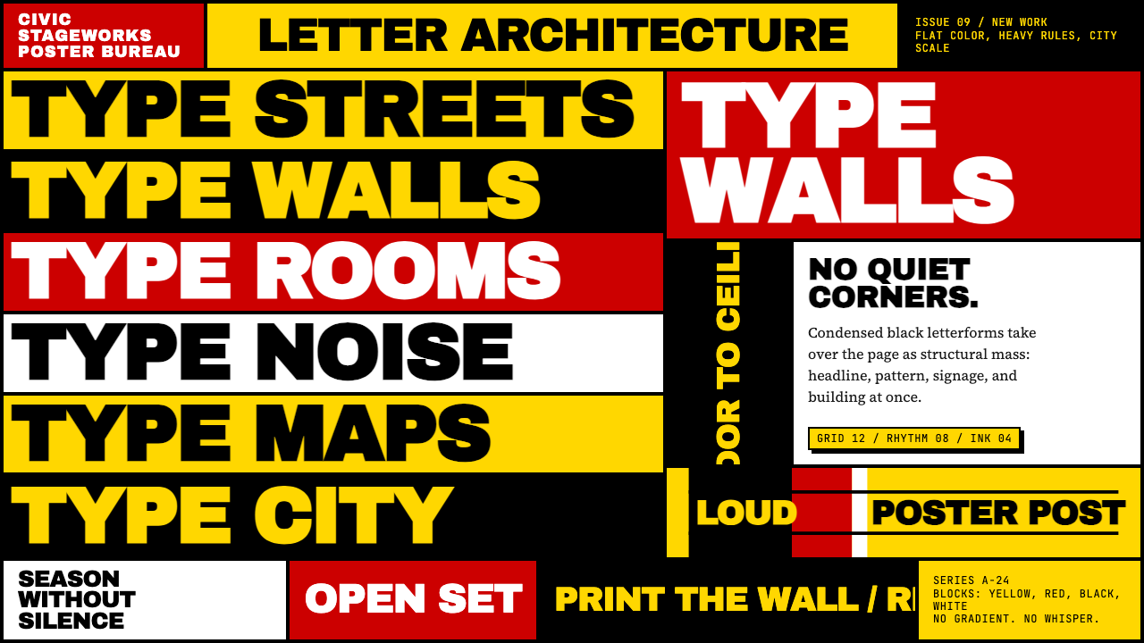 Paula Scher / PentagramType becomes architecture. Yellow-red-black blocks and stacked condensed caps…字体成为建筑:黄红黑色块与密排粗窄大写填满画面。
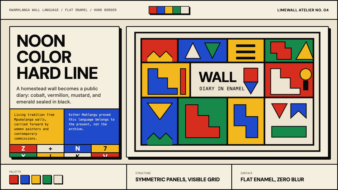 South African Ndebele House PaintNoon color, hard border. Vermilion, cobalt, mustard and emerald lock into a w…正午色彩,硬黑封边:朱红、钴蓝、芥末黄与翡翠绿锁进墙面网格。
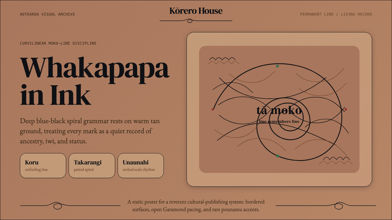 Māori Tā Moko (Facial Tattoo)Ancestry feels carved. Blue-black spirals on tan ground carry a restrained Ga…祖谱如刻入肌理。蓝黑螺旋落在暖棕肤底,Garamond克制叙事。
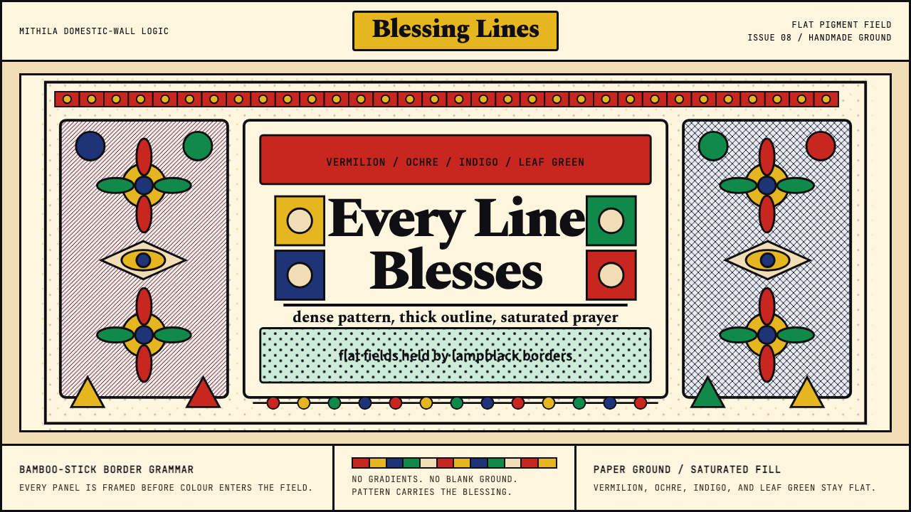 Mithila (Madhubani) PaintingEvery inch is blessed. Lampblack borders lock vermilion, ochre, indigo, and l…寸寸皆成祝福:黑线框住朱红、赭黄、靛蓝与叶绿。