What is Paula Scher / Pentagram?什么是 Paula Scher / Pentagram?
Paula Scher turned condensed type into architecture — stacking letters floor-to-ceiling until the page became the building.Paula Scher 把压缩字体变成了建筑——将字母从地板堆到天花板,直到页面本身成为建筑物。
Paula Scher / Pentagram in briefPaula Scher / Pentagram 速览
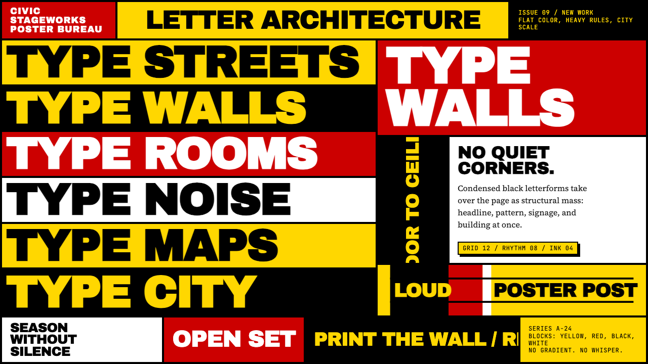
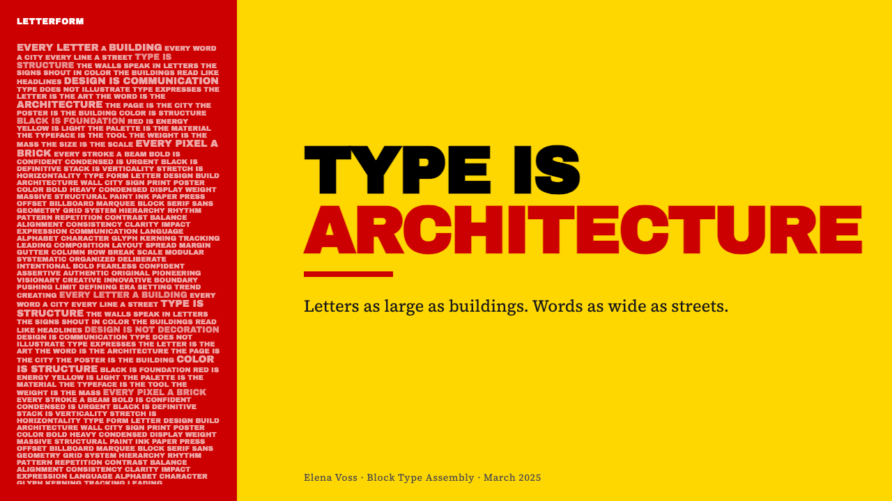
Paula Scher / Pentagram is a design approach in which typography is not placed on a composition but becomes the composition. Letters — typically heavy condensed capitals — are scaled to fill the entire frame, stacked in dense columns, and treated as structural mass rather than readable text. Color is reduced to a small number of primary or near-primary hues deployed as solid planes: whole backgrounds, entire columns, entire walls. The result is simultaneously poster, signage, and architecture.Paula Scher / Pentagram 是一种设计方式,其中字体不是被放置在构图上,而是成为构图本身。字母——通常是粗重的压缩大写——被放大到填满整个画框,以密集的纵列堆叠,被当作结构性体量而非可读文字来处理。色彩被缩减为少数几种原色或近原色,以实色平面的方式部署:整个背景、整列、整面墙。结果同时是海报、标识和建筑。
The aesthetic owes its directness to the New York School of graphic design — a tradition of loud, flat, commercially urgent visual communication rooted in the advertising and theater cultures of midtown Manhattan. Scher absorbed this energy at CBS Records in the 1970s before developing it into an identifiable language at Pentagram, the international design partnership she joined in 1991. Her work shares DNA with the Russian Constructivists and Dada typographers she admires, but it is fundamentally American in its scale ambitions and its confidence.这种美学的直接性源于纽约设计学派——一种根植于曼哈顿中城广告与剧院文化中响亮、扁平、具有商业紧迫感的视觉传达传统。Scher 在1970年代的哥伦比亚广播公司唱片部门吸收了这种能量,随后在1991年加入国际设计合伙机构 Pentagram 后,将其发展成一套可辨识的语言。她的作品与她所推崇的俄罗斯构成主义者和达达派字体排印家共享基因,但在尺度抱负和自信气质上本质上是美国式的。
Visually, the style is maximalist rather than minimal. Where minimalism removes to reveal clarity, this approach accumulates to create density and force. Hierarchy is achieved not by negative space but by size contrast — a word in enormous condensed black type announces itself as dominant; secondary text is simply smaller and perhaps differently colored. The flattening is absolute: no gradients, no soft shadows, no photographic depth. Everything is hard-edged, opaque, and present.视觉上,这种风格是极繁主义而非极简主义。极简主义通过去除来揭示清晰,这种方式则通过积累来创造密度与力量。层级不是靠负空间实现,而是靠尺寸对比——一个用巨大压缩黑体字排出的词宣告自己的主导地位;次级文字只是更小,也许颜色不同。平面化是绝对的:无渐变,无柔和阴影,无摄影深度。一切都是硬边的、不透明的、在场的。
See the Paula Scher / Pentagram design system查看 Paula Scher / Pentagram 完整设计系统
Where does Paula Scher / Pentagram come from?Paula Scher / Pentagram 从何而来?
Paula Scher graduated from the Tyler School of Art in Philadelphia in 1970 and moved immediately to New York, where she worked as a layout artist before joining CBS Records as an art director in 1972. At CBS through the late 1970s, she designed hundreds of album covers under intense commercial pressure and tight deadlines — conditions that taught her to think in bold gestures and simple visual arguments. Her covers from this period are already typographic in character: the letterforms are the image, not a caption above an image.Paula Scher 于1970年从费城泰勒艺术学院毕业后立即移居纽约,在那里担任版面设计师,随后于1972年加入哥伦比亚广播公司唱片部门担任艺术总监。在1970年代末的唱片公司,她在巨大的商业压力和紧迫截止日期下设计了数百张专辑封面——这些条件训练她以大胆的姿态和简洁的视觉论点来思考。她这一时期的封面已经具有字体性格:字形本身就是图像,而不是图像上方的说明文字。
After CBS, Scher co-founded the studio Koppel and Scher with Terry Koppel in 1984. The studio's work applied a newly historical consciousness — she was reading extensively in the history of graphic design and became fascinated by the visual energy of early twentieth-century Russian and European avant-garde typography, which she described as 'dangerous' and 'politically charged.' The hand-drawn map work she began making privately in the 1980s — filling the outlines of continents and states with densely packed place names in varying type sizes — grew directly from this engagement with typography as territory.离开唱片公司后,Scher 于1984年与 Terry Koppel 共同创立了 Koppel and Scher 工作室。工作室的作品体现出新的历史意识——她大量阅读平面设计史,并被二十世纪初俄罗斯和欧洲先锋派字体排印的视觉能量深深吸引,她将其描述为「危险的」和「充满政治张力的」。她从1980年代开始私下创作的手绘地图作品——用各种大小的地名文字密密填满大陆与州的轮廓——直接生长于这种对字体作为领土的思考之中。
In 1991 Scher joined Pentagram, the London-founded international design partnership that operates as a group of individually branded partners. Pentagram gave her a platform for large-scale institutional identities. The first and most consequential was the identity for The Public Theater in New York, begun in 1994. Working with artistic director George C. Wolfe, Scher developed a visual language for the institution that fused the scale of urban signage with the urgency of political placards: condensed Wood Type-influenced letterforms, primary colors collaged and overlapped, raw energy that felt both historical and urgent. The identity was immediately successful and has remained essentially intact for decades.1991年,Scher 加入 Pentagram——这家伦敦创立的国际设计合伙机构以一群各自品牌化的合伙人形式运作。Pentagram 给了她一个从事大规模机构视觉识别的平台。其中最重要的第一个项目是1994年开始的纽约公共剧院视觉识别。与艺术总监 George C. Wolfe 合作,Scher 为该机构发展出一套视觉语言,将城市标识的尺度与政治标语的紧迫感融为一体:受木质活字影响的压缩字形、拼贴叠压的原色、感觉既具历史感又充满紧迫性的粗粝能量。该视觉识别立即获得成功,并在此后数十年间基本保持完整。
From the Public Theater onward, Scher applied and extended the language to a remarkable range of institutional clients: the identity and environmental graphics for the High Line park in New York, the branding and wayfinding for the New Jersey Performing Arts Center, the environmental graphics for Bloomberg's global headquarters, and the Citibank rebrand — an exercise in making a major financial institution's visual presence feel both confident and approachable. Throughout, the governing logic remained consistent: typography as structural mass, color as architecture, flatness as honesty.从公共剧院开始,Scher 将这套语言应用并延伸到一系列令人印象深刻的机构客户:纽约高线公园的视觉识别与环境图形、新泽西表演艺术中心的品牌与导视系统、彭博全球总部的环境图形,以及花旗银行的品牌重塑——一项让大型金融机构的视觉存在同时显得自信而平易近人的任务。贯穿始终,支配性的逻辑保持一致:字体作为结构性体量,色彩作为建筑,平面性作为诚实。
What defines the Paula Scher / Pentagram look?Paula Scher / Pentagram 的视觉特征是什么?
Typographic Mass字体体量
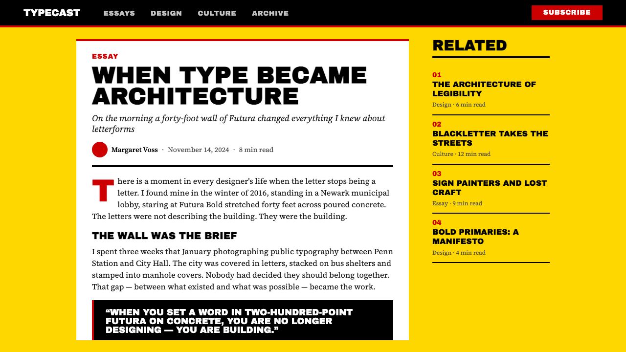
Typography is not a label applied to a design — it is the design. Letters are scaled to fill the entire available area, often leaving almost no conventional margin. Condensed or extra-condensed letterforms are preferred because they can be made very large while still stacking multiple words vertically. The physical weight of letters — their visual density on the page — is treated the same way an architect treats load-bearing columns: the heavier and more numerous, the more structural authority they convey.字体排印不是贴在设计上的标签——它就是设计本身。字母被放大到填满整个可用区域,通常几乎不留常规页边距。压缩或超压缩的字形是首选,因为它们可以被放得非常大,同时仍能在垂直方向堆叠多个词语。字母在页面上的视觉密度被对待的方式与建筑师对待承重柱完全相同:越重、越多,传达的结构权威感就越强。
Primary Color as Architecture原色即建筑
Color is used in large, unmodulated planes — entire backgrounds, full columns, complete rectangles — rather than as tints, gradients, or accents. The palette draws from primaries and near-primaries: saturated reds, sharp yellows, dense blacks, clean whites. These are not chosen for psychological warmth or brand friendliness but for maximum visual presence and contrast. A yellow field does not suggest happiness; it commands attention the way a painted wall commands attention.色彩以大面积、未经调和的平面使用——整个背景、完整的色柱、完整的矩形——而不是作为色调、渐变或点缀。色板取自原色和近原色:饱和的红色、锐利的黄色、浓重的黑色、干净的白色。选择这些颜色不是出于心理上的温暖感或品牌亲和力,而是为了最大的视觉存在感和对比度。一片黄色并不暗示快乐;它命令注意力,就像一面涂色的墙命令注意力一样。
Collage and Layering拼贴与叠压
Multiple type elements — words at different sizes, set in different orientations, sometimes in different colors — are allowed to overlap and crowd one another. This collage sensibility distinguishes the style from both Swiss grid rationalism and from careful editorial typography. The overlaps are not mistakes or accidents; they are compositional decisions that create visual tension and energy. The resulting density mirrors the visual experience of urban environments: posters layered on walls, signs competing for attention.多个字体元素——不同大小的词语、以不同方向排列、有时采用不同颜色——被允许相互叠压和拥挤。这种拼贴感性将该风格与瑞士网格理性主义和谨慎的编辑排版区别开来。叠压不是错误或意外;它们是制造视觉张力和能量的构图决定。由此产生的密度反映了城市环境的视觉体验:贴在墙上层叠的海报,争夺注意力的标识。
Flat, Hard-Edged Surfaces平面、硬边表面
There are no gradients, soft shadows, glows, or simulated three-dimensionality anywhere in the system. Every element — letter, color block, rule, background — meets every other element at a sharp, clean edge. This commitment to flatness is not a stylistic preference borrowed from digital minimalism; it is a structural conviction inherited from the silk-screen and letterpress traditions that shaped early twentieth-century avant-garde print. Flatness is honest: a surface that is flat admits it is a surface.整个系统中没有渐变、柔和阴影、发光或模拟三维立体效果。每个元素——字母、色块、线条、背景——与其他每个元素都以锐利、干净的边缘相遇。这种对平面性的坚持不是从数字极简主义借来的风格偏好;它是从塑造了二十世纪初先锋派印刷的丝网印刷和活版印刷传统中继承的结构信念。平面性是诚实的:一个平面承认自己就是一个平面。
Scale as Hierarchy尺度即层级
Information hierarchy is established primarily through dramatic size contrast rather than through color differentiation, spatial separation, or weight gradation alone. The most important word or phrase is often many times larger than the next element in the hierarchy. Secondary and tertiary information is present — the style is rarely cryptic — but it is visually subordinate in a way that is immediately legible even at a distance. This approach is rooted in the logic of street-level signage and theatrical posters, where information must communicate instantly at varying distances.信息层级主要通过戏剧性的尺寸对比建立,而不是单纯通过色彩区分、空间分隔或字重渐变。最重要的词或短语通常比层级中下一个元素大许多倍。次级和三级信息是存在的——这种风格很少晦涩难懂——但在视觉上处于从属地位,即使在远处也能立即辨识。这种方式根植于街道标识和剧场海报的逻辑,在那里信息必须在不同距离下瞬间传达。
Historical Eclecticism历史折中主义
The style draws openly on the visual history of typography — Wood Type poster lettering from the nineteenth century, Constructivist propaganda graphics from early twentieth-century Russia, American vernacular signage, Dada typographic experiments. These references are not citations or homages but raw material absorbed and transformed. The result is a visual language that feels simultaneously contemporary and deeply rooted, authoritative without being academic. This is eclecticism deployed as cultural confidence, not as nostalgia.这种风格公开借鉴字体排印的视觉历史——十九世纪的木质活字海报字体、二十世纪初俄罗斯的构成主义宣传图形、美国本土标识、达达派字体实验。这些参照不是引用或致敬,而是被吸收和转化的原材料。结果是一种视觉语言,同时感觉当代而又根植深厚,权威而不学院派。这是作为文化自信而非怀旧情感部署的折中主义。
Environmental Scale Ambition环境尺度野心
The logic of the style extends naturally from the printed page to architectural surfaces. Scher's environmental graphic work — for Bloomberg, the High Line, institutional lobbies and atria — applies the same typographic-mass approach to walls, floors, glass facades, and wayfinding systems. The letters that fill a poster at half a meter can fill a wall at twenty meters by the same compositional rules. This scalar flexibility is a genuine strength: the visual system works at the scale of a business card and at the scale of a building.这种风格的逻辑自然地从印刷页面延伸到建筑表面。Scher 的环境图形作品——为彭博、高线公园、机构大堂和中庭创作的——将同样的字体体量方式应用于墙面、地板、玻璃幕墙和导视系统。在半米距离填满一张海报的字母,可以用同样的构图规则在二十米距离填满一面墙。这种尺度灵活性是一种真正的优势:视觉系统在名片尺度和建筑物尺度上都同样有效。
See the Paula Scher / Pentagram design system查看 Paula Scher / Pentagram 完整设计系统
Who shaped Paula Scher / Pentagram?谁塑造了 Paula Scher / Pentagram?
The originating intelligence of the style. Scher spent the 1970s designing album covers at CBS Records, developing a facility for bold typographic gestures under commercial pressure. After co-founding Koppel and Scher in 1984, she joined Pentagram in 1991 and became one of its most recognized partners. Her 1994 identity for The Public Theater in New York — condensed Wood Type-influenced letterforms in collaged primary colors — established the visual language that would define her career. Her hand-painted map series, begun privately in the 1980s and exhibited internationally, demonstrate the same underlying principle: fill the available surface with letters until the letters become landscape.这种风格的创始智识。Scher 在1970年代为哥伦比亚广播公司唱片部门设计专辑封面,在商业压力下培养出对大胆字体姿态的驾驭能力。1984年联合创立工作室后,她于1991年加入 Pentagram 并成为最受认可的合伙人之一。她1994年为纽约公共剧院设计的视觉识别——拼贴在原色背景上受木质活字影响的压缩字形——确立了定义其职业生涯的视觉语言。她从1980年代私下开始创作、并在国际间展出的手绘地图系列,展示了同样的基本原则:用字母填满可用表面,直到字母成为风景。
Founder of The Public Theater and the figure whose institutional vision created the conditions for Scher's most famous identity. Papp built The Public as a deliberately democratic, politically engaged theater — Shakespeare in the Park, emerging American playwrights, a downtown sensibility opposed to Broadway's commercial conservatism. That identity — energetic, urgent, populist — gave Scher a brief that demanded maximum visual force rather than institutional restraint. Though Papp died in 1991, before the 1994 identity was designed, his vision of the theater as a public, democratic space defined what the visual language needed to say.公共剧院的创始人,其机构愿景为 Scher 最著名的视觉识别创造了条件。Papp 将公共剧院建设成一个刻意民主化、政治参与的剧院——公园里的莎士比亚、新兴美国剧作家、一种与百老汇商业保守主义对立的下城感性。这种身份——充满活力、紧迫、大众化——给了 Scher 一个要求最大视觉力量而非机构克制的委托任务。尽管 Papp 于1991年去世,早于1994年的视觉识别设计,但他对剧院作为公共民主空间的愿景定义了这套视觉语言需要表达的内容。
The design partnership that gave Scher the operational platform and client access to realize her language at institutional scale. Founded in London in 1972, Pentagram operates as a co-operative of independent partners — each runs their own team and practice, sharing the firm name and administrative infrastructure. The model is unusual in that individual partners are publicly identified with their work, creating a situation where Scher's identity is both her own and the firm's. Pentagram's prestige and its network of major institutional and corporate clients made possible the breadth of Scher's built and printed work from the 1990s onward.给予 Scher 运营平台和客户资源,使她得以在机构规模上实现其视觉语言的设计合伙机构。Pentagram 于1972年在伦敦创立,以独立合伙人合作社的形式运作——每位合伙人运营自己的团队和实践,共享公司名称和行政基础设施。这种模式的不寻常之处在于,个别合伙人与其作品公开关联,创造出 Scher 的身份既属于她个人又属于公司的局面。Pentagram 的声望及其主要机构和企业客户网络使 Scher 从1990年代起的广泛建成作品和印刷作品成为可能。
Artistic director of The Public Theater from 1993, and Scher's collaborator on the institution's 1994 identity. Wolfe's programming vision — ambitious, politically aware, culturally diverse, and always oriented toward a broad public rather than a cultural elite — was directly translated into the graphic identity that Scher designed. The alignment between Wolfe's institutional ambition and Scher's visual approach produced one of the most sustained and coherent institutional identities in American graphic design history: a system that remained legible and vital across decades of changing programs, productions, and cultural contexts.1993年起担任公共剧院艺术总监,也是 Scher 在机构1994年视觉识别上的合作者。Wolfe 的编程愿景——雄心勃勃、政治敏锐、文化多元,始终面向广大公众而非文化精英——被直接转化进 Scher 设计的图形识别中。Wolfe 的机构抱负与 Scher 的视觉方式之间的契合,产生了美国平面设计史上最持久、最连贯的机构视觉识别之一:一个在数十年不断变化的项目、演出和文化背景中始终保持清晰和活力的系统。
How do you use Paula Scher / Pentagram today?今天怎么用 Paula Scher / Pentagram?
Paula Scher / Pentagram is one of the most applicable historical styles for contemporary high-impact communication work — presentations, campaigns, institutional identities, and environmental graphics — because its logic is transferable and its visual rules are clear. Applying it well requires understanding that the style's power comes from commitment: half-measures produce not bold Scher but cluttered pastiche. The typography must genuinely dominate the frame, the color must be used in full planes rather than as accent, and the flatness must be absolute.Paula Scher / Pentagram 是当代高冲击力传播工作——演示文稿、活动、机构视觉识别和环境图形——中可应用性最强的历史风格之一,因为它的逻辑是可移植的,视觉规则是清晰的。好好应用它需要理解:这种风格的力量来自于承诺——半途而废产生的不是大胆的 Scher 风格,而是杂乱的仿制品。字体必须真正主导画框,色彩必须以完整平面而非点缀的方式使用,平面性必须是绝对的。
For presentation slides, the style works at two levels. Cover slides benefit from a full-bleed typographic approach: a single key phrase — the theme, the proposition, the company name — set in a heavy condensed face large enough to fill the entire slide, potentially in two colors where one large word anchors the top field and a second anchors the bottom. Content slides should be treated as structured typographic compositions: section headers at dramatically large scale, supporting text at correspondingly smaller scale, with no decorative elements between them. Data slides acquire visual force when charts and diagrams are rebuilt in the primary palette — bars colored in full saturated tones, labels set in the same condensed face as the surrounding text, no chart junk.对于演示文稿幻灯片,该风格在两个层次上发挥作用。封面幻灯片适合全出血字体方式:一个关键短语——主题、主张、公司名称——用足够大的重磅压缩字体排列,大到填满整张幻灯片,可能用两种颜色,一个大词锚定顶部区域,第二个锚定底部。内容幻灯片应被当作结构性字体构图处理:章节标题以戏剧性的大尺度排列,支撑文字以相应更小的尺度排列,两者之间没有装饰性元素。当图表和图解以主色板重建时,数据幻灯片获得视觉力量——柱条以完整饱和色调着色,标签以与周围文字相同的压缩字体排列,没有图表杂质。
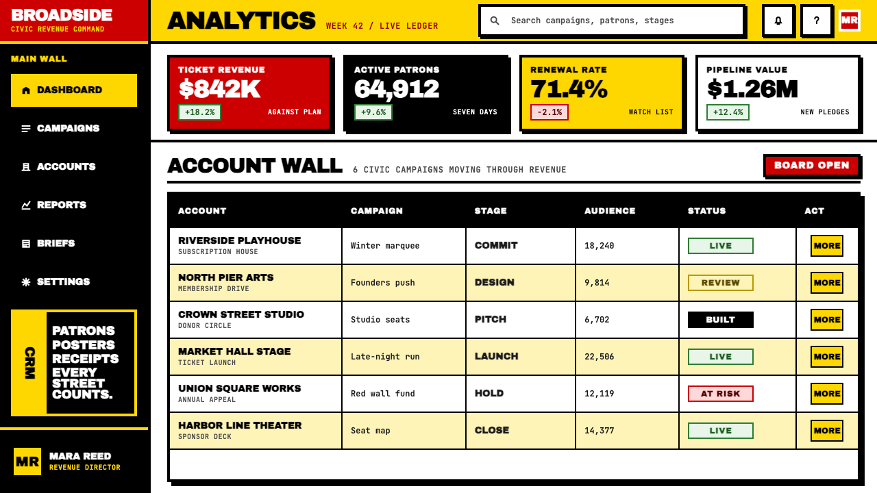
For web interfaces — particularly dashboards, analytics tools, pricing pages, and marketing landing pages — the style provides a strong structural vocabulary. The approach: commit to a strict column grid, use the full width for key navigational and headline elements, and reserve the primary colors for states that demand attention: error conditions, the recommended pricing tier, the primary call-to-action button. Body text should be restrained in size and weight to create contrast with the large typographic features; the background should be close to white or a very light neutral rather than any color that competes with the primary palette.对于网页界面——特别是仪表板、分析工具、定价页面和营销落地页——该风格提供了强劲的结构词汇。方法是:坚持严格的列网格,将全宽用于关键导航和标题元素,将原色保留给需要引起注意的状态:错误条件、推荐定价层级、主要行动召唤按钮。正文文字在尺寸和字重上应当克制,以与大型字体特征形成对比;背景应接近白色或非常浅的中性色,而非任何与主色板竞争的颜色。
For editorial and marketing work — event posters, campaign materials, institutional reports, branded social content — the style is at its most direct. An event poster in this mode commits its entire surface to the key information: the name of the event in the largest possible type, the date and venue at half that scale, the institution's name somewhere within the composition at yet another scale. No photography, no illustration, no decorative border. The hierarchy is total and immediate. Marketing campaign materials work best when the visual system is applied consistently across formats: the same color assignment, the same typeface approach, the same scale logic, whether the format is a full-page advertisement or a social media tile.对于编辑和营销工作——活动海报、活动物料、机构报告、品牌社交内容——该风格最为直接。这种模式下的活动海报将整个表面都奉献给关键信息:尽可能大的字体排列活动名称,日期和地点以一半的大小排列,机构名称在构图中的某处以另一种大小排列。没有摄影,没有插图,没有装饰性边框。层级是全面的和即时的。当视觉系统在各种格式中一致应用时,营销活动物料效果最好:相同的色彩分配、相同的字体方式、相同的尺度逻辑,无论格式是整版广告还是社交媒体方块。
A common mistake when working with this style is treating it as merely a typographic style — choosing a condensed typeface and calling it done. The style's actual mechanism is the relationship between massive type, color used as solid architectural plane, and absolute flatness. If any of these three elements is diluted — condensed type on a photographically complex background, or primary colors used as small accents, or soft shadows introduced under cards — the visual logic collapses. Another frequent error is trying to use the style for contexts that call for warmth, softness, or sensory richness. This is a confrontational, urban, physically assertive aesthetic. It is excellent for institutions, platforms, and cultural organizations that want authority and energy. It is wrong for contexts where the user experience depends on approachability, organic texture, or emotional softness.使用这种风格时最常见的错误是将其仅仅视为字体风格——选择一种压缩字体就算完成。该风格的实际机制是巨大字体、作为实心建筑平面使用的色彩,以及绝对平面性三者之间的关系。如果这三个元素中的任何一个被稀释——压缩字体置于摄影复杂背景上,或原色作为小点缀使用,或卡片下引入柔和阴影——视觉逻辑就会崩溃。另一个频繁的错误是试图将该风格用于需要温暖感、柔软感或感官丰富性的语境。这是一种对抗性的、城市的、具有物理assertiveness的美学。它非常适合希望传达权威和活力的机构、平台和文化组织。它不适合用户体验依赖于亲和力、有机质感或情感柔软性的语境。
See the Paula Scher / Pentagram design system查看 Paula Scher / Pentagram 完整设计系统
Paula Scher / Pentagram — FAQPaula Scher / Pentagram · 常见问题
Is this style the same as maximalist typography in general?这种风格和一般的极繁主义字体排印是同一回事吗?
Not quite. Maximalist typography is a broad descriptor that includes decorative lettering, ornamental flourishes, layered texture, and expressive hand-drawn forms — many of which are the opposite of what Scher's system does. The Scher / Pentagram approach is maximalist in its commitment to filling the frame and asserting typographic presence, but it is also rigorously flat, structurally disciplined, and free of decoration. The letters are as large and numerous as possible; they are also as clean, hard-edged, and unadorned as possible. The maximalism is of mass and scale, not of ornament.不完全是。极繁主义字体排印是一个广泛的描述词,包括装饰性字体、花饰、纹理分层和富有表现力的手绘字形——其中许多与 Scher 系统所做的事情恰恰相反。Scher / Pentagram 方式在填满画框和主张字体存在感上是极繁的,但同时也是严格平面的、结构上有纪律的、无装饰的。字母尽可能大和多;它们同时也尽可能干净、硬边和朴素。这种极繁主义是体量和尺度上的,而非装饰上的。
Can the style work with more than two or three colors?这种风格能使用两到三种以上的颜色吗?
The style's natural palette is highly restricted — typically a dominant color, a secondary color, and black and white — and this restriction is part of what gives the work its visual authority. Introducing additional colors is possible but risks fragmenting the architectural clarity that makes the approach work. If more colors are needed — for example, to differentiate multiple brands or categories within a single composition — the discipline should be maintained: each color must be used in full planes at significant scale, not as accents or gradients. Four or five colors of equal weight will tend to produce visual chaos; four or five colors where one clearly dominates and the others are used sparingly can still hold together.该风格的自然色板是高度受限的——通常是一种主导色、一种次要色,加上黑色和白色——这种限制是作品获得视觉权威的部分原因。引入额外颜色是可能的,但有破坏使该方式奏效的建筑清晰度的风险。如果需要更多颜色——例如,在单一构图中区分多个品牌或类别——应保持纪律:每种颜色必须以完整平面在显著尺度上使用,而不是作为点缀或渐变。四到五种等重颜色往往会产生视觉混乱;四到五种颜色,其中一种明显主导,其他的少量使用,仍然可以保持整体。
How does this style differ from the Swiss International Style it is sometimes compared to?这种风格与有时被拿来比较的瑞士国际主义风格有何不同?
Swiss International Style and Scher's typographic approach share a commitment to sans-serif letterforms and grid-based composition, but their underlying values diverge sharply. Swiss Style aims for neutrality, system, and rational clarity — it is designed to recede and let content speak. Scher's approach aims for presence, force, and cultural specificity — the design asserts itself alongside the content, not behind it. Swiss Style is typographic precision; Scher's work is typographic architecture. One aspires to transparency; the other to mass. The visual results are recognizably different: Swiss Style produces quiet authority, Scher's approach produces loud authority.瑞士国际主义风格和 Scher 的字体排印方式都致力于无衬线字形和基于网格的构图,但它们的基本价值观有着明显的分歧。瑞士风格追求中立性、系统性和理性清晰——它被设计为退到背景,让内容说话。Scher 的方式追求存在感、力量和文化特殊性——设计与内容并肩主张自身,而非躲在内容后面。瑞士风格是字体排印精确性;Scher 的作品是字体排印建筑。一个追求透明度;另一个追求体量。视觉结果是可以明显区分的:瑞士风格产生安静的权威,Scher 的方式产生响亮的权威。
Is the style appropriate for digital products, or does it only work in print?这种风格适合数字产品吗,还是只适合印刷品?
The style translates well to digital contexts, with some adaptations. Its flatness and hard edges are natural properties of screen rendering and do not require any special treatment. Large typographic display elements — hero headers, landing page headlines, dashboard category labels — are strong applications. The challenge in digital contexts is interactive states and small-scale UI components: buttons, form fields, dropdown menus, and tooltips all require more visual nuance than the poster logic of the style naturally provides. The approach works best in digital when it is used for structural and display elements — the large-scale architecture of the interface — while the detail-level UI follows a related but quieter system that the bold display elements frame.该风格在数字环境中转化效果良好,需要一些适配。它的平面性和硬边是屏幕渲染的自然属性,不需要任何特殊处理。大型字体展示元素——英雄区标题、落地页大标题、仪表板类别标签——都是强有力的应用。数字环境中的挑战是交互状态和小尺度界面组件:按钮、表单字段、下拉菜单和工具提示都需要比该风格的海报逻辑自然提供的更多视觉细腻度。当该方式用于结构性和展示性元素时——界面的大尺度架构——而细节层面的界面遵循一个相关但更安静的系统,由醒目的展示元素框定,在数字环境中效果最佳。
What is the single most important thing to get right when applying this style?应用这种风格时,最重要的一件事是什么?
Commitment to scale. Every failure mode in applying this style comes down to timidity with type size. If the largest typographic element in a composition is not genuinely large — not slightly larger than normal but dramatically, uncomfortably, surprisingly large — the visual argument collapses. The condensed letterforms at moderate size simply look like a font choice; at extreme size they become structural mass. The rest of the system — the primary colors, the flatness, the collage layering — amplifies that mass. Without the mass, there is nothing to amplify. Start by making the most important thing much larger than feels comfortable, then build the rest of the composition around that commitment.对尺度的承诺。应用这种风格的每一种失败模式都归结为对字体大小的怯懦。如果构图中最大的字体元素不是真正的大——不是比正常稍大,而是戏剧性的、让人不舒服的、出人意料的大——视觉论点就会崩溃。压缩字形在适中大小时只是看起来像一种字体选择;在极端大小时,它们成为结构性体量。系统的其余部分——原色、平面性、拼贴分层——放大那种体量。没有体量,就没有什么可以放大的。从把最重要的东西做得比感觉舒适的大得多开始,然后围绕这个承诺构建构图的其余部分。
Related design styles相关设计风格
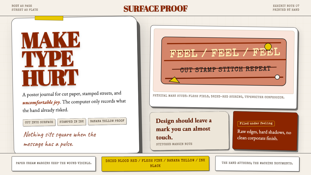 Stefan SagmeisterPain becomes typography. Flesh pink, dried blood red, banana yellow; broken p…痛感变成字体:肉粉、血红与香蕉黄堆成破格纸面。
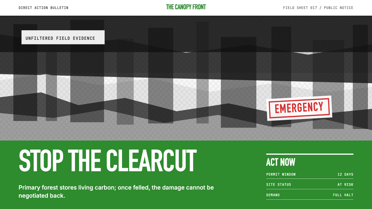 Greenpeace (Activist Poster)Protest without softness. Forest-green caps over monochrome newsprint, one de…抗议毫不柔化。森林绿大写字压住黑白画面,只留一个诉求。
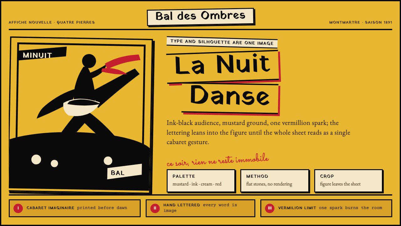 Toulouse-Lautrec Belle ÉpoqueNight becomes gesture. Mustard ground, black silhouette, hand lettering, one…夜色化作手势:芥末底、墨黑剪影、手绘字与一抹朱红。
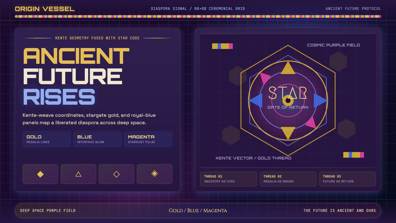 AfrofuturismAncient future, fully luminous. Gold kente grids cut through cosmic purple an…古老未来自带光芒:金色肯特网格切开宇宙紫与蓝色辉光。
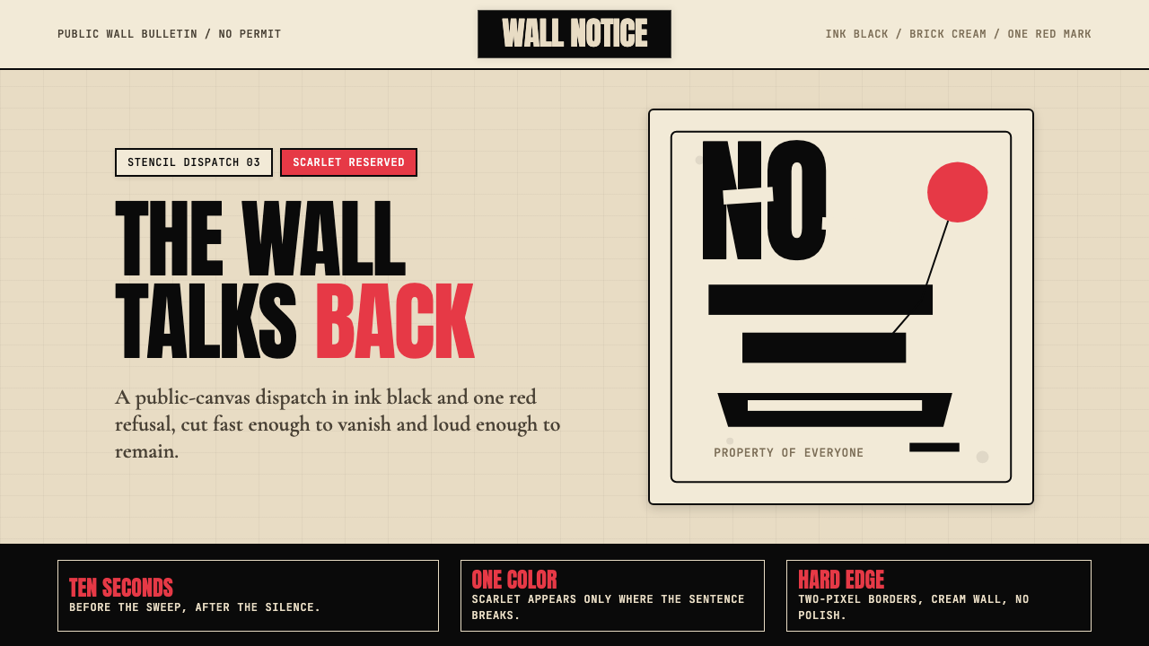 Banksy Stencil GraffitiProtest is reduced to a cut mark. Anton black on brick cream, one scarlet red…抗议被压成剪影。砖墙奶油底、Anton黑字,一点猩红打断。
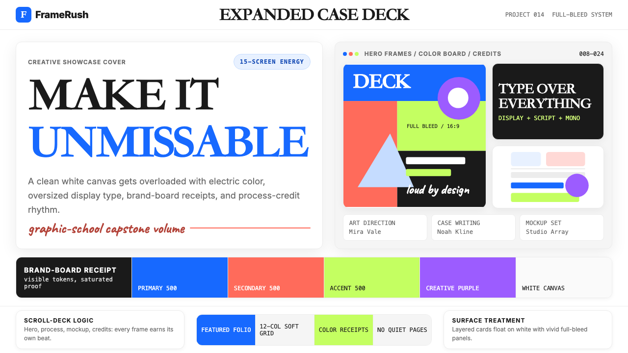 Behance Maximalist PortfolioPortfolio volume at max. Electric blue, coral and lime stack into a full-blee…作品集音量拉满:电光蓝、珊瑚橙与酸橙绿堆成全出血案例板。