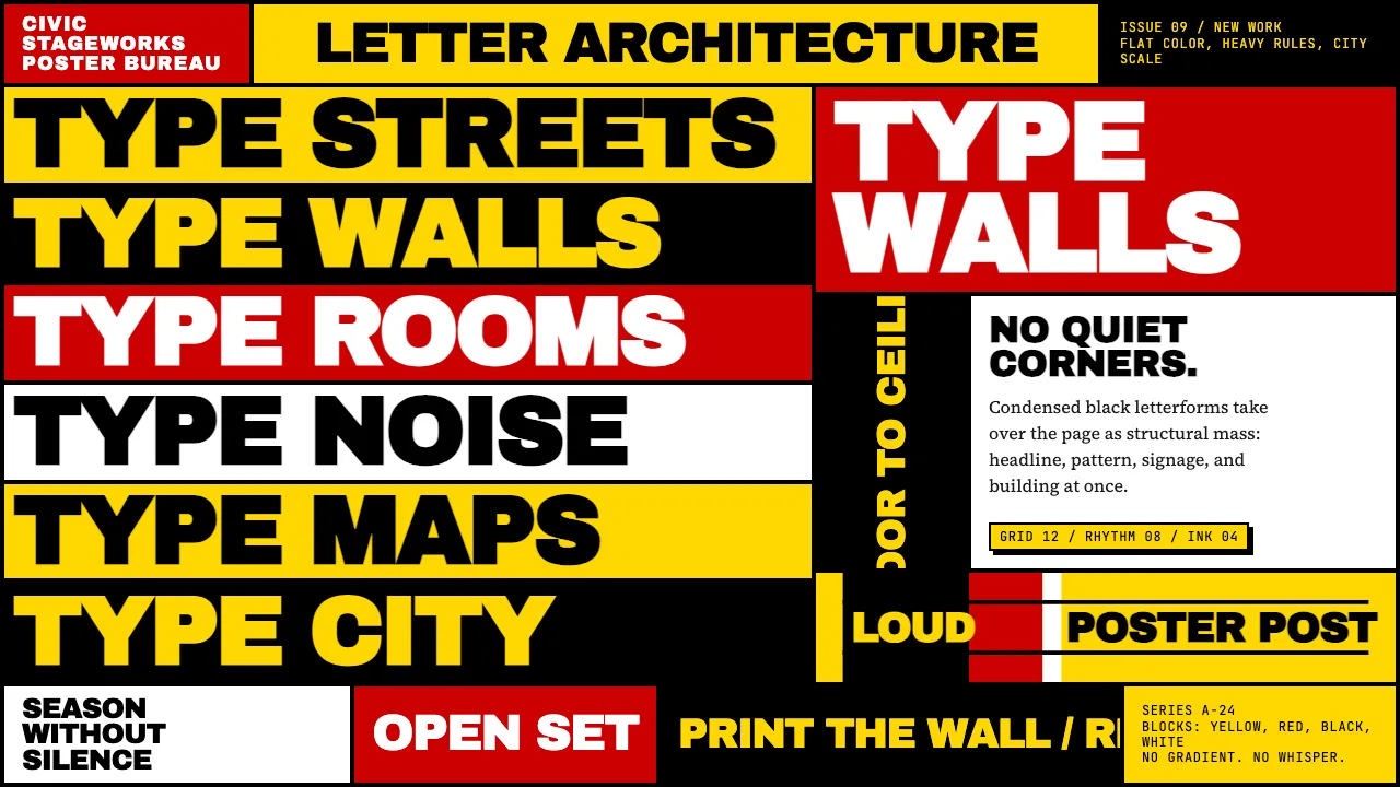
About Paula Scher / Pentagram
Paula Scher is the Pentagram partner who turned letters into architecture. From the 1994 Public Theater identity to Citibank, Bloomberg HQ, and her hand-painted maps, Scher treats typography as structural mass — condensed blacks stacked floor-to-ceiling, primaries deployed as entire rooms of color.
Her aesthetic is loud, flat, and unapologetically maximalist. Type doesn't sit on a page; it becomes the page. Readability and decoration coexist because the letters themselves ARE the decoration — the composition, the wallpaper, the building.
- Origin
- New York City
- Era
- Active 1972–present; Pentagram partner since 1991; Public Theater identity since 1994
- Key figures
- Paula Scher · Joe Papp · Pentagram
- Movements
- New York School of design · Typographic maximalism · Environmental typography
Paula Scher / Pentagram design spec
Colors
Typography
The other 11 sections — buttons, cards, spacing, motion, techniques and more — open once you unlock. Download the DESIGN.md or send it to your AI in one click. Unlock once, yours forever.
Sign up nowStyles similar to Paula Scher / Pentagram
Also inspired by brands & products, with a close feel.
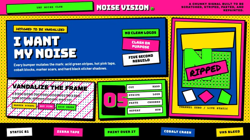 MTV Launch Identity (1981)Built to be vandalized. Hot pink, acid green, Bungee blocks, and crooked sticker borders.
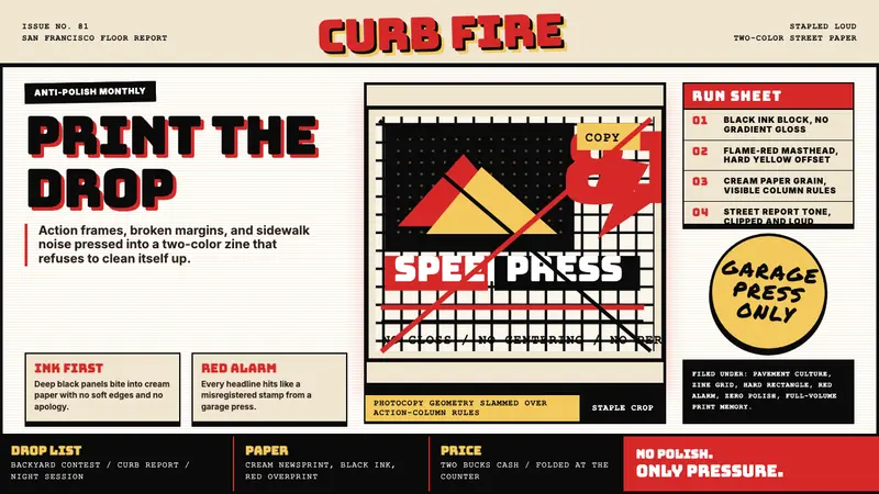 Thrasher Skate Zine (1981)Loud without polish. Flame red type, black ink blocks, and cream zine grids hit hard.
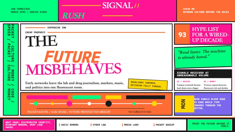 Wired Magazine (1993)Neon rejects restraint. Hot pink, orange, and electric green crash through broken type.
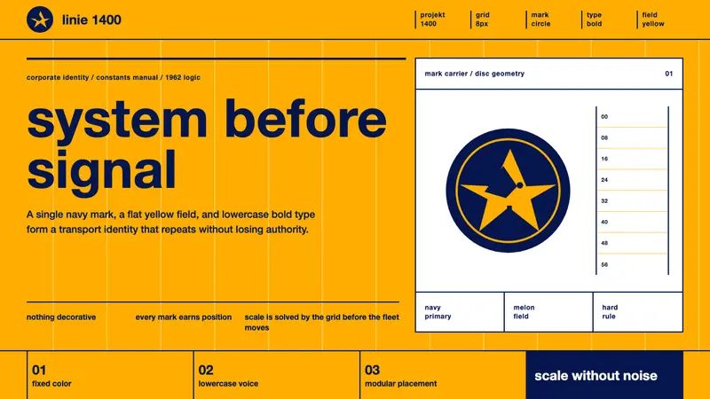 Lufthansa (Aicher)Systems speak first. Melon yellow, navy disc mark, lowercase Helvetica on a hard grid.