What is Toulouse-Lautrec Belle Époque?什么是 Toulouse-Lautrec Belle Époque?
Toulouse-Lautrec collapsed the distance between poster art and painting — mustard ground, black silhouette, a single vermillion spark, and the night of Montmartre becomes a gesture.劳特累克消弭了海报与绘画之间的距离——芥末底、墨黑剪影、一抹朱红,蒙马特的夜色化作了一个手势。
Toulouse-Lautrec Belle Époque in briefToulouse-Lautrec Belle Époque 速览
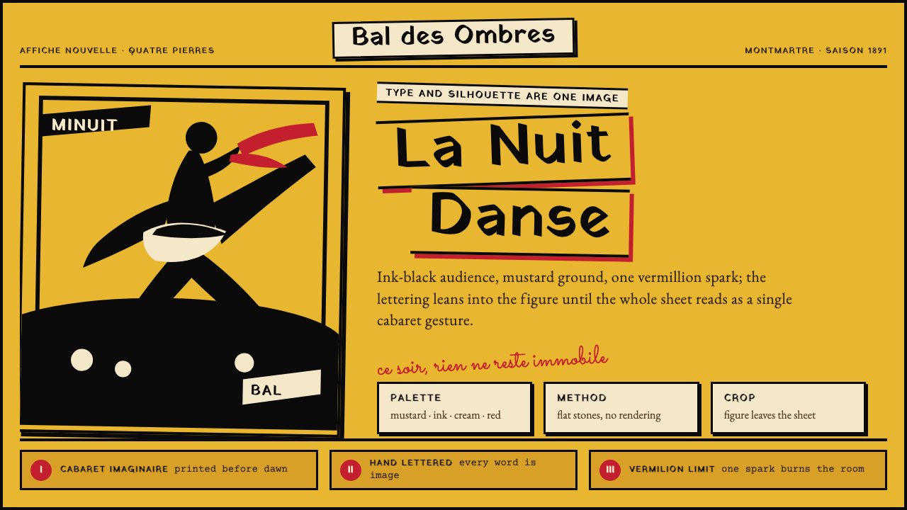
Toulouse-Lautrec Belle Époque is the visual language of the chromolithographic cabaret posters Henri de Toulouse-Lautrec produced for Montmartre's entertainment venues between 1891 and 1900. These works — for Moulin Rouge, Divan Japonais, and Folies-Bergère — are widely recognized as the founding documents of modern advertising art, establishing principles of flat color, gestural silhouette, bold cropping, and the integration of lettering into image that remain vital a century and a quarter later.图卢兹-劳特累克美好年代风格,是亨利·德·图卢兹-劳特累克于1891至1900年间为蒙马特歌舞演艺场所创作的彩色石版画海报所呈现的视觉语言。这些作品——为红磨坊、日本沙发、女神游乐厅而作——被公认为现代广告艺术的奠基文献,确立了平涂色块、写意剪影、大胆裁切以及文字与图像融为一体等原则,这些原则在一个多世纪后的今天依然充满生命力。
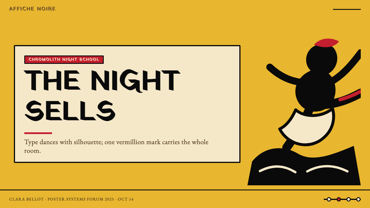
The aesthetic is defined above all by restraint in the service of impact. Each poster works with no more than four colors: a warm ground (typically a deep mustard or ochre yellow), a near-black for mass and silhouette, an off-white or cream for faces and negative space, and a single hot accent — vermillion, scarlet, or vivid pink — that functions as an ignition point for the whole composition. The flatness is total: no graduated tones, no cast shadows, no illusion of three-dimensional depth. Figures are read as bold ink shapes against the ground.这套美学首先以克制服务于冲击力。每张海报最多使用四种颜色:暖色底(通常是深芥末黄或赭黄),接近黑色的深色用于塑造大面积形状与剪影,米白或奶油色用于脸部与负空间,以及唯一一个炽热的强调色——朱红、大红或鲜粉——作为整个构图的引爆点。平涂是绝对的:无渐变色调,无投影,无三维深度的幻觉。人物在底色上被读作大胆的墨色形状。
Typography is not a secondary element appended to an image but part of the image itself. Lautrec's hand-painted letterforms — loose, gestural, sometimes tilted — share the same ink weight and visual authority as the drawn figures. The letters lean into the composition the way a dancer leans into a kick. This inseparability of word and image, of figure and ground, of performance and advertisement, is the style's most radical and enduring contribution.字体并非附加于图像之后的次要元素,而是图像本身的组成部分。劳特累克手绘的字形——随意、写意、有时倾斜——与所绘人物共享同等的笔墨分量与视觉权重。字母融入构图的方式,一如舞者踢腿时倾身而入的姿态。文字与图像、图形与底色、表演与广告之间这种不可分割性,是这种风格最激进、也最经久的贡献。
See the Toulouse-Lautrec Belle Époque design system查看 Toulouse-Lautrec Belle Époque 完整设计系统
Where does Toulouse-Lautrec Belle Époque come from?Toulouse-Lautrec Belle Époque 从何而来?
The Belle Époque — literally 'Beautiful Era' — was the period of relative peace, prosperity, and cultural efflorescence in Western Europe that stretched roughly from the 1880s to the outbreak of the First World War in 1914. In Paris, its epicenter was Montmartre: the bohemian hill on the city's northern edge where artists, performers, writers, and a broad cross-section of Parisian society mingled in a density of cafés, cabarets, music halls, and circus venues unlike anything elsewhere in Europe. The Moulin Rouge, which opened in 1889 on the Boulevard de Clichy, was its most celebrated institution.美好年代——字面意思即“美好时代”——是西欧大约从1880年代延伸至1914年第一次世界大战爆发前的一段相对和平、繁荣与文化繁盛时期。在巴黎,其中心是蒙马特:这座位于城市北缘的波西米亚山丘,艺术家、演员、作家与各阶层巴黎市民在咖啡馆、歌舞厅、音乐厅与马戏场所的密集交织中相遇,其多样与活力举世无双。1889年在克利希大道开业的红磨坊,是这一切中最负盛名的机构。
Henri de Toulouse-Lautrec arrived in Montmartre in 1882, a nobleman's son whose childhood bone diseases had left him with stunted legs and an outsider's restless need to observe. He became a fixture at the Moulin Rouge and other cabarets, sketching performers from ringside tables night after night. His immersion was not journalistic but empathic: he was drawn to the performers — La Goulue, Jane Avril, Yvette Guilbert — as personalities of extreme physical and theatrical intelligence. When Jules Chéret, the father of the color lithographic poster, had established the medium's commercial viability in the 1870s and 1880s, the stage was set. In 1891, the Moulin Rouge commissioned Lautrec's first major poster. The result was a transformation of the medium.亨利·德·图卢兹-劳特累克于1882年来到蒙马特,这位贵族之子因童年骨病导致双腿发育不全,由此养成了一个局外人式的急切观察欲望。他成了红磨坊及其他歌舞厅的常客,夜复一夜坐在表演区边侧的桌子旁素描演员。他的沉浸并非记者式的,而是充满共情的:他被拉古吕、简·阿芙丽、伊薇特·吉尔贝尔这些演员所吸引,视她们为具有极致身体与戏剧才智的个体。当彩色石版画海报之父朱尔·谢雷在1870至80年代建立了这一媒介的商业可行性,时机已然成熟。1891年,红磨坊委托劳特累克创作了他的第一张重要海报。结果是对这一媒介的彻底改造。
The decisive artistic influence was Japanese ukiyo-e — woodblock prints depicting the floating world of theater, pleasure districts, and urban life. Lautrec, like many of his contemporaries, was an ardent collector and student of Hiroshige, Hokusai, and Utamaro. From ukiyo-e he absorbed the compositional principle of flat, unmodulated color zones separated by confident contour lines; the taste for bold cropping that cuts figures at the edge of the picture plane; the habit of treating the background as an active shape rather than a neutral ground; and the integration of calligraphic text into the visual field as an equal graphic element. Japonisme gave Lautrec the structural toolkit; Montmartre gave him the subject matter and the urgency.决定性的艺术影响来自日本浮世绘——描绘戏剧、欢乐街区与都市生活的木版画。劳特累克与他的许多同代人一样,是广重、北斋与歌麻吕的热忱收藏者与研究者。从浮世绘中,他吸收了以自信轮廓线分隔的平涂、无渐变色块的构图原则;对大胆裁切、将人物切断于画面边缘的偏好;将背景视为主动形状而非中性底色的习惯;以及将书法式文字作为平等图形元素融入视觉场域的做法。日本主义给了劳特累克结构上的工具箱;蒙马特给了他题材与紧迫感。
The technical vehicle was chromolithography — a printing process using separate stones or plates, one per color, that by the 1880s had achieved sufficient registration accuracy and color richness to make large-format, multi-color poster printing commercially viable. Lautrec worked directly on the lithographic stone with brush and tusche (a greasy ink), achieving a spontaneity of line that transferred cleanly to print. He also pioneered the technique of spatter and crayon to create textured mid-tones within his otherwise flat fields. The discipline of working within a strict color count — imposed partly by economics, partly by the process itself — forced a visual economy that became the style's defining strength. Contemporaries Jules Chéret, Théophile Steinlen, and Pierre Bonnard each contributed to the evolving language of the Belle Époque poster, but Lautrec's synthesis of Japanese composition, cabaret subject matter, and chromolithographic economy produced the most influential single body of work.技术载体是彩色石版画——一种每色使用单独石板或版的印刷工艺,至1880年代已实现足够的套印精度与色彩丰富性,使大幅多色海报印刷具备商业可行性。劳特累克直接用画笔和油性墨水在石版上作画,获得了能够清晰转印的线条自发性。他还首创了喷洒与蜡笔技法,在否则平涂的色域内制造出有质感的中间调。在严格色数限制内工作的纪律——部分由经济条件所迫,部分由工艺本身所限——强制形成了一种视觉经济性,这正是这种风格的决定性力量。同时代的朱尔·谢雷、泰奥菲勒·斯泰因伦与皮埃尔·博纳尔各自为美好年代海报语言的演进做出贡献,但劳特累克对日式构图、歌舞厅题材与彩色石版画经济性的综合,产生了影响最为深远的单一艺术体。
What defines the Toulouse-Lautrec Belle Époque look?Toulouse-Lautrec Belle Époque 的视觉特征是什么?
Flat Color Zones平涂色块
Color is applied in solid, unmodulated areas with no blending, gradation, or tonal variation within a zone. A skirt is one uniform mustard. A crowd is one uniform near-black. The boundary between zones is a firm contour or a clean edge — never a soft transition. This absolute flatness is the visual cornerstone of the style and its most direct debt to Japanese woodblock printmaking.色彩以实色、无渐变的区域铺设,同一色块内部无混合、无深浅变化。一条裙子是均匀的芥末黄,一群观众是均匀的近黑色。色块之间的边界是明确的轮廓或干净的边缘——绝不是柔和的过渡。这种绝对的平涂是这种风格的视觉基石,也是它对日本木版画最直接的借鉴。
Restricted Palette克制的色板
Each composition operates on a maximum of four colors: a warm, deep ground (mustard, ochre, or olive yellow), a near-black for silhouettes and mass, a light neutral (cream or off-white) for faces and negative space, and a single hot accent — vermillion, scarlet, or vivid pink — that provides the visual ignition point. The accent color is used sparingly, deployed at a single focal node such as a ribbon, a hat, or a pair of stockings. Nothing competes with it.每件构图最多使用四种颜色:暖色深底(芥末黄、赭黄或橄榄黄),接近黑色的深色用于剪影与大面积形状,浅中性色(奶油或米白)用于脸部与负空间,以及唯一一个炽热的强调色——朱红、大红或鲜粉——作为视觉引爆点。强调色用量极少,仅部署于单一焦点节点,如缎带、帽子或一双长筒袜。没有任何元素与之竞争。
Gestural Silhouette写意剪影
Human figures are rendered not through anatomical detail but through the overall gestural shape their body makes — the arc of a kick, the lean of a top-hatted silhouette, the thrust of a raised arm. The silhouette communicates identity and personality more efficiently than a face. Crowds are collapsed into a single undifferentiated dark mass, giving depth and contrast without the labor of rendering individual figures. The ink line is confident, fast, and slightly rough — the mark of a hand that has watched the same performer dozens of times.人物的呈现不依赖解剖细节,而是通过身体所构成的整体写意形状——踢腿的弧度、顶礼帽剪影的倾斜、举臂的冲劲。剪影传达身份与个性,比面孔更有效率。人群被压缩为一整块无差别的深色团块,在无需描绘单个人物的前提下制造深度与对比。墨线自信、迅疾、略显粗粝——那是一双看过同一个演员数十次的手留下的印记。
Bold Cropping and Off-Edge Figures大胆裁切与出血人物
Figures are frequently cut off by the picture's edge — a dancer's feet disappear at the bottom, a spectator's head exits at the top. This compositional device, borrowed directly from ukiyo-e, creates a sense of immediacy and participation: the viewer is in the space rather than observing it from outside. It also allows the scale of figures to be dramatically enlarged relative to the poster field, increasing the impact of the silhouette against the flat ground.人物经常被画面边缘截断——舞者的双脚消失于底边,观众的头顶退出于上边。这一构图手法直接借鉴自浮世绘,营造出一种即时感与参与感:观看者身处其中,而非从外部旁观。它也允许人物相对于海报画面被戏剧性地放大,增强剪影在平涂底色上的冲击力。
Hand-Painted Letterforms Integrated as Image手绘字体融入图像
Display type is not set from a type case but painted by hand, using the same brush and ink as the figures. The letters share the gestural weight, the slight roughness, and the visual energy of the drawn elements. Type is sized, angled, and positioned as a compositional object — it may arc along a curve, lean against a figure, or be embedded within a color zone. The poster reads as a single unified object in which text and image are inseparable, not as an image with a caption.展示用字体并非从铅字排成,而是用与画人物相同的画笔和墨水手绘而成。字母与绘制元素共享写意的分量、轻微的粗粝感与视觉能量。字体在尺寸、角度与位置上作为构图对象来处理——它可以沿弧线排布,倚靠在人物旁边,或嵌入某个色块之中。海报被读作一个统一的整体,文字与图像不可分割,而非一张带有说明的图片。
Warm Ground as Active Color暖色底作为主动颜色
The background is not a neutral field but the dominant warm color — mustard, straw yellow, or deep ochre — that carries as much visual weight as the figures placed upon it. It sets the emotional register of the whole composition: warmth, artificial light, the atmosphere of gaslit interiors. In many posters, the ground color is the largest color area and the first thing the eye registers. It is chosen not for neutrality but for chromatic character.背景不是中性的空白,而是主导性的暖色——芥末黄、稻草黄或深赭黄——其视觉重量与置于其上的人物同等重要。它确立了整个构图的情感基调:温暖、人工光线、煤气灯内室的氛围。在许多海报中,底色是面积最大的颜色区域,也是视线最先登记的元素。它的选择并非出于中性,而是出于色彩的个性。
Economy of Means手段的经济性
Every mark serves either identification, hierarchy, or atmosphere — nothing is decorative surplus. There are no ornamental borders, no filigree details, no textures applied for visual richness. The style trusts that a silhouette read correctly, a color placed correctly, and a letterform drawn with the right weight will communicate more powerfully than any amount of elaboration. This economy is not impoverishment; it is a form of concentrated precision that makes every element count.每一笔触都服务于识别、层级或氛围——没有装饰性的冗余。没有装饰性边框,没有镂空细节,没有为丰富视觉而施加的纹理。这种风格相信,一个读对了的剪影、一个放对了的颜色、一个以正确分量绘制的字形,比任何程度的细化都更有力量地传达信息。这种经济性不是贫乏;它是一种让每个元素都举足轻重的集中精准。
See the Toulouse-Lautrec Belle Époque design system查看 Toulouse-Lautrec Belle Époque 完整设计系统
Who shaped Toulouse-Lautrec Belle Époque?谁塑造了 Toulouse-Lautrec Belle Époque?
Lautrec (1864–1901) was the originator and definitive master of the Belle Époque cabaret poster. A Post-Impressionist painter trained under Fernand Cormon, he found his true subject in the nightlife of Montmartre and his true medium in chromolithography. Between 1891 and 1900 he produced thirty-one lithographic posters, including the canonical series for Moulin Rouge, Divan Japonais, and Jane Avril at the Jardin de Paris. His synthesis of Japanese composition, flat color, and gestural draftsmanship created a visual language that influenced every subsequent tradition of commercial poster art, from Art Nouveau through mid-century advertising to contemporary graphic design.劳特累克(1864—1901年)是美好年代歌舞厅海报的创始人与最具权威的大师。作为受训于费尔南·科尔蒙的后印象派画家,他在蒙马特的夜生活中找到了真正的主题,在彩色石版画中找到了真正的媒介。1891至1900年间,他创作了三十一张石版画海报,包括为红磨坊、日本沙发和巴黎花园的简·阿芙丽创作的标志性系列。他对日式构图、平涂色彩与写意素描的综合,创造了一套影响此后所有商业海报艺术传统的视觉语言——从新艺术运动到二十世纪中期广告,直至当代平面设计。
Chéret (1836–1932) is often called the father of the modern poster. Working in Paris from the 1860s onward, he developed the technical and commercial infrastructure of large-format color lithographic poster printing and produced more than a thousand posters in a style characterized by jubilant female figures, airborne compositions, and festive color. His work demonstrated that the poster could be a legitimate art form with mass reach, and his technical innovations — particularly in color registration and paper scale — made Lautrec's later, more radical experiments commercially possible. Lautrec acknowledged Chéret's priority even as he dramatically surpassed him in compositional austerity and psychological depth.谢雷(1836—1932年)常被称为现代海报之父。他自1860年代起在巴黎工作,建立了大幅彩色石版画海报印刷的技术与商业基础设施,并以欢腾的女性人物、腾空的构图与节日般的色彩为特征创作了逾千张海报。他的工作证明了海报可以是一种具有大众影响力的合法艺术形式,而他在色彩套印和纸张尺幅上的技术创新,使劳特累克后来更激进的实验在商业上成为可能。劳特累克承认谢雷的先驱地位,尽管他在构图的简洁性与心理深度上已大大超越了后者。
Steinlen (1859–1923) was a Swiss-born painter and printmaker who settled in Montmartre and became one of its most prolific visual chroniclers. His posters — most famously the 1896 advertisement for Lait pur stérilisé de la Vingeanne — shared Lautrec's commitment to bold silhouette and restricted color but tended toward a warmer, more socially empathetic subject matter, often depicting workers, cats, and everyday Parisian street life. His work demonstrates the breadth of the Belle Époque poster tradition beyond Lautrec's cabaret focus, and his mastery of the black-and-white lithographic line drawing influenced a generation of illustrators.斯泰因伦(1859—1923年)是定居蒙马特的瑞士裔画家与版画家,成为那里最多产的视觉记录者之一。他的海报——最著名的是1896年为纯净消毒牛奶创作的广告——与劳特累克共享对大胆剪影与克制色彩的承诺,但倾向于更温暖、更具社会共情的题材,常常描绘工人、猫咪与日常巴黎街头生活。他的作品展示了美好年代海报传统在劳特累克歌舞厅焦点之外的宽度,而他对黑白石版画线条的掌握影响了整整一代插画家。
Bonnard (1867–1947) was a founding member of the Nabis — the group of Post-Impressionist artists deeply influenced by Japanese printmaking — and his 1891 poster France-Champagne is one of the earliest examples of the new Belle Époque poster language. His work emphasized decorative patterning, sinuous contour, and a more playful palette than Lautrec's. While Bonnard's subsequent career moved toward intimate domestic painting, his early posters document the moment when Japonisme entered commercial graphic arts in Paris and demonstrate how the same set of Japanese influences could be resolved in fundamentally different visual personalities.博纳尔(1867—1947年)是那比派的创始成员之一——这个深受日本版画影响的后印象派艺术家群体——他1891年的海报《法国香槟》是新美好年代海报语言最早的范例之一。他的作品强调装饰性图案、蜿蜒的轮廓线与比劳特累克更为活泼的色板。尽管博纳尔后来的职业生涯转向亲密的室内绘画,但他早期的海报记录了日本主义进入巴黎商业图形艺术的历史时刻,并展示了同一套日本影响如何可以在根本不同的视觉个性中得到解决。
How do you use Toulouse-Lautrec Belle Époque today?今天怎么用 Toulouse-Lautrec Belle Époque?
Toulouse-Lautrec Belle Époque is a style of theatrical authority and concentrated gesture. Applying it well demands the same discipline Lautrec applied to his stones: strict color economy, silhouettes that communicate immediately, and lettering that participates in the composition rather than being appended to it. The first question to ask of any element is whether it would survive if the palette were cut to four colors. If it would not survive, it is probably doing decorative work rather than communicative work.图卢兹-劳特累克美好年代是一种戏剧权威与集中手势的风格。恰当地应用它,需要劳特累克对待石版时同样的纪律:严格的色彩经济,能立即传达信息的剪影,以及参与构图而非被附加于其上的字体。对任何元素都应首先提出这个问题:如果色板被削减至四色,它还能存活吗?如果不能,它很可能在做装饰性工作而非传达性工作。
For presentation slides, the style performs best on covers and section dividers where a single strong gesture can set the register for everything that follows. A cover works by taking one dominant warm-ground color and placing a bold cropped figure or silhouette against it — the title lettering should be large, hand-feeling, and integrated into the figure's space rather than positioned independently below. Content slides should carry the color economy forward: one ground, one dominant dark, a single accent used no more than twice per slide. Data visualizations work well in this style when bar charts and line graphs are treated as flat shape compositions, with the accent color marking the single most important data series.在演示文稿中,这种风格在封面和章节分隔页上表现最佳——在这里,一个强烈的单一手势可以为后续一切定下基调。封面的做法是:取一个主导性的暖底色,将一个大胆裁切的人物或剪影置于其上——标题字体应当大、有手绘感,并融入人物的空间,而非独立置于其下方。内容页应延续色彩经济性:一个底色,一个主导深色,一个强调色在每页不超过两次使用。当柱状图和折线图被作为平涂形状构图来处理、用强调色标记单一最重要数据系列时,数据可视化在这种风格中表现良好。
For web interfaces, the style suits landing pages, editorial homepages, and event or ticketing sites where drama and urgency are appropriate. A Belle Époque-inspired hero section might use the warm mustard ground at full width, with a large cropped illustrative or photographic figure treated as a flat silhouette, and headline type that is oversized, slightly rough in character, and integrated with the image. Navigation and body type should lean to the bold and relatively large to sustain the poster's forthright legibility. Dashboard applications are a harder fit — the style's theatricality works against the information density and neutral-ground clarity that functional dashboards require.对于网页界面,这种风格适合落地页、编辑类首页,以及戏剧感与紧迫感相宜的演出或票务网站。一个受美好年代启发的主视觉区可以采用芥末黄全宽底色,将一个大幅裁切的插画或摄影人物处理为平涂剪影,标题字体超大、性格略显粗粝,并与图像融为一体。导航与正文字体应偏粗且相对较大,以维持海报式的坦率可读性。仪表板应用是更难适配的场景——这种风格的戏剧感与功能性仪表板所需的信息密度和中性底色清晰度相悖。
For editorial and marketing work, the style is most powerful in event promotion, cultural institution branding, and campaigns where a sense of historical depth and artistic ambition is an asset. A Lautrec-inflected marketing poster uses a dominant warm ground, a bold central silhouette, and all supporting text treated as an integral graphic element with scale contrast between headline and detail lines. The single hot accent should appear at one focal point only — the product name, the event date, the one fact the audience must retain. Applying the accent at multiple points dissipates its energy. Campaigns that attempt to use more than four total colors lose the style's defining compression and begin to read as generic retro rather than historically grounded.对于编辑与营销内容,这种风格在活动宣传、文化机构品牌推广,以及历史深度与艺术抱负是资产的营销活动中最为有力。一张劳特累克风格的营销海报使用主导性暖底色、一个大胆的中心剪影,所有辅助文字作为一体化图形元素处理,标题与细节文字之间有显著的尺度对比。唯一的炽热强调色只应出现在一个焦点位置——产品名称、活动日期、观众必须记住的那一个事实。在多个位置使用强调色会分散其能量。尝试使用超过四种颜色的方案将失去这种风格的决定性压缩感,开始读作泛泛的复古,而非有历史根基的风格。
A common mistake is misidentifying what makes the style feel 'Belle Époque' and attempting to simulate it through surface signals — Art Nouveau swirls, sepia toning, aged paper textures — rather than through its actual structural principles. Authentic application of this style has nothing to do with distressed texture or nostalgic color treatment. It requires flat color, a maximum of four hues, gestural silhouettes with confident edges, and letterforms that are drawn rather than set. A second frequent error is using the mustard-and-black palette at small scale where the bold cropping and silhouette logic break down: this style was conceived for large-format poster viewing and loses its authority when applied at thumbnail sizes or dense information layouts.一个常见错误是误判是什么让这种风格感觉像“美好年代”,并试图通过表面信号来模拟它——新艺术运动的卷草纹、棕褐色调、做旧纸张纹理——而非通过其实际的结构原则。对这种风格的真实应用与做旧纹理或怀旧色彩处理毫无关系。它需要平涂色彩、最多四种色调、具有自信边缘的写意剪影,以及绘制而非排印的字形。另一个常见错误是在小尺寸下使用芥末黄与黑色的色板,因为大胆裁切与剪影逻辑在小尺寸下会失效:这种风格是为大幅海报观看而构想的,应用于缩略图尺寸或密集信息版面时会失去其权威性。
See the Toulouse-Lautrec Belle Époque design system查看 Toulouse-Lautrec Belle Époque 完整设计系统
Toulouse-Lautrec Belle Époque — FAQToulouse-Lautrec Belle Époque · 常见问题
How is this style different from Art Nouveau, which is often shown in the same period?这种风格与常被放在同一时期的新艺术运动有何不同?
They share a historical moment and some sources — notably Japonisme — but operate on fundamentally different visual principles. Art Nouveau is characterized by flowing organic lines, sinuous plant forms, and an embrace of intricate ornamental surface decoration. Lautrec's Belle Époque poster style is the opposite: flat, geometrically simplified, silhouette-driven, and ornament-free. Art Nouveau celebrates the decoration; Lautrec eliminates everything that is not gesture. Where an Art Nouveau poster fills its surface with interlocking botanical curves, a Lautrec poster uses three bold color areas and a single decisive silhouette. The two styles feel related because they are contemporaneous and both reference Japan, but in execution they are near-opposites.它们共享一个历史时刻与某些来源——尤其是日本主义——但建立在根本不同的视觉原则上。新艺术运动以流动的有机线条、蜿蜒的植物形态和对繁复装饰表面的热爱为特征。劳特累克的美好年代海报风格恰恰相反:平涂、几何简化、以剪影为驱动力、无装饰。新艺术运动赞美装饰;劳特累克则消除一切非手势的元素。新艺术运动海报以相互交织的植物曲线填满画面,而劳特累克的海报使用三块大胆的色彩区域和一个决定性的剪影。两种风格之所以感觉相关,是因为它们同属一个时代且都参照了日本,但在执行上它们几乎是对立的。
Can this style work for digital products, or is it inherently a print style?这种风格能用于数字产品吗,还是它本质上是一种印刷风格?
It translates well to digital contexts when the fundamental principles are respected, not the surface details of aged lithography. The flat color zones, bold silhouettes, and integrated type all work effectively on screen. The warm ground colors — the mustard yellows and deep ochres — render well in digital color spaces and maintain their warmth. What does not translate is any attempt to simulate the grain, registration variation, or tactile quality of nineteenth-century lithography: on screen, those effects read as low-fidelity rather than historical. A successful digital interpretation uses the style's structural vocabulary — flat, restricted, gestural, bold — without the period texture. Event sites, editorial platforms, and cultural institution web presences are natural fits.当基本原则而非做旧石版画的表面细节受到尊重时,这种风格能很好地迁移到数字语境。平涂色块、大胆剪影与一体化字体在屏幕上都能有效运作。暖底色——芥末黄与深赭黄——在数字色彩空间中渲染良好并保持其温暖感。无法迁移的是任何试图模拟十九世纪石版画的颗粒感、套印偏差或触觉质感的尝试:在屏幕上,这些效果读作低保真而非历史感。成功的数字诠释使用这种风格的结构词汇——平涂、克制、写意、大胆——而不添加时代纹理。演出网站、编辑类平台与文化机构网络形象是天然的适配场景。
The style uses very few colors. How do you create depth without shading?这种风格色彩极少,如何在没有明暗的情况下制造深度?
Depth in this style is created through three spatial conventions inherited from Japanese printmaking: overlapping (a dark silhouette placed in front of a lighter ground reads as nearer), scale contrast (a large foreground figure against a small background mass creates recession), and cropping (figures cut off at the picture edge imply continuation beyond the frame, suggesting a space larger than what is shown). Shadows and tonal gradation are not part of the vocabulary at all. The apparent flatness is not a limitation but a deliberate choice that forces the eye to read space through placement and scale rather than through light simulation. This results in compositions that feel immediate and present rather than recessive and illusionistic.这种风格中的深度通过三种继承自日本版画的空间惯例来创造:叠压(置于浅底色前的深色剪影被读作距离更近),尺度对比(大幅前景人物与小幅背景团块制造后退感),以及裁切(在画面边缘被截断的人物暗示着画框之外的延续,暗示一个比所呈现的更大的空间)。投影与色调渐变根本不是这套词汇的组成部分。表面上的平涂并非局限,而是一种刻意的选择,迫使眼睛通过位置与尺度而非光照模拟来读取空间。这使构图呈现出即时而临场的感觉,而非后退的幻觉感。
Is the warm mustard ground mandatory, or can the style be executed on other grounds?暖芥末底色是必须的吗,还是这种风格可以在其他底色上执行?
The mustard or ochre ground is the historically characteristic choice but not the only valid one. Lautrec himself used pale cream grounds, deep blue-grey grounds, and in some posters a warm salmon. What is non-negotiable is the warmth and the role the ground plays as the dominant color area — it must carry visual weight and establish an atmospheric register, not function as a neutral void. A pale cool white ground tends to work against the style's warmth and theatricality. A deep near-black ground can work for a darker, more nocturnal interpretation, but requires care with the accent color because the visual hierarchy changes significantly when ground and figure-dark are tonally similar.芥末黄或赭黄底色是历史上的典型选择,但并非唯一有效的选择。劳特累克本人使用过浅奶油底色、深蓝灰底色,以及在某些海报中使用的暖橙粉色底色。不可妥协的是底色的暖感,以及底色作为主导色彩区域所扮演的角色——它必须承载视觉重量并确立大气基调,而不能作为中性空白发挥作用。浅冷白底色往往会对抗这种风格的温暖感与戏剧性。深近黑底色可以用于更暗、更夜晚感的诠释,但需要对强调色格外谨慎,因为当底色与人物暗色在色调上相近时,视觉层级会发生显著变化。
How do you handle photography in this style — can photos be used at all?这种风格如何处理摄影——可以使用照片吗?
Photography was not part of the original lithographic practice, but it can be incorporated into contemporary applications of the style if it is treated correctly. The key is conversion: a photograph used in a Toulouse-Lautrec Belle Époque context must be reduced to a flat silhouette or a high-contrast duotone that reads as a solid color shape rather than a photographic window. Full tonal range, naturalistic color, or photorealistic detail immediately defeats the style's flat structural logic. The photograph ceases to be a photograph and becomes a shape. Silhouetting against the warm ground, high-contrast treatment with the palette's near-black as the image tone, or isolation of a single figure with all background removed are all workable approaches.摄影并非原始石版画实践的组成部分,但如果处理得当,可以融入这种风格的当代应用。关键在于转换:在图卢兹-劳特累克美好年代语境中使用的照片,必须被简化为平涂剪影或高对比度双色调,读作实色形状而非摄影窗口。完整的色调范围、自然主义色彩或写实细节会立即破坏这种风格的平涂结构逻辑。照片必须不再是照片,而成为一个形状。在暖底色上做剪影处理、用色板近黑色作为图像色调的高对比度处理,或隔离单一人物并去除所有背景,都是可行的方法。
Related design styles相关设计风格
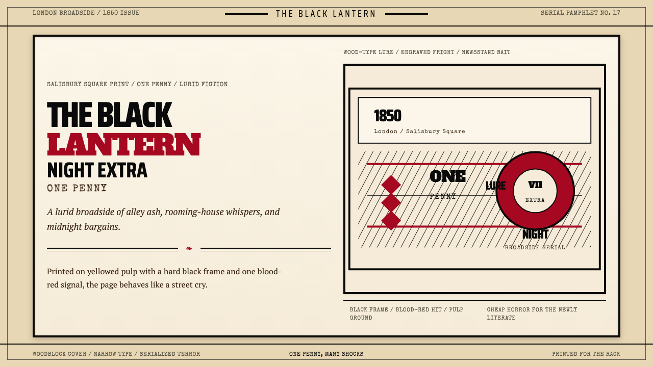 Penny Dreadful Victorian Headline (1850)Cheap terror in full cry. Condensed wood-type, black borders, and one blood-r…廉价恐怖全速开喊。窄体木活字、黑框和血红点染钉在泛黄纸上。
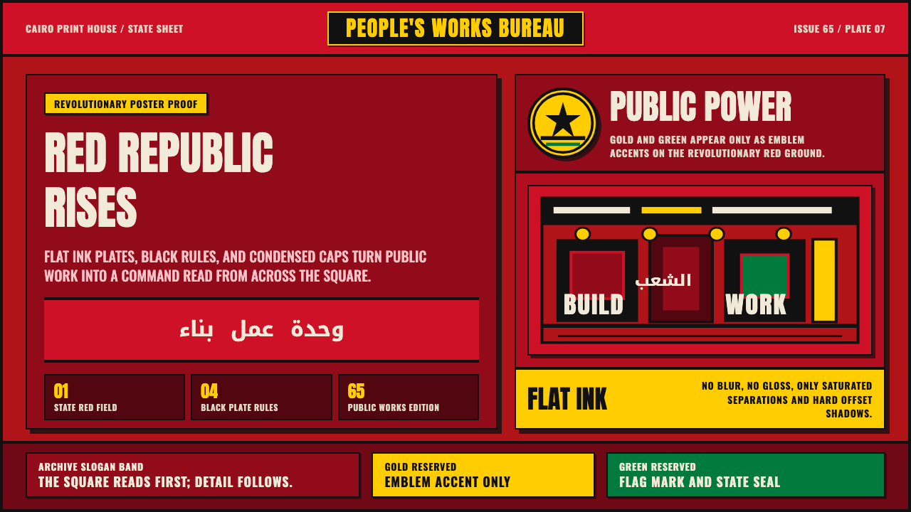 Egyptian Political PosterState power shouts. Red poster grids, black keylines, kufic type, gold-green…国家力量高声宣告:红底海报网格、黑色粗线、库法体与金绿徽记。
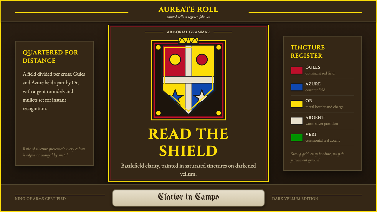 Heraldic BlazonCommand at a glance. Gules, Azure and Or quartering lock into a gilt shield o…一眼即权威。深羊皮纸上,红蓝金分割锁成镀金盾徽。
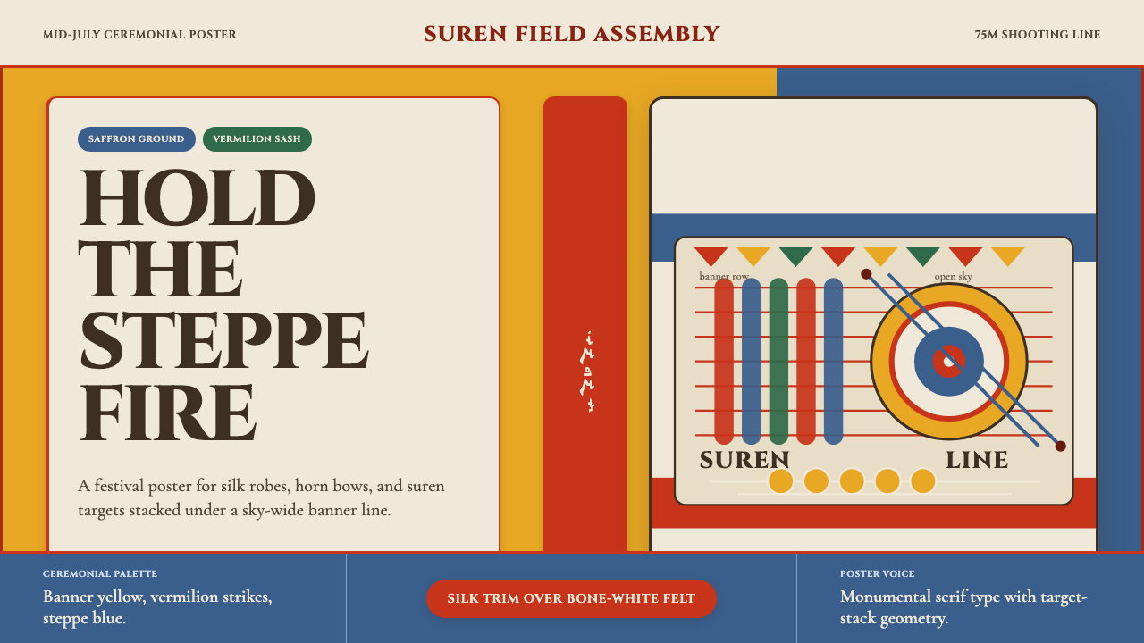 Mongolian Naadam ArcheryFestival heat at full draw. Saffron ground, vermilion trim, suren circles.满弓的节庆热度。藏红花黄底、朱红镶边、苏仁圆靶。
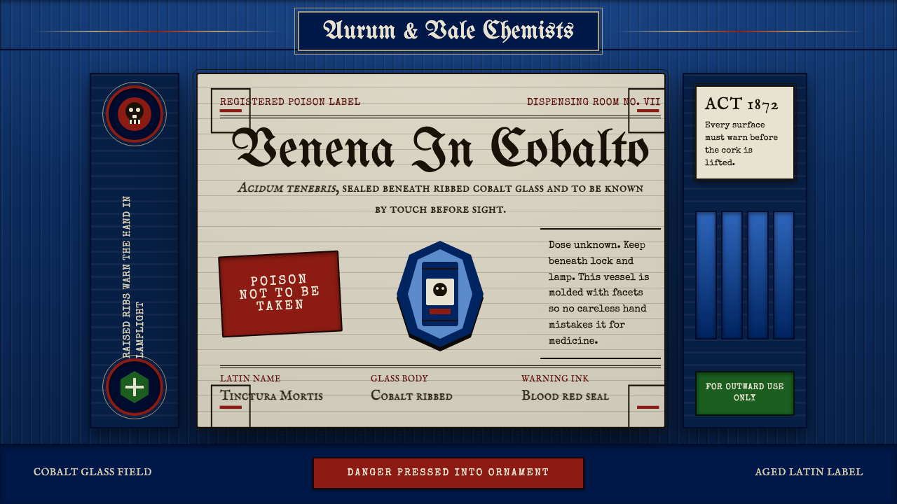 Apothecary Poison LabelDanger made ornate. Cobalt ribs, aged paper, and red POISON rules make fear t…危险被做成装饰:钴蓝凸棱、旧纸标签与红色警示让恐惧可触。
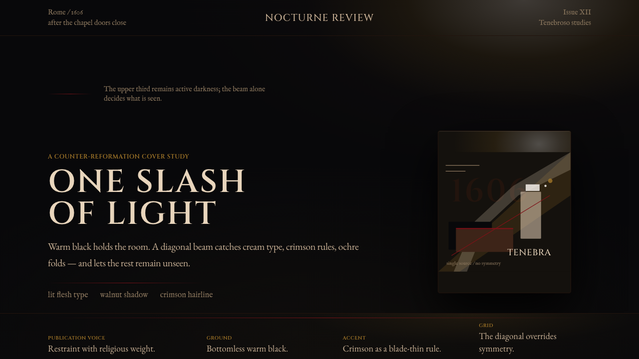 Caravaggio TenebrismDarkness acts first. Warm-black voids, Cinzel capitals, and one ochre raking…黑暗先发声:暖黑空场、Cinzel 大写与赭石斜光。