About Stefan Sagmeister
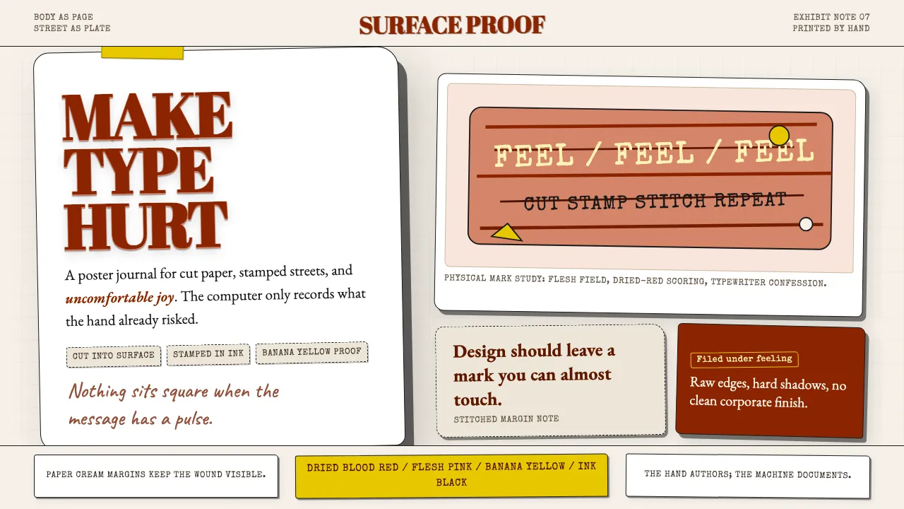
Stefan Sagmeister treats the body, the street, and the physical world as design surfaces. The 1999 AIGA Detroit poster — event details cut into his own torso with an X-Acto knife — is the thesis: design should make you feel something, even if it is discomfort. Type is built from bananas, skin, stitched thread, torn paper, and inked stamps.
His visual language is handmade, often painful, always unforgettable. Colors are material-derived rather than sampled — flesh pink, dried blood, banana yellow, paper cream, ink black. Grids are broken; edges are raw; scale jumps from the intimate to the monumental. The computer is the documenter, never the author.
- Origin
- New York City, USA (Bregenz, Austria)
- Era
- Active 1993–present; Sagmeister Inc. (1993), Sagmeister & Walsh (2012–2019)
- Key figures
- Stefan Sagmeister · Jessica Walsh · Tibor Kalman
- Movements
- Experiential typography · Design-as-art · Physical-material graphic design
Stefan Sagmeister design spec
Colors
Typography
The other 11 sections — buttons, cards, spacing, motion, techniques and more — open once you unlock. Download the DESIGN.md or send it to your AI in one click. Unlock once, yours forever.
Sign up nowStyles similar to Stefan Sagmeister
Also inspired by art & artists, with a close feel.
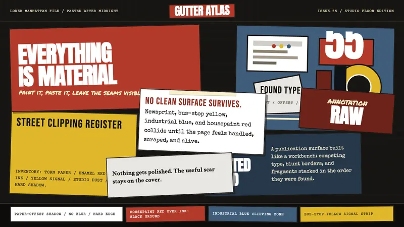 Rauschenberg Combine (1955)Street debris becomes syntax. Ink black, torn type, red-blue-yellow scraps collide.
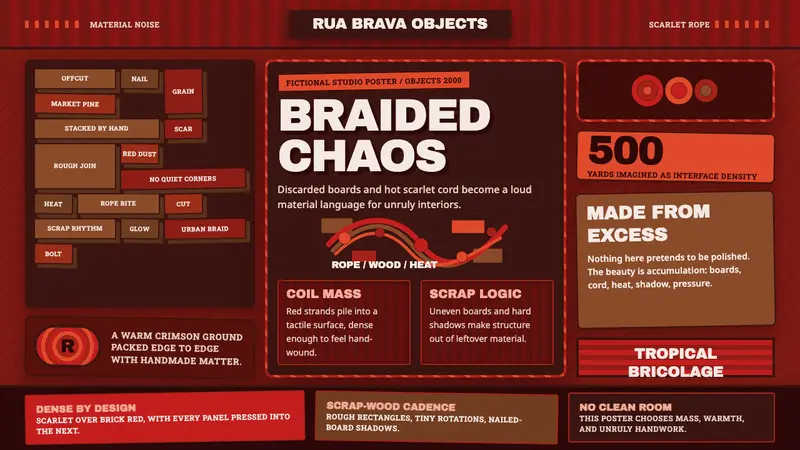 Campana Brothers DesignChaotic craft turns loud. Scarlet rope grids and scrap-brown masonry stack the canvas.
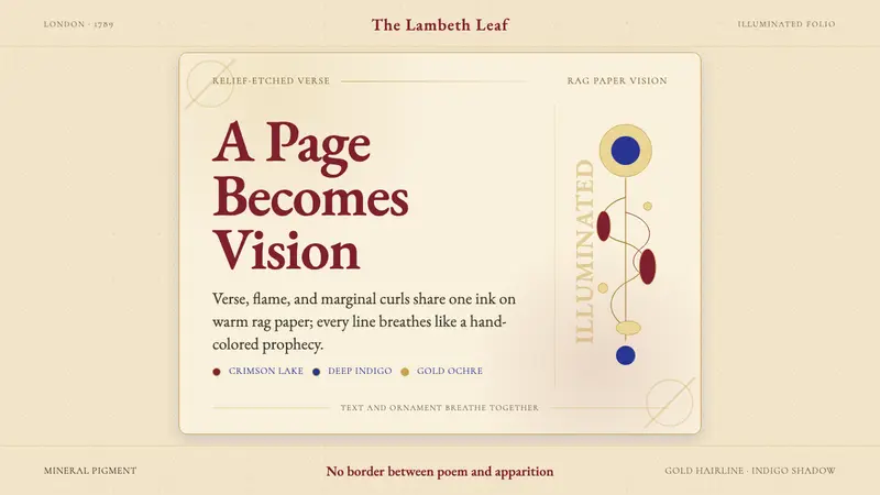 William Blake IlluminatedThe page becomes a vision. Crimson, indigo, and gold ornament breathe on rag paper.
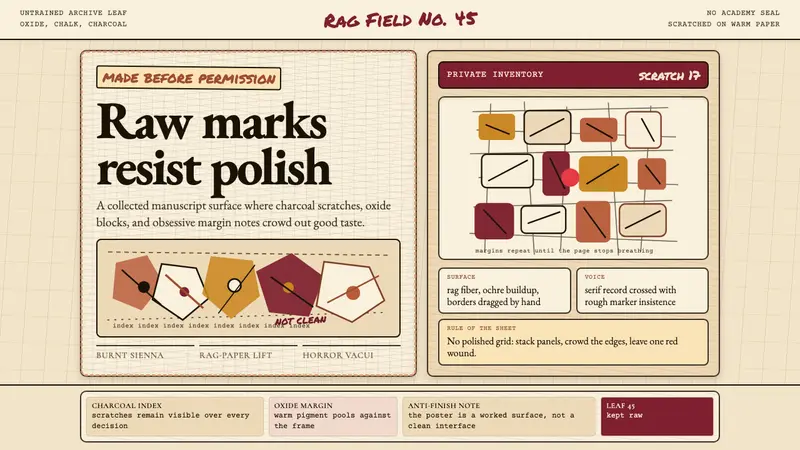 Art Brut (Dubuffet)Polish is refused. Bone-cream paper, earth pigments, scratched borders, dense margins.