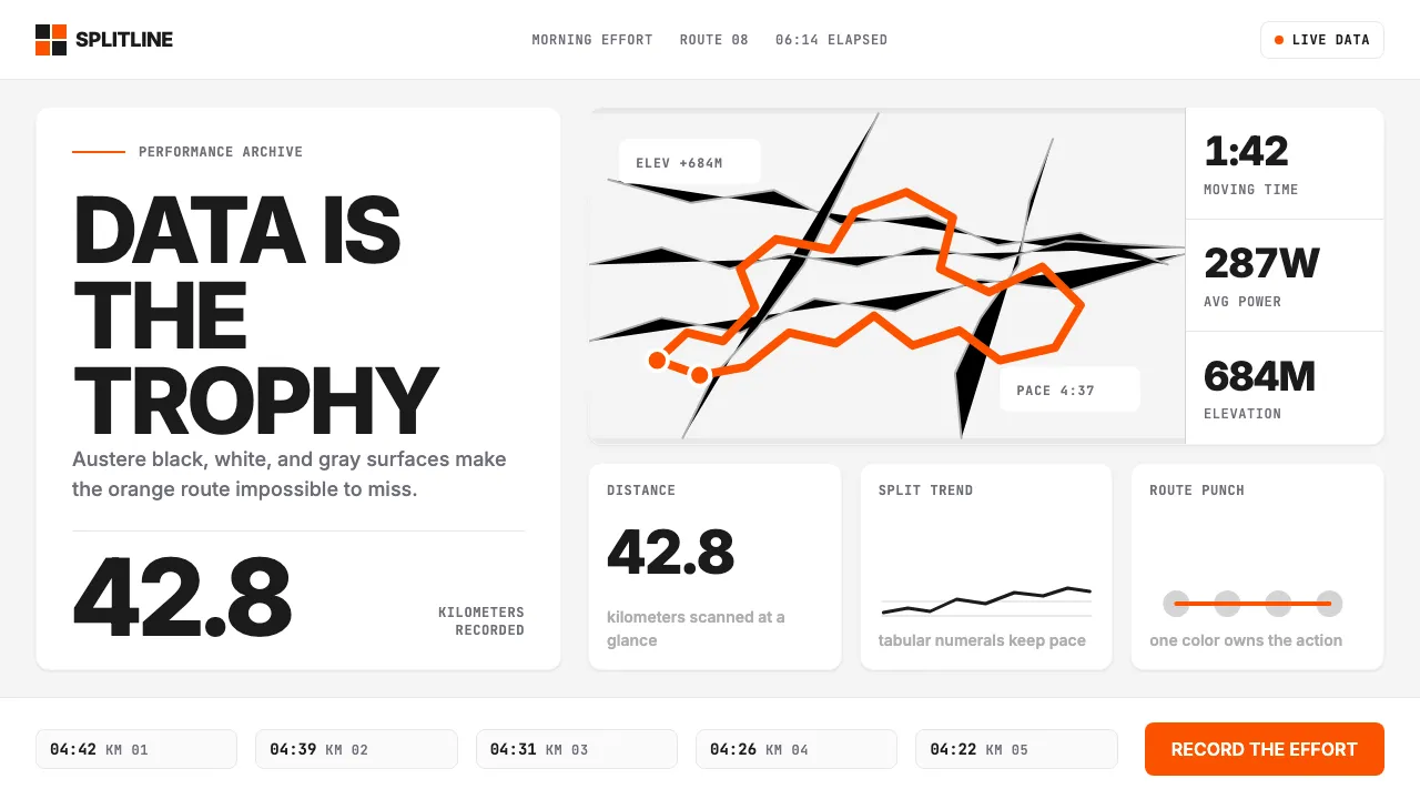
About Strava Orange Fitness
Strava's design language is built on a single conviction: the data is the trophy. One saturated orange punches through an otherwise monochromatic interface of off-black text, white surfaces, and neutral gray cards. Typography is Inter at heavy weights — tabular numerals that align vertically so your splits, watts, and elevation gain read cleanly mid-stride or post-ride.
Every screen is structured around metric tiles, pace charts, and map polylines — the bright orange route drawn over a muted basemap is the brand's most recognizable visual. No gradients, no decoration, no lifestyle pastels. Just numbers, maps, and one unmistakable color that reads on a sweat-soaked phone at dawn.
- Origin
- San Francisco, USA
- Era
- 2009 founded; current visual ~2020–2024
- Key figures
- Michael Horvath · Mark Gainey · Mateo Ortega
- Movements
- Quantified-self movement · Social fitness apps · Strava KOM culture
Strava Orange Fitness design spec
Colors
Typography
The other 11 sections — buttons, cards, spacing, motion, techniques and more — open once you unlock. Download the DESIGN.md or send it to your AI in one click. Unlock once, yours forever.
Sign up nowStyles similar to Strava Orange Fitness
Also inspired by brands & products, with a close feel.
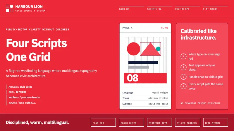 Singapore Merlion BrandPrecision with civic warmth. Flag red and geometric sans lock into a four-script grid.
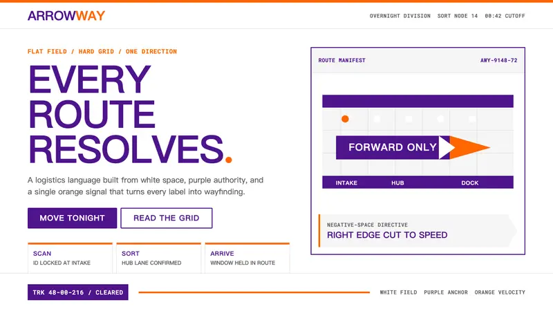 FedExDirections, not decoration. Purple authority and one orange bar organize a flat white grid.
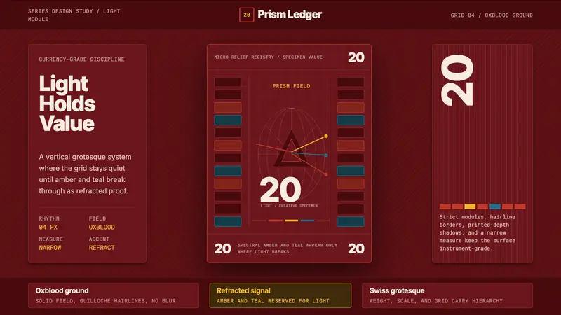 Swiss Franc NoteCurrency-grade calm. Oxblood grid, Inter numerals, amber-teal prism lines.
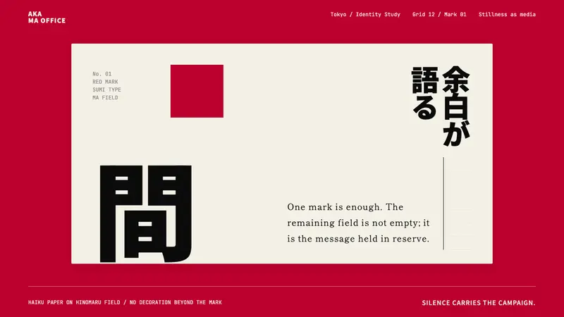 Dentsu Tokyo CreativeSilence does the selling. Hinomaru red, sumi type, and empty columns carry the mark.