About Swiss Franc Note
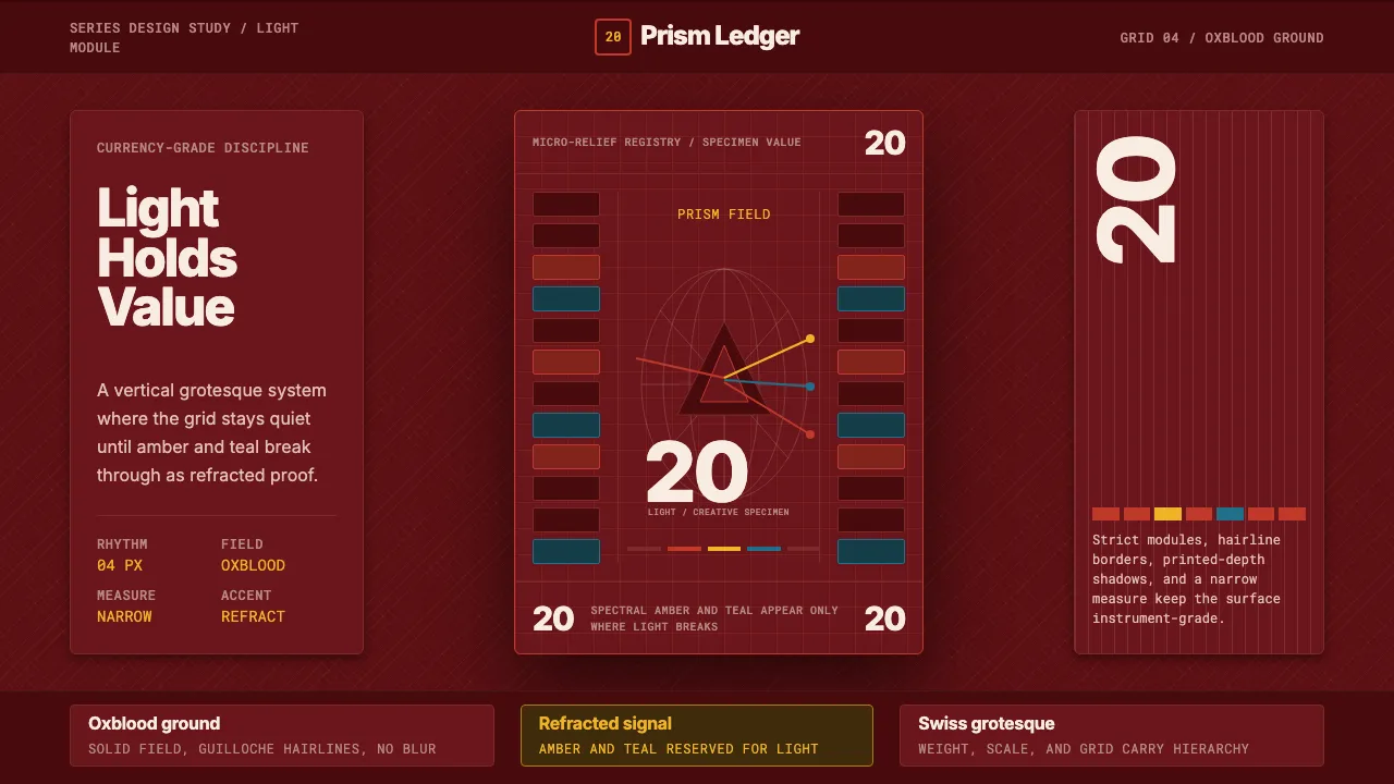
The ninth-series Swiss banknote rebuilt currency design around a single idea per denomination. The 20-franc note — themed "light / creativity" — prints a saturated oxblood field carrying a hand that holds a prism, splitting a beam into its spectrum beside a star-map globe and micro-relief security guilloché.
This system borrows that grammar: a deep red ground, a disciplined Swiss grotesque hierarchy, and spectral amber and teal used only where light refracts. Everything sits on a precise grid in a vertical, note-like format.
- Origin
- Switzerland, Western Europe
- Era
- 2010–now (ninth series designed and released 2017)
- Key figures
- Swiss National Bank (SNB) · ninth-series design team
- Movements
- Swiss / International Typographic Style · modern security printing · micro-relief guilloché
Swiss Franc Note design spec
Colors
Typography
The other 11 sections — buttons, cards, spacing, motion, techniques and more — open once you unlock. Download the DESIGN.md or send it to your AI in one click. Unlock once, yours forever.
Sign up nowStyles similar to Swiss Franc Note
Also inspired by brands & products, with a close feel.
 Strava Orange FitnessData becomes trophy. Inter numerals, gray metric grids, and one orange route line.
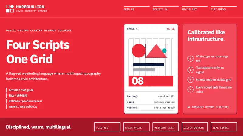 Singapore Merlion BrandPrecision with civic warmth. Flag red and geometric sans lock into a four-script grid.
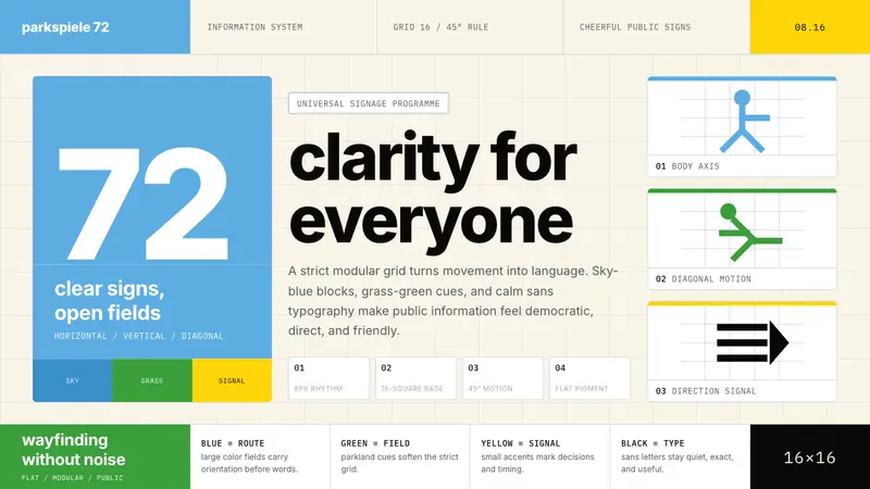 Otl Aicher Munich OlympicsFriendly rigor. Sky-blue grids and straight-line pictograms make public information universal.
 Nubank PurpleBanking stripped to one color. Full-bleed Nupurple ground, white type, generous negative space.