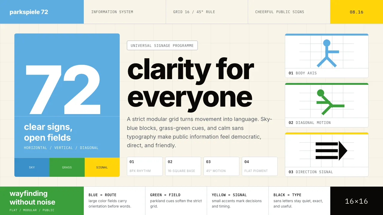
About Otl Aicher Munich Olympics
Otl Aicher's 1972 Munich Olympics identity is the most influential information-design system of the 20th century. Its 21 sport pictograms — built on a strict grid of horizontal, vertical, and 45-degree strokes — became the universal template for wayfinding worldwide.
The sky-blue and grass-green palette was a deliberate rejection of Berlin 1936's totalitarian red-black-white, embodying Aicher's doctrine of "heitere Spiele" — cheerful games. Combined with Univers typography and rigorous modular grids, the system proves that information can be universal, geometric, and friendly without ever becoming grandiose.
- Origin
- Germany — Munich & Ulm
- Era
- 1967–1972; ongoing influence through Aicher's later corporate work
- Key figures
- Otl Aicher · Inge Aicher-Scholl · Rolf Müller · Frei Otto
- Movements
- Swiss International Style · HfG Ulm pedagogy · modernist pictogram tradition
Otl Aicher Munich Olympics design spec
Colors
Typography
The other 11 sections — buttons, cards, spacing, motion, techniques and more — open once you unlock. Download the DESIGN.md or send it to your AI in one click. Unlock once, yours forever.
Sign up nowStyles similar to Otl Aicher Munich Olympics
Also inspired by brands & products, with a close feel.
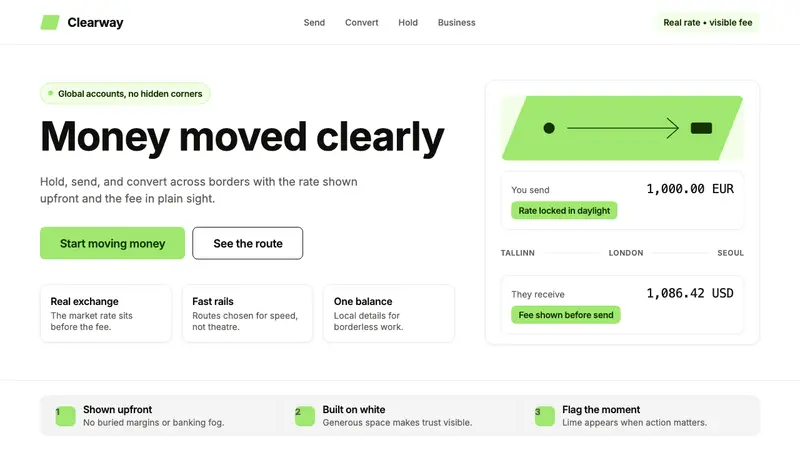 Wise (TransferWise)Clarity feels bankable. Lime flag on white, Inter geometry, quiet fee cards.
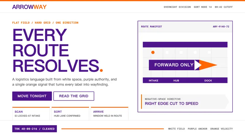 FedExDirections, not decoration. Purple authority and one orange bar organize a flat white grid.
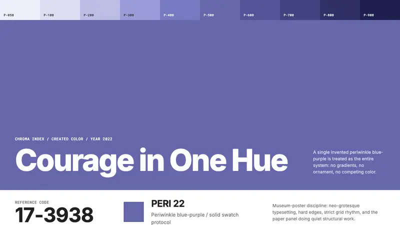 Pantone Very Peri (2022)Color becomes authority. Periwinkle field, reference codes, and white paper impose discipline.
 Strava Orange FitnessData becomes trophy. Inter numerals, gray metric grids, and one orange route line.