About Pantone Very Peri (2022)
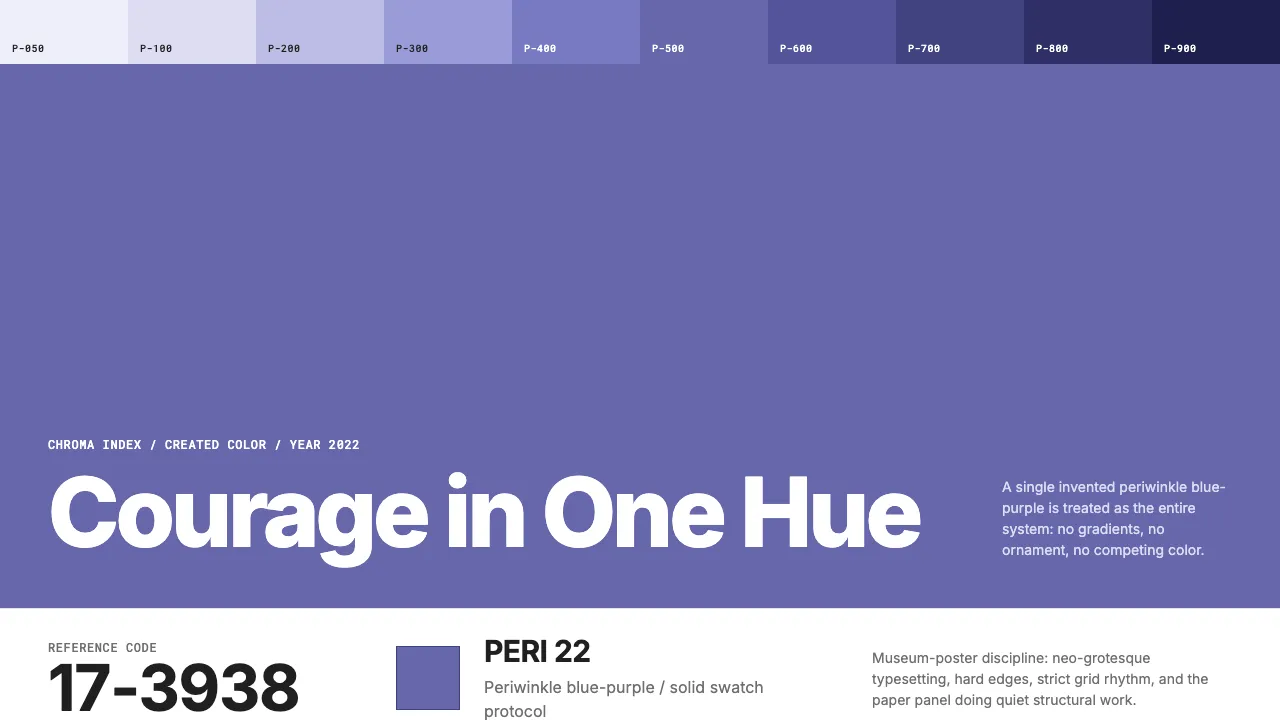
Pantone Very Peri is the rare Color of the Year that was invented rather than selected — a brand-new periwinkle blue-purple (#6667AB) announced in December 2021 as "courageously creative." The visual system channels Pantone's swatch-card formality: a dominant solid-color field, Helvetica Neue typography with reference codes, generous whitespace, and zero ornamentation.
The design language borrows from Swiss international style filtered through industrial color-matching discipline. Every composition follows single-hue protocol — one color dominates, text is minimal and precisely placed, and the paper substrate itself becomes a design element.
- Origin
- Carlstadt, New Jersey, USA
- Era
- Announced December 2021 as Color of the Year 2022; Pantone COTY program since 1999
- Key figures
- Leatrice Eiseman · Laurie Pressman · Lawrence Herbert
- Movements
- Color forecasting industry · Swiss international typographic style · Color authority branding
Pantone Very Peri (2022) design spec
Colors
Typography
The other 11 sections — buttons, cards, spacing, motion, techniques and more — open once you unlock. Download the DESIGN.md or send it to your AI in one click. Unlock once, yours forever.
Sign up nowStyles similar to Pantone Very Peri (2022)
Also inspired by brands & products, with a close feel.
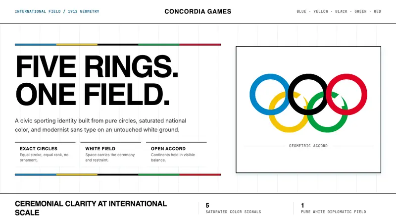 Olympics Five Rings (1912)Ceremony without noise. Saturated five-ring color on pure white, locked to a civic grid.
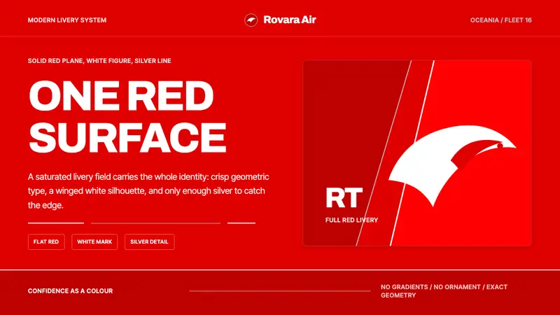 Qantas Flying KangarooConfidence is one red field. White silhouette, Archivo type, silver hairlines.
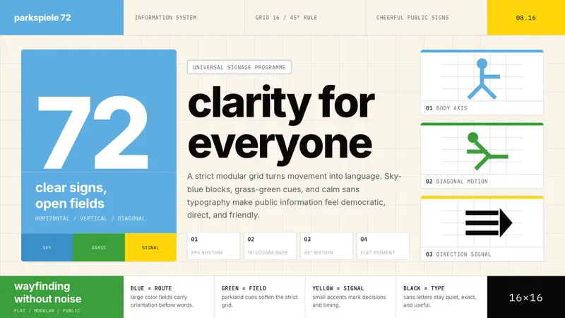 Otl Aicher Munich OlympicsFriendly rigor. Sky-blue grids and straight-line pictograms make public information universal.
 Strava Orange FitnessData becomes trophy. Inter numerals, gray metric grids, and one orange route line.