What is Strava Orange Fitness?
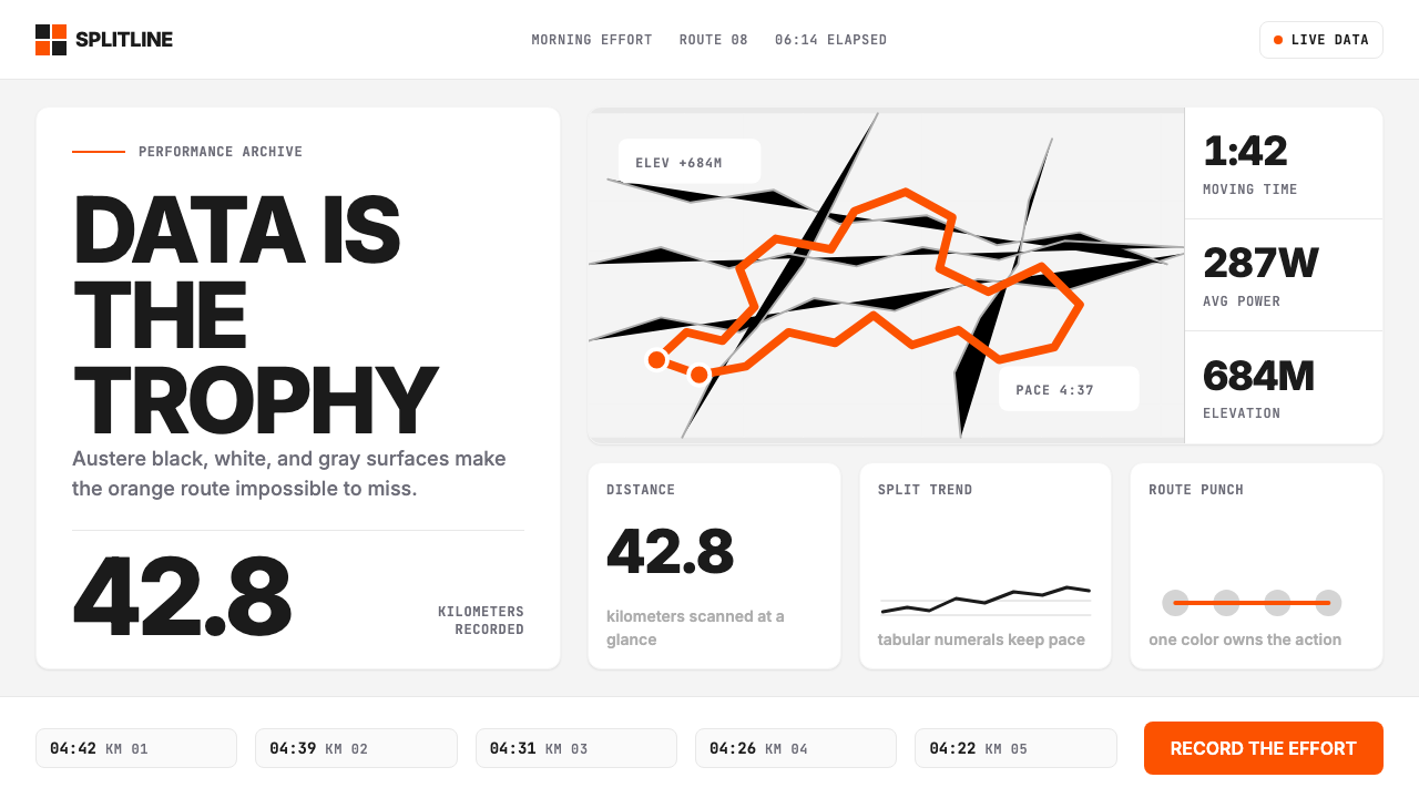
Strava turned athletic data into a design language where a single blazing orange route line is the only trophy that matters.
Strava Orange Fitness in brief
Strava Orange Fitness is the visual language of the Strava platform: a disciplined, almost ascetic interface built around the belief that athletic data is inherently beautiful and needs no decoration to communicate its meaning. The system pairs a near-monochromatic palette of off-black, white, and neutral grays with a single saturated orange accent that functions as the brand's entire emotional register — energy, effort, accomplishment.
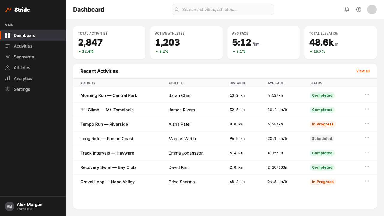
At its core, the aesthetic is organized around the metric tile: a card-like container holding a single data point — pace, power, elevation, heart rate — in large, tabular-style numerals that stack and align vertically so athletes can scan figures at a glance, even mid-activity on a small screen. These tiles are laid out in tight, dense grids that prioritize information density over visual breathing room. The map polyline — a route drawn over a muted basemap in that signature orange — is the system's most iconic element, treated as both data and identity mark.
What distinguishes Strava's visual language from generic fitness UI is its refusal of lifestyle imagery, gradient fills, and motivational pastels. The system trusts numbers and maps to carry emotional weight on their own. An athlete's weekly summary is a dashboard of facts; the orange route is the narrative. Nothing else is needed.

Where does Strava Orange Fitness come from?
Strava was founded in San Francisco in 2009 by Michael Horvath and Mark Gainey, two Harvard rowing teammates who wanted to replicate the motivational dynamics of training with a team — the shared suffering, the competitive leaderboard, the social accountability — for solo athletes training alone. The earliest version of the app was primarily a GPS tracking tool for cyclists, and its design reflected that functional focus: maps, numbers, routes. The visual language grew from the data up, not from a branding brief down.
The orange accent color has roots in cycling culture's relationship with high-visibility gear — jerseys, helmets, and accessories in saturated warning colors that cyclists wear to be seen by traffic. Within the platform, orange took on a second meaning: it marks the Strava KOM (King of the Mountain) and QOM (Queen of the Mountain) leaderboard leaders, the fastest recorded times on community-defined segments. Orange is the color of the fastest, which made it the color of aspiration. Over time, the route polyline became orange not just for visibility but because it inherited this competitive connotation.
The refinement of the current visual system — the dense metric grid, the muted basemap, the Inter-style tabular numerals — accelerated during the mid-2010s as the platform grew from a niche cycling community into a multi-sport social fitness network encompassing running, swimming, rowing, skiing, and dozens of other activities. Design lead Mateo Ortega and the Strava design team undertook several iterative visual overhauls between approximately 2018 and 2024, progressively stripping the interface of decorative elements and doubling down on data clarity. Each redesign moved further from the visual conventions of lifestyle fitness apps and deeper into a discipline closer to data journalism or scientific instrumentation.
The broader quantified-self movement — the cultural shift toward tracking, logging, and optimizing personal physical performance that gained momentum in the early 2010s alongside wearables and GPS-enabled smartphones — shaped the aesthetic values Strava codified. Athletes who wore heart rate monitors and exported CSV files of their workouts had different aesthetic expectations than casual fitness app users: they wanted precision, legibility, and density. Strava's visual language is a direct response to that user population's demands, and its persistence as a design system reflects the fact that those demands have only grown.
What defines the Strava Orange Fitness look?
The Single Orange Accent
The entire emotional weight of the Strava palette rests on one highly saturated, warm orange. Everything else — backgrounds, text, cards, borders, secondary labels — exists in a strict range of near-whites, off-blacks, and neutral grays. The orange is never diluted into a tint for secondary uses; it appears at full intensity or not at all. This creates an interface where the orange always means something: a route, an active state, a KOM indicator, a call to action. Its scarcity is the source of its power.
Tabular Numerals and Data Legibility
Metric displays use heavy-weight, tabular-style numerals — characters designed so that each digit occupies the same horizontal width, allowing columns of numbers to align precisely and enabling rapid vertical scanning. This is essential in an athletic context where a runner glancing at their wrist or a cyclist checking their phone mid-ride needs to parse a pace or power figure in under a second. Large figures dominate their tiles while unit labels sit in smaller text beneath, creating an instant visual hierarchy that requires no conscious parsing.
The Route Polyline as Identity
The orange route line drawn over a muted, desaturated basemap is Strava's most recognizable visual element and the clearest expression of its design philosophy: the athlete's actual path is the content. Basemaps are deliberately low-contrast — pale roads, gentle terrain shading, minimal labels — so that the orange polyline reads as the foreground element at every zoom level. The route is data, but it is also a portrait of effort, a geographic self-portrait that makes the number visible as a shape.
Density over Breathing Room
Where most contemporary design systems default to generous whitespace as a mark of refinement, Strava deliberately packs data into dense tile grids. An activity detail screen might show eight or ten metric tiles in rapid succession before the map, and those tiles are compact — enough space to be readable, no space wasted on breathing room. This density is not a failure of hierarchy; it is a deliberate acknowledgment that the target user wants all the numbers, and any decision to hide or collapse data behind progressive disclosure is a disservice to a serious athlete.
Functional Dark Mode
Strava's dark interface mode is not an aesthetic preference but a practical adaptation for outdoor use: a dark background reduces screen glare in bright sunlight and, on devices with OLED displays, significantly extends battery life during long efforts. The dark version maintains the same chromatic logic as the light version — the orange accent at full saturation, all secondary information in descending shades of gray — but shifts the ground from white to near-black. Neither version feels like an afterthought; both serve specific use contexts with equal discipline.
No Lifestyle, No Gradient
Strava's visual language conspicuously excludes the visual conventions that dominate lifestyle fitness: no warm photography of athletes in golden-hour light, no gradient backgrounds suggesting vitality, no motivational typography rendered in script fonts, no decorative icons or illustrative elements. The discipline is categorical. If an element cannot be justified as data, map, or navigation, it does not belong on screen. This creates a visual culture that is more akin to a scientific instrument panel than a consumer wellness app.
KOM and Achievement Markers
The system reserves specific visual treatments for achievement states — the orange star that marks a personal record, the crown icon that signals a segment leaderboard position, the trophy symbol for a new KOM or QOM. These elements appear only when earned, which gives them significance that a perpetually visible badge could never have. The restraint with which achievement markers are distributed mirrors the system's overall philosophy: visual emphasis is a finite resource, and spending it on anything that isn't genuinely exceptional degrades its currency.
Who shaped Strava Orange Fitness?
Co-founder of Strava, Horvath shaped the platform's foundational conviction that the social dynamics of team sport could be reconstructed digitally for solo athletes. His background as a Harvard rower informed the emphasis on segment leaderboards and KOM culture — the idea that a solo training ride could be simultaneously competitive because every route was a potential record. This framing gave orange its original significance in the platform's visual language as the color of the fastest.
Co-founder and long-serving CEO, Gainey guided Strava's expansion from a cycling-focused GPS logger into a multi-sport social fitness network covering dozens of activity types. Under his leadership, the design language evolved to accommodate this breadth without losing its core identity — the same metric tile grid, the same orange accent, the same map-first orientation applied consistently whether the user was recording a marathon, a ski descent, or an open-water swim. His stewardship preserved the aesthetic coherence of the system through rapid growth.
As a senior design leader at Strava, Ortega was instrumental in the platform's visual refinements during the period when the design language solidified into its current form. The shift toward greater data density, the progressive stripping of decorative UI elements, and the disciplined application of the orange accent across a growing range of surface types are associated with the iterative overhaul work his team conducted. Ortega represents the practitioner tradition that understood Strava's users as serious athletes first and app users second — a position that shaped every layout decision.
The quantified-self movement — a loosely organized cultural and technological phenomenon that emerged around 2007–2010, centered on the practice of self-tracking through wearable sensors, GPS devices, and logging apps — established the aesthetic expectations that Strava's design language was built to satisfy. Practitioners of this movement valued precision, export capability, and unmediated access to raw data over polished consumer presentation. Their influence can be read directly in Strava's rejection of lifestyle aesthetics in favor of instrument-panel clarity.
The KOM (King of the Mountain) and QOM (Queen of the Mountain) leaderboard system — in which any GPS-recorded segment of road or trail becomes a timed competition with a global leaderboard — is as much a design driver as it is a product feature. The orange crown that marks a leaderboard leader transformed orange from a mere brand color into a status symbol with competitive meaning. The aspirational desire to hold an orange crown, or to beat a friend who holds one, is the emotional engine that the design language was built to serve.
How do you use Strava Orange Fitness today?
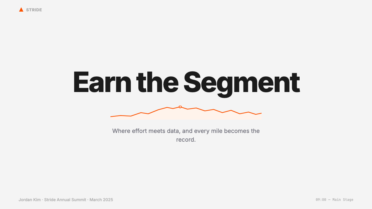
Strava Orange Fitness transfers effectively to any presentation or design context where athletic performance, personal metrics, or progress data is the primary content. For slide decks, the system works best on covers and data-heavy content slides. A cover should commit to the palette's logic: dark or light ground, large typographic treatment of the subject, and a single orange element — a shape, a line, a highlighted number — that anchors the composition. Content slides translate naturally into tile grids: group related metrics into compact card clusters, use large numerals as the primary visual anchor, and reserve orange exclusively for the figure or category that is the main point of the slide. Avoid the temptation to orange-highlight every important number; the system depends on orange being rare.
For web interfaces, the style is particularly well-suited to dashboards, leaderboards, personal analytics pages, and any screen where users need to process quantitative information rapidly. The implementation logic follows the same principles: establish a neutral ground of near-white or near-black, define a strict grid for metric tiles, and use orange only for interactive states, primary calls to action, or the single most important data point per view. Navigation should be strictly typographic with minimal iconography. Progress charts and activity timelines should render as clean line or bar charts on muted grid lines, with orange used only for the primary data series. Avoid gradient fills in chart areas — they undermine the system's instrument-panel clarity.
For editorial and marketing applications — race recaps, training plan promotions, athlete profiles, event materials — the style supports strong information hierarchy combined with a poster-like boldness. Feature a dominant map visual or an oversized metric figure as the hero element, then organize supporting data in a tile or table format below. Marketing pages work well when alternating between light and dark ground blocks, with the orange accent used sparingly as a directional or highlight color. The style is less suited to emotional or aspirational marketing that relies on photography of idealized athletes; those contexts call for different visual systems. Strava's aesthetic strength is analytical, not inspirational.
A common mistake when applying this style is reaching for orange too liberally. Because the Strava brand is strongly orange-associated, designers working in this aesthetic often default to using orange as a general emphasis color — highlighting multiple elements on the same screen, using it for section headers, applying it to decorative dividers. This rapidly degrades the system's logic. In authentic Strava-derived design, orange appears perhaps once or twice per screen, always in service of the single most important piece of information. Every additional orange element dilutes the one that should matter. Treat the accent budget as finite and spend it only on what genuinely deserves the user's full attention.
Strava Orange Fitness — FAQ
Is this style only suitable for fitness or athletic products?
The Strava aesthetic is optimized for data-dense, performance-oriented contexts, but it is not limited to fitness products. Any product where users are tracking progress over time — personal finance dashboards, productivity analytics, learning platforms showing completion rates and streaks, scientific or research tools — can apply the core principles: neutral ground, tabular numerals, a single saturated accent, tight metric grids. The style is less appropriate for products where warmth, organicism, or cultural richness are expected values, and it should not be grafted onto contexts that call for lifestyle imagery or emotional softness.
How does the Strava style relate to Swiss International Style or data journalism aesthetics?
There is a clear aesthetic lineage. Swiss International Style (1950s–60s) established the foundational principles of grid-based composition, typographic clarity, and the rejection of decorative ornament that Strava's system applies in a digital context. Data journalism aesthetics — as developed by publications like The New York Times or the Financial Times — contributed the emphasis on tabular numerals, chart clarity, and muted backgrounds that let data speak. Strava combines these two traditions with the specific context of personal athletic performance: the result is a system that has the structural rigor of Swiss design and the informational density of data journalism, but adds a singular emotional accent — orange — that those traditions deliberately avoid.
Can this style work for brands that are not associated with Strava?
Yes, but with one important caveat: orange is sufficiently associated with Strava that using it in fitness or athletic contexts risks immediate brand confusion. The underlying design system — the neutral palette, the metric tile grid, the tabular numerals, the map-first orientation — can be fully adopted and adapted with a different accent color. A blue or yellow accent applied with the same discipline and restraint produces a Strava-derived aesthetic that carries the same informational clarity without the color overlap. The structural logic of the system is the transferable asset; the specific orange is Strava's territory.
What is the difference between Strava's visual language and generic fitness app design?
Generic fitness app design typically uses gradient backgrounds in energetic colors, lifestyle photography of idealized athletes, motivational typography in bold display fonts, and a relatively loose information hierarchy where whitespace signals premium quality. Strava's system is almost the inverse: no gradients, no lifestyle photography, no motivational display type, and an information hierarchy that prioritizes density over spaciousness. The most direct contrast is in the treatment of data: a generic fitness app often presents a single headline metric with secondary figures collapsed behind a tap; Strava surfaces six to ten metrics simultaneously and expects the user to want all of them.
Does this style translate well to print or physical materials?
The Strava visual language translates to print with minimal adaptation, because its core elements are flat and typographic rather than screen-dependent. The metric tile grid reads as a well-organized data table in print; the orange accent reproduces cleanly in both CMYK and spot color; the tabular numerals set in heavy weights remain legible at small sizes. Race bibs, results posters, event programs, and training plan booklets are natural applications. The one element that does not fully translate is the interactive map polyline, which becomes a static graphic in print — effective as a design element but stripped of its data interactivity.
Related design styles
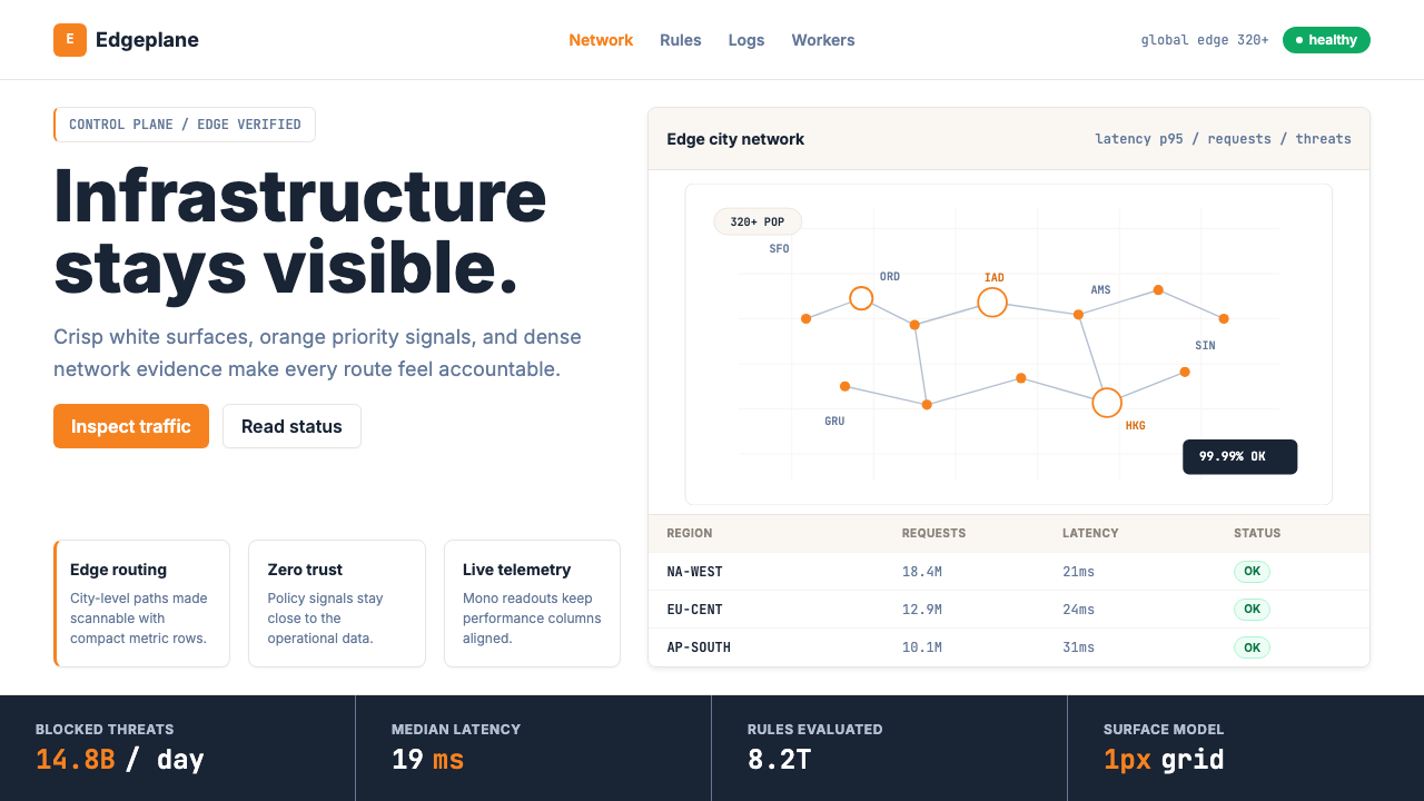 Cloudflare Orange EdgeOperational clarity wins. Orange accents, hairline grids, and mono metrics ma…
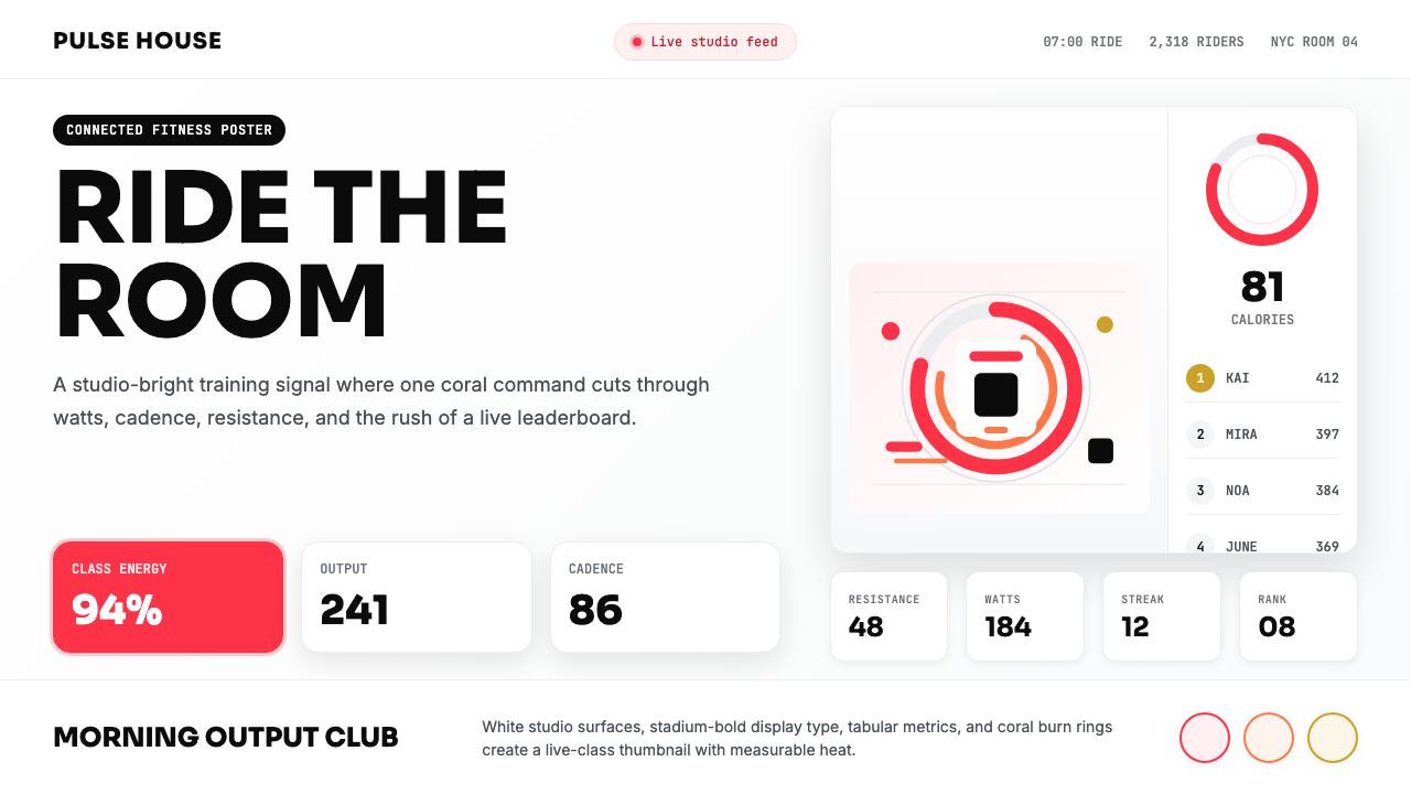 Peloton Fitness Coral (2020)Studio-bright urgency. Coral rings, Sora caps, and leaderboard grids drive th…
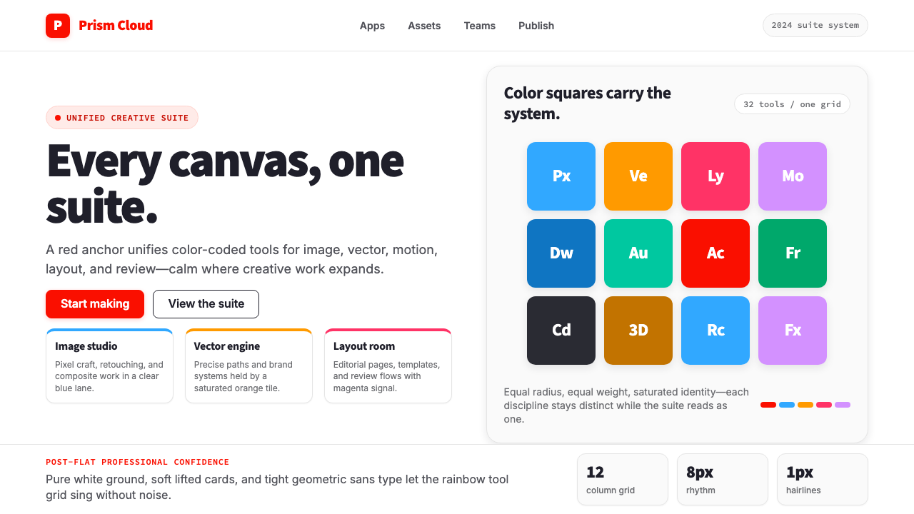 Adobe Creative CloudUnified, not uniform. Red anchor, white space, and saturated app tiles organi…
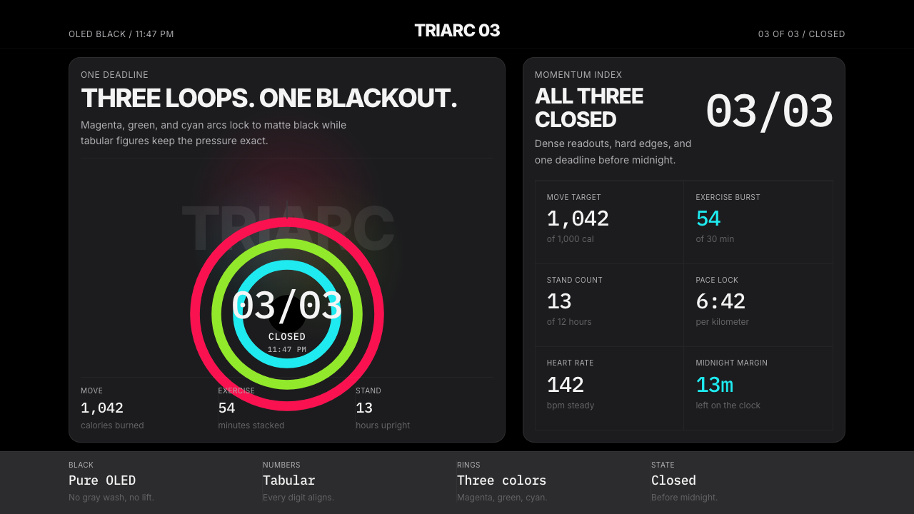 Apple Fitness Rings Closed (2024)Midnight feels exact. Magenta, green, and cyan rings lock onto OLED black.
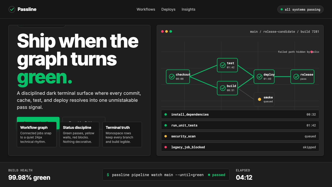 CircleCI Pipeline-GreenConfidence goes green. Emerald status lines cut through terminal-black pipeli…
 Databricks LakehouseWarm enterprise confidence. Flame red-orange gradients meet DM Sans and clean…