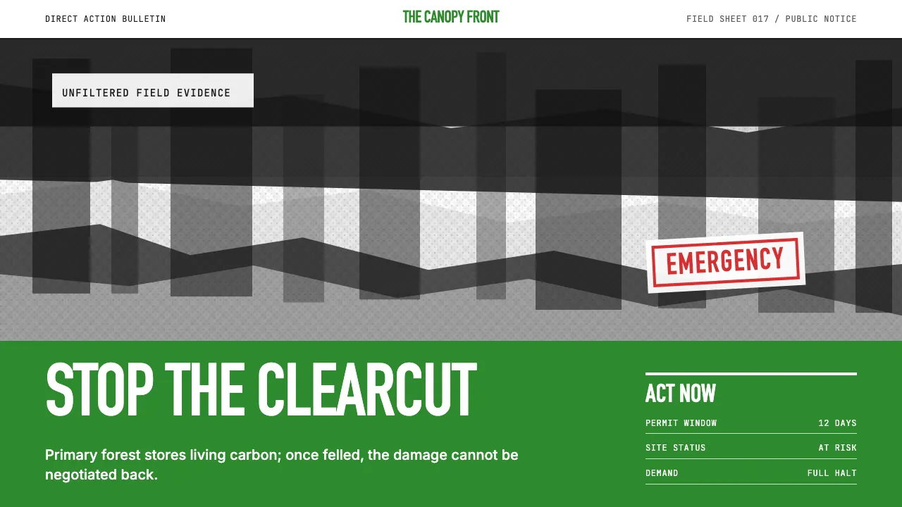
About Greenpeace (Activist Poster)
Greenpeace's visual language is protest reduced to its purest form: a single devastating photograph, a single ALL-CAPS condensed headline, and forest-green ink on white paper. Born from the 1971 anti-nuclear voyage to Amchitka Island, the aesthetic owes more to newspaper crisis headlines and wheatpasted street posters than to graphic design studios.
Fifty years of campaign material — from "Save the Whales" to climate-emergency reports — maintain the same brutal discipline: no ornament, no illustration, no softening. The green-on-white lockup with black-and-white photojournalism is instantly recognizable on fences, bus shelters, and protest banners worldwide.
- Origin
- Vancouver, BC (founding) → Amsterdam (HQ)
- Era
- 1971 founded; poster visual tradition 1971–present
- Key figures
- Bob Hunter · Jim Bohlen · Irving Stowe · KesselsKramer
- Movements
- Environmental direct-action · 1970s eco-protest poster · Climate-emergency campaigning
Greenpeace (Activist Poster) design spec
Colors
Typography
The other 11 sections — buttons, cards, spacing, motion, techniques and more — open once you unlock. Download the DESIGN.md or send it to your AI in one click. Unlock once, yours forever.
Sign up nowStyles similar to Greenpeace (Activist Poster)
Also inspired by brands & products, with a close feel.
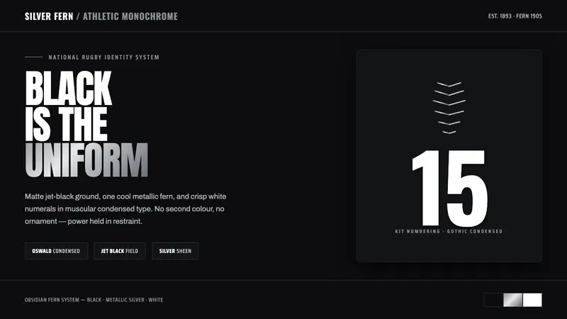 All Blacks Silver FernOne colour, total force. Jet-black field, a single metallic-silver fern, white condensed numerals.
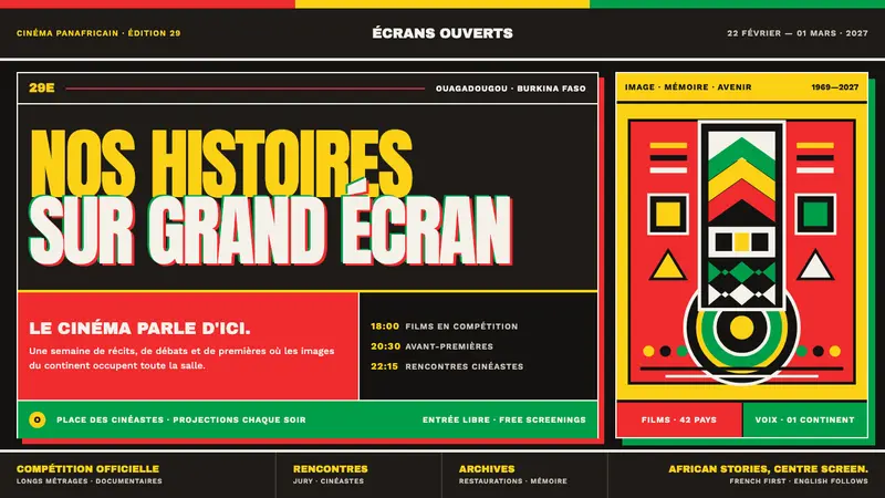 FESPACO PosterCinema speaks from the continent. Flag-exact spot inks and edge-fighting type command the frame.
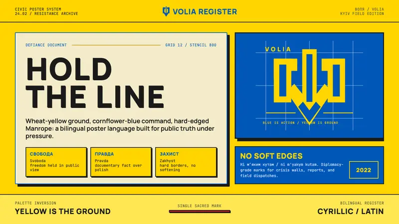 Ukrainian Trident Blue/Yellow (2022)Defiance becomes statecraft. Wheat yellow, cornflower blue, trident mark, stencil grid.
 HeinekenEmerald owns the field. White label, red star, gold line, and condensed type make it cold.