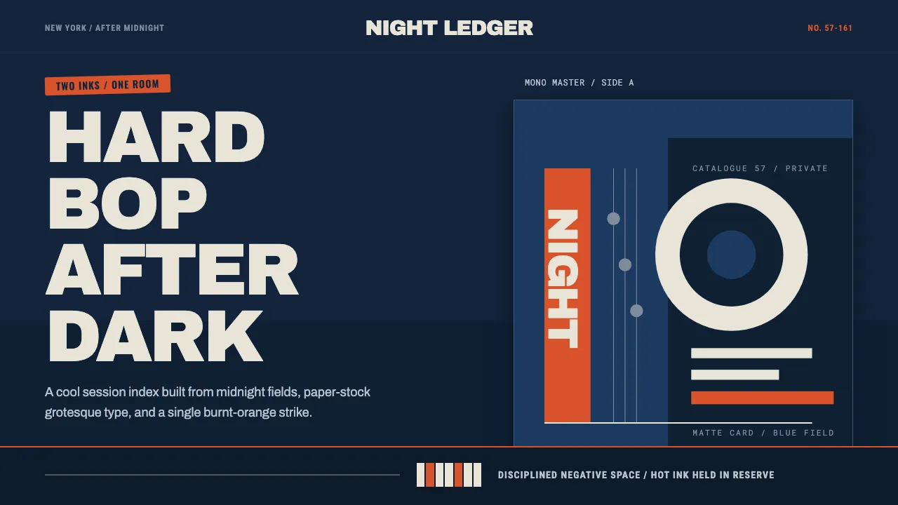
About Blue Note Jazz
Between 1956 and 1967, designer Reid Miles gave Blue Note Records one of the most coherent visual identities in American graphic design. Working with a two-to-three-color printing budget and Francis Wolff's session photographs, he built record jackets from oversized grotesque type, duotone-tinted images, asymmetric blocks, and disciplined fields of negative space — the cool, intelligent look of hard bop made visible.
This system translates that LP-jacket language into an interface: a deep midnight-blue ground, off-white paper-stock type, a single hot accent rationed like a third ink, and large gothic headlines that carry the layout. Nothing is decorative for its own sake — every element earns its place the way a printed cover had to earn each color.
- Origin
- North America (New York City)
- Era
- 1950–1990 (peak 1956–1967)
- Key figures
- Reid Miles · Francis Wolff · Alfred Lion
- Movements
- Blue Note Records cover art · Hard bop · Mid-century modernist graphic design
Blue Note Jazz design spec
Colors
Typography
The other 11 sections — buttons, cards, spacing, motion, techniques and more — open once you unlock. Download the DESIGN.md or send it to your AI in one click. Unlock once, yours forever.
Sign up nowStyles similar to Blue Note Jazz
Also inspired by brands & products, with a close feel.
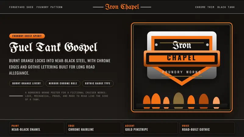 Harley Orange & BlackBuilt like a tank badge. Burnt orange, chrome hairlines, gothic type on near black.
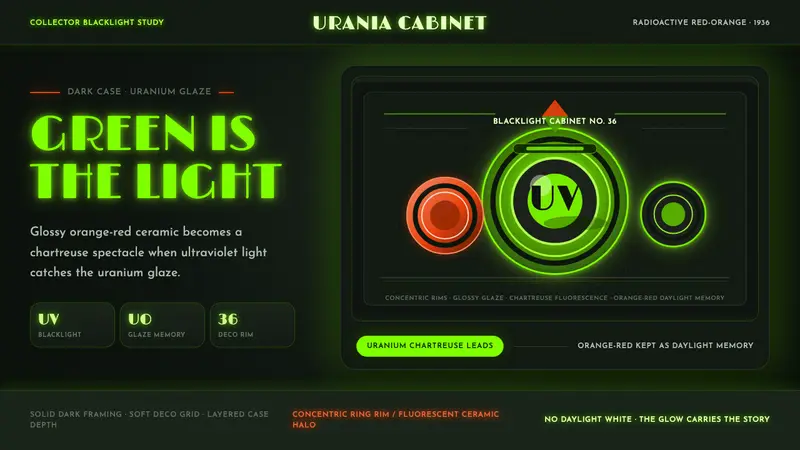 Fiestaware Radioactive Red-OrangeGlows like a collector's secret. Chartreuse rims cut through a dark deco case.
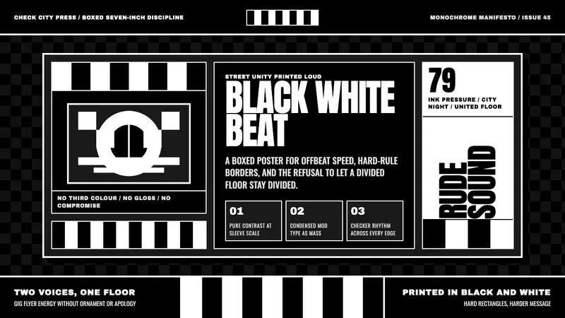 2 Tone SkaContrast as manifesto. White Anton type locks into a near-black checkerboard sleeve.
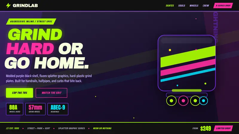 90s Aggressive Inline SkateX-Games attitude in plastic and paint. Fluoro lime and magenta slash across molded purple-black.