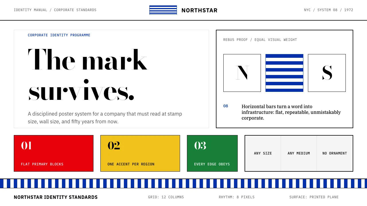
About Paul Rand / IBM Corporate Identity
Paul Rand built American corporate identity from the ground up: the IBM 8-bar logo, the ABC eye, the UPS shield, the NeXT cube. From 1956 to 1996 at IBM, he proved a mark could work at any size, in any medium, for decades — through rigorous grids, primary color blocks, and Bodoni rebus posters that turned business communication into art.
This system channels that conviction. Flat primary rectangles, IBM Blue as anchor, slab-serif subheads beside geometric sans body text, zero ornament. Every element looks like it was printed on a well-made corporate manual in 1972 and will still look correct in 2072.
Learn more about the Paul Rand / IBM Corporate Identity style
- Origin
- New York City / Armonk, NY (IBM HQ)
- Era
- 1956 Rand begins IBM work; peak 1960s–1980s; principles endure
- Key figures
- Paul Rand · Eliot Noyes · Thomas J. Watson Jr.
- Movements
- American corporate modernism · International Typographic Style · Swiss-American graphic design
Paul Rand / IBM Corporate Identity design spec
Colors
Typography
The other 11 sections — buttons, cards, spacing, motion, techniques and more — open once you unlock. Download the DESIGN.md or send it to your AI in one click. Unlock once, yours forever.
Sign up nowStyles similar to Paul Rand / IBM Corporate Identity
Also inspired by brands & products, with a close feel.
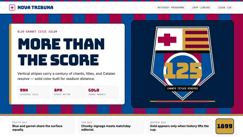 FC Barcelona (Blaugrana)Stadium heritage, not nostalgia. Blue-garnet stripes, Bungee type, gold heraldry.
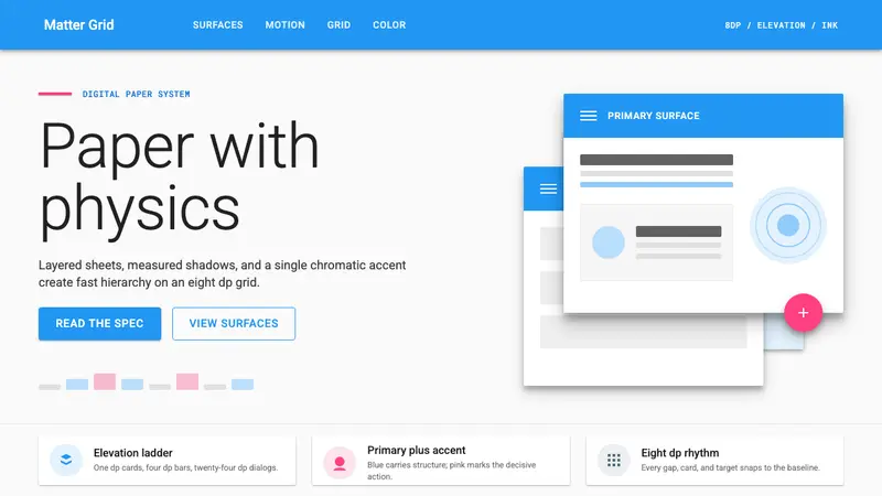 Material Design 1.0Depth made flat usable. Blue app bars, pink FABs, 8dp grids, and crisp paper shadows.
 Atlassian Jira BlueWarm enterprise teamwork. Saturated blue cards on cream make status feel human.
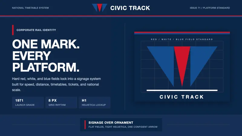 Amtrak Arrow (1971)Civic authority at speed. Deep navy, Helvetica lockups, and red-blue arrows.