What is Kawasaki Racing Lime Green?
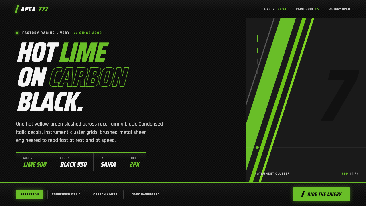
Kawasaki Racing Lime Green turns factory-livery aggression into a digital language: hot lime slashes across carbon black, condensed italics lean forward, and every edge feels engineered for speed.
Kawasaki Racing Lime Green in brief
Kawasaki Racing Lime Green is a motorsport-derived design system rooted in Japanese industrial design, factory race teams, sportbike decal culture, and the visual authority of the Ninja lineage. Its signature contrast is immediate: a hot yellow-green cuts through glossy or matte carbon black, while brushed-metal and carbon greys provide controlled support. The result is not decorative color blocking but the visual charge of a machine prepared for the circuit.
The system translates racing bodywork into interface structure. Sharp angular decals become directional bands, italic slashes create forward motion, and condensed racing-decal typography compresses information into a narrow, forceful field. Lime is used as an active signal against black rather than as a soft atmosphere. Panels, labels, indicators, and calls to action should feel placed with mechanical intent, as though each element belongs to an instrument cluster or fairing graphic.
Although the style is aggressive, its discipline comes from restraint. The black ground carries most of the visual weight; lime appears where attention, speed, or hierarchy must be declared; grey supplies material character without competing for focus. Gloss and matte are treated as distinct surfaces, not as random effects. Authenticity depends on preserving this relationship between dark mass, sharp accent, forward-leaning type, and purposeful geometry.
Where does Kawasaki Racing Lime Green come from?
The visual heritage reaches back to Kawasaki’s racing presence from the 1950s through the 1990s, when factory motorsport livery and sportbike decal culture established a language of speed, sponsorship, machine identity, and competitive display. This history matters less as a catalog of individual graphics than as a lasting attitude: the vehicle should announce its purpose before it moves. Graphics are not applied after the machine is designed; they complete the machine’s character.
The modern lime-green identity has been in continuous use since 2003. Set against Ninja bodywork in glossy and matte black, the color gained its distinctive force through contrast rather than complexity. The fairing becomes a dark aerodynamic field, and the lime mark reads like a cut, flare, or signal across it. Brushed metal and carbon greys reinforce the impression of engineered surfaces while keeping the livery’s primary confrontation intact.
The system belongs to a broader Japanese industrial-design tradition in which precision, material awareness, and functional clarity coexist with visual intensity. Kawasaki Heavy Industries provides the industrial frame; the Ninja sportbike lineage provides the recognizable bodywork context; and the Kawasaki Racing Team carries the factory-racing expression into global racing circuits. Together, these references make the style feel institutional and physical rather than merely neon or cybernetic.
In digital form, the design system distills those origins into repeatable principles: dark instrument-like panels, sharp angular divisions, italic marks that imply acceleration, and condensed typography that resembles a racing decal. Its success depends on keeping the source visible. If the lime becomes a generic bright accent, if the black becomes an empty background, or if the slashes lose directional force, the connection to factory livery disappears and only surface styling remains.
What defines the Kawasaki Racing Lime Green look?
Lime Against Carbon Black
The palette is built around a forceful dark ground and a hot yellow-green accent. Black supplies depth, authority, and machine mass; lime carries attention, energy, and identity. Brushed-metal and carbon greys appear as supporting surfaces, adding industrial variation without weakening the central contrast. The palette should feel concentrated, not colorful in a general-purpose sense.
Angular Decals
Geometry comes from the sharp cuts of factory livery: wedges, slashes, tapered bands, and hard directional breaks. These shapes should imply movement even when the interface is static. Curves may appear only when they belong to a machine-like contour or instrument detail. Rounded, friendly geometry weakens the style because it changes the emotional register from competition to comfort.
Forward-Leaning Type
Typography is condensed, italic, and assertive, recalling racing decals and technical markings. The forward slant creates a visual promise of acceleration, while the narrow width allows labels and headings to occupy a compact field. Type should be arranged in clear ranks, with the strongest display treatment reserved for identity, speed, or decisive action rather than applied everywhere.
Instrument-Panel Hierarchy
Information is organized like a racing instrument panel: dense where scanning matters, sharply separated where status changes, and visually quiet where the system needs to rest. Lime marks active readings, alerts, selected states, or primary actions. Dark panels create compartments, while grey divisions and material shifts clarify structure without introducing ornamental borders.
Gloss and Matte Contrast
Depth comes from surface behavior rather than soft decoration. Glossy black can suggest lacquered fairings or a polished machine surface; matte black can absorb attention and create a quieter technical field. Carbon grey and brushed-metal grey provide tactile difference. These surfaces should be placed deliberately, so contrast feels engineered rather than atmospheric.
Directional Aggression
The style communicates through forward pressure. Diagonal marks, compressed lettering, abrupt panel transitions, and lime accents should guide the eye along a route. Aggression is not visual noise; it is controlled momentum. Every slash needs a destination, every bright mark needs a hierarchy, and every dense cluster needs a clear reason to exist.
Who shaped Kawasaki Racing Lime Green?
The factory race teams are the primary source of the style’s competitive authority. Their role in the system is represented through livery logic: machine-dark surfaces, sharp decals, compressed markings, and accents that appear built for visibility at speed. The teams are less a character portrait than a design principle made institutional.
The Ninja lineage supplies the bodywork context that gives the palette its physical meaning. Glossy and matte black fairings become the dark field, while lime reads as a decisive graphic cut across an aerodynamic form. In digital work, this lineage encourages panels and components to feel assembled, surfaced, and engineered.
The Kawasaki Racing Team represents the contemporary factory expression of the system across global racing circuits. Its importance lies in continuity: the lime identity is not an isolated retro reference but a living visual language associated with competition, speed, and Kawasaki’s racing presence.
Kawasaki Heavy Industries provides the Japanese industrial foundation beneath the aesthetic. The reference keeps the style grounded in engineered production rather than fantasy futurism. Precision, durable surfaces, and purposeful markings should therefore matter as much as dramatic contrast.
How do you use Kawasaki Racing Lime Green today?
Kawasaki Racing Lime Green works best when the whole composition behaves like a piece of factory equipment. Establish a dominant carbon-black field, introduce lime only where attention must accelerate, and use grey to separate surfaces or clarify structure. Angular cuts should create a route through the page, while condensed italic type gives the route a recognizable voice. The style is strongest when color, geometry, and typography all push in the same direction.
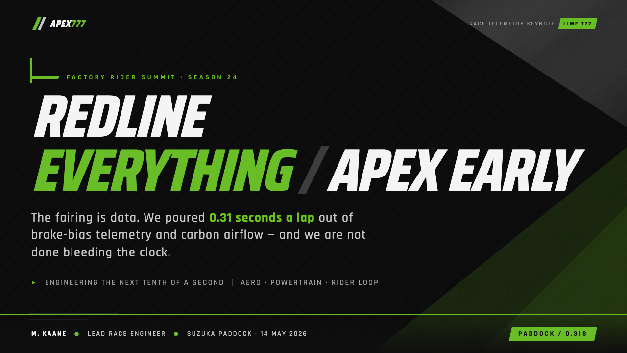
For presentation slides, the cover can use a large dark field interrupted by a decisive lime slash, with a condensed italic title positioned as if it were a racing decal. Content slides should resemble instrument panels: compact labels, clear status groupings, strong contrast, and angular divisions that keep information moving. Data slides benefit from lime as a signal for the active series or critical value, while grey preserves secondary information and black prevents the chart from becoming visually diffuse.
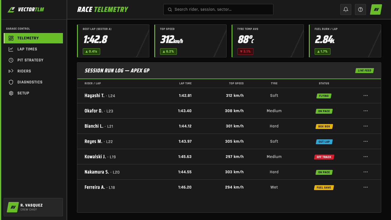
For web interfaces, the system suits dashboards, monitoring tools, performance products, and pricing pages that want to communicate speed and technical authority. Use dark panels to establish compartments, lime for selected states, alerts, progress, or primary actions, and carbon or brushed-metal greys for supporting layers. Cards should feel surfaced rather than softly floating; navigation should use assertive labels and directional markers instead of friendly decorative icons.
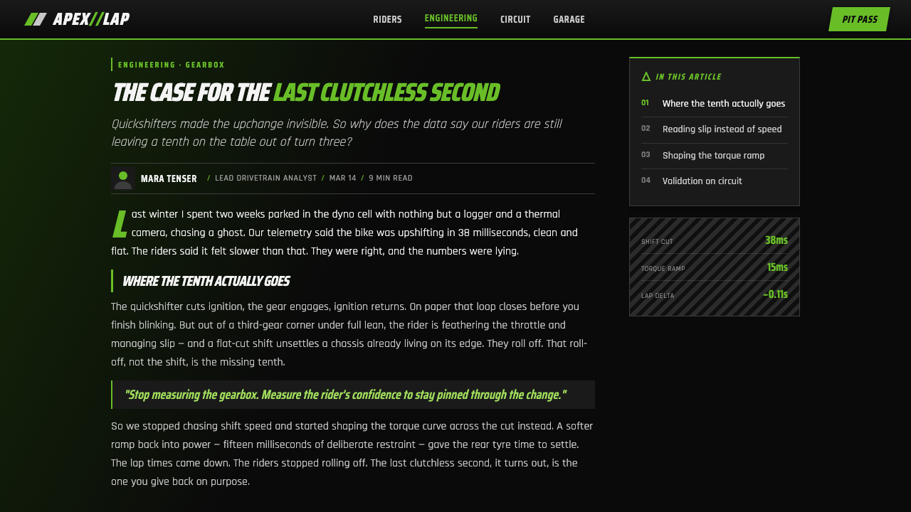
For editorial and marketing work, the style brings a poster-like sense of launch and competition. A feature article can pair a dense black text field with a wide lime rule or angular side mark, leaving grey metadata to establish technical context. Marketing pages can alternate quiet matte sections with sharper glossy accents, using italic headings and racing-style bands to move the reader toward a call to action. Product stories should emphasize engineered purpose, bodywork, speed, and identity rather than lifestyle softness.
The common mistake is treating lime as a general-purpose neon accent and sprinkling it across every component. That destroys its signaling power and makes the interface noisy. Another failure is pairing the color with soft, rounded, or overly playful construction, which contradicts the factory-racing source. Keep the black field substantial, reserve lime for decisive moments, make diagonals directional, and let typography carry the pressure.
Kawasaki Racing Lime Green — FAQ
Is Kawasaki Racing Lime Green simply a Kawasaki brand color?
It is more specific than a color reference. The identity depends on the relationship between hot lime, carbon black, racing decals, condensed italic type, angular geometry, and instrument-panel structure. Remove that system and the lime becomes generic. Use the system together and the color carries the authority of factory motorsport livery.
Why does the style rely so heavily on black?
Black provides the visual mass associated with glossy and matte Ninja bodywork, carbon surfaces, and technical instrument panels. It also gives the lime accent maximum authority. The dark ground is not empty space; it is the machine around which the graphic signals are organized. If the background becomes too light or fragmented, the livery logic loses its force.
Can the system work without diagonal decals?
It can, but the result will be less recognizably racing-derived. The diagonal mark is one of the clearest ways to communicate forward motion in a static layout. If the composition needs to be quieter, retain directional pressure through italic type, tapered panels, or sharply offset information groups. The key is not to reproduce a literal motorcycle graphic but to preserve movement as a structural idea.
Should every interactive element be lime green?
No. Lime is most effective when it signals a meaningful condition: selection, activation, warning, progress, primary action, or brand identity. Applying it to every button, label, and border removes hierarchy. Let black establish the field, grey handle supporting structure, and lime announce what deserves immediate attention.
Where does this style struggle?
It struggles when the product depends on softness, calm, or organic warmth as its primary emotional promise. The dark field, hard angles, and forward-leaning type naturally communicate competition, machinery, speed, and technical confidence. They can feel misplaced in experiences that need gentleness or leisurely intimacy. The right question is whether the product wants to feel engineered and ready to launch.
Related design styles
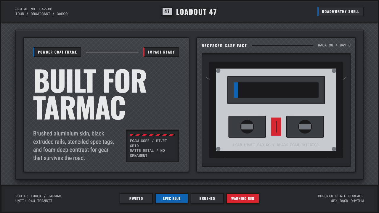 Aluminium Flight CaseRoadproof and exact. Diamond-plate gray, stencil type, black frames, blue-red…
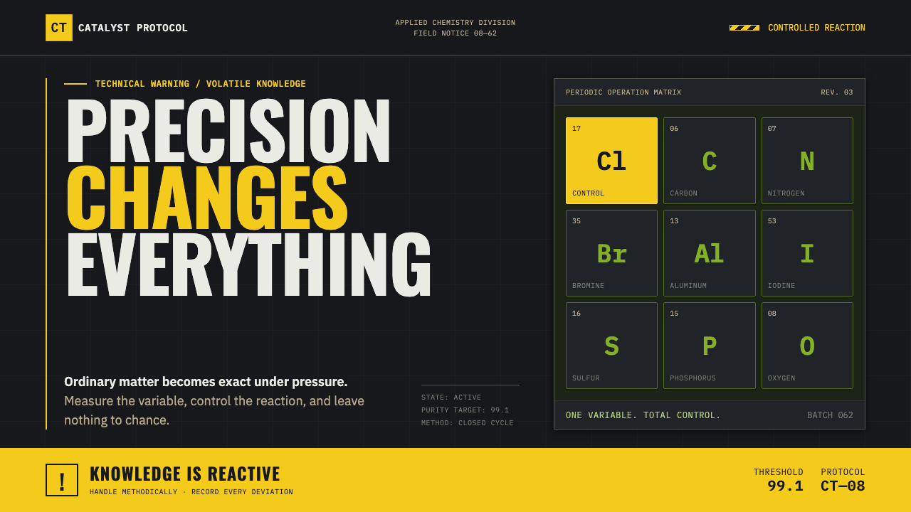 Breaking Bad (2008)Precision turns dangerous. Hazmat yellow and element tiles cut through asphal…
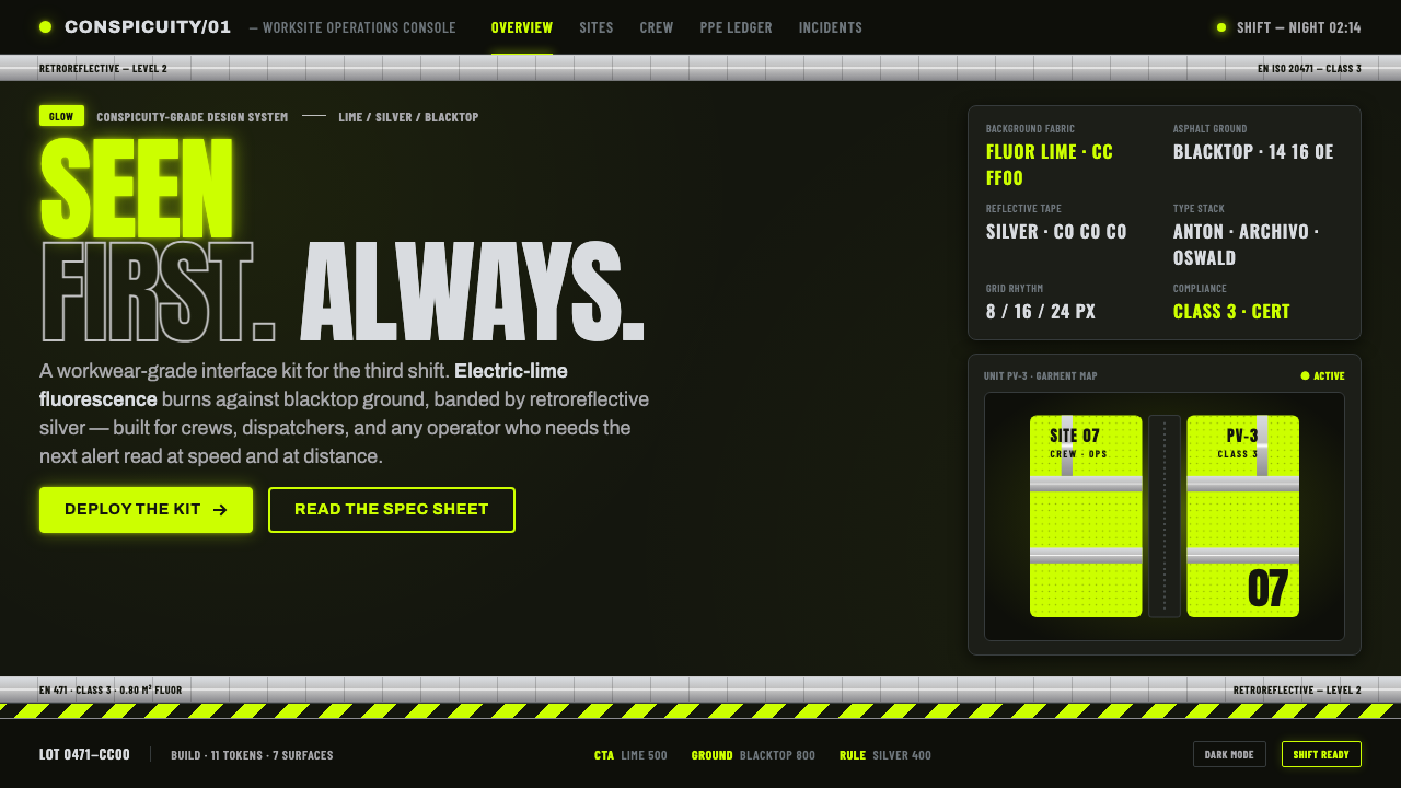 Hi-Vis Safety VestEngineered to be seen. Fluorescent lime on blacktop, silver reflective bands,…
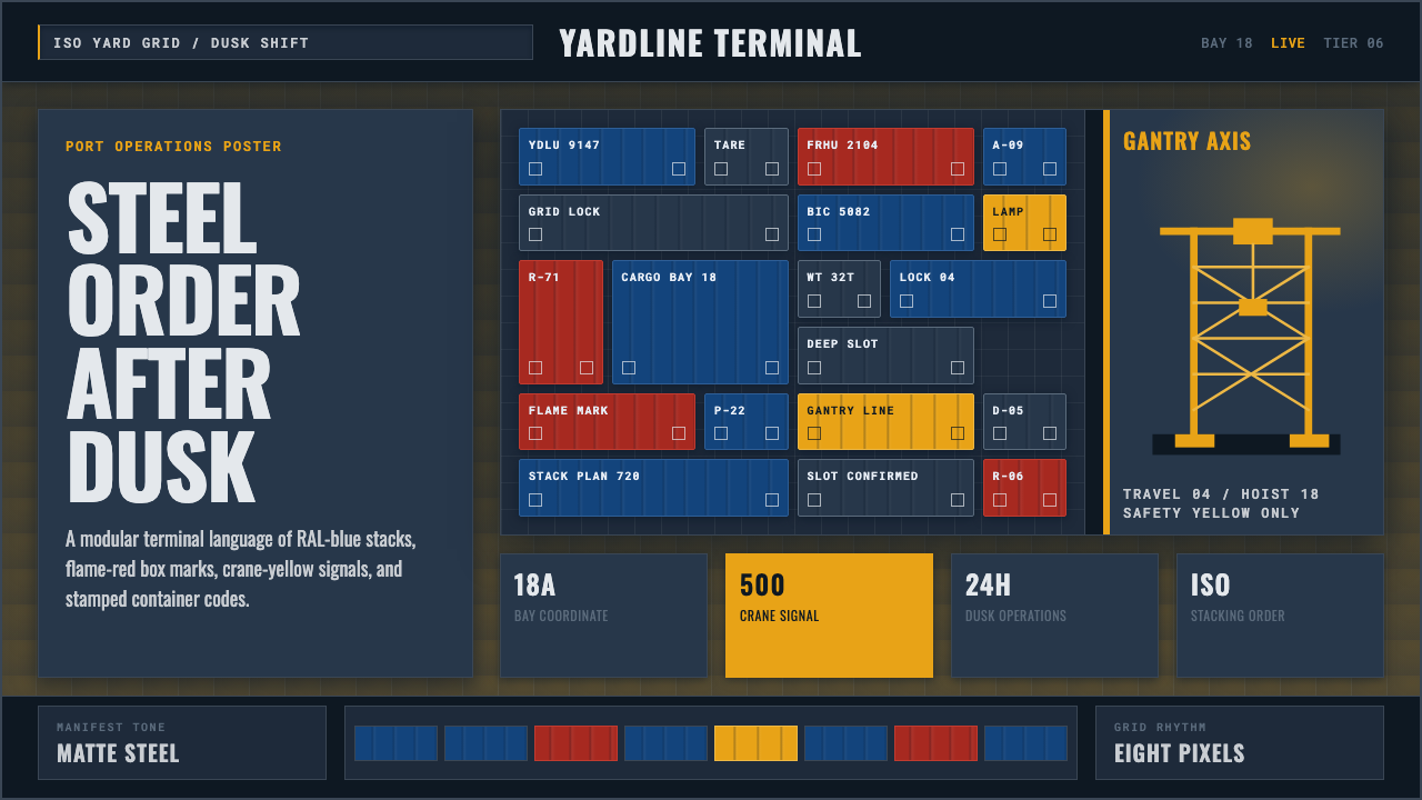 Container PortIndustrial dusk, standardized. Slate grid, RAL-blue stacks, and crane-yellow…
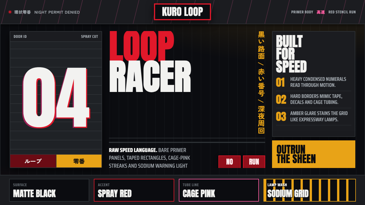 Kanjōzoku Loop RacerSpeed as contraband. Hot red numbers slice black tarmac with amber grid glare.
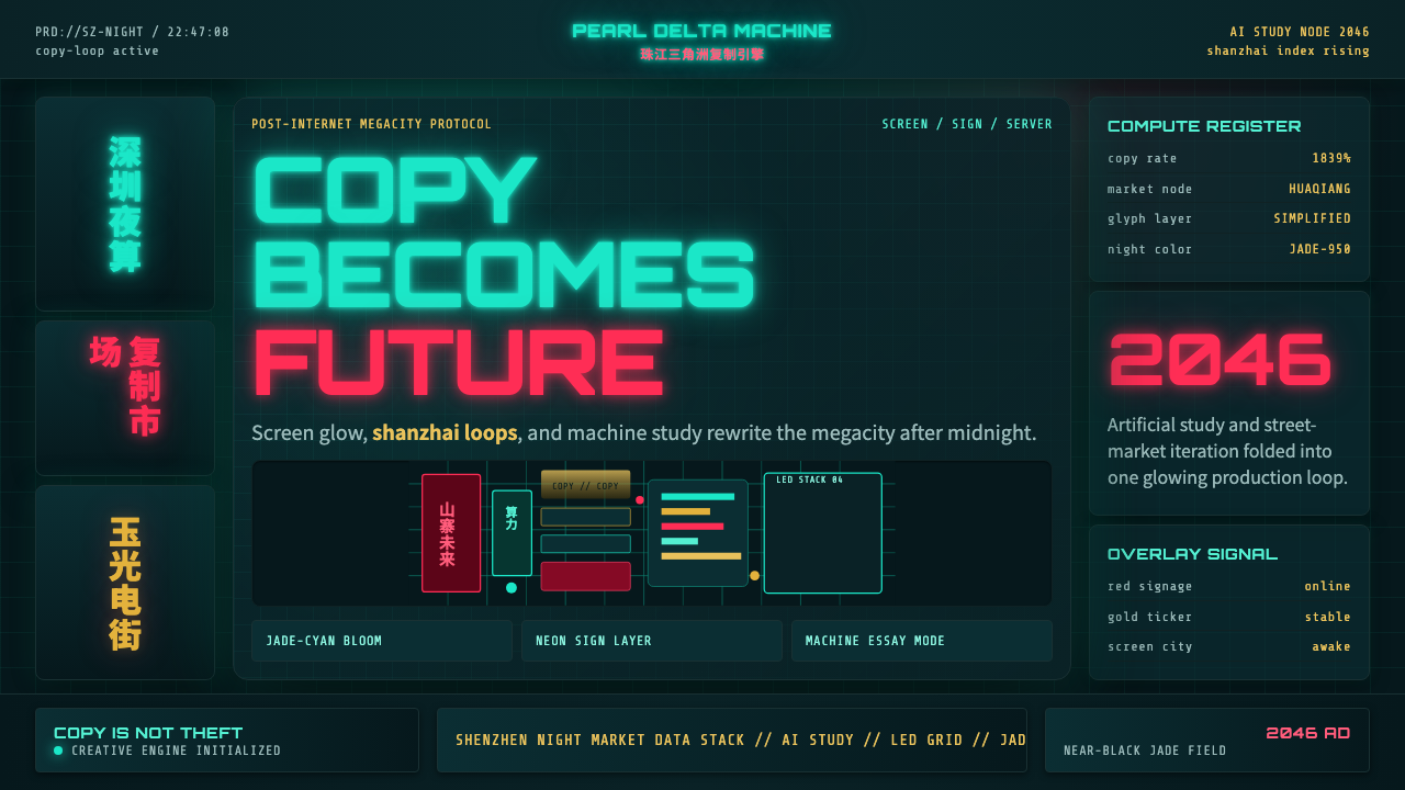 SinofuturismCopy becomes future. Jade-cyan grids, red signage, and Orbitron data stack th…