What is Liquid Chrome Y2K?
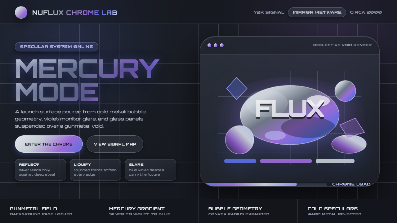
Liquid Chrome Y2K imagined the future as molten metal: reflective silver forms floating in a gunmetal void, cut by cold blue-violet glare.
Liquid Chrome Y2K in brief
Liquid Chrome Y2K captures the turn-of-the-millennium fantasy that technology would become sensual, weightless, and physically glossy. Its forms are not ordinary metallic surfaces but imagined digital mercury: bubble letterforms, rounded blob logos, and interface objects that seem soft enough to drip while remaining impossibly reflective. The style belongs to Y2K futurism, Chromecore, and the broader liquid-metal or digital-mercury aesthetic that moved across fashion, music video, web, and interface design.
Its visual logic depends on a strict environmental contrast. Chrome is legible only when it reflects darkness, so the background is a cool gunmetal field rather than cream, white, or flat neutral gray. Against that reflective void, silver bodies carry sliding gradients and blue-violet specular highlights. The result is sleek but not sterile: the surface appears wet, inflated, and slightly unstable, as though the screen were displaying a material that had not yet finished becoming solid.

Where does Liquid Chrome Y2K come from?
The style emerged around the Y2K and turn-of-the-millennium futurist moment, when global visual culture repeatedly imagined the near future through polished surfaces, synthetic materials, and technological spectacle. Its source field was deliberately broad. Fashion supplied the reflective drama, music videos supplied the sense of motion and transformation, and web and interface design translated the same fantasy into logos, buttons, panels, and screens.
Thierry Mugler is a central reference because his runway language demonstrated how chrome could become theatrical rather than merely industrial. The comparison is not to ordinary steel or machinery but to a reflective gown: sculptural, body-conscious, cool, and capable of catching colored light as it moves. Liquid Chrome Y2K carries that same tension between hard material and soft impression, making surfaces appear molded, inflated, or in motion.
The visual movement also belongs to the wider vocabulary of Y2K futurism, Chromecore, and digital mercury. Y2K graphic designers and Y2K interface designers adapted the fantasy to communication systems, where reflective forms could function as identity, navigation, or atmosphere. The result was a design language that treated the screen as a glossy material environment rather than a neutral page.
What defines the Liquid Chrome Y2K look?
Gunmetal Environment
The background is not a passive backdrop but the condition that makes chrome visible. It should feel cool, deep, and faintly reflective, closer to a gunmetal void than to flat gray. Warm grounds, cream surfaces, and open white fields weaken the illusion because they give the metal nothing dark to mirror.
Liquid Chrome Surface
Chrome is rendered as a flowing surface rather than a fixed metallic plate. Silver gradients appear to slide across rounded forms, creating the impression that a hand has just moved over wet metal. Edges remain smooth and swollen, with no emphasis on industrial seams, brushed grain, or mechanical joints.
Blue-Violet Specular Light
The decisive highlights are cool blue-violet reflections. They cut through the silver and give the material its digital, nocturnal character. Warm gold light changes the emotional register and makes the object feel luxurious or classical; blue-violet glare keeps it synthetic, futuristic, and screen-born.
Bubble and Blob Forms
Letterforms and logos favor rounded, inflated masses. A wordmark may look cast from mercury, while a symbol may seem ready to drip from the screen. These forms are playful without becoming cartoonish because their softness is balanced by the severe darkness of the surrounding field and the precision of their reflections.
Reflective Contrast
The style organizes attention through the opposition between dark surroundings and bright, polished bodies. Silver should not be spread evenly across every surface. The eye needs passages of darkness, sudden glare, and shifting tonal bands to read the object as reflective rather than merely gray or white.
Slick Interface Atmosphere
When applied to interfaces, the chrome treatment turns navigation and controls into objects with surface presence. Panels, buttons, and logos should feel coated in the same reflective sheen, while the dark field keeps the system cohesive. The interface becomes an environment of polished forms rather than a collection of unrelated decorations.

Who shaped Liquid Chrome Y2K?
Mugler provides the clearest fashion reference for Liquid Chrome Y2K. His runway language connects reflective material with sculptural silhouettes, theatrical presentation, and the cool sheen of a futuristic garment. In this design vocabulary, chrome is not simply a symbol of machinery; it becomes wearable, sensual, and capable of transforming with light.
Y2K graphic designers translated turn-of-the-millennium futurism into visual identities, lettering, and promotional compositions. Their contribution lies in treating chrome as a communicative surface: a blob logo or inflated word can carry technological optimism, fashion drama, and a sense of imminent transformation at the same time.
Y2K interface designers brought the aesthetic into the screen itself. They treated controls, logos, and panels as polished objects within a dark digital environment, allowing reflection and surface sheen to become part of navigation and identity rather than merely decorative effects.
How do you use Liquid Chrome Y2K today?
For presentation slides, Liquid Chrome Y2K is strongest when the cover behaves like a dramatic object reveal: a single inflated wordmark or silver blob emerges from a gunmetal field, with blue-violet glare providing the directional focus. Content slides should keep text sparse and place it beside one dominant chrome form. Data slides can treat charts as polished objects, but the reflection must support legibility; excessive shine turns information into surface noise.
For web interfaces, the style suits dashboards, pricing pages, and futuristic product environments where technology, spectacle, and premium surface quality are part of the message. Use the dark field as the continuous environment, reserve chrome for primary objects, and let blue-violet highlights distinguish active or important areas. A pricing card should feel like a solid reflective module, not a pale panel dropped onto a dark page.
For editorial and marketing work, the aesthetic works best when the material fantasy is allowed to carry the campaign. A cover can pair a short, swollen headline with a large silver form that seems to float or melt. Interior pages should alternate dense dark atmosphere with moments of reflective emphasis, while marketing compositions can use a chrome logo, a cool glare, and a carefully controlled void to make a small number of elements feel monumental.
The common mistake is treating chrome as a silver gradient that can be placed on any background. Without the cool gunmetal environment, it becomes gray decoration; without blue-violet reflection, it loses the Y2K character; and when every element is equally glossy, no surface feels special. The style depends on hierarchy, darkness, and selective reflection as much as on the metal itself.

Liquid Chrome Y2K — FAQ
Why does Liquid Chrome Y2K require a dark background?
Chrome is understood through reflection, not through silver color alone. A dark gunmetal field gives the surface something deep to mirror, creating the alternating bands of darkness, silver, and glare that make the object feel polished. On cream, white, or flat gray, the same treatment tends to read as a generic gradient rather than liquid metal.
Why are the highlights blue-violet instead of gold?
Blue-violet glare keeps the material tied to the cool, synthetic, nocturnal character of Y2K futurism. Gold would shift the surface toward warmth, luxury, or historical metalwork. The cooler reflection makes the chrome feel digital and screen-born, while also separating it from ordinary silver objects.
Can the style use flat gray or cream as a supporting color?
They may appear in small supporting roles, but they should not replace the gunmetal environment. The defining contrast depends on a dark reflective void around the chrome. If light neutral surfaces become the dominant setting, the material loses its depth and the design begins to read as ordinary metallic decoration rather than Liquid Chrome Y2K.
How can the aesthetic remain readable when used for interface controls?
Treat chrome as a hierarchy tool rather than a coating applied to everything. Keep the dark environment stable, use reflective treatment for primary objects, and let blue-violet glare identify focus or importance. Text and controls still need clear separation from the surface; if every panel, label, and button carries the same shine, the interface loses both navigation and atmosphere.
Related design styles
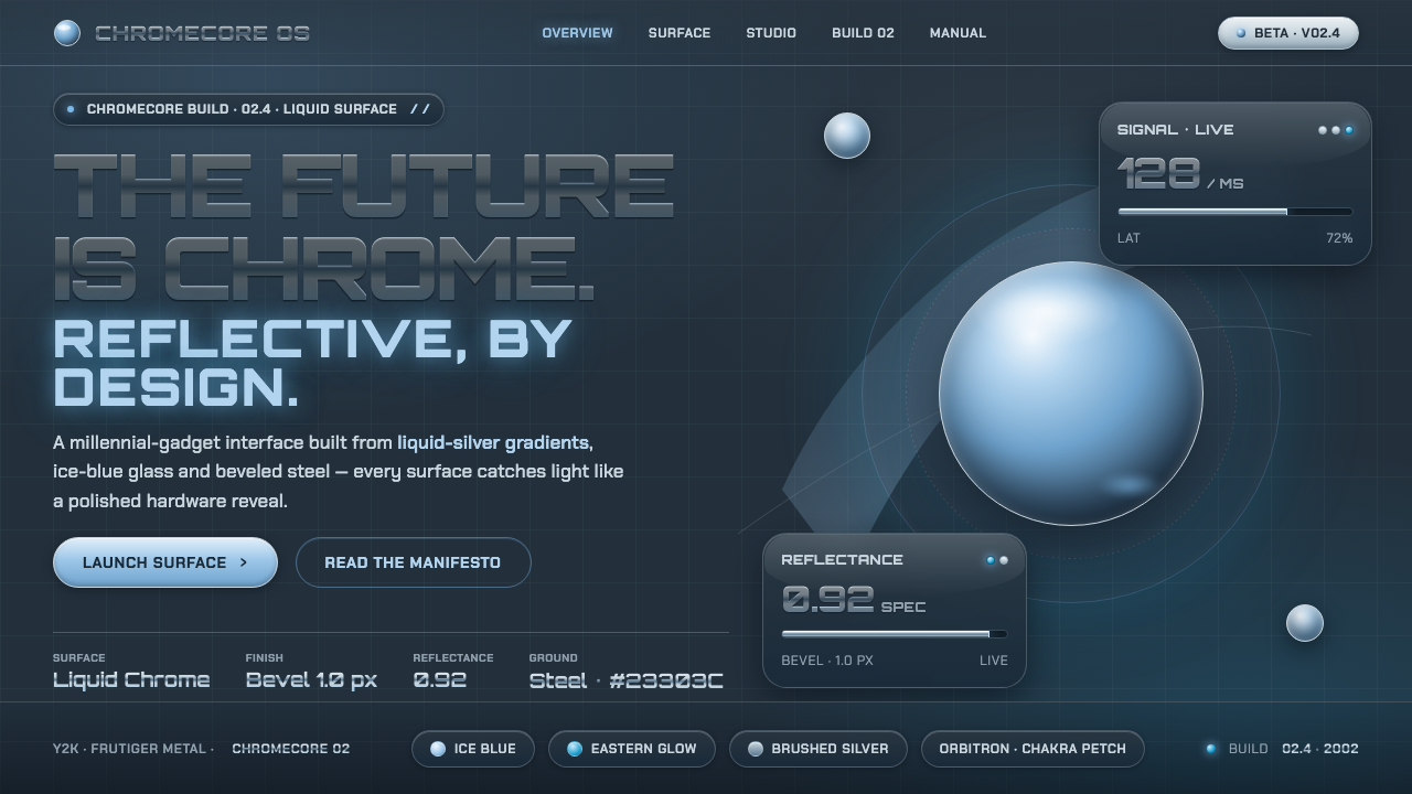 Y2K Frutiger MetalThe future is chrome. Liquid-silver gradients, ice-blue glass and beveled ste…
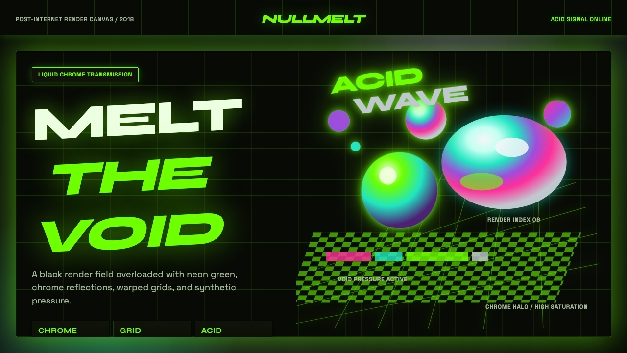 Acidwave 3D RenderPsychedelia hits the render engine. Neon green, chrome orbs, and warped grids…
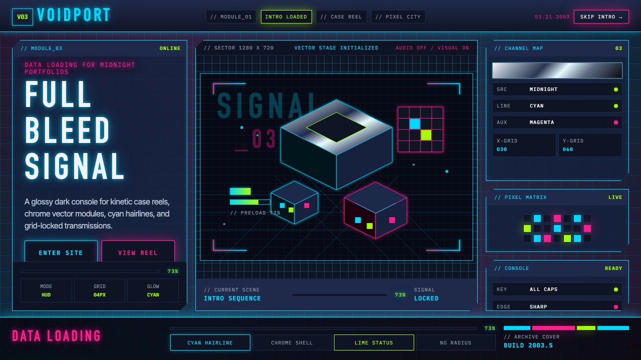 Flash Website Era (2003)A browser turned sci-fi console. Cyan HUD hairlines, chrome gradients, and 4p…
 Hyper Light DrifterBeautiful ruin glows. Dusk purple holds crimson pixels and cyan grid light.
 No Man's SkyA paperback cosmos you can enter. Orange suns, magenta haze, and Jost type fl…
 Xbox Original (2001)Not a toy. Acid green cuts matte black in a rigid grille-and-jewel hardware p…