What is Y2K Frutiger Metal?
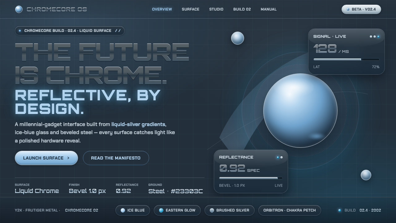
Y2K Frutiger Metal imagines tomorrow as a polished machine: liquid chrome, ice-blue glass, and beveled steel glowing against a deep technical dark.
Y2K Frutiger Metal in brief
Y2K Frutiger Metal is the Chromecore branch of turn-of-millennium futurism, active roughly from 1998 to 2004. Its visual language is built from polished liquid-chrome surfaces, brushed silver, ice-blue glass, mirror-finish highlights, and the bevels associated with millennial consumer electronics. It treats the interface, logo, and product shell as parts of one optimistic technological environment: every surface is expected to catch light, curve into space, or suggest precision manufacturing.
The style is distinct from the green, nature-oriented Aero side of Frutiger aesthetics. Where the latter imagines technology as airy, ecological, and integrated with water, grass, or open sky, Y2K Frutiger Metal turns toward hardware. Its future is steel-blue, reflective, and deliberately synthetic. Bubbles, liquid-silver swooshes, chrome wordmarks, and glossy transparent panels create a world in which computation feels tangible, clean, and exciting rather than invisible.
At its center is a particular reading of shine. White is rarely simply white: placed on a dark steel-blue ground, it becomes a reflected highlight on metal or glass. Silver is not a neutral fill but a shifting material, moving from bright polish to brushed depth. Blue is not merely decorative either; it produces the cold electric sheen that makes a panel feel glazed, illuminated, or newly manufactured. The result is an aesthetic of optimistic techno-display, where the future announces itself through surface.
Where does Y2K Frutiger Metal come from?
Y2K Frutiger Metal emerged within the wider Y2K and turn-of-millennium futurist atmosphere of roughly 1998 to 2004. It was global and internet-facing, but especially legible in Western consumer-technology branding and product design. At a moment when digital products were becoming everyday possessions, futurism no longer belonged only to films or industrial prototypes. It appeared in the visible skin of gadgets, operating systems, web graphics, and brand identities.
The style grew from a shared fascination with materials that implied advanced manufacturing. Polished chrome suggested a seamless, high-spec future; brushed silver made the same future feel engineered and usable; icy blue glass supplied clarity, coolness, and electronic energy. These were not isolated decorative choices. Together they translated the physical appeal of millennial hardware into screens and graphic systems, allowing a web page or logo to feel like part of a glossy device ecosystem.
Chrome-wordmark brand studios and early-2000s gadget industrial designers helped establish this vocabulary across products and communications. Their work made metallic lettering, reflective edges, beveled forms, and liquid-silver gestures familiar signs of technical confidence. The visual promise was direct: technology could be powerful without appearing severe, because shine, curvature, and translucent blue light made it feel inviting.
Glossy interface work associated with Windows XP and Mac Aqua reinforced the same public expectation. Their UI teams gave digital controls an apparently physical presence through rounded forms, glass-like sheen, bright highlights, and layered depth. Y2K Frutiger Metal belongs to that broader bubble-gradient web aesthetic, but its emphasis remains firmly metallic. It is the chrome-and-steel expression of early-2000s optimism, rather than a later return to flatness or the greener, nature-inflected Frutiger variant.
What defines the Y2K Frutiger Metal look?
Dark Steel-Blue Ground
The base is a deep steel-blue darkness rather than plain black. This matters because it gives pale marks a material role: highlights read as reflections sliding over metal and glass, not as flat white graphics pasted onto a background. The ground creates contrast while preserving a cold, engineered atmosphere.
Liquid Chrome and Brushed Silver
Chrome is rendered as a changing surface, with bright bands, darker troughs, and sharply reflective edges that imply a mirror finish. Brushed silver provides a more controlled counterpart: still metallic, but less liquid and more mechanical. Alternating the two prevents the composition from becoming a single undifferentiated field of shine.
Ice-Blue Glass
Ice-electric blue gives transparent or translucent forms their technological charge. It appears as a glassy sheen over panels, bubbles, controls, and highlights, suggesting cool illumination beneath a polished surface. The blue should feel crisp and artificial, closer to a lit gadget display than to water or sky.
Bevels and Specular Highlights
Beveled edges make interfaces and graphic objects appear machined, raised, or inset. Their value is not merely depth but controlled attention: a highlight along an upper edge and a darker lower edge tells the eye where a control begins and ends. Specular glints add moments of polished precision, especially on metallic marks and curved forms.
Bubbles and Liquid Swooshes
Rounded bubbles and flowing silver swooshes soften the severity of steel. They introduce buoyancy, motion, and a lightly playful optimism without leaving the technological world of the style. A bubble is not botanical decoration here; it is a glossy volume. A swoosh is not handwritten flourish; it is a stream of reflective material moving through the interface.
Chrome Typography and Glossy UI
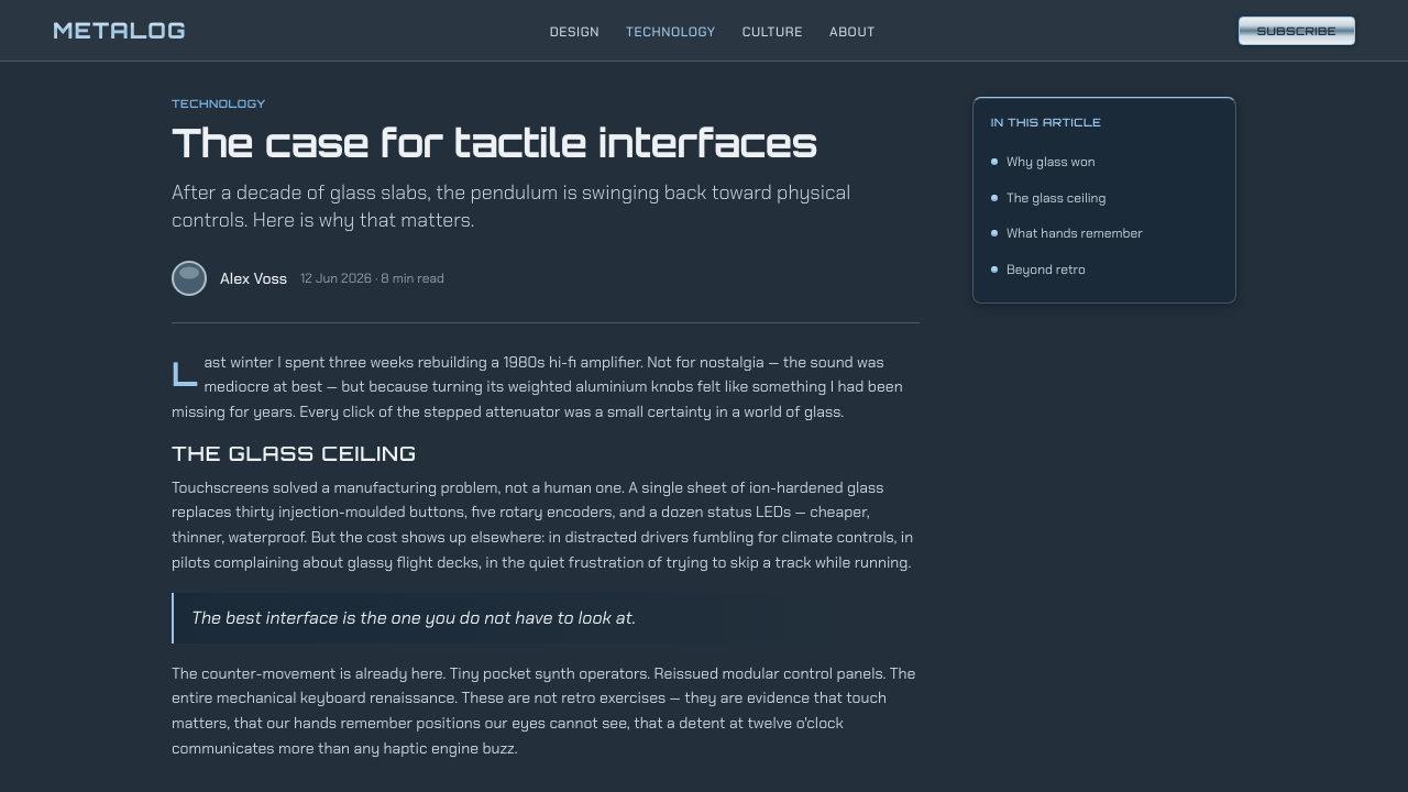
Wordmarks and headings can behave like formed objects rather than neutral text. Chrome treatment, bevel-gradient web graphics, and reflective contours make a title feel stamped into a futuristic product surface. In interface work, this logic favors controls that visibly differentiate their states through surface, edge, shine, and glass-like layering instead of relying on bare flat blocks.
Who shaped Y2K Frutiger Metal?
Early-2000s gadget industrial designers are a defining collective figure for this style. Their product surfaces made polished metal, brushed silver, dark technical grounds, and cold blue illumination feel appropriate for everyday technology. Y2K Frutiger Metal carries that industrial-design sensibility into graphic and interface work, treating screen elements as if they belonged to the same manufactured object.
Chrome-wordmark brand studios established the promotional face of the aesthetic. By giving lettering a metallic body, mirrored edge, and bevel-gradient presence, they made the name of a product feel like a technical object in its own right. Their contribution is central to the style's confidence: the future is not described in copy alone, but embodied in the mark that introduces it.
The glossy-UI teams associated with Windows XP and Mac Aqua are important reference points because they made shine, rounded volume, and glass-like controls familiar at a system scale. Their interfaces demonstrated how an optimistic hardware-inspired material language could organize everyday interaction, from prominent panels to small controls, without abandoning legibility.
How do you use Y2K Frutiger Metal today?
Y2K Frutiger Metal works best when a design needs to present technology as exciting, visible, and materially desirable. It is not a neutral utility style. Its gradients, reflective surfaces, and bevels are carrying a narrative: the product belongs to a future of polished devices and friendly machine intelligence. Use the material system consistently so shine reads as intentional structure rather than an assortment of isolated effects.
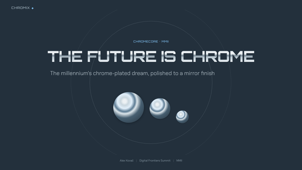
For presentation slides, make the cover feel like a product reveal. A dark steel-blue field can hold a chrome title, an ice-blue glass form, or a liquid-silver sweep that establishes movement across the composition. Content slides need a calmer version of the same language: place readable text on stable dark panels, use metallic dividers or restrained highlights to establish hierarchy, and allow one glossy object to anchor a section. Data slides can turn charts into technical display objects, with silver structure and ice-blue emphasis making values feel precise without obscuring them.
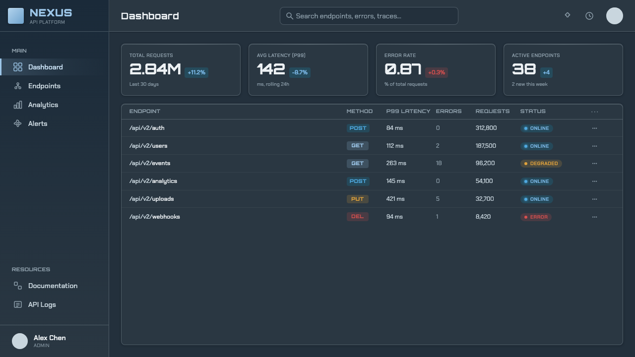
For web interfaces, the style is strongest in dashboards, product launch pages, media players, technology communities, and pricing experiences that benefit from aspirational hardware energy. Use dark grounds to support reflective cards and glass-like modules; let important actions gain prominence through controlled sheen and beveled edges. Navigation, data, and long-form content still need dependable contrast and clear grouping. A convincing metallic environment should make scanning easier, not force users to decode every glossy surface.
For editorial and marketing work, use the style to frame releases, feature announcements, event pages, and product stories as artifacts from a confident near future. Chrome wordmarks and liquid-silver sweeps are especially useful for hero moments, while icy glass callouts can hold specifications, quotations, or feature summaries. Keep the body of the page comparatively quiet so that the strongest reflective gestures retain their impact. The style is most persuasive when the material drama gives information a stage rather than competing with it.
The common mistake is to confuse maximum gloss with coherent Y2K Frutiger Metal. If every panel, word, icon, and border carries the same intense reflection, the hierarchy collapses and the design becomes visually greasy rather than futuristic. Do not mix in green nature-Aero motifs merely because both styles are associated with Frutiger aesthetics. Commit to the metal branch: dark steel-blue space, icy electronic blue, silver surfaces, and a small number of deliberately placed glossy focal points.
Y2K Frutiger Metal — FAQ
Is Y2K Frutiger Metal the same as the green Frutiger Aero look?
No. They share a broad early-2000s optimism and a taste for glossy digital surfaces, but their imagined environments differ. The metal branch centers polished chrome, brushed silver, ice-blue glass, dark steel-blue space, and gadget-like precision. The nature-Aero variant is associated with green, airy, ecological imagery. Mixing them indiscriminately weakens the specific hardware-forward identity of Y2K Frutiger Metal.
Why does this style need a dark steel-blue background?
The dark ground changes the meaning of light elements. Bright bands and pale edges become reflections on chrome or glass rather than plain white decoration. It also gives silver and ice-blue surfaces enough surrounding depth to feel luminous. A lighter ground can work for individual metallic objects, but it usually reduces the dramatic contrast that makes the Chromecore branch recognizable.
Can the style support information-heavy dashboards?
Yes, provided material effects serve hierarchy rather than replace it. Keep data regions stable and readable, reserve strong reflection for primary controls or section anchors, and use silver structure with ice-blue emphasis to guide attention. The dashboard should still behave like a dashboard: users must be able to compare values, identify groups, and act quickly. Gloss should establish a technological atmosphere around the information, not blur the information itself.
What makes a chrome treatment feel convincing rather than decorative?
Convincing chrome behaves like material. It has a reason for its highlights, darker passages, reflective edges, and surrounding contrast. Pair it with beveled form, brushed-silver structure, or a dark ground that lets the reflection read clearly. Decorative chrome is usually applied uniformly without changing the object's role or hierarchy. In this style, shine works when it helps an element feel formed, surfaced, and deliberately placed.
Related design styles
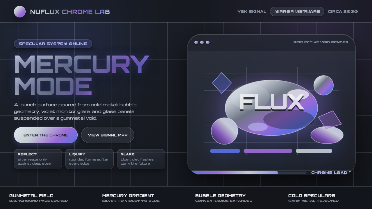 Liquid Chrome Y2KChrome needs darkness. Gunmetal voids make silver blobs and blue-violet glare…
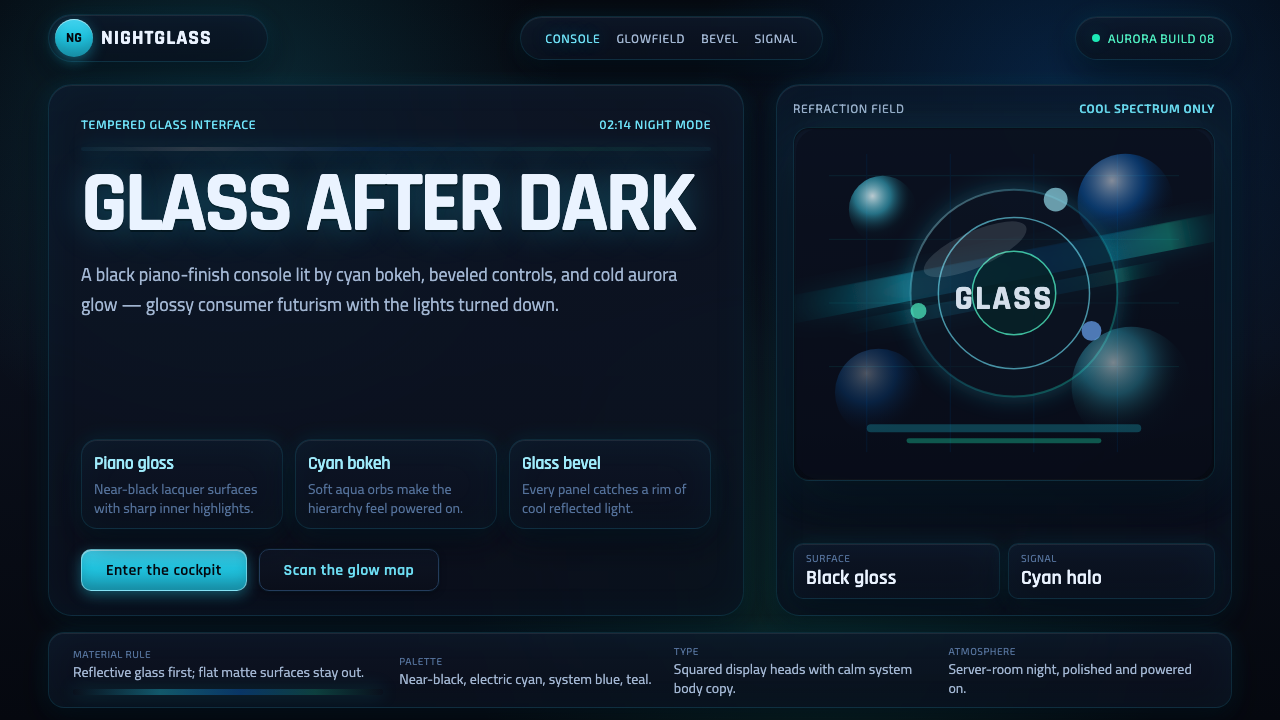 Dark AeroGlass glows after dark. Black lacquer, cyan bokeh, and beveled panels turn Ae…
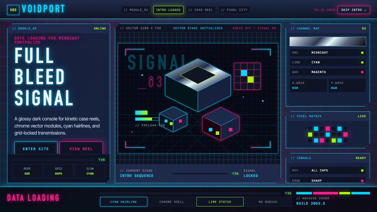 Flash Website Era (2003)A browser turned sci-fi console. Cyan HUD hairlines, chrome gradients, and 4p…
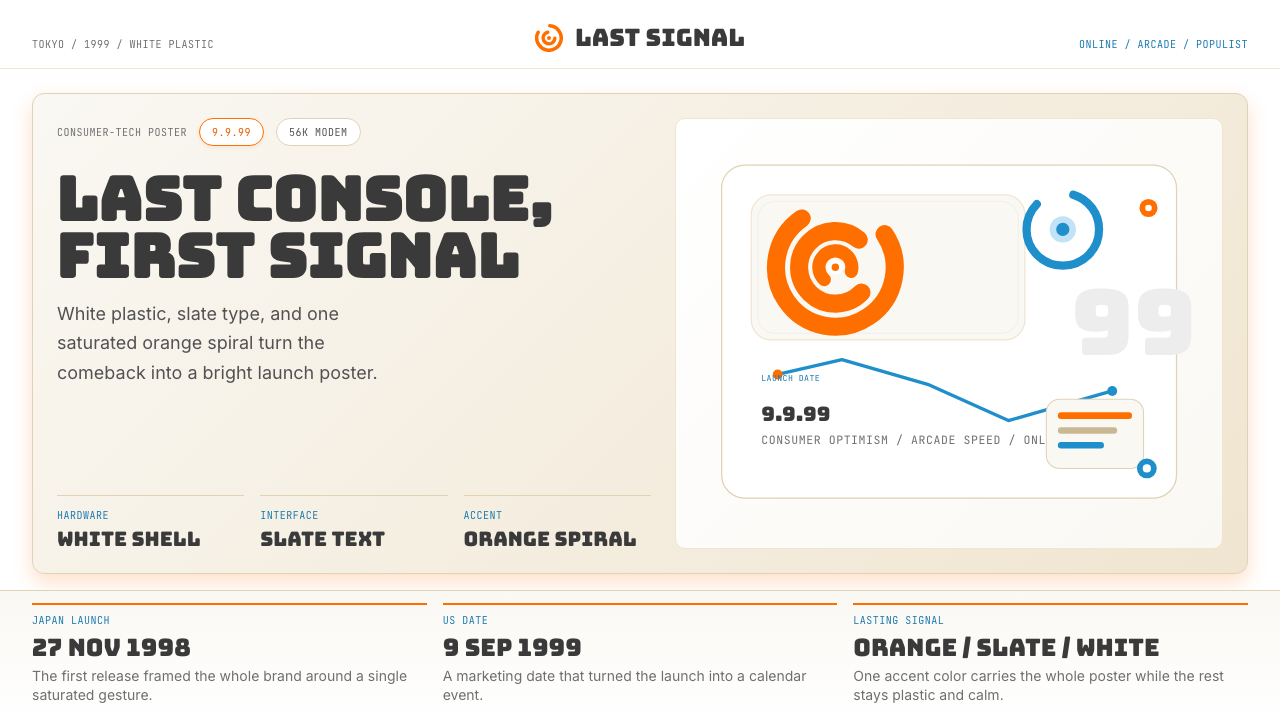 Sega Dreamcast (1999)Last-console cool. White plastic, slate type, and one orange spiral.
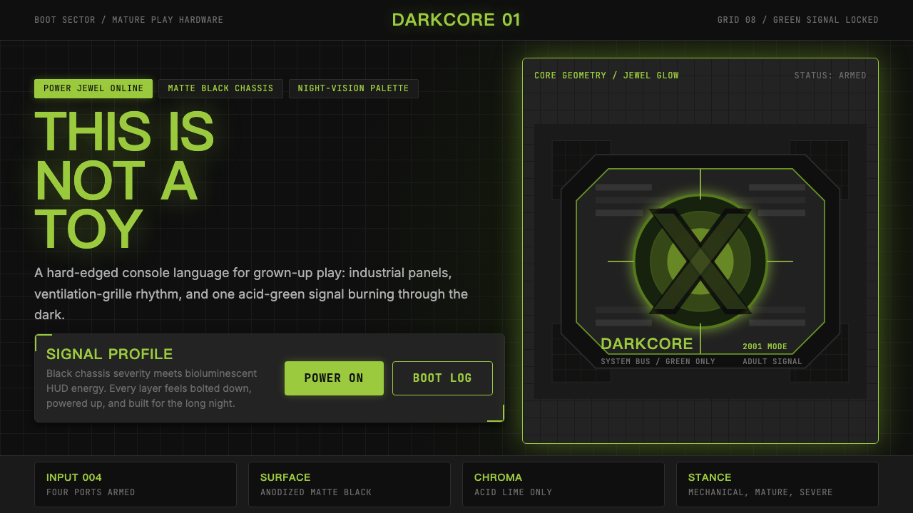 Xbox Original (2001)Not a toy. Acid green cuts matte black in a rigid grille-and-jewel hardware p…
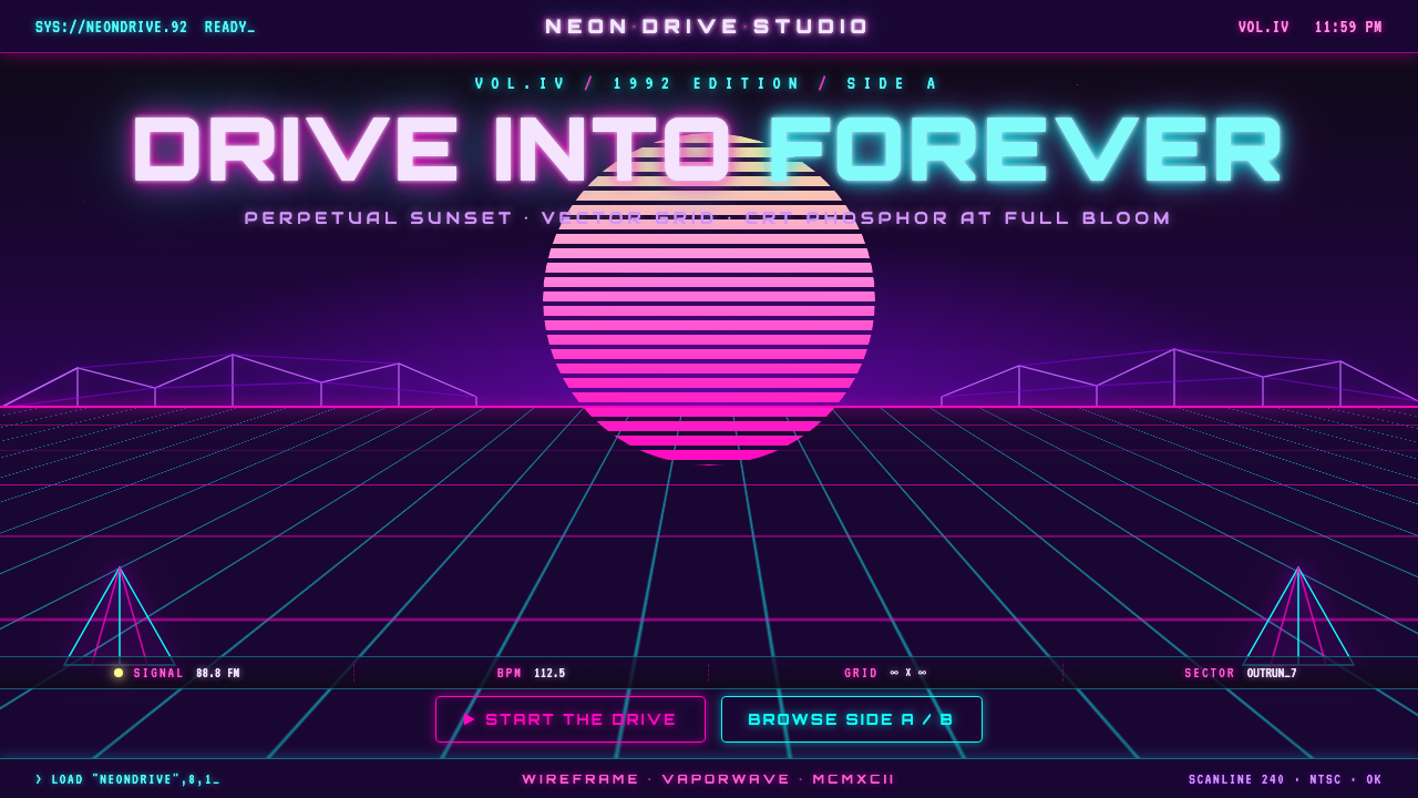 Wireframe VaporwaveDrive into forever. Magenta-cyan grid races to a vanishing point under a stri…