What is Dark Aero?
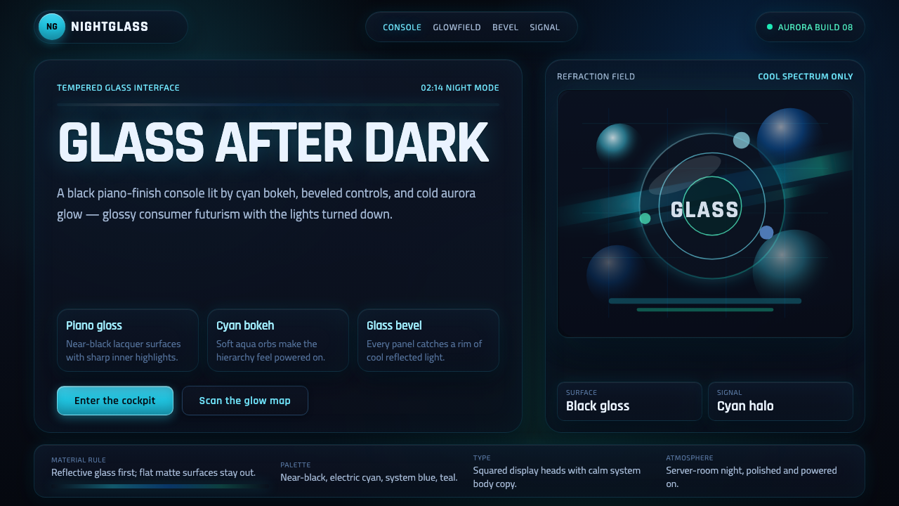
Dark Aero turns the glassy optimism of the Windows Vista and Windows 7 era toward midnight: black lacquer, cyan bokeh, beveled panels, and reflected light glowing against a near-black ground.
Dark Aero in brief
Dark Aero is a nocturnal strain of Frutiger Aero built from the visual language of Windows Vista and Windows 7. It keeps the movement’s translucent panels, glossy surfaces, aqua bokeh, aurora ribbons, water droplets, and light-catching reflections, but replaces the bright sky-like ground with black piano-finish darkness.
The result is not a rejection of Aero’s optimism. It is that optimism after sunset. Glass still suggests openness and technological possibility; rounded highlights still make interfaces feel tactile; bubbles and lens flares still imply energy in motion. The black ground simply gives every luminous detail more force and turns transparency into something atmospheric rather than airy.
Dark Aero is recognizable because it combines consumer technology with theatrical illumination. Its natural references are not daylight landscapes but a server room at night, a gaming rig viewed through tempered glass, or a console dashboard glowing in a dark room. Gloss, bevels, and reflection remain structural parts of the language, not optional decoration.

Where does Dark Aero come from?
Dark Aero belongs to the broader Frutiger Aero and glossy skeuomorphic glass tradition associated with global consumer operating systems and product design. Its historical setting is the Windows Vista and Windows 7 Aero era, circa 2007–2012, when translucent surfaces, illuminated edges, and optimistic technological imagery formed a recognizable public language for digital products.
The original Aero mood was bright, open, and sky-oriented. Its visual vocabulary depended on glass that seemed to catch daylight, soft aqua color, rounded transparency, bokeh, aurora-like ribbons, and droplets that made a digital surface feel connected to air and water. These details translated software into a friendly consumer object: polished, legible, tactile, and visibly high-tech.
Dark Aero changes the emotional stage rather than discarding the vocabulary. The bright ground becomes black lacquer, the surrounding atmosphere becomes nocturnal, and cyan or blue light takes the role once played by open sky. The shift makes bevels more apparent, gives reflections a sharper presence, and turns translucent panels into illuminated objects set against darkness.
The strain persists through the Frutiger Aero revival community, active from 2020 to the present. In that revival, Dark Aero reads as a continuation rather than a historical reconstruction: it preserves the glossy optimism and skeuomorphic confidence of the earlier language while adapting its atmosphere to gaming hardware, console interfaces, dashboards, and other products that naturally operate in dark environments.
What defines the Dark Aero look?
Black Glass Ground
The defining move is the near-black, piano-finish ground. It should feel reflective and lacquered rather than flat or dead, creating a deep stage for cyan and blue illumination. Darkness is not merely a background color; it is the contrast field that makes every translucent surface, rim light, and reflected highlight visibly active.
Translucent Panels
Panels appear like smoked or illuminated glass: layered, slightly see-through, and separated from the ground by bevels or reflected edges. Transparency should reveal atmosphere without making the interface vague. The strongest panels feel like solid objects with light passing through them, combining tactile presence with visual depth.
Cyan and Blue Glow
Cyan and blue carry the luminous identity of the style. They belong around edges, droplets, bokeh, active surfaces, and reflected highlights rather than covering everything equally. The light should feel concentrated and intentional, with darker regions preserving the sense that the glow is emerging from within a nocturnal environment.
Beveled Depth
Bevels are essential because they explain how the glossy surfaces catch light. A panel edge can brighten, darken, or reflect the surrounding blue atmosphere, making a flat interface read as a designed object. The bevel is not ornamental framing; it is the visual evidence that gives the glass its thickness.
Bokeh and Water Detail
Bokeh, droplets, and rounded highlights connect Dark Aero to its Frutiger Aero lineage. These details soften the technological darkness with signs of atmosphere and fluidity. They work best as selective accents: enough to suggest a living luminous environment, never so many that the interface becomes a field of unrelated sparkling objects.
Aurora Motion
Aurora ribbons introduce movement without abandoning the glass metaphor. Their forms should feel luminous, layered, and fluid, as if colored light were sliding across a polished surface. Motion belongs to the atmosphere and the reflections; the underlying panels should remain calm enough that hierarchy and interaction are still immediately readable.

Who shaped Dark Aero?
The Microsoft Aero design team represents the Windows Vista and Windows 7 source language from which Dark Aero borrows its translucent panels, glossy surfaces, illuminated edges, and optimistic consumer-technology atmosphere. The contribution is a recognizable visual foundation rather than a single authored motif.
The Frutiger Aero revival community keeps the broader language active from 2020 to the present. Dark Aero belongs to this continuing reinterpretation, where the earlier glassy optimism is carried into darker product contexts while remaining visibly connected to its original atmosphere.
Windows Vista Aero is one of the defining historical references for the style. Its role here is not as a separate visual system but as part of the bright, translucent Aero era whose surfaces and light effects Dark Aero places against black lacquer.
The Dark Aero strain is the nocturnal extension of Frutiger Aero and glossy skeuomorphic glass. Its defining contribution is the atmospheric inversion: the same glassy optimism, reframed through near-black reflection, cyan glow, and night-time depth.
How do you use Dark Aero today?
For presentation slides, Dark Aero is strongest on covers that establish a single luminous scene: a near-black ground, a large translucent panel, and a controlled cyan or blue glow that appears to come from within the composition. Content slides should keep the glass language calmer, using beveled panels to group information and reserving bokeh, droplets, or aurora ribbons for moments that need emphasis.
Data slides should make the data feel illuminated rather than decorated. Charts can sit inside dark glass panels with restrained cyan or blue highlights, while reflections and glow clarify active values or important comparisons. The main discipline is contrast: luminous accents should guide attention, not compete with every label, axis, or figure.
For web interfaces, Dark Aero suits dashboards and pricing pages that want to feel technical, immersive, and product-oriented. Use the black lacquer ground as a continuous environment, distinguish panels through translucency and beveled edges, and make active states glow with deliberate cyan or blue light. Pricing tiers should remain structurally clear; gloss should support hierarchy rather than obscure the differences between options.
For editorial and marketing work, the style creates a strong contrast between darkness and luminous product imagery. Feature sections can place a reflective object or interface inside a glass panel, while copy remains concise and sharply separated from the atmospheric background. Marketing pages benefit from a consistent light source: reflections, droplets, and lens flare should appear to belong to the same night environment.
The common mistake is treating Dark Aero as a black interface covered with random neon effects. Too much glow destroys depth, too many bokeh elements turn the surface into visual noise, and flat panels weaken the glass metaphor. The style works when darkness, transparency, bevel, and illumination form one coherent material story.

Dark Aero — FAQ
Is Dark Aero simply dark mode for classic Aero?
Not exactly. Dark Aero keeps the glass, gloss, bevels, bokeh, droplets, aurora ribbons, and optimistic consumer-technology attitude of classic Aero, but changes the surrounding atmosphere. The near-black piano-finish ground makes the style feel nocturnal, reflective, and more concentrated. It is better understood as an atmospheric strain of Frutiger Aero than as a simple inversion of a light interface.
Why does the black ground matter so much?
The black ground supplies the contrast that allows cyan and blue light to behave as material evidence. On a bright ground, the same glow can feel airy and decorative; against black lacquer, it explains the edge of a panel, the curvature of a droplet, or the reflection on a glass surface. Darkness therefore acts as a structural condition, not merely a mood choice.
Can Dark Aero remain readable when it uses transparency and glow?
Yes, if transparency is used to establish layers rather than to weaken them. Panels need clear edges, a stable dark field behind important information, and a limited luminous accent that signals interaction or emphasis. Bokeh, droplets, and aurora forms should stay atmospheric. When every surface glows equally, the material language loses hierarchy and the interface becomes difficult to scan.
Is Dark Aero limited to gaming and hardware interfaces?
No. Gaming rigs, console dashboards, and tempered-glass hardware are especially natural contexts because their dark environments reinforce the style’s reflective logic. The same language can support dashboards, pricing pages, presentations, editorial features, and marketing work when the product benefits from a sense of immersive technology. The key is not the industry but whether gloss, transparency, and controlled illumination express the product’s intended atmosphere.
What separates convincing Dark Aero from generic neon design?
Convincing Dark Aero is organized around glass and reflection. Light explains thickness, bevels, droplets, and translucent layers; cyan and blue accents belong to a coherent night environment; black lacquer provides the depth that makes the highlights meaningful. Generic neon design often treats glow as a surface effect. Dark Aero treats glow as evidence of material, atmosphere, and hidden light.
Related design styles
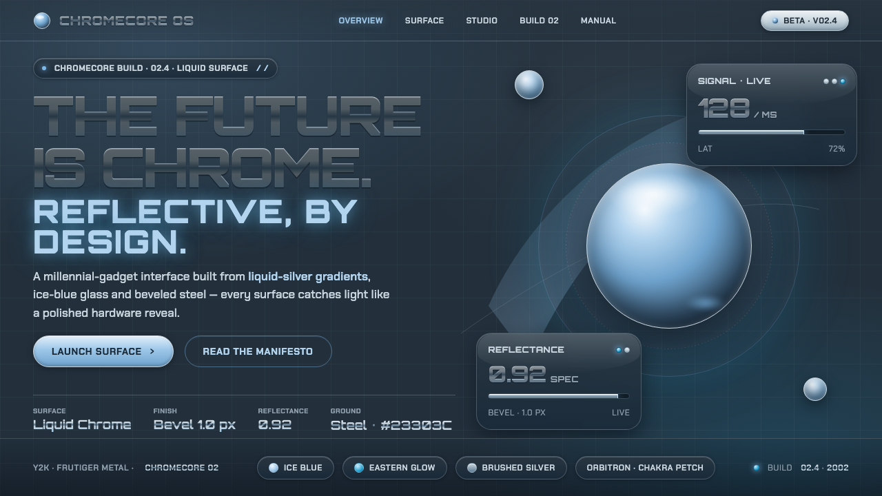 Y2K Frutiger MetalThe future is chrome. Liquid-silver gradients, ice-blue glass and beveled ste…
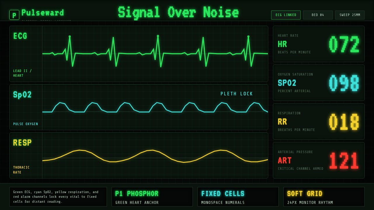 EKG Vital MonitorClinical clarity glows. Phosphor ECG green, cyan and yellow channels lock to…
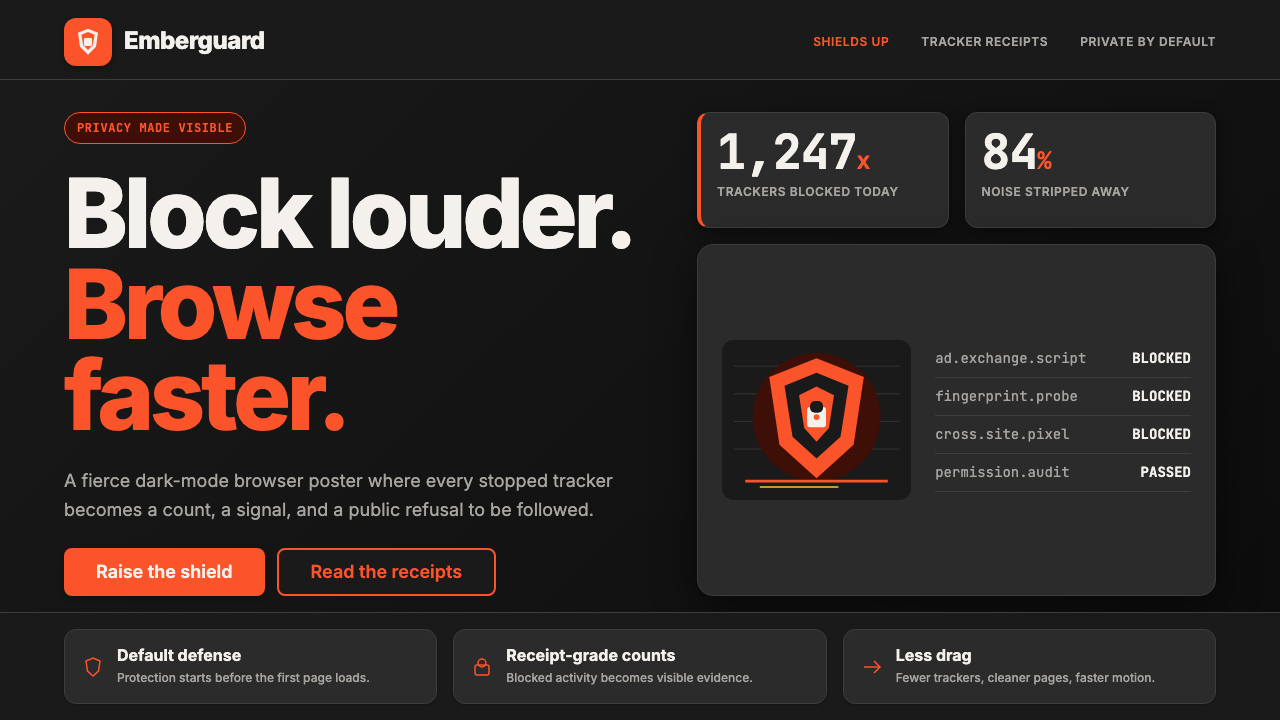 Brave Browser Lion OrangePrivacy gets loud. Lion-orange counters and shield geometry cut through warm…
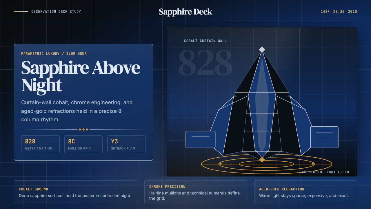 Emirati Burj Khalifa Sapphire (2010)Commanding height, controlled light. Sapphire glass, chrome grid, aged-gold g…
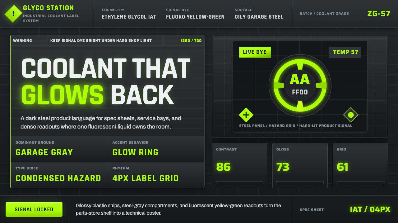 Fluorescent Antifreeze GreenCoolant becomes hazard signal. Fluoro green burns through steel-gray label gr…
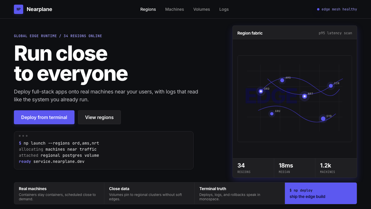 Fly.io Edge-Compute PurpleEdge-cloud with discipline. Electric purple nodes, Inter type, and terminal b…