Design style guide设计风格指南
What is Letterboxd Cinephile Orange-Green?什么是 Letterboxd Cinephile Orange-Green?
Letterboxd turned the humble film diary into a design statement — deep cinema-navy backgrounds, expressive italic serifs, and three glowing dots that rate every film on earth.Letterboxd 把朴素的观影日记变成了一种设计宣言——深邃影院深蓝为底,富有表情的斜体衬线为骨,三颗发光圆点为每一部电影打出定论。
Letterboxd Cinephile Orange-Green in briefLetterboxd Cinephile Orange-Green 速览
Letterboxd Cinephile Orange-Green is the visual language of the world's most design-conscious film community. It marries the warmth of old cinema — the amber glow of a projection booth, the tactile weight of a festival programme — with the clarity of a modern social feed. The result is a dark, immersive aesthetic that feels like browsing a beautifully typeset film festival catalogue at midnight.Letterboxd 影迷橙绿风格是全球最具设计自觉的电影社区的视觉语言。它将老电影的温度——放映室里的琥珀微光,电影节手册的纸质份量——与现代社交动态的清晰感融为一体。最终呈现的是一种深邃、沉浸式的美学:像是在午夜翻阅一本精心排版的影展图录。
The style is immediately recognizable through a handful of signature moves: deep navy grounds that recall a darkened auditorium, expressive italic serif headlines that carry personality and cinephile warmth, and those three colored rating dots — orange, green, and blue — that have become one of the most iconic micro-interaction systems on the modern web. Typography does the heavy lifting, with headline type that leans and gestures while body text stays composed and readable.这套风格通过几个标志性手法令人过目难忘:深蓝背景让人想起一间熄灯的放映厅;富有表情的斜体衬线标题带着个性与影迷的温情;以及那三颗评分圆点——橙、绿、蓝——已成为当代网络上最具辨识度的微交互系统之一。排版承担了大部分表达重量:标题字体在倾斜中带着手势感,正文则沉稳而易读。
What distinguishes this style from generic dark-mode design is its emotional register. It is not cold or austere — it is intimate and curatorial, the visual equivalent of a trusted friend recommending a film. The palette glows rather than merely sits on screen. The type feels chosen, not defaulted. Every design decision reflects a community built by people who care about cinema as much as they care about craft.这套风格与普通深色模式设计的本质区别在于它的情感基调。它不冷峻,不克制——它是亲密的,是策展式的,如同一位值得信赖的朋友在向你推荐一部电影。色板是发光的,不只是停在屏幕上。字体是被挑选过的,不是随手选的。每一个设计决定都映射出一个社区的底色:这里的人,对电影的热爱与对设计工艺的热爱同样深切。
Where does Letterboxd Cinephile Orange-Green come from?Letterboxd Cinephile Orange-Green 从何而来?
Letterboxd was founded in 2011 by Matthew Buchanan and Karl von Randow in Auckland, New Zealand. It began as a niche tool for serious cinephiles — a place to log films, write reviews, and maintain watchlists. The founding vision was modest in ambition but precise in taste: create the film equivalent of Goodreads, but designed by people who genuinely love typography and interface craft.Letterboxd 由 Matthew Buchanan 与 Karl von Randow 于 2011 年在新西兰奥克兰创立,最初是一个面向严肃影迷的小众工具——用来记录观影、撰写评论、整理片单。创立愿景朴素而精准:做电影界的 Goodreads,但由真正热爱字体与界面工艺的人来设计。
The platform's visual identity evolved alongside its growth. In the early years, the design was functional but restrained. As the community deepened — attracting critics, programmers, festival-goers, and obsessive completionists alongside casual viewers — the design language grew more expressive and self-assured. The shift to a darker, more cinematic palette reflected both the community's identity and a broader cultural moment in which dark-mode interfaces moved from accessibility option to aesthetic statement.平台的视觉身份随着成长而演变。早年设计功能性强,但相对克制。随着社区深化——吸引了影评人、策展人、影展常客、狂热的完成主义者,以及普通观众——设计语言也变得更具表现力,更加自信。向深邃影院调色板的转变,既折射出社区的身份认同,也呼应了一个更广泛的文化时刻:深色模式界面从无障碍选项演变为一种美学宣言。
Gemma Gracewood, who joined as editor in chief and later became a key cultural voice for the platform, helped articulate the editorial sensibility that the design reflects: serious but never snobbish, encyclopedic but warmly personal. The orange rating dots — which mark a film as seen — became shorthand for the entire community's ethos. By the time the platform reached twelve million users, those three colored circles had achieved something rare: they were instantly understood by anyone who cared about film.Gemma Gracewood 以主编身份加入后,成为平台最重要的文化声音之一。她帮助阐明了设计所折射的编辑感性:严肃但不自命清高,博学而带有私人温度。橙色评分圆点——标记「已观看」的标志——成为整个社区精神气质的缩影。当平台用户突破 1200 万时,那三颗彩色圆圈已经实现了某种罕见的成就:任何在意电影的人,一眼即懂。
The current visual identity, refined through roughly 2023 to 2025, represents the mature expression of a design system that grew organically from community values rather than being imposed from a brand strategy document. The italic serif headline style, the navy ground, and the glowing dot accents feel inevitable rather than designed — which is the hallmark of any identity that has found its true register.大约在 2023 至 2025 年间精炼定型的当前视觉身份,是一套从社区价值观有机生长出来的设计系统的成熟表达,而非由品牌策略文件自上而下植入的。斜体衬线标题风格、深蓝底色、发光圆点强调色——这些元素感觉是必然的,而非被设计出来的。这正是任何真正找到自己语调的品牌身份所共有的标志。
What defines the Letterboxd Cinephile Orange-Green look?Letterboxd Cinephile Orange-Green 的视觉特征是什么?
Color Palette色彩体系
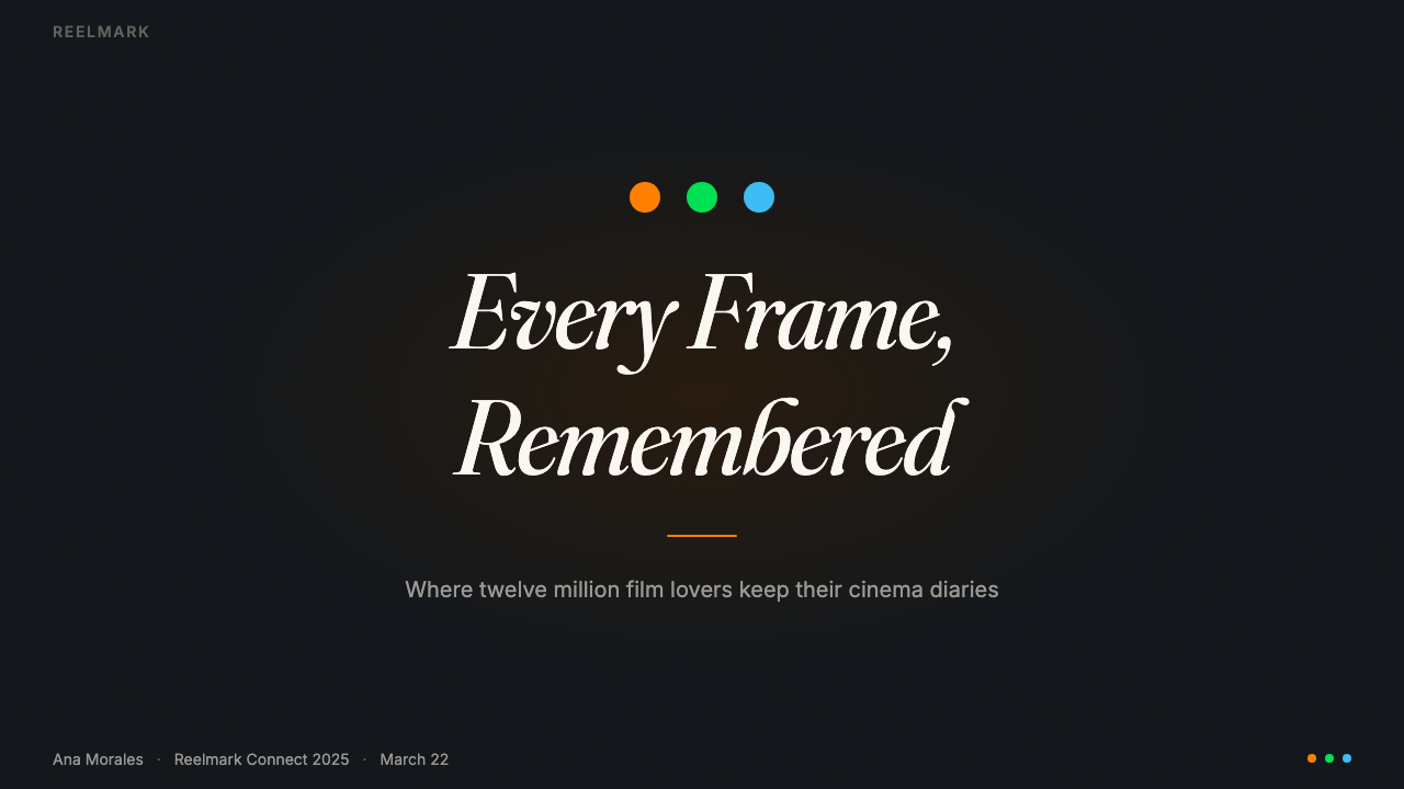
The foundation is a deep cinema-navy — not black, but the blue-inflected darkness of a theater before the lights go down. Against this ground, the signature orange-green-blue dot trio provides warm, saturated accent energy without overwhelming the negative space. Secondary interface tones are cool and muted, creating a hierarchy where the rating dots and key calls to action glow with purpose. The overall effect is cinematic warmth within a controlled, night-sky depth.底色是深邃的影院深蓝——不是纯黑,而是灯光熄灭前放映厅里那种带蓝调的暗色。在这个底面上,标志性的橙-绿-蓝三色圆点提供温暖、饱和的强调能量,却不吞没负空间。次级界面色调冷静低调,构建出层级感——评分圆点与关键行动号召在其中发光,带着目的性。整体效果是在受控的夜空深度里孕育出的影院温度。
Expressive Italic Serif富有表情的斜体衬线
Headline typography leans into italic serif letterforms — specifically the kind of high-contrast, lively serif associated with literary and editorial design traditions. The italic angle gives headlines a sense of forward motion and enthusiasm that upright type cannot convey. Fraunces, the typeface most associated with this style, has an unusual warmth for a display serif: it curves where others cut, and its optical sizes behave differently at different scales, giving the system a natural hierarchy without mechanical repetition.标题排版倾向于斜体衬线字形——具体而言,是那种与文学、编辑设计传统相关联的高对比度、充满活力的衬线字体。斜角赋予标题一种向前的冲劲与热情,这是竖直字体难以传递的。与这套风格最相关的字体 Fraunces,拥有显示衬线字体中罕见的温度:它在别人锐截的地方弯曲,其视觉字号在不同尺寸下表现各异,让设计系统获得自然的层级感,而不依赖机械性的重复。
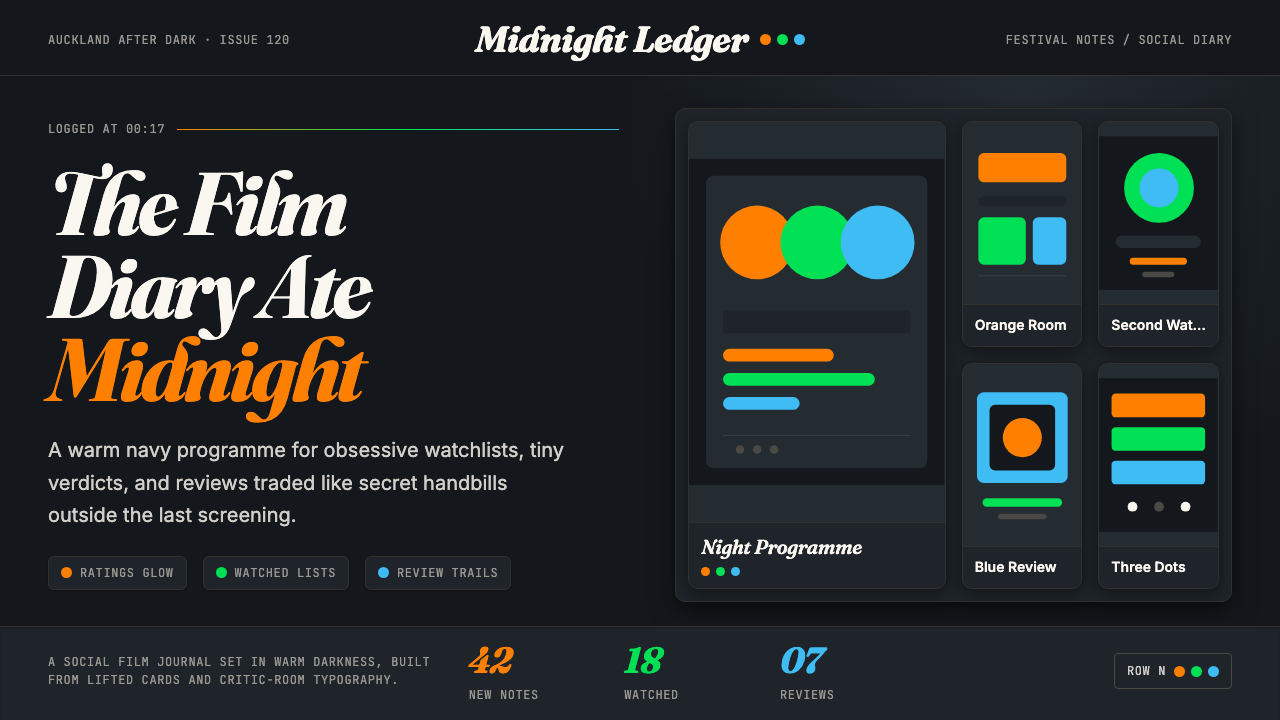
The Three-Dot Rating System三色评分圆点
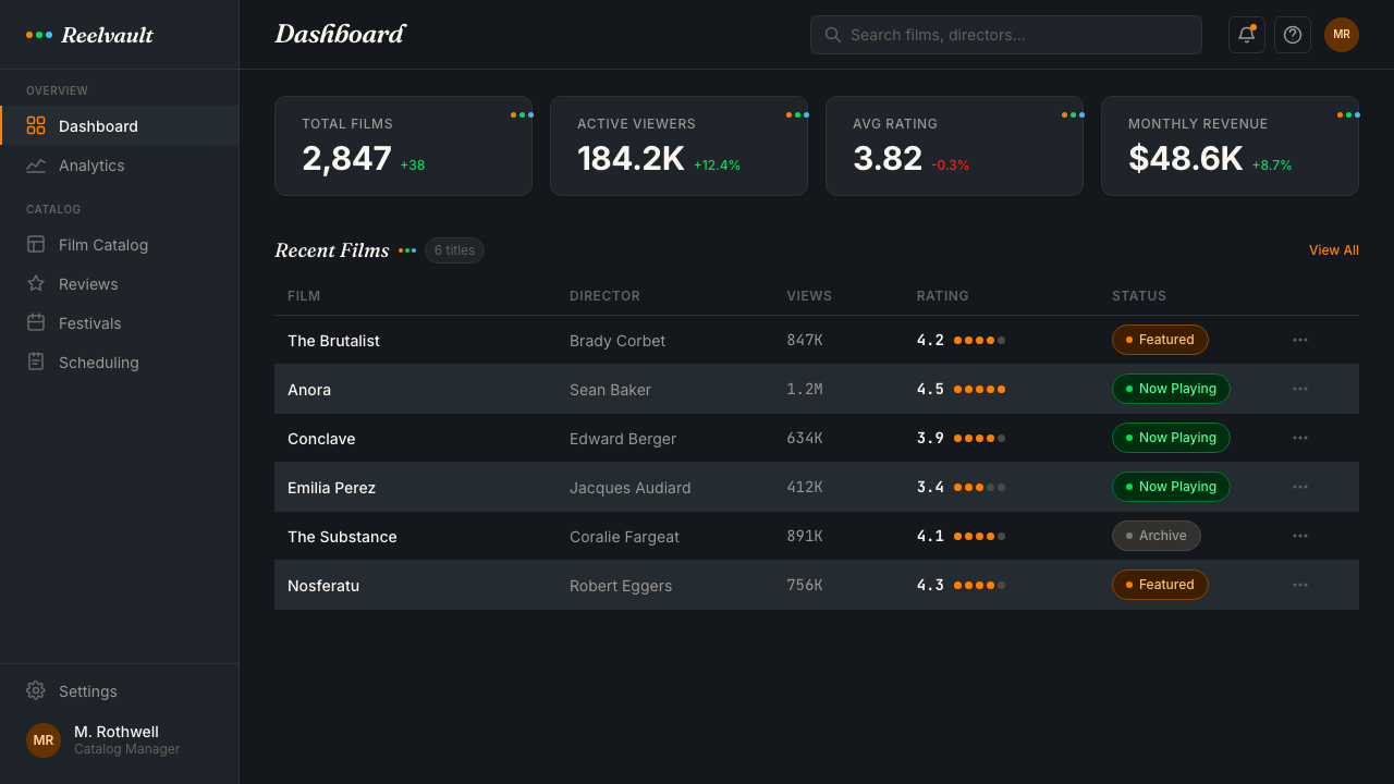
The orange, green, and blue dots — indicating whether a film has been seen, liked, or wishlisted — are the most distinctive micro-design element in the system. They are small enough to be unobtrusive in a grid of film posters but distinctive enough to be recognized at a glance. Their round form against dark grounds creates a quality of illumination, as if each dot is its own small light source. This treatment elevates what could have been a functional checkbox into a visual signature of the entire community.橙、绿、蓝三色圆点——分别标示「已看」「喜欢」「想看」——是这套系统中最具辨识度的微设计元素。它们足够小,不会在海报网格中喧宾夺主,却足够鲜明,能在一眼之间被认出。圆形在深色底面上制造出一种发光质感,仿佛每个圆点都是一个微小的光源。这种处理方式将本可只是功能性复选框的元素,升华为整个社区的视觉签名。
Film Poster Grid海报网格
The gallery grid of film posters is the primary visual rhythm of the interface. Posters arrive in all aspect ratios, colors, and eras — from silent-film one-sheets to contemporary digital art — and the design system must hold them together without homogenizing them. It does this through restraint: the navy ground, consistent card sizing, and the rating dot overlay are the only unifying elements. Each poster remains itself; the system is the frame, not the content.电影海报的画廊网格是界面最主要的视觉节奏。海报来自各种比例、色调与年代——从默片时代的单张到当代数字美术——设计系统必须在不使它们同质化的前提下把它们聚合在一起。它通过克制做到这一点:深蓝底色、统一的卡片尺寸、评分圆点覆层——这些是仅有的统一元素。每张海报保持自己的面目;系统是画框,不是内容。
Intimate Editorial Voice亲密的编辑调性
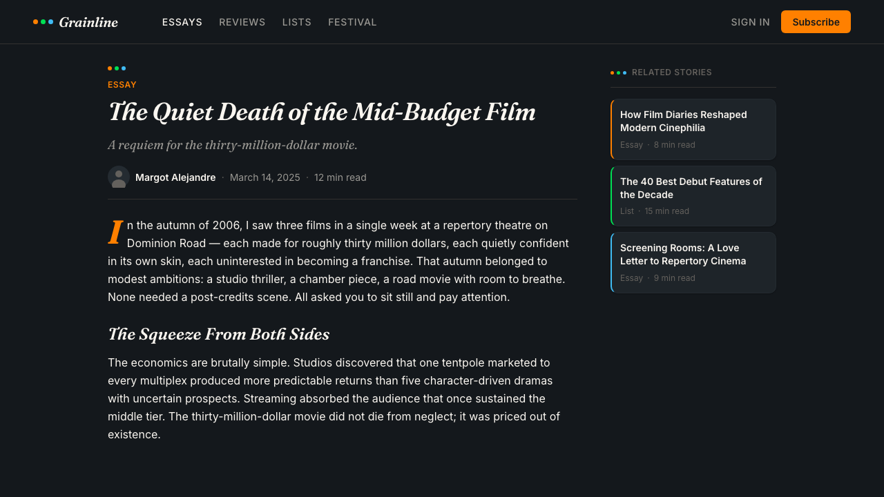
The design supports a distinctive editorial register — neither the cold objectivity of a database nor the breathless enthusiasm of consumer entertainment, but something closer to the voice of a trusted film critic writing for a specialist audience. Long-form reviews sit comfortably in wide measures with generous line spacing; short diary entries feel immediate and personal. The typography signals that words matter here — that this is a place for considered opinions, not algorithmic recommendations.这套设计支撑着一种独特的编辑腔调——既非数据库的冷静客观,也非消费娱乐的急切热情,而是更接近一位值得信赖的影评人为专业读者写作时的语气。长评在宽行宽与充裕行距下显得从容自在;短日记条目则感觉即时而私人。排版在无声地表明:文字在这里很重要——这是一个写认真意见的地方,不是一个接受算法推荐的地方。
Controlled Glow and Luminosity克制的发光感与亮度
Rather than relying on hard contrast alone, the Letterboxd visual language uses a subtle sense of luminosity — elements appear to glow softly against the dark ground, as if backlit. This is achieved through careful color saturation management: the accent colors are vivid enough to feel alive, but not so aggressive that they disrupt the overall sense of calm immersion. The effect echoes the warm halo of light around a cinema screen in a dark room.这套视觉语言不仅依赖硬对比,还运用一种微妙的发光感——元素在深色底面上似乎带着柔光,仿佛被背光点亮。这通过仔细的色彩饱和度管理来实现:强调色足够鲜活,让人感到有生命力,却不会激进到破坏整体那种沉浸式平静感。效果呼应了暗室里电影银幕周围那圈温暖的光晕。
Community and Social Texture社区感与社交质感
The design reflects the fact that Letterboxd is fundamentally social. User avatars, follower counts, and activity feeds are woven into the interface alongside the film data. The visual language accommodates both the solitary experience of logging a late-night film and the communal experience of seeing what friends are watching. This dual register — intimate yet networked — shapes decisions about spacing, card density, and the treatment of user-generated content alongside editorial material.设计反映了 Letterboxd 本质上是社交性的这一事实。用户头像、关注数量、动态流与电影数据交织在界面中。视觉语言同时容纳了独自记录深夜观影的体验,以及看见朋友在看什么的社群体验。这种双重基调——亲密而互联——塑造了关于间距、卡片密度,以及用户生成内容与编辑内容并置处理方式的每一个设计决定。
Who shaped Letterboxd Cinephile Orange-Green?谁塑造了 Letterboxd Cinephile Orange-Green?
Buchanan co-founded Letterboxd in Auckland in 2011 and shaped its early product and design sensibility. His background in web design and interface craft established the principle that a film diary should be as pleasurable to look at as the films it catalogues. The emphasis on typographic quality and considered visual detail that defines the platform traces back to his founding influence.Buchanan 于 2011 年在奥克兰联合创立 Letterboxd,奠定了平台早期的产品与设计感性。他在网页设计与界面工艺方面的背景确立了一个原则:电影日记应该像它所记录的电影一样,令人赏心悦目。平台对排版质量与精心视觉细节的重视,正是追溯至他的创立影响。
Von Randow co-founded Letterboxd alongside Buchanan and has been instrumental in the platform's technical and product direction. The decision to build Letterboxd as a dedicated platform rather than a feature inside an existing service — a bold choice in an era of social media consolidation — preserved the design integrity that makes the platform distinctive. Von Randow's commitment to the platform as a standalone product created the conditions for a coherent visual identity to develop.Von Randow 与 Buchanan 共同创立 Letterboxd,长期主导平台的技术与产品方向。将 Letterboxd 建设为独立平台而非嵌入现有服务的某个功能——在社交媒体整合浪潮中这是一个大胆的选择——保全了使平台独树一帜的设计完整性。Von Randow 对独立产品的坚守,为连贯视觉身份的形成创造了条件。
Gracewood joined Letterboxd as editor in chief and became a key voice in defining the platform's editorial and cultural identity. Her curatorial sensibility — serious about cinema without being exclusionary, encyclopedic without being dry — helped articulate the register that the design reflects. The warmth and intellectual confidence of the platform's editorial voice is inseparable from the warmth and confidence of its visual language.Gracewood 以主编身份加入 Letterboxd,成为定义平台编辑与文化身份的关键声音。她的策展感性——认真对待电影却不排外,博学却不枯燥——帮助阐明了设计所折射的那种腔调。平台编辑声音中的温度与知识自信,与其视觉语言中的温度和自信是密不可分的。
Fraunces — designed by Phaedra Charles and Flavia Zimbardi and released by Undercase Type — is a variable optical size serif with an unusual warmth and expressiveness for a display face. Its italic forms, with their lively contrast and slightly unconventional letter construction, are central to the Letterboxd headline aesthetic. The typeface's ability to feel simultaneously literary and contemporary, and its behavior across a wide range of optical sizes, made it a natural fit for a platform that bridges cinephile culture with modern social design.Fraunces——由 Phaedra Charles 与 Flavia Zimbardi 设计,Undercase Type 发行——是一款具有可变光学字号的衬线字体,拥有显示字体中罕见的温度与表现力。其斜体字形,以其活泼的对比与略带非常规的字母构造,是 Letterboxd 标题美学的核心。这款字体既感觉文学性又现代,在宽泛的光学字号范围内表现各异,使它成为一个跨越影迷文化与现代社交设计的平台的天然选择。
Unusually for a design system analysis, the community itself deserves mention as a shaping force. Letterboxd's visual language emerged in dialogue with twelve million users whose taste, literacy, and enthusiasm for film culture set the expectations that the design had to meet. The rich, immersive aesthetic is partly a response to a user base sophisticated enough to notice and appreciate design quality — and vocal enough to signal when something feels off.在设计系统分析中,这是罕见的一例——社区本身值得被列为塑造力量。Letterboxd 的视觉语言是在与 1200 万用户的对话中形成的,这些用户的品味、文化素养与对电影文化的热情,设定了设计必须达到的期望值。这套丰富、沉浸式的美学,部分上是对一个足够成熟、能够注意并欣赏设计质量——且足够直率、会在感觉不对时发声——的用户群体的回应。
How do you use Letterboxd Cinephile Orange-Green today?今天怎么用 Letterboxd Cinephile Orange-Green?
Letterboxd Cinephile Orange-Green is a rich starting point for any project where the user base is engaged, taste-driven, and deserves more than a generic dark interface. Its principles translate well beyond film: any platform built around a collection, a community of enthusiasts, or the act of curation can draw on this visual language without pastiche.Letterboxd 影迷橙绿风格是任何用户群体投入、有品味、值得比通用深色界面更多的项目的丰富起点。它的原则远不止于电影:任何围绕收藏、爱好者社区或策展行为建立的平台,都可以借用这套视觉语言,而不会流于模仿。
For presentation slides, the style works particularly well on covers and section dividers. A cover built in this register uses a deep navy ground, a large italic serif headline set at generous scale, and one or two of the signature accent colors used sparingly — for a film title, a year, a key statistic. Content slides should maintain the dark ground and lean on typographic contrast rather than decorative elements. Data slides take on an almost cinematic quality when charts and graphs are rendered with the accent color palette against the dark ground, giving numerical information an unusual visual weight and presence.在演示文稿中,这套风格尤其适合封面页与分章页。用这种调性做的封面,以深蓝为底,将一个大尺寸斜体衬线标题以宽裕的字号铺开,一两种标志性强调色只用于点题处——一个片名、一个年份、一个关键数字。内容页应保持深色底色,依靠排版对比而非装饰性元素来组织信息。数据页在深色底面上以强调色渲染图表时,会呈现出一种近乎电影感的品质,赋予数字信息罕见的视觉重量与存在感。
For web interfaces, this style suits editorial platforms, cultural recommendation tools, community dashboards, and any product where the user's personal collection or history is central. The approach: commit to the dark ground as a baseline rather than as an option, use the italic serif for display headings and key labels only, reserve the colored accent dots or highlights for interactive state and key action indicators. Card components work well with subtle inner glow or light border treatments rather than heavy drop shadows. Navigation should be restrained — wordmarks and clean labels, with the color accent appearing only on the active state.对于网页界面,这套风格适合编辑类平台、文化推荐工具、社区仪表板,以及任何以用户个人收藏或历史记录为核心的产品。使用方法:将深色底面作为基准而非可选项,仅为展示标题与关键标签使用斜体衬线,将彩色强调圆点或高亮保留给交互状态与关键行动指示器。卡片组件适合细腻的内发光或浅色边框处理,而非厚重的投影。导航应当克制——文字标识与简洁标签,强调色仅出现在当前激活状态。
For editorial and marketing contexts, the style's poster-like sensibility makes it effective for campaign visuals, event announcements, and seasonal features. A Letterboxd-influenced editorial layout pairs wide italic serif headlines with short, sharp body text in high contrast. The navy ground works as both a background and a framing device — white or cream text on deep navy evokes a film title card, giving even a promotional message a sense of occasion and care. Marketing pages can use the three-color accent system as a content taxonomy device, color-coding categories or themes without resorting to arbitrary brand colors.在编辑与营销语境中,这套风格的海报式感性使其在活动视觉、发布公告与季节性专题上都很有效。受 Letterboxd 影响的编辑版面,将宽体斜体衬线标题与短促、锐利的高对比度正文配对。深蓝底色既是背景,也是取景框——深蓝上的白色或奶油色文字唤起电影字幕卡片的观感,给哪怕是一条推广信息也带来某种仪式感与用心感。营销页面可以将三色强调系统用作内容分类手段,以颜色区分类别或主题,而无需诉诸任意的品牌色。
A common mistake when applying this style is over-saturating the accent palette — using orange, green, and blue simultaneously at full intensity across a single layout. In the source material, each color occupies its own space and purpose; they rarely compete directly. A second common mistake is reaching for italic serif type everywhere: the expressiveness of italic display type depends on contrast with more neutral body settings. When everything is italic and expressive, nothing is. Use the italic serif for the moments that need personality — headlines, pull quotes, film titles — and let the rest of the layout breathe in a quieter voice.应用这套风格时最常见的错误,是过度饱和地使用强调色板——在单一版面上同时以全强度使用橙、绿、蓝三色。在源设计中,每种颜色各有其空间与目的,它们几乎从不直接竞争。第二个常见错误是到处使用斜体衬线字体:斜体展示字体的表现力,依赖于它与更中性的正文设置之间的对比。当一切都是斜体与表现力时,就什么都不是了。将斜体衬线字体留给需要个性的时刻——标题、引文、片名——其余版面则以更安静的声音呼吸。
Letterboxd Cinephile Orange-Green — FAQLetterboxd Cinephile Orange-Green · 常见问题
Is this style only appropriate for film or entertainment products?这套风格只适合电影或娱乐类产品吗?
Not at all. The Letterboxd visual language works for any platform built around curation, community, and personal collections — music libraries, book communities, travel logs, restaurant diaries. The core transfer is the combination of a dark, immersive ground with expressive typography and a small, purposeful accent color system. The style signals taste, care, and engagement, which are values relevant far beyond cinema.完全不是。Letterboxd 视觉语言适用于任何围绕策展、社区与个人收藏建立的平台——音乐库、书评社区、旅行日志、餐厅日记。核心的可迁移之处,在于深邃沉浸式底面与富有表情的排版,以及小而有目的性的强调色系统的组合。这套风格传递的是品味、用心与投入感——这些价值观远不止属于电影。
How does this style differ from generic dark-mode design?这套风格与普通深色模式设计有何不同?
Generic dark mode typically inverts a light interface — dark backgrounds with light text, using the same structural logic as the light version. Letterboxd's approach is built for darkness from the outset: the deep navy is not simply a dark grey, and the accent colors are chosen specifically for their behavior against a rich dark ground rather than a neutral one. The expressive italic serif and the luminous quality of the accent dots are choices that would not make sense in a light interface — they are native to the dark register rather than adapted to it.普通深色模式通常是对浅色界面的反转——深色背景配浅色文字,延用与浅色版本相同的结构逻辑。Letterboxd 的做法从一开始就是为深色而建:那种深邃的影院深蓝并非简单的深灰,强调色也是专门为其在丰富深色底面(而非中性底面)上的表现而选择的。富有表情的斜体衬线和强调圆点的发光质感,都是在浅色界面中不成立的选择——它们是原生于深色语境的,而非被改编进来的。
Can this style work for a light-background product?这套风格能用于浅色背景产品吗?
It can, but with significant adaptation. The three accent colors were calibrated for deep navy — on a cream or white ground, orange and green need to be more carefully managed to avoid a garish quality. The italic serif works beautifully on light grounds and should remain. The most successful light-mode interpretation of this style leads with the typographic expressiveness and the three-dot color language, while treating the navy as an accent block rather than a ground — using it for hero sections, callout panels, or key feature blocks rather than as the dominant surface.可以,但需要较大幅度的调整。三种强调色是针对深蓝底面校准的——在奶油或白色底面上,橙色与绿色需要更谨慎地管理,以免显得俗气。斜体衬线在浅色底面上表现精彩,应当保留。这套风格最成功的浅色模式解读,以排版表现力和三色点语言为主导,将深蓝作为强调色块而非底面——用于 hero 区、引用框或关键特性区块,而不是主导性的表面。
What makes the italic serif so central to this style, and can it be swapped for a different typeface?为什么斜体衬线如此核心?可以换用其他字体吗?
The italic serif provides the emotional register that separates Letterboxd from utilitarian dark interfaces. It signals that this is a place for opinion, for personal voice, for considered recommendations — not just data storage. A different typeface can work, but it needs to carry the same qualities: high contrast between thick and thin strokes, a lively and somewhat idiosyncratic italic, and optical behavior that changes meaningfully between display and text sizes. A transitional or old-style serif in italic will generally read as more formal; a humanist sans-serif will read as more neutral. The choice of a high-personality display serif is a deliberate editorial decision, not merely a typographic preference.斜体衬线提供了将 Letterboxd 与功能性深色界面区分开来的情感基调。它传递出:这是一个发表意见、展现个人声音、给出认真推荐的地方——不只是存储数据。其他字体也可以奏效,但需要具备同样的特质:粗细笔画之间的高对比度、活泼且略带个性的斜体,以及在展示尺寸与正文尺寸之间有意义变化的光学表现。过渡式或旧式样的斜体衬线通常会读起来更正式;人文主义无衬线字体则更中性。选择一款高个性展示衬线字体,是一个刻意的编辑决定,而不仅仅是排版偏好。
How should the three accent colors be used to avoid visual chaos?如何使用三种强调色,才能避免视觉混乱?
The key principle is functional separation: each accent color should own a specific semantic role rather than being used decoratively or interchangeably. In the source design, orange marks the 'seen' state, green marks 'liked', blue marks 'watchlisted' — each appears in the context of its function, not scattered across the interface for visual richness. When adapting this to other contexts, assign each color a clear and consistent role — for instance, one color for primary actions, one for secondary status indicators, one for informational callouts — and never use all three in proximity without clear functional justification.关键原则是功能性分离:每种强调色应当拥有一个特定的语义角色,而不是被装饰性地或交替地使用。在源设计中,橙色标记「已看」状态,绿色标记「喜欢」,蓝色标记「想看」——每种颜色出现在其功能语境中,而不是为了视觉丰富性散落在界面各处。当将这套方法迁移到其他语境时,给每种颜色指定清晰且一致的角色——比如,一种用于主要行动,一种用于次级状态指示,一种用于信息性提示——并且永远不要在没有明确功能理由的情况下在同一区域同时使用三者。
Related design styles相关设计风格
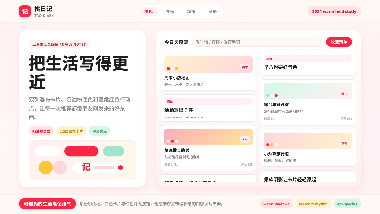 Xiaohongshu (RedNote) 2024Warm notes feel trusted. Cream-pink masonry cards glow with signature red acc…亲密可信的生活笔记:奶油粉瀑布流卡片,以标志红点亮。
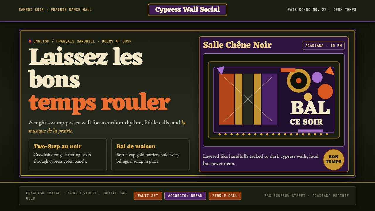 Cajun Louisiana Bayou Fais Do-DoSaturday darkness dances. Crawfish orange and Mardi Gras violet stack on bayo…周六夜在跳舞:小龙虾橙与狂欢紫层叠在沼泽黑上。
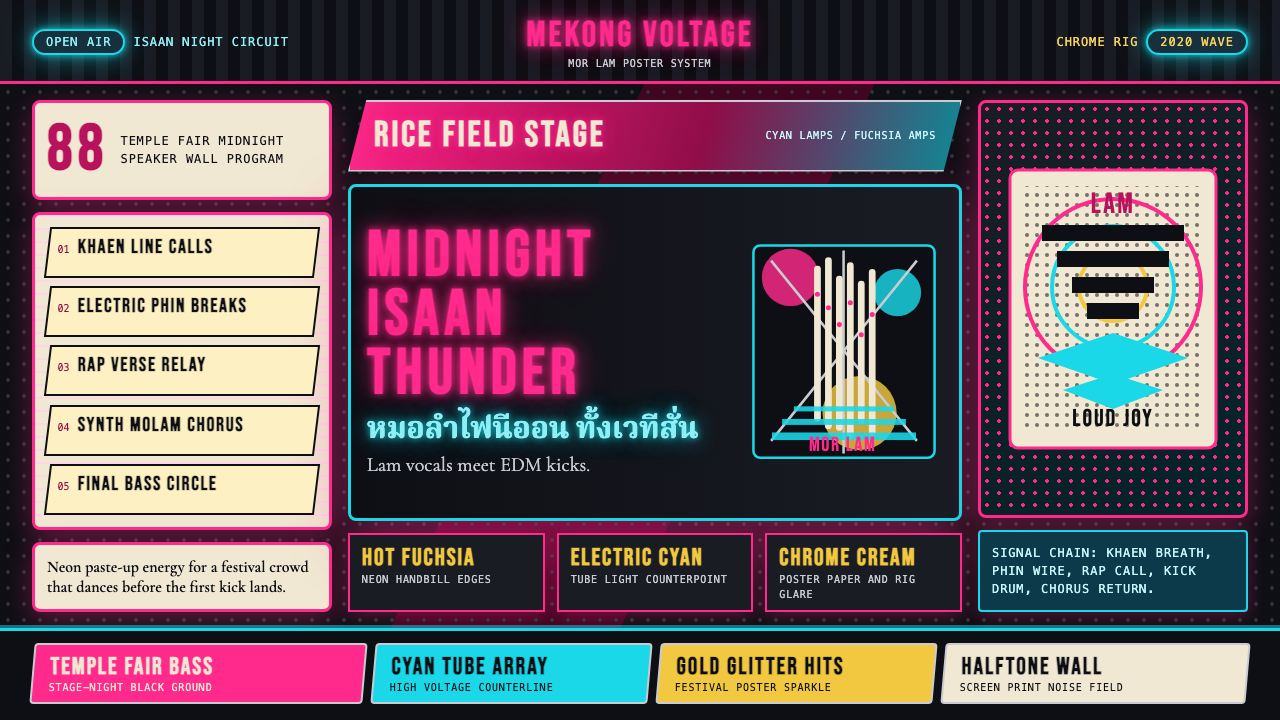 Thai Mor Lam Isaan (2020)Joy at maximum volume. Fuchsia-cyan neon, chrome type, and halftone grids hit…最大音量的欢愉:黑底上洋红青霓虹、铬字与网点格爆发。
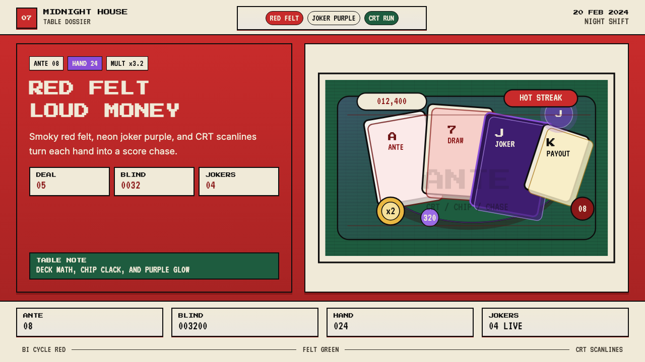 Balatro Poker RoguelikeLate-night poker math with a grin. Bicycle red, felt green, and CRT scanlines.深夜扑克数学感。自行车牌红、毛毡绿和CRT扫描线。
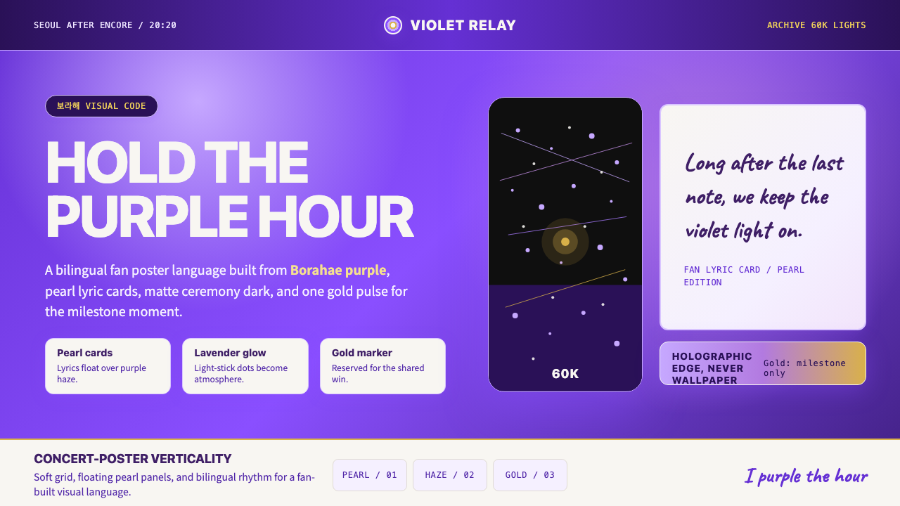 BTS Army Purple 2020Fandom becomes atmosphere. Borahae purple, pearl cards, lavender glow, one go…粉丝成为气氛:Borahae紫、珍珠歌词卡、薰衣草光晕与一束金光。
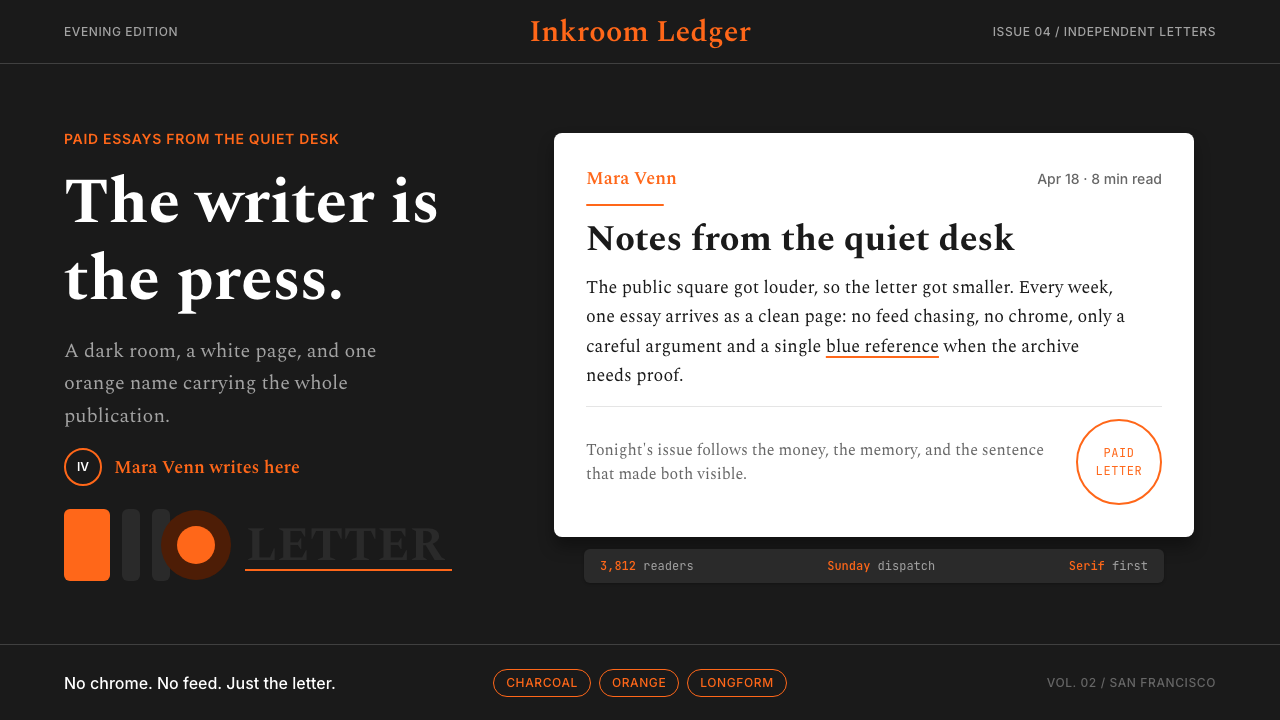 Substack Orange NewsletterLit page, dark room. Orange serif bylines ignite white cards on charcoal.暗室里的亮页。橙色衬线署名点燃炭黑上的白卡。