What is Cajun Louisiana Bayou Fais Do-Do?
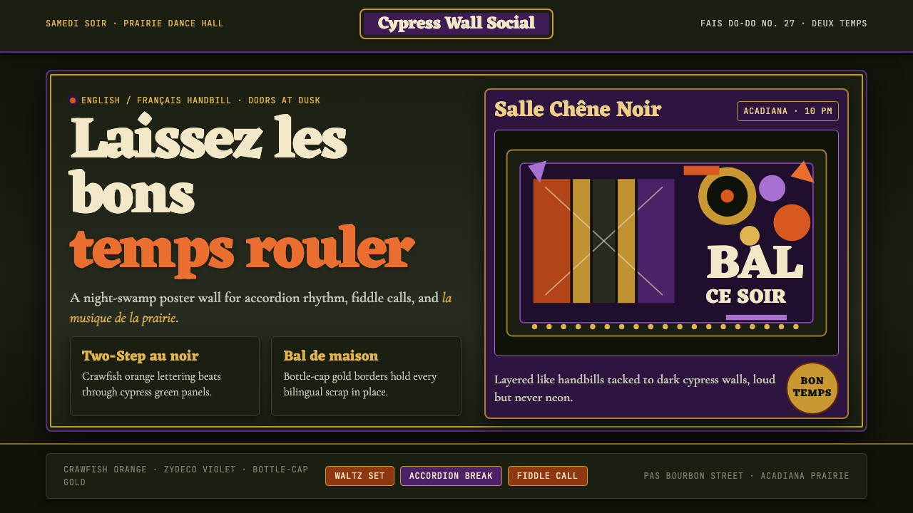
Cajun Fais Do-Do brings the raucous energy of Southwest Louisiana dance halls into visual form — saturated night-swamp darkness, crawfish-boil heat, and the layered chaos of hand-painted zydeco posters.
Cajun Louisiana Bayou Fais Do-Do in brief
Cajun Fais Do-Do is a design system rooted in the visual culture of southwest Louisiana's Acadian prairie — specifically the Saturday-night dance hall tradition known as the fais do-do, a Cajun French phrase meaning 'go to sleep,' referring to the corner where children were put to bed so their parents could dance until sunrise. The style channels the hand-crafted energy of that world: hand-painted handbills nailed to cypress-plank walls, accordion music bleeding into swamp darkness, the dense layered visual noise of a culture that celebrates loudly and decorates with abandon.
This is not the New Orleans of Bourbon Street neon and jazz funeral second lines. Cajun Fais Do-Do belongs to the Acadian prairie interior — Eunice, Mamou, Breaux Bridge, Opelousas — communities of French-speaking descendants of the Acadians expelled from Nova Scotia in the eighteenth century. Their visual vernacular is bilingual (French and English lettering coexist on the same poster), physically robust, and unapologetically saturated. The palette is anchored by a deep night-swamp black ground over which crawfish-boil orange, Mardi Gras violet, and bottle-cap gold collide with muscular intensity.
What makes the system visually distinctive is not any single element but the quality of its accumulation. Layers build on layers — type over texture, color over color, image over border — the way real fais do-do halls accumulate decades of tacked-up posters, painted signs, and neon beer advertisements. The effect is simultaneously festive and grounded, vibrant and rooted in place. It rewards density without losing legibility, which is the core tension the style navigates.
Where does Cajun Louisiana Bayou Fais Do-Do come from?
The fais do-do as a social institution has roots in the Acadian diaspora. When the British forcibly expelled the French-speaking Acadians from Nova Scotia between 1755 and 1763 — an event the Cajun community still calls le Grand Dérangement, the Great Upheaval — many eventually settled in the swampy prairies of southwest Louisiana, then Spanish and later American territory. They brought with them their language, their Catholicism, their fiddle traditions, and their practice of communal dance. Isolated from the Anglo-Protestant mainstream and too poor for elaborate entertainment, the Cajun communities developed dense local cultural institutions: the Saturday dance hall was the central one.
The visual culture of the fais do-do emerged organically from necessity. Dance halls in Eunice, Mamou, and the surrounding parishes needed to advertise their weekly events. Commercial printing was expensive and often inaccessible to rural communities, so handbills were hand-lettered, hand-painted, and hand-distributed — nailed to cypress trees, tacked to general-store bulletin boards, pressed into the hands of neighbors. The letterers who made these handbills were not trained graphic designers; they were sign painters, barbers, and general-store owners who developed a confident, exuberant vernacular using whatever paints and brushes were at hand.
The 1960s and 1970s brought the zydeco emergence — a genre developed by Creole musicians of African descent in the same southwest Louisiana communities, fusing Cajun musical traditions with rhythm and blues. Key figures like Clifton Chenier, who called himself the King of Zydeco, brought the music to wider American and international audiences. Record labels like Arhoolie and Rounder began documenting and distributing this music, and their album covers and promotional materials — designed by people who understood both the music's roots and its new national reach — refined the visual vocabulary of the fais do-do into a more deliberate aesthetic. The deep backgrounds, the layered typography, the unapologetic use of saturated warm tones against dark grounds: these conventions crystallized in this period.
The 1980s and 1990s brought a sustained Cajun French language revival, driven in part by CODOFIL (the Council for the Development of French in Louisiana) and by cultural entrepreneurs like Marc Savoy, the accordion maker and musician from Eunice whose workshop became a gathering point for musicians, scholars, and cultural preservationists. The Festival International de Louisiane, founded in Lafayette in 1987, provided a new public platform for the aesthetic, and the visual materials produced around it — posters, programs, signage — consolidated the style's identifying marks. The fais do-do visual system is now simultaneously folk vernacular and consciously curated cultural heritage.
What defines the Cajun Louisiana Bayou Fais Do-Do look?
Color and Ground
The foundational move is a deep, lightless ground — the visual equivalent of the Louisiana bayou at night, an absence that makes everything placed against it vibrate with intensity. Over this darkness, the system deploys three signature tones: a searing orange drawn from the heat of a crawfish boil, a rich violet inherited from Mardi Gras tradition, and a warm metallic gold that evokes bottle caps and brass instrument valves. These colors do not exist at low saturation in this system; they are deployed at full intensity, relying on the dark ground to keep them readable rather than chaotic. The overall impression is one of controlled thermal energy — heat visible against cool darkness.
Typography and Lettering
The typographic tradition of the fais do-do is hand-lettered vernacular — energetic, slightly irregular, displaying the confident imprecision of someone who has lettered hundreds of handbills but was never formally trained. Display lettering tends toward rounded, generous forms with prominent serifs or exaggerated decorative strokes, referencing both the French carnival broadside tradition and the American carnival sideshow poster. Body copy, where it appears, is set in high contrast against dark grounds. Bilingual French-English coexistence is a structural feature rather than an afterthought — the two languages alternate in size and hierarchy, sometimes on the same line, reflecting the community's lived bilingualism.
Texture and Layer
Unlike design systems that prize a clean surface, Fais Do-Do embraces the accumulation of layers as an expressive value. Surfaces show the history of their making: worn edges, overlapping fields of color, the slight misregistration of hand-applied elements. This texture is not simulated aging for nostalgic effect — it is the authentic mark of a culture that produces visual material in real time, outdoors, by hand. In the digital application of the style, these qualities are best conveyed through the deliberate loosening of precision: slightly uneven letter spacing, color fields that bleed past their containers, compositional arrangements that feel found rather than engineered.
Compositional Energy
Fais Do-Do compositions are busy without being incoherent. The organizing logic is not the grid of the modernist poster but the wall of the dance hall: competing elements jockey for attention, borders serve as corrals rather than precise containers, and hierarchy is established through scale contrast rather than whitespace. Multiple focal points coexist — the headliner's name, the date, the venue, the supporting acts — each claiming visual territory. The result reads as festive abundance rather than disorder, because each element is fully committed to its own color and weight.
Decorative Border and Frame
Borders are structural to the Cajun dance hall poster tradition. They appear as thick bands of contrasting color, chains of geometric repeat patterns, or nested rectangles that separate the content field from the outer ground. These borders are not minimal rules in the Swiss tradition; they are assertive declarations of territory — the visual equivalent of the physical walls of the dance hall, marking where the celebration is. In the digital application of the style, borders serve a similar framing function: they contain and announce rather than simply delineate.
Iconography and Symbol
A specific set of motifs recurs across the Cajun visual tradition: the accordion (a diatonic button accordion, not a piano accordion), the fiddle, the crawfish, the fleur-de-lis, and Mardi Gras masks. These icons function as instant cultural markers — legible to community insiders and legible as 'southern Louisiana' to outsiders. In the Fais Do-Do system, they appear as flat silhouette forms embedded in the overall layered composition, rendered in the signature warm tones against the dark ground. They are never photorealistic; they are always stylized toward bold outline and flat fill.
Festive Rhythm
The Cajun fais do-do system has an underlying temporal quality that distinguishes it from purely spatial design systems. Because it emerged from music promotion, its compositions carry the rhythm of the music they announced: call-and-response structures where a large bold statement is answered by smaller supporting text, cascading stacks of type that create visual downbeats, and the alternating hot-cool of orange against black that mirrors the accordion's push-pull bellows action. This rhythmic quality is not literal transcription of sound into image — it is the absorption of musical thinking into compositional structure.
Who shaped Cajun Louisiana Bayou Fais Do-Do?
Clifton Chenier, born in 1925 in Opelousas, Louisiana, is the figure most responsible for bringing the Cajun and Creole musical traditions of southwest Louisiana to national and international attention. His recording career with Arhoolie Records through the 1960s and 1970s produced the canonical visual artifacts of the zydeco genre — album covers, promotional posters, and concert handbills whose deep-ground, warm-toned visual vocabulary helped define the aesthetic that the Fais Do-Do design system systematizes. His title 'King of Zydeco' and his trademark crown are themselves icons of the visual tradition. Chenier's commercial success demonstrated that the southwest Louisiana visual vernacular could communicate powerfully beyond its originating community.
Marc Savoy is an accordion builder, musician, and cultural institution based in Eunice, Louisiana, whose workshop — Savoy Music Center — became a gathering place for Cajun musicians, scholars, and preservationists from the 1960s onward. Savoy's role in the visual tradition is indirect but significant: the Saturday morning sessions he hosted became occasions for cultural production, and the materials distributed around them — handbills, programs, photographs — are primary documents of the Cajun visual vernacular. His advocacy for the Cajun French language and his insistence on the value of vernacular musical and visual culture gave the aesthetic a self-conscious defense at a historical moment when it might otherwise have been absorbed into a homogenized Southern American culture.
Michael Doucet, the fiddler and bandleader of BeauSoleil, represents the generation that transformed the Cajun fais do-do from a local community institution into a nationally recognized art form in the 1980s and 1990s. BeauSoleil's recordings for Rounder Records and their performances at the New Orleans Jazz and Heritage Festival and elsewhere generated a sustained body of visual materials — concert posters, album covers, press photographs — that crossed the aesthetic of the local dance hall with the expectations of the national folk music market. This crossover produced a version of the visual style that is simultaneously authentic and legible to audiences with no prior exposure to the Cajun community.
Dewey Balfa, a fiddler from the Mamou prairie community, was one of the most important figures in the first wave of Cajun cultural revival following his appearance at the Newport Folk Festival in 1964. Where earlier Cajun musicians had often soft-pedaled their French identity to succeed in the mainstream American market, Balfa insisted on performing entirely in French and in the uncompromised traditional style. His advocacy helped establish the cultural legitimacy of the full southwest Louisiana aesthetic — including its visual dimension — and his profile raised the visibility of the community's material culture to scholars and cultural institutions that would later help preserve and promote it.
Founded in Lafayette in 1987, the Festival International de Louisiane is not a single person but a cultural institution that became a crucial site for the consolidation and public projection of the Cajun visual aesthetic. Its annual posters, produced by a rotating roster of Louisiana artists, represent the most deliberate and high-profile expressions of the Fais Do-Do visual system — works that must communicate the festival's identity to an international audience while remaining legibly rooted in the regional vernacular. The festival's poster archive constitutes a sustained design history of the style, showing how successive artists have interpreted and evolved the core visual vocabulary of deep grounds, saturated warm tones, bilingual lettering, and festive layering.
How do you use Cajun Louisiana Bayou Fais Do-Do today?
Cajun Fais Do-Do is a style of deliberate specificity — it communicates place, celebration, and cultural heritage simultaneously, which means it rewards applications where those associations add value rather than confusion. The style is not a general-purpose festive system; it is a culturally specific visual vernacular that works best when the product or event it serves has a genuine relationship to the qualities it embodies: warmth, community, handcraft, and celebratory abundance.
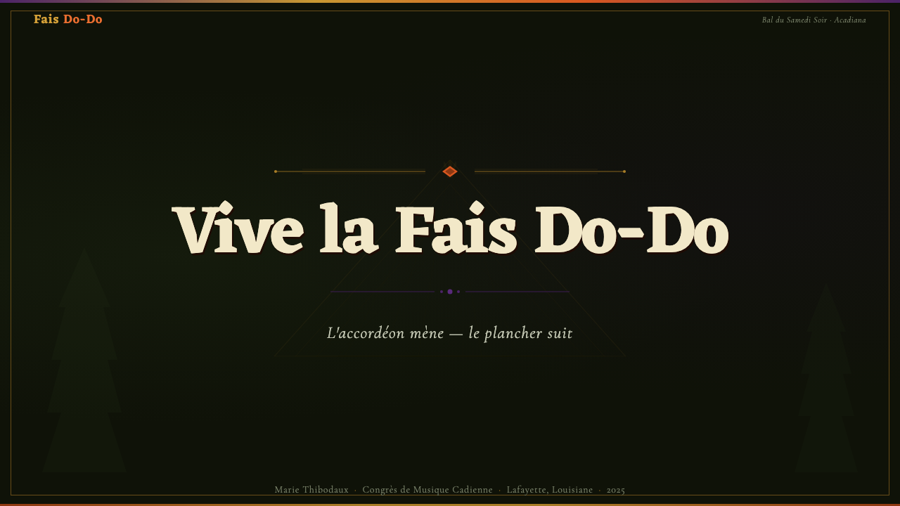
For presentation slides, the style works best on covers and section dividers rather than content-heavy slides. A cover following this aesthetic anchors the composition in a near-black ground and lets warm tones command the primary visual hierarchy — the title treatment should feel like a dance-hall headliner announcement, with generous letter spacing and bold scale contrast. Section dividers can carry a full-bleed ground with a single signature accent color and bilingual label treatment. Content slides should pull back from the full density of the aesthetic: keep body text on a lighter sub-background, reserve the deep ground for emphasis blocks or pull quotes, and use the accent palette sparingly for data highlights rather than filling every bar chart with crawfish orange.
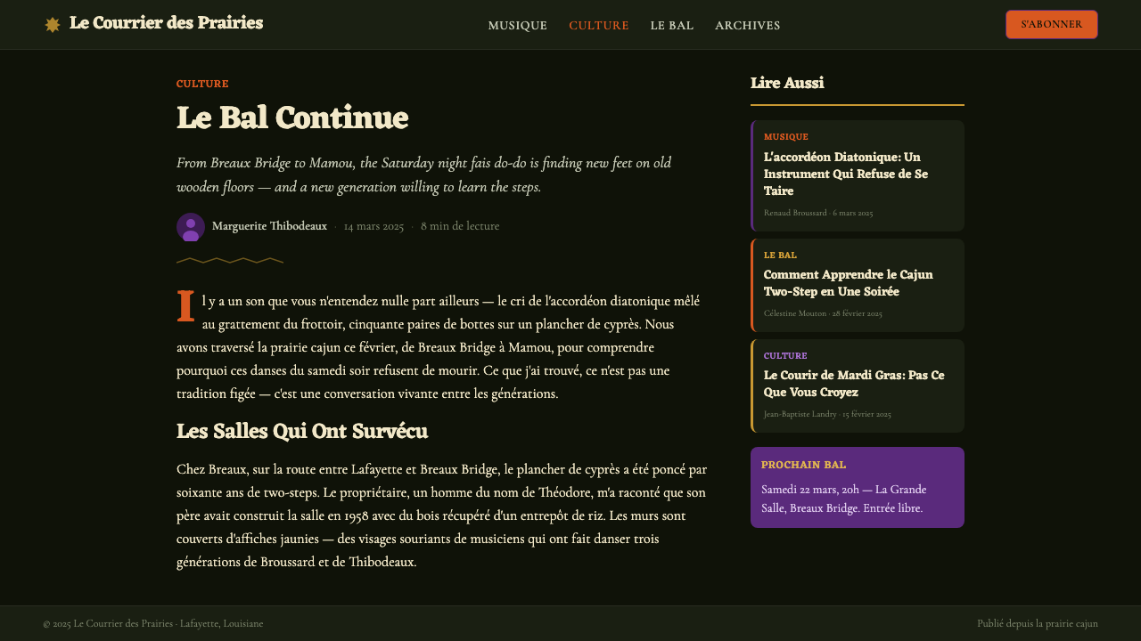
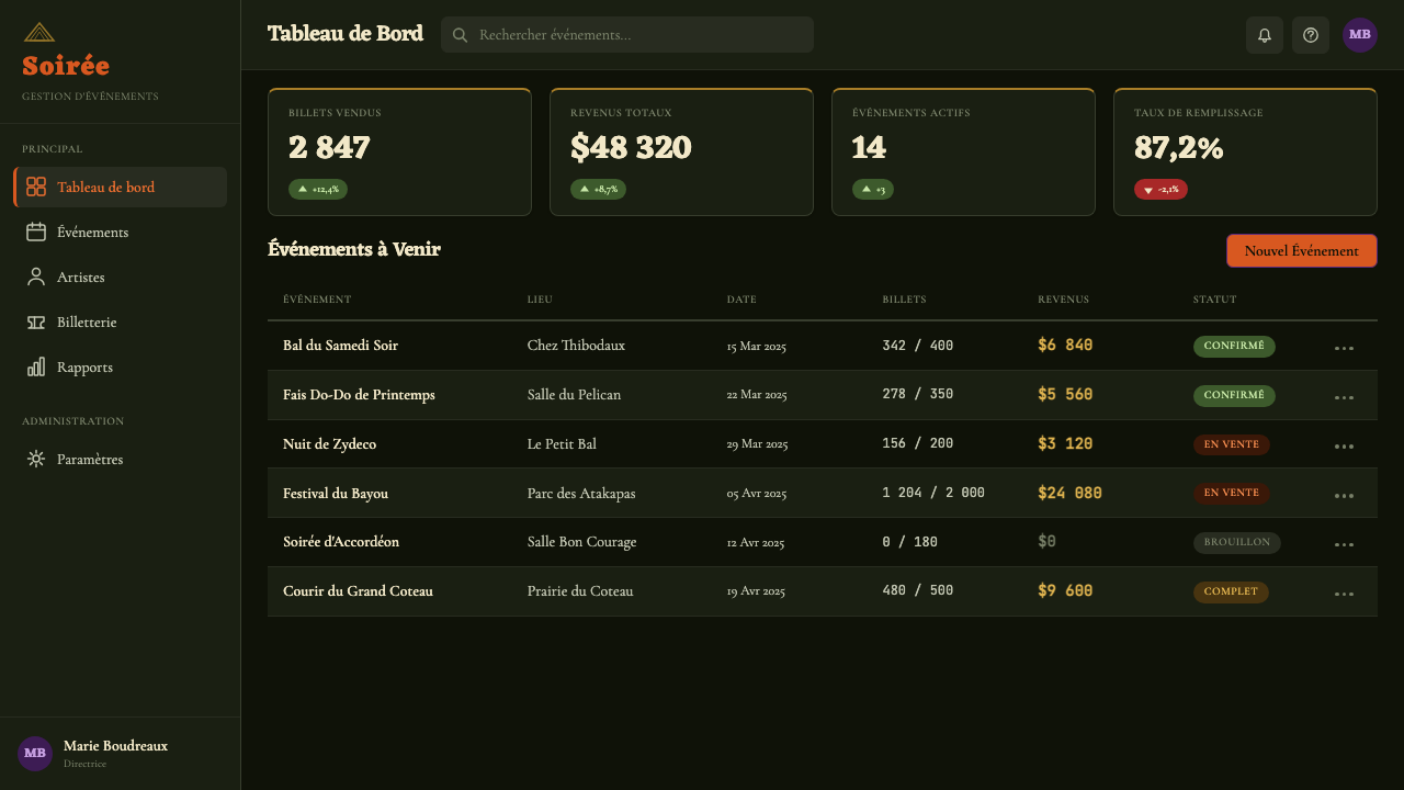
For web interfaces, the style translates most naturally into contexts that benefit from an established, place-rooted identity: food and beverage brands, music discovery platforms, cultural heritage applications, event ticketing pages, and tourism-facing content. A dashboard built entirely in this aesthetic would likely overwhelm users with cognitive load — the system is not optimized for sustained utility work. Instead, use it in high-impact zones: hero sections, promotional banners, event listing cards with deep-ground treatment. Navigation and utility chrome should be simplified to a near-neutral, letting the content areas carry the visual energy.
For editorial and marketing work, the style's layered poster logic translates well into full-page advertisement designs, event programs, and brand identity systems for cultural organizations. An editorial layout in this style uses the deep ground as a canvas: pull quotes rendered in signature warm type against dark backgrounds become visual anchors that interrupt the flow of body text set in a lighter, simpler register. Marketing posters benefit from the tradition's compositional abundance — multiple elements competing for attention within a clearly bordered field — while maintaining the discipline of a limited palette (deep ground, one warm dominant, one metallic accent).
A common mistake when applying this style is treating the dark ground as an invitation to use every element at maximum saturation and weight simultaneously. The authentic fais do-do poster achieves its energy through contrast and hierarchy even within its density: one element dominates by scale, another by color intensity, a third by textural quality. Attempting to make every element scream simultaneously produces visual noise rather than festive energy. A second common mistake is importing generic 'vintage' or 'distressed' texture effects in place of the genuine layered quality of the style — the accumulation in the real tradition is spatial and chronological, not simulated patina applied as a filter.
Cajun Louisiana Bayou Fais Do-Do — FAQ
What is the difference between Cajun and Creole visual traditions?
The distinction matters but is often blurred in practice. Cajun visual tradition traces to white Acadian French settlers, and its visual language incorporates fleur-de-lis motifs, bilingual French-English lettering, and references to the Catholic liturgical calendar. Creole visual tradition, associated with the African-descended communities who developed zydeco music in the same region, draws more heavily on pan-African color associations, and its typographic energy is more inflected by rhythm-and-blues promotional culture. In the real visual landscape of southwest Louisiana, these two traditions are thoroughly intermixed — Clifton Chenier's promotional materials, for instance, draw on both. The Fais Do-Do system synthesizes both streams, which is historically accurate: the dance halls where the style was born were spaces of cultural mixing as much as cultural preservation.
Can this style work for products that have no connection to Louisiana or Cajun culture?
It can, but requires care about what is borrowed and what is communicated. The structural elements of the system — deep grounds, layered warm tones, dense compositional energy, hand-lettered typographic character — can be applied to any product that benefits from associations with warmth, celebration, handcraft, and festive community. The culturally specific iconography — crawfish, accordions, fleur-de-lis, Mardi Gras masks — should only be used when there is a genuine reason. Borrowing the structural vocabulary without the specific icons is legitimate and historically normal; using the icons decoratively when the product has no relationship to the culture crosses into appropriation. The style's energy is its most transferable quality; its specific symbols are its most context-dependent.
How does Fais Do-Do handle light-background or daytime versions of the aesthetic?
The deep night-swamp ground is so fundamental to the system's identity that a light-background version is better understood as a daylight variant rather than a full expression of the style. The historic reference point for a lighter version is the lunchtime food-stand aesthetic of the Breaux Bridge Crawfish Festival or the outdoor daytime stage of the Festival International — bleached wood, sun-faded reds and oranges, hand-lettered banners in daylight. In practice, a light variant of this system works by preserving the warm chromatic character — sunburned orange, dusty violet, aged gold — but deploying them against a warm off-white or weathered cream ground. The layered quality should be maintained; what changes is the darkness level of the base, not the density of the composition.
Is Fais Do-Do appropriate for digital product UI, or is it better suited to print and event materials?
The style has a natural home in print and event promotion, where its density and visual noise read as celebratory rather than functionally problematic. In digital UI, the style requires more careful management. The deep grounds work well for OLED screens and can reduce eye strain in dark environments. The typographic layering, however, poses accessibility challenges: ensuring sufficient contrast between text and background becomes more complex when multiple warm tones are stacked over dark grounds. For digital applications, the recommendation is to use the style's visual vocabulary for immersive, limited-interaction contexts — landing pages, event pages, promotional screens — and to simplify significantly for any screen that requires sustained reading or frequent interaction. The style celebrates abundance; good UI design often requires restraint.
What distinguishes authentic Fais Do-Do application from generic 'vintage Louisiana' pastiche?
The distinction lies in structural commitment versus surface borrowing. Pastiche typically applies a few surface markers — a crawfish motif, some faux-aged texture, an approximation of the warm palette — on top of a fundamentally different underlying structure (usually a clean modern layout with generous whitespace and rational type hierarchy). Authentic application commits to the underlying compositional logic: the deep ground as the primary condition, the layered accumulation of type and image within bordered frames, the bilingual coexistence as a structural feature rather than a decorative novelty, and the use of warm tones at full intensity rather than as muted accents. The test is whether the design would still be recognizably itself if all the culturally specific icons were removed — if it collapses into an unrelated style, the specific motifs were doing all the work and the structural logic was never internalized.
Related design styles
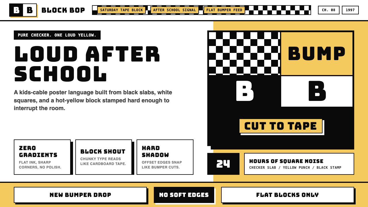 Cartoon Network 90s BlocksKids-cable noise, squared. Black-white checkerboards crash into hot-yellow Bu…
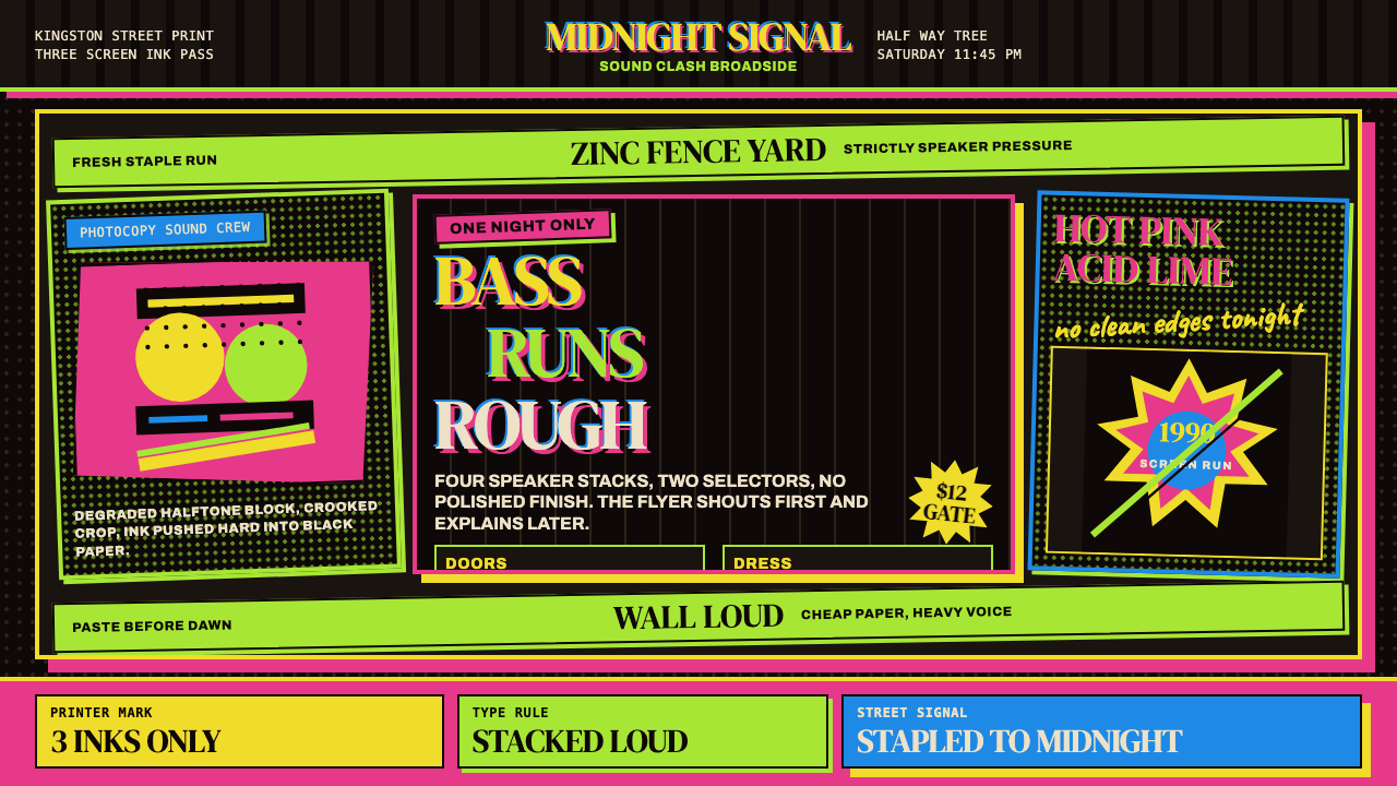 Jamaican Dancehall 1990 PosterMidnight volume. Acid lime and hot pink type stack like screenprint ink on bl…
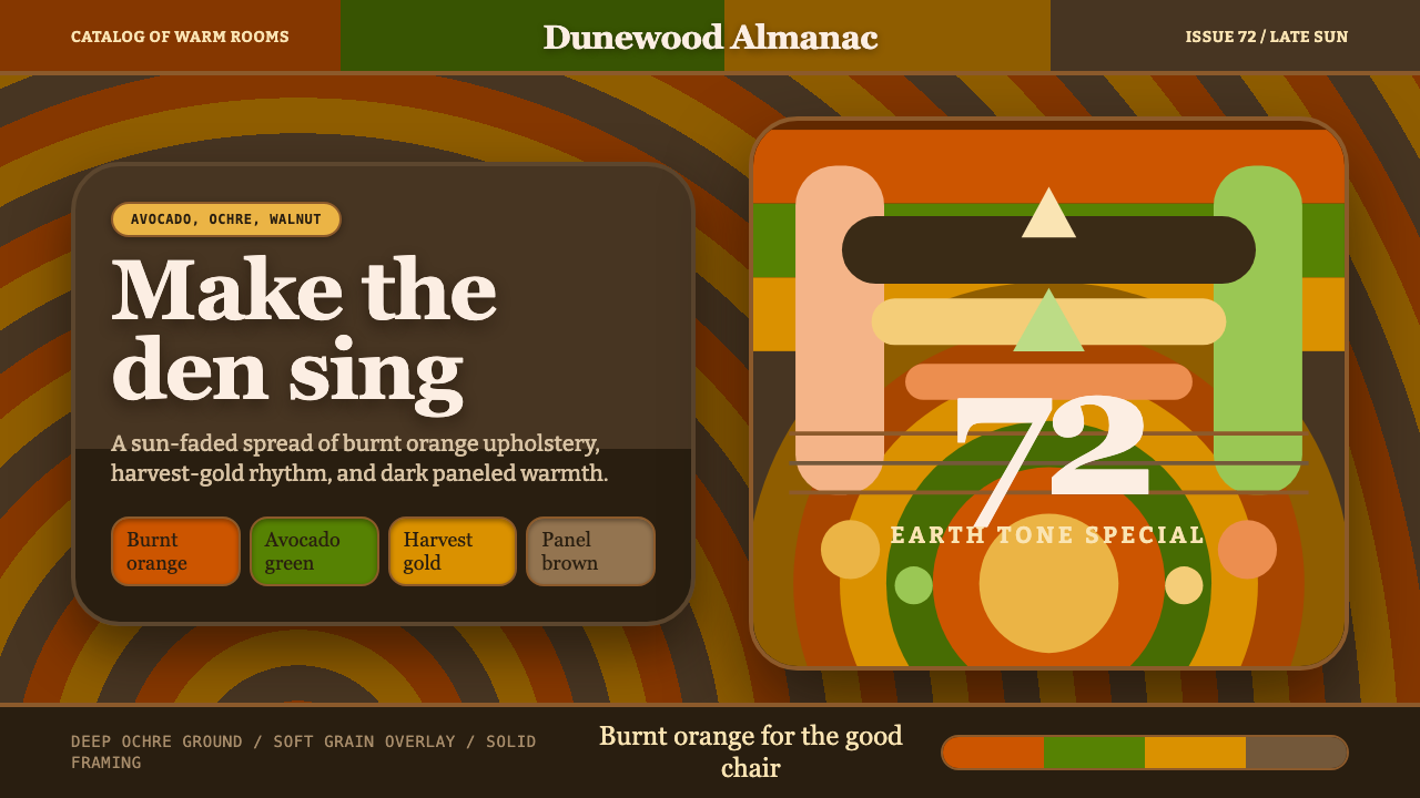 1970s Earth TonesWarm maximalism stays muddy. Bulbous slabs, avocado bands, and harvest-gold r…
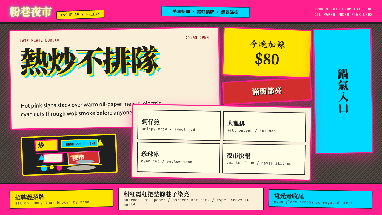 Taipei Shilin Night Market NeonLoud by design. Hot pink, neon yellow, and stacked TC serif signs break the g…
 Taiwanese Raohe Night Market NeonTaipei night reads vertically. Neon red, cobalt panels, and acid-yellow numbe…
 TMNT (1987 Saturday-Morning)Saturday-morning chaos, full blast. Sewer green, bandana brights and clogged…