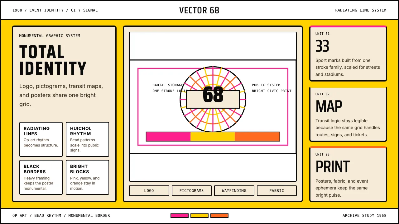
About Lance Wyman Mexico Olympics (1968)
Lance Wyman's 1968 Mexico City Olympics identity is the gold standard of event graphic design — a total system where logo, pictograms, wayfinding, and color are inseparable. The radiating-line motifs fuse 1960s Op Art with Huichol Indian beadwork, producing a visual language that is simultaneously international-modernist and unmistakably Mexican.
Learn more about the Lance Wyman Mexico Olympics (1968) style
- Origin
- Mexico City, Mexico
- Era
- 1966 commissioned; Olympics held October 1968; canonized 1968–1970
- Key figures
- Lance Wyman · Eduardo Terrazas · Pedro Ramírez Vázquez · Beatrice Trueblood
- Movements
- 1960s graphic modernism · Olympic identity systems · Op Art + Huichol visual fusion
Lance Wyman Mexico Olympics (1968) design spec
Colors
Background
Surface
Primary
Secondary
Accent
Text
Typography
Saira CondensedHeadings
InterBody
JetBrains MonoMono
Unlock for 1 credit
The other 11 sections — buttons, cards, spacing, motion, techniques and more — open once you unlock. Download the DESIGN.md or send it to your AI in one click. Unlock once, yours forever.
Sign up nowHave an account? Sign in
Styles similar to Lance Wyman Mexico Olympics (1968)
Also inspired by brands & products, with a close feel.
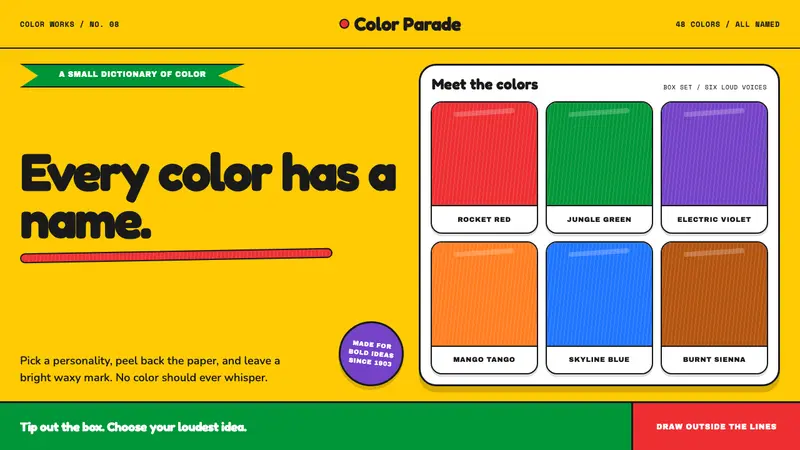 Crayola (1903)Color never whispers. Golden yellow, a green slash, and waxy swatches make every name a character.
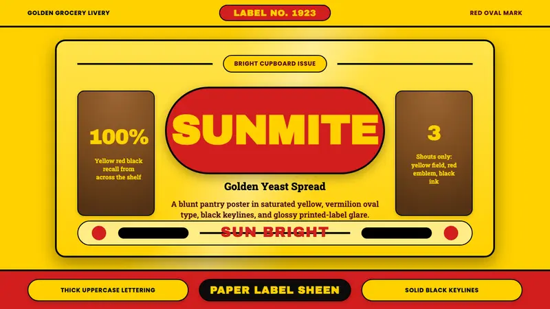 Vegemite Jar Label (1923)Instant pantry recall. Golden yellow, vermilion oval type, and hard black keylines.
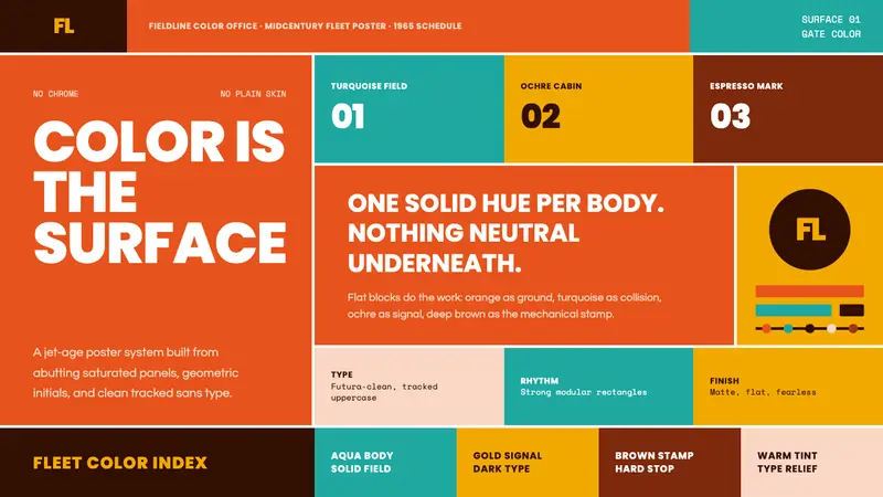 Braniff (Girard)Color becomes fuselage. Jellybean orange, turquoise blocks, and geometric sans lock the grid.
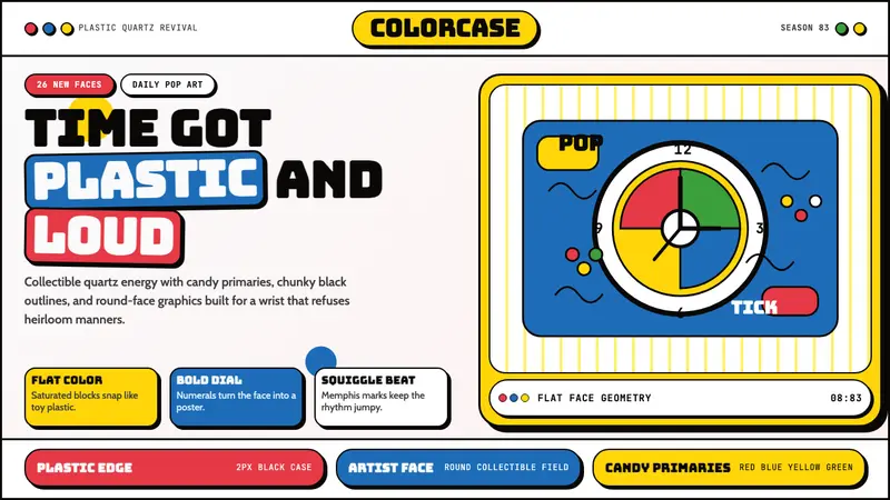 Swatch Watch (1983)Pop plastic optimism. Bungee type, candy primaries, round dials and squiggles snap loud.