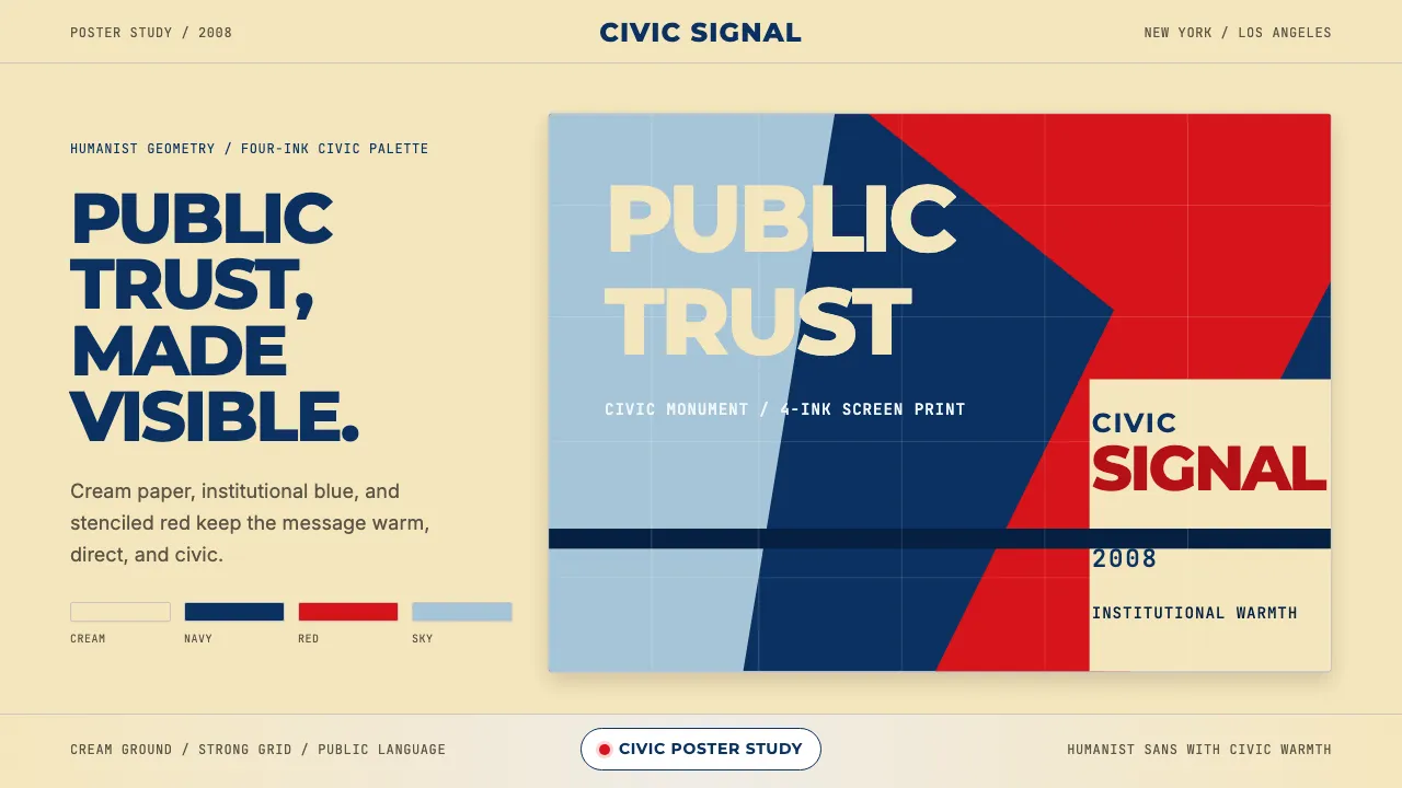
About Gotham / Obama Hope Poster (2008)
Gotham distilled the vernacular lettering of mid-century New York — Port Authority signage, Eighth Avenue address plates — into a typeface that became shorthand for American institutional confidence. Shepard Fairey's 2008 HOPE poster fused Gotham Bold with a four-color stenciled portrait, creating one of the most recognized political graphics in history.
This system channels that civic-monumental energy: cream grounds, institutional dark blue, HOPE red accents, and relentless humanist-geometric sans-serif typography that says authority without coldness.
Learn more about the Gotham / Obama Hope Poster (2008) style
- Origin
- USA — New York City / Los Angeles
- Era
- Gotham designed 2000; Obama HOPE poster 2008; peak cultural adoption 2002–2010
- Key figures
- Tobias Frere-Jones · Jonathan Hoefler · Shepard Fairey · Scott Thomas
- Movements
- humanist-geometric sans-serif · 2000s American political-design vernacular · Obama campaign identity
Gotham / Obama Hope Poster (2008) design spec
Colors
Typography
The other 11 sections — buttons, cards, spacing, motion, techniques and more — open once you unlock. Download the DESIGN.md or send it to your AI in one click. Unlock once, yours forever.
Sign up nowStyles similar to Gotham / Obama Hope Poster (2008)
Also inspired by brands & products, with a close feel.
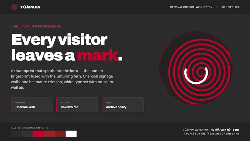 Te Papa Aotearoa ModernEvery visitor leaves a mark. Charcoal museum walls, one haematite crimson, a thumbprint-koru spiral.
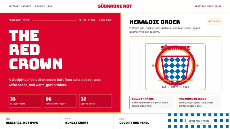 Bayern Munich (Rot)Heritage, not hype. Saturated rot fields, gold rules, and blue lozenges enforce order.
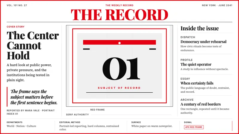 TIME MagazineAuthority in a red rectangle. Didone masthead, black-white columns, and a 4px frame.
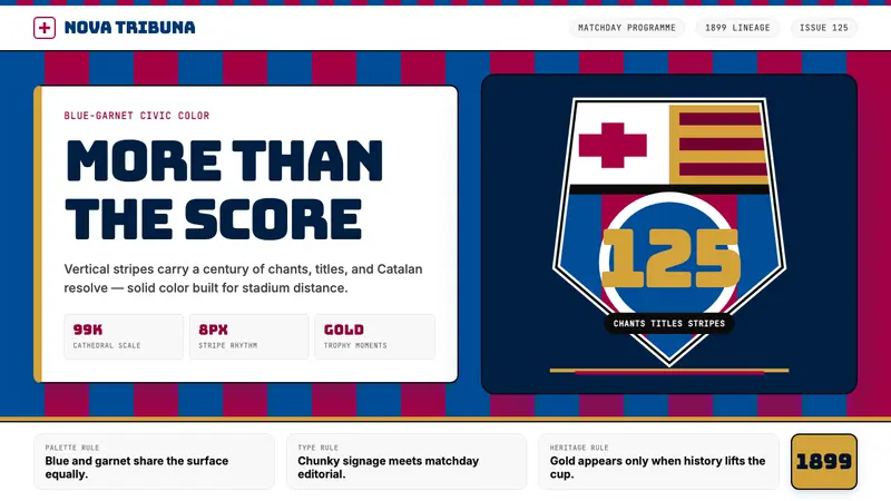 FC Barcelona (Blaugrana)Stadium heritage, not nostalgia. Blue-garnet stripes, Bungee type, gold heraldry.