What is Admiralty Sea Chart?
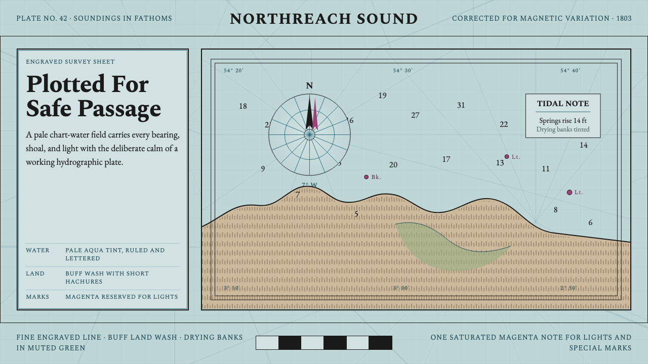
The British Admiralty chart is one of the most information-dense visual systems ever produced — a document where pale aqua-tinted sea, engraved black coastlines, and the precise numerals of depth soundings combine into a reading surface that is both technically exacting and quietly beautiful.
Admiralty Sea Chart in brief
The Admiralty Sea Chart style derives from the official hydrographic charts produced by the British Admiralty's Hydrographic Office, founded in 1795. These documents were working instruments — navigational tools used aboard ship — yet their visual grammar, developed through decades of engraving practice, achieved an aesthetic coherence that has never been fully superseded. The characteristic palette is restricted and purposeful: a pale aqua or blue-green tints the sea area, buff or warm off-white describes land, muted sage marks the drying zones between high and low water, and a single note of magenta or vermilion signals lights, special marks, or urgent hazards.
Everything on an Admiralty chart is drawn, not printed. Coastlines were engraved with hachures — dense parallel strokes that shade the foreshore, giving an almost topographic relief to the land-sea boundary. Depth soundings are small serif numerals set at measured intervals across the sea field, each one the product of a survey lead-line dropped from a heaving ship. Rhumb lines radiate from compass roses, their magnetic variation annotated to the minute. The lettering is copperplate cursive for place names, roman for sounding figures and notes — a dual type register that separates navigational data from geographic identification at a glance.
What distinguishes this visual system from decorative cartography is its commitment to the reading act. Nothing is included for ornament. The aqua sea tint is not atmospheric — it is the standardized 'chart-water' color that separates sea from land in ambiguous coastal situations. The buff land is similarly documentary: it describes surveyed territory, not artistic impression. Even the compass rose, the most ornate element, is a functional instrument — its radiating lines are the magnetic bearings a navigator needs. The beauty of Admiralty charts is entirely instrumental, which is precisely what makes it so hard to replicate without understanding the system's purpose.
Where does Admiralty Sea Chart come from?
The British Hydrographic Office was established in 1795 under the direction of Alexander Dalrymple, a hydrographer who had previously compiled charts for the East India Company and argued vigorously for a centralized chart-making authority under naval control. The founding impulse was navigational catastrophe: the Royal Navy had suffered repeated shipwrecks from reliance on commercially produced charts of inconsistent quality and often unknown provenance. Dalrymple's appointment formalized what surveyors had been attempting piecemeal for decades — systematic, authoritative, government-backed documentation of the sea.
The engraving tradition that gives Admiralty charts their distinctive appearance predates the Hydrographic Office itself. Copper-plate engraving had been the dominant technology for map reproduction since the late sixteenth century, and the conventions it produced — the hachured foreshore, the serif soundings, the ruled rhumb lines, the copperplate place-name lettering — were already well established by 1795. What the Hydrographic Office standardized was not the visual language but its application: consistent datum references, systematic survey coverage, and a protocol for revision that kept charts current as coastlines silted or lighthouses moved.
The nineteenth century was the great age of Admiralty survey. HMS Beagle — famous for carrying Charles Darwin — was a hydrographic survey vessel before it was a natural history platform; its primary mission was to chart the coasts of South America, and the charts it produced remained in navigational use for decades. The global reach of the British Navy made Admiralty charts the de facto international standard: they covered not only British coastal waters but the coasts of Asia, Africa, Australia, and the Americas, and were used by merchant vessels of every nationality.
The pale aqua sea tint — perhaps the most immediately recognizable element of the Admiralty style — was not adopted uniformly from the beginning. Early charts were printed in black on white, with hand-applied watercolor washes added for official or presentation copies. As color lithography became practical in the mid-nineteenth century, the standardized chart-water tint was adopted across the series, and the specific hue — cool, desaturated, unmistakably maritime — became embedded in navigational expectation. Sailors learned to read pale aqua as sea, and any departure from it would have introduced dangerous ambiguity into a life-or-death reading system.
What defines the Admiralty Sea Chart look?
Chart-Water Tint
The sea area is rendered in a cool, desaturated blue-green — the standardized Admiralty 'chart-water' color — that is neither vivid nor neutral. It is specifically designed to contrast with the buff land and the white of the paper at drying zones, creating an unambiguous three-way reading: sea, land, and inter-tidal. No gradient or wash variation is used within the sea area; the tint is flat and consistent, functioning as a color-coded data field rather than an atmospheric representation of water.
Engraved Line and Hachure
Coastlines are not drawn as simple outlines but are built up with hachures — short parallel strokes that shade the foreshore and submarine contours. The density and angle of hachuring communicates gradient: a steep cliff face carries dense, closely spaced marks; a gently shelving beach is rendered with lighter, more widely spaced strokes. This convention, inherited directly from topographic engraving practice, gives the chart a tactile, almost sculptural quality that flat digital coastlines cannot replicate.
Sounding Numerals
Depth soundings — the measured depths at specific locations — are typeset as small upright serif numerals distributed across the sea field. Their placement is not decorative; it encodes surveyed data at the exact positions where measurements were taken. The contrast between the serif precision of sounding numerals and the copperplate cursive of geographic place names is a deliberate typographic system: it allows a navigator to scan for navigational data without confusion from place-name labeling.
Compass Rose and Rhumb Lines
The compass rose is the most visually elaborate element on an Admiralty chart, yet it serves an entirely technical function. Its radiating rhumb lines — drawn across the sea area to the edges of the chart — represent lines of constant magnetic bearing that a navigator can use to plot a course with a parallel ruler. The rose itself is annotated with the magnetic variation for the area, allowing the navigator to correct from true north to magnetic north. Ornamental as it appears, every element of the compass rose encodes navigational data.
Magenta Signal
In an otherwise achromatic or near-achromatic chart surface, a single chromatic accent — magenta or vermilion — marks lights, buoys, leading marks, and other navigational aids that a mariner must identify in real time at sea. This is the Admiralty chart's only use of saturated color, and its restriction to safety-critical information gives it immediate reading priority. When a navigator's eye falls on magenta, something requires attention. The convention is so consistent that its misapplication would introduce genuine navigational risk.
Dual Typography
Admiralty charts employ two distinct lettering traditions simultaneously. Geographic names — bays, headlands, islands, settlements — are set in copperplate italic, a cursive letterform with pronounced axis and fine hairlines that reads as 'geographic' information. Navigational data — sounding figures, light characteristics, note abbreviations — is set in upright roman or condensed sans forms. This dual register was not the result of stylistic choice but of functional necessity: it allows a navigator to parse two categories of information simultaneously without conscious effort.
Documentary Flatness
Despite its visual richness, the Admiralty chart maintains a documentary flatness. There is no atmospheric perspective, no shading to simulate sunlight, no tonal variation to suggest mood. The sea is the same tint whether the water is calm or rough, near or far. This flatness is a feature, not a limitation — it ensures that the chart reads identically in a gale at midnight as in calm at noon, that its information hierarchy remains stable under any conditions. The aesthetic emerges from the discipline of invariant readability.
Who shaped Admiralty Sea Chart?
Dalrymple was appointed the first Hydrographer to the Admiralty in 1795, bringing decades of chart compilation experience from his work with the East India Company. A meticulous and combative figure, he fought for the establishment of a centralized naval chart-making authority against significant institutional resistance, and devoted his tenure to assembling and standardizing the existing survey record. His conviction that navigational charts required government authority and systematic methodology — not the commercial marketplace — established the institutional framework within which the Admiralty chart style would mature over the following century.
Beaufort served as Hydrographer from 1829 to 1855, the longest tenure of any Hydrographer, and oversaw the most productive period of Admiralty survey. Under Beaufort, the office dispatched survey vessels across the globe and established the typographic and representational conventions that would define the Admiralty chart style for the rest of the century. His name is better known for the Beaufort wind scale, but his administrative ambition — standardizing the visual grammar of nautical charts — had consequences just as lasting. The Beagle surveys of South America were commissioned and directed during his tenure.
Before it became famous as the vessel that carried Charles Darwin on a voyage that changed biology, HMS Beagle was a hydrographic survey brig. Its first two voyages (1826–1836) were entirely devoted to charting the coasts of Patagonia, Tierra del Fuego, and the Falkland Islands. The charts it produced — engraved with soundings, hachured coastlines, and compass roses following the established Admiralty grammar — remained in active navigational use for decades. The Beagle represents the convergence of scientific survey and the Admiralty visual system: a ship whose primary product was documentary knowledge encoded in a highly disciplined graphic form.
The earliest surviving Admiralty charts, including what is catalogued as Chart No. 2 covering British coastal waters, represent the visual grammar in its formative state — before standardization locked the conventions in place. These documents show the transition from hand-engraved, individually produced charts to a reproducible system: the hachured foreshore, the sounding numeral distribution, the copperplate lettering, all present but not yet fully regulated. Studying these early charts reveals that the Admiralty style was not designed — it was accumulated, tested in use, and gradually formalized into the visual system that became the global standard.
Not an Admiralty body but a commercial chart publisher, Imray represents the productive tension between official and commercial hydrographic practice. Operating since the eighteenth century, Imray charts adopted and adapted Admiralty conventions — the pale sea tints, the serif soundings, the hachured coastlines — while serving a different market: the private yachtsman rather than the naval officer. The visual dialogue between Admiralty and Imray charts shows how a graphic system designed for government use migrated into broader nautical culture, becoming the default expectation for what a maritime chart should look like.
How do you use Admiralty Sea Chart today?
The Admiralty chart style is one of the few historical visual systems with a built-in information hierarchy so complete and self-consistent that it can be applied to modern interface contexts without significant translation. The core principle is the same in a dashboard or a slide as in a real chart: every visual element must earn its place by carrying specific, decodable information. The aesthetic emerges from that discipline, not the other way around. Applied correctly, this style communicates technical authority, documentary seriousness, and a particular kind of beauty that comes from functional precision.
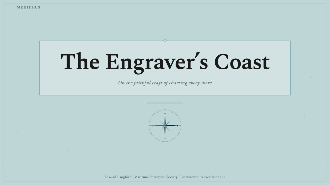
For presentation slides, the Admiralty chart style works best in scientific, data-heavy, or institutional contexts. A cover page can adopt the chart's layered approach: a pale aqua or sea-tinted background field, a title set in a precise serif or refined upright letterform, with a single accent mark — a dot, a dagger, a magenta rule — that signals the key claim. Content slides should use the chart's typographic dual register: larger, more prominent type for navigational data (your key figures, conclusions) and smaller, supporting type for contextual information. Reserve any saturated color — especially anything in the red-to-magenta range — for a single element of highest priority per slide.
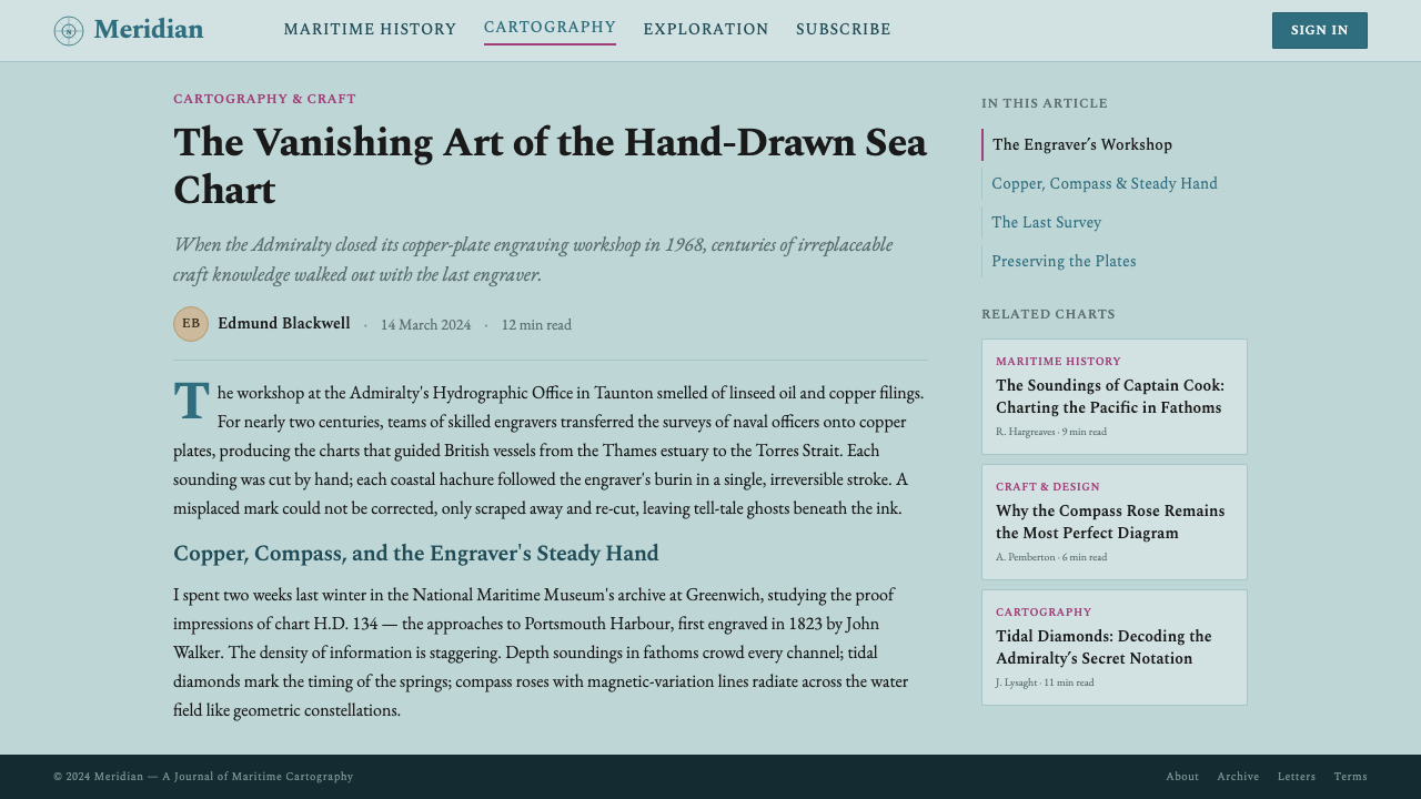
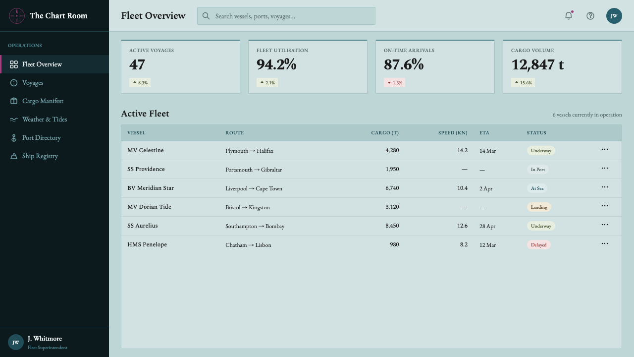
For web interfaces and dashboards, the Admiralty palette translates to a system where the background color carries data meaning. Use the pale aqua as a zone-defining field (for active states, selected rows, highlighted map areas), buff or warm off-white for inactive content areas, and white for empty or available space. All body text should be dark — engraving-dark — against these muted grounds. Interactive affordances and alert states take the magenta accent, used with strict restraint. Data visualizations in this system should look like charts within the chart: plotted points, ruled lines, enumerated axes — never soft gradients or bubble fills.
For editorial and marketing work, the style supports long-form documentary layouts. A Admiralty-inspired article page uses generous margins (treated as the sea field), body text set with the precision and density of sounding numerals, and section headings that sit like the place-name labels on the chart — exactly sized to their importance, no larger. Pull quotes or call-outs can be framed with a thin ruled border, the way a chart frames a notes panel, with the accent color used only for the most critical piece of information on the page.
The most common mistake when applying the Admiralty chart style is treating it as decoration — importing the aqua color or the compass rose motif without adopting the underlying information discipline. Charts have no ornament, and any attempt to soften, decorate, or make warmer this visual system destroys its essential character. A second common error is using the magenta accent too freely: once it appears on more than one or two elements per layout, it loses its signaling function and the entire hierarchy collapses. The style rewards restraint and punishes decoration.
Admiralty Sea Chart — FAQ
Is the Admiralty chart style the same as vintage map aesthetics?
They overlap in superficial appearance but are fundamentally different in intent. Vintage map aesthetics — as commonly understood in contemporary design — typically involve decorative cartouches, illustrated sea monsters, aged-parchment textures, and color palettes that evoke nostalgia. Admiralty chart style is documentary and instrumental: every element serves a specific navigational function, and the visual system is designed for maximum legibility under difficult conditions, not for aesthetic appeal. The pale aqua, the hachured coastlines, and the serif soundings look 'vintage' to contemporary eyes, but they were cutting-edge information design in their own time. Conflating the two results in charts that feel decorative but carry none of the authority of the real thing.
Can this style work in dark mode?
With difficulty and with significant loss of authenticity. The Admiralty chart is fundamentally a light-ground system: the pale aqua sea tint exists specifically in contrast to buff land and white paper, and inverting the palette destroys the three-way reading grammar that makes the system work. A dark inversion can produce something evocative — dark navy or deep teal as the background, warm off-white for land, pale cyan for sea — but it will no longer function as a navigational reading system. It becomes atmospheric rather than documentary. If a dark variant is required, it is better to treat it as a contemporary interpretation of the visual language rather than a faithful inversion.
How is this style different from other scientific or technical chart styles?
The Admiralty chart style is distinguished by its dual commitment to precision and material completeness. Other technical chart styles — engineering drawings, weather charts, topographic maps — tend to prioritize one or the other. Weather charts maximize legibility of dynamic data at the expense of spatial precision; engineering drawings maximize dimensional accuracy at the expense of geographic context. Admiralty charts carry both simultaneously: the sounding numeral is as precise as an engineering specification, while the hachured coastline locates it within a geographically accurate and aesthetically considered space. The dual typography — separating geographic names from navigational data — is another distinction with few parallels in other technical visual systems.
What is the right way to use the magenta accent in modern applications?
The Admiralty chart uses magenta for exactly one class of information: active navigational aids — lights, buoys, leading marks — that a mariner must identify in real time under difficult conditions. This is the correct model for modern application: the saturated accent should mark only the information that demands immediate attention and cannot be missed. In an interface, this might be an error state, a critical alert, or a single call-to-action. In a slide, it should appear on at most one element — the most important number, the key insight. The moment it appears on two competing elements, the hierarchy breaks down. The accent earns its visual authority precisely because it appears so rarely.
Is this style appropriate for non-nautical contexts?
Yes, but the application requires understanding what the style communicates rather than what it depicts. The Admiralty chart is not about the sea — it is about documentary precision, instrumental authority, and a visual hierarchy built entirely around the communication of measured data. These qualities transfer well to any context where technical credibility and information density are values: scientific reporting, data journalism, institutional communications, financial documentation, analytical tools. The chart references become atmospheric when the style is applied to non-nautical content, but the underlying reading grammar — the dual typography, the flat color zones, the single accent signal — remains fully functional. The mistake is importing nautical motifs (anchors, compasses) rather than the visual system itself.
Related design styles
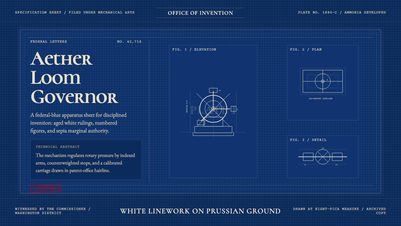 Patent Cyanotype Drawing (1880)Federal authority, chemically printed. Prussian blue gridwork carries aged-wh…
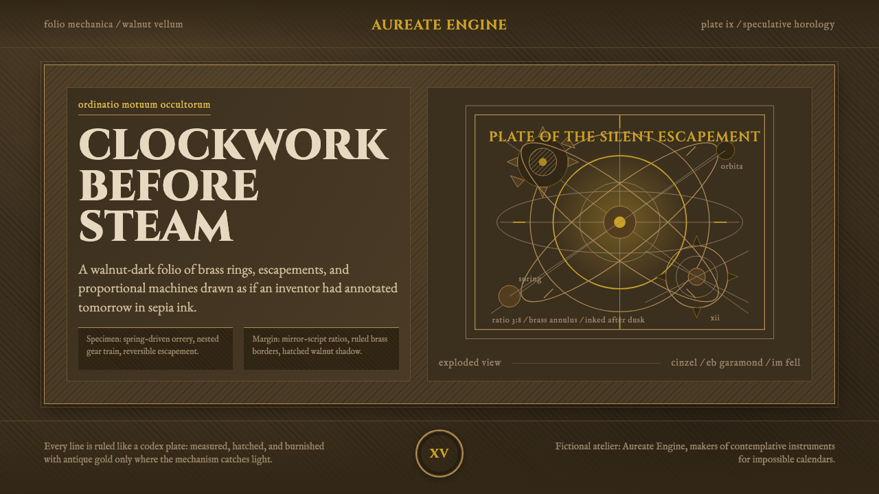 ClockpunkInventive antiquity. Walnut vellum, Cinzel capitals, brass orrery rings, and…
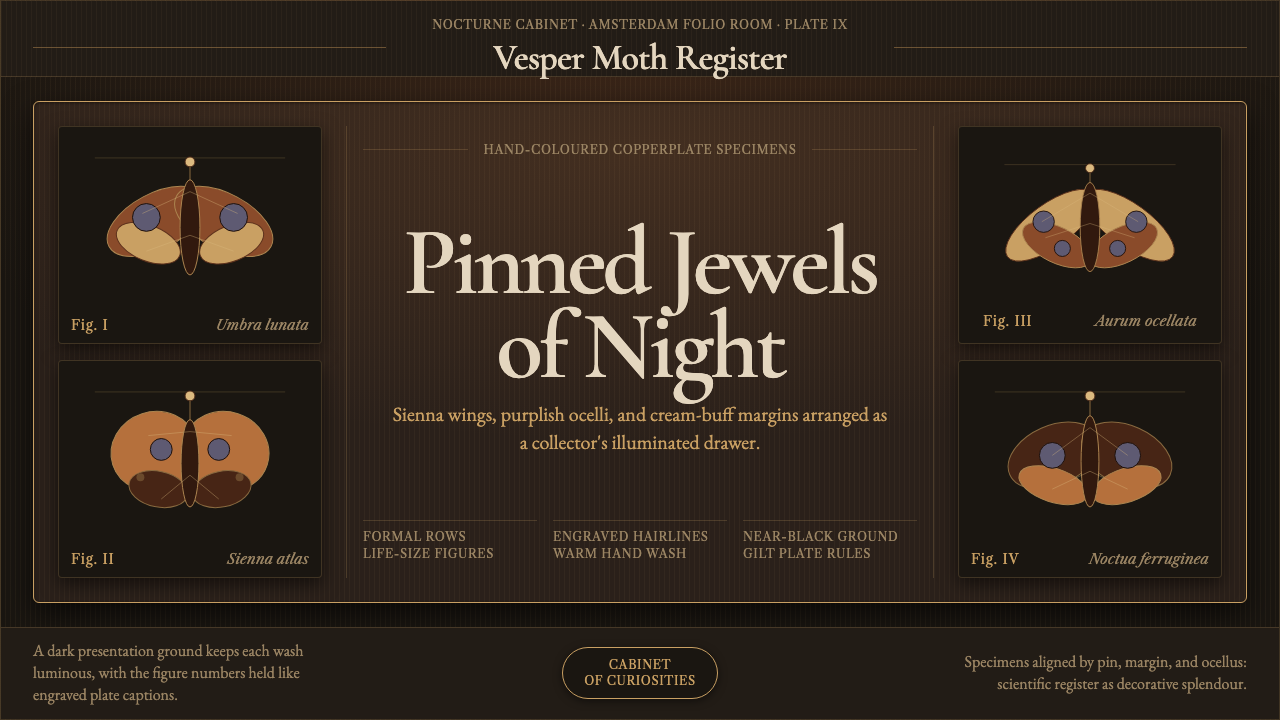 Cramer Exotic MothsJewel-like precision. Sienna specimens glow in formal rows on a near-black pl…
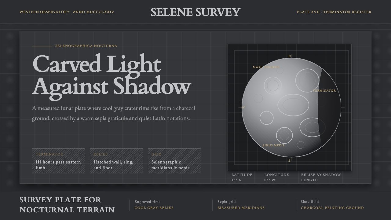 Lunar SelenographyMoonlight becomes measurement. Slate ground, sepia grid, and hatched gray cra…
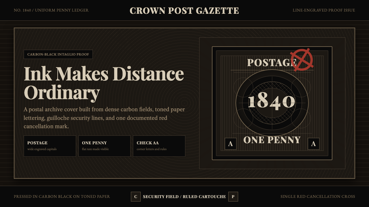 Penny Black StampBlack carries authority. Guilloche lines, Victorian serifs, and one red cross…
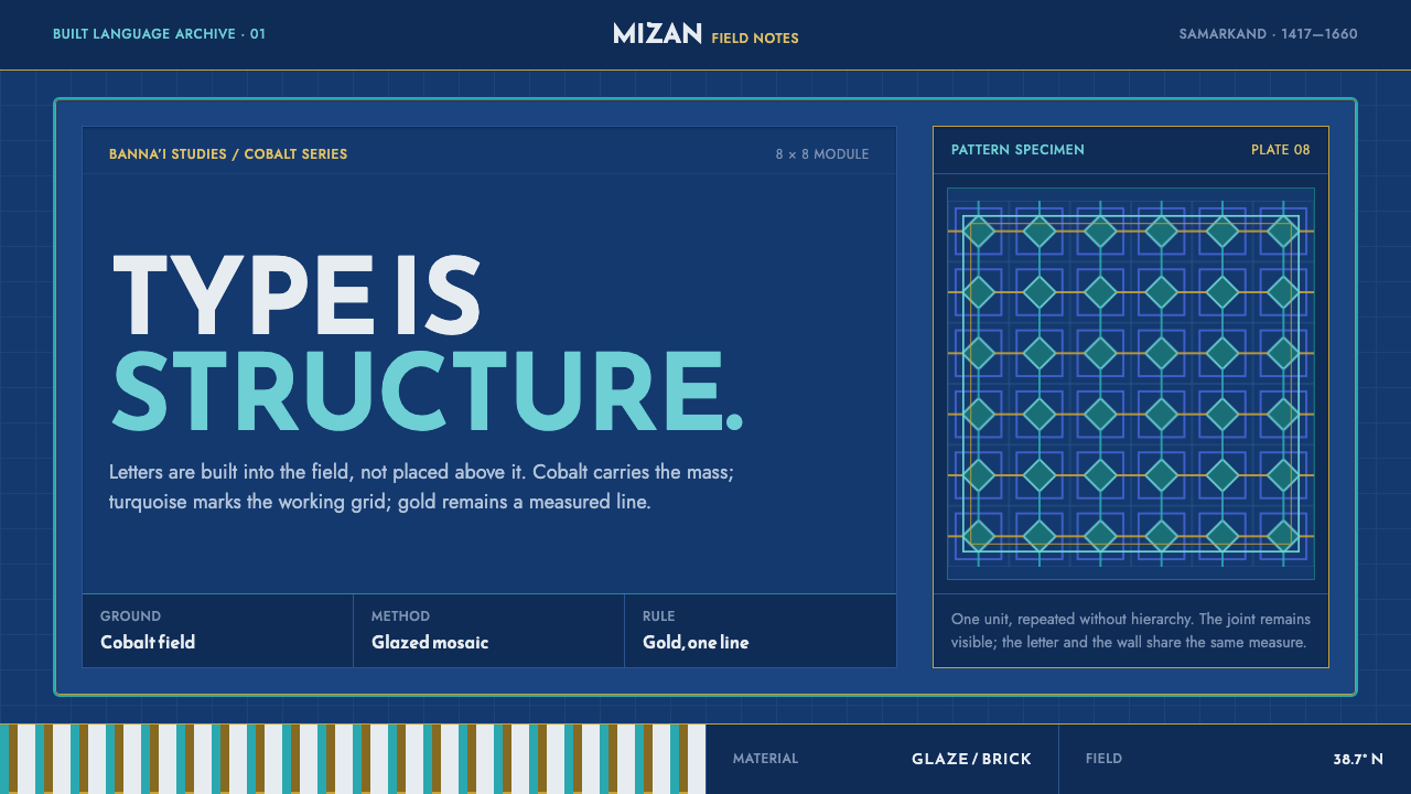 Registan TileworkType becomes structure. Turquoise geometry locks into cobalt, edged with spar…