What is Cricket Test Scorecard?
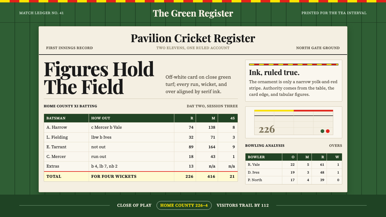
The Cricket Test Scorecard at Lord's is not merely a document of runs and wickets — it is a study in institutional restraint, where serif numerals on an off-white ledger, deep grass green, and a single club stripe of yolk gold and bacon red perform the dignity of a century of Test cricket.
Cricket Test Scorecard in brief
The Cricket Test Scorecard at Lord's is a visual system produced by the Marylebone Cricket Club across the first half of the twentieth century. It places black-ink serif numerals into a ruled tabular grid, prints that grid on an off-white card stock, and sets the whole thing against the deep, saturated green of the Lord's outfield. The result is a typographic document that has barely needed to change in a hundred years because it was designed correctly the first time.
The palette is anchored by three unambiguous elements: the near-black of letterpress ink, the creamy warmth of uncoated card, and the distinctive deep grass green that references the outfield itself. The only ornament is the egg-and-bacon stripe of the MCC — yolk gold running alongside bacon red — which appears as a ruled border or binding element. Every other decision is an act of subtraction: no illustration, no tonal graduation, no colour deployed beyond what the institution's heraldry permits.
As a design language, the scorecard belongs to the tradition of the British institutional ledger — the same sensibility that governed banknotes, railway timetables, and Lloyd's of London policy documents. The authority it communicates does not come from decoration but from precision: ruled lines that are exactly parallel, columns that are exactly aligned, numerals that are exactly the right weight to be legible at the distance of a spectator's hand in full afternoon sunlight.
Where does Cricket Test Scorecard come from?
Lord's Cricket Ground in St John's Wood, London, has been administered by the Marylebone Cricket Club since 1787, when Thomas Lord laid out the first of three grounds that would eventually bear his name. By the early twentieth century, MCC had codified the laws of cricket and served as the sport's global governing body. The scorecard was the primary medium through which spectators followed the game in an era before electronic scoreboards or radio commentary — it was a functional necessity that acquired, over time, the weight of ritual.
The visual language of the scorecard was not the result of a single design decision but an accumulation of letterpress conventions and institutional habit. British printers of the late nineteenth and early twentieth centuries worked with a limited toolkit: the typefaces available in compositing rooms were primarily serif, the paper was off-white uncoated stock chosen for economy and legibility in outdoor light, and the tabular structure of the document was dictated by the nature of cricket statistics themselves — overs bowled, runs conceded, wickets taken, batting order, runs scored, method of dismissal. The form followed the data with no room for embellishment.
The egg-and-bacon stripe is the one element of pure heraldic identity in an otherwise purely functional document. The colours — yolk gold and bacon red — were adopted by the MCC in the mid-nineteenth century and have remained unchanged, appearing on the club tie, the members' cap, and the scorecard border. The nickname 'egg and bacon' was given not by the club but by spectators and members, and it captures perfectly the stripe's domestic warmth within an otherwise institutional context.
Test cricket itself — the long-form version of the game played over five days between national teams — was first played in 1877, and Lord's has hosted Tests since 1884. The cultural authority of the Lord's Test, sometimes called 'the home of cricket,' lent the scorecard a resonance beyond its immediate function. By the interwar period it had become an artefact: something spectators kept as a record of the day, a ledger of hours well spent, which is why its design had to be both practical and legible over years of handling.
What defines the Cricket Test Scorecard look?
Colour Palette
The palette has exactly three components: deep grass green as the ground or ground-referencing field, off-white card as the primary surface for information, and near-black ink as the typographic layer. Against this functional trio, the egg-and-bacon stripe introduces yolk gold and bacon red as the single ornamental signal — but even these are heraldic rather than decorative in intention. No tint, no shade, no midtone graduation appears anywhere. The discipline is absolute and produces a visual system that reads instantly at almost any distance.
Typography
The typeface tradition of the scorecard is letterpress serif — the kind of roman face that British compositing rooms treated as the default for tabular and official documents. Numerals are the primary typographic content, and they must satisfy a specific demand: legibility at small sizes in strong outdoor light, and consistency of width that allows them to align cleanly in columnar tables. The result is a typographic voice that feels simultaneously official and warm — the warmth coming from the slight irregularities of letterpress impression on soft uncoated stock.
The Ruled Table
The dominant structural element is the ruled horizontal and vertical grid. Cricket statistics are inherently tabular: each batsman occupies a row, each bowling figure a column, and the final totals close the ledger with satisfying mathematical precision. The rules are fine, regular, and given weight only where a category boundary genuinely requires emphasis. The result is a document that looks like what it is — an accurate accounting of something that actually happened — and derives authority from that honesty.
Ground Colour as Context
The deep grass green that anchors the system functions not as a neutral background but as an active signifier. It places the document within the physical context of play — the outfield, the pitch, the ground itself — before a single numeral is read. In this sense it operates the way an institutional seal operates: establishing legitimacy and situating the document within a tradition larger than the single match it records. The green is never decorative; it is always referential.
Heraldic Ornament
The egg-and-bacon stripe is the only concession to visual identity in what is otherwise a purely informational document. Its restraint is significant: it does not repeat, does not fill, does not expand to compete with the typographic content. It appears once, as a border element or a binding stripe, and then steps aside. This is how institutional heraldry functions at its best — the identity is stated, not performed. The stripe is less an embellishment than a signature.
Legibility Under Use
A cricket scorecard is not a poster that lives behind glass. It is handled for hours, folded into pockets, consulted in bright afternoon light, used with a pencil, and occasionally saved for decades. Every design decision — the uncoated stock that pencil marks, the dark ink that reads in glare, the open tabular grid that leaves space for annotations — is optimised for use under real conditions rather than ideal presentation. This quality-under-handling is characteristic of the best institutional document design.
Numerical Clarity as Aesthetic
The scorecard makes no attempt to visualise data graphically. There are no bars, no charts, no proportional representations. Instead, it trusts the reader to interpret raw numerals arranged in meaningful spatial relationships. The beauty of the document, such as it is, comes from the mathematical completeness of a correctly totalled scorecard — the columns that add up, the innings that close, the over-by-over record that tells the story of the match more precisely than any graphic could. The system treats numeric precision as its own form of elegance.
Who shaped Cricket Test Scorecard?
Founded in 1787, the MCC is the private members' club that owns Lord's Cricket Ground and served as the sole custodian of the Laws of Cricket until 2009, when it formally transferred the guardianship to an international body while retaining the intellectual role of their steward. The MCC's authority over cricket's visual culture — including the scorecard format, the egg-and-bacon livery, and the dress codes enforced in the members' pavilion — has been exercised with a conservatism that, paradoxically, produced one of the most durable and coherent visual identities in sport.
Thomas Lord, a Yorkshire-born professional cricketer who worked as a groundsman and entrepreneur, established the first Lord's ground in Dorset Square in 1787 at the request of MCC members seeking a private enclosed ground in London. He moved the ground twice before settling at the current St John's Wood site in 1814, taking the original turf with him each time. The ground that bears his name now carries one of cricket's most recognisable visual traditions, including the famous slope of several feet across the playing surface — a natural topographic feature that no scorecard can record but that every player who has fielded there remembers.
William Gilbert Grace, the dominant figure in Victorian-era English cricket, played at Lord's across a career spanning from the 1860s to the early 1900s. His statistics filled countless scorecards, and his physical presence — the enormous beard, the MCC cap, the commanding batting style — became inseparable from the visual imagery of late nineteenth-century cricket. In a real sense, the scorecard tradition was being solidified at precisely the moment when Grace's scores were the ones most spectators were there to follow, and the document's format was shaped partly by the need to record the particular complexity of his prolific accumulations.
The Pavilion at Lord's, completed in 1890 to designs by Frank Verity, is the physical embodiment of the same institutional aesthetic that governs the scorecard. Its red-brick Victorian exterior, its reserved members-only Long Room, and the strict dress code enforced within it represent a designed environment in which every element signals belonging, tradition, and hierarchy without requiring explicit statement. The Pavilion and the scorecard are complementary artefacts — one architectural, one typographic — expressing the same set of values through different media.
The Laws of Cricket, first codified in 1744 and revised by the MCC through numerous editions, are the conceptual counterpart to the visual system of the scorecard. Just as the Laws provide a complete and self-consistent account of the game's logic — a framework within which any outcome can be precisely categorised — the scorecard provides a visual framework within which any match can be precisely recorded. Both are exercises in the same intellectual tradition: the reduction of a complex, human, contingent activity to a set of formal rules rigorous enough to produce unambiguous results.
How do you use Cricket Test Scorecard today?
The Cricket Test Scorecard at Lord's is one of the most specific and contextually grounded design styles in the Curio library. Applying it effectively requires understanding that its power comes from its institutional specificity, not its visual complexity. The elements are simple — deep green, off-white, near-black ink, one heraldic accent — but they carry connotations of authority, tradition, and precision that only function when those connotations are deserved by the content.
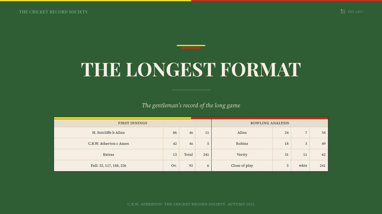
For presentation slides, the style suits contexts where data, results, and accumulated records are the primary content. A cover slide works well with a deep grass green field, the title and date set in a clean serif at high contrast on an off-white inset panel, and no illustration beyond a ruled border. Content slides function best as actual tables: a properly ruled ledger grid with columns labelled in small serif caps and figures set in tabular numerals. The visual authority of the layout comes from the grid's precision, not from decorative additions. Slide decks for quarterly reviews, tournament records, board presentations, or any context where accumulated numerical data is the argument benefit from this approach.
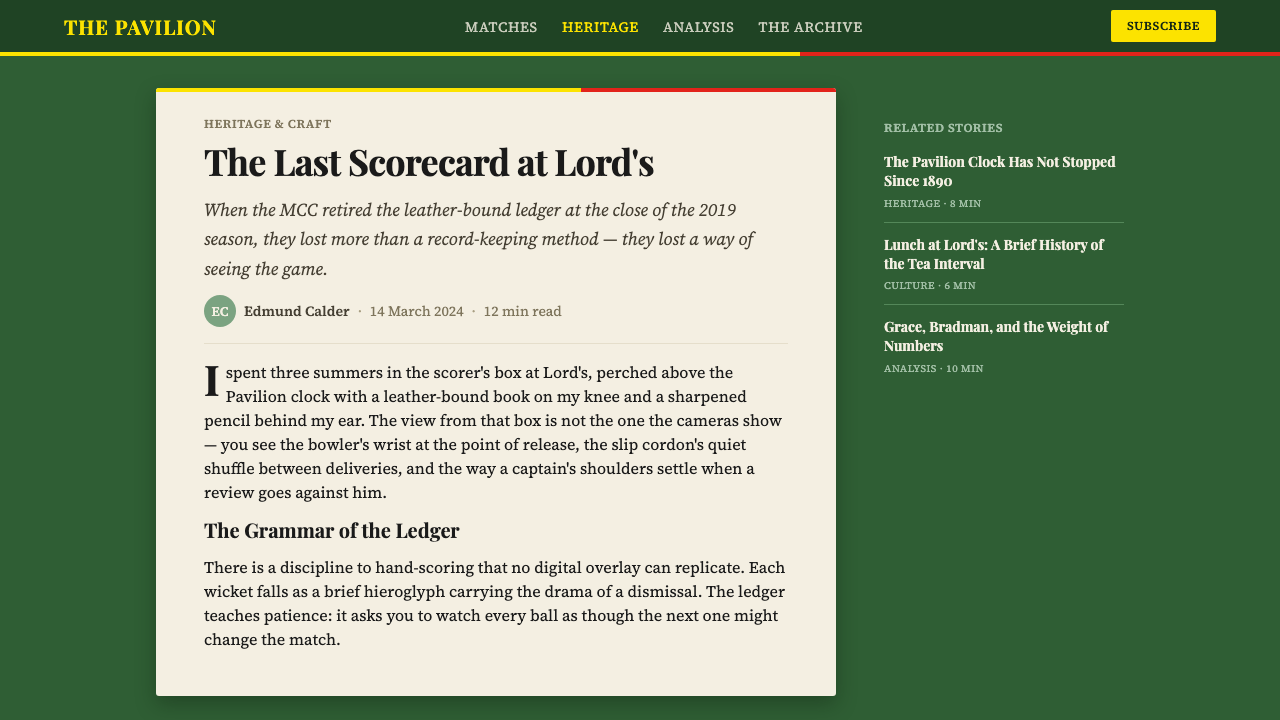
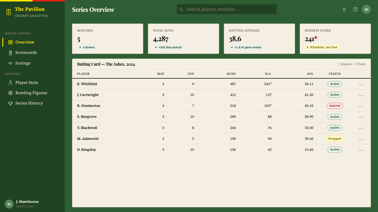
For web interfaces, the style applies most naturally to dashboards, standings tables, historical records, and any interface that must communicate institutional permanence. Use deep green as a masthead or accent band, off-white or warm white as the primary background, and a carefully chosen serif typeface for all tabular data. The egg-and-bacon accent should be used sparingly — a single ruled border, a thin top-of-page stripe — rather than repeated throughout the interface. Interactive states can be indicated by shifts in the green or by the introduction of a warm gold, but the palette should not be expanded beyond these established boundaries.
For editorial and printed materials, the scorecard style is particularly appropriate for annual reports, programme books, institution histories, and longform data publications. The ruled table structure translates well to print: a correctly set up grid with consistent margins, tabular figures aligned to the decimal, and section breaks marked by horizontal rules rather than graphic ornaments will produce work that feels serious and accountable without feeling cold. The style suits organisations that want to project longevity and precision — legal, financial, sporting, educational — rather than youth or novelty.
The most common mistake when applying this style is adding colour or illustration to fill what feels like visual emptiness. The off-white and deep green combination with ruled lines can seem spare to designers trained in more decorative traditions, and there is a temptation to add texture, gradient, or additional palette colours to make the work feel 'designed.' This is exactly the wrong instinct. The authority of the scorecard comes from what is not there — from the confidence that precision, legibility, and institutional weight are sufficient. Adding visual noise to reassure yourself that the design is working is the clearest sign that you have lost confidence in the system.
Cricket Test Scorecard — FAQ
Is this style only appropriate for cricket or sports contexts?
Not at all, though the cricket reference must be worn lightly if the content has no connection to the sport. The visual language of the Lord's scorecard is fundamentally the language of the British institutional ledger — a tradition that encompasses legal records, financial accounts, railway timetables, and official results of all kinds. Any context where accumulated numerical data must be presented with authority, legibility, and a suggestion of institutional permanence can use this system effectively. What it cannot do is lend those qualities to content that is trying to seem innovative, playful, or informal — the connotations run too strongly the other way.
How does this style handle colour beyond the three main elements?
The system is intentionally closed. Deep green, off-white, and near-black are not a starting palette to which other colours are added — they are the complete palette. The egg-and-bacon accent (yolk gold and bacon red) functions as a heraldic identity marker, not as a colour-coding system to be expanded. When designers extend this palette to include, say, a third data colour or a status indicator, the institutional character immediately weakens. If the content genuinely requires a richer colour vocabulary — for example, a multi-team tournament table where teams must be distinguished by colour — a different visual system should be chosen, or the additional colours should be introduced via a deliberate and constrained convention such as a single-column identifier.
Can this style work in digital interfaces, or is it primarily for print?
The style translates well to digital, but it requires choosing typefaces that carry the same qualities as traditional letterpress serif types — consistent stroke contrast, clear tabular numerals, sufficient weight at small sizes. The off-white background translates naturally to screen; the deep green works as a masthead, navigation bar, or accent band. The ruled table structure is native to HTML and CSS and can be implemented precisely. The main risk in digital implementation is over-engineering the hover states and interactive elements — the system's restraint should extend to interactions, which means subtle state changes rather than animated transitions or bold colour shifts.
What is the difference between this style and other British institutional design traditions?
The Lord's scorecard belongs to a specifically sporting and amateur institutional tradition, which distinguishes it from the corporate gravity of, say, a Bank of England document or the civic authority of a Royal Charter. Its authority is warmer and more particular than either of those — grounded in the specific physicality of a summer afternoon at a cricket ground, in the texture of a card held in a spectator's hand, in the social context of membership and belonging. Compared to the Bank of England's engraved severity or the BBC's polished neutrality, the scorecard has a specific human warmth derived from its outdoor setting and its association with a game. That warmth is part of what designers can draw on, and it distinguishes the style from other British institutional systems that tend toward more abstract authority.
Why does the scorecard's design feel more authoritative than a modern data table?
Because it makes no attempt to make the data look impressive. Contemporary data design often defaults to visual embellishment — gradient fills, animated transitions, large typographic numerals pulled out of their tabular context — precisely because designers feel that raw data is not, by itself, sufficiently engaging. The scorecard does the opposite: it presents the data in the most direct possible format, trusts the reader to find it meaningful, and adds only the structural minimum needed to ensure legibility. The result reads as confident rather than anxious. Authority in institutional design, as in institutional conduct, is often communicated most effectively by understatement — by the refusal to perform.
Related design styles
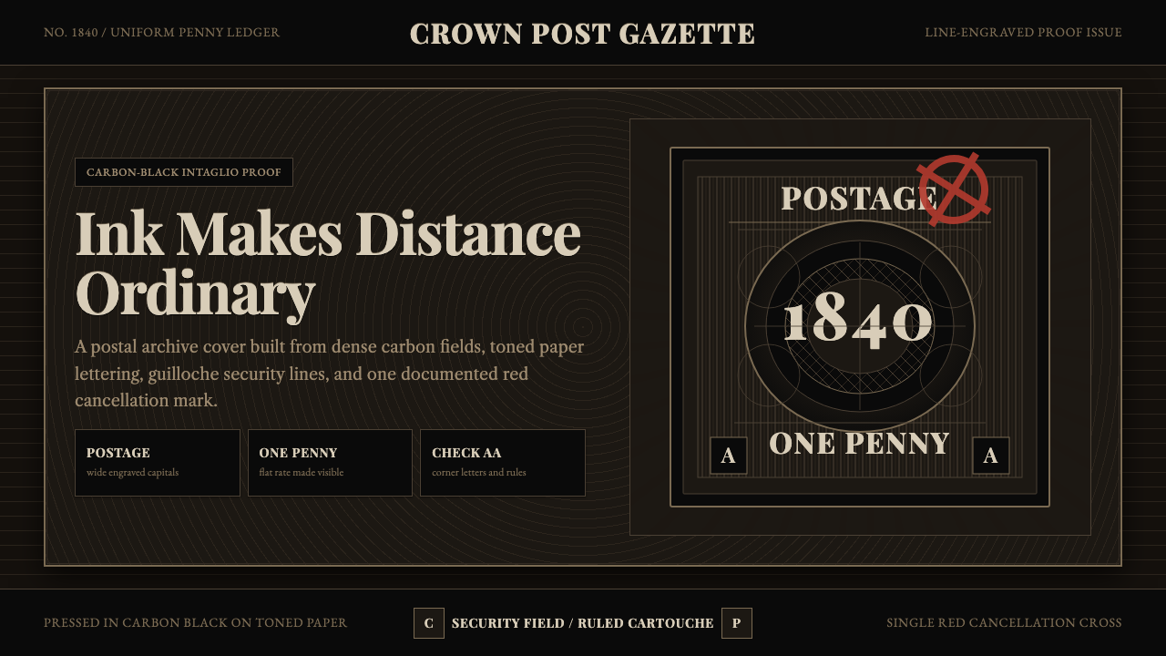 Penny Black StampBlack carries authority. Guilloche lines, Victorian serifs, and one red cross…
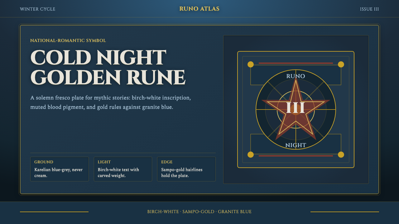 Finnish Kalevala EpicEpic weight in cold night. Birch-white Cinzel, Sampo-gold rules, blue-grey fr…
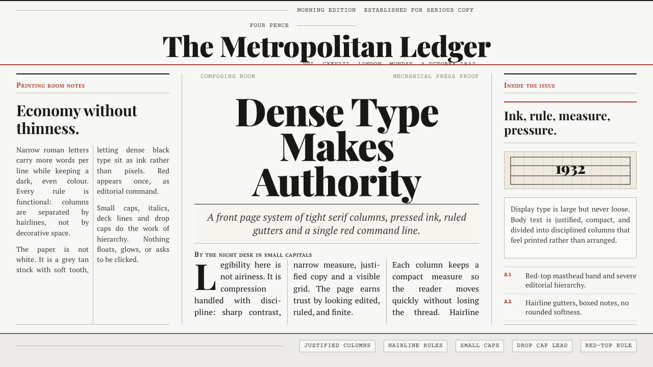 Times New Roman by MorisonAuthority under pressure. Dense black serif columns on grey-tan newsprint, ru…
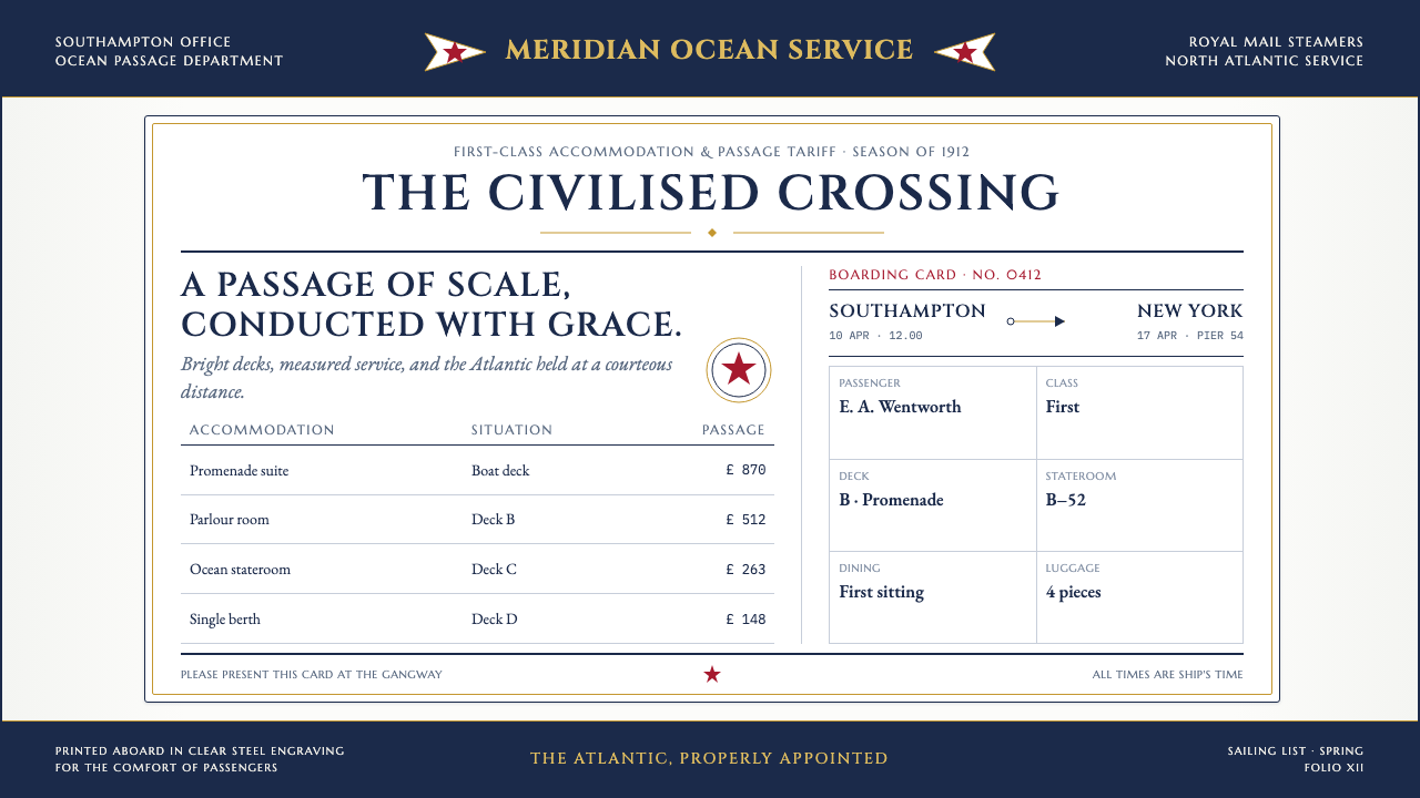 Titanic White Star Line (1912)Service made ceremonial. Navy rules, gilt capitals and a lone red star order…
 Admiralty Sea ChartSurvey authority, engraved. Aqua chart water, black soundings, buff land, one…
 Ansel Adams Zone SystemOnly light remains. Deep shadow, serif captions, and one white moon mark the…