What is Patent Cyanotype Drawing (1880)?什么是 Patent Cyanotype Drawing (1880)?
Every invention that reshaped the modern world — the light bulb, the telephone, the airplane — was first made official in white hairlines on deep Prussian blue, the chemical grammar of American patent authority.每一项重塑现代世界的发明——电灯泡、电话、飞机——都首先以白色细线绘制在深普鲁士蓝底色上,以这种化学语法获得美国专利的官方认证。
Patent Cyanotype Drawing (1880) in briefPatent Cyanotype Drawing (1880) 速览
Patent Cyanotype Drawing is the visual system of American federal invention documentation from the Gilded Age. Between 1875 and 1920, every patent drawing submitted to the US Patent Office was rendered in white lines on a deep blue field, produced through the cyanotype photographic process — a contact-printing technique in which iron-salt coated paper turned the now-iconic Prussian blue wherever light did not strike it, leaving white wherever lines blocked the exposure. The result was a technical illustration of exceptional precision and an unmistakable aesthetic authority.专利氰版绘图是镀金时代美国联邦发明文献的视觉系统。1875至1920年间,提交给美国专利局的每一份专利图纸均以白色线条绘制在深蓝色底面上,通过氰版摄影工艺制成——这是一种接触印刷技术:涂有铁盐的纸张在光照处呈现出标志性的普鲁士蓝,而被线条遮挡、未受光照的区域则保持白色。其结果是一幅精度卓越的技术插图,以及一种无可辨错的美学权威。
The visual language is defined by its constraints: hairline technical draftsmanship on a saturated, atmospheric blue ground, with ornamental borders drawn from Victorian legal document conventions, figure reference numbers in neat serif numerals, and the occasional title block rendered in the formal copperplate hand of the professional draftsman. Everything serves the legal and technical function of the patent record — yet the aggregate effect is one of austere beauty, the beauty of a system working at its full capacity.这套视觉语言由其约束条件所定义:在高饱和度、氛围感浓郁的蓝色底面上,精细的技术线稿与源自维多利亚时期法律文书传统的装饰性边框并置,图示参考编号以整洁的衬线数字标注,标题栏偶尔以专业制图师的铜版楷书手写完成。一切元素都服务于专利档案的法律与技术功能——然而综合效果却呈现出一种朴素之美,一套系统以其全部能力运转时所呈现的美。
This design system captures two things simultaneously: the authority of government documentation and the craft of the professional patent illustrator. The deep blue carries connotations of officialdom and permanence; the white linework speaks to precision, expertise, and the trained hand. Applied to contemporary design work, the vocabulary signals institutional credibility, technical depth, and a respect for process — values that are rare and therefore legible when authentically deployed.这套设计系统同时捕捉了两样东西:政府文件的权威感与专业专利插图师的精湛工艺。深蓝色承载着官方性与永久性的意涵;白色线稿则传递出精确、专业与训练有素之手的气质。应用于当代设计工作时,这套视觉词汇传递出机构公信力、技术深度与对流程的尊重——这些品质在当下稀缺,因而在真实部署时格外清晰可辨。
See the Patent Cyanotype Drawing (1880) design system查看 Patent Cyanotype Drawing (1880) 完整设计系统
Where does Patent Cyanotype Drawing (1880) come from?Patent Cyanotype Drawing (1880) 从何而来?
The cyanotype process was invented in 1842 by the English scientist Sir John Herschel, who discovered that ferric ammonium citrate and potassium ferricyanide, when combined and exposed to ultraviolet light, produced a stable Prussian blue compound. Herschel developed the process as a means of duplicating notes and drawings — not as photography in the artistic sense, but as a reprographic tool. The botanical illustrator Anna Atkins immediately grasped its potential for scientific documentation and in 1843 produced the first photographically illustrated book, cyanotype prints of British algae that combined scientific precision with an otherworldly blue-on-white beauty.氰版工艺由英国科学家约翰·赫歇尔爵士于1842年发明。他发现柠檬酸铁铵与铁氰化钾混合后经紫外线照射,能产生稳定的普鲁士蓝化合物。赫歇尔开发这一工艺是为了复制笔记与图纸——不是艺术意义上的摄影,而是一种复制工具。植物插图师安娜·阿特金斯立即看到了它在科学文献记录方面的潜力,于1843年出版了第一本以摄影技术配图的书籍——英国藻类的氰版印刷图,将科学精确性与一种超凡的蓝白之美融为一体。
The process migrated from scientific documentation to engineering and architecture in the 1850s and 1860s, where it became the dominant means of duplicating technical drawings — the origin of what we still call a 'blueprint.' Its advantages were practical: the chemistry was cheap and stable, the paper required no darkroom to process (daylight or a UV lamp sufficed), and the resulting prints were durable, chemically stable, and resistant to fading under normal archival conditions. By the 1870s, the US Patent Office had standardized cyanotype as the required format for patent illustration submissions, and a cottage industry of professional patent draftsmen had developed in Washington DC, New York, Boston, and Philadelphia to serve the exploding volume of Gilded Age invention.这一工艺在1850至1860年代从科学文献迁移到工程与建筑领域,成为复制技术图纸的主要手段——这正是我们今天仍称之为「蓝图」的起源。它的优势是实用性的:化学原料廉价而稳定,纸张无需暗室处理(日光或紫外灯即可),印制出的成品耐用、化学性质稳定,在正常档案保存条件下不易褪色。到1870年代,美国专利局已将氰版印刷标准化为专利图纸提交的法定格式,一个由专业专利制图师构成的产业在华盛顿特区、纽约、波士顿和费城兴起,服务于镀金时代爆炸式增长的发明申请量。
The period from 1875 to 1920 represents the high-water mark of American patent culture. The US Patent Office processed hundreds of thousands of applications during these decades, and the visual conventions of the cyanotype drawing became deeply standardized: mandatory figure numbers, reference numerals keyed to written specifications, ornamental borders adapted from legal document conventions, and the use of hatching and cross-hatching to indicate material and surface. Orson Desaix Munn and Alfred Ely Beach, editors of Scientific American and operators of a prominent patent agency, were among the figures who helped codify and disseminate these conventions through the widely read patent filing guides and specimen sheets their agency produced.1875至1920年是美国专利文化的鼎盛时期。专利局在这数十年间处理了数以十万计的申请,氰版绘图的视觉规范也高度标准化:强制性图示编号、与书面说明书对应的参考数字、改编自法律文书传统的装饰性边框,以及用于标示材料与表面的排线与交叉排线。《科学美国人》的编辑奥森·德萨伊·芒恩与阿尔弗雷德·伊莱·比奇,同时也是一家著名专利代理机构的运营者,他们通过广泛流传的专利申请指南与样本图集,协助编纂并传播了这些制图规范。
The cyanotype era ended gradually as photostatic copying and, later, xerographic reproduction made the process obsolete. By the 1920s, the Patent Office had shifted to accepting drawings on white paper with black ink — the format still in use today. But the 1875–1920 corpus of cyanotype patent drawings survived in federal archives, and their aesthetic has experienced a sustained cultural revival since the late twentieth century, as designers and historians recognized in the deep-blue technical drawings not just historical artifacts but a fully realized visual system of remarkable coherence and authority. The drawings of Edison's lamp, Bell's telephone, and the Wright brothers' Flyer No. 1 are among the most reproduced technical images in American cultural memory.氰版时代随着静电复印和后来的静电照相复制技术的普及而逐渐终结。到1920年代,专利局已转向接受黑墨水绘制在白纸上的图纸——这一格式沿用至今。但1875至1920年间的氰版专利图纸作为联邦档案留存了下来,其美学自二十世纪末以来经历了持续的文化复兴:设计师与历史学家在这些深蓝色技术图纸中发现的不仅是历史文物,而是一套具有卓越连贯性与权威感的完整视觉系统。爱迪生电灯泡、贝尔电话与莱特兄弟一号飞行者号的专利图纸,是美国文化记忆中被复制最广泛的技术图像。
What defines the Patent Cyanotype Drawing (1880) look?Patent Cyanotype Drawing (1880) 的视觉特征是什么?
Ground Color底色
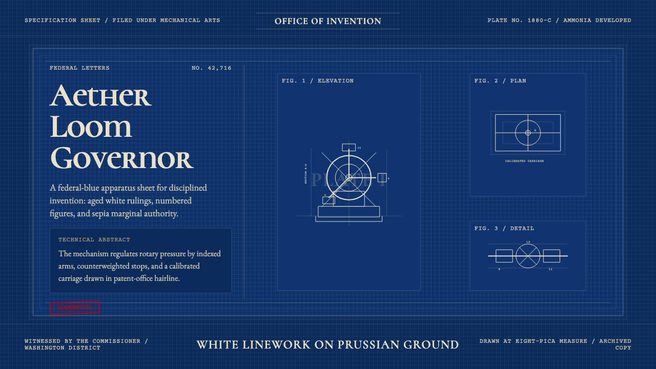
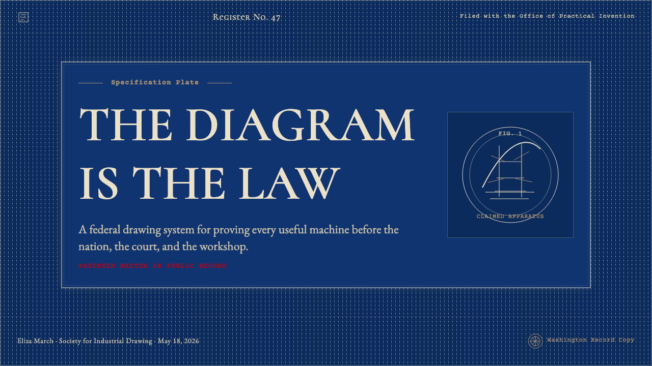
The defining element is the deep, saturated Prussian blue ground — a blue that sits between navy and cobalt, neither warm nor cold, with a chemical density that reads as institutional and permanent. This is not a decorative choice but a chemical fact of the cyanotype process: the blue emerges wherever iron compounds are oxidized by ultraviolet exposure, creating a field that functions simultaneously as background, atmosphere, and authority. The specific depth of the blue varied with exposure time and chemistry, giving individual patent sheets subtle variations within the same tonal family.定义性元素是深度饱和的普鲁士蓝底色——一种介于深海蓝与钴蓝之间的蓝,不偏暖也不偏冷,具有一种读起来既官方又永久的化学密度感。这不是装饰性选择,而是氰版工艺的化学事实:蓝色在铁化合物经紫外线氧化之处生成,形成一个同时承担背景、氛围与权威感的底面。蓝色的具体深度因曝光时间与化学配比而异,使每张专利图纸在同一色调家族中呈现出微妙变化。
Linework线稿
All drawn elements appear in white or near-white against the blue ground, produced by the opacity of the original ink or graphite blocking light during contact printing. Professional patent draftsmen worked at a level of precision demanding hairlines, consistent weights, and the ability to render complex mechanical assemblies in clean, unambiguous outline. Line weight is used hierarchically: heavier lines define major outlines and section boundaries; finer lines indicate surface details, hatching, and annotation. The overall effect is diagrammatic clarity elevated to a craft standard.所有绘制元素在蓝色底面上以白色或近白色呈现,这是原稿中的墨迹或铅笔在接触印刷时遮挡光线的结果。专业专利制图师以极高精度工作,要求极细的发丝线、均匀的线重,以及以清晰、无歧义的轮廓线表现复杂机械组件的能力。线重按层级使用:较重的线定义主要轮廓与截面边界;较细的线标注表面细节、排线与注释。整体效果是被提升至工艺标准的示意图式清晰感。
Ornamental Borders装饰性边框
Each patent sheet carries a formal border drawn from Victorian legal document conventions — typically a double-rule frame with corner ornaments, or a single heavy outer rule with a thinner inner rule creating a margin of official gravity. These borders are not merely decorative; they signal the document's legal status and establish the sheet as a formal record rather than a working sketch. The border vocabulary draws on the same tradition as stock certificates, legal briefs, and government currency of the period.每张专利图纸都带有源自维多利亚时期法律文书传统的正式边框——通常是带有角落装饰的双线框,或由粗外框线与细内框线构成、形成官方庄重感页边距的单层框。这些边框不仅是装饰性的,它们标示着文件的法律地位,将图纸确立为正式档案而非工作草图。这套边框词汇与同时期的股票证书、法律简报和政府货币出自同一传统。
Figure Numbers and Reference Numerals图号与参考编号
Every patent drawing is organized through a formal numbering system: figure numbers identify each distinct view (Fig. 1, Fig. 2, and so on), and reference numerals keyed to the written specification identify each component. These numerals are typically set in a clean, upright serif — the preferred hand of the trained patent draftsman — placed with enough spatial separation from the linework to remain legible without crowding. The numerals are functional annotations, but their consistent placement and weight contribute to the overall typographic authority of the sheet.每张专利图纸通过正式编号系统组织:图号标识每个独立视图(图1、图2,以此类推),与书面说明书对应的参考编号标识每个组件。这些数字通常以整洁、直立的衬线字体标注——这是训练有素的专利制图师的惯用手写体——与线稿保持足够的空间距离,以确保清晰可读而不显拥挤。这些数字是功能性注释,但其一致的位置与字重为整张图纸的排印权威感作出了贡献。
Hatching and Material Indication排线与材料标示
Patent drawing conventions required draftsmen to indicate material and surface type through standardized hatching patterns: parallel lines for metal, cross-hatching at specific angles for different materials, stippling for certain surfaces. These conventions were codified in Patent Office rules and enforced during examination. The hatching serves both a functional purpose — making sectional views readable — and an aesthetic one, adding texture and tonal variation to what would otherwise be a purely linear composition.专利图纸规范要求制图师通过标准化排线图案标示材料与表面类型:金属用平行线,不同材料用特定角度的交叉排线,某些表面用点刻。这些规范在专利局规则中已有编纂,并在审查过程中得到执行。排线既服务于功能目的——使截面视图清晰可读——也具有美学功能,为否则纯粹线性的构图增添了质感与色调变化。
Aged and Archival Quality岁月感与档案质感
Surviving cyanotype patent sheets carry a characteristic aged quality: the white lines have yellowed slightly to warm ivory, the blue ground has shifted subtly in areas of uneven original exposure, and the paper itself shows the texture of period stock. This patina is not degradation but accumulation — evidence of a document that has endured. In contemporary design applications, invoking this quality requires restraint: the aged effect should feel inherent to the process rather than applied as a surface treatment.留存至今的氰版专利图纸带有一种特征性的岁月感:白色线条已微微泛黄为暖象牙色,蓝色底面在原始曝光不均匀之处已发生细微偏移,纸张本身也呈现出同时代纸料的质感。这种包浆不是劣化,而是积累——一份历经岁月的文件所留下的证据。在当代设计应用中,唤起这种质感需要克制:岁月效果应感觉内生于工艺本身,而非作为表面处理叠加上去。
Diagrammatic Clarity示意图式清晰感
The overriding visual principle of the patent drawing is unambiguous legibility. Every element must be readable by a patent examiner, a judge, or a manufacturer attempting to replicate the invention. This functional demand produced an aesthetic of diagrammatic precision: multiple views (plan, elevation, section, perspective) organized on a single sheet, with each view self-contained and consistently scaled relative to its neighbors. The patent draftsman's art was the art of explanation — making the invisible mechanism visible, making the complex assembly readable.专利图纸压倒一切的视觉原则是无歧义的清晰可读性。每一个元素都必须能被专利审查员、法官或试图复制发明的制造商所阅读。这一功能需求产生了示意图式精确感的美学:多个视图(平面、立面、截面、透视)组织在单张图纸上,每个视图自成一体,与相邻视图保持一致的比例关系。专利制图师的艺术是解释的艺术——让不可见的机制变得可见,让复杂的组件变得可读。

See the Patent Cyanotype Drawing (1880) design system查看 Patent Cyanotype Drawing (1880) 完整设计系统
Who shaped Patent Cyanotype Drawing (1880)?谁塑造了 Patent Cyanotype Drawing (1880)?
Herschel invented the cyanotype process in 1842 as a scientific reprographic tool, not as a visual art form. A polymath who also coined the terms 'photography,' 'negative,' and 'positive,' he understood the process as a means of making exact copies of handwritten notes and drawings without manual transcription. His decision to publish the process openly rather than patent it ensured its rapid adoption across scientific, engineering, and eventually governmental contexts — a choice whose consequences include the entire corpus of American patent drawings.赫歇尔于1842年将氰版工艺作为科学复制工具而非视觉艺术形式发明出来。他是一位博学者,同时也创造了「摄影」、「负片」和「正片」等术语,他将这一工艺理解为无需手工抄录即可精确复制手写笔记与图纸的手段。他选择公开发表而非申请专利的决定,确保了这一工艺在科学、工程乃至政府领域的迅速普及——这一选择的后果包括整个美国专利图纸档案的形成。
Atkins was the first person to grasp the cyanotype's potential for scientific illustration and the first to use it to produce a published book. Her 1843 series 'Photographs of British Algae: Cyanotype Impressions' placed botanical specimens directly on sensitized paper and made contact prints, producing images of extraordinary precision and an almost dreamlike blue-and-white beauty. Her work established the visual grammar — white form against deep blue ground — that would define the process's aesthetic identity for the remainder of the century.阿特金斯是第一个认识到氰版工艺在科学插图方面潜力的人,也是第一个用它出版书籍的人。她于1843年出版的《英国藻类摄影:氰版印象》系列将植物标本直接置于感光纸上进行接触印刷,产生了精度卓越、带有近乎梦幻的蓝白之美的图像。她的工作确立了这一视觉语法——白色形态映衬于深蓝底面——这一语法定义了该工艺在此后整个世纪的美学身份。
As co-owner of Scientific American and founder of Munn and Company, the largest patent agency in nineteenth-century America, Munn occupied a central position in the Gilded Age patent ecosystem. His agency handled tens of thousands of patent applications and published widely read guides to the patent process, including detailed specifications for acceptable drawing formats. The visual standards codified and distributed through Munn's agency were among the most influential forces shaping the professional practice and aesthetic conventions of the American patent draftsman.作为《科学美国人》的共同所有者和十九世纪美国最大专利代理机构芒恩公司的创始人,芒恩在镀金时代专利生态系统中占据核心位置。他的机构处理了数以万计的专利申请,并出版了广泛流传的专利申请指南,包括对可接受图纸格式的详细规范。通过芒恩机构编纂和传播的视觉标准,是塑造美国专利制图师专业实践与美学规范最具影响力的力量之一。
Beach was Munn's partner at Scientific American and served as the magazine's editor for decades. In addition to his editorial role, he was himself an inventor and patent holder — most famously for a pneumatic transit tunnel beneath Broadway in New York, completed in 1870 — which gave him an unusual dual perspective as both patent system advocate and patent applicant. His close involvement with both the documentation and promotion of American invention culture made Scientific American under his editorship a key vehicle for establishing and spreading the visual conventions of technical illustration.比奇是芒恩在《科学美国人》的合伙人,担任该杂志编辑长达数十年。除编辑职务外,他本人也是一位发明家和专利持有人——最著名的是1870年建成的纽约百老汇地下气动轨道隧道——这使他同时具备专利制度倡导者与专利申请人的双重视角。他对美国发明文化的记录与推广的密切参与,使他主编下的《科学美国人》成为确立和传播技术插图视觉规范的关键媒介。
Edison's prolific patent record — he held over a thousand US patents — makes him the single most important figure in the visual canon of the cyanotype patent drawing era, not as a draftsman but as a subject. The cyanotype drawings for his incandescent lamp (Patent No. 223,898, granted 1880), phonograph, and early motion picture apparatus are among the most recognized technical images in American history. Edison's Menlo Park laboratory employed dedicated draftsmen who worked to the Patent Office's exacting specifications, and the visual language of those drawings has become inseparable from the cultural mythology of invention itself.爱迪生的专利记录极为丰厚——他持有超过一千项美国专利——使他成为氰版专利图纸时代视觉典范中最重要的人物,不是作为制图师,而是作为图纸的主题。他的白炽灯(1880年授权的第223,898号专利)、留声机和早期电影设备的氰版图纸是美国历史上最广为人知的技术图像之一。爱迪生的门洛帕克实验室雇用了专职制图师,严格按照专利局的规范工作,而那些图纸的视觉语言已与发明本身的文化神话不可分割。
How do you use Patent Cyanotype Drawing (1880) today?今天怎么用 Patent Cyanotype Drawing (1880)?
Patent Cyanotype Drawing is a high-specificity style: it communicates institutional authority, technical precision, and historical credibility with unusual efficiency. Applying it correctly requires understanding that its power comes from coherence — the deep blue ground, the white linework, the period-appropriate borders, and the diagrammatic organization must work together rather than be borrowed piecemeal. Lifting only the blue color or only the linear diagram aesthetic will produce something that feels like a vague historical reference rather than a fully realized system.专利氰版绘图是一种高特异性风格:它以不寻常的效率传递机构权威、技术精确性和历史公信力。正确应用它需要理解其力量来自连贯性——深蓝底色、白色线稿、符合时代的边框,以及示意图式的组织方式,必须协同运作,而非被零散借用。仅仅提取蓝色或仅仅借鉴线性图解美学,只会产生一种含混历史参考的感觉,而非一套完整实现的系统。
For presentation slides, the style is most effective on covers and section dividers, where its poster-like authority creates immediate impact. A cover slide benefits from centering a single technical diagram — a stylized machine, a schematic circuit, an architectural cross-section — against the characteristic deep blue, with the title set in a clean upright type that echoes the numerals of the period. Content slides should use a lighter interpretation: the blue as an accent or header background while body text sits on near-white, with data visualizations rendered as crisp white-on-blue diagrams. Charts and graphs become technical drawings in their own right — axes drawn as fine rules, data series rendered as precise linework rather than filled areas.在演示文稿中,这种风格在封面页与章节分隔页上最为有效,其海报式的权威感能立即产生冲击力。封面页适合将单一技术图解——风格化的机械、原理图电路、建筑截面图——置于特征性深蓝底色的中央,标题以呼应同时代图纸数字字体的整洁直立字体排版。内容页应使用更轻盈的诠释:将蓝色用作强调色或标题背景,正文置于近白底色上,数据可视化以清晰的蓝底白色图表呈现。图表和数据图本身成为技术图纸——坐标轴绘制为细线规则,数据系列以精确线稿而非填色区域呈现。
For web interfaces, the style translates naturally to dashboards, technical documentation hubs, and platforms positioning themselves around precision and credibility — analytics tools, engineering platforms, scientific or medical applications. The approach: use the deep blue as the primary background for key interface zones (navigation bars, hero sections, data cards), with white type and fine-rule dividers. Interactive elements — buttons, toggles, selected states — can pick up warm ivory or off-white as the active state against the blue ground. Pricing pages benefit from the style's natural hierarchy: tier names set in the manner of patent figure titles, feature lists rendered as annotated diagrams rather than generic bullet points.对于网页界面,这种风格自然适用于仪表板、技术文档中心,以及围绕精确性与公信力定位自身的平台——分析工具、工程平台、科学或医疗应用。方法如下:将深蓝色用作关键界面区域(导航栏、英雄区、数据卡片)的主背景,配以白色文字与细线分割。交互元素——按钮、切换开关、选中状态——可采用暖象牙色或近白色作为蓝色底面上的活跃状态。定价页面适合这种风格天然的层级感:产品层级名称以专利图号的方式排版,功能列表以注释式图表而非通用项目符号呈现。
For editorial and marketing work, the vocabulary of the patent drawing supports a distinctive combination of historical gravitas and technical credibility. Feature spreads about innovation, engineering, or industrial history are natural fits. Full-bleed deep-blue section openers with white diagram illustrations establish the tone; body copy pages shift to black-on-white with blue used only for pull quotes, section markers, or illustrative elements. Marketing campaigns for technical products — hardware, instrumentation, precision manufacturing — can use the style to signal craft and deliberateness without the sterility of contemporary flat design. The patent border motif works particularly well as a recurring structural element across multi-page layouts.对于编辑与营销内容,专利图纸的视觉词汇支持历史厚重感与技术公信力的独特组合。关于创新、工程或工业历史的专题报道是天然契合的应用场景。以深蓝色为底的全出血章节开篇配合白色图解插图确立基调;正文页转为黑底白字,蓝色仅用于引用语、章节标记或图解元素。技术产品——硬件、仪器、精密制造——的营销活动可以借助这种风格传递工艺感与慎重感,而不必承受当代扁平设计的刻板无温度感。专利边框母题在多页版面中作为反复出现的结构性元素特别有效。
A common mistake when applying this style is using it as pure nostalgia — deploying the blue ground and aged texture without honoring the diagrammatic logic that makes the original drawings coherent. Authentic patent drawing style is organized, not distressed. Every line serves a function; the borders frame rather than decorate; the numerals and annotations are legible and intentionally placed. Adding artificial aging, noise, or decay textures on top of a disorganized layout produces something that reads as costume rather than character. The style works best when the underlying information architecture is as clean and purposeful as a real patent examiner would require.应用这种风格时最常见的错误是将其作为纯粹的怀旧元素使用——部署深蓝底色和做旧质感,却不遵循使原始图纸连贯的示意图式逻辑。真实的专利图纸风格是有组织的,不是破败的。每条线都有功能;边框是框定而非装饰;数字与注释是清晰可读、有意布置的。在混乱的版面布局上叠加人为做旧、噪点或衰变纹理,只会产生像服装而非性格的东西。当底层信息架构如同真正的专利审查员所要求的那样清晰有目的时,这种风格才能发挥最佳效果。
See the Patent Cyanotype Drawing (1880) design system查看 Patent Cyanotype Drawing (1880) 完整设计系统
Patent Cyanotype Drawing (1880) — FAQPatent Cyanotype Drawing (1880) · 常见问题
Can this style work on a light or white background, or does it require the deep blue ground?这种风格能用在浅色或白色背景上吗,还是必须使用深蓝底色?
The deep blue ground is the defining element of the style — without it, you are working in technical illustration rather than patent cyanotype. A light-background variant is possible but requires a deliberate inversion: use near-white or warm cream as the ground, render all diagram elements in deep blue rather than white, and carry forward the border conventions and numeral annotations. This inverted form is readable and shares the stylistic DNA of the original, but it reads as a modern interpretation rather than an authentic deployment of the vocabulary. For contexts requiring light backgrounds — long-form reading, print on standard stock — the inverted approach is preferable to stripping out the blue entirely.深蓝底色是这种风格的定义性元素——没有它,你就是在做技术插图而非专利氰版绘图。浅色背景变体是可行的,但需要刻意的反转:以近白色或暖奶油色为底面,将所有图解元素以深蓝色而非白色呈现,并保留边框规范和数字注释。这种反转形式是可读的,与原始风格共享基因,但读起来像现代诠释而非对该视觉词汇的真实部署。对于需要浅色背景的场景——长篇阅读、标准纸张印刷——反转方式优于完全去除蓝色。
Is there a risk of the style reading as simply 'retro' rather than authoritative?这种风格是否有被读解为单纯「复古」而非权威感的风险?
Yes, and the risk is real. The patent cyanotype aesthetic sits close to the border between historical authority and nostalgic decoration, and which side it lands on depends almost entirely on execution discipline. Authentic deployment requires the diagrammatic logic of the original to be present: organized multi-view layouts, functional annotation, purposeful borders. When those structural elements are present, the style reads as institutional and precise. When they are absent — when only the blue tone and an aged texture remain — the result reads as vintage wallpaper. The discipline required is the same discipline the original patent draftsmen applied: every element must justify its presence.是的,这个风险是真实存在的。专利氰版美学处于历史权威与怀旧装饰的边界附近,落在哪一侧几乎完全取决于执行的严格程度。真实部署需要原始图纸的示意图式逻辑到位:有组织的多视图布局、功能性注释、有目的的边框。当这些结构性元素存在时,风格读起来是机构性的、精确的。当它们缺席——只剩下蓝色调和做旧质感时——结果就像复古壁纸。所需要的严格程度与原始专利制图师所遵循的相同:每个元素都必须能为自身的存在提供正当理由。
How does this style handle color photography or rich imagery?这种风格如何处理彩色摄影或丰富图像?
The honest answer is: it does not, and this is a feature rather than a limitation. The patent cyanotype system is a two-value world — the blue of the ground and the white of the lines — with no accommodation for photographic tone or color imagery. Contemporary deployments that attempt to incorporate full-color photography alongside the style invariably dilute it; the photograph introduces naturalistic light and atmospheric color that contradicts the chemical flatness of the cyanotype ground. The most coherent approach is to treat photographs as diagrams: crop aggressively, convert to blue-and-white duotone using the palette's specific tones, and frame within the border conventions. This honors the style's logic while accommodating photographic content.诚实的回答是:它不处理,而这是一种特性而非局限。专利氰版系统是一个双值世界——底面的蓝与线稿的白——不容纳摄影色调或彩色图像。试图将全彩摄影与这种风格并置的当代部署必然稀释它;照片引入了自然主义的光线和大气色彩,与氰版底色的化学平面性相悖。最连贯的方式是将照片当作图表处理:激进裁切,使用色板中的特定色调转换为蓝白双色调,并在边框规范内加以框定。这尊重了风格的逻辑,同时容纳了摄影内容。
What kinds of brands or products is this style most and least suited for?这种风格最适合和最不适合哪类品牌或产品?
The style is best suited to products and brands where technical credibility, institutional authority, and depth of craft are the primary value propositions: precision instruments, engineering software, scientific research tools, financial analytics platforms, advanced manufacturing, and any context where the user should feel they are engaging with something built by people who understand their domain at a deep level. It is also well suited to educational contexts and cultural institutions — museums, archives, reference publications — where the historical register reinforces rather than distracts. The style struggles with consumer-facing products that depend on warmth, approachability, or cultural playfulness: food and beverage brands, lifestyle products, children's applications, wellness platforms, and anything where the user experience depends on sensory pleasure rather than rational confidence.这种风格最适合技术公信力、机构权威感和工艺深度是主要价值主张的产品与品牌:精密仪器、工程软件、科学研究工具、金融分析平台、先进制造业,以及任何用户应感受到自己在与深刻理解其专业领域的人所构建之物互动的场景。它也非常适合教育场景和文化机构——博物馆、档案馆、参考出版物——在这些场景中,历史语境是强化而非干扰。这种风格在依赖温暖感、亲切感或文化趣味性的面向消费者产品上则力不从心:食品与饮料品牌、生活方式产品、儿童应用、健康平台,以及任何用户体验依赖感官愉悦而非理性信任感的场景。
How should ornamental borders be used without looking like clip art?如何使用装饰性边框而不至于看起来像剪贴画?
The key is to treat borders as structural framing rather than applied decoration. In the original patent drawings, borders establish the legal and archival status of the sheet — they are analogous to a document's official letterhead, not its wallpaper. In contemporary use, a border should define the compositional boundary of a major layout element — a full-page section, a data panel, a featured diagram — rather than being placed around arbitrary content. The border lines themselves should be consistent in weight with the other ruling lines in the layout: fine enough to read as systematic, not so ornate as to dominate. Corner ornaments, when used, should be geometric rather than naturalistic — the Victorian legal document convention used simple repeated units, not floral flourishes.关键在于将边框视为结构性框定而非附加装饰。在原始专利图纸中,边框确立了图纸的法律与档案地位——它类似于文件的官方抬头,而非它的壁纸。在当代应用中,边框应定义主要版面元素的构图边界——整页章节、数据面板、特色图解——而不是被放置在任意内容周围。边框线本身的线重应与版面中其他规则线保持一致:细到足以读出系统性,而不至于精致到喧宾夺主。角落装饰若要使用,应是几何性的而非具象自然的——维多利亚时期法律文书传统使用简单的重复单元,而非花草纹饰。
Related design styles相关设计风格
 Admiralty Sea ChartSurvey authority, engraved. Aqua chart water, black soundings, buff land, one…测量权威感。淡水绿图水、黑色水深、浅赭陆地与一抹品红。
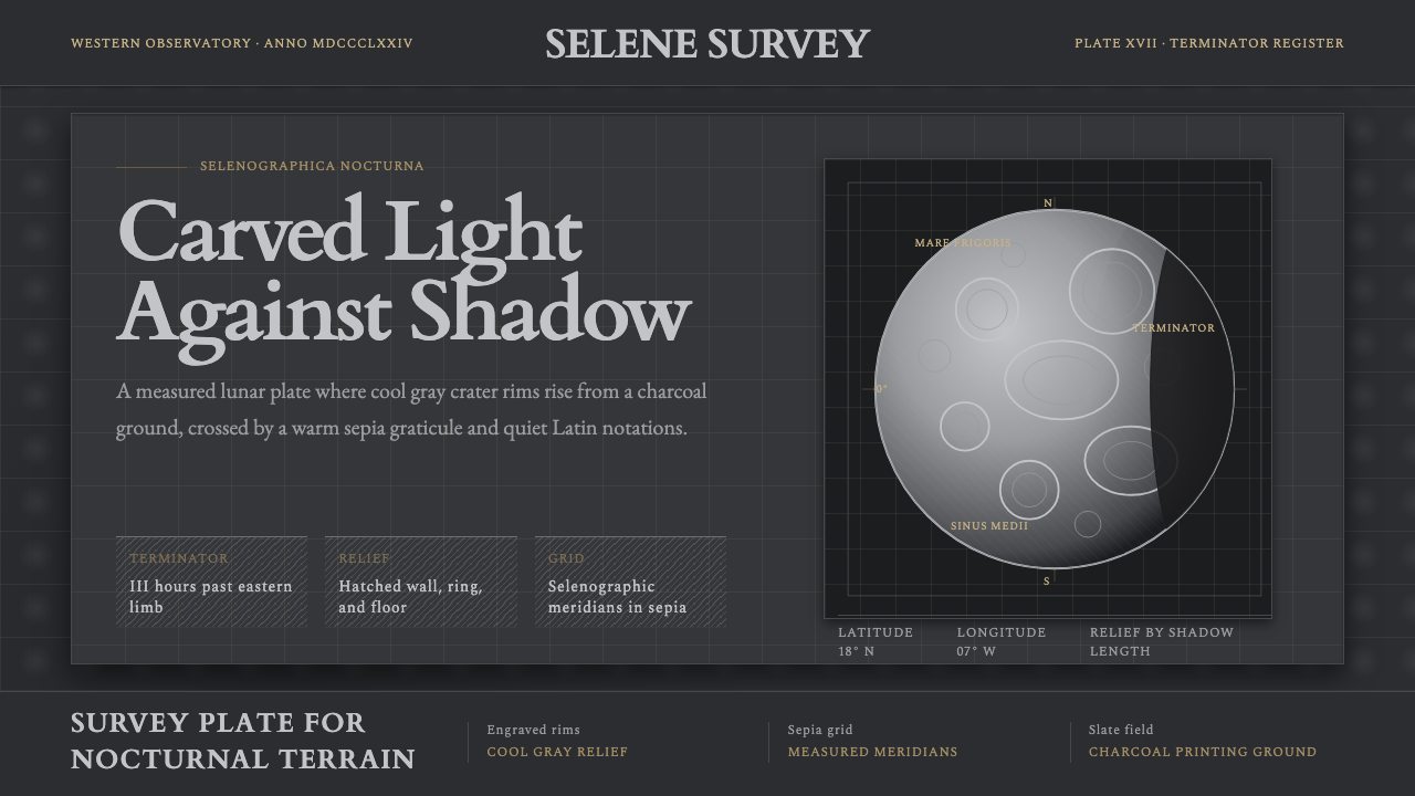 Lunar SelenographyMoonlight becomes measurement. Slate ground, sepia grid, and hatched gray cra…月光成为测量:石板灰底、赭石经纬网、排线灰环形山。
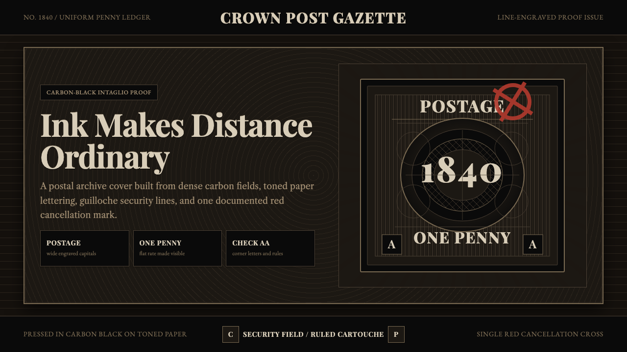 Penny Black StampBlack carries authority. Guilloche lines, Victorian serifs, and one red cross…黑色即权威:番纹线、维多利亚衬线与一枚红十字,皆如凹版压印。
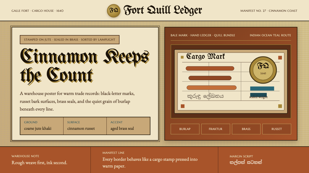 Sri Lankan Cinnamon Galle (1640)Warehouse warmth. Jute khaki, Fraktur stamps, brass seals, cinnamon-russet bl…仓储有温度。黄麻卡其、黑字母戳记、黄铜印章、肉桂赭块。
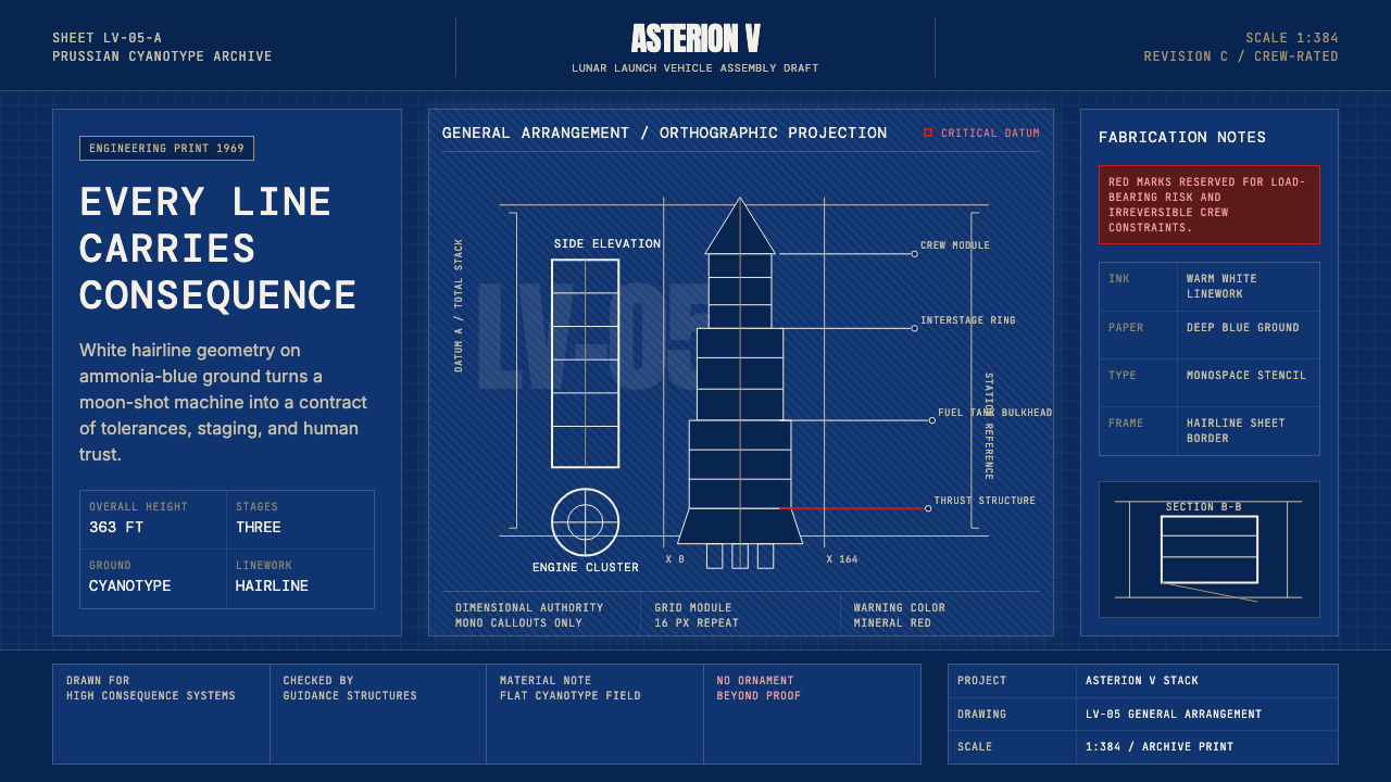 NASA Saturn V BlueprintPrecision carries risk. Prussian blue grids and white mono callouts frame a l…精密即风险。普鲁士蓝网格与白色等宽标注构成发射栈蓝图。
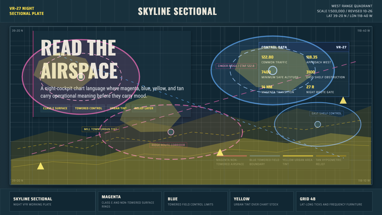 Aeronautical ChartReads like cockpit data. Magenta-blue airspace rings cut through dense dark-c…像座舱数据般可读:品红与蓝色空域环切入深色密集网格。