What is Japanese Stationery?
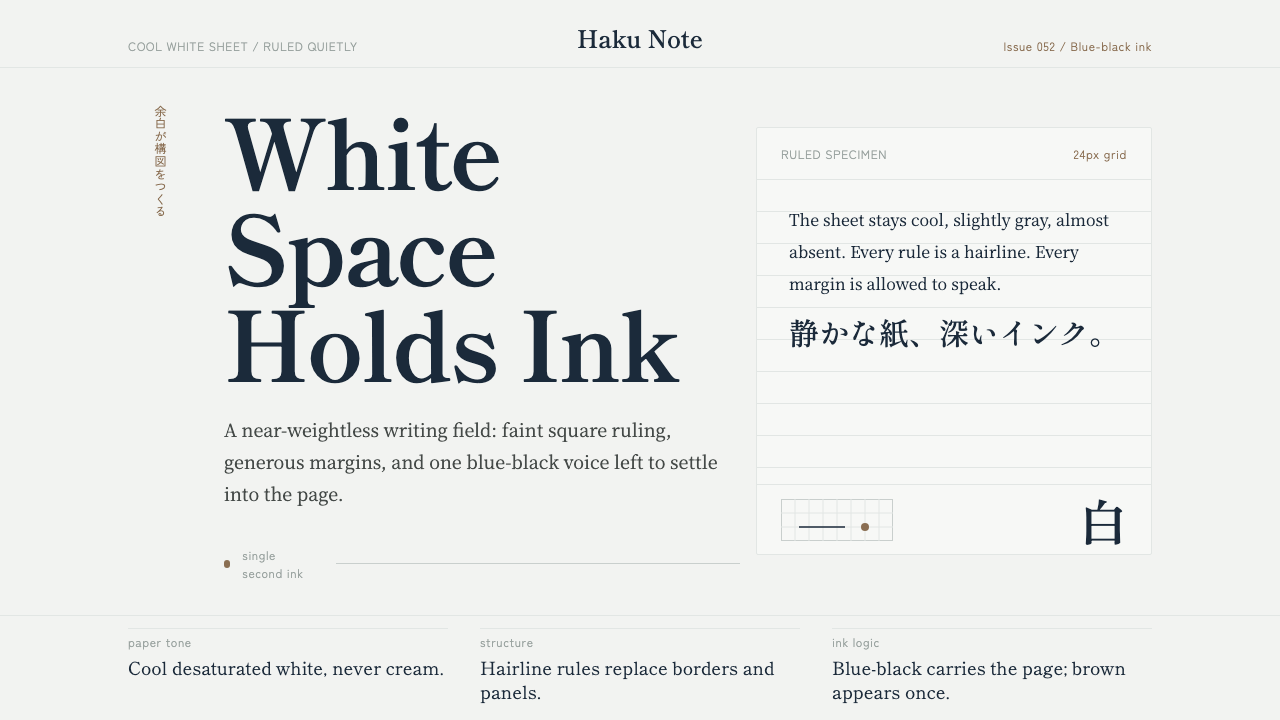
Japanese Stationery is the fountain-pen collector's aesthetic made into a design system — a near-weightless white page, a faint grid, and one deep blue-black ink doing the work of an entire palette.
Japanese Stationery in brief
Japanese Stationery is a contemporary design language drawn from the material culture of high-end Japanese fountain-pen paper — most famously Tomoe River, a startlingly thin sheet that has become a cult object among pen collectors precisely because of what it does not do. It does not feather. It does not bleed through. It lets ink pool, shade, and shimmer on the surface in a way thicker, more absorbent paper cannot. The design system translates that material fact into a visual one: everything is thin, cool, quiet, and just slightly reflective, as if the whole interface were printed on something you could almost see through.
Where many stationery-inspired aesthetics reach for warmth — cream stock, brown kraft, the coziness of a well-loved notebook — this one deliberately does not. The white here is cool and faintly desaturated, closer to the pale gray-green of good writing paper than to the yellowed warmth of aged paper or the stark glare of copier stock. That single choice sets the emotional register for everything else: restraint instead of nostalgia, precision instead of comfort.
The system reads as instantly legible to anyone who has used a good notebook, and instantly foreign to anyone used to the loud, saturated conventions of most digital interfaces. It has almost no chroma and almost no ornament. What it has instead is an enormous amount of unmarked space, a grid so faint it barely qualifies as a grid, and an unwavering trust that a single, well-chosen ink color is more expressive than a dozen competing ones.
Where does Japanese Stationery come from?
Japanese Stationery does not descend from a single named movement or founding manifesto the way Bauhaus or Constructivism do. It emerges instead from a living material culture: the contemporary fountain-pen and stationery community that has grown up in Japan since roughly the 2010s and gone fully global through online pen forums, YouTube reviewers, and specialty retailers. Its 'canon' is a paper stock rather than a school of artists — a fact that shapes everything about how the aesthetic behaves.
The centerpiece of that culture is Tomoe River paper, manufactured by the paper company Tomoegawa. At roughly 52 grams per square meter, it is far lighter than ordinary writing or printer paper, which typically runs closer to 80 grams. Ordinary logic says thinner paper should be worse for ink — more prone to bleed-through, less able to hold a wet nib. Tomoe River inverts that logic through a distinctive coating and fiber structure: ink sits on top of the sheet rather than soaking into it, letting fountain-pen inks show off properties — sheen, shading, the subtle color-shift some inks display at the edges of a stroke — that would be muddied or lost on absorbent paper. This is why the paper became, and remains, an object of near-obsessive devotion among pen enthusiasts.
That devotion built a secondary economy and community around the paper — pen shops, boutique notebook makers, and specialist retailers who built their identity around sourcing and championing it. Two names recur constantly in that world: Goulet Pens and Texas Pens, both specialty retailers whose reviews, comparisons, and product photography did as much to define the visual vocabulary of 'good stationery' as any single designer did. Their product shots — a fountain nib resting on a pale, faintly gridded page, ink pooling in a hairline stroke — are, in effect, the reference images this design system distills.
Underlying it all is a broader Japanese design sensibility toward negative space, often called 余白 (yohaku) — literally 'the white that remains.' It is the same instinct that governs traditional Japanese page layout, ink painting, and packaging: emptiness is not an absence of design decision but a decision in itself, one that gives whatever mark appears on the page room to be read clearly. Japanese Stationery inherits that instinct directly, pairing it with the modern, almost nerdy precision of pen-community paper engineering — a fusion of centuries-old restraint and twenty-first-century hobbyist obsession.
What defines the Japanese Stationery look?
Color
The palette is built around a single dominant ink: a deep blue-black that reads almost as ink itself rather than a design color. It carries nearly all of the system's contrast — headings, active states, key data points — while everything else recedes into the pale, cool, faintly gray-green white of the page. A warm brown ink occasionally appears, but only as the rarest of accents. There is no bright accent color in the conventional sense; hierarchy is built through the presence or absence of ink, not competing hues.
Paper and Surface
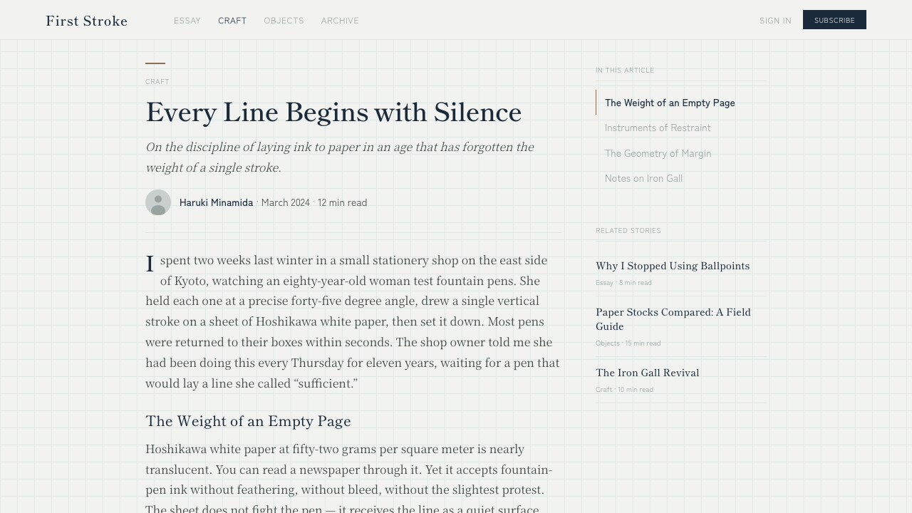
The defining sensation of the system is thinness and a faint sheen — the sense of a surface so fine that ink sits on top of it rather than soaking in. This is evoked through subtle, almost imperceptible tonal shifts rather than heavy texture or grain: a whisper of shimmer at the edge of a filled shape, a barely-there gradient where a stroke of 'ink' would pool. The impression should feel closer to holding a single fine sheet up to the light than touching a thick, matte cardstock.
Grid
A square grid runs beneath the composition, pitched so pale it barely registers as a pattern — closer to a memory of a grid than a visible one. Its job is not to organize content the way a conventional design grid does; it evokes the ruled notebook page itself, a quiet reassurance that everything on top has somewhere legitimate to rest. The grid should never compete with content for attention; if a viewer consciously notices it before the text, it has been rendered too dark.
Typography
Type is carried by Mincho — the Japanese serif tradition, with its calligraphic, brush-derived stroke contrast — paired with a Gothic (sans-serif) Japanese face for supporting text, mirroring how Japanese print traditionally pairs a serif headline face with a plainer body face. Latin text follows the same logic: a refined serif for headings or considered statements, a quiet neutral sans for anything functional. Letterforms are never heavy or bold in the assertive, poster-like sense; weight is used sparingly, the way a fountain pen naturally varies line weight rather than the way a marker does.
Line and Structure
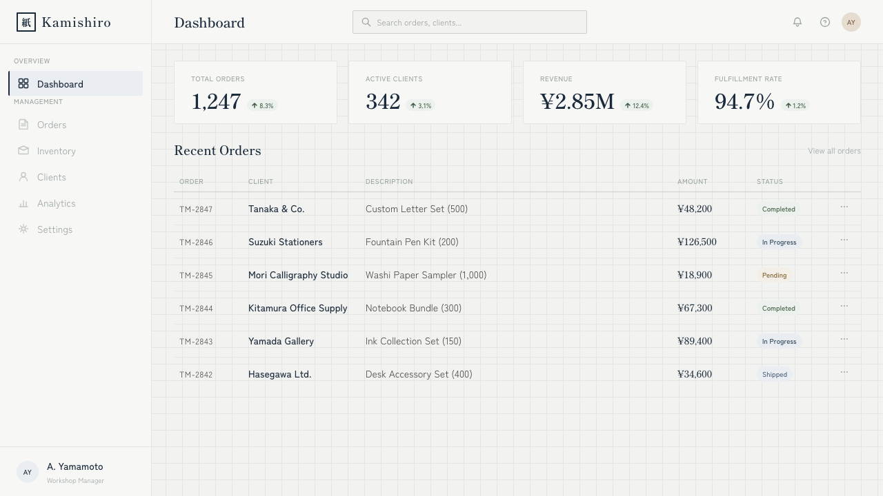
Structure is drawn with hairline rules rather than filled borders or heavy dividers — the visual equivalent of a fine nib rather than a marker. Where a conventional interface might use a filled card with a drop shadow to group content, this system uses a ruled note block: a thin outline, generous padding, no fill beyond the page's own near-white ground. The effect should recall a ruled notebook page rather than a stack of physical cards — a meaningfully different metaphor from most card-based UI.
Space and Restraint
Margins are generous almost to the point of austerity, and this is the load-bearing decision of the entire system, not a finishing touch. Content is given far more surrounding emptiness than a typical dense interface would allow, on the theory that a single line of well-set type in a quiet field reads as more considered — and more legible — than the same line crowded by neighboring elements. This is the system's version of 余白: white space treated as an active compositional element rather than leftover area.
Mood and Restraint of Ornament
Nothing in the system exists to decorate; every mark is either the pale structural grid, a hairline rule, or the single working ink color. There are no gradients for visual richness, no drop shadows simulating depth, no secondary accent colors introduced for variety. The mood is contemplative and precise rather than austere in a cold sense — closer to the quiet concentration of someone testing a new pen on good paper than the sparseness of a minimalist showroom.
Who shaped Japanese Stationery?
Tomoegawa is the Japanese paper manufacturer behind Tomoe River, the ultralight, ink-friendly sheet that anchors this entire aesthetic. Its distinctive coating lets fountain-pen ink sit on the surface rather than soak in, revealing shading and sheen that heavier papers suppress. The paper's near-mythical status among pen collectors — prized, discontinued and revived amid community outcry, endlessly compared and hoarded — is the single material fact from which every visual rule here is derived.
Goulet Pens is a specialty fountain-pen and stationery retailer whose detailed product reviews, ink comparisons, and paper testing helped popularize Tomoe River and the broader vocabulary of 'good stationery' to a global, largely online audience. Their close-up photography of ink pooling and shading on thin paper functions as a de facto visual reference for the aesthetic this system distills.
Texas Pens is another specialty retailer within the same fountain-pen community, contributing to the same body of product photography, comparison content, and enthusiast discourse that shaped the visual conventions this style draws on. Retailers like this one, rather than any single designer, function as the aesthetic's de facto authors.
How do you use Japanese Stationery today?
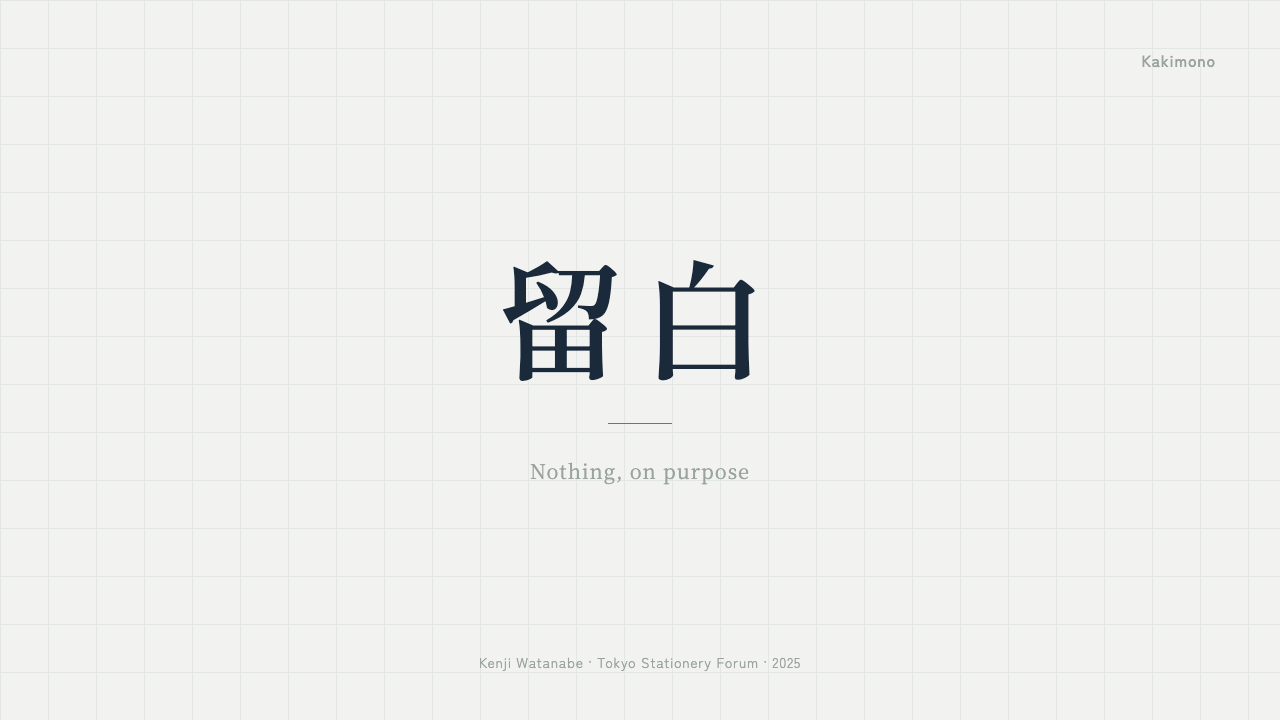
Because this style's entire logic rests on restraint and negative space, applying it well means resisting the urge to fill space — the opposite instinct from most digital design work. For presentation cover slides, let a single line of refined serif type sit in a vast, quiet field of pale, cool white, with perhaps one hairline rule beneath it and nothing else. Content slides should carry information in short, deliberately spaced lines rather than dense paragraphs or busy bullet stacks — think of each slide as a page in a well-kept notebook rather than a report screen. Where slides genuinely need data, treat it the way a ruled note block would: a thin outline, generous padding, and the single blue-black ink used for whatever needs emphasis, never a rainbow of chart colors.
For web interfaces, this system suits dashboards and pricing pages that want to project calm authority rather than urgency — financial tools, writing and productivity software, anything positioning itself as considered rather than flashy. Cards become ruled note blocks with hairline borders instead of filled backgrounds and drop shadows; the background stays close to white with only the faintest suggestion of the underlying grid; and the one deep ink color is reserved for primary actions, active states, or the single number on a pricing page that matters most. Interactive elements should feel like marks made with a fine nib — precise, singular — rather than the bold filled buttons common to louder design systems.
For editorial and marketing work, the style rewards a slow, considered reading rhythm: a narrow measure for body text, wide surrounding margins, and section breaks marked by nothing more than a hairline rule and extra vertical space rather than banners or dividers. It suits writing-adjacent products especially well — note-taking apps, journals, long-form publishing tools — where the pitch is precision and quiet craft rather than speed or scale. Marketing pages built in this style should resist the temptation to add a hero image or bold color block for impact; the impact here comes from confidence in emptiness.
A common mistake is treating this style as simply 'a minimalist white theme' and reaching for generic neutral grays instead of the specific cool, desaturated white and deep blue-black ink that give the system its character — the result reads as merely empty rather than considered. Another common mistake is over-filling the grid or adding a second accent color for variety; the system's emotional effect depends on there being exactly one working ink color and abundant untouched space around it. If a layout ever starts to feel busy, the fix is almost always to remove content rather than to add structure.
Japanese Stationery — FAQ
Is Japanese Stationery the same as generic minimalism?
No, though they share a love of empty space. Generic minimalism tends to strip a design down to neutral grays and geometric restraint for its own sake. Japanese Stationery is more specific: it is anchored in the sensory memory of a particular material — thin, cool-toned paper and a single well-loved ink — and every visual decision traces back to that memory. The pale grid, the cool rather than warm white, and the singular blue-black ink are all choices drawn from stationery culture, not generic 'less is more' defaults.
Why does this style avoid warm, cream-colored paper tones?
Because the aesthetic is modeled specifically on Tomoe River and papers like it, prized in the pen community for a cool, almost clinical whiteness rather than the warm cream of vintage stationery or kraft paper. That coolness is part of what lets fountain-pen ink show its truest color and sheen — warm-toned paper would shift the perceived hue of the ink itself. Carrying that cool white through the whole system keeps the aesthetic tied to its material source rather than drifting into the more common warm-paper, cozy-notebook look.
How should the blue-black ink color be used across a layout?
Sparingly and consistently, as the single carrier of emphasis rather than one color among several. It should appear on headings, the most important data point on a page, active or selected states, and body text where legibility demands real contrast — but not spread decoratively across icons, backgrounds, or secondary accents. The moment a second bold color is introduced for variety, the system starts to resemble a conventional brand palette rather than the single-ink discipline of a fountain pen, and the quiet mood breaks.
Does the grid need to be visible for the style to work?
It needs to be present but should never be prominent. The grid's function is atmospheric rather than structural in the way a conventional layout grid organizes columns — it evokes the memory of a ruled notebook page, a background reassurance rather than a foreground pattern. If a viewer notices the grid before the content sitting on it, it has been rendered too dark or too large; the correct pitch is one most people will feel rather than consciously see.
What kinds of products does this style suit, and where does it struggle?
It suits products built around precision, writing, and quiet craft — note-taking and journaling apps, writing tools, portfolio sites for work that rewards close attention, and premium stationery or pen-adjacent brands themselves. It struggles wherever a product needs to feel energetic, playful, or urgent: entertainment platforms, youth-oriented consumer apps, or any checkout flow built to create excitement rather than calm. Because so much of its identity depends on generous empty space, it also struggles in dense, information-heavy interfaces — a dashboard with dozens of simultaneous data points will fight the style's core instinct to leave things unmarked.
Related design styles
 Giant's Causeway BasaltCold stone edits the page. Spectral type locks into slate hex grids and iron-…
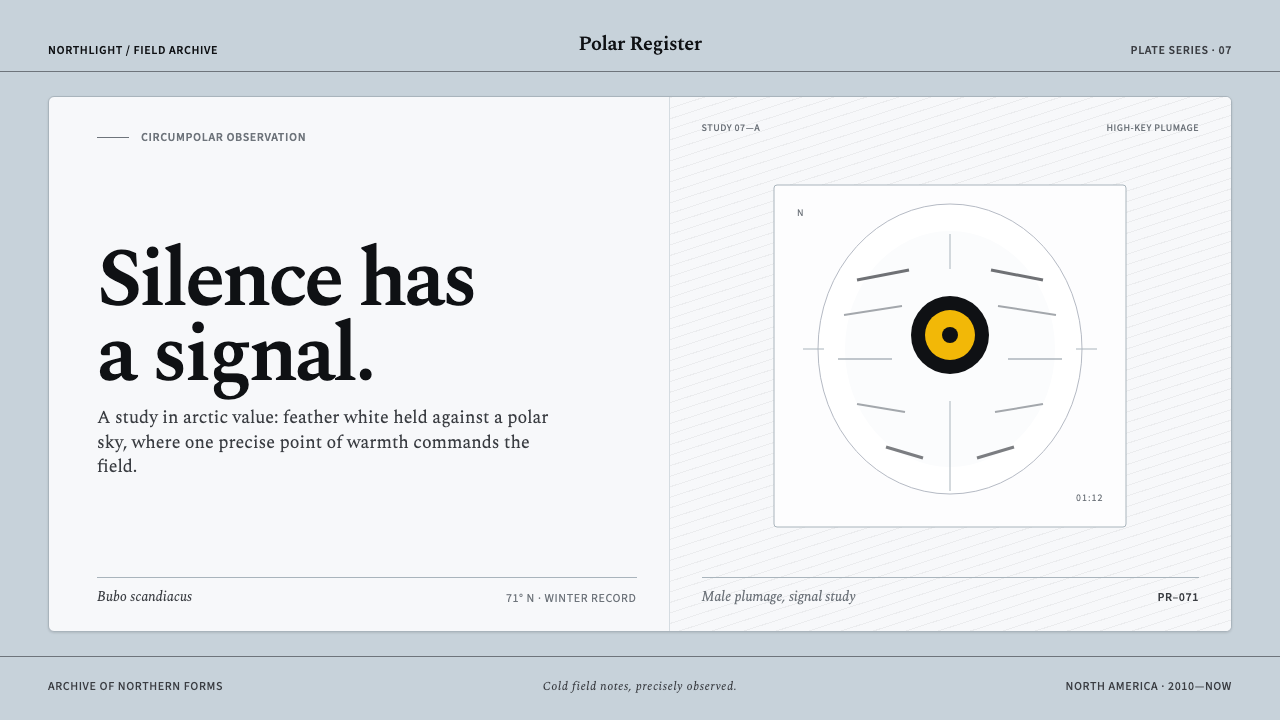 Snowy Owl TundraCold precision, one warm signal. Feather white and charcoal frame a lone lemo…
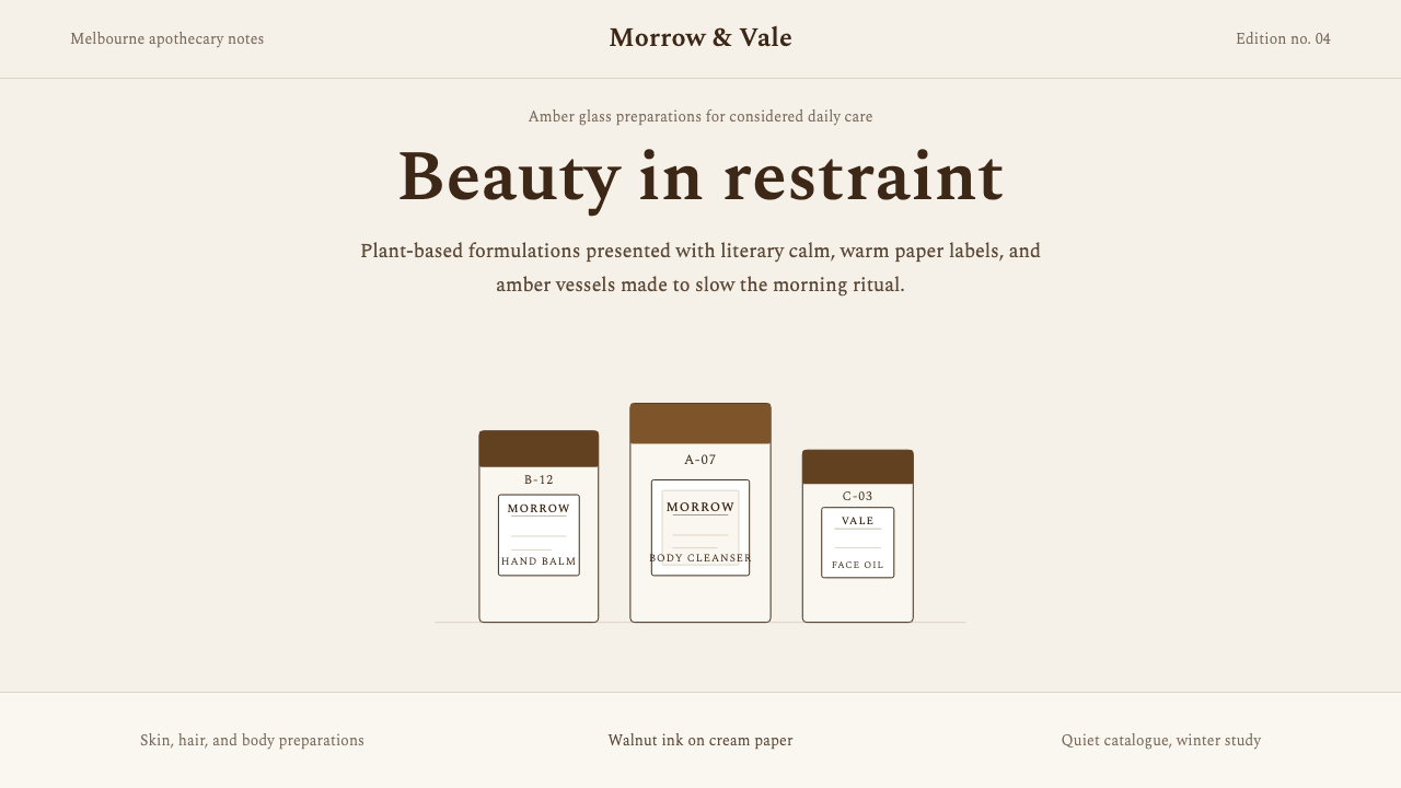 AesopRefuses urgency. Walnut serif on cream paper — every surface paced like a 19t…
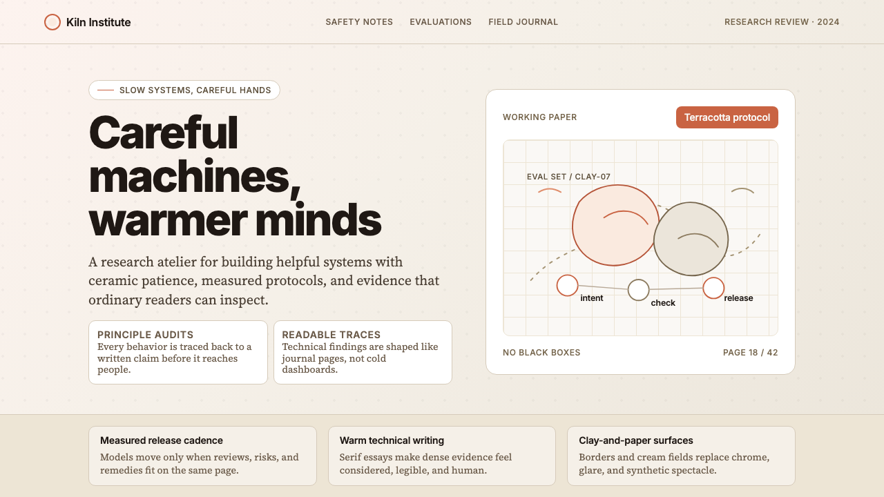 Anthropic ClayAI safety in handmade clay. Sand backgrounds, terracotta accents, serif body…
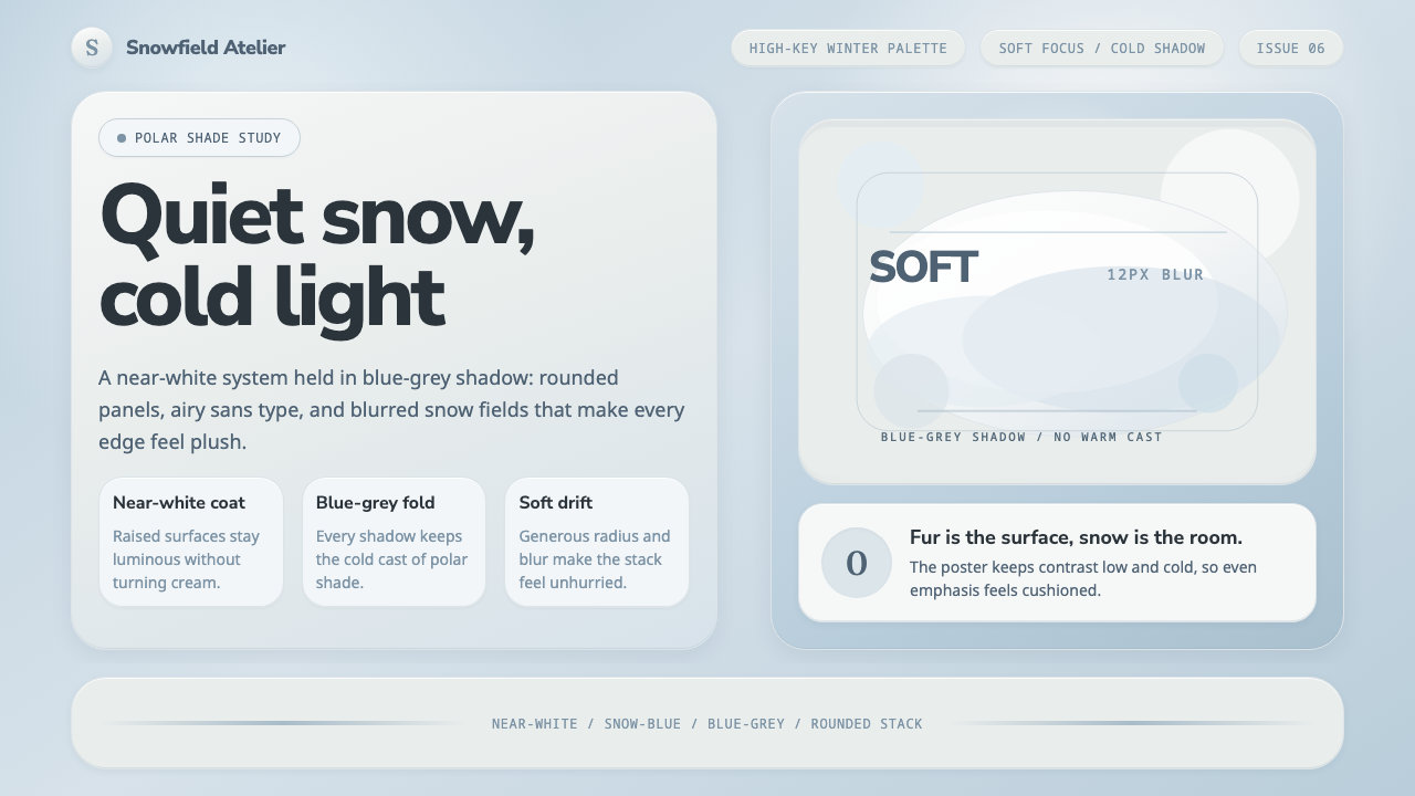 Arctic Fox Winter CoatIcy softness, never cream. Near-white panels float over snow-blue shadow.
 Salt Flat UyuniAtmosphere does the work. Blue-grey space, one horizon line, faint salt polyg…