About Japanese Stationery
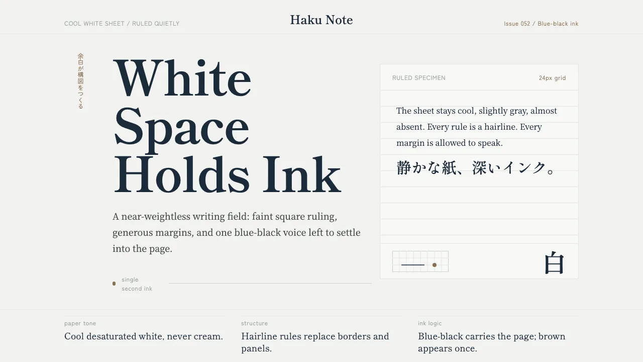
Japanese Stationery is built on the cool, near-weightless white stock of Tomoe River paper — a 52gsm sheet beloved by the fountain-pen world for taking ink without bleed. The page is faintly desaturated, never paper-warm, ruled with a square grid so pale it barely registers beneath generous margins.
Everything here is restraint. Hairline rules instead of borders, ruled note blocks instead of filled cards, and a single deep blue-black ink doing the work of an entire palette. Type is carried by Mincho and Gothic Japanese faces, with the rare warm-brown ink reserved for the quietest of accents.
- Origin
- Japan (East Asia)
- Era
- 2010–now (contemporary Japanese 万年筆 stationery culture)
- Key figures
- Tomoegawa Paper · Goulet Pens · Texas Pens
- Movements
- Japanese minimalism · 余白 white-space aesthetics · fountain-pen-friendly paper engineering
Japanese Stationery design spec
Colors
Typography
The other 11 sections — buttons, cards, spacing, motion, techniques and more — open once you unlock. Download the DESIGN.md or send it to your AI in one click. Unlock once, yours forever.
Sign up nowStyles similar to Japanese Stationery
Also inspired by brands & products, with a close feel.
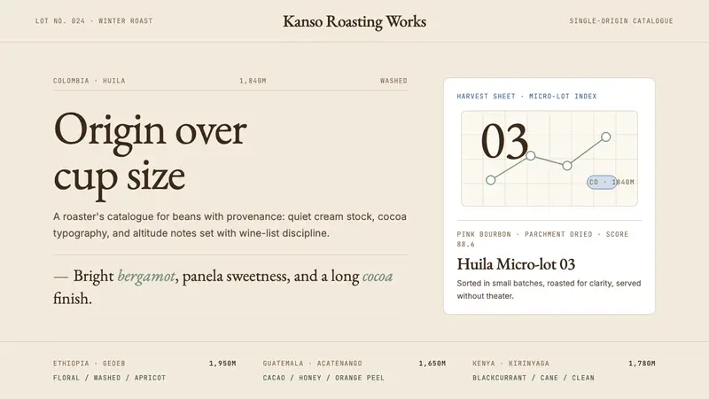 Third Wave CoffeeCoffee as catalogue. Cream paper, cocoa serif, mono origin specs, one sage note.
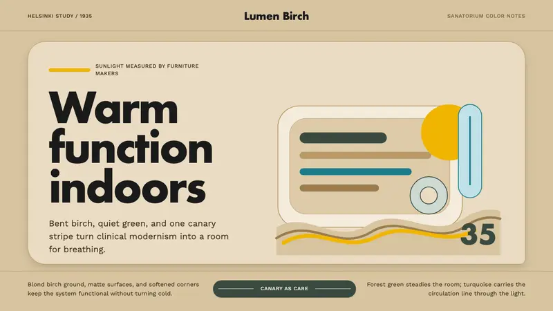 Aalto Finnish ModernModernism made humane. Birch fields, canary yellow, and soft plywood curves bring sun inside.
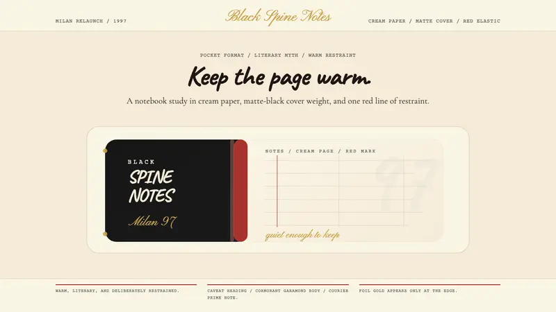 Moleskine Sketchbook (1997)Quietly literary. Cream paper, matte black, and a red elastic stripe do the work.
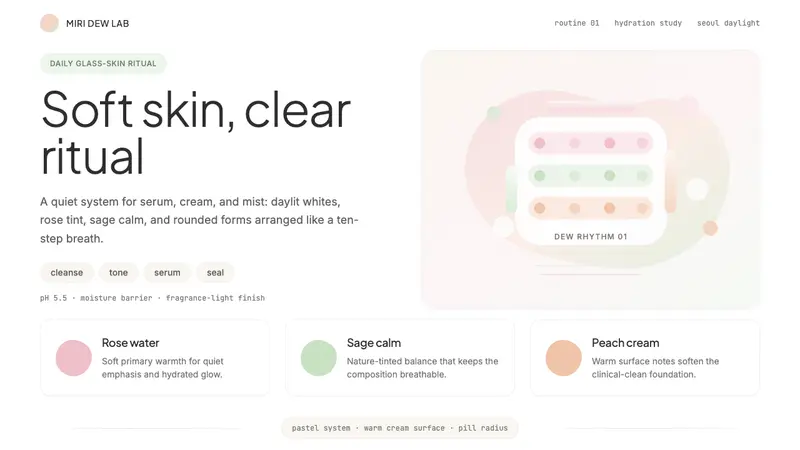 K-Beauty CleanCalm arrives dewy. Rose, sage, and peach pastels float through airy rounded forms.