What is Salt Flat Uyuni?
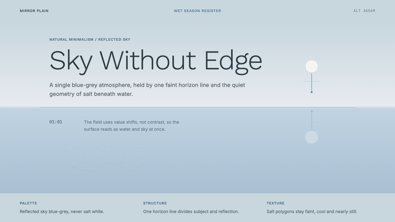
Salt Flat Uyuni is minimalism that nature builds by itself — a thin sheet of water over salt turning an entire horizon into one soft, borderless field of sky.
Salt Flat Uyuni in brief
Salt Flat Uyuni draws its language from the Salar de Uyuni in Bolivia, the largest salt flat on Earth, which undergoes a seasonal transformation during the wet months: a thin film of rainwater settles evenly across the vast, dead-flat salt crust and turns the entire surface into a near-perfect mirror. Standing on it, a person can no longer reliably locate the horizon — sky above and its reflection below merge into a single, continuous field of pale color, and up and down lose their usual meaning.
This is minimalism that occurs naturally rather than minimalism achieved by editing something down. The style does not start from a busy composition and strip elements away; it starts from an environment that is already, by physical accident, almost entirely empty — one flat plane, one enormous sky, and a single subject if there is one at all. The design task is to preserve that emptiness rather than to manufacture it.
The palette leans cool and atmospheric rather than warm or saturated: pale blue-greys, soft washed-out horizon tones, and the faint geometric tracery of salt-crust polygons where the water thins toward dry ground. Nothing in this system is meant to compete with the atmosphere for attention — no bright accent color, no bold graphic shape, no dense texture. The mood is calm, spacious, and slightly disorienting in the same way the actual landscape is.
Where does Salt Flat Uyuni come from?
The Salar de Uyuni sits at high altitude on the Bolivian Altiplano, formed over tens of thousands of years by the evaporation of prehistoric lakes that left behind an enormous, nearly perfectly flat crust of salt many meters thick in places. Its scale is genuinely extreme — the flat stretches across roughly ten thousand square kilometers, making it flat and featureless enough that it has historically been used to calibrate satellite altimeters, since so few natural surfaces on Earth offer that degree of geometric consistency.
During the dry season, the salar is a blinding white desert of hexagonal salt polygons, cracked into a natural tiling pattern by repeated evaporation cycles. But during the wet season, typically from roughly December through March, a shallow layer of rainwater spreads across the crust and, because the ground beneath is so exactly level, does not pool into puddles the way water would on ordinary terrain — it forms one continuous, nearly undisturbed sheet across the entire flat. That sheet is thin enough to be walked through yet deep enough to produce a genuine, high-fidelity reflection of the sky.
The site's rise as a specific visual and photographic subject is a recent, largely twenty-first-century phenomenon, driven by increased travel access to Bolivia and by photographers and travelers sharing images of the mirror effect widely once digital photography and online image-sharing made that kind of documentation easy to produce and distribute. Contemporary landscape and travel photographers working in a minimalist register — favoring a single subject against a vast, atmospheric field rather than a busy, detail-rich frame — found in the Uyuni mirror effect an almost readymade example of the aesthetic they were already pursuing elsewhere.
Unlike many historical design styles rooted in a particular workshop, court, or artistic movement, this one has no single point of origin beyond the geological and climatic accident that produces the mirror each year. Its visual grammar was recognized and popularized by photographers rather than invented by them — the discipline of minimalism here is closer to documentary restraint than to artistic reduction.
What defines the Salt Flat Uyuni look?
The Single Horizon
A single horizon line is the compositional backbone of this style, but it is often deliberately faint or nearly dissolved rather than crisp — echoing the way water and sky blur together on the real salt flat. Where other minimalist styles use a horizon as a hard structural anchor, this one treats it as something almost optional, present but not emphasized.
Cool Atmospheric Palette
Colors sit in a pale, cool register — blue-greys, soft washed neutrals, faint pastel tints borrowed from an overcast or dawn sky. Warm tones, high saturation, and strong contrast are all avoided, since any of those would introduce a sense of drama or heat that contradicts the atmosphere's actual cool stillness.
Vast Negative Space
Negative space dominates the composition far beyond what most minimalist design styles attempt — a subject, if present, occupies only a small fraction of the frame, with the remaining field left almost entirely empty. This is not restraint for its own sake; it is fidelity to the physical scale of the actual landscape.
Calm Asymmetry
Where a subject or focal element is present, it is placed off-center in a quiet, unforced asymmetry rather than perfectly centered or mirrored. This slight off-balance placement reads as natural rather than composed, echoing the informal way a lone figure or object would actually sit within such a vast, featureless field.
Faint Polygon Tracery
Where the water thins toward drier ground, the salt crust's natural hexagonal cracking pattern becomes faintly visible — a subtle geometric texture that should read as barely-there rather than as a bold graphic pattern. This texture is the only permitted departure from pure flatness, and it should always stay understated.
Single Subject
When a figure, object, or focal element appears at all, there is only ever one. Multiple competing subjects, busy groupings, or layered focal points all undermine the sense of scale and solitude this style depends on to communicate the vastness of the actual landscape.
Reflective Symmetry
Where the mirror effect is depicted directly, the reflected sky should closely mirror the real sky above rather than diverging from it, reinforcing the disorienting sense that up and down have become interchangeable. This vertical mirror symmetry is distinct from the style's otherwise deliberate horizontal asymmetry.

Who shaped Salt Flat Uyuni?
Fredericks is a landscape photographer whose long-running body of work centers on vast, nearly empty terrain — flat salt lakes, open desert, and polar ice — captured with extreme patience and minimal intervention. His approach, favoring a single stable vantage point held over long durations to capture subtle atmospheric shifts, exemplifies the disciplined restraint that this style asks a designer to bring to any composition built around a salt-flat mirror effect.
Paredes is a Peruvian-American artist known for photographic self-portraits in which her painted body blends almost invisibly into a patterned or textured backdrop, dissolving the usual boundary between figure and ground. That specific interest — a subject merging into its surrounding field rather than standing apart from it — resonates directly with the way a lone figure disappears into the reflected sky on the Uyuni salt flat.
Cern is a Lithuanian photographer and conceptual artist whose work often isolates a single subject against a stark, unadorned field to study form, gesture, and atmosphere without narrative distraction. That same principle — one subject, one field, everything else stripped away — is the working method this style asks a designer to apply to any composition inspired by the Uyuni mirror.
How do you use Salt Flat Uyuni today?
This style rewards designers who can resist the urge to fill space — the entire aesthetic depends on trusting that a huge amount of quiet, cool emptiness reads as considered rather than incomplete.
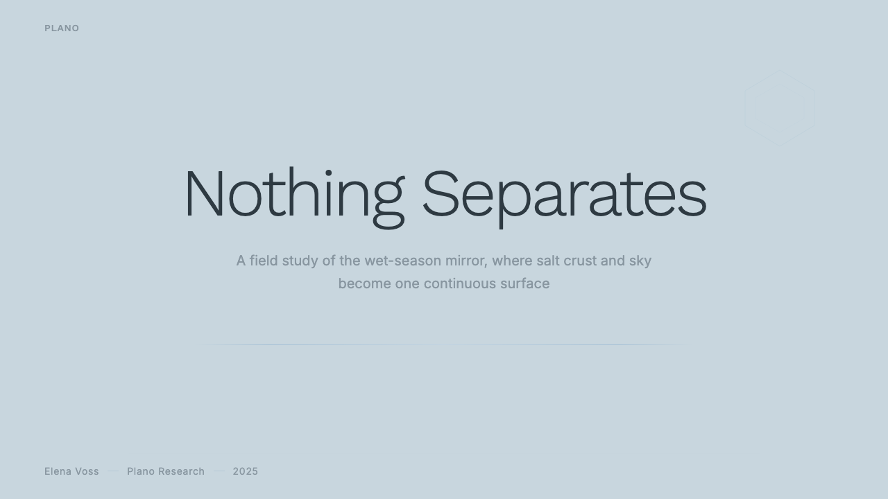
On presentation slide covers, the style works best when a single line of title type sits low or off-center against an otherwise empty, pale blue-grey field, echoing the horizon's placement in the real landscape. Content slides should keep text sparse and set well away from the edges of the frame, letting the surrounding space do as much communicative work as the words themselves; data visualizations should favor a single simple line or faint dot pattern over a busy multi-series chart, since density of any kind works against the style's core discipline.
For web interfaces, this palette suits marketing pages, empty states, and calm onboarding flows particularly well, where its generous negative space signals confidence rather than absence of content. It is a difficult fit for data-dense dashboards, since the style's entire logic depends on there being far less on screen than a typical dashboard requires — attempting to force dense information into this palette usually just produces a washed-out, low-contrast interface rather than a genuinely calm one.
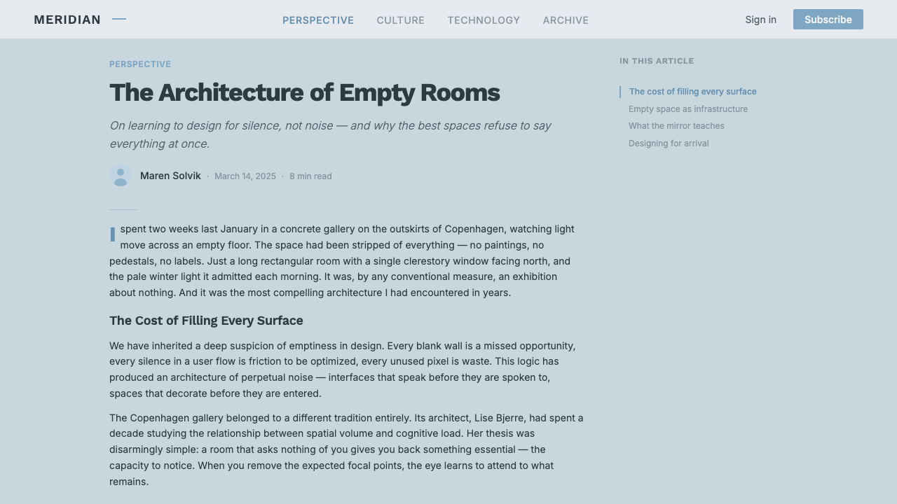
In editorial and marketing contexts, a full-bleed hero image with a faint horizon line and a single small subject, paired with a short line of type set at a considered distance from the image's edge, captures the tone efficiently. Section breaks work well as simple pale fields with no dividing rule at all, letting color alone signal a transition rather than a hard graphic line.
A common mistake is treating this as simply a pale, desaturated color palette applied to an otherwise conventional, busy layout — dense navigation, multiple simultaneous focal points, bold typography competing for attention. None of that belongs here. The palette only reads correctly when it is paired with genuine emptiness in the composition; without that restraint, the muted colors alone will look washed-out rather than atmospheric.
Salt Flat Uyuni — FAQ
Is this style just a generic "minimalist" or "whitespace-heavy" design approach?
It shares the same commitment to negative space as generic minimalism, but it is more specific in palette and mood. Generic minimalism can be warm, bright, or high-contrast — think a stark white background with bold black type. This style is specifically cool, pale, atmospheric, and slightly disorienting, built around the exact color and horizon relationship of the Uyuni mirror effect rather than any arbitrary reduction of a busier design.
Can this style support a bold, high-contrast brand identity?
Not comfortably. The style's entire emotional effect depends on low contrast and a hushed, atmospheric palette; forcing in bold, high-contrast branding elements — a saturated logo color, heavy black type, aggressive geometric shapes — breaks the calm the style is built to project. It is much better suited to brands whose values already lean toward quiet, contemplative, or premium-minimal positioning than to brands that need to shout.
How does this style differ from the Salt Crystal Evaporite style, since both are about salt?
The two draw from entirely different phenomena and produce opposite visual effects. Salt Crystal Evaporite is about hard, cubic crystal geometry precipitating out of hypersaline Dead Sea brine — bright, sharp-edged, high-contrast. This style is about a flat salt crust submerged under a thin mirror of water in the Salar de Uyuni — soft, atmospheric, low-contrast, and defined by the near-total absence of geometric detail rather than its presence. They should never be treated as interchangeable just because both involve salt.
Does this style require an actual reflection or mirror effect to work?
Not strictly, but the mirror effect is the style's most distinctive signature, and dropping it removes much of what makes the aesthetic recognizable rather than simply a generic pale, minimal palette. Where a literal reflection cannot be shown, preserving the underlying logic — a single soft horizon nearly dissolving into the surrounding field, with sky-colored tones both above and below that line — keeps the composition faithful to the source even without a literal mirrored image.
What is the biggest risk when applying this style to a data-heavy product?
The biggest risk is that the style's low contrast and pale palette, applied without reducing the actual amount of on-screen content, produces an interface that is simply hard to read rather than genuinely calm. This style's emptiness is not just decorative restraint — it is load-bearing for legibility. A dashboard that keeps all its usual data density while adopting this palette will likely feel washed-out and difficult to scan rather than atmospheric.
Related design styles
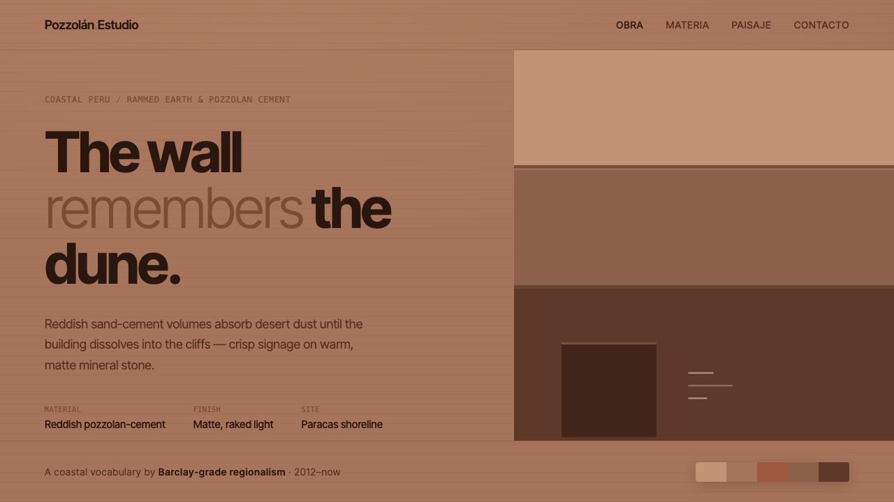 Peruvian Contemporary Adobe-ModernThe building dissolves into the dune. Reddish pozzolan-cement planes, matte r…
 Arctic Fox Winter CoatIcy softness, never cream. Near-white panels float over snow-blue shadow.
 Buenos Aires Branding StudioRigour with nerve. Black grotesque on warm grey, pierced by one vermillion ma…
 Cargo Collective PortfolioInterface disappears. White space, full-bleed blocks, mono metadata and hairl…
 Corten Weathering SteelWeight over ornament. Rust-brown planes and concrete-grey seams make mass vis…
 Modern Kufi BrandingRestraint becomes architecture. White Kufi blocks on near-black obey a biling…