What is Awwwards Swiss Portfolio?什么是 Awwwards Swiss Portfolio?
Cinema, not interface: a cinematic black canvas, oversize condensed display type, and a single electric accent color propel the portfolio reel of the world's most awarded digital studios.不是界面,是电影:纯黑画布、巨型窄体展示字与唯一一抹电光强调色,驱动着全球顶尖数字工作室的作品卷轴。
Awwwards Swiss Portfolio in briefAwwwards Swiss Portfolio 速览
The Awwwards Swiss Portfolio style is the shared visual language that emerged from a generation of Awwwards Site-of-the-Day-winning digital studios — Locomotive, Active Theory, Akaru, Resn, and their peers — in the years spanning roughly 2018 to 2024. It distills the agency formula into a remarkably consistent set of decisions: a near-total black canvas, hero-scale condensed display type, smooth-scroll inertia, and transitions driven by WebGL shaders. The style treats the browser not as a document viewer but as a film medium, where every frame advance, every cursor movement, and every section reveal is choreographed.Awwwards 瑞士作品集风格,是大约2018至2024年间一代 Awwwards 年度最佳网站得主级数字工作室——Locomotive、Active Theory、Akaru、Resn 及其同侪——所共同形成的视觉语言。它将顶尖工作室的设计公式提炼为一套高度一致的选择:几近全黑的画布、英雄尺度的窄体展示字体、平滑滚动惯性,以及由 WebGL 着色器驱动的转场动效。这种风格将浏览器视为电影媒介,而非文档浏览器——每一次帧推进、每一次光标移动、每一次段落显现,都经过编排设计。
What unifies this style beneath its surface theatrics is a philosophy of restraint in service of the work. The portfolio itself — the reel, the case studies, the moving images — is the protagonist. Everything else is stage design. Monochromatic backgrounds eliminate visual competition; the entire palette contracts to a single accent hue — lime green, electric magenta, or saturated blue — that punctuates headings, hover states, and progress indicators without asserting independent presence. Text is enormous where it speaks and invisible where it serves. Space is cinematic: generous, intentional, and timed.在其表面戏剧性之下统一这种风格的,是一种服务于作品本身的克制哲学。作品集——展示卷轴、案例研究、动态影像——才是主角,其他一切都是舞台布景。单色背景消除一切视觉竞争;整个色板收缩至唯一一个强调色相——青柠绿、电光品红或饱和蓝——在标题、悬停状态与进度指示符上制造视觉锚点,而不抢夺独立存在感。文字在表达时巨大,在服务时隐匿。空间如电影般:充裕、刻意、带有节奏感。
The style borrows its grid rigor from Swiss International Style and its typographic drama from the condensed display tradition, but it departs from both in one decisive way: it is fundamentally interactive. Static screenshots of these sites are almost meaningless. The design only becomes itself when the cursor triggers a magnetic pull, when the scroll triggers a parallax depth shift, when a transition dissolves one project into the next through a liquid-membrane effect. This insistence on motion as a structural element — not decoration, not delight, but architecture — is what separates the Awwwards Swiss Portfolio from any print-derived aesthetic.这种风格从瑞士国际主义风格借取了网格严谨,从窄体展示字传统借取了排印戏剧感,但在一个决定性之处背离了两者:它从根本上是交互式的。这些网站的静态截图几乎没有意义。设计只有在光标触发磁性吸引力、滚动触发视差深度偏移、转场通过液态薄膜效果将一个项目溶解为下一个项目时,才真正成为它自己。将运动视为结构性元素——而非装饰,而非愉悦,而是建筑——这种坚持,正是 Awwwards 瑞士作品集风格与一切源自印刷的美学体系的根本区别。
See the Awwwards Swiss Portfolio design system查看 Awwwards Swiss Portfolio 完整设计系统
Where does Awwwards Swiss Portfolio come from?Awwwards Swiss Portfolio 从何而来?
The Awwwards platform was founded in Barcelona in 2009 as a peer-judged awards site for the web design community. Its early years coincided with the twilight of Flash-based interactive web experiences and the emergence of HTML5 and CSS3 as capable mediums for visual experimentation. Studios that had built their reputations on Flash-era nonlinearity — parallax, full-screen video, unconventional navigation — began migrating those ambitions into the new technical substrate. Awwwards became the curatorial lens through which the community recognized the most ambitious of these experiments, and a feedback loop formed: winning studios influenced each other, and the judging criteria subtly rewarded a particular kind of polished craft.Awwwards 平台于2009年在西班牙巴塞罗那创立,以同行评审奖项网站的形式服务于网页设计社区。其早期发展与 Flash 交互网页体验的黄昏、以及 HTML5 和 CSS3 作为视觉实验媒介的兴起相互交织。那些在 Flash 时代以非线性叙事——视差、全屏视频、非常规导航——建立声誉的工作室,开始将这些野心迁移到新的技术基底上。Awwwards 成为社区识别这类最具野心实验的策展镜头,一个反馈循环由此形成:获奖工作室相互影响,评审标准也在无形中奖励某种特定的精湛技艺。
The aesthetic crystallized around 2018, when WebGL became performant enough across consumer browsers to support real-time shader transitions and 3D canvas effects without requiring specialist plugins. Montréal-based Locomotive developed their smooth-scroll library — later open-sourced — which gave other studios a consistent way to implement the inertia-scrolling effect that had become a hallmark of high-craft portfolio sites. Active Theory in Los Angeles and Akaru in Paris were pushing real-time WebGL scene transitions. Resn in Auckland were experimenting with cursor deformation and hover physics. Though these studios operated on different continents with different cultural backgrounds, the Awwwards judging and peer recognition system drew them toward a shared formal vocabulary.这种美学大约在2018年结晶成形——此时 WebGL 在消费级浏览器上的性能已足以支持实时着色器转场与三维画布效果,无需专用插件。蒙特利尔的 Locomotive 开发了平滑滚动库(后来开源),为其他工作室提供了一种实现惯性滚动效果的统一方式,而这一效果已成为高质量作品集网站的标志性特征。洛杉矶的 Active Theory 与巴黎的 Akaru 在推进实时 WebGL 场景转场;奥克兰的 Resn 在尝试光标形变与悬停物理效果。尽管这些工作室在不同大陆以不同文化背景运营,Awwwards 的评审与同行认可机制将他们推向了共同的形式词汇。
The condensed display typeface at the center of the style — most commonly a bold grotesque compressed to extreme narrowness — has roots in European commercial printing of the nineteenth century, where condensed wood and metal type allowed maximum headline size within a fixed column width. Its adoption by digital agencies in the late 2010s was partly an aesthetic statement (the weight and height of condensed type at large scale creates a cinematic poster effect) and partly a functional one: ultra-condensed letterforms allow long project titles to occupy a single line at hero scale without wrapping, preserving the clean horizontal logic of the layout.这种风格核心的窄体展示字体——通常是被压缩至极度纤窄的粗无衬线字体——其根源可追溯至十九世纪欧洲商业印刷:窄体木质与金属活字允许在固定栏宽内最大化标题尺寸。数字代理机构在2010年代末采用它,一半是美学声明(大尺度窄体字的重量与高度创造出电影海报般的效果),一半是功能考量:超窄字形允许长篇项目标题在英雄尺度下占据单行而不换行,保持版面清晰的水平逻辑。
The style's relationship to Swiss International Style is one of selective inheritance. It adopts the Swiss commitment to grid discipline and typographic hierarchy, and it shares the Swiss preference for sans-serif letterforms and the elimination of decorative ornament. But where Swiss Style was fundamentally static and print-derived — its grid living in the flat plane — the Awwwards Swiss Portfolio style treats the grid as a departure point for motion. Scroll position becomes a timeline; section transitions become cuts and dissolves; the cursor becomes a design element with its own physics. The result is a hybrid: Swiss precision in the resting state, cinematic choreography in motion — a visual language made possible only by the browser as a medium and the GPU as a rendering engine.这种风格与瑞士国际主义风格的关系是选择性继承。它采纳了瑞士风格对网格纪律与排印层级的承诺,也共享瑞士风格对无衬线字形的偏好以及对装饰性元素的排斥。但瑞士风格从根本上是静态且源自印刷的——其网格存在于平面之中——而 Awwwards 瑞士作品集风格则将网格视为运动的出发点。滚动位置成为时间轴;段落转场成为剪切与溶解;光标成为拥有自身物理属性的设计元素。结果是一种混合体:静止状态下的瑞士精确,运动状态下的电影编舞——一种只有在浏览器作为媒介、GPU 作为渲染引擎的条件下才得以成立的视觉语言。
What defines the Awwwards Swiss Portfolio look?Awwwards Swiss Portfolio 的视觉特征是什么?
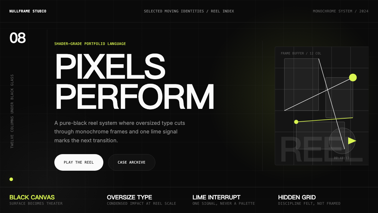
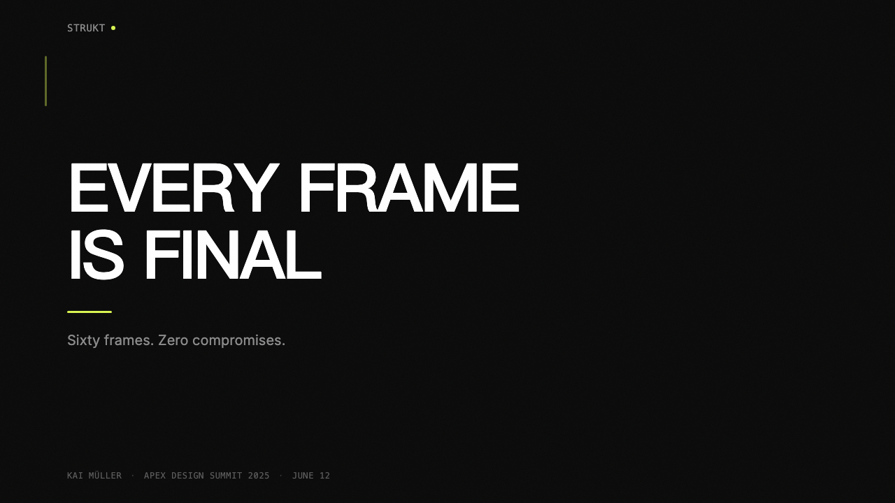
Cinematic Black Canvas电影感黑色画布
The background is near-absolute black — not a softened charcoal or a dark navy, but the deepest tone the screen can produce. This choice is foundational: it transforms every lighter element into something that appears to emit rather than reflect light, giving the site a luminous, theatrical quality impossible on light-ground layouts. The blackness also functions as a temporal signal, borrowing the conventions of cinema projection and film trailers to prime the viewer for a reel-presentation experience rather than a document-browsing one.背景是近乎绝对的黑色——不是柔化的深炭灰或深海军蓝,而是屏幕能够呈现的最深色调。这一选择是根基性的:它让每一个较亮的元素看起来像是在发光而非反光,赋予网站一种在浅色底面版面上不可能实现的发光感与戏剧性。这种黑暗同时作为时间信号发挥作用——借用电影放映与预告片的惯例,将观者调适为欣赏作品卷轴而非浏览文档的状态。
Oversize Condensed Display Type超大窄体展示字
Hero typography is set at extreme scale — the kind of size where individual letterforms become architectural elements occupying most of the viewport height. The typeface is invariably a heavy grotesque compressed to a narrow width, which allows long phrases and project titles to read across the full width of the screen without line breaks. The contrast between the immense weight of the letterforms and the darkness behind them creates an impression of text as physical object rather than communicative mark. Secondary type, by contrast, is set small and light, creating a scale ratio that signals hierarchy instantly.主视觉区排版设置在极端尺度下——单个字形成为占据大部分视口高度的建筑性元素。字体无一例外是被压缩至纤窄宽度的粗无衬线字体,允许长短语与项目标题在全屏幅宽度内横向阅读而不换行。巨大字重与背后黑暗之间的对比,制造出文字作为物理对象而非传达符号的印象。次级文字则设置得小而轻盈,创造出即刻传达层级信号的尺度比例。
Single Accent Color单一强调色
The entire palette is monochromatic except for one accent hue — most commonly lime green, electric magenta, or a saturated cyan-blue. This color appears sparingly and strategically: on an active navigation item, a hover state, a scroll progress indicator, or a single typographic highlight. Its rarity is what gives it power. Because the eye has been deprived of color across the majority of the layout, the accent hue reads with disproportionate force at first encounter. Using more than one accent color, or applying the accent at large area, would immediately dissolve this effect.除单一强调色相外,整个色板均为单色——最常见的是青柠绿、电光品红或饱和青蓝色。这种颜色出现得节制而具有策略性:活跃导航项、悬停状态、滚动进度指示符,或单一字体高亮。它的稀有性赋予它力量。由于眼睛在大部分版面中被剥夺了色彩感受,当强调色首次出现时,其视觉冲击力远超其实际面积所应有的强度。使用多于一种强调色,或大面积铺设强调色,将立即消解这一效果。
Smooth-Scroll Inertia and Parallax平滑滚动惯性与视差
Scrolling in this style is never the default browser scroll. A JavaScript-managed scroll system intercepts native scroll events and re-renders movement with momentum and easing — the page continues moving briefly after the user stops scrolling, and decelerates with a physical quality that feels weighted rather than mechanical. Within this scrolling system, different layers move at different speeds, creating parallax depth: background elements drift slower than foreground type, mid-ground images shift at a rate between the two, producing a convincing sense of three-dimensional space on a flat screen.这种风格中的滚动绝不是浏览器默认滚动。一套 JavaScript 管理的滚动系统拦截原生滚动事件,以动量与缓动重新渲染运动——用户停止滚动后页面会短暂继续移动,并以有质量感而非机械感的方式减速。在这套滚动系统内,不同层级以不同速度移动,制造视差深度:背景元素漂移得比前景文字慢,中景图像以介于两者之间的速度偏移,在平面屏幕上产生令人信服的三维空间感。
WebGL Transition and Shader EffectsWebGL 转场与着色器特效
Transitions between sections or between portfolio projects are not CSS fades or slides — they are GPU-executed shader programs that distort, liquify, or ripple the incoming and outgoing content. Common effects include a liquid-membrane morph where the edge between two images dissolves like a surface tension break, or a noise-based grain wipe that advances in organic rather than geometric waves. These transitions require a capable GPU and a well-optimized implementation; when executed poorly they become a performance liability, but when done well they are the most distinctive visual signature of the style.段落之间或作品项目之间的转场不是 CSS 淡入淡出或滑动——而是由 GPU 执行的着色器程序,对进出的内容施加扭曲、液化或波纹效果。常见效果包括液态薄膜变形(两张图像之间的边界像表面张力破裂般溶解),以及基于噪声的粒纹划变(以有机波浪而非几何波形推进)。这些转场对 GPU 性能和优良实现有较高要求;执行不佳时会成为性能负担,但执行精良时,它们是这种风格最具辨识度的视觉签名。
Magnetic and Deformed Cursor磁性与变形光标
The system cursor is replaced or augmented by a custom cursor object — often a small circle or dot — that exhibits two distinct behaviors. In open space, it trails the actual pointer position with a slight easing lag, giving it physical weight. Near interactive elements such as buttons or project thumbnails, the cursor deforms: it expands into a filled circle that engulfs the target element, or the target element itself shifts magnetically toward the cursor position as if attracted. This interaction transforms every hover event into a micro-choreography, making even navigation feel designed.系统光标被自定义光标对象取代或增强——通常是一个小圆或圆点——表现出两种截然不同的行为。在开放空间中,它以轻微的缓动滞后跟踪实际指针位置,赋予其物理重量感。在按钮或项目缩略图等可交互元素附近,光标发生形变:它扩展为包围目标元素的填充圆,或目标元素本身像被吸引一样磁性地向光标位置偏移。这种交互将每次悬停事件转化为微型编舞,使得即便是导航也充满设计感。
Typographic Hierarchy Without Decoration无装饰排印层级
Beyond the hero display type, the typographic system is lean and functional. Navigation labels are set small and widely tracked in capitals, reading as coordinates rather than calls to action. Body text in case studies is set at a reading-comfortable measure in a neutral grotesque, kept well away from the hero content so the two voices never compete. Section numbers or project indices appear in a lighter weight at a size too small to interrupt but large enough to anchor position. There are no decorative rules, no pull-quote ornaments, no icon-text lockups — hierarchy is achieved entirely through scale, weight, and placement.在主视觉展示字之外,排印系统简洁而功能性。导航标签以大写、宽字距设置得小巧,读起来像坐标而非行动号召。案例研究中的正文以舒适阅读行宽设置在中性无衬线字体中,与主视觉内容保持足够距离,使两种声音永不竞争。段落编号或项目索引以较轻的字重出现在不打扰阅读但足以锚定位置的尺度下。没有装饰性横线,没有引用符号装饰,没有图标与文字的锁定组合——层级完全通过尺度、字重与位置来实现。
See the Awwwards Swiss Portfolio design system查看 Awwwards Swiss Portfolio 完整设计系统
Who shaped Awwwards Swiss Portfolio?谁塑造了 Awwwards Swiss Portfolio?
A Paris-based creative developer whose personal site and client work exemplified the mature form of the Awwwards Swiss Portfolio aesthetic — combining extreme typographic scale, WebGL distortion effects, and immaculate micro-interaction design. Hocdé's work was cited repeatedly in Awwwards jury notes as a benchmark for technical craft married to visual restraint, and his public experiments with shader-based transitions influenced how other studios approached the GPU as a compositional tool.巴黎创意开发者,其个人网站与客户作品是 Awwwards 瑞士作品集美学成熟形态的典范——将极端排印尺度、WebGL 扭曲效果与精湛微交互设计融为一体。Hocdé 的作品在 Awwwards 评审注记中被反复引用为技术精湛与视觉克制融合的基准,他在着色器转场方面的公开实验影响了其他工作室将 GPU 视为构图工具的方式。
A French creative developer and Awwwards developer of the year honoree, Lemonnier built a body of work that demonstrated how the condensed-type-and-black-canvas formula could be applied across diverse client contexts without becoming formulaic. His projects for cultural institutions and luxury brands showed that the style's cinematic authority could serve ends beyond self-promotion, legitimizing it as a deployable visual language rather than merely a portfolio-site genre.法国创意开发者、Awwwards 年度最佳开发者获奖者。Lemonnier 建立了一批作品,证明窄体字加黑色画布的公式可以在不同客户语境中应用而不流于程式化。他为文化机构和奢侈品牌所做的项目表明,这种风格的电影权威感可以服务于自我宣传之外的目的,使其成为可部署的视觉语言,而不仅仅是一种作品集网站类型。
Co-founder and creative director at Active Theory, a Los Angeles–based studio that became synonymous with the most technically ambitious tier of Awwwards-caliber work. Active Theory's projects for major entertainment and technology clients pushed WebGL scene transitions, audio-reactive visuals, and real-time 3D canvas work into the mainstream of award-winning web design, establishing the template that many subsequent studios emulated and iterated upon.洛杉矶工作室 Active Theory 的联合创始人兼创意总监。Active Theory 成为技术最具野心的 Awwwards 级别作品的代名词。他们为重要娱乐与科技客户所做的项目,将 WebGL 场景转场、音频响应视觉与实时三维画布工作推入获奖网页设计主流,建立了许多后续工作室效仿和迭代的模板。
The Spanish-born developer and artist who created Three.js, the JavaScript library that abstracted WebGL sufficiently to make GPU-driven visual effects accessible to web developers without deep graphics programming backgrounds. Three.js did not create the Awwwards Swiss Portfolio aesthetic, but it provided the technical infrastructure on which much of it runs. Cabello's decision to make Three.js open-source and extensively documented was arguably the single most enabling act for the entire creative coding community that produced this style.西班牙裔开发者与艺术家,Three.js 的创建者。Three.js 是一个 JavaScript 库,将 WebGL 充分抽象,使没有深厚图形编程背景的网页开发者也能使用 GPU 驱动的视觉效果。Three.js 并未创造 Awwwards 瑞士作品集美学,但它提供了其大部分内容赖以运行的技术基础设施。Cabello 将 Three.js 开源并提供详尽文档的决定,可以说是促成产生这种风格的整个创意编程社区的最重要的单一赋能行为。
The Montréal-based studio that, in addition to producing award-winning sites of their own, open-sourced Locomotive Scroll — the smooth-scroll library that became the most widely adopted infrastructure layer for inertia-scrolling in the Awwwards creative community. By releasing the library publicly, Locomotive effectively standardized the scroll feel of the style across hundreds of studios worldwide, making what had been a costly custom implementation available to any team willing to integrate a dependency.蒙特利尔工作室,除制作自身的获奖网站外,还将 Locomotive Scroll 开源——这个平滑滚动库成为 Awwwards 创意社区中被采用最广泛的惯性滚动基础设施层。通过公开发布这个库,Locomotive 实际上在全球数百家工作室中标准化了这种风格的滚动手感,将此前需要高成本定制实现的特性,变为任何愿意集成该依赖的团队都能使用的工具。
How do you use Awwwards Swiss Portfolio today?今天怎么用 Awwwards Swiss Portfolio?
The Awwwards Swiss Portfolio style was built for portfolio and showcase contexts, but its visual language translates well to other high-stakes presentation formats — provided you understand which elements are structural and which are medium-specific. The black canvas, the typographic scale hierarchy, and the single-accent color discipline are all transferable. The WebGL transitions, the custom cursor, and the smooth-scroll physics are browser-native behaviors and cannot be replicated in static media. When adapting this style, begin by identifying which layer of the aesthetic you are working in.Awwwards 瑞士作品集风格为作品集与展示场景而生,但其视觉语言可以很好地迁移到其他高要求演示格式——前提是理解哪些元素是结构性的,哪些是媒介特定的。黑色画布、排印尺度层级与单一强调色纪律,均可迁移。WebGL 转场、自定义光标与平滑滚动物理效果是浏览器原生行为,无法在静态媒介中复制。适配这种风格时,首先确定你正在使用哪个层次的美学。
For presentation slides — cover and section architecture — the style provides a strong template. A cover slide works best with the full canvas black, a single project title set in a condensed grotesque at the largest size the slide dimensions allow, and one accent-color detail: a colored rule beneath the studio name, or a highlighted word in a subheading. Section opener slides should follow the same discipline: near-total black, one large typographic element, one color signal, no imagery competing for attention. Content slides inside case studies or data sections shift register: the black ground remains, but type size decreases and a loose grid of text and image panels replaces the hero composition. Data visualization in this style reads best when chart elements — bars, lines, nodes — are rendered in the accent color against the dark ground, with all axes and labels in a subdued off-white.对于演示文稿——封面与段落结构——这种风格提供了强有力的模板。封面幻灯片最佳做法:全黑画布,以窄体无衬线字体将单一项目标题设置在幻灯片尺寸允许的最大字号,加上一个强调色细节——工作室名称下方的彩色横线,或副标题中的高亮词语。段落开篇幻灯片遵循同样的纪律:近乎全黑,一个大型排印元素,一个色彩信号,无图像争夺注意力。案例研究或数据段落内部的内容幻灯片切换语调:黑色底面保留,但字体尺寸减小,以松散的文字与图像面板网格替代英雄构图。在这种风格下,数据可视化的最佳效果是将图表元素——柱条、折线、节点——以强调色渲染在深色底面上,所有坐标轴与标签使用抑制的近白色。
For web interfaces — dashboards, pricing pages, and product landing pages — the style's authority works well in contexts where the product needs to signal creative credibility or premium quality. The implementation logic: commit fully to the dark canvas; define one primary accent color and use it only for interactive states, active selections, and primary calls to action; set all primary navigation in small-caps with generous tracking; use a single display typeface at two sizes only — large for section titles, small for body — and do not introduce a second typeface family. Card components should have visible borders in a low-contrast grey rather than shadows; the border treatment reads as precision rather than depth-simulation, which is consistent with the style's values.对于网页界面——仪表板、定价页面与产品登陆页——这种风格的权威感在产品需要传达创意可信度或高端品质的场景中效果良好。实现逻辑:完全投入深色画布;定义一种主强调色,仅用于交互状态、激活选择与主要行动号召;将所有主导航以小型大写字母加宽松字距设置;仅使用单一展示字体、两种尺寸——大号用于段落标题,小号用于正文——不引入第二种字体家族。卡片组件应有低对比度灰色可见边框而非投影;边框处理读起来像精确而非深度模拟,与这种风格的价值观一致。
For editorial and marketing applications — long-form articles, brand campaign pages, and promotional emails — the style's cinematic scale translates into structural contrast between sections. A marketing page built in this language alternates between full-bleed black sections with large condensed type and dark-grey sections with smaller reading type, using the accent color consistently on primary action buttons and key metrics. Editorial layouts should use generous vertical spacing between sections to preserve the breathing-room quality that distinguishes the style from merely dark-themed design. Avoid filling every section with imagery; the black space between images is as intentional as the images themselves.对于编辑与营销应用——长篇文章、品牌活动页面与推广邮件——这种风格的电影感尺度转化为段落之间的结构性对比。以这种语言构建的营销页面,在全出血黑色段落(配以大型窄体字)与深灰色段落(配以较小阅读字体)之间交替,在主要行动按钮和关键指标上一致使用强调色。编辑版面应在段落之间使用充裕的垂直空间,以保留将这种风格与仅仅是深色主题设计区分开来的呼吸感。避免在每个段落中填充图像;图像之间的黑色空间与图像本身同样刻意。
A persistent mistake when applying this style outside its native browser context is treating the accent color as a decoration budget rather than a signal system. Because the style trains the eye to read the accent color as meaningful — a hover state, an active item, a key data point — using it for illustrative or atmospheric purposes breaks the visual contract. Similarly, introducing a second accent color, even a closely related one, immediately halves the signal strength of both. Discipline means using the accent color less than feels natural, trusting the scale and contrast of the typography to carry the visual interest, and reserving color for moments of genuine communicative purpose.在浏览器原生语境之外应用这种风格时,一个持续性错误是将强调色视为装饰预算而非信号系统。由于这种风格训练眼睛将强调色读作有意义的信号——悬停状态、激活项、关键数据点——将其用于说明性或氛围性目的会打破视觉契约。同样,引入第二种强调色(即便是相近的颜色),立即将两者的信号强度各削减一半。纪律意味着使用强调色的频率要低于本能感觉,信任排印的尺度与对比来承担视觉兴趣,将色彩保留给真正具有传达目的的时刻。
See the Awwwards Swiss Portfolio design system查看 Awwwards Swiss Portfolio 完整设计系统
Awwwards Swiss Portfolio — FAQAwwwards Swiss Portfolio · 常见问题
Is this really a 'Swiss' style, or is that label misleading?这真的是「瑞士」风格吗,还是这个标签有些误导?
The Swiss label is a genealogical reference rather than a geographical one. The style inherits the grid discipline, typographic hierarchy, and rejection of ornament that define Swiss International Style as it emerged from Basel and Zurich in the mid-twentieth century. But it was developed primarily by studios in Montréal, Paris, Barcelona, Los Angeles, Auckland, and Amsterdam — none of them Swiss. The name signals visual DNA, not national origin. Where classical Swiss Style was static and print-native, this descendant style is interactive and browser-native. The shared inheritance is structural: the commitment to the grid as primary organizing logic, the insistence that type can carry visual interest without decoration, and the belief that restraint is not poverty but authority.「瑞士」标签是一种谱系学上的指称,而非地理性的。这种风格继承了瑞士国际主义风格所定义的网格纪律、排印层级与排斥装饰——后者在二十世纪中期兴起于巴塞尔和苏黎世。但它主要由蒙特利尔、巴黎、巴塞罗那、洛杉矶、奥克兰与阿姆斯特丹的工作室发展而来——没有一家是瑞士的。这个名称指向视觉基因,而非国籍来源。古典瑞士风格是静态的、源自印刷的;而这个后裔风格是交互式的、源自浏览器的。共同的遗产是结构性的:以网格作为主要组织逻辑的承诺,坚持文字无需装饰即可承载视觉兴趣,以及相信克制不是匮乏而是权威。
Can this style work for a product that is not a creative agency or portfolio?这种风格适用于非创意代理机构或作品集的产品吗?
Yes, with clear-eyed adaptation. The style's authority — its cinematic scale, its monochromatic discipline — communicates premium positioning and creative seriousness, which can serve product categories beyond digital agencies: luxury goods, high-end audio and technology hardware, entertainment platforms, and cultural institutions all benefit from the same visual register. The key adaptation is tonal: a portfolio site for a motion studio can afford to be almost aggressively self-referential in its craft display, whereas a luxury product page needs to redirect the same visual energy toward the product itself. The black canvas, the condensed type, and the single accent color travel well; the cursor effects and WebGL transitions should be evaluated against the product audience's technical context and patience for interaction.可以,前提是清醒地进行适配。这种风格的权威感——其电影化尺度、单色纪律——传达出高端定位与创意严肃性,这可以服务于数字代理机构之外的产品类别:奢侈品、高端音频与科技硬件、娱乐平台以及文化机构,都能从同样的视觉语调中受益。关键适配是语调上的:动态工作室的作品集网站可以几乎近乎自我指涉地展示技艺,而奢侈品产品页面则需要将同样的视觉能量重新导向产品本身。黑色画布、窄体字与单一强调色具有良好的可移植性;光标效果与 WebGL 转场则应针对目标受众的技术语境与交互耐心进行评估。
What makes a site in this style feel authentic versus derivative?什么使这种风格的网站看起来真实而非衍生?
Authenticity in this style comes from the integration of motion and content rather than the application of visual tropes. A derivative site applies the black canvas, oversize type, and WebGL transitions as a theme layered on top of otherwise conventional content architecture. An authentic site designs the content architecture around the motion: the scroll sequence is the editorial sequence; the transition effect is the content transition; the cursor behavior changes meaning based on context. The motion is not a feature — it is the medium. Practically, this means that authentic work tends to emerge from teams where the developer and designer are either the same person or in very close collaboration, because the interactive decisions cannot be separated from the visual ones.这种风格的真实性来自运动与内容的整合,而非视觉套路的应用。衍生性网站将黑色画布、超大字体与 WebGL 转场作为叠加在常规内容架构之上的主题。真实的网站则围绕运动来设计内容架构:滚动序列就是编辑序列;转场效果就是内容过渡;光标行为根据语境改变含义。运动不是一个功能——它是媒介。实际上,这意味着真实的作品往往来自开发者与设计师是同一人或紧密协作的团队,因为交互决策与视觉决策无法分离。
How should this style handle accessibility, given its reliance on motion and dark backgrounds?考虑到对运动与深色背景的依赖,这种风格应如何处理无障碍访问?
Accessibility is a genuine tension in this style and cannot be dismissed as a secondary concern. On the motion side, the smooth-scroll inertia, parallax layers, and WebGL transitions can be severely disorienting for users with vestibular disorders — a prefers-reduced-motion media query should disable or significantly attenuate all scroll-physics and transition effects, falling back to instant position changes and simple opacity transitions. On the contrast side, the dark background with near-white text and a single accent color generally produces high contrast ratios that exceed accessibility standards — but the accent color itself, particularly if it is a saturated lime or magenta, must be checked against the dark background at the font sizes where it appears, since small saturated text can fail contrast requirements even at high perceptual saturation. The magnetic cursor and custom cursor object should not be the only interactive affordance — keyboard focus states must be clearly visible, and focus order must follow the visual content sequence.无障碍访问是这种风格中真实存在的张力,不能将其视为次要顾虑。在运动方面,平滑滚动惯性、视差层与 WebGL 转场对患有前庭障碍的用户可能造成严重的方向迷失——prefers-reduced-motion 媒体查询应禁用或显著减弱所有滚动物理与转场效果,回退至即时位置变化与简单透明度过渡。在对比度方面,深色背景配近白色文字与单一强调色通常产生超过无障碍标准的高对比度比值——但强调色本身,尤其是饱和青柠或品红,必须在其出现的字体尺寸下针对深色背景进行检查,因为小号高饱和文字即便在视觉饱和度很高的情况下也可能未能达到对比度要求。磁性光标与自定义光标对象不应是唯一的交互可见性线索——键盘焦点状态必须清晰可见,焦点顺序必须遵循视觉内容序列。
How is this different from simply making a dark-themed website?这与简单地制作深色主题网站有何不同?
Dark-themed websites use a dark background as a preference or aesthetic choice, often accompanying a light-mode equivalent and applying standard visual conventions — drop shadows for depth, multiple accent colors, conventional scroll behavior — within the dark color scheme. The Awwwards Swiss Portfolio style uses the black canvas as a foundational commitment from which the entire visual logic derives: the accent color has the power it does precisely because everything else is dark; the condensed display type reads as it does precisely because there is no background noise competing with it; the scroll physics create the effect they do because the dark ground makes spatial depth legible in a way that a lighter, noisier background would obscure. Dark theme is a color setting. This style is a compositional system in which the darkness is load-bearing.深色主题网站将深色背景作为偏好或美学选择,通常附有浅色模式版本,并在深色配色方案内应用标准视觉惯例——深度阴影、多种强调色、常规滚动行为。Awwwards 瑞士作品集风格则将黑色画布作为整个视觉逻辑从中派生的基础性承诺:强调色之所以拥有其力量,恰恰因为其他一切都是深色的;窄体展示字之所以读起来如此,恰恰因为没有背景噪声与之竞争;滚动物理之所以产生其效果,是因为深色底面使空间深度以浅色、嘈杂的背景所无法实现的方式变得可读。深色主题是一种配色设置。这种风格是一个构图系统,其中黑暗本身是承重结构。
Related design styles相关设计风格
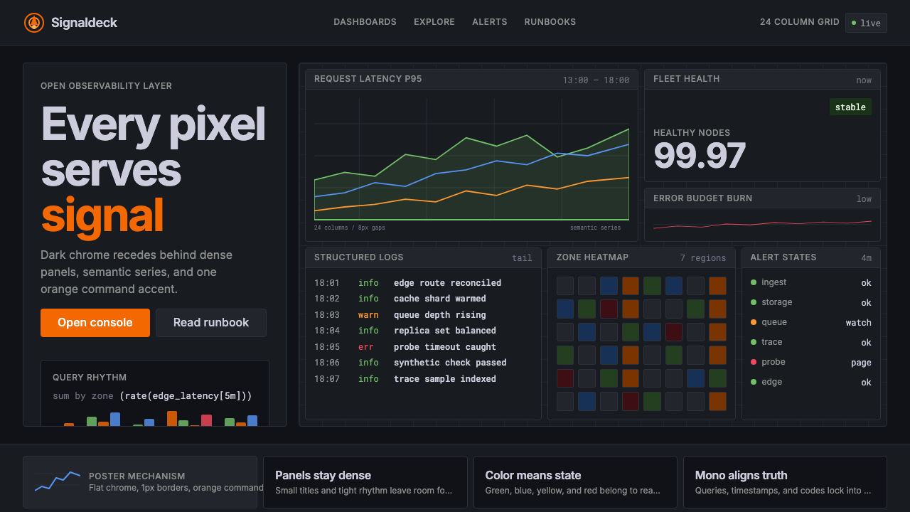 GrafanaData first, chrome last. Orange accent cuts through dense dark panels and sem…数据优先,界面退后:橙色强调穿透深色密集面板与语义图表。
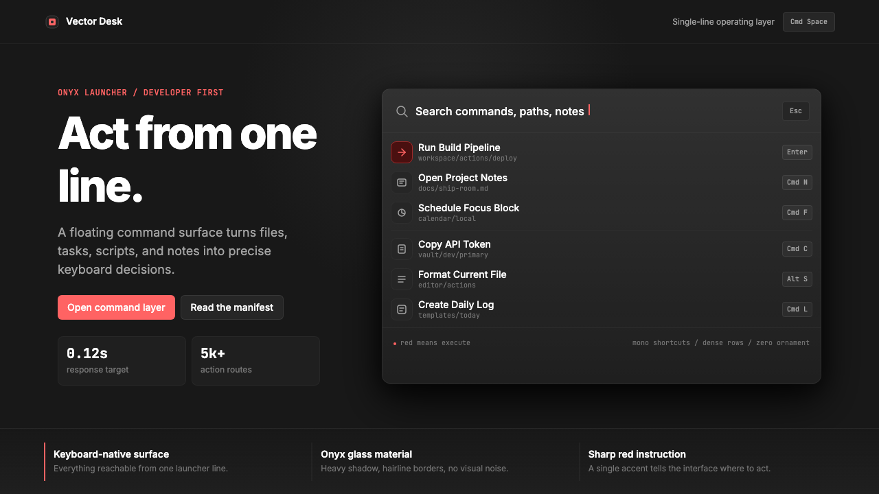 Raycast Spotlight Launcher (2023)Obsidian confidence. Sharp red cuts through Inter rows and mono shortcut chip…黑曜石般自信。锐红切过 Inter 行与等宽快捷键。
 Android Bugdroid GreenFriendly tech, reduced to geometry. Vivid green pops from Grey 900 and rounde…友好科技化为几何:明绿从 Grey 900 与圆润字形中跃出。
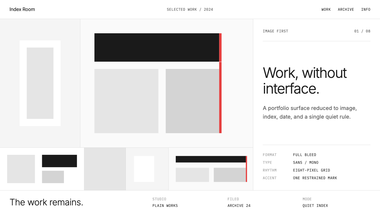 Cargo Collective PortfolioInterface disappears. White space, full-bleed blocks, mono metadata and hairl…界面退场:留白、全出血块面、等宽元数据与极细线。
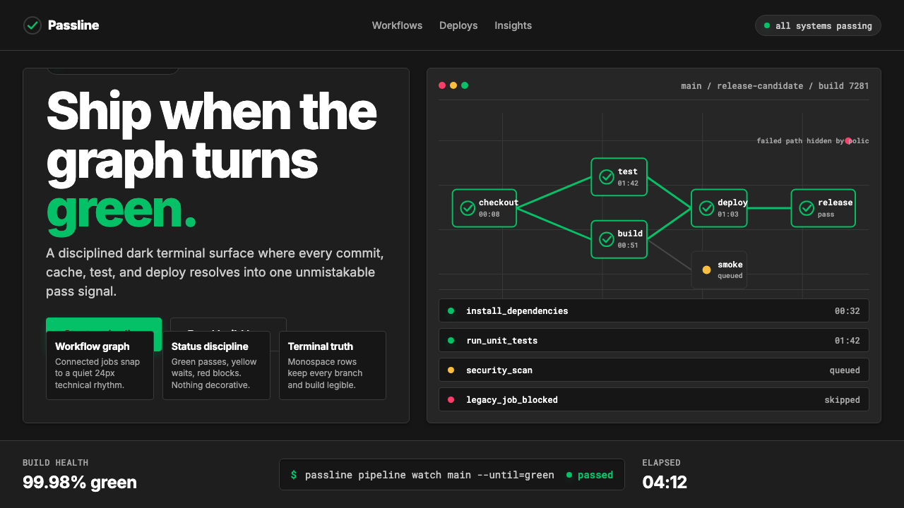 CircleCI Pipeline-GreenConfidence goes green. Emerald status lines cut through terminal-black pipeli…信心变绿。翠绿状态线切过终端黑流水线网格。
 Cursor IDEAI-first code editor. Pure dark surfaces, off-white text, electric blue reser…以 AI 为核心的代码编辑器:近乎纯黑背景、柔白文字、唯一的电光蓝色专为 AI…