Design style guide设计风格指南
What is Korean Hanok Eaves Revival?什么是 Korean Hanok Eaves Revival?
Korean Hanok Eaves Revival translates eight centuries of Joseon courtyard architecture into a living contemporary aesthetic — smoke-blue roof-tile shadow, warm white-oak beams, and brass fixture details that feel earned rather than applied.韩屋檐影复兴将八百年朝鲜庭院建筑转化为鲜活的当代美学——烟蓝色瓦影、暖色白橡木梁与黄铜五金,每一处细节都像是从岁月里长出来的,而非刻意贴上去的。
Korean Hanok Eaves Revival in briefKorean Hanok Eaves Revival 速览
Korean Hanok Eaves Revival is a design sensibility rooted in the 2010s–2020s transformation of Joseon-era courtyard houses into contemporary cultural spaces. Specialty cafés, small-press bookshops, ceramics studios, and soap workshops opened inside centuries-old timber frames across Seoul's Bukchon, Ikseon-dong, and Seochon neighborhoods — and the visual language that emerged from those renovations became a coherent aesthetic in its own right.韩屋檐影复兴是一种植根于2010至2020年代改造运动的设计感性。在首尔北村、益善洞、西村一带,精品咖啡馆、独立书店、陶瓷工作室与手工皂铺在历经数百年风霜的木构框架中相继开张——这些改造项目所共同催生的视觉语言,逐渐形成了一套自洽的美学体系。
The style is defined by a precise layering of materials and tones rather than by geometry or graphic boldness. Smoke-blue roof-tile shadow acts as the dominant cool register; warm white-oak beams and hanji-white plaster walls supply the warm ground; and fine brass hardware — door pulls, lighting fixtures, shelf brackets — introduces a third register of aged warmth that keeps the palette from reading as cold. Nothing in the system is stark or high-contrast in the Western minimalist sense. The contrasts are subtler: aged versus fresh, structural versus decorative, interior versus threshold.这种风格的核心是对材料与色调的精确叠合,而非几何构成或图形张力。烟蓝色瓦影作为主要的冷调基准;暖色白橡木梁与韩纸白灰墙构成暖调底色;精细的黄铜五金——门拉手、灯具、搁架托件——引入第三层带有岁月感的暖意,使整体色调不至于流于寒冷。这套体系中没有任何元素是西方极简主义意义上的强烈对比,所有的张力都是更为幽微的:经年与崭新、承重与装饰、室内与门槛之间的对话。
Crucially, Hanok Eaves Revival is not generic Asian minimalism and is not the same as Japanese wabi-sabi. Where wabi-sabi foregrounds imperfection and the passage of time as primary aesthetic values, Hanok Revival foregrounds the structural logic of the timber frame — the hierarchy of column, beam, purlin, and rafter — and the cultural specificity of the Korean building tradition. The eaves overhang, with its characteristic upward curve at the corner, is not an ornamental flourish but a functional and identity-bearing element. The style treats that overhang as a compositional anchor.值得强调的是,韩屋檐影复兴既不是泛化的亚洲极简风,也不等同于日本侘寂美学。侘寂以不完美与时间流逝本身作为首要美学价值,而韩屋复兴则以木构框架的结构逻辑——柱、梁、檩、椽的层级关系——以及朝鲜建筑传统的文化特殊性为核心。飞檐的悬挑,尤其是四角翘起的曲线,并非装饰性的点缀,而是一个兼具功能意义与身份表达的构成要素。这种风格将飞檐视为构图的锚点。
See the Korean Hanok Eaves Revival design system →查看 Korean Hanok Eaves Revival 完整设计系统 →
Where does Korean Hanok Eaves Revival come from?Korean Hanok Eaves Revival 从何而来?
The hanok — a Korean traditional house organized around a central courtyard, built with timber columns, earthen walls, and a distinctive ceramic tile roof — traces its mature form to the Joseon dynasty (1392–1897). Joseon-period hanok design synthesized earlier Unified Silla construction traditions (dating to the eighth century and famous for the giwa, or clay roof tile, fired in characteristic blue-grey) with Confucian spatial principles that organized domestic life around hierarchies of public and private, male and female, family and guest.韩屋——围绕中央庭院布局、以木柱、土墙与独特陶瓦屋顶构成的朝鲜传统民居——其成熟形式可追溯至朝鲜王朝(1392—1897年)。朝鲜时代的韩屋设计将更早期的统一新罗建筑传统(可追溯至八世纪,以烧制独特蓝灰色的「기와」陶瓦著称)与儒家空间秩序相融合,后者将家居生活按公私之别、内外之序、家人与宾客之分组织起来。
By the late nineteenth and early twentieth centuries, rapid urbanization under Japanese colonial rule (1910–1945) and later under the compressed industrialization of the postwar Korean economic miracle meant that hanok neighborhoods were demolished at a rate that alarmed cultural preservationists. Seoul's old tile-roofed districts — once the domestic fabric of the Joseon capital, Hanseong — shrank dramatically. The preservation movement that arose in response was initially driven by heritage policy but gained its contemporary cultural resonance through a different channel: the independent café and creative industry scene of the 2010s.十九世纪末至二十世纪初,日本殖民统治(1910—1945年)下的快速城市化,以及此后战后韩国经济奇迹中压缩式的工业化进程,使韩屋街区的消失速度令文化保护者深感震惊。首尔昔日以瓦顶为标志的老旧街区——朝鲜都城汉城的传统民居肌理——急剧萎缩。随之而起的保护运动最初由遗产政策驱动,但在2010年代的独立咖啡馆与创意产业浪潮中找到了截然不同的当代共鸣。
Studios including Mass Studies, led by architect Minsuk Cho, and Guga Urban Architecture, led by Cho Jung-goo, along with the practice of Hwang Doo-jin (Doojin Hwang Architects), pioneered a renovation approach that preserved and exposed the structural timber rather than concealing it behind modern cladding. The approach set a register: raw timber grain alongside smooth lime plaster, the dark ceramic tile of the roof visible at the eaves from the interior, brass and steel hardware selected for material affinity rather than decorative novelty. Jeonju Hanok Village, south of Seoul, served as a parallel laboratory for this aesthetic outside the capital.以建筑师赵敏硕(Minsuk Cho)领衔的Mass Studies事务所、曹仲九(Cho Jung-goo)主持的具家都市建筑,以及黄斗进(Hwang Doo-jin)的建筑实践,共同开创了一种改造思路:保留并裸露承重木构,而非将其遮藏于现代饰面之后。这种做法确立了一种基准语言——粗粒木纹与光滑石灰抹灰并置,屋顶深色陶瓦的边缘从室内向外可见,黄铜与钢制五金因材料亲缘性而入选,而非出于装饰新奇感。首尔以南的全州韩屋村,作为首都之外的平行实验场,共同培育了这一美学。
The influence of architect Itami Jun — a Korean-Japanese architect born Yoo Dong-ryong, whose work meditated on the sensory qualities of Korean materials — provided a theoretical underpinning. Itami Jun's buildings in Jeju Island and elsewhere demonstrated that the specific weight and hue of Korean clay, tile, stone, and timber could anchor a contemporary architecture without becoming nostalgic reproduction. This precedent legitimized the revival not as heritage preservation but as a live visual language capable of being extended into new programs, new scales, and new media.韩裔日本建筑师柳东龙(艺名石田纯一)的影响为这场复兴提供了理论支撑。他的建筑在济州岛等地深思朝鲜材料的感官品质,证明了朝鲜黏土、陶瓦、石材与木材特有的重量与色调,足以锚定一种当代建筑,而无需沦为怀旧的复原。这一先例将复兴的性质定位为一套活的视觉语言,而非遗产保护——一套能够延伸至新功能、新尺度与新媒介的视觉语言。
What defines the Korean Hanok Eaves Revival look?Korean Hanok Eaves Revival 的视觉特征是什么?
Eaves as Compositional Anchor飞檐作为构图锚点
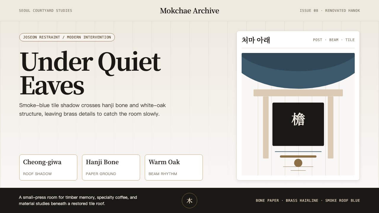
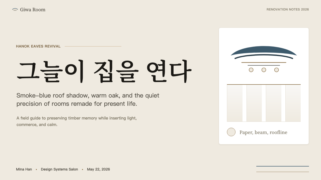
The defining element of the style is the treatment of the eaves overhang — the deep horizontal projection of the roof that casts a band of shadow across the wall below. In Hanok Revival interiors and graphics, this shadow band functions as a compositional horizon: a cool, dark register that sits above a warmer, lighter field. The gentle upward curve at the corner eave is echoed in subtle curved details elsewhere — the lip of a shelf, the arc of a lamp arm — without being literally reproduced. The eave is an attitude rather than a copy.这种风格最具标志性的元素,是对飞檐悬挑的处理——屋顶深远的水平出挑在下方墙面投下一道阴影带。在韩屋复兴的室内与平面设计中,这道阴影带发挥着构图地平线的作用:一个冷调、深沉的视觉层,悬于更温暖、更明亮的底色之上。四角翘起的轻柔曲线被以含蓄的方式呼应在其他细节之中——搁板的唇边、灯臂的弧度——而非直接字面复制。飞檐是一种姿态,而非一份拷贝。
Layered Tonal Register叠合的色调层次
The palette works through three distinct tonal layers rather than through color contrast. The cool layer is the smoke-blue grey of fired ceramic roof tile — a desaturated blue with significant grey and a slight olive undertone that reads differently in natural versus artificial light. The warm layer is hanji white — the off-white of Korean mulberry-bark paper and lime plaster, warmer and more alive than a pure white. The accent layer is aged brass, which introduces warmth without sweetness. These three layers never compete; they are assigned to different material categories and held apart by structural logic.这套色调体系通过三个层次递进,而非依赖色彩对比。冷调层是烧制陶瓦的烟蓝灰——一种降饱和的蓝调,带有大量灰质与轻微橄榄色底,在自然光与人工光下呈现出不同面貌。暖调层是韩纸白——朝鲜楮皮纸与石灰抹灰的米白,比纯白更温润、更有生气。点缀层是做旧黄铜,引入温度感而不失克制。这三个层次从不竞争,它们被分配给不同的材料类别,由结构逻辑彼此隔开。
Timber Frame Hierarchy木构框架的层级
The Joseon hanok is organized by a clear structural hierarchy: major columns carry the main horizontal beams, which carry the purlins, which carry the rafters. Hanok Revival applies this hierarchical logic to visual design — a primary structural line (equivalent to the column) anchors the composition, secondary lines define zones (the beams), and fine lines articulate detail (the rafters). In digital and print contexts, this translates to a deliberate sizing rhythm where the gap between hierarchy levels is large rather than incremental, producing a layout that reads as architecturally structured.朝鲜韩屋以清晰的结构层级组织:主柱承主梁,主梁承檩,檩承椽。韩屋复兴将这套层级逻辑引入视觉设计——主结构线(对应柱)锚定构图,次级线条划定区域(对应梁),细线条阐释细节(对应椽)。在数字与印刷语境中,这转化为一种审慎的尺寸节奏:层级之间的跨度是大幅跳跃而非渐进递增,产生一种具有建筑结构感的版面阅读体验。
Material Specificity Over Abstraction材料特殊性优先于抽象
Unlike design traditions that abstract materials into flat color fields, Hanok Revival retains the specific surface quality of its materials as an expressive asset. The grain of white oak is visible and directional. The roughness of lime plaster is present rather than smoothed to uniformity. The patina of brass implies use and time. In digital applications, this translates to a preference for actual photography of natural surfaces over synthesized texture, and for the kind of tonal complexity that comes from photographing real materials rather than rendering them.与将材料抽象为平涂色块的设计传统不同,韩屋复兴将各材料特有的表面质感保留为表达资产。白橡木纹理清晰可辨,方向感十足。石灰抹灰的粗粝是在场的,而非被磨平至均一。黄铜的包浆暗示着使用与时间。在数字应用中,这转化为对真实自然表面摄影的偏好,胜于合成纹理;以及对拍摄真实材料所带来的色调复杂性的偏好,胜于渲染图像。
Threshold and Interior Ambiguity门槛与内外的暧昧
A defining spatial quality of the traditional hanok is the maru — the wooden-floored transitional space between exterior courtyard and interior room, neither fully inside nor outside. Hanok Revival translates this spatial idea into a compositional preference for zones that are neither foreground nor background, neither fully defined nor fully open. In layouts, this appears as generous intermediate zones — wide margins that contain neither text nor void but low-contrast graphic elements, or backgrounds that shift subtly between the cool and warm registers without a hard boundary.传统韩屋在空间上最具定义性的特征之一,是「马루」——木地板铺就的过渡空间,介于室外庭院与室内房间之间,既非完全在外,也非完全在内。韩屋复兴将这种空间意象转化为构图上的偏好:既非前景也非背景、既非完全界定也非完全开放的中间地带。在版面中,这表现为慷慨的中间带——宽阔的留白区域,其中既无文字也无空洞,只有低对比度的图形元素;或是在冷暖色调之间无硬边界地微妙过渡的底色。
Restrained Brass Accent克制的黄铜点缀
Brass in the Hanok Revival context is never used as decoration for its own sake — it appears only where a functional fixture or hardware element exists: the pull of a door or drawer, the socket of a pendant light, the bracket supporting a shelf. The restraint is part of the aesthetic logic. Brass is the punctuation of the system, not its subject. When it appears frequently or decoratively — as a border, a background pattern, a typographic element — it crosses into a different, more commercial aesthetic that the style consciously resists.在韩屋复兴语境中,黄铜从不作为纯粹装饰出现——它只在功能性五金件存在之处现身:门拉手或抽屉拉手、吊灯灯座、搁架托件。这种克制本身就是美学逻辑的一部分。黄铜是这套体系的标点,而非主题。当它频繁出现或作装饰用途——作为边框、底纹、字体元素——便会越界进入一种更商业化的美学,而这正是该风格有意识地抵抗的。
Courtyard Breathing Room庭院式留白
The traditional hanok centers on the madang — the open courtyard that gives every interior room air, light, and a relationship to sky. Hanok Revival treats generous negative space as an equivalent: not decorative emptiness but functional breathing room that allows each element to exist independently before the eye travels from one to another. This is not the tight-packed, information-dense aesthetic of much East Asian commercial design. The spacing is deliberate and almost meditative — closer to the spatial generosity of a traditional tea ceremony setting than to a contemporary Seoul café menu board.传统韩屋以「마당」(庭院)为核心——这片开放的院落为每间室内房间带来空气、光线与天空的对话。韩屋复兴将充裕的负空间视为其当代对应物:这不是装饰性的空洞,而是功能性的呼吸余地,让每个元素在视线从一处移向另一处之前,都能独立存在。这并非东亚商业设计中常见的密集信息美学。间距是审慎而近乎冥想式的——更接近传统茶道场域的空间慷慨,而非当代首尔咖啡馆的菜单牌。
See the Korean Hanok Eaves Revival design system →查看 Korean Hanok Eaves Revival 完整设计系统 →
Who shaped Korean Hanok Eaves Revival?谁塑造了 Korean Hanok Eaves Revival?
Minsuk Cho, principal of Mass Studies in Seoul, has been among the most internationally visible architects working with the hanok idiom since the 2000s. His practice integrates Joseon spatial logic — the hierarchy of courtyard, transitional space, and interior — into contemporary programs without mimicking historical surface detail. Cho's theoretical writing on the urban condition of Korean architecture, particularly his analysis of the pressures placed on traditional neighborhoods by rapid development, gave critical vocabulary to a generation of architects and designers who were learning to work with the city's surviving hanok fabric.赵敏硕是首尔Mass Studies事务所主持建筑师,自2000年代以来一直是在国际上最具知名度的韩屋语汇从业者之一。他的实践将朝鲜的空间逻辑——庭院、过渡空间与室内的层级关系——整合进当代功能,而不复制历史性的表面细节。赵敏硕关于韩国建筑城市状况的理论写作,尤其是对传统街区在快速开发压力下处境的分析,为一代建筑师和设计师提供了批判性词汇,使他们学会如何与城市幸存的韩屋肌理共同工作。
Hwang Doo-jin (Doojin Hwang Architects) is known for renovation projects that restore and re-expose the structural timber of hanok buildings with an emphasis on material honesty over period recreation. His practice has been influential in establishing the principle that a renovated hanok should declare its renovation — new interventions should be legible as new, sitting in respectful tension with the original fabric rather than masquerading as part of it. This principle, widely adopted in the Ikseon-dong and Bukchon renovation waves, is central to why the style reads as contemporary rather than historicist.黄斗进(Doojin Hwang Architects)以韩屋建筑改造项目著称,其改造思路强调材料诚实,而非年代复原——修缮后裸露并呈现原有承重木构。他的实践确立了一条被广泛采纳的原则:改造后的韩屋应当「宣告」自己的改造——新的介入应当可被读作新的存在,与原有肌理形成尊重性的张力,而非伪装成原物的一部分。这一原则在益善洞与北村的改造浪潮中广受认可,也正是该风格呈现为当代感而非历史主义感的核心原因。
Itami Jun — born Yoo Dong-ryong in Tokyo to Korean parents — built a body of work across Jeju Island and the Korean peninsula that meditated on the sensory weight of Korean materials: the particular density of volcanic basalt, the temperature of clay tile, the silence of hanji paper. Though not a hanok revivalist in a direct programmatic sense, Itami Jun's insistence that regional material culture carries an irreducible aesthetic truth provided a philosophical foundation for the revival movement. His work demonstrated that emotional depth in Korean contemporary architecture came from material specificity, not from formal quotation.柳东龙(艺名石田纯一)生于东京,父母均为朝鲜族。他在济州岛与朝鲜半岛留下了一批作品,沉思朝鲜材料的感官重量:火山玄武岩特有的密度、陶瓦的温度、韩纸的寂静。尽管他并非直接意义上的韩屋复兴者,但他对地域材料文化携带不可化约的美学真理这一主张的坚持,为复兴运动提供了哲学基础。他的作品证明,韩国当代建筑的情感深度来自材料的特殊性,而非形式的引用。
Cho Jung-goo of Guga Urban Architecture has worked extensively on the adaptation of hanok structures to contemporary hospitality programs — cafés, small hotels, and cultural venues. His projects in Bukchon and Seochon have been particularly influential in establishing the interior language of the revival: the visible roof structure, the contrast of dark tile and warm plaster, and the use of limited brass hardware as the sole decorative accent. Guga's work helped define the hospitality register of the style that has since been widely emulated.具家都市建筑的曹仲九在将韩屋结构适配于当代待客场所——咖啡馆、精品民宿与文化场馆——方面积累了大量实践。他在北村与西村的项目在确立复兴运动的室内语言方面尤具影响力:可见的屋顶结构、深色陶瓦与暖色抹灰的对比,以及以有限的黄铜五金作为唯一装饰点缀。具家建筑的作品帮助定义了这种风格的待客场所语言,并被此后的大量实践所仿效。
Kim Seung-hoy, a Seoul-based architect and academic who has written extensively on the relationship between traditional Korean spatial concepts and contemporary architecture, provided important critical framing for the revival. His analysis of the philosophical underpinnings of hanok spatial organization — particularly the concept of 'in-between' space represented by the maru and the madang — gave architects and designers language to describe what they were doing beyond the purely formal. Kim's theoretical contribution helped distinguish the Hanok Revival as a spatially and philosophically grounded movement rather than a surface-driven nostalgic trend.首尔建筑师兼学者金承会曾就朝鲜传统空间概念与当代建筑的关系著述甚丰,为复兴运动提供了重要的批评框架。他对韩屋空间组织哲学基础的分析——尤其是马鲁与庭院所代表的「中间地带」概念——赋予了建筑师和设计师描述自身工作的语言,使其超越纯粹的形式层面。金承会的理论贡献有助于将韩屋复兴界定为一场具有空间与哲学根基的运动,而非一种表面驱动的怀旧潮流。
How do you use Korean Hanok Eaves Revival today?今天怎么用 Korean Hanok Eaves Revival?
Applying Korean Hanok Eaves Revival correctly requires understanding that the style is built on a material logic rather than a color formula. Its authority comes from the specific relationship between structural and decorative elements — the way the cool eave shadow anchors the composition and the brass hardware punctuates but does not lead. Attempting to reproduce the look by selecting similar tones without attending to the underlying relational logic tends to produce something that looks like a generic East Asian café rather than the specific aesthetic the revival developed.正确应用韩屋檐影复兴风格,首先需要理解这套风格建立在材料逻辑之上,而非色彩配方之上。它的权威性来自结构元素与装饰元素之间的特定关系——冷调檐影锚定构图,黄铜五金点缀其间而非主导全局。如果只是选取相似色调而不关注其背后的关系逻辑,往往只能得到泛化的东亚咖啡馆感,而非这场复兴所发展出的那套特定美学。
For presentation slides, the style works best in contexts where deliberate restraint and cultural specificity serve the message — cultural institution decks, architecture and interior design portfolios, artisan brand presentations, and similar work where the audience will read the visual register as intentional rather than understated by default. A cover page in this style uses the compositional horizon: a cool, darker band across the upper third (evoking eave shadow) above a warm lighter ground, with title text sitting in the warm zone in a clean, unhurried typeface. Content slides should breathe generously — the equivalent of the hanok courtyard. Data slides use the palette's three tonal layers to encode hierarchy: structural figures in the darkest register, supporting data in the middle warm tone, annotations in a lighter, more recessive register.对于演示文稿,这种风格在审慎的克制与文化特殊性服务于内容的场合中最为有效——文化机构的提案、建筑与室内设计的作品集、匠作品牌的品牌陈述,以及类似场合,在那里受众会将视觉语言读作有意为之而非默认的低调。这种风格的封面页运用构图地平线:上三分之一处一道冷调、深色的横向色带(呼应檐影),其下是温暖明亮的底色,标题文字落于暖调区域,使用干净从容的字体。内容页应当留有充裕的呼吸空间——相当于韩屋庭院的对应物。数据页用色调体系的三个层次编码层级:核心数据用最深的冷调,支撑数据用中间的暖调,注释用更轻、更退后的层次。
For web interfaces, Hanok Revival suits editorial platforms, portfolio sites, cultural venue websites, and premium product pages where considered pace and material richness are appropriate. The approach is to establish the tonal layering system in the background and surface treatments, then populate it with content that respects generous spacing. Navigation should be quiet and typographic. Cards and panels should carry a sense of material substance — slight warmth in the background, a shadow that suggests depth without drama. Interactive states should use the brass accent register: a subtle warm hover state rather than a color-pop change.对于网页界面,韩屋复兴风格适合编辑平台、作品集网站、文化场馆官网以及高端产品页面——凡是需要从容节奏与材料质感的场合。做法是先在背景与表面处理中建立色调叠合体系,再以尊重充裕间距的内容填充其中。导航应当安静而字体性。卡片与面板应当传递材料实质感——背景带有轻微暖意,投影暗示深度而不戏剧化。交互状态应当使用黄铜点缀层:克制的暖色悬停状态,而非颜色跳变式的交互反馈。
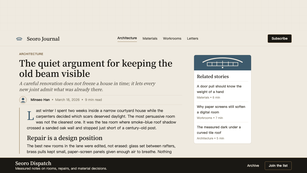
In editorial and marketing contexts, the style rewards patience and sustained reading rather than fast scanning. A long-form article layout in this register uses wide margins that hold secondary material — pull quotes, image captions, footnotes — while the body text occupies a column of considered width. Section breaks are marked by horizontal space rather than graphic dividers. Photography should show real surfaces: the grain of wood, the texture of plaster, the natural patina of aged objects. Composite imagery with rendered or synthetic surfaces will undermine the material honesty that gives the style its authority.在编辑与营销语境中,这种风格奖励耐心与持续阅读,而非快速扫描。这种风格下的长文版面使用宽阔的页边距容纳次要内容——摘引、图注、注脚——而正文占据一列经过审慎考量的宽度。段落分隔以横向留白标记,而非图形分割线。摄影应当呈现真实表面:木纹、抹灰质感、陈年物件的自然包浆。使用渲染或合成表面的合成图像,将损害赋予该风格权威性的材料诚实感。
A common mistake when working in this style is over-applying the brass accent, either by using it across multiple element types simultaneously or by substituting a brighter, more golden tone for the specific muted warmth of aged brass. The second common mistake is using a background that is too blue — the smoke-blue of the style lives in the shadow register, not in the ground. The ground is warm. Reversing this — a cool ground with warm accents — produces something closer to Nordic design than to the Joseon-inflected aesthetic the style actually describes. The third mistake is tightening the spacing to match conventions from East Asian commercial design: the courtyard breathing room is not a detail, it is structural to the system.在这种风格中最常见的错误之一是过度使用黄铜点缀——同时将其应用于多种元素,或用更亮、更金色的色调替代做旧黄铜特有的低饱和暖意。第二个常见错误是使用过蓝的底色——这种风格的烟蓝活在阴影层中,而非底色。底色是暖的。一旦反转——冷调底色加暖色点缀——结果会更接近北欧设计,而非这套风格实际所描述的朝鲜式美学。第三个错误是将间距压缩到东亚商业设计的惯常标准:庭院式的呼吸余地不是细节,它是这套体系的结构性组成部分。
See the Korean Hanok Eaves Revival design system →查看 Korean Hanok Eaves Revival 完整设计系统 →
Korean Hanok Eaves Revival — FAQKorean Hanok Eaves Revival · 常见问题
How is Hanok Revival different from Japanese wabi-sabi?韩屋复兴与日本侘寂美学有何不同?
The two aesthetics are frequently confused because both involve natural materials, muted tones, and a rejection of decorative excess. But their underlying values differ substantially. Wabi-sabi is centered on imperfection, transience, and the beauty of things that are incomplete or worn — the cracked glaze of a tea bowl, the moss growing on a stone. Hanok Revival is centered on structural clarity and material specificity — the precision of the timber joint, the exact hue of fired tile, the functional rightness of a brass pull. Where wabi-sabi meditates on entropy, Hanok Revival affirms the logic of making. The emotional register is also different: wabi-sabi tends toward quietude and melancholy, while the Hanok Revival sensibility, rooted in active contemporary use rather than contemplative withdrawal, has a quality of purposeful aliveness.这两种美学经常被混淆,因为二者都涉及天然材料、低饱和色调与对装饰过剩的拒绝。但它们的底层价值观存在实质性差异。侘寂以不完美、无常与未完成或磨损之物的美为核心——茶碗开裂的釉面、石头上蔓生的苔藓。韩屋复兴则以结构清晰性与材料特殊性为核心——木榫卯接头的精确、烧制陶瓦特有的色调、黄铜拉手的功能正确性。侘寂沉思的是熵,韩屋复兴肯定的是制造的逻辑。情感基调也不同:侘寂倾向于宁静与忧郁,而以当代活用而非沉思退隐为根基的韩屋复兴感性,带有一种有意为之的生命力。
Can this style work for digital products that have no physical connection to Korean architecture?这种风格能用于与韩国建筑毫无物理关联的数字产品吗?
Yes, but the honest version of applying a culturally specific style to a product outside its original context requires understanding what is being borrowed and why. The Hanok Revival's structural logic — tonal layering, generous negative space, material honesty, restrained accent — is transferable without cultural appropriation concerns precisely because these are spatial and compositional principles, not symbols or sacred forms. What makes the application feel considered rather than arbitrary is using the underlying spatial logic rather than applying surface markers. A product that adopts the tonal layering and the breathing-room spacing while being genuinely appropriate to its content will land more authentically than one that simply adds some warm-grey backgrounds and a brass-colored button.可以,但将具有文化特殊性的风格诚实地应用于原始语境之外的产品,需要理解在借用什么以及为何借用。韩屋复兴的结构逻辑——色调叠合、充裕的负空间、材料诚实、克制的点缀——是可移植的,不涉及文化挪用的担忧,正因为这些是空间与构图原则,而非符号或神圣形式。让应用显得有意为之而非随意的,是运用底层空间逻辑,而非附加表面标志。一个采纳了色调叠合与庭院式间距、并与其内容真实相称的产品,比一个仅仅添加了些暖灰背景和黄铜色按钮的产品,会产生更真实的落地感。
How does the style handle dark mode?这种风格如何处理深色模式?
The Hanok Revival is inherently a light-ground aesthetic — the warm white of hanji and plaster is structural to the system, not incidental. A dark inversion is possible but requires rethinking the layering logic rather than simply darkening the background. In a dark variant, the eave shadow that normally sits above the warm ground must find a new compositional role: it can become a slightly lighter zone in an otherwise deep field, or the relationship between cool and warm registers can be inverted while maintaining the same three-layer structure. The brass accent behaves well in dark contexts because its warmth reads as luminous against dark grounds. The risk in dark mode is losing the 'courtyard breathing room' quality — dark backgrounds tend to encourage denser layouts, which works against the style's core spatial value.韩屋复兴本质上是一种浅色底面美学——韩纸与石灰的暖白是体系的结构性组成部分,而非偶然特征。深色反转版本是可行的,但需要重新思考叠合逻辑,而非简单地压暗背景。在深色变体中,通常悬于暖色底面之上的檐影必须找到新的构图角色:它可以成为深色底面中一个略微明亮的区域,或者冷暖色调的关系可以对调,同时保持相同的三层结构。黄铜点缀在深色语境中表现良好,因为其暖意在深色底面上读作发光感。深色模式的风险在于失去「庭院式呼吸余地」的品质——深色背景往往引导更密集的版面,这与该风格核心空间价值相悖。
What is the relationship between this style and the broader contemporary Korean design scene?这种风格与更广泛的当代韩国设计圈有怎样的关系?
The Hanok Revival occupies a specific and self-aware position within Korean contemporary design rather than representing the whole of it. South Korean design culture in the 2010s and 2020s includes a wide spectrum: the high-tech futurism of its consumer electronics industry, the bold graphic energy of its entertainment and fashion brands, and the internationally oriented Swiss-grid-influenced corporate design that many Seoul studios practice. The Hanok Revival is a deliberate turn toward vernacular and local, positioned in conscious contrast to both the global corporate standard and to the nostalgic folk aesthetic that preceded the revival. It is the design language of a specific cultural moment — the rediscovery of urban heritage neighborhoods by a generation of creative entrepreneurs — rather than a national style.韩屋复兴在韩国当代设计中占据一个特定而自觉的位置,而非代表其全部。2010至2020年代的韩国设计文化涵盖广阔的光谱:消费电子产业的高科技未来感、娱乐与时尚品牌的大胆图形张力,以及首尔众多工作室实践的国际化瑞士网格导向的企业设计。韩屋复兴是向本土与地方的审慎转向,有意识地与全球企业标准以及复兴运动之前的怀旧民俗美学均形成对照。它是特定文化时刻的设计语言——一代创意创业者对城市遗产街区的重新发现——而非一种国家性风格。
How does spacing work in this style, and why does it matter so much?这种风格中的间距是如何运作的,它为何如此重要?
Spacing in the Hanok Revival style is not a passive leftover between elements — it functions the way the madang courtyard functions in the traditional hanok: as an active structural element that gives every surrounding element its identity and breathing room. The traditional courtyard is not simply a gap between buildings; it is the organizing center of the house, the space that makes sense of the rooms arranged around it. In design terms, this means that the space between a heading and its body text, between a card and its neighbor, between a section and the next, should be generous enough to read as intentional presence rather than default padding. When the spacing is reduced to match denser grid conventions, the entire tonal and material system loses its character because the elements begin to compete rather than coexist.韩屋复兴风格中的间距并非元素之间被动剩余的空白——它的功能方式与传统韩屋中「마당」庭院的功能方式相同:作为一个主动的结构性元素,赋予每个周边元素以身份与呼吸余地。传统庭院不仅仅是建筑之间的空隙,它是整栋房屋的组织中心,是赋予围绕它布置的各房间以意义的空间。在设计语言中,这意味着标题与正文之间的间距、卡片与相邻卡片之间的距离、段落与下一段落之间的空白,都应当充裕到足以被读作有意为之的存在感,而非默认的填充。当间距被压缩至与更密集的网格惯例一致时,整套色调与材料体系都将失去其性格,因为元素开始相互竞争,而非共存。
Related design styles相关设计风格
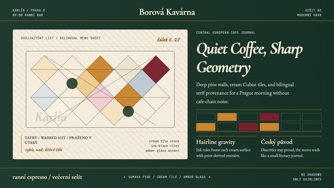 Czech Prague Modernist Cafe (2020)Quietly assured. Pine green, cream hairlines, amber Cubist tiles, and literar…安静而笃定:松林绿、奶油发丝线、琥珀立体主义瓷砖与文学衬线。
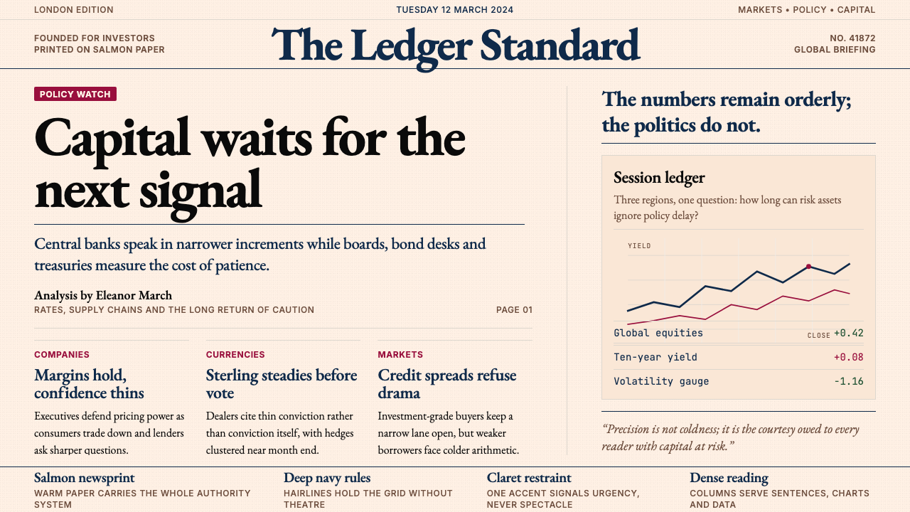 Financial Times (Pink Paper)Authority on salmon paper. Deep navy rules and claret accents discipline dens…三文鱼粉纸上的权威:深海军蓝细线与酒红点缀,约束密集衬线栏。
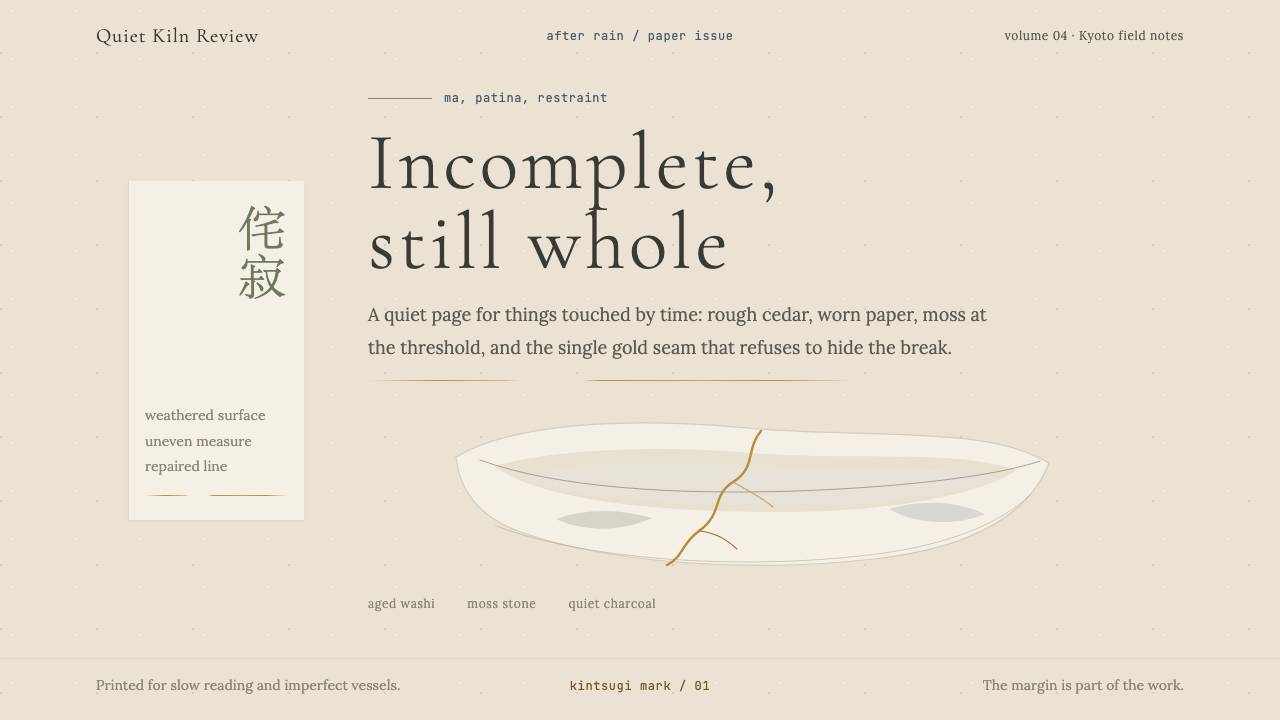 Wabi-SabiStillness makes imperfection whole. Washi beige, moss sage, and a spare gold…静默让缺憾完整:和纸米色、苔藓绿与一线金缮撑起留白。
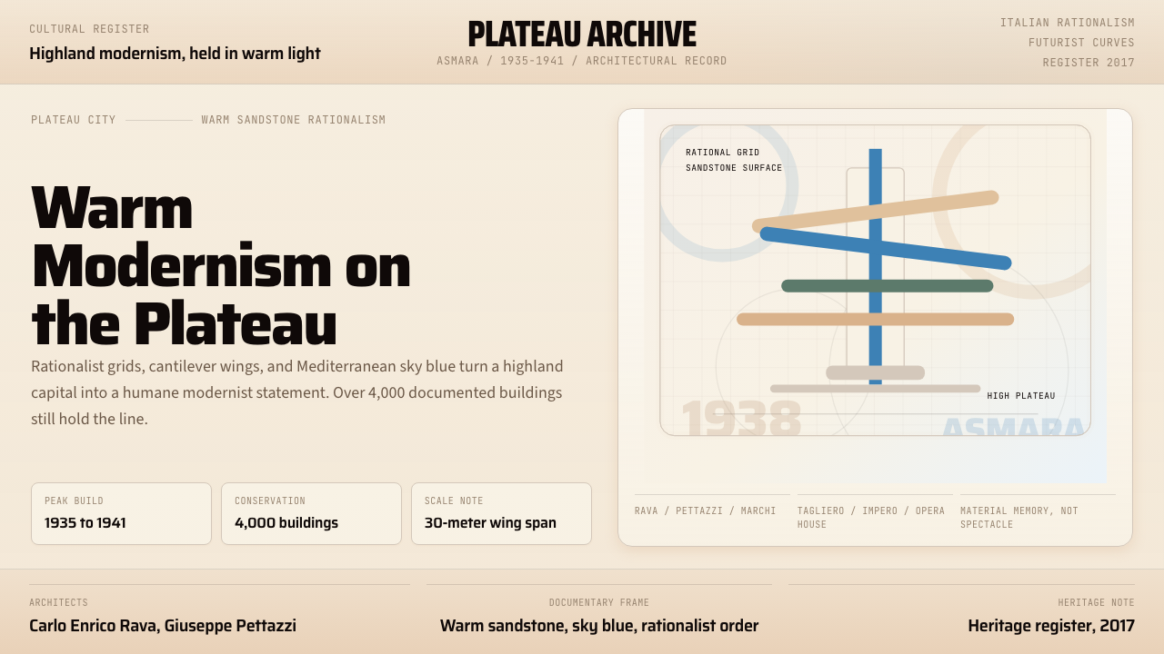 Eritrean Asmara Italian ModernismHuman modernism, not cold monumentality. Sandstone panels, sky-blue cantileve…人本现代主义,不冷硬。砂岩板面与天蓝悬臂几何。
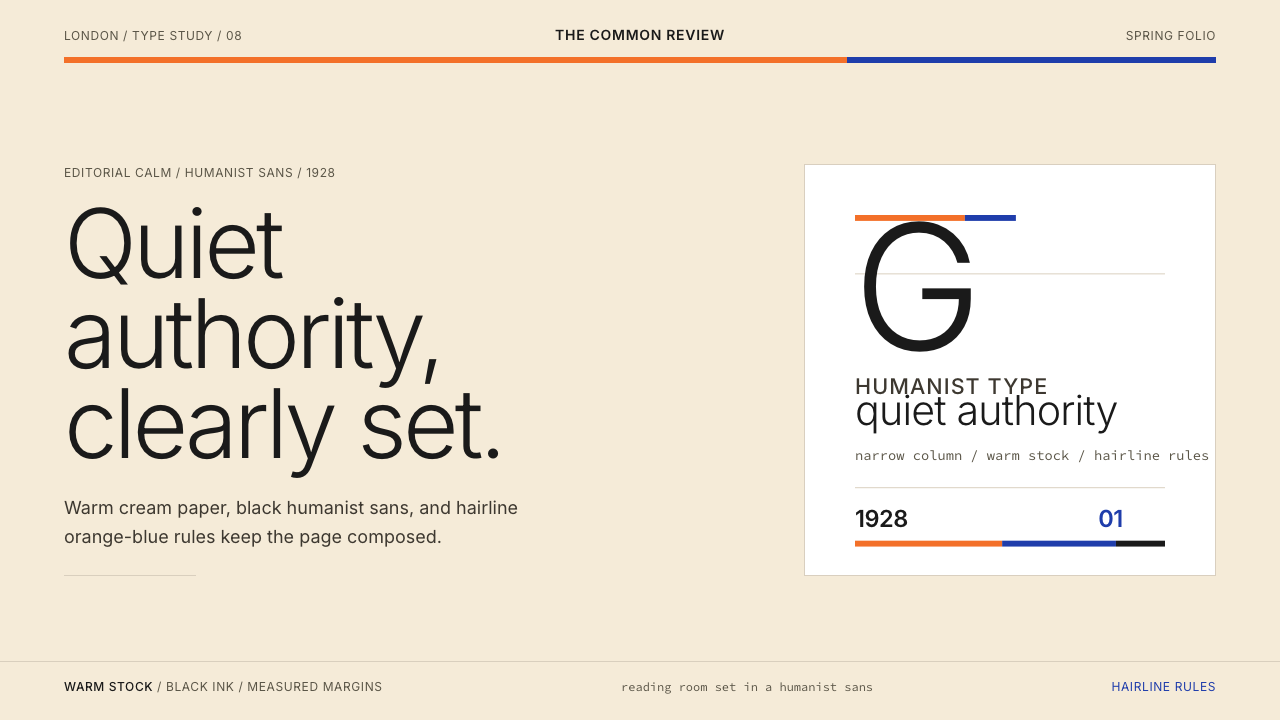 Gill Sans (BBC, 1928)Quiet authority, clearly set. Warm cream, black humanist sans, and hairline o…安静而权威。奶油底、黑色人文无衬线与橙蓝细线。
 The Atlantic MonthlyAuthority slows down. Navy Garamond on warm cream, ruled like an essay page.权威主动放慢:米色纸底、海军蓝Garamond与细栏线。