Design style guide设计风格指南
What is São Toméan Cocoa Roça?什么是 São Toméan Cocoa Roça?
The roças of São Tomé let a tropical empire collapse back into the jungle, leaving behind a palette of faded pink walls, cocoa-brown shadows, and the persistent blue of Portuguese tile — a design system built on magnificent decay.圣多美的庄园任由热带帝国崩塌回归丛林,留下褪色粉墙、可可棕阴影与葡萄牙瓷砖顽强的蓝——一套建立在壮丽衰败之上的设计语言。
São Toméan Cocoa Roça in briefSão Toméan Cocoa Roça 速览
São Toméan Cocoa Roça is a design aesthetic drawn from the plantation compounds — roças — that once powered the world's cocoa trade on the small equatorial island of São Tomé. These were not modest farmsteads. At their peak in the early twentieth century, the roças were self-contained colonial worlds: vast casarões with lime-washed walls in faded terracotta and rust-pink, cobbled terraces where cocoa pods dried in the sun, iron-rail tracks running through the jungle canopy, and chapels whose walls still hold fragments of Portuguese azulejo tile. The aesthetic captures the visual register of those compounds as they exist today — caught between their colonial past and an ongoing, generative decay.圣多美可可庄园美学,源自曾驱动全球可可贸易的种植园建筑群——旧称「roça」(庄园)——坐落于赤道小岛圣多美。这些不是普通的农场。在二十世纪初鼎盛时期,庄园是自给自足的殖民世界:宏大的殖民大宅(casarão),石灰粉刷的墙面呈褪色的赤陶与锈粉;鹅卵石台地上,可可果荚在阳光下晾晒;铁轨穿越丛林林冠;教堂墙面至今留有葡萄牙蓝白釉面瓷砖(azulejo)的碎片。这种美学捕捉的,是这些庄园当下的视觉状态——悬停于殖民历史与持续进行中的壮丽衰败之间。
What distinguishes this style from conventional tropical or colonial pastiche is its commitment to material honesty. The palette is not the bright pink of a restored heritage building; it is the pink of a wall that has been rained on for decades, where the lime wash has lifted and the color beneath has muted. The brown is not chocolate-box warmth but the specific darkness of fermented cocoa in shadow. The blue is not decorative accent but survivor — a fragment of glazed tile that outlasted the plaster around it. Every color in this system carries the memory of weathering.这种风格之所以有别于一般的热带或殖民地仿制品,在于它对材料诚实的坚守。这里的色板不是修缮一新的历史建筑的鲜亮粉红,而是一堵被雨水浸润数十年的墙的粉红——石灰粉刷已经脱落,底下的颜色已经沉淀变哑。这里的棕不是巧克力盒子般的温暖甜腻,而是发酵可可豆在阴影中那种特定的深沉。这里的蓝不是装饰性的点缀,而是幸存者——一块釉面瓷砖的碎片,比周遭的灰泥更长命地留了下来。这套系统里的每一种色彩,都承载着风化的记忆。
The result is a visual language that feels simultaneously historic and contemporary: architectural in its weight, botanical in its softness, and quietly melancholic in its acceptance that beautiful things deteriorate. It is well-suited to brands and projects that want depth without drama — warmth without sentimentality, authority without formality.由此形成的视觉语言,同时具有历史感与当代感:建筑般的厚重,植物般的柔软,以及在接受美好事物终将消逝这件事上隐藏的静谧悲悯。它适合那些追求深度而非戏剧性的品牌与项目——有温度却不煽情,有分量却不拘谨。
See the São Toméan Cocoa Roça design system →查看 São Toméan Cocoa Roça 完整设计系统 →
Where does São Toméan Cocoa Roça come from?São Toméan Cocoa Roça 从何而来?
São Tomé and Príncipe, a two-island nation in the Gulf of Guinea roughly three hundred kilometers off the coast of Gabon, was uninhabited when Portuguese navigators arrived around 1470. By the sixteenth century it had become a critical node in the Atlantic slave trade, serving as a transit point for enslaved people moving from the African mainland to Brazil. The island's equatorial climate and volcanic soil proved ideal for sugar cultivation, and later — with devastating historical symmetry — for cocoa.圣多美和普林西比——几内亚湾中的双岛国家,位于加蓬海岸约三百公里处——在葡萄牙航海者约于1470年抵达时尚无人居住。十六世纪,它成为大西洋奴隶贸易的关键节点,充当将被奴役者从非洲大陆转运至巴西的中转站。赤道气候与火山土壤为甘蔗种植提供了理想条件,后来——以令历史学家沉痛的对称感——又为可可种植提供了同样的条件。
The roças themselves were established in the nineteenth century and expanded dramatically during what historians call the cocoa boom years, roughly 1880 to 1908. At the peak of production, São Tomé was the world's largest cocoa exporter. The plantation compounds were built to function as complete colonial settlements: the casarão at the center, housing the estate owner or manager, surrounded by worker quarters, processing facilities, chapels, and schools. The Marquês de Valle Flor was among the most powerful of the plantation lords, controlling vast acreage and a labor force brought under conditions of debt bondage from other Portuguese colonies. The architecture of this period — substantial, Pombaline in influence, adapted for the tropics with wide verandas and high ceilings — gives the aesthetic its structural DNA.庄园体系在十九世纪建立,并在史学家所称的可可繁荣年代(约1880至1908年)急剧扩张。产量巅峰时,圣多美是全球最大的可可出口国。种植园建筑群被建造为完整的殖民定居点:中心是殖民大宅,安置庄园主或管理者,四周环绕工人宿舍、加工设施、教堂与学校。瓦利弗洛尔侯爵(Marquês de Valle Flor)是最有权势的庄园主之一,控制着大片土地和一批从葡萄牙其他殖民地以债务束缚形式带来的劳动力。这一时期的建筑——体量厚重,受庞巴尔风格影响,以宽廊和高顶适应热带气候——构成了这套美学的结构基因。
The Cadbury boycott of 1909, triggered by investigative journalism exposing forced labor on the islands, began the slow commercial decline of the São Toméan roça system. Independence in 1975 hastened that decline: the newly formed Democratic Republic of São Tomé and Príncipe nationalized the plantations, many estate owners departed, and the compounds transitioned into managed disrepair. Some housed the families of former workers; others were simply left. The jungle began its reclamation. This is the visual moment the aesthetic captures — not the active plantation, but the compound in its second life, where colonial architecture and equatorial nature negotiate their borders.1909年吉百利抵制事件由揭露岛屿强迫劳动的调查报道引发,开启了圣多美庄园体系的漫长商业衰落。1975年独立加速了这一进程:新成立的圣多美和普林西比民主共和国将种植园收归国有,许多庄园主离去,建筑群进入有管理的衰败状态。一些庄园被前工人家庭入住;另一些则就此荒置。丛林开始收复失地。这正是这套美学所捕捉的视觉时刻——不是运转中的种植园,而是庄园在第二次生命中的状态:殖民建筑与赤道自然在此协商各自的边界。
Contemporary engagement with the roça aesthetic has come primarily through photographers, architects, and writers rather than through a design school or movement. Photographer Stan Engelbrecht has documented the compounds extensively, producing images that show the specific chromatic quality of the decay: the way lime wash creates a dusty pink that reads differently from any manufactured paint, the way rust bleeds through iron fixtures into surrounding plaster, the way chapels still feel occupied by the tiles that remain on their walls. Architect João Carrilho da Graça has engaged with Portuguese colonial heritage in a way that treats existing material culture as a generative resource rather than a problem to be solved. Poet Conceição Lima, the island's most prominent literary voice, has written about the roças as sites of memory — places where colonial violence and human endurance coexist in the same crumbling courtyard. These perspectives together constitute the intellectual atmosphere from which the design aesthetic draws.对庄园美学的当代介入,主要来自摄影师、建筑师与作家,而非某个设计学派或运动。摄影师斯坦·恩格尔布雷希特(Stan Engelbrecht)对这些建筑群进行了大量记录,留下的图像展示了这种衰败特有的色彩质感:石灰粉刷如何制造出一种尘雾粉红,与任何人造涂料都不同;铁器的锈迹如何渗入周围的灰泥;教堂如何因留存在墙上的瓷砖而仍令人感到有人居住。建筑师若昂·卡里略·达格拉萨(João Carrilho da Graça)以一种将现存物质文化视为生成性资源而非待解决问题的方式,介入葡萄牙殖民地遗产。岛上最重要的文学声音、诗人孔塞桑·利马(Conceição Lima)写作庄园作为记忆场所——殖民暴力与人类坚韧在同一座坍塌的庭院中共存。这些视角共同构成了这套设计美学所生长的思想氛围。
What defines the São Toméan Cocoa Roça look?São Toméan Cocoa Roça 的视觉特征是什么?
Color: Weathered Tropical Palette色彩:风化热带色板
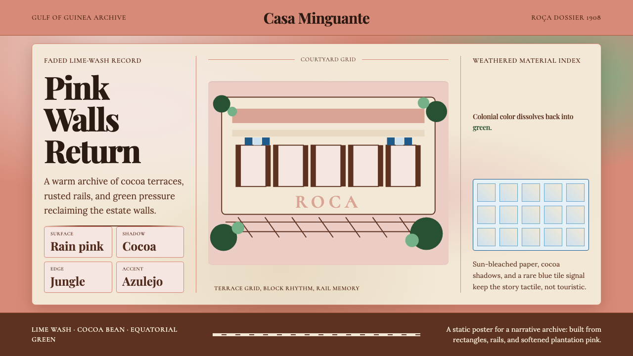
The palette is built on three dominant tones in deliberate dialogue: a faded lime-wash pink that reads as warm and dusty rather than bright or festive; a deep cocoa brown that ranges from the color of dried cocoa husks to the near-black of fermented beans in shadow; and a clear, slightly aged Portuguese blue derived from azulejo tile, carrying the specific quality of a glaze rather than a paint. A botanical green appears at the edges — the green of encroaching jungle rather than carefully tended foliage — soft, slightly yellowed, suggesting humidity and growth. These tones are muted across the board; none competes for attention at maximum saturation. The system rewards restraint: the most evocative combinations pair just two of these tones, using the third only as a trace.色板建立在三种主色调的刻意对话之中:一种褪色石灰粉刷的粉,传递温暖与尘土感而非明亮或节庆;一种深可可棕,从晒干可可壳的颜色延伸至发酵豆在阴影中近乎黑色的深沉;以及一种清澈而略带年代感的葡萄牙蓝,源自蓝白釉面瓷砖,带有釉料而非涂料特有的质感。植物绿出现在边缘——是蚕食建筑的丛林之绿,而非精心修剪的枝叶——柔和,略带黄调,暗示湿气与生长。这些色调整体上都是哑光的,没有一种以最高饱和度争夺视线。这套系统奖励克制:最具感染力的配色往往只将其中两种并置,第三种仅作微弱痕迹出现。
Texture: Visible Material History质感:可见的材料历史
Unlike design systems that aim for flatness or gloss, this aesthetic celebrates evidence of time. Surfaces in this system should read as having been through something — not artificially distressed, but carrying the kind of subtle irregularity that comes from real weathering. This might manifest as a slightly uneven wash in a background field, a paper stock with tooth, or a print treatment that allows the substrate to show through color. The goal is texture that references material without simulating it clumsily. In digital contexts, this means favoring matte surface treatments and restrained use of effects, letting natural variation in photography carry the textural weight rather than applying artificial grain or overlays.不同于追求平整或光洁的设计系统,这套美学推崇时间留下的痕迹。系统内的表面应传达出一种经历感——不是人为做旧,而是真实风化带来的那种微妙不均匀。这可能体现为背景色域中略显不平的涂刷感、带有纸纹的纸张,或能让底材透过色彩显现的印刷处理。目标是引用材料质感而不笨拙地模仿它。在数字场景中,这意味着偏向哑光表面处理,克制使用特效,让摄影中的自然变化承载质感重量,而非叠加人工颗粒或纹理图层。
Typography: Serif with Colonial Weight字体排印:带殖民分量的衬线体
The typographic register of this style leans toward traditional serif letterforms — not the hairline serifs of fashionable editorial revival, but the sturdier, more humanist serifs associated with colonial-era printing and Portuguese administrative documents: letterforms with visible calligraphic origin and confident stroke contrast. Headlines can be set large and with generous leading, allowing the letters to breathe within the humidity of the overall palette. Body text works best at a modest size with a relaxed line rhythm. All-caps settings in a slightly compressed serif add an archival, documentary quality appropriate to the source material. Hierarchy should be established through weight and size rather than through decorative separation.这种风格的字体排印倾向于传统衬线字形——不是时髦编辑类复兴风格的细衬线,而是更坚实、更人文主义的衬线体,与殖民时期的印刷品和葡萄牙行政文书相关联:字形有可见的书法起源,笔画粗细对比自信。标题可以设置得较大,行距充裕,让字母在整体色调的湿润感中自由呼吸。正文在适中字号下配合放松的行间节奏效果最佳。略微压缩的衬线体全大写设置,增添了与源材料相称的档案感、文献感。层级应通过字重和字号建立,而非依靠装饰性分隔。
Composition: Asymmetric but Grounded构图:非对称而稳重
Layouts in this style favor asymmetric balance — not the dynamic tension of constructivist work, but a quieter stability, as if elements have settled into their positions over time. A wide margin might hold a caption or secondary element while the primary content occupies a narrower column; an image might bleed off one edge while generous white space holds the opposite side. The underlying logic is architectural: rooms have walls, doorways, and thresholds, and compositions should imply similar spatial divisions without gridding the page into clinical rigidity. Generous breathing room between elements prevents the palette's richness from feeling crowded.这种风格的版面偏向非对称平衡——不是构成主义作品的动态张力,而是一种更静默的稳定,仿佛各元素已在各自的位置上安定了很久。宽阔的留白处可容纳说明文字或次要内容,主体内容占据较窄的一栏;图像可以出血至一侧边缘,而丰厚的留白则撑持另一侧。内在逻辑是建筑式的:房间有墙壁、门洞与门槛,构图应暗示类似的空间划分,却不将页面切割成临床式的网格僵硬。元素之间充裕的呼吸空间,防止丰富的色板显得拥挤。
Imagery: Documentary and Botanical图像:纪录性与植物性
Photography and illustration in this system draw from two traditions: the documentary photographic legacy of recording colonial and post-colonial spaces — images that value the specific detail of a corrugated iron roof, a mossy brick threshold, or a painted wall with layers of different colors visible at its crumbling edge — and the tradition of botanical illustration, with its careful rendering of plant structure, leaf venation, and the geometry of a cocoa pod. These two modes share a quality of close attention. Imagery should never feel staged or commercial; it should feel observed. Color photography works best when its tones naturally align with the palette — heavily saturated fashion imagery will fight rather than support the system.这套系统中的摄影与插图汲取自两种传统:记录殖民与后殖民空间的纪录摄影遗产——这类图像重视具体细节,如波纹铁皮屋顶、长了青苔的砖石门槛、或坍塌边缘可见多层不同颜色的彩绘墙;以及植物插图传统,以其对植物结构、叶脉纹理与可可豆荚几何形态的细致描绘为特征。这两种模式共享一种专注的品质。图像永远不应感觉是经过摆拍或商业化的,它应该感觉是被观察到的。彩色摄影在色调自然契合色板时效果最佳——高度饱和的时尚图像会与系统产生冲突而非支撑它。
Negative Space: Generous and Unforced留白:慷慨而自然
This aesthetic does not rush. Negative space is used generously — not as a luxury signal in the contemporary minimalist sense, but as something closer to the silence inside a large, mostly empty room. The scale of open areas should feel proportional to the weight of the architectural and chromatic elements: a deep cocoa-brown headline needs room around it, not because of design convention, but because the color itself has mass. Crowded layouts undermine the melancholic spaciousness that is central to the aesthetic's emotional character.这套美学不急于填满。留白使用慷慨——不是当代极简主义意义上的奢华信号,而是更接近一个宽阔、大半空着的房间内部的那种寂静。开敞区域的尺度应与建筑性和色彩性元素的重量相称:一行深可可棕的标题需要周围有空间,不是因为设计惯例,而是因为这种颜色本身有重量。拥挤的版面会破坏这套美学情感特质的核心——那种带有忧郁色彩的空阔感。
Detail: Archival and Specific细节:档案性与具体性
Where other styles avoid clutter by eliminating detail, this one earns its spareness through the specificity of what detail it does include. A thin rule that references the iron rail lines of the original roças, a decorative motif derived from azulejo tile geometry, a caption set in a compressed serif that echoes the administrative typesetting of a colonial record — each such detail should be traceable to its source in the material culture of São Tomé. Arbitrary decoration is inconsistent with the aesthetic; historically grounded detail, used with restraint, reinforces it.其他风格通过消除细节来避免杂乱,这套风格则通过所包含细节的具体性来赢得其简洁。一条细线,引用庄园原始铁轨的痕迹;一个装饰母题,源自蓝白釉面瓷砖的几何图案;一段以压缩衬线体排印的说明文字,呼应殖民档案的行政排版——每一处这样的细节,都应能追溯到圣多美物质文化中的来源。任意的装饰与这套美学不符;有历史依据的细节,配合克制的运用,则能强化它。
See the São Toméan Cocoa Roça design system →查看 São Toméan Cocoa Roça 完整设计系统 →
Who shaped São Toméan Cocoa Roça?谁塑造了 São Toméan Cocoa Roça?
Among the most powerful of the great roça owners, the Marquês de Valle Flor controlled some of the island's largest plantation compounds at the height of the cocoa boom in the early twentieth century. His operations exemplify the scale and architectural ambition of the roça system at its peak: centralized casarões, industrial processing infrastructure, and a labor force drawn from other Portuguese colonies under conditions that attracted international scrutiny. The physical legacy of estates associated with this scale of operation — their proportions, their materials, their spatial organization — forms much of the architectural basis of the aesthetic.作为最有权势的大庄园主之一,瓦利弗洛尔侯爵在二十世纪初可可繁荣顶峰时期控制着岛上数片最大的种植园建筑群。他的经营规模体现了庄园体系鼎盛时期的尺度与建筑抱负:中央化的殖民大宅、工业化的加工设施,以及一支从葡萄牙其他殖民地招募、因此遭到国际审视的劳动力。与这一规模相关的庄园遗存——其比例、材料与空间组织——构成了这套美学的建筑基础的重要组成部分。
São Tomé's foremost poet, Conceição Lima has written extensively about the island's history, its roças, and the layered experience of post-colonial identity. Her work approaches the plantation landscape as a site of memory and ambivalence — not celebrating it, not erasing it, but inhabiting it with the specificity of someone who knows the smell of a particular room and the weight of a particular silence. This literary sensibility — attentive, historically grounded, unwilling to resolve complexity into easy emotion — is the closest intellectual parallel to what the design aesthetic is attempting.作为圣多美最重要的诗人,孔塞桑·利马大量书写该岛的历史、庄园与后殖民身份认同的复杂体验。她的作品将种植园景观视为记忆与矛盾情感的场所——既不颂扬它,也不抹去它,而是以一个熟知某个特定房间气味、某种特定沉默分量的人的具体性居于其中。这种文学感性——专注、有历史根基、拒绝将复杂性简化为简单情感——是与这套设计美学最接近的思想对应。
South African photographer Stan Engelbrecht has made extensive documentary work across the roças of São Tomé, producing images that reveal the specific chromatic and textural qualities that the aesthetic attempts to transpose into design language. His photographs are notable for their attention to the particular: the way tropical light falls differently on lime-washed pink than on painted plaster, the gradations within a single wall as its surface weathers unevenly, the visual coexistence of Portuguese tile and equatorial plant growth. His documentary method — close attention without sentimentality — is a model for how imagery in this aesthetic should be selected and used.南非摄影师斯坦·恩格尔布雷希特在圣多美庄园进行了大量纪录性创作,留下的图像揭示了这套美学试图转译为设计语言的独特色彩与质感品质。他的照片以对具体细节的关注著称:热带光线落在石灰粉刷的粉红墙面上与落在普通粉刷灰泥上的不同;一堵墙的表面因不均匀风化而产生的色彩层次;葡萄牙瓷砖与赤道植物生长的视觉共存。他的纪录方法——专注而不煽情——是这套美学在图像选取与使用上的方法论范本。
Portuguese architect João Carrilho da Graça has worked at the intersection of contemporary architecture and Portuguese colonial heritage in ways that directly inform this aesthetic's relationship to its source material. Rather than treating colonial-era structures as either monuments to be preserved unchanged or problems to be demolished, his approach engages with existing material — existing walls, existing proportions, existing materials — as generative constraints. This attitude of material respect without nostalgia, of working with existing cultural residue rather than against it, is fundamental to the São Toméan Cocoa Roça design ethos.葡萄牙建筑师若昂·卡里略·达格拉萨在当代建筑与葡萄牙殖民遗产的交汇处开展工作,其方式直接启发了这套美学与源材料的关系。他的做法不将殖民时期的建筑视为需要原封不动保存的纪念碑,也不视其为需要拆除的问题,而是将现存材料——现存的墙面、现存的比例、现存的材质——作为生成性的约束条件。这种尊重材料而不沉湎于怀旧、与现存文化残留共同工作而非对抗它的态度,是圣多美可可庄园设计精神的根本所在。
How do you use São Toméan Cocoa Roça today?今天怎么用 São Toméan Cocoa Roça?
São Toméan Cocoa Roça is one of the more distinctive historical aesthetics available to contemporary designers precisely because it is not widely deployed. Its visual register — muted tropical tones, material texture, serif type with documentary authority — occupies a space that neither mainstream minimalism nor maximalist heritage revivalism covers well. Applying it well requires genuinely engaging with its source material rather than simply borrowing its color palette.圣多美可可庄园美学在当代设计师可取用的历史性美学中格外独特,原因之一正是它鲜少被广泛使用。它的视觉语域——哑光热带色调、材料质感、具有文献权威感的衬线字体——占据着主流极简主义和最大化遗产复兴主义都无法良好覆盖的空间。正确应用它,需要真正介入源材料,而不仅仅是借用它的色板。
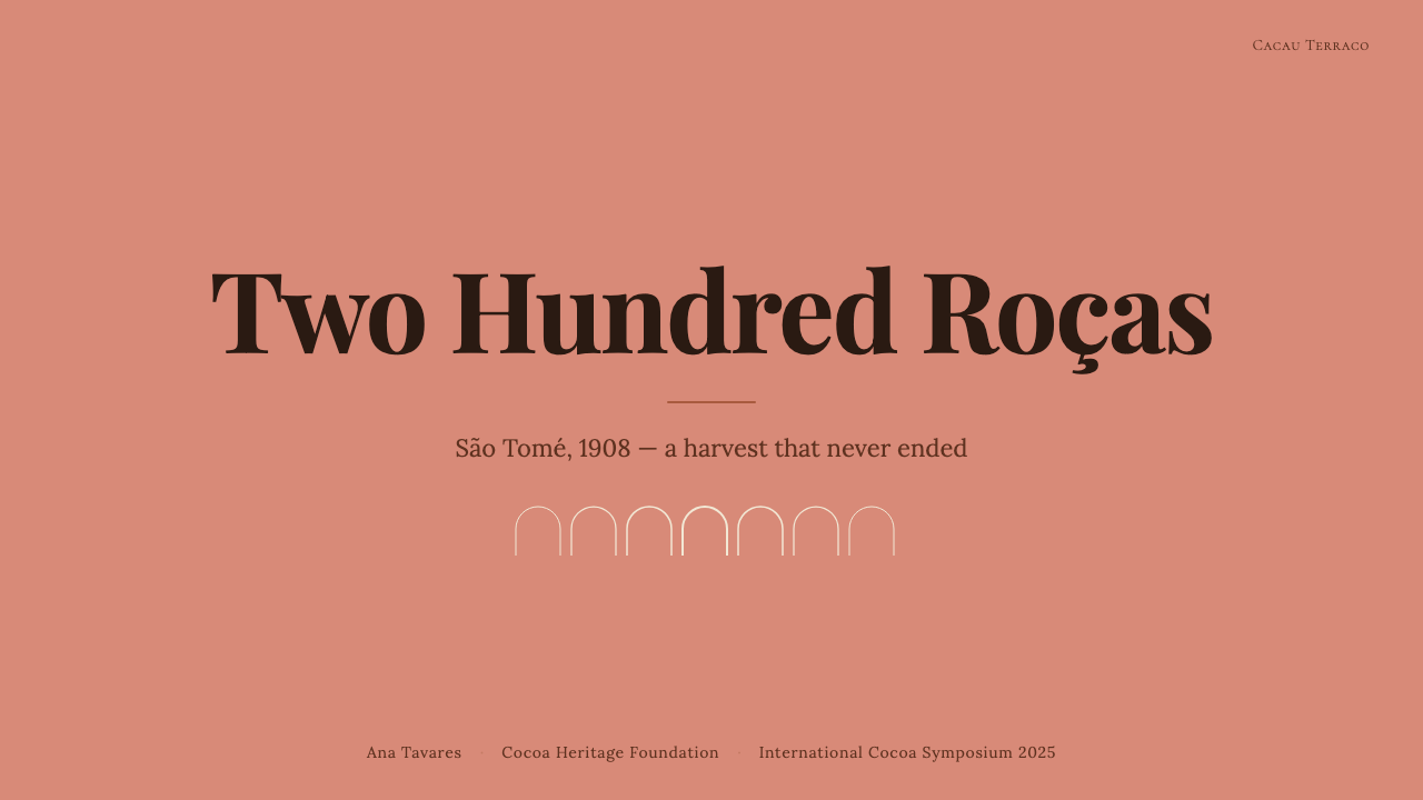
For presentation slides, the aesthetic works particularly well on covers and transitional pages where atmospheric impact matters. A cover using this system might pair the cocoa-brown as a dominant field with a faded pink headline set in a sturdy serif, with a botanical detail or fragment of tile geometry in the corner — sparse, weighted, immediately distinctive. Content slides benefit from its typographic logic: a clear hierarchy established through serif size and weight, generous margins used as holding areas for annotations or secondary information, and data elements treated with the same documentary restraint as the overall composition. Avoid filling slides densely; this is a system that needs room to register.在演示文稿中,这套美学尤其适合封面页和需要营造氛围感的过渡页。采用这套系统的封面,可以将可可棕作为主色调大面积铺陈,以强壮衬线体设置褪色粉红的标题,角落点缀植物细节或瓷砖几何碎片——克制、有分量、辨识度极高。内容页从其字体排印逻辑中获益:以衬线体尺寸与字重建立清晰的层级,宽阔的页边作为注释或次要信息的容纳区,数据元素以与整体构图相同的文献性克制处理。避免密集填充幻灯片;这是一套需要空间才能呈现的系统。
For web interfaces, the palette and texture approach are well suited to editorial sites, cultural institution pages, specialty food and beverage brands, and heritage-oriented projects where the product's provenance is part of its value proposition. Dashboard and product UI applications are possible but require careful adaptation: the muted palette works well against white or near-white backgrounds for data-heavy contexts, with the deeper cocoa tones reserved for navigation or structural framing rather than data encoding. Pricing pages can use the architectural composition logic — wide margins, strong typographic hierarchy, no decorative clutter — to great effect. The main risk in digital contexts is that the subtle texture register that makes physical or photographic applications of this style compelling can disappear entirely on screen; compensate by ensuring that photography and illustration carry sufficient textural weight.对于网页界面,这套色板与质感处理方法适合编辑类网站、文化机构页面、精品食饮品牌,以及产品出处是价值主张一部分的遗产导向项目。仪表板与产品UI应用也可行,但需要谨慎适配:哑光色板在白色或近白背景下用于数据密集场景效果良好,较深的可可色调保留给导航或结构性框架而非数据编码。定价页面运用这套建筑式构图逻辑——宽留白、强排印层级、无装饰性杂乱——可以取得很好的效果。数字场景中的主要风险是:让实体或摄影应用中这套风格引人入胜的微妙质感,在屏幕上可能完全消失;通过确保摄影与插图承载足够的质感重量来弥补这一点。
For editorial and marketing work, the style excels in contexts where the brand needs to communicate craft, provenance, and depth without resorting to the clichés of luxury design. A magazine layout in this aesthetic uses a generous text measure in a humanist serif, with images that feel observed rather than produced, and section headings that reference archival typographic conventions. Marketing collateral — posters, packaging, event materials — benefits from the style's poster-like quality when color and scale are used decisively: a single cocoa-brown field behind cream type, a botanical diagram used as structural background, azulejo-blue used sparingly as the one element that holds the eye.对于编辑与营销内容,这套风格在品牌需要传达工艺感、出处感与深度,同时又不诉诸奢侈品设计陈规的场景中表现出色。采用这套美学的杂志版面,以人文主义衬线体设置宽松的正文行宽,配以感觉是被观察而非被制造的图像,章节标题参考档案排印惯例。营销物料——海报、包装、活动材料——在色彩和比例被果断运用时,从风格的海报质感中获益:可可棕大面积底色配奶油色字体,植物图解用作结构性背景,葡萄牙蓝克制使用,成为唯一吸引视线的元素。
A common mistake when applying this aesthetic is reaching for the palette while ignoring the material logic behind it. Dropping the faded pink and cocoa brown into an otherwise conventional clean sans-serif tech layout produces pastiche rather than coherence — the colors signal one thing while the typography and composition signal another. Similarly, artificially distressing elements in an attempt to simulate weathered texture tends to read as contrived. This is an aesthetic that rewards working with genuinely textured photography and with typefaces that have real calligraphic weight; the system should feel earned rather than costumed.应用这套美学时最常见的错误,是拿到色板的同时忽略了其背后的材料逻辑。将褪色粉红与可可棕植入一个原本干净的无衬线科技版面,产生的是仿制品而非连贯性——色彩传递一种信号,字体与构图却传递另一种。同样,为模拟风化质感而人为做旧元素的做法,往往显得矫揉造作。这是一套奖励真正使用有质感的摄影、并搭配具有真实书法重量的字体的美学;整个系统应该感觉是被赢得的,而不是被穿戴上的。
See the São Toméan Cocoa Roça design system →查看 São Toméan Cocoa Roça 完整设计系统 →
São Toméan Cocoa Roça — FAQSão Toméan Cocoa Roça · 常见问题
Is this style too niche or regionally specific to apply broadly?这种风格是否过于小众或地域性太强,难以广泛应用?
The geographic specificity is actually what gives the style its coherence and distinctiveness — it is not trying to evoke a generic tropical mood but a very particular kind of place. That said, the visual system's core qualities (muted warm palette, material texture, serif typography, documentary restraint) are fully transferable to projects with no connection to São Tomé. What matters is whether the aesthetic's values — depth, provenance, the beauty of impermanence — align with the project's values. Specialty food and beverage brands, cultural institutions, heritage tourism, editorial publishing, and independent creative practices are all natural fits regardless of geography.地理上的具体性恰恰是赋予这种风格连贯性与独特性的原因——它并非试图唤起泛泛的热带情绪,而是一种非常特定的场所感。话虽如此,这套视觉系统的核心品质(哑光暖色板、材料质感、衬线排印、文献性克制)完全可以迁移至与圣多美毫无关联的项目。关键在于这套美学的价值观——深度、出处、无常之美——是否与项目的价值观相契合。精品食饮品牌、文化机构、遗产旅游、编辑出版,以及独立创意实践,无论地域,都是天然的适配场景。
How does this style differ from other colonial or tropical heritage aesthetics?这种风格与其他殖民地或热带遗产美学有何不同?
Most tropical heritage aesthetics in design gravitate toward either the festive (bright saturated colors, bold patterns, celebratory energy) or the nostalgic (polished restoration, colonial elegance presented without critical distance). São Toméan Cocoa Roça occupies neither position. It engages with the colonial legacy of the roças without celebrating or sanitizing it — the muted palette, the evidence of decay, the archival typographic register all insist on history as something present and complex rather than picturesque. This makes it unusual among heritage-adjacent styles: it is atmospheric without being romantic, specific without being precious.设计中大多数热带遗产美学,要么倾向节庆感(明艳饱和的色彩、大胆的图案、欢庆的能量),要么倾向怀旧感(修缮一新的精致、未经批判距离呈现的殖民优雅)。圣多美可可庄园美学两者都不是。它直面庄园的殖民遗产,既不颂扬也不净化——哑光色板、衰败的痕迹、档案式的字体排印,都坚持将历史呈现为当下存在的、复杂的事物,而非如画风景。这使它在遗产邻近风格中显得不同寻常:它有氛围感却不浪漫化,有特殊性却不自矜。
Can this style work in a dark-background or high-contrast layout?这种风格能用于深色背景或高对比度版面吗?
With care. The canonical expression of this palette is light-ground — the lime-wash pink and cream tones are most legible and most evocative against a white or very light neutral. A dark inversion is possible: the deep cocoa brown can serve as a background, with the faded pink or azulejo blue used as the primary light tones above it, and cream or warm white for body text. However, the botanical green and the archival texture qualities that define the style can be difficult to maintain at high contrast. A dark version of this system tends to work better in print or photographic contexts than in digital UI, where the subtlety of the muted palette can collapse into simple dark mode.需要谨慎处理。这套色板的经典表达是浅色底面——石灰粉刷的粉红与奶油色调,在白色或非常浅的中性背景上最为清晰、最具感染力。深色反转版本是可行的:深可可棕可以作为背景,以褪色粉红或葡萄牙蓝作为其上的主要浅色调,奶油色或暖白色用于正文。然而,植物绿与定义这种风格的档案质感品质,在高对比度下难以维持。这套系统的深色版本往往在印刷或摄影语境中比在数字UI中效果更好——在数字UI中,哑光色板的微妙感可能塌缩为简单的深色模式。
What kinds of projects should avoid this style?哪些类型的项目应该避开这种风格?
Projects that need to communicate urgency, technical precision, or contemporary dynamism will struggle with this aesthetic — the muted palette and documentary quietness that make it distinctive will work against those values. Consumer technology products, fintech dashboards, gaming interfaces, and high-energy entertainment brands all sit poorly with this system's emotional register. Similarly, brands targeting audiences who read the decayed aesthetic as neglect rather than as intentional depth should look elsewhere. The style requires an audience with enough visual literacy to recognize that the muted tones and archival references are choices, not defaults.需要传达紧迫感、技术精准性或当代动感的项目,与这套美学会产生摩擦——使它独特的哑光色板和文献性的安静,会与这些价值观相悖。消费科技产品、金融科技仪表板、游戏界面,以及高能量娱乐品牌,都与这套系统的情感语域格格不入。同样,目标受众倾向于将衰败美学读作疏于维护而非有意为之的品牌,也应另寻方向。这种风格需要视觉素养足够的受众,能够辨认出哑光色调与档案性引用是一种选择,而非默认状态。
How should AI tools work with this design system?AI工具应如何运用这套设计系统?
This system gives AI image generation and layout tools unusually specific art direction through its palette and textural logic. For image generation, prompting toward the specific chromatic qualities — lime-wash pink, cocoa-fermentation brown, azulejo blue, equatorial botanical green — and toward the documentary photographic tradition (high-contrast, observed rather than staged, attentive to architectural and botanical detail) will produce more useful outputs than prompting toward generic tropical or colonial moods. For layout and content AI, the typographic register — sturdy humanist serif, generous white space, documentary restraint — provides clear decision parameters. The most important directive for any AI tool working with this system is to resist the temptation toward legibility through brightness or saturation; the depth of the system lives in its refusal to be immediately striking.通过其色板与质感逻辑,这套系统为AI图像生成与排版工具提供了异常具体的美术指导。在图像生成方面,向特定色彩品质进行提示——石灰粉刷的粉红、可可发酵的棕、葡萄牙瓷砖蓝、赤道植物绿——并朝向纪录摄影传统(高对比度、被观察而非被摆拍、对建筑与植物细节保持专注),将比向泛泛的热带或殖民地氛围提示产生更有用的输出。对于排版与内容AI,字体排印语域——坚实的人文主义衬线体、充裕的留白、文献性克制——提供了清晰的决策参数。与这套系统合作的任何AI工具,最重要的指令是抵制通过亮度或饱和度来提升易读性的诱惑;这套系统的深度,恰恰存在于它拒绝立即夺目的那种克制之中。
Related design styles相关设计风格
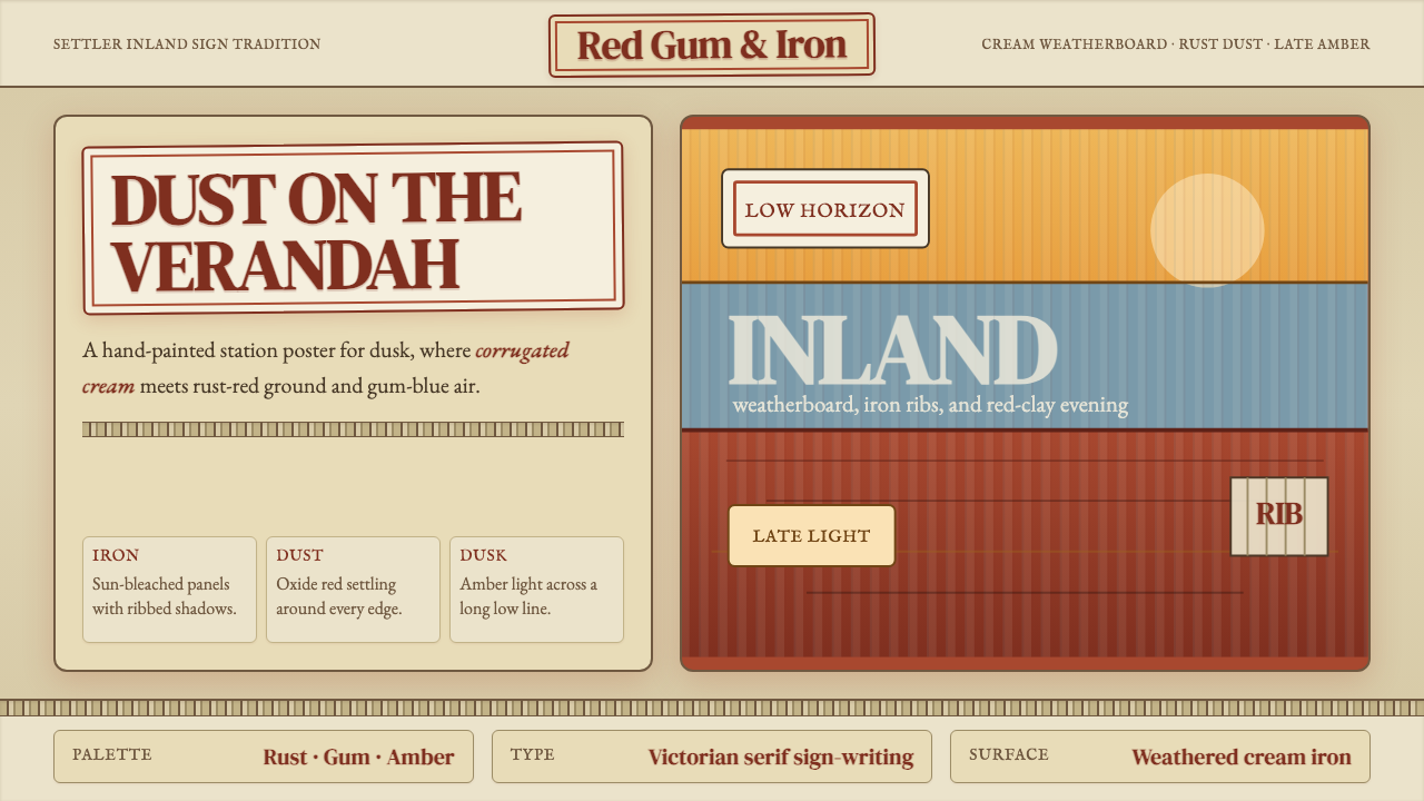 Australian Outback VernacularWeather is the voice. Rust dust, gum-blue bands, and serif sign-writing age t…风化就是声音:锈红尘土、桉蓝横带与衬线招牌让页面有年岁。
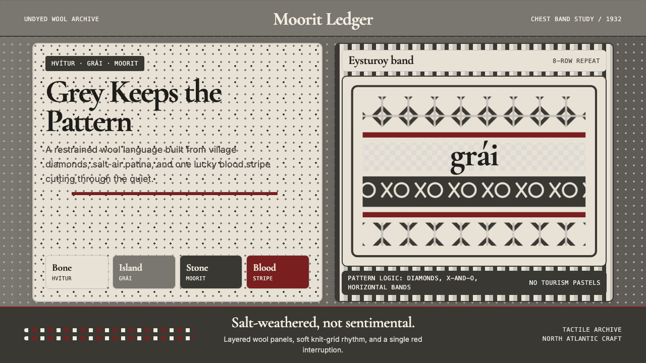 Faroese Knit Pattern Island GreyWeathered wool, not cozy kitsch. Island greys, Cormorant serif, one blood-red…风化羊毛,不是旅游暖意。岛屿灰、Cormorant衬线与一道血红横纹。
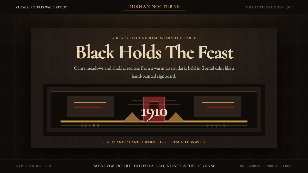 Georgian Pirosmani 1910Oilcloth black turns memory ceremonial. Ochre panels and Cormorant type hold…油布黑让记忆庄严:赭黄面板与Cormorant字形守住烛光。
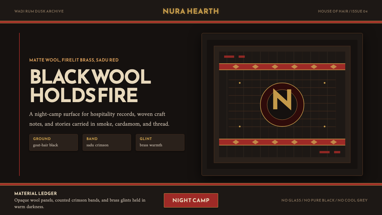 Jordanian Bedouin Black TentNight camp honesty. Goat-hair black, sadu crimson, brass lines.夜营般诚实。黑羊毛底、萨杜绛红与黄铜线。
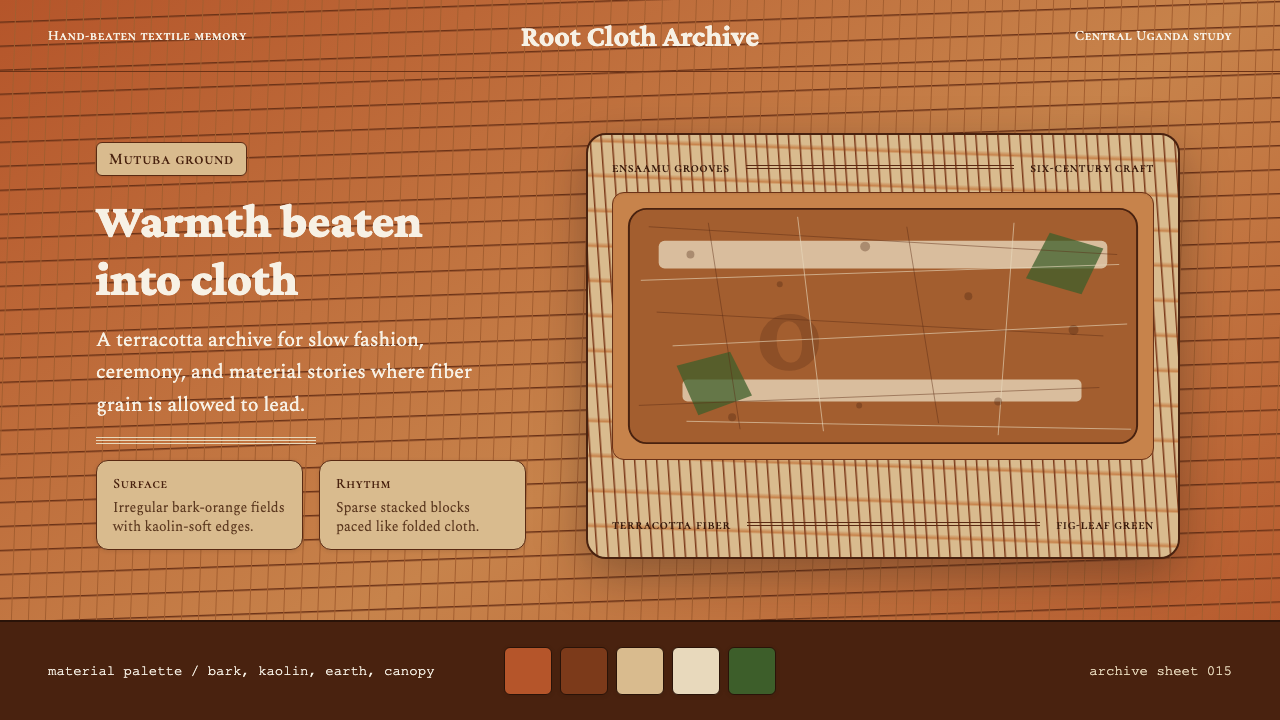 Ugandan Mutuba BarkclothHandmade warmth holds. Terracotta grain, Crimson Pro, and sparse stacked clot…手作温度沉稳铺开。赤陶纤维、Crimson Pro 与疏朗叠布构图。
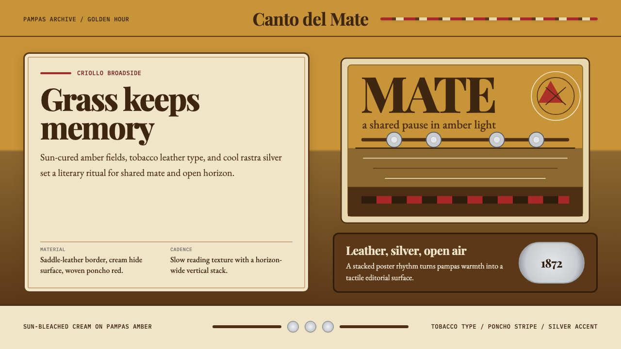 Argentine Gaucho (Pampas Mate Culture)Open grassland, printed warm. Amber fields, Playfair serif, and silver rastra…开阔草原的温热印刷:琥珀底、Playfair衬线与银色腰带几何。