What is Serbian Medieval Fresco?
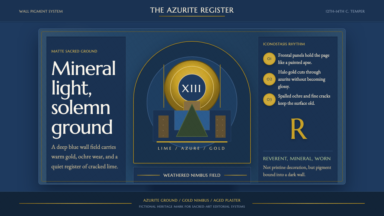
Serbian Medieval Fresco turns eight centuries of sacred wear into structure — saturated azurite grounds, warm gold halos, and cracked plaster holding the frame together.
Serbian Medieval Fresco in brief
Serbian Medieval Fresco draws on the wall paintings of the Raška school, the dominant style of monumental church painting in medieval Serbia, which set its saints and biblical scenes against deep, saturated blue grounds and lit them with warm gold halos and ochre earth tones. It is a wall-painting tradition in the fullest sense: the images were never separate objects hung on a wall but were painted directly into the wet plaster of the wall itself, so the architecture and the image are structurally inseparable.
The style's defining tension is between luminous, almost jewel-like color and centuries of physical weathering. Gold leaf and richly ground mineral pigment sit inside plaster that has spalled, cracked, and faded across eight hundred years of continuous use inside active monasteries. This system treats that weathering not as damage to be corrected but as an essential part of the aesthetic — the cracks and mineral warmth are what give the imagery its reverent, lived-in gravity, distinguishing it from a crisp, newly painted icon.
Visually, everything is matte and mineral rather than glossy. Deep azurite and lapis-derived blue dominates large fields, warm gold marks the sacred and the holy — halos, background sky, divine light — and ochre, umber, and other earth tones ground the human and material world. Forms are typically framed the way an architectural apse or arch would frame a figure: rounded, enclosing, and monumental, never a flat rectangular crop.
Where does Serbian Medieval Fresco come from?
Serbian medieval fresco painting developed under the Nemanjić dynasty, which ruled the medieval Serbian state from the late 12th through the 14th century and used monastery-building as a central act of both religious devotion and political legitimacy. The dynasty's founder, Stefan Nemanja, established the Monastery of Studenica in the 1190s, and its church contains some of the earliest and most influential examples of what would become the Raška school style — a Serbian inflection of the wider Byzantine fresco tradition, adapted to local workshops, local materials, and a distinctly Serbian devotional sensibility.
Nemanja's son, later canonized as Saint Sava, became the first archbishop of the autocephalous Serbian Orthodox Church and was instrumental in shaping the theological and artistic program that Serbian monasteries would follow for generations — establishing monastic scriptoria and workshops that trained generations of painters in the Byzantine iconographic canon while gradually developing a warmer, more human, more emotionally direct treatment of sacred figures than their Constantinopolitan models.
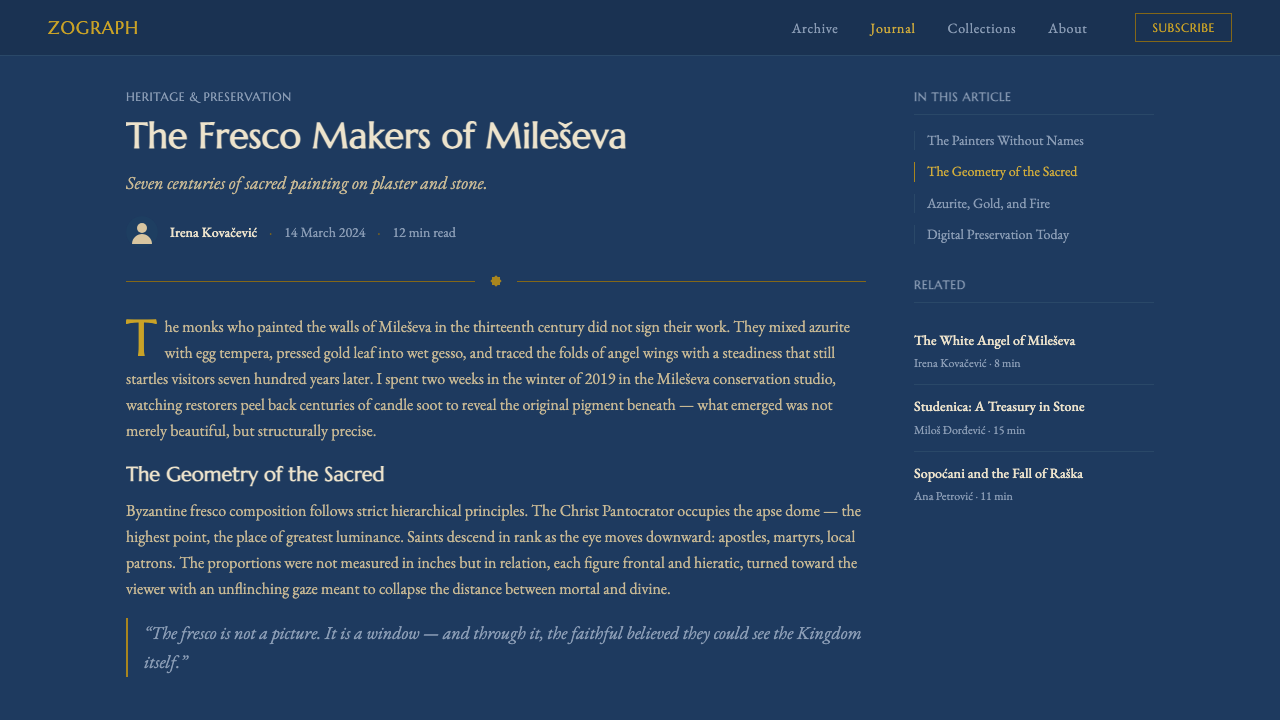
The style reached one of its highest points at the Monastery of Mileševa, founded in the 1220s by King Stefan Vladislav, whose frescoes include the celebrated angel at Christ's empty tomb — known today simply as the White Angel — rendered in luminous white robes against the same deep azurite ground that defines the wider tradition. The image is now one of the most reproduced works of medieval Serbian art, prized for the serene, almost weightless quality of the angel's expression against the surrounding saturated blue.
A further high point came at the Monastery of Sopoćani, founded by King Stefan Uroš I in the 1260s, where anonymous workshop painters developed an even more monumental, classically influenced figural style — solid, weighty bodies and expressive faces that art historians have long noted anticipate qualities associated with the later Italian Renaissance, despite arising independently within the Byzantine-Serbian tradition. All three sites — Studenica, Mileševa, and Sopoćani — remain active monasteries today, meaning the frescoes have survived not as museum pieces removed from context but as continuously used sacred walls, worn by candle smoke, humidity, and centuries of liturgical life, which is precisely the source of the cracked, weathered texture this style depicts.
What defines the Serbian Medieval Fresco look?
Color
Deep, saturated azurite and lapis-derived blue is the ground color for entire compositions, not a mere accent — skies, backgrounds, and large fields all carry this same mineral blue. Warm gold marks anything sacred (halos, divine light, sometimes entire backgrounds), while ochre, umber, and other earth tones handle skin, garments, and the material, human world.
Weathering and Craquelure
Fine, irregular cracking runs across the plaster surface, and patches of loss reveal the layered construction beneath — these are treated as intrinsic to the aesthetic rather than flaws to be smoothed away. The weathering gives the color a warm, softened quality that a freshly painted surface could never achieve, communicating age and continuous veneration rather than decay.
Halos and Sacred Light
Gold, whether as leaf or a warm painted approximation, is reserved specifically for the sacred — a halo, a divine radiance, an emanation of holiness — and never used decoratively for ordinary objects. This restriction gives gold enormous symbolic weight: its appearance anywhere in a composition immediately signals the presence of the divine.
Monumental Framing
Figures and scenes are framed the way church architecture frames them — within a rounded apse, an arch, or a vaulted niche — rather than a flat rectangle. This architectural framing gives even a single figure a sense of monumental scale and permanence, since the image is understood as inseparable from the wall and the building that holds it.
Matte, Mineral Surface
Every surface is matte rather than glossy — pigments are ground mineral and earth compounds applied directly onto wet lime plaster, absorbing rather than reflecting light. This mineral flatness is fundamental: any glossy sheen or reflective highlight breaks the illusion of true fresco and reads instead as a modern print or icon panel.
Expressive, Human Faces
Compared with more rigidly formal Byzantine icon traditions, Serbian Raška-school figures carry a warmer, more emotionally direct quality in the eyes and expression, without abandoning the elongated, otherworldly proportions of the Byzantine canon. This blend of formal sacredness and human warmth is a signature of the tradition.
Composition and Density
Wall surfaces are densely populated with figures and narrative scenes organized in registers, or horizontal bands, stacked from floor to ceiling — there is little empty ground. This density communicates a complete theological program rather than a single isolated image, and it means the eye is meant to travel across the whole wall as a continuous narrative.

Who shaped Serbian Medieval Fresco?
Founder of the medieval Serbian Nemanjić dynasty, Nemanja established the Monastery of Studenica in the 1190s, whose church contains some of the earliest and most influential examples of the Raška-school fresco style, setting the template that later Serbian monasteries would follow.
Son of Stefan Nemanja and first archbishop of the autocephalous Serbian Orthodox Church, Saint Sava shaped the theological and artistic program followed by generations of Serbian monastic painters, helping establish the workshops that trained artists in the Byzantine canon while developing a distinctly Serbian devotional character.
Founder of the Monastery of Mileševa in the 1220s, Vladislav's patronage produced one of the tradition's most celebrated images, the White Angel fresco, whose luminous rendering against a saturated azurite ground remains among the most reproduced works of medieval Serbian art.
Founder of the Monastery of Sopoćani in the 1260s, Uroš I patronized workshop painters who developed a more monumental, classically weighted figural style, producing frescoes that art historians have long compared to qualities later associated with the Italian Renaissance.
The individual painters who executed the Raška school's greatest works remain unnamed, in keeping with a tradition that treated fresco painting as collective, workshop-based religious service rather than individual artistic authorship — their anonymity is itself part of the style's devotional character.
How do you use Serbian Medieval Fresco today?
This style communicates reverence, permanence, and accumulated history, and it works best whenever a product wants to feel weighty, storied, and trustworthy rather than fresh or disposable.
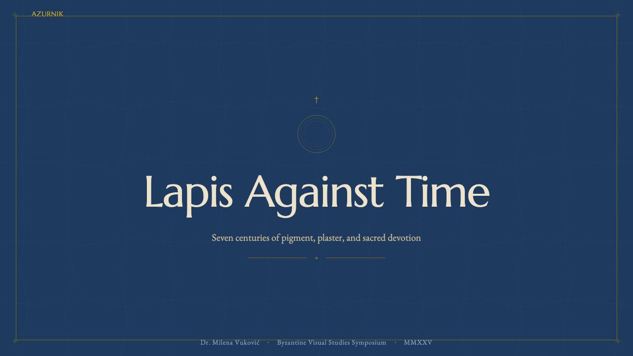
For presentation slides, the aesthetic suits cover pages built around a deep azurite field with a single gold-accented focal element framed by an arch-like border, evoking the apse framing of the original frescoes. Content slides can use registers — horizontal bands stacked top to bottom — to organize sequential information, much as narrative scenes stack across a monastery wall. Gold should be reserved strictly for the single most important element per slide: a key figure, a headline number, a critical callout.
For web interfaces, the style suits heritage brands, cultural institutions, premium editorial products, or any platform positioning itself around trust built over time. Dashboards can use the deep blue as a grounding background with gold used exclusively for premium status or completed milestones, and card components can adopt a rounded, arch-like top edge rather than a sharp rectangular corner to echo the architectural framing.
For editorial and marketing content, this system fits long-form cultural, historical, or religious storytelling particularly well. Feature images can be framed within an arch-shaped crop rather than a rectangle, and pull quotes can sit against the azurite ground with a thin gold rule marking their edge, giving even a digital page the gravity of a monastery wall.
The most common mistake is making the surface too clean and glossy — removing the weathering and craquelure in pursuit of a crisper, more modern look. This erases the exact quality that gives the style its authority: the sense of accumulated time and continuous reverence. A second common error is scattering gold liberally as decoration rather than reserving it strictly for the sacred or the most important element in a composition.
Serbian Medieval Fresco — FAQ
Is this style the same as Byzantine icon painting in general?
It is a specific regional and historical branch of the wider Byzantine sacred-art tradition. Serbian Raška-school fresco, developed under the Nemanjić dynasty from the late 12th century onward, shares Byzantine iconographic conventions but developed a warmer, more emotionally direct treatment of faces and figures than more formal Constantinopolitan models, along with its own distinctive palette and monumental scale.
Why is the weathering considered part of the aesthetic rather than damage?
The frescoes have survived inside continuously active monasteries for roughly eight centuries, worn by candle smoke, humidity, and ongoing liturgical use rather than sitting untouched in a museum vault. That accumulated wear is inseparable from the images' devotional history — removing it in a design application would erase the very quality of reverent age that gives the style its emotional and cultural weight.
How strictly should gold be rationed in a design using this style?
Very strictly. In the source tradition, gold is reserved exclusively for the sacred — halos, divine light, holy backgrounds — never for ordinary decoration. Carrying that discipline into design work means gold should mark only the single most important element in a composition, so its appearance retains the weight of signaling something set apart.
What kind of typography pairs well with this aesthetic?
Typography should feel weighty, formal, and unhurried rather than casual or geometric — a serif with historical presence generally reads more consistently than a contemporary geometric sans, since the aesthetic as a whole is built around monumental permanence rather than modern efficiency.
Does this style suit lighter, brighter product contexts?
Not naturally. The system depends on a deep, saturated blue ground and a matte, mineral quality that reads as solemn rather than cheerful. It suits products valuing gravity, trust, and cultural depth — heritage brands, cultural institutions, premium editorial — far better than casual, playful, or high-energy consumer contexts.
Related design styles
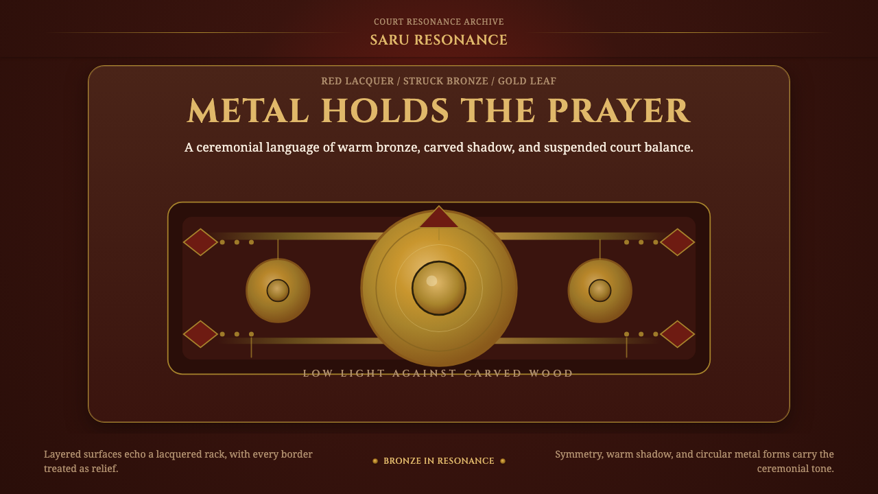 Gamelan BronzeCeremony in low light. Bronze circles glow inside red lacquer and gold-leaf f…
 Sikh Golden TempleReverent gold in dark water. Teal ground, Gurmukhi type, marble rules hold th…
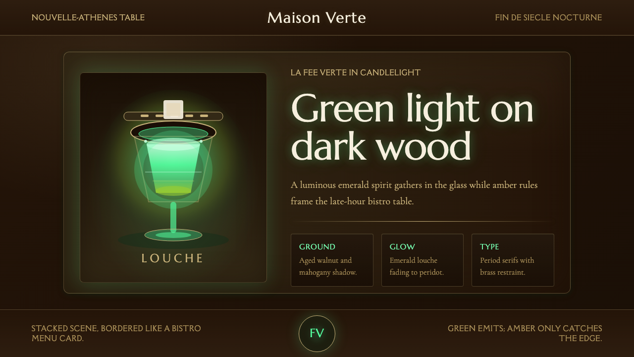 Absinthe Green Fairy GlowDarkness makes the fairy glow. Emerald louche on mahogany, framed by amber se…
 Buryat Buddhist Datsan ThangkaCold lapis holds silence. Gold mandala lines frame a solemn azurite field.
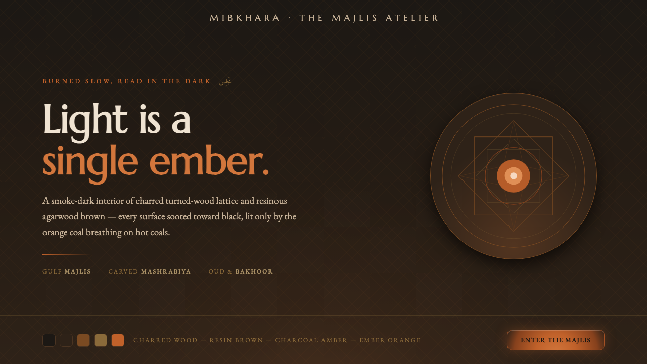 Oud Incense MashrabiyaLight is a single ember. Charred near-black mashrabiya lattice, resin browns,…
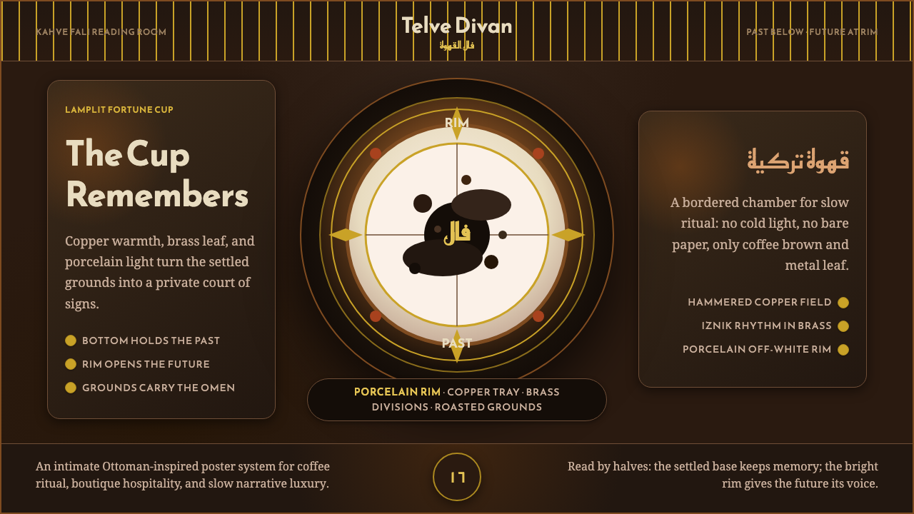 Turkish Coffee FortuneLamplit ritual, richly framed. Copper, brass, and Reem Kufi orbit a porcelain…