What is Gamelan Bronze?
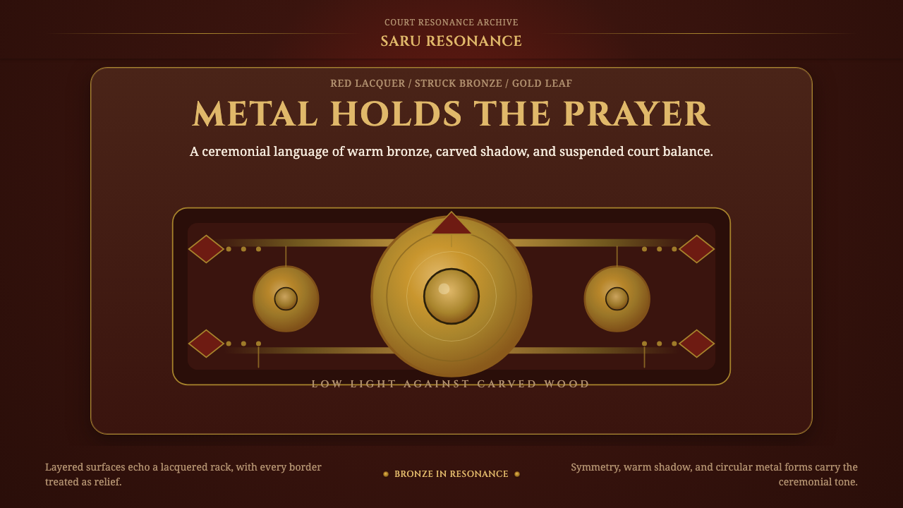
Gamelan Bronze turns the glow of struck metal, red lacquer, and gold-leaf carving into a design language of ceremony held in low light.
Gamelan Bronze in brief
Gamelan Bronze is a dark visual style distilled from the sacred instrument craft of the Central Javanese courts. Its central image is the gong ageng and its accompanying suspended kettles: broad circles of golden-bronze hanging within a deep red-lacquered wooden rack, or gayor, whose carved silhouette and gold-leaf relief turn support structure into ceremonial architecture. The style is not simply metallic or luxurious. It is reverent, warm, and composed around the expectation that an important sound is about to be struck.
The system translates the gamelan stands associated with the Kraton Yogyakarta into contemporary surfaces. Dark lacquer becomes the enveloping ground; bronze becomes the principal focal material; ogee-carved contours shape frames and boundaries; gold-leaf filigree marks edges with patient craft. Each element retains a clear relationship to the court object from which it derives. Circles evoke gongs rather than generic badges, ornament behaves like relief carving rather than printed pattern, and the surrounding darkness reads as carved wood rather than empty black space.
Its most distinctive quality is controlled radiance. Bronze and gold appear luminous because they are surrounded by deep red and sawo-mateng brown, not because the whole composition is brightly illuminated. The result is solemn without becoming cold. Metal provides resonance, lacquer provides depth, carved wood provides gravity, and gold leaf provides a narrow ceremonial emphasis. Together they create an interface atmosphere that feels framed, sheltered, and prepared for concentrated attention.
Where does Gamelan Bronze come from?
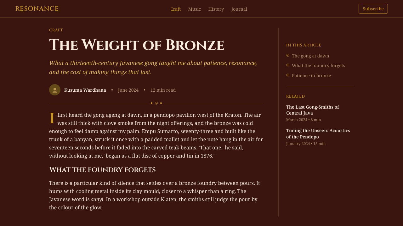
The source of Gamelan Bronze is the pre-1900 court tradition of Central Java, formalised within the kratons of Yogyakarta and Surakarta. In this setting, gamelan ageng instrument-making was inseparable from the visual construction of the ensemble. The large gong and suspended kettles were not presented as isolated metal objects; they belonged to carved wooden structures whose finish, silhouette, and gilded relief established the ceremonial setting in which the instruments were encountered.
The gong ageng supplies the style with its dominant form and material idea. Its broad circular face reads as struck bronze: warm, substantial, and capable of holding light without becoming mirror-like. Suspended within a gayor, the circle gains meaning through contrast with the dark, elaborately worked frame. The visual relationship is therefore one of containment and resonance. A luminous metal center is held within a heavier architectural surround, much as the instrument itself is held within the ordered space of the court ensemble.
Court finishing traditions provide the surrounding palette and surface character. Deep red lacquer contributes a Hindu-associated red of gravity rather than brightness, while sawo-mateng wood finishing introduces a mature brown that keeps the darkness organic and warm. Gold-leaf relief carving follows the structure of the rack, catching attention along ridges and borders. The ogee-carved silhouette prevents the frame from becoming a plain rectangle: it rises and curves like a ceremonial crest, making enclosure itself expressive.
Gamelan Bronze preserves these relationships while changing their medium. It does not attempt to reproduce an entire court interior or imitate an antique object literally. Instead, it carries forward the hierarchy already present in the stands: bronze as resonant center, lacquer and wood as sheltering field, carving as boundary, and gold leaf as consecrating accent. This translation allows a historical court craft to inform interfaces without severing its materials from their original ceremonial logic.
What defines the Gamelan Bronze look?
Color
The palette is built from low-light red lacquer, sawo-mateng brown, golden-bronze, and restrained gold leaf. Red and brown occupy the broad surfaces, producing darkness with warmth and material depth. Bronze marks the principal circular forms, while gold is reserved for carved borders and relief details. The hierarchy depends on unequal distribution: the dark field dominates, bronze gathers attention, and gold appears as a fine ceremonial edge rather than a continuous blaze.
Metallic Light
Bronze should read as struck metal rather than polished chrome. Its light is warm, concentrated, and slightly muted, suggesting a surface shaped for resonance rather than display. Highlights belong near the center or raised portions of a circular form, with surrounding tones falling back gradually into the lacquered darkness. Gold leaf behaves differently: it catches along carved relief, producing narrow flashes that reveal structure instead of turning the surface uniformly metallic.
Circular Focus
The gong circle is the style's primary organizing form. It functions as a visual center, an emblem of suspended weight, and an implied source of sound. Smaller circles may echo the kettles of the ensemble, but they should remain subordinate to a dominant form. Circular elements feel most authentic when visibly held by a frame or aligned within an ordered sequence; detached decorative dots weaken the connection to the instrument tradition.
Carved Frames
Frames are not neutral containers. Derived from the gayor, they use ogee-like rises, carved shoulders, and gold-leaf relief to make support visually significant. Ornament should follow the frame's edges, joints, and crown rather than float across the central field. This gives decoration a structural home. Even when simplified for an interface, the frame should feel crafted and load-bearing, as though it protects and suspends the luminous content within.
Depth and Enclosure
Depth comes from nested material layers: dark wood behind red lacquer, carved relief above the frame, and bronze suspended within it. The composition should feel recessed and sheltered rather than open and weightless. Broad darkness around the focal circle is essential because it supplies both spatial depth and ceremonial silence. Excessive shine, floating panels, or evenly bright surfaces dissolve this enclosure and make the style merely decorative.
Ceremonial Restraint
Although the source craft is richly carved, the aesthetic is not one of indiscriminate abundance. The main field remains calm, the gong remains legible, and ornament is concentrated where the structure can carry it. Repetition should create cadence, like an ordered ensemble, rather than visual noise. This restraint is what separates reverence from spectacle: every gleam and carved turn contributes to framing the central presence.
Who shaped Gamelan Bronze?
The court ensembles of the Kraton Yogyakarta provide the clearest institutional source for Gamelan Bronze. Their stands unite golden-bronze instruments with deep red lacquer, carved wooden silhouettes, and gold-leaf relief. For the design system, their importance lies in this total composition: instrument, support, finish, and ceremonial setting operate together. The style therefore treats framing and background as integral parts of the focal object rather than as later decoration.
K.K. Guntursari represents the ceremonial gamelan tradition named in the source material. Within Gamelan Bronze, it anchors the understanding of the ensemble as more than a collection of attractive metal forms. The combination of suspended bronze, formal arrangement, and ornamented support establishes a visual order suited to reverent attention. Its relevance is therefore symbolic as well as material: the design language should suggest ceremony, readiness, and collective resonance.
The gong-smiths associated with the Surakarta kraton stand for the instrument-making lineage behind the style's bronze center. Their place in the source material directs attention to metal as a crafted, struck, resonant substance rather than a generic luxury finish. A faithful application preserves that distinction. Bronze should appear weighty and acoustically suggestive, with evidence of warmth and handling, while the surrounding wood and gilding acknowledge the court framework that gives the instrument ceremonial presence.
How do you use Gamelan Bronze today?
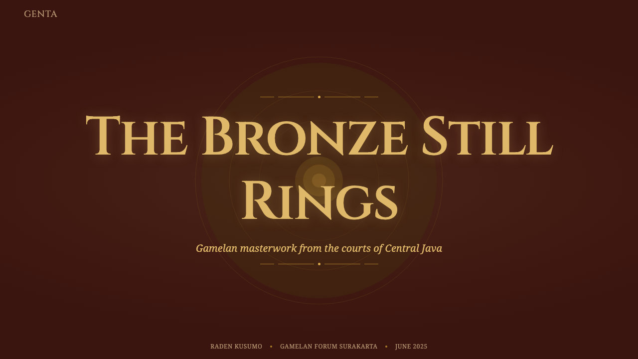
For presentation covers, use one dominant gong-like circle held within a carved or ogee-shaped frame. Place the title in the surrounding dark lacquer field so that it feels announced by the object rather than printed over it. Content slides should become quieter: retain the red-brown ground, use gold-leaf motifs only at section boundaries, and let bronze circles identify major ideas or chapter markers. The hierarchy should feel processional, with each element entering an already ordered ceremonial space.
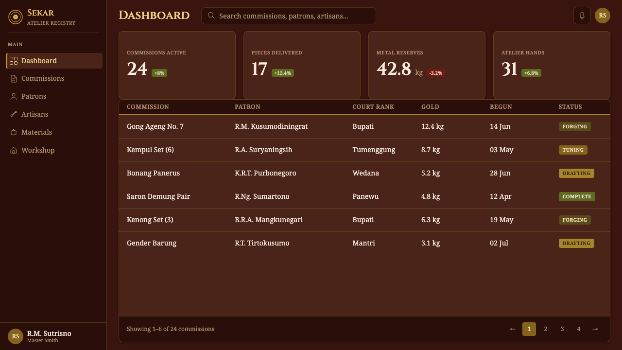
Data slides benefit from the ensemble principle. Repeated bronze circles can express categories, stages, or proportional relationships, while a larger circle establishes the primary measure. Linear charts and tables should remain restrained and framed by the same dark wood logic. Avoid turning every mark gold. Bronze carries the data; gold leaf defines the enclosure or highlights one consequential result. This division preserves legibility and keeps decorative richness from competing with evidence.
For web dashboards and pricing pages, treat panels as recesses within a lacquered rack rather than as unrelated floating cards. A primary metric or recommended tier can occupy the gong position: centered, circular, and visually weighty. Secondary information belongs in smaller repeated modules that recall suspended kettles. Navigation and controls should remain calm and readable, while carved contours and gilded accents are concentrated around major regions, active selections, or the most important decision.
Editorial and marketing layouts can use the style's ceremonial pacing to make reading feel deliberate. Open with a dark field, a bronze focal image, and a framed title; then alternate dense narrative passages with quieter expanses that allow the metal and carving to breathe. Pull quotations or product promises may sit inside simplified gayor-like frames. Marketing calls to action should feel like moments of arrival, marked by a focused bronze glow or a narrow gold border rather than an abrupt change to an unrelated bright color.
The common mistake is to equate Gamelan Bronze with generic dark luxury. Filling every border with gold, polishing bronze into chrome, or scattering Indonesian-looking ornament across every surface removes the system's specific court logic. Another error is using gong circles as arbitrary decorative discs without suspension, hierarchy, or framing. Begin with the relationship among resonant center, lacquered enclosure, carved support, and selective gilding. If that structure is convincing, relatively little ornament is needed.
Gamelan Bronze — FAQ
Is Gamelan Bronze simply a bronze-and-gold luxury theme?
No. Its identity comes from a specific relationship among Central Javanese court instruments, red-lacquered carved stands, sawo-mateng wood, and gold-leaf relief. Bronze is not an abstract sign of expense; it evokes a struck and resonant gong. Gold does not cover the whole surface; it follows carved structure. Removing the lacquered enclosure, suspended circular focus, and ceremonial restraint leaves a generic luxury palette rather than Gamelan Bronze.
Why is the style dark if its focal materials are bronze and gold leaf?
The darkness is what allows the metal to feel luminous without becoming ostentatious. Deep red lacquer and mature brown wood establish the low-light setting associated with the ceremonial stands. Bronze then gathers the available light, while gold leaf reveals selected ridges and borders. If the background becomes uniformly bright, the contrast between sheltered frame and resonant center disappears, along with much of the style's reverent atmosphere.
Can the carved ornament be simplified for contemporary interfaces?
Yes, provided its structural role survives. The essential feature is not the quantity of carving but its placement along the gayor-like frame, crown, joints, and boundaries. A simplified ogee silhouette with a few relief accents can communicate the source more faithfully than a dense all-over pattern. Preserve the sense that ornament belongs to crafted support and that the central bronze form remains clear, suspended, and visually dominant.
How should imagery be handled within Gamelan Bronze?
Imagery should reinforce the material hierarchy rather than compete with it. A close view of a gong-like bronze surface, carved dark wood, red lacquer, or gold-leaf relief fits naturally because it extends the established vocabulary. Images work best when tightly framed and surrounded by darkness, as though presented within the stand. Bright scenic photography or unrelated metallic imagery can break the sense of enclosure and turn the page into a collage of luxury references.
What kinds of products suit Gamelan Bronze best?
It is strongest where ceremony, cultural depth, focused attention, and a sense of crafted importance support the product's purpose. Presentation systems, cultural or educational interfaces, premium editorial experiences, and dashboards built around a small number of consequential choices can benefit from its deliberate hierarchy. It is less suitable when an interface needs to feel casual, weightless, or continuously playful. The style asks users to pause and attend; that expectation should match the experience being designed.
Related design styles
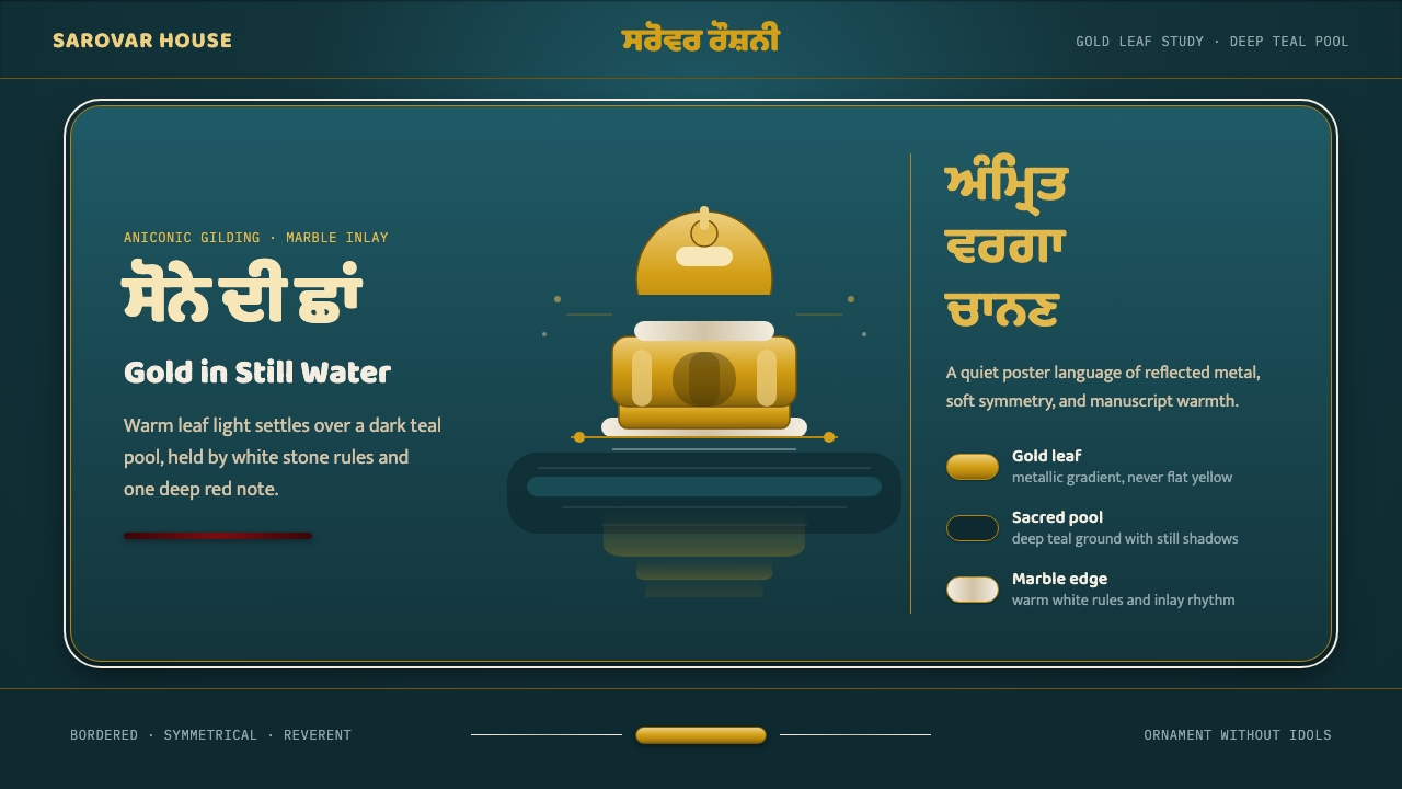 Sikh Golden TempleReverent gold in dark water. Teal ground, Gurmukhi type, marble rules hold th…
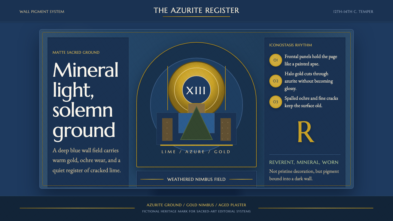 Serbian Medieval FrescoSacred wear becomes structure. Azurite fields, gold halos, and cracked plaste…
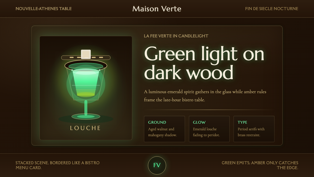 Absinthe Green Fairy GlowDarkness makes the fairy glow. Emerald louche on mahogany, framed by amber se…
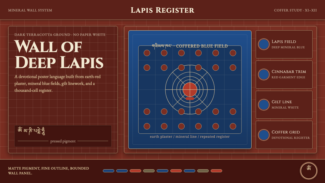 Alchi Monastery MuralDevotional depth. Lapis fields and coffered grids glow on terracotta plaster.
 Bhutanese Dzong (Fortress Red)Monumental red holds the page. Cobalt frames and gold bands lock the fortress…
 Kammavaca ManuscriptEvery surface worth gilding. Black tamarind-seed script and floating gold lea…