What is Kammavaca Manuscript?
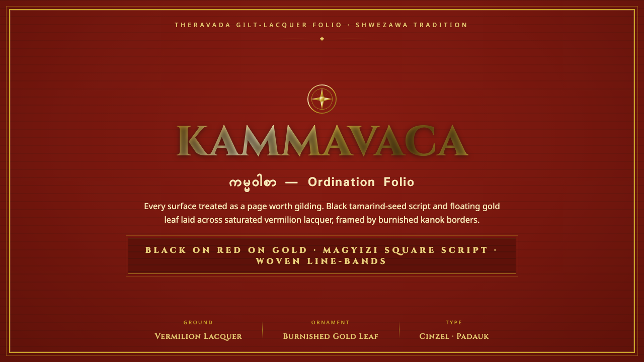
Kammavaca turns the manuscript folio into a total surface: vermilion lacquer, black square script, and gold ornament make reading feel inseparable from reverence.
Kammavaca Manuscript in brief
Kammavaca are Theravada Burmese ordination manuscripts, copied by monastic scribes onto gilded palm-leaf or stiffened cloth folios. Their visual identity is ceremonial rather than merely literary. Dense bands of Pali text occupy the page with the concentrated presence of pattern, while lacquer, gilding, and borders declare that the manuscript is an object of devotion as well as a carrier of instruction.
The most distinctive visual element is magyizi, often described as tamarind-seed script. Its thick, black, square letterforms gather into close horizontal runs across a saturated vermilion field. To a viewer unable to read the text, the writing can first register as a woven grid: repeated dark units, measured intervals, and a strong rhythm that gives the folio both density and order.
Around that script sits a gilded frame of floral ornament and Burmese kanok motifs. Gold is not a small accent applied after the composition is complete; it establishes the folio’s perimeter, dignity, and ritual charge. This design language translates those qualities into an interface system built from deep red grounds, burnished ornament, black block-like text, and bordered panels that make each section feel like a page worthy of preservation.
Where does Kammavaca Manuscript come from?
Kammavaca belongs to the manuscript culture of Theravada Burma, where ordination texts were copied in monastic scriptoria for religious use. Its origin lies in a setting where writing, craft, patronage, and ritual were not separate disciplines. The manuscript had to communicate sacred words, but it also had to embody the care appropriate to a consequential monastic act.
The physical support shaped the visual result. Palm-leaf and stiffened cloth folios favor a long, bounded field rather than an open book page. Text therefore gathers in sustained horizontal bands, and ornament naturally works as a protective enclosure around the writing. The border does not feel optional: it completes the object by making the textual field distinct from the richly treated surface that contains it.
The notable surviving folios associated with this tradition date from the seventeenth through nineteenth centuries. Across that period, the combination of red lacquer, gilding, black magyizi writing, floral pattern, and kanok framing produced a recognizable visual system. Its richness comes from disciplined repetition rather than pictorial abundance: the same few materials and marks are reiterated until the whole surface acquires authority.
Two groups sustained this tradition. Buddhist monastic copyists created the texts and gave their writing its dense visual order. Lay donors commissioned ordination manuscripts, connecting the making of the object to acts of support and religious merit. The resulting folio is therefore both a manuscript and a social artifact: a carefully made boundary around words, made possible by a relationship between monastery and patron.
What defines the Kammavaca Manuscript look?
Vermilion Ground
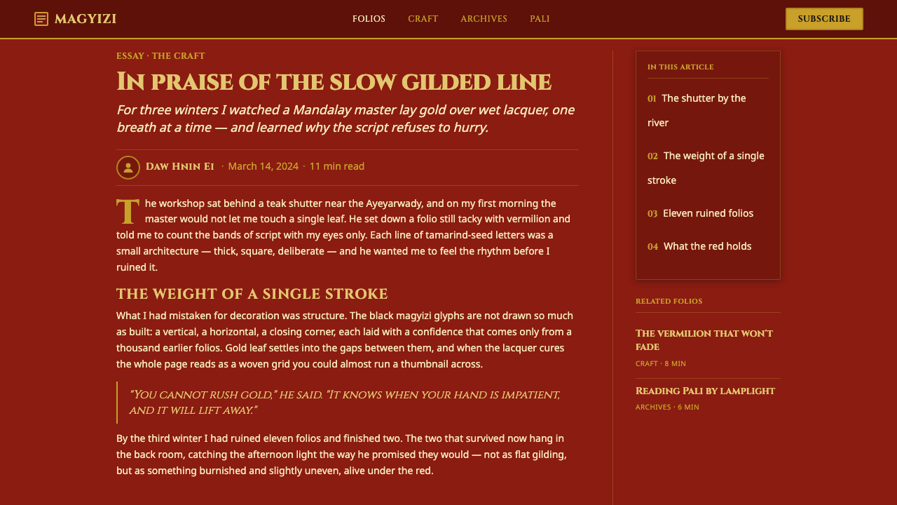
The dominant field is a deep, saturated vermilion lacquer ground. It should feel sealed, dense, and ceremonial rather than bright or playful. This red is a surface with gravity: it holds the black writing forward and lets gold read as burnished light. In contemporary work, use it as the defining plane for major sections, not as a scattered accent competing with many unrelated colors.
Tamarind-Seed Script
Black magyizi script creates the manuscript’s most forceful contrast. Its square, thick presence makes language appear architectural, almost assembled from blocks. The important quality is not imitation of a sacred script in ordinary copy, but the effect of compact dark marks arranged in deliberate horizontal continuity. Text should feel woven into the field, not casually placed upon it.
Gilded Border
Gold frames the content as an act of elevation. The border should be continuous enough to make the panel feel protected and precious, yet lively enough to avoid becoming a generic metallic outline. It is best understood as a threshold between the surrounding world and the textual interior. When used in an interface, gilding should establish hierarchy around significant content, actions, or statements rather than decorate every component.
Floral and Kanok Ornament
Floral ornament and Burmese kanok motifs supply movement at the edges. Their role is not naturalistic illustration. They articulate the frame with curling, repeating energy, allowing the center to remain disciplined and text-led. Keep ornament attached to boundaries, corners, dividers, and transitions; once it drifts freely across the reading field, it weakens the manuscript logic.
Folio Panels
A Kammavaca-derived layout treats each substantial surface as a folio. Panels are bounded, frontal, and complete in themselves, with a strong outer frame and a dense inner field. This produces an interface that feels collected rather than endlessly scrolling: each card, module, or section has the composure of a presented page. Empty space is valuable when it heightens the border and the central text block.
Ritual Density
The style balances elaboration with control. A red ground, black writing, and gold edge can be visually intense, but their roles are sharply divided: ground carries atmosphere, script carries content, ornament carries consecration. Preserve this division. The style becomes convincing when every layer has a specific duty, and becomes theatrical pastiche when gold, pattern, and text all compete for the same attention.
Who shaped Kammavaca Manuscript?
Monastic copyists made the Kammavaca manuscript possible by preserving ordination text through careful copying. Their contribution is both textual and visual: the dense horizontal bands of black magyizi script turn disciplined handwriting into the central structural force of the folio.
Lay donors commissioned ordination manuscripts and linked their production to acts of religious support. Their role helps explain why the object is treated with such material care: gilt, lacquer, and border are part of a commissioned devotional artifact, not a neutral container for words.
The monastic scriptorium is the setting in which Kammavaca’s visual disciplines converge. It joins copying, material preparation, decorative framing, and liturgical purpose in one production environment, making the manuscript’s coherence a consequence of shared ritual attention.
How do you use Kammavaca Manuscript today?
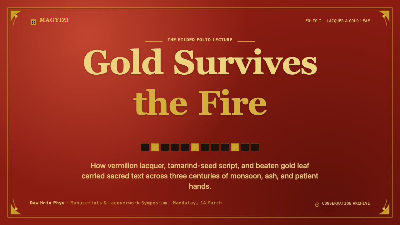
For presentation covers, use the Kammavaca system to make a title feel presented rather than advertised. Set a deep vermilion field behind a centered or carefully offset title block, give the title the density of a dark inscription, and reserve gilded floral or kanok detail for the perimeter. The cover should feel like an object being opened, with the border creating anticipation before the content begins.
Content slides should use folio logic. Place information in a clearly bounded central field, with dense headings and short text groups aligned into calm horizontal bands. A thin gilded rule or ornamental corner can mark hierarchy, but the information itself must remain legible and direct. On data slides, treat charts as inscriptions within a framed field: use restrained dark marks for primary information and let gold identify the single result, category, or threshold that deserves ritual emphasis.
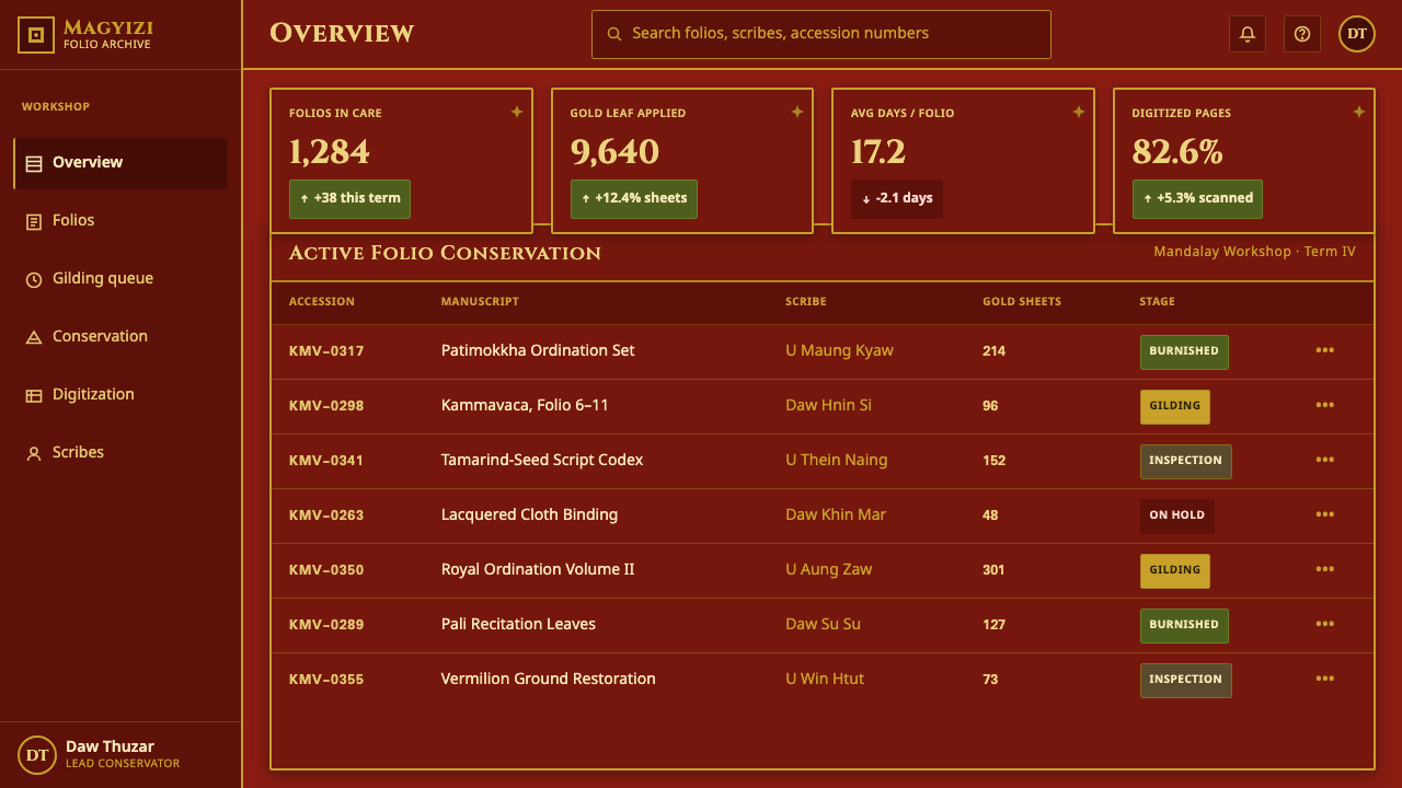
For web interfaces, this language is strongest in dashboards, archives, premium editorial tools, and pricing pages where users benefit from a sense of contained value. Build sections as bordered folios rather than soft floating cards. The deep red can establish high-attention zones, while black text-like forms and gold outlines make navigation, selected states, and key summaries feel deliberate. Keep interaction patterns conventional enough that ornament never obscures function.
Editorial and marketing work can use the style to turn long-form content into a sequence of presented leaves. Introductions may open on a red field with a gilded surround; article sections can alternate between quieter grounds and framed ceremonial moments. For campaigns, gold should signal rarity, invitation, or culmination, while floral and kanok motifs should enter at seams and edges. This is a better fit for cultural, archival, craft, and premium narratives than for casual, disposable messaging.
The common mistake is to reduce Kammavaca to red backgrounds plus random gold decoration. That approach misses the manuscript’s governing relationship: black script creates density, gilding creates threshold, and ornament remains subordinate to the text-bearing field. Do not fill every empty area with pattern, use gold on every label, or imitate sacred letterforms as novelty. Preserve the hierarchy and the atmosphere will follow.
Kammavaca Manuscript — FAQ
Is Kammavaca a typography style?
Not by itself. Its distinctive black magyizi writing is central, but Kammavaca is a manuscript system in which script, red lacquer ground, gilding, material support, and framed folio format work together. Borrowing only the block-like lettering produces an incomplete result. The more useful lesson is to make text behave as a dense structural field within a carefully bounded surface.
How should gold be used without making the interface feel excessive?
Give gold a boundary-making role. It is most effective on frames, dividers, corner motifs, and singular moments of emphasis because those uses echo the gilded enclosure of the manuscript folio. If gold appears on every icon, card, button, and line of copy, it loses its ability to indicate elevation. Let the red ground and black content do most of the visual work.
Can the style work with ordinary modern-language content?
Yes, provided the design borrows compositional behavior rather than pretending modern copy is sacred manuscript text. Use readable contemporary type, then create Kammavaca-like density through measured bands, strong contrast, framed panels, and an intentional relationship between red, black, and gold. The reference should be visible in the structure and material mood, not in a forced imitation of liturgical writing.
Where does this style struggle?
It struggles where lightness, speed, visual neutrality, or broad utilitarian flexibility are the main goals. A Kammavaca-inspired surface asks users to pause and attend; its lacquered depth and gilded framing carry ceremonial weight. It is therefore less suitable for dense commodity workflows, playful social feeds, or products that need to disappear into the background. Use it when contained significance is an advantage, not a burden.
Related design styles
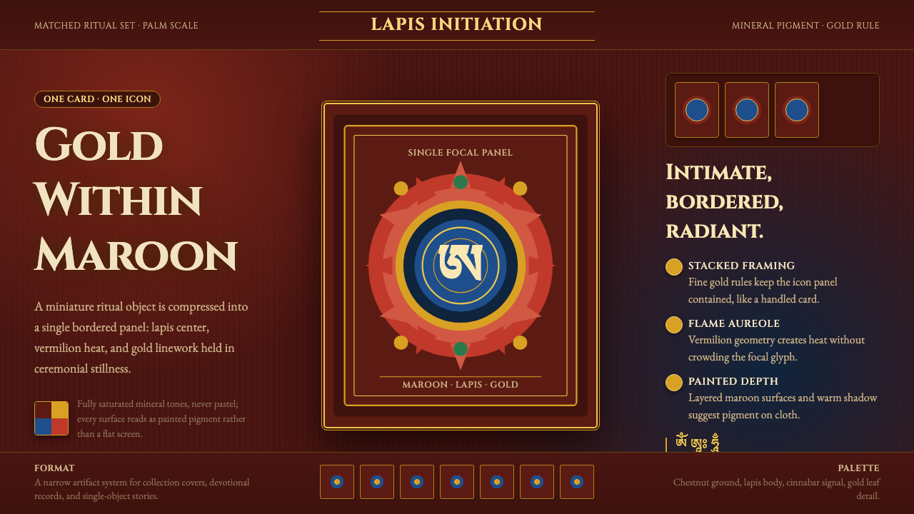 Tibetan Tsakli Initiation CardsPalm-sized radiance. Gold rules, lapis centers, and vermilion flame on maroon…
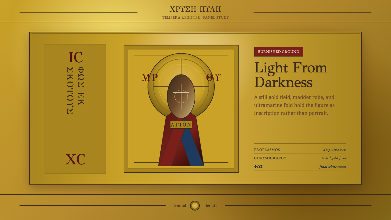 Mount Athos IconStillness becomes light. GFS Greek inscriptions frame madder, ultramarine, an…
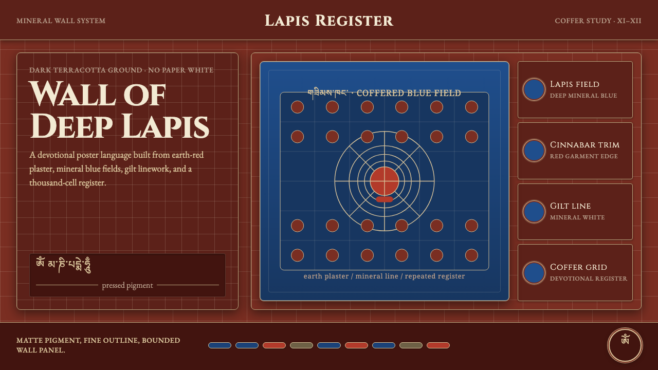 Alchi Monastery MuralDevotional depth. Lapis fields and coffered grids glow on terracotta plaster.
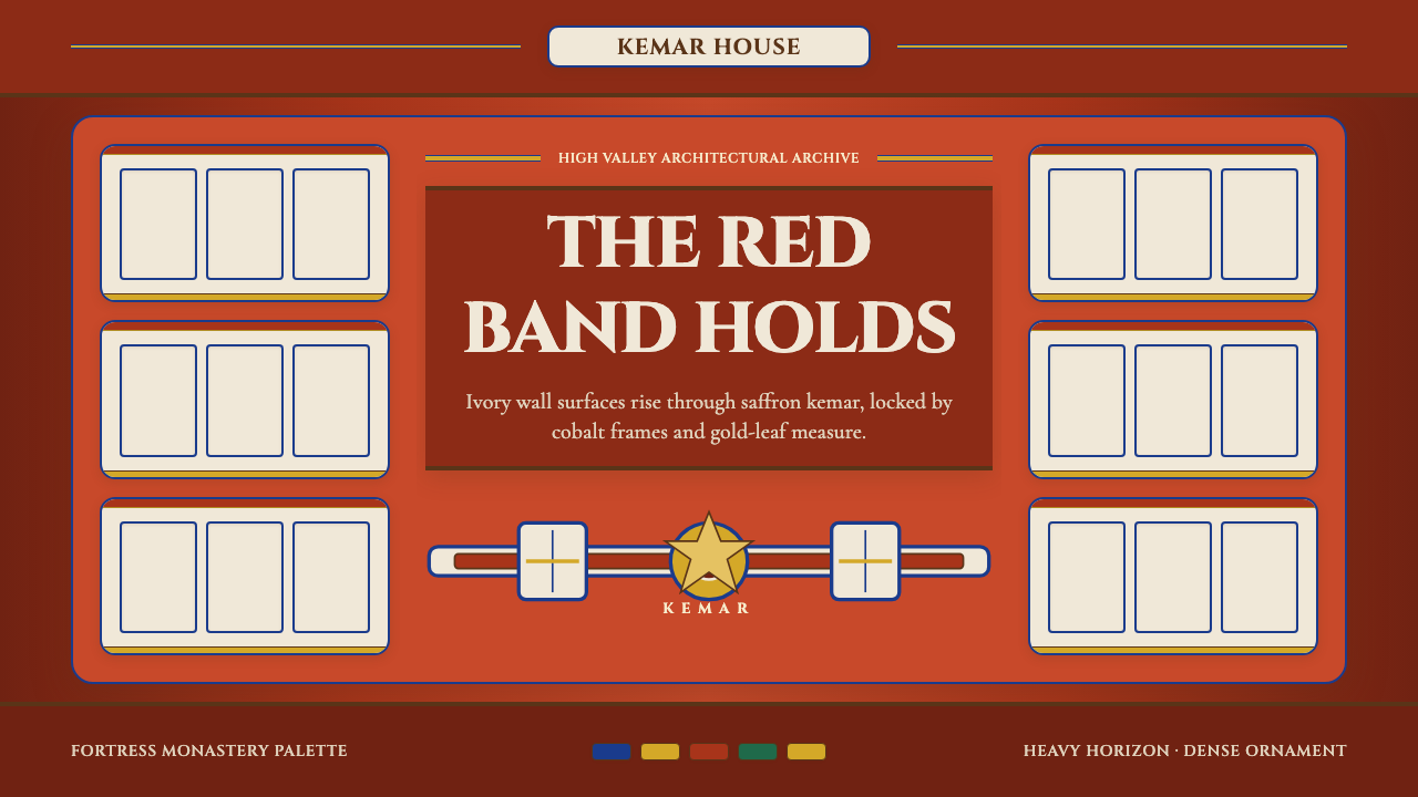 Bhutanese Dzong (Fortress Red)Monumental red holds the page. Cobalt frames and gold bands lock the fortress…
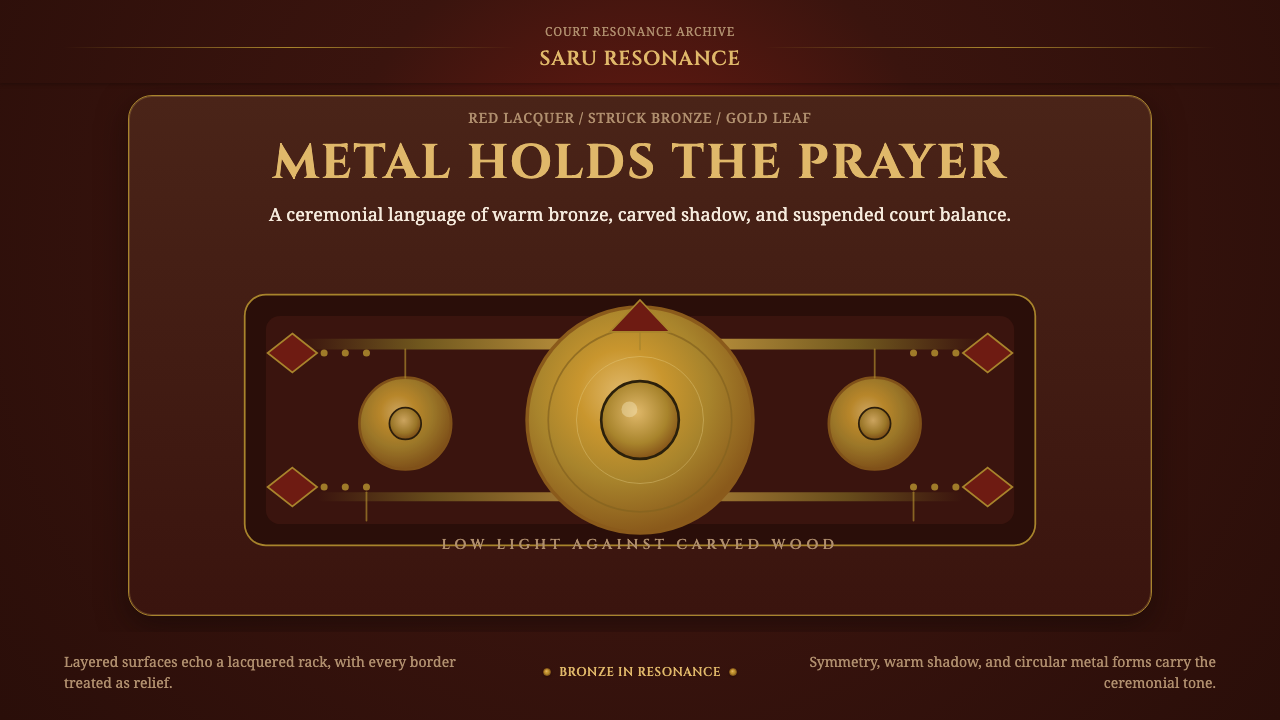 Gamelan BronzeCeremony in low light. Bronze circles glow inside red lacquer and gold-leaf f…
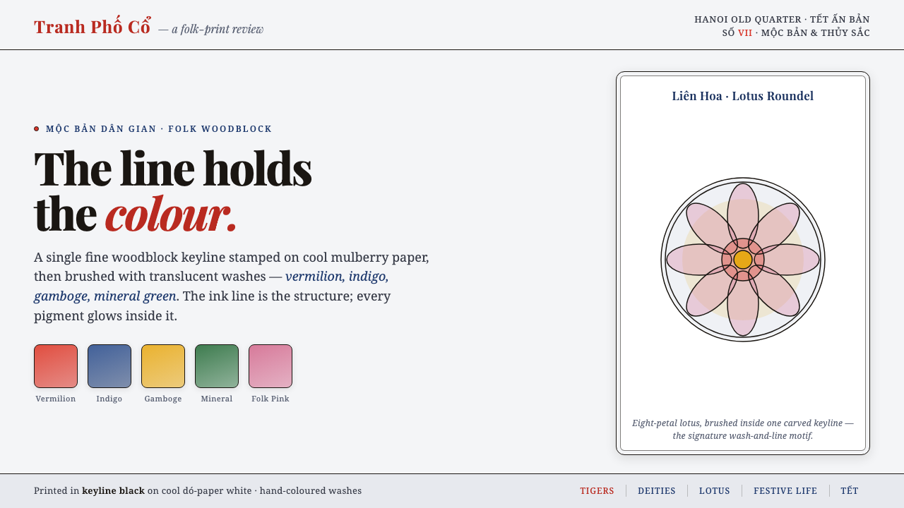 Hàng Trống Folk PrintBright folk colour, never loud. Translucent vermilion-indigo washes held insi…