What is Mahogany Ship Cabin?
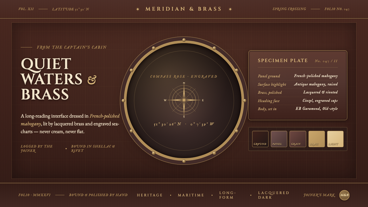
Mahogany Ship Cabin turns the screen into a pre-1900 ocean-going vessel — dark French-polished wood, lacquered brass, engraved charts, and the solemn authority of carved capital letters.
Mahogany Ship Cabin in brief
Mahogany Ship Cabin distills the interior of a nineteenth-century Western European sailing vessel, particularly the British and European ocean-going ships associated with the Age of Sail. Its visual ground is deep, reddish-brown mahogany paneling: warm enough to feel inhabited, dark enough to make every lighter object appear illuminated. The surface is not an abstract dark background. It should feel like a material wall, with grain, polish, joinery, and accumulated craft visible in the atmosphere of the composition.
The style treats maritime luxury as an experience of restraint rather than abundance. Brass portholes, rings, rivets, and fittings provide points of reflected warmth against the wood, while sea charts and engraved nautical markings supply the intellectual and navigational character of the cabin. The palette stays close to dark mahogany, antique mahogany, lacquered brass, and the occasional pale chart surface. Cream is not the default ground, and flatness is not the goal.
Typography carries the authority of an inscription. Cinzel capital letters suggest carved names, ship registers, brass plaques, and engraved instruments rather than contemporary interface labels. The result should feel ceremonial but useful: a cabin organized around navigation, craftsmanship, and passage across open water. Ornament is welcome when it belongs to the world of joinery, cartography, or maritime hardware; unrelated decoration weakens the illusion.
Where does Mahogany Ship Cabin come from?
The style belongs to the pre-1900 maritime world, when ocean-going sailing vessels were understood through their materials as much as through their machinery or routes. Its regional reference is Western Europe, with particular emphasis on British and European ships. The cabin is imagined as a crafted interior rather than a generic nautical scene: a protected room inside a moving vessel, where wood paneling, brass fittings, charts, and engraved surfaces make navigation tangible.
Its strongest craft lineage is French-polished mahogany joinery. Mahogany supplies the cabin with warmth, depth, and visible grain, while polishing turns the wood into a surface capable of catching and holding light. The result is neither rustic timber nor glossy modern luxury. It is a dark, reddish-brown material with a lighter antique surface highlight, suggesting careful maintenance and the long presence of skilled hands.
The visual language also comes from maritime interior craft. Ship’s joiners and cabinetmakers are central figures because the cabin depends on fitted woodwork: panels, seams, rings, and carefully resolved edges. Naval architects contribute the sense that every opening and fitting belongs to a vessel with structure and purpose. Maritime chart-makers contribute the other essential layer, turning the cabin from a furnished room into a navigational environment marked by routes, coastlines, and engraved information.
Rendered for the screen, the style preserves these origins without pretending to reproduce a physical ship exactly. Dark wood becomes the reading ground, brass becomes the light-catching signal, and charts become controlled fields of detail. The atmosphere should recall a nineteenth-century ocean voyage through material cues rather than through theatrical props. Its authenticity comes from consistency: every surface must seem to belong to the same cabin, the same craft tradition, and the same pre-1900 maritime world.
What defines the Mahogany Ship Cabin look?
Mahogany Ground
The dominant field is deep mahogany, warmer and redder than neutral brown. It should read as polished paneling rather than a painted backdrop, with a darker reading ground and a lighter antique-mahogany surface presence. Variation is subtle and material-led: grain, sheen, and joinery establish depth without requiring scenic illustration.
Lacquered Brass
Brass is the cabin’s principal counterpoint to wood. Portholes, rings, rivets, and fittings appear polished, warm, and capable of catching a concentrated glint. Brass should be used as a structural accent, not spread across every surface. Its value comes from contrast: a small metal detail against dark paneling can establish more luxury than a broad field of gold.
Engraved Capitals
Cinzel caps give the style its ceremonial voice. Letterforms should feel engraved into a plaque, chart, or shipboard register, with generous presence and a measured rhythm. Capital typography works best for names, headings, navigation cues, and short declarations. Longer reading passages need a calmer supporting treatment so the display voice remains special.
Nautical Cartography
Sea charts supply the cabin with information rather than generic decoration. Coastlines, routes, engraved markings, and chart-like fields can appear as inserts, overlays, or quiet background evidence. Their detail should remain legible enough to suggest navigation while staying subordinate to the main message. The chart is a sign of knowledge, direction, and travel.
Joinery and Hardware
Edges, seams, panels, rings, and rivets create the cabin’s constructional grammar. Components should appear fitted, fastened, or framed, as though assembled for a vessel rather than placed in an abstract interface. This makes borders meaningful: a line can imply a joint, a ring can imply a fastening, and a metal corner can imply protection.
Concentrated Light
Light is warm, directional, and selective. It should reveal the polish of wood or the edge of brass without washing the cabin into a bright room. Highlights are most effective when they are localized: a porthole rim, a chart edge, or a narrow reflection across a panel. The surrounding darkness is part of the composition, not an absence to be corrected.
Who shaped Mahogany Ship Cabin?
These craftspeople define the cabin’s tactile authority. Their work is expressed through fitted mahogany panels, polished surfaces, seams, rings, and carefully resolved edges. In a screen interpretation, they are the reason the interface should feel built and maintained rather than merely colored. Every joinery cue should suggest patience, precision, and a material that has been shaped for life at sea.
Naval architects provide the underlying sense of structure and purpose. A porthole, fitting, or framed opening should feel related to the vessel’s construction, even when it appears in a digital layout. Their influence keeps the style from becoming a collection of nautical ornaments. The cabin’s beauty depends on the impression that every component belongs to a functioning ship.
Maritime chart-makers contribute the cabin’s intellectual and directional character. Their engraved maps turn open water into an organized field of routes, coastlines, and decisions. Used in moderation, chart material can frame a title, support a data point, or provide a quiet layer behind content. It should always suggest knowledge in service of navigation.
How do you use Mahogany Ship Cabin today?
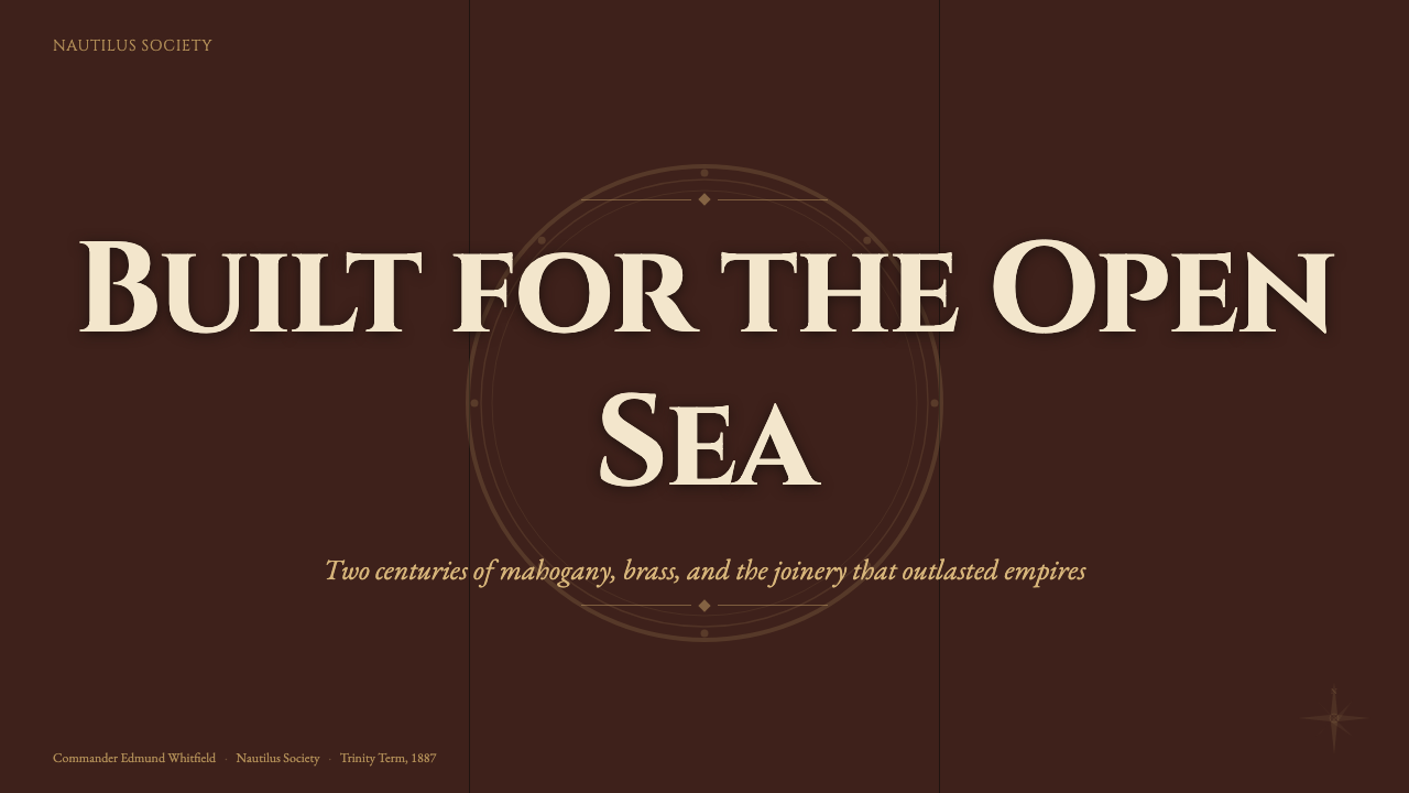
For presentation slides, use the cover as the cabin door into the system: a dark mahogany field, a restrained brass detail, and a Cinzel-cap title that feels engraved rather than typed. Content slides should preserve a clear reading route through panel-like sections, chart inserts, and brass rules or rings used as structural markers. Data slides can borrow the language of navigation: routes, bearings, chart fields, and instrument-like labels. Keep the information legible and let one brass or chart accent carry the atmosphere.
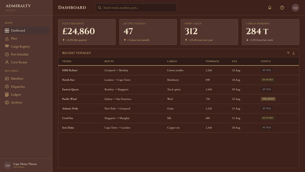
For web interfaces, the style suits dashboards, analytics tools, and pricing pages that want authority, craft, and a sense of expedition. Cards can resemble fitted panels, with dark wood as the continuous environment and brass reserved for selected actions, active states, or important thresholds. Charts should feel like navigational instruments or engraved diagrams rather than glossy technology graphics. Pricing tiers can be separated through panel framing and brass emphasis, while the typography keeps names and categories ceremonial without making every label shout.
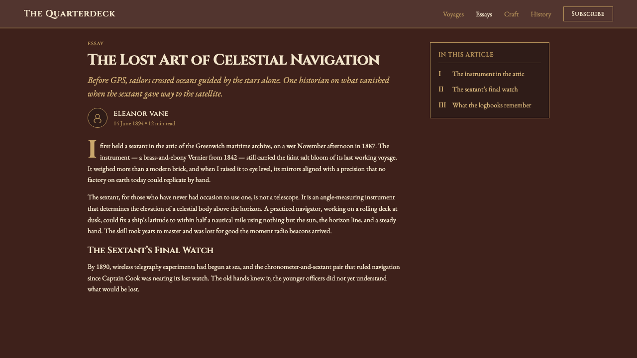
For editorial and marketing work, Mahogany Ship Cabin supports stories about travel, heritage, craft, hospitality, luxury goods, and exploration. A feature page can place a narrow column of calm reading text beside a broad chart-like field, a brass-framed quotation, or a panel of maritime metadata. Marketing compositions benefit from material contrast: a dark wood ground, a polished metal signal, and one carefully placed chart or engraved mark. The style is strongest when the page feels commissioned and made, not decorated from a theme library.
The common mistake is confusing nautical atmosphere with indiscriminate nautical imagery. Adding anchors, ropes, waves, ship wheels, and oversized brass ornaments everywhere produces a costume rather than a cabin. Another mistake is making the wood too light or too flat, which removes the central reading ground. Start with the dark mahogany atmosphere, establish real hierarchy, then add only the joinery, brass, and chart details that clarify structure or reinforce the maritime world.
Mahogany Ship Cabin — FAQ
Is Mahogany Ship Cabin meant to look literally realistic?
It should feel materially credible, but it does not need to imitate a complete physical ship. The essential cues are the dark French-polished mahogany ground, warm lacquered brass, engraved chart language, fitted joinery, and ceremonial capital typography. These elements should behave consistently enough to suggest a cabin. Literal realism is less important than preserving the relationship between wood, metal, navigation, and light.
Why must the background stay darker than the antique-mahogany highlight?
The darker reading ground gives the cabin its enclosed, ocean-going atmosphere and creates the contrast that lets brass, charts, and lettering register as illuminated details. If the whole surface becomes equally bright, the wood loses depth and the interface starts to resemble a generic brown theme. The lighter mahogany presence should describe polish and wear, while the deeper ground carries the room.
How should brass be used without making the design feel gaudy?
Treat brass as a scarce structural signal. Use it for a porthole rim, a fastening ring, a selected rule, an active state, or a significant label rather than covering every component. Its warmth becomes persuasive when surrounded by dark wood. The more selective the metal accents are, the more they resemble maintained ship hardware and the less they resemble decorative gold.
Can the style use imagery other than sea charts?
Yes, provided the imagery remains connected to the cabin’s material and navigational world. Engraved joinery, portholes, fittings, rivets, and chart-like markings all belong naturally. Images that introduce unrelated softness, bright contemporary surfaces, or a different cultural atmosphere will compete with the style. When in doubt, choose imagery that can plausibly be read as part of the vessel’s interior or its work of navigation.
Where does Mahogany Ship Cabin work best, and where does it struggle?
It works best for subjects that value heritage, craft, navigation, travel, hospitality, luxury, or purposeful exploration. It can make dashboards and pricing pages feel authoritative, and it gives editorial work a strong sense of place. It struggles when the product depends on bright openness, playful softness, or a weightless contemporary mood. The style’s darkness and historical specificity are its strengths, but they also mean the surrounding content must genuinely benefit from atmosphere and material presence.
Related design styles
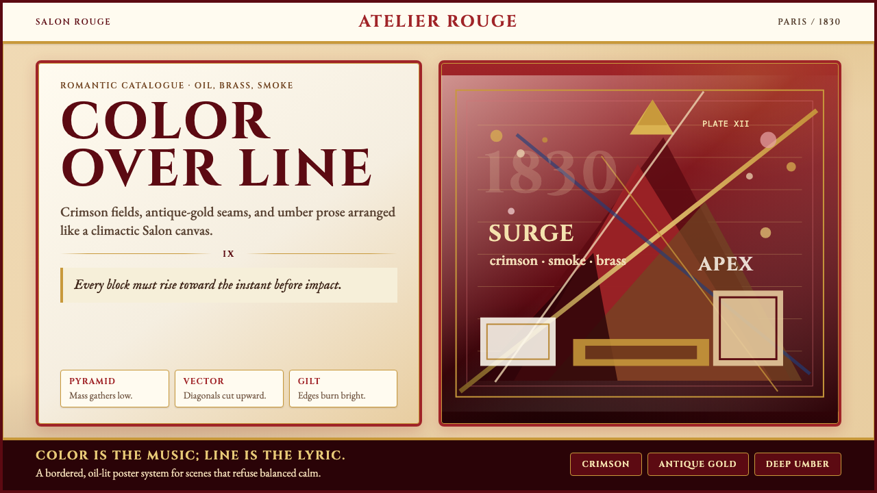 Delacroix French RomanticismOperatic color erupts. Crimson parchment, gilt borders, and diagonal pyramids…
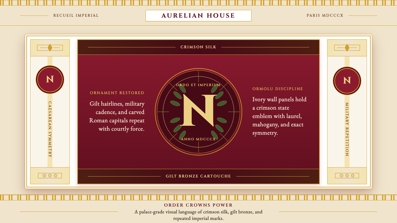 Napoleonic Empire StyleImperial order speaks. Crimson silk, gilt hairlines, and strict symmetry fram…
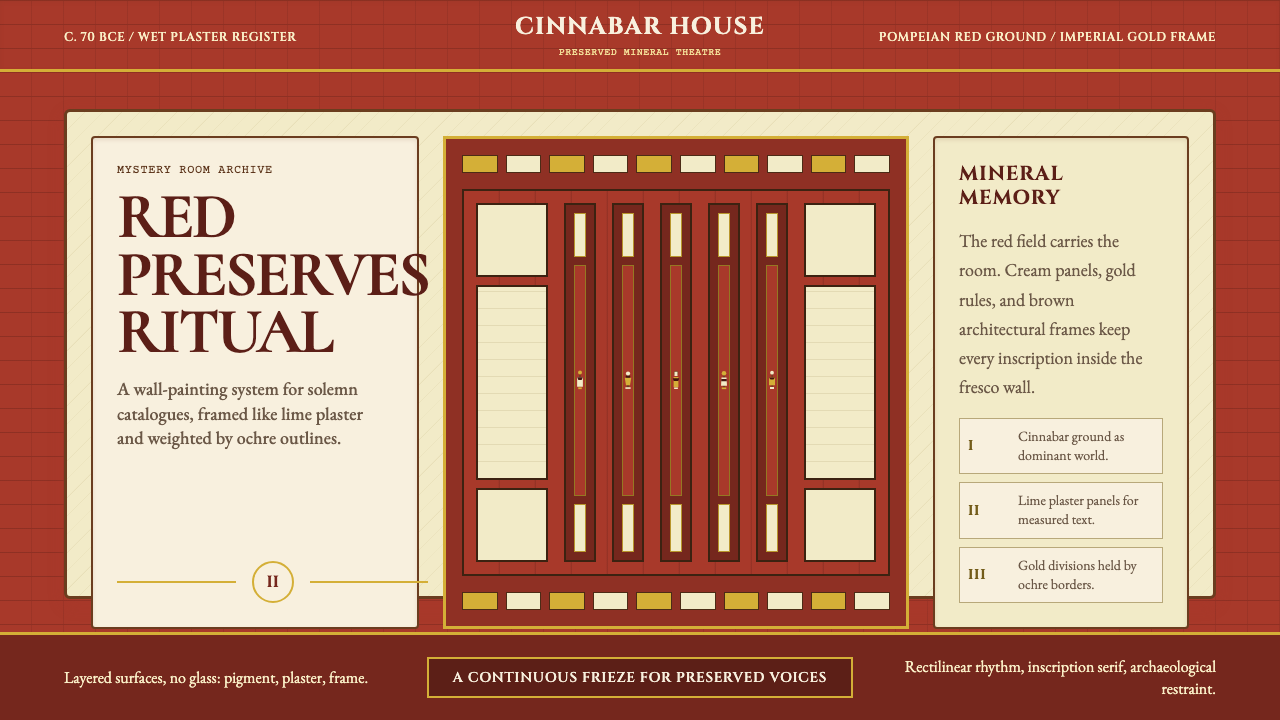 Pompeii Fresco Villa of MysteriesThe wall is the world. Pompeian red, cream plaster panels, and gold frames ho…
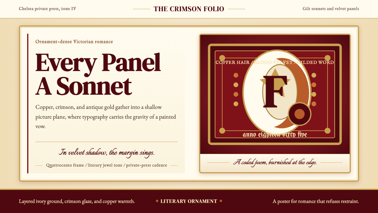 Rossetti — Pre-Raphaelite StunnerRomance refuses restraint. Crimson velvet, copper serif, and gilt frame turn…
 Aneroid BarometerMeasures weather as furniture. Gilt rings and Cinzel engraving glow on dark w…
 Bhutanese Dzong (Fortress Red)Monumental red holds the page. Cobalt frames and gold bands lock the fortress…