What is Wimbledon Grass?
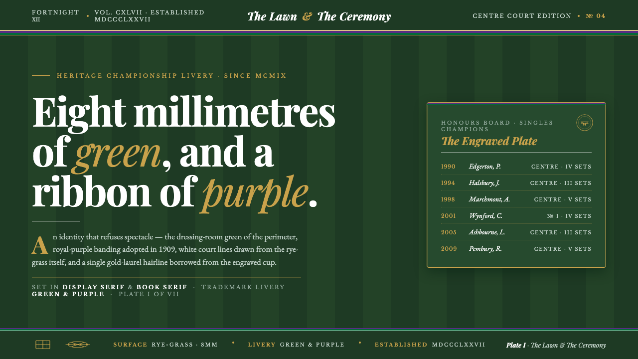
Wimbledon Grass turns the tennis court into a heritage emblem — championship green, royal purple, crisp white rules, and the quiet authority of gold-laurel serif type.
Wimbledon Grass in brief
Wimbledon Grass is a heritage sports identity built from the visual vocabulary of The Championships, Wimbledon: deep green rye-grass lawns, dark-green surrounds, royal purple livery, crisp white court markings, and a restrained gold-laurel trophy accent. It is aristocratic without being ornamental, ceremonial without becoming theatrical. The design should feel inherited, maintained, and exact.
The essential distinction is between heritage and stadium spectacle. This system does not rely on floodlights, neon energy, aggressive motion, or generic athletic imagery. Its authority comes from the lawn itself: a dark, cultivated ground carrying white rules and carefully controlled bands of purple and green. The result is formal, composed, and unmistakably connected to championship tradition.
On screen, the style translates the court into a complete visual environment. Deep green becomes the continuous ground, purple and green establish institutional framing, white provides the strongest reading contrast, and gold appears only where distinction or ceremony is required. High-contrast serif type completes the language, giving headlines and labels the presence of a printed programme or engraved award rather than a broadcast interface.
Where does Wimbledon Grass come from?
The Championships, Wimbledon was founded in 1877 and is played at the All England Lawn Tennis & Croquet Club in Wimbledon, London, England. Its identity begins with the surface: rye-grass lawns that are cultivated, mown, and presented as part of the competition itself. The court is not a neutral container for sport. It is the central material and the central image, a living green ground whose care communicates discipline before a player or score appears.
The visual language belongs to the British grass-court tradition and to a broader idea of heritage sports branding. It treats the tournament as an institution with continuity rather than as a temporary event seeking attention. Dark-green windscreens extend the lawn vocabulary beyond the playing surface, while white court lines establish a clear, almost heraldic order. The identity is therefore rooted in maintenance, boundaries, and repeated ceremony.
The club adopted its purple-and-green livery in 1909. That pairing gives the system its most recognizable institutional contrast: purple introduces royal distinction, while green keeps the identity tied to grass, place, and the championship ground. The colors do not behave like a general-purpose athletic palette. They function as livery, a visible sign of belonging and continuity around the court.
The colors were trademark-registered in 2016, reinforcing the idea that this is not an accidental combination but a protected identity system. Its historical movement is therefore clear: British grass-court tradition provides the ground, heritage sports branding provides the institutional frame, and aristocratic championship identity gives the composition its restraint. The screen adaptation should preserve that hierarchy instead of flattening it into generic tennis decoration.
What defines the Wimbledon Grass look?
Championship Green Ground
Deep green is the dominant field and should read as a cultivated lawn rather than a generic dark background. It creates continuity across the interface, absorbs visual noise, and gives white rules and restrained accents room to speak. The green must feel substantial and maintained: more like the court and its windscreens than like a bright sports logo.
Royal Purple Livery
Purple functions as institutional livery rather than decoration. It can frame a section, mark a selected state, or form a band that announces belonging to the Wimbledon system. Its best use is deliberate and edged: a visible strip, border, or field that meets green with confidence. Purple should never dissolve into a rainbow palette or compete with every element on the page.
Crisp White Court Rules
White is the system's clearest structural voice. It represents court lines, baselines, score divisions, and reading rules. White marks should be crisp, uninterrupted, and purposeful, never used as a haze or decorative sparkle. On the dark green ground, they create the sharp contrast that makes the identity feel measured, legible, and ready for competition.
Manicured-Lawn Striping
Subtle striping may suggest the alternating direction of a carefully mown lawn. The effect should remain quiet and directional, adding material memory without turning the background into a texture field. Stripes work best when they support orientation or hierarchy: guiding the eye across a panel, separating a score area, or reinforcing the horizontal logic of a court.
Gold-Laurel Ceremony
Gold is reserved for distinction: a trophy cue, a championship marker, or a small ceremonial emphasis. The laurel reference makes the accent feel awarded rather than luxurious. Gold should appear as a controlled glint against green, purple, or white, never as a broad metallic treatment. Its scarcity is what gives it authority.
High-Contrast Serif Type
Serif typography gives the system its editorial and ceremonial register. High contrast between thick and thin strokes creates the feeling of a formal programme, while generous spacing keeps the text from becoming antique or crowded. Headlines may carry the authority of a title or honour roll; supporting text should remain calm, readable, and subordinate to the court-like structure around it.

Who shaped Wimbledon Grass?
The committee represents the institutional continuity behind the identity. In this design language, it is the reason the colors feel like livery rather than fashion: green, purple, white, and gold belong to an enduring championship framework. Any application should therefore feel governed, consistent, and maintained rather than improvised for a single campaign.
Centre Court champions embody the identity's human measure of achievement. They are not treated as anonymous athletic silhouettes or commercial action figures; they stand within a setting of lawn, rules, ceremony, and distinction. The design should let achievement appear as a consequence of the institution's order, not as noise competing with it.
The head groundsman represents the discipline of the surface itself. The lawn is not a passive green fill; it is cultivated, precise, and visibly cared for. This role explains why striping, dark green, and clean boundaries matter so much: they make maintenance part of the visual identity and turn material care into a form of authority.
How do you use Wimbledon Grass today?
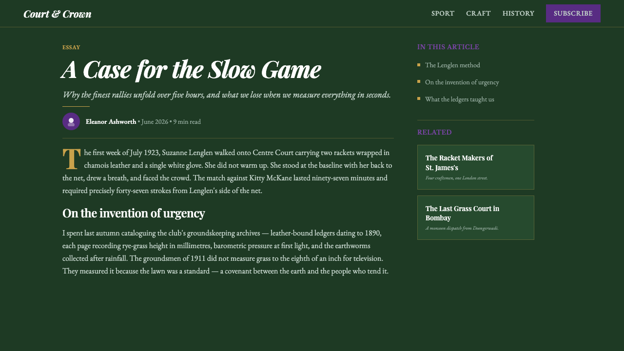
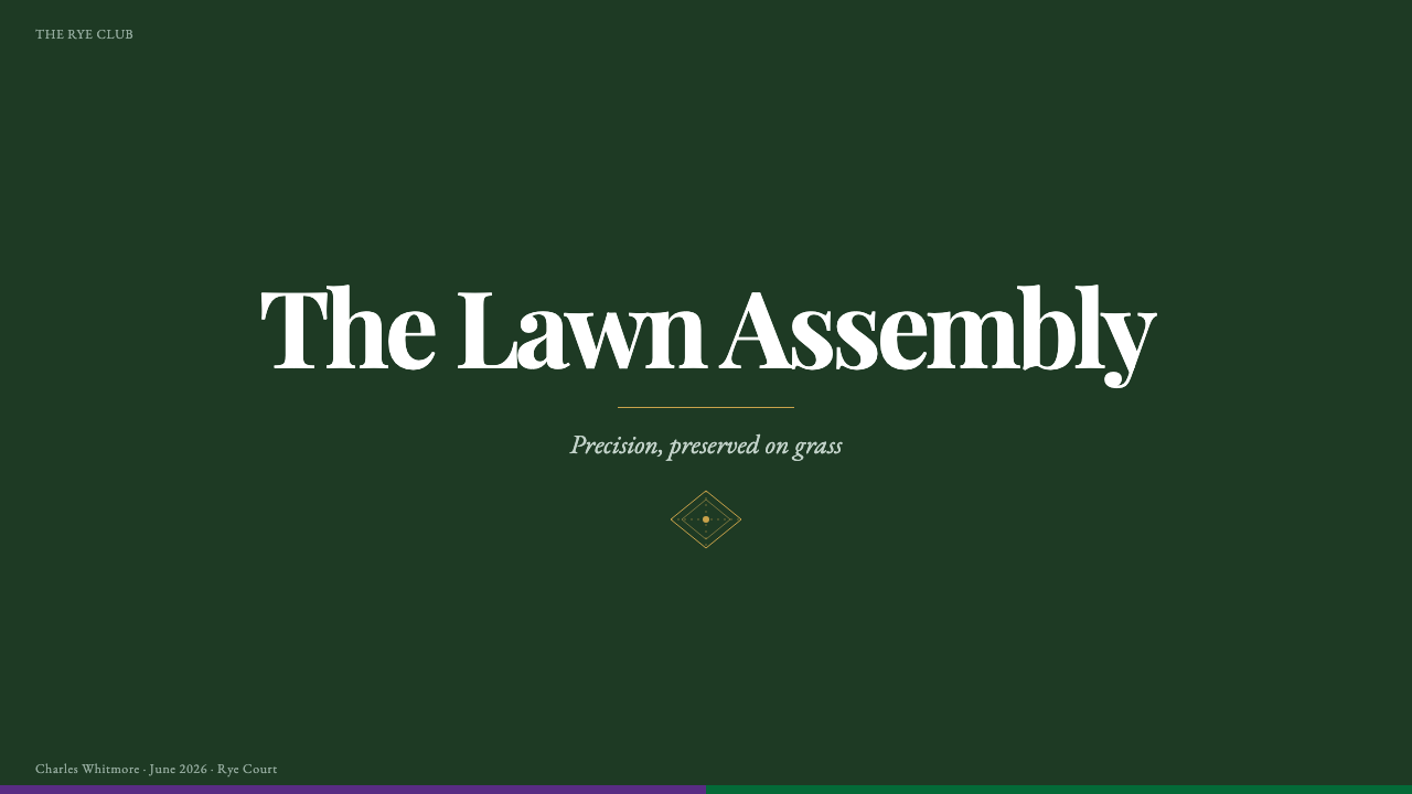
For presentation slides, use the deep green ground as the continuous stage. A cover can place a large serif title against the lawn, framed by a controlled purple-and-green band and a small gold-laurel cue. Content slides should behave like courts: clear white rules divide sections, restrained purple identifies the active subject, and serif hierarchy separates title, context, and supporting detail. Data slides should use white structural marks first, with green, purple, and occasional gold assigned to meaningful categories rather than decorative variety.
For web interfaces, Wimbledon Grass suits dashboards, rankings, schedules, and pricing pages that need authority without looking corporate or technological. Keep the dark green field stable across the experience, use white for primary reading and navigation, and let purple signal selection or institutional status. Pricing tiers can be differentiated through livery bands and restrained gold distinction, while the typography remains serif-led and composed. The interface should feel like a championship register or club system, not a live betting screen.
For editorial and marketing work, the style creates a strong frame for stories about tradition, performance, place, and cultivated excellence. Use narrow, calm reading blocks against the green ground, with white rules marking transitions and purple carrying recurring institutional cues. Campaign layouts can pair a large serif statement with a court-like horizontal structure, while photography or illustration should remain subordinate to the identity's atmosphere. Gold is most effective in a title mark, award cue, or small emblematic detail.
For slides, websites, and editorial pages alike, hierarchy should come from contrast and position before ornament. Green establishes the field, white establishes the rule, purple establishes affiliation, and gold establishes distinction. This sequence keeps the system legible even when content changes. It also allows the same design language to move from a score panel to a long article or a pricing comparison without losing its heritage character.
The common mistake is turning Wimbledon Grass into generic luxury sports branding. Excessive gold makes it look like a hotel or jewellery identity; bright purple and green used everywhere make it feel like a team jersey; glossy effects and stadium imagery replace the quiet authority of the lawn. Another mistake is using cream paper tones, which contradict the system's defining instruction: this is always the grass, never the nostalgic page. Preserve the dark ground, crisp rules, restrained livery, and serif dignity.
Wimbledon Grass — FAQ
Is Wimbledon Grass simply a green tennis theme?
No. Green is only the ground. The identity depends on the relationship between cultivated championship green, royal purple livery, crisp white rules, gold-laurel distinction, and high-contrast serif type. Remove the institutional banding and ceremonial restraint, and the result becomes generic sports design. The style is about heritage, maintenance, and controlled authority as much as it is about tennis.
Can the style work without a literal court illustration?
Yes. The court is a structural reference, not a requirement for literal illustration. White rules can organize content, striping can guide movement through a panel, and the green ground can establish continuity without showing a racket, player, or stadium. In fact, abstraction often protects the heritage character by allowing the system to feel institutional rather than promotional.
How much gold should be used?
Very little. Gold is the accent of distinction, connected to the trophy and laurel rather than to the main field. Use it for a small award cue, emblematic mark, or moment of recognition. If gold becomes a broad background, repeated border, or dominant text color, it stops communicating achievement and starts communicating luxury. Its authority comes from restraint.
Why are serif typefaces essential to the identity?
The serif is what shifts the tone from live sports interface to championship institution. High-contrast strokes give headlines a formal, editorial presence, while the dark ground and white rules keep that formality legible rather than dusty. A purely neutral sans-serif treatment would make the system feel more contemporary and generic, weakening the connection to programmes, honours, and inherited ceremony.
Can Wimbledon Grass be used outside tennis?
Yes, when the product values heritage, precision, stewardship, and recognized achievement. It can support an editorial archive, a premium membership experience, a ranking dashboard, or a formal awards interface. It is less suitable for products whose promise depends on speed, informality, playful novelty, or loud entertainment. The key question is not whether the subject is sport, but whether the subject can carry the identity's quiet sense of ceremony.
Related design styles
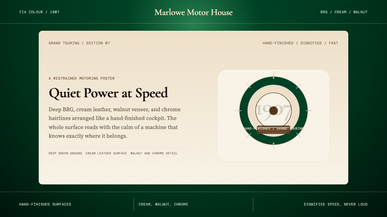 British Racing Green (Motorsport, 1907)Quiet authority at speed. Deep BRG, cream leather, walnut, and chrome hairlin…
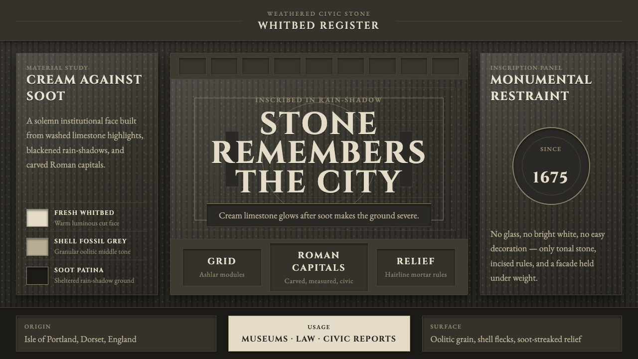 Portland Whitbed StoneCivic stone in shadow. Cream Cinzel capitals glow over soot-black ashlar grai…
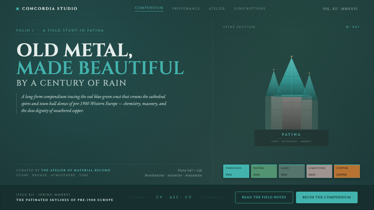 Verdigris Copper RoofOld metal made beautiful by decay. Cool cyan-green patina on dark teal, with…
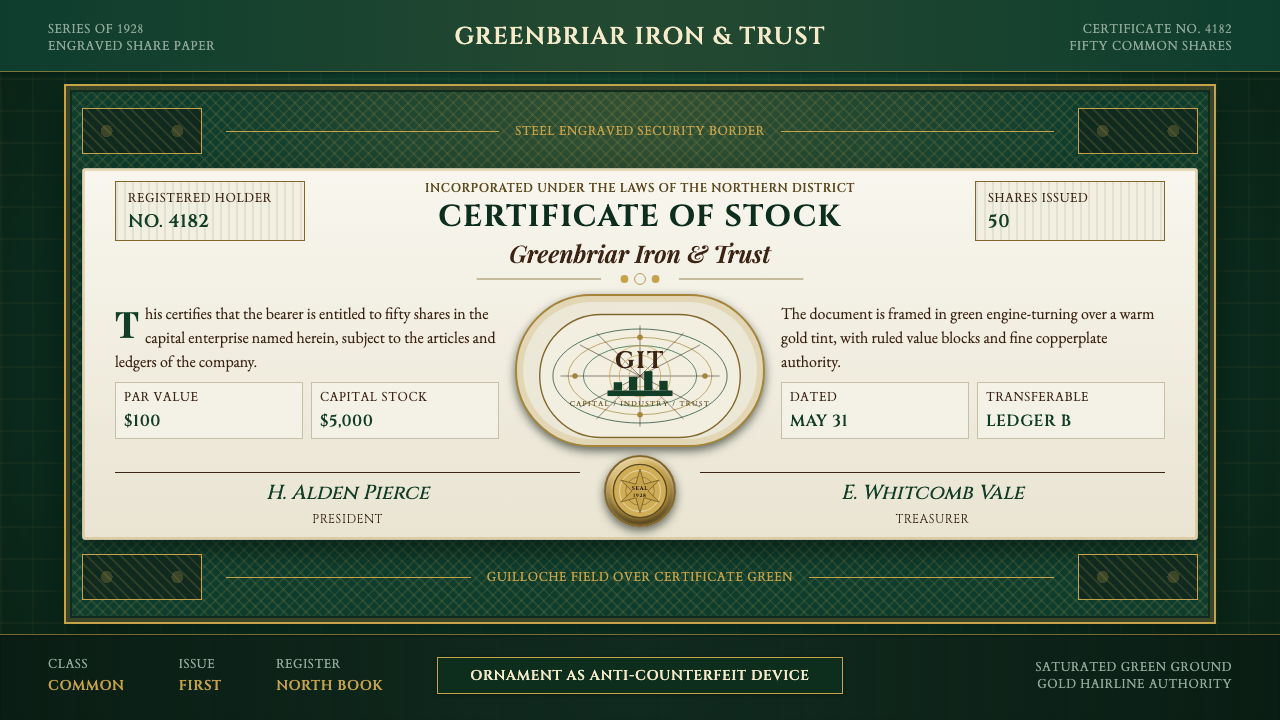 Stock CertificateCapital made ceremonial. Certificate green, gold hairlines, and guilloche bor…
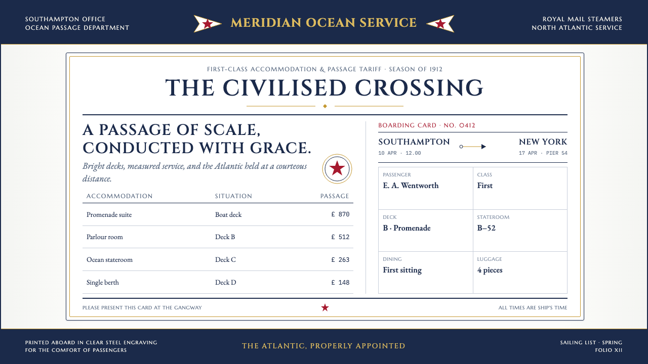 Titanic White Star Line (1912)Service made ceremonial. Navy rules, gilt capitals and a lone red star order…
 Vintage Star ChartScholarly night, gilded. Cinzel caps orbit gold grids and magnitude stars.