What is Titanic White Star Line (1912)?
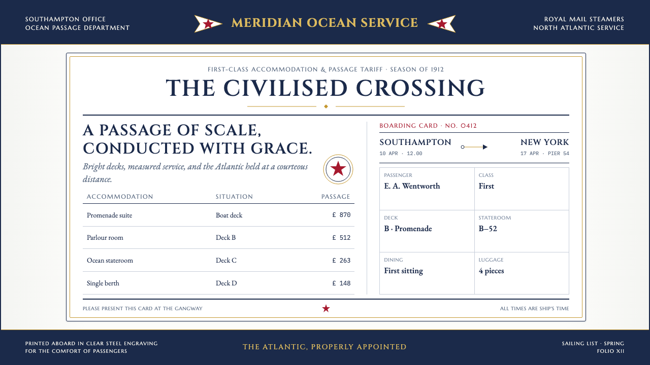
White Star Line turned passage into ceremony: navy rules, gilt Roman capitals, and a solitary red star made even shipboard paperwork feel momentous.
Titanic White Star Line (1912) in brief
Titanic White Star Line is the printed-matter language of a 1912 White Star Line crossing: first-class menus, boarding cards, deck plans, cabin-class fare tables, tickets, and luggage labels. It belongs to the bright, highly ordered world surrounding an Olympic-class voyage, where service was expressed not only through accommodation but through the paper handed to a passenger.
Its visual character comes from Edwardian commercial engraving and steel-plate stationery printing. Crisp engraved letterforms, ruled hairlines, formal tabular structures, and inscriptional Roman capitals give every document an institutional confidence. Information is never casually placed: fares sit inside precise enclosures, headings occupy ceremonial positions, and the company name arrives with the gravity of an inscription.
The style is not an image of catastrophe. It is an image of assurance, scale, and managed hospitality. Bright ship paper creates an open field for dark rules and type; gilt capitals establish prestige; the burgee-red swallowtail star acts as the small but unmistakable sign of line identity. The result is restrained rather than lavish, yet every restraint communicates that the journey has been carefully staged.
Where does Titanic White Star Line (1912) come from?
The style belongs to the 1901–1914 high point of Olympic-class ocean-liner culture. Its geographic center joins Belfast, where Harland & Wolff built the vessels, with the White Star Line office world of Liverpool and Southampton. The printed system therefore stands between industrial construction and passenger administration: monumental machinery on one side, intimate paper transactions on the other.
Titanic was launched in 1911 and made its maiden voyage in April 1912. The visual material associated with that crossing reflects a moment when the ocean liner was presented as a complete service environment. A menu, fare table, or boarding card did more than convey instructions; it helped make the passenger’s movement through the ship legible, formal, and socially framed.
Three overlapping traditions shape the language: Edwardian commercial engraving, Belle Époque ocean-liner design, and steel-plate stationery printing. Together they favor sharp reproduction, controlled lettering, bright paper, and a strong sense of official finish. The page behaves less like casual correspondence than like a compact public document whose authority is visible before it is read.
The source identifies Thomas Andrews, Alexander Carlisle, J. Bruce Ismay, and Lord Pirrie as key figures within this world. Their presence situates the style within a larger Olympic-class undertaking rather than treating stationery as an isolated decorative artifact. The paper system carries the same ambition as the ship itself: coordinated, public-facing, and designed to make scale feel orderly.
What defines the Titanic White Star Line (1912) look?
Bright Ship Paper
The ground is bright and open, allowing typography, rules, and emblems to appear with exceptional clarity. This whiteness is not emptiness; it is the formal stage on which the company’s order is performed. Large untouched areas make the printed elements feel deliberate, clean, and official.
Engraved Typography
Type carries the crispness associated with Edwardian steel engraving. It appears precise without becoming mechanical, retaining the ceremonial character expected of premium travel material. Roman capitals are used inscriptionally for the line name, turning identification into a public declaration of status.
Ruled Order
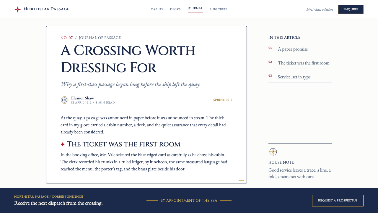
Fine navy rules organize fares, tables, and practical details into contained fields. The line is not decorative trim; it is an administrative instrument. By boxing information and separating categories, it gives complicated travel arrangements a calm, inspectable hierarchy.
Gilt Ceremony
Gilt Roman capitals introduce prestige without overwhelming the page. Their role is concentrated at the level of the line’s name and most ceremonial identifiers, where metallic emphasis can imply permanence and confidence. Gold is therefore an act of announcement, not a general-purpose embellishment.
The Red Star
A burgee-red swallowtail star sits at the masthead as the compact visual signature of the line. Against bright paper and navy structure, it supplies the page’s singular moment of warmth and recognition. Its isolation matters: one small emblem can carry more authority than a field of repeated decoration.
Tabular Hospitality
Fare tables and deck plans show that hospitality here is operational as well as ornamental. Information is arranged for comparison, movement, and decision-making, but never stripped of dignity. The practical page becomes part of the passenger experience because clarity itself is treated as a form of service.
Who shaped Titanic White Star Line (1912)?
Thomas Andrews is named among the key figures connected to the Olympic-class peak. Within this visual context, his name belongs to the larger coordinated undertaking behind the ship and its passenger-facing world, where the scale of the vessel and the precision of its printed matter reinforce one another.
Alexander Carlisle appears among the source material’s key figures. His inclusion places the stationery language inside the broader Belfast and White Star Line world, where a crossing was conceived not as transport alone but as a complete, carefully presented service environment.
J. Bruce Ismay is identified as a key figure in the White Star Line context. The printed identity associated with the line shows how corporate presence could be made tangible at passenger scale, through cards, menus, tariffs, and marks that repeated a disciplined public voice.
Lord Pirrie is included among the key figures of the period. His presence connects the style to the industrial and administrative scale implicit in Olympic-class travel, where highly finished paper objects translated a vast maritime enterprise into manageable, personal encounters.
How do you use Titanic White Star Line (1912) today?
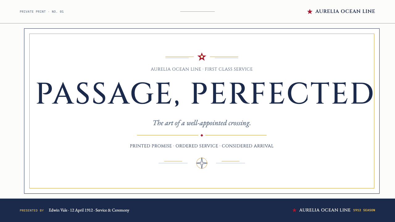
For presentation covers, use the style as an act of formal arrival. Place an inscriptional title in a commanding position on a bright field, support it with restrained navy rules, and let a single red star or swallowtail-inspired mark establish identity. The composition should feel issued rather than illustrated: a document of occasion, not a decorative poster.
For content and data slides, borrow the fare-table logic. Use fine rules to group facts, make headings visibly distinct from explanatory copy, and give charts the same disciplined enclosure as a tariff card. Data should appear inspectable and composed, with emphasis arising from alignment, title treatment, and one carefully reserved accent rather than from visual noise.
For web interfaces, the language suits dashboards, account areas, reservations, pricing, and itinerary tools. Bright backgrounds, navy separators, formal headings, and clearly enclosed information can make dense systems feel reassuring. The red emblem should remain a rare signal for the most consequential brand or action moment, rather than becoming a routine decorative color.
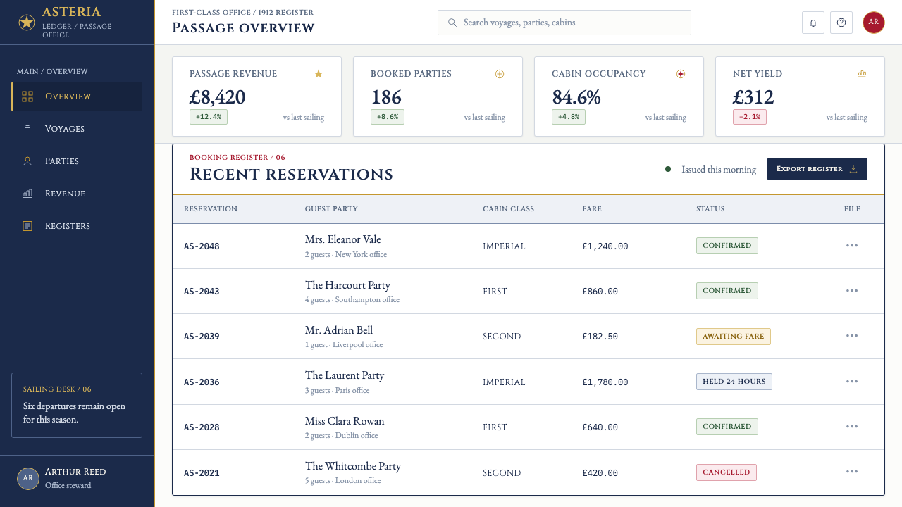
For editorial and marketing work, treat the page as a piece of premium correspondence. Use generous open paper around a strong masthead, frame schedules or offers as dignified tables, and let serif capitals mark institutional moments. This is especially effective for heritage hospitality, travel stories, invitations, and products that need to convey deliberation without theatrical excess.
The common mistake is to turn the style into generic luxury nostalgia: scattered gold effects, crowded crests, distressed paper, or excessive maritime motifs. White Star Line’s printed language is compelling because it is controlled. Keep the paper bright, the rules purposeful, the typography formal, and the red star solitary; ceremony depends on restraint.
Titanic White Star Line (1912) — FAQ
Is this style only appropriate for Titanic-related projects?
No. Its transferable qualities are ceremonial service, formal information design, bright paper, engraved authority, and disciplined brand marking. It can suit hospitality, travel, membership, invitation, archival, and premium administrative contexts. The important distinction is to use the underlying order rather than relying on ship imagery or disaster associations.
How should the red star be used?
Use it as a singular identifying event. In the source material, the burgee-red swallowtail star sits at the masthead, where it has maximum recognition and minimum competition. Repeating it as a pattern weakens its role; its authority comes from being the one compact interruption within an otherwise navy, gilt, and bright-paper system.
Does the style require literal gilt printing?
No. What matters is the hierarchy associated with gilt capitals: the line name or highest ceremonial label receives a distinct, elevated treatment. In digital work, that sense of distinction can be conveyed through restrained contrast, placement, and typographic form, without turning every heading into a metallic ornament.
Can this language work in a dense interface?
Yes, particularly where users need to compare records, prices, routes, reservations, or account details. The source material already demonstrates dense information handled through ruled enclosures and fare-table structures. The requirement is to preserve breathing room around groups and to make every rule explain a real relationship rather than merely decorate the screen.
What most quickly makes a design feel inauthentic?
Excess is the fastest failure. Too many nautical symbols, too much gold, ornamental borders with no informational role, or an abundance of red all undo the source material’s restraint. The authentic effect comes from a bright field, crisp hierarchy, navy structure, ceremonial capitals, and one red emblem carrying the burden of recognition.
Related design styles
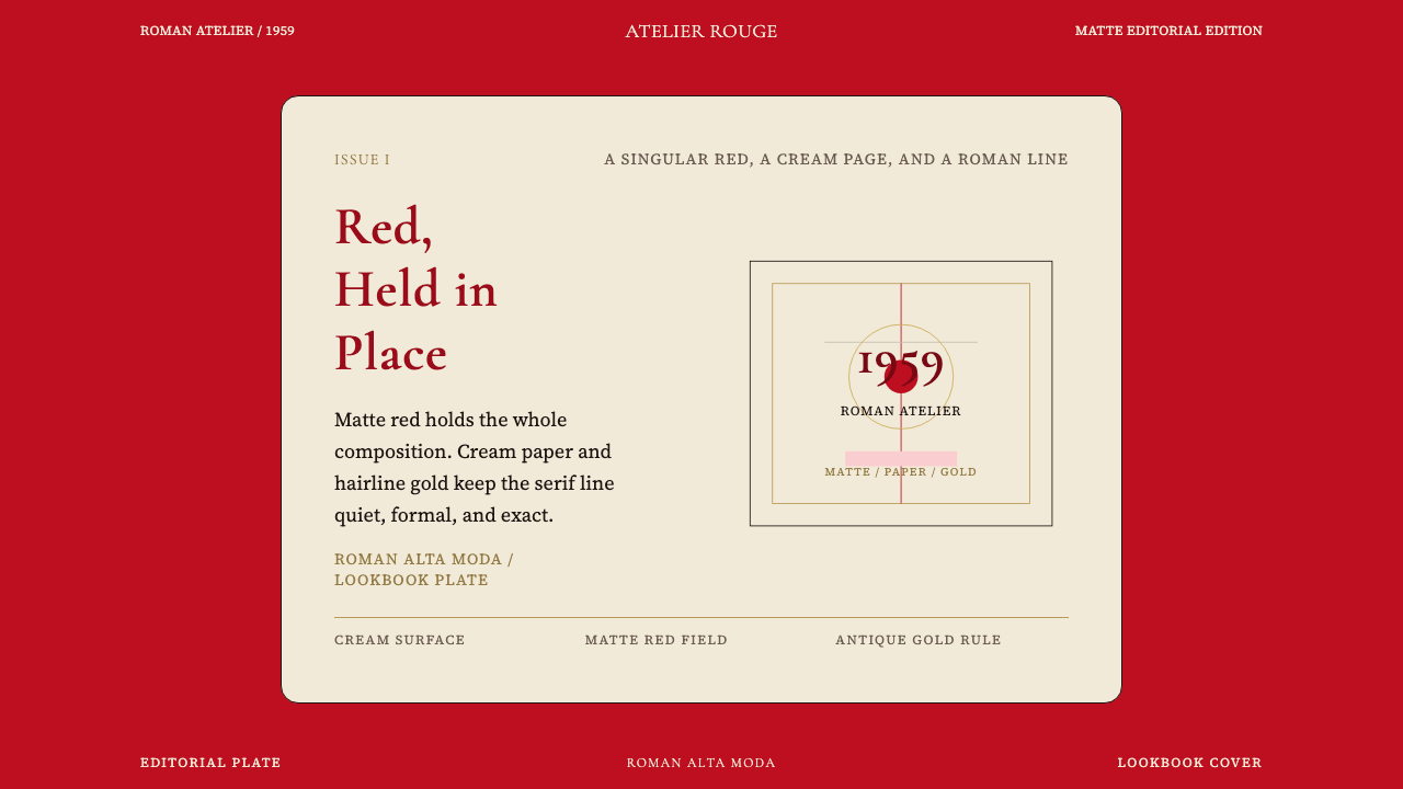 Valentino Rouge Couture (1959)Matte couture red holds the page. Cream paper and hairline gold keep it cerem…
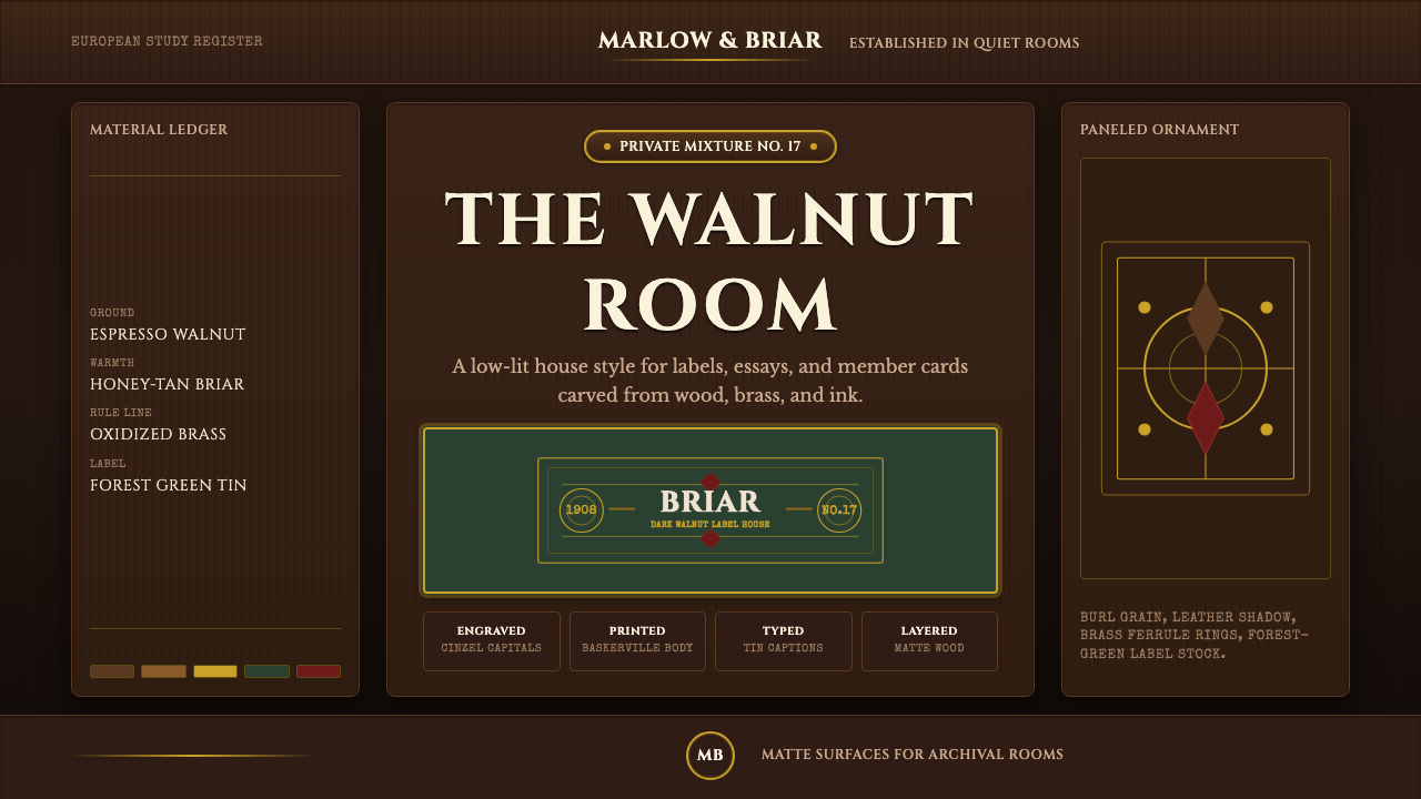 Briar Pipe & TobaccoWarm gloom, precisely aged. Brass rules and Cinzel capitals sit on espresso w…
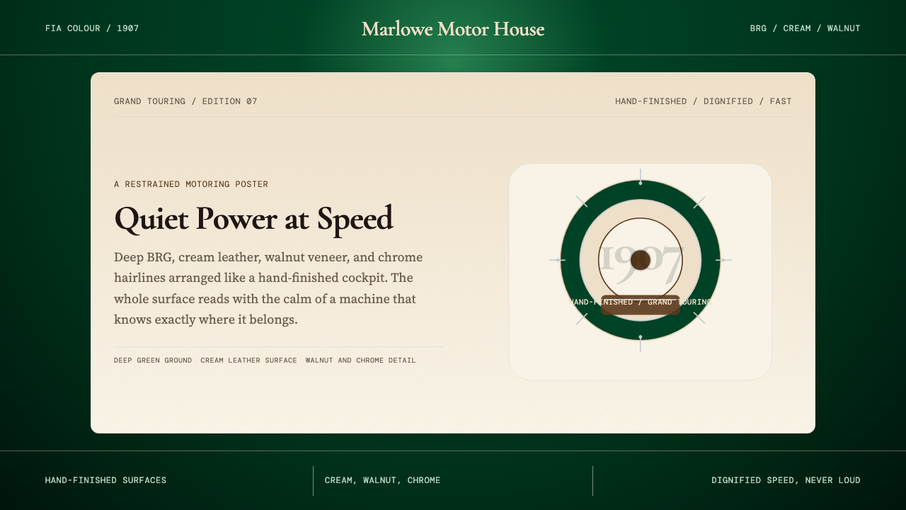 British Racing Green (Motorsport, 1907)Quiet authority at speed. Deep BRG, cream leather, walnut, and chrome hairlin…
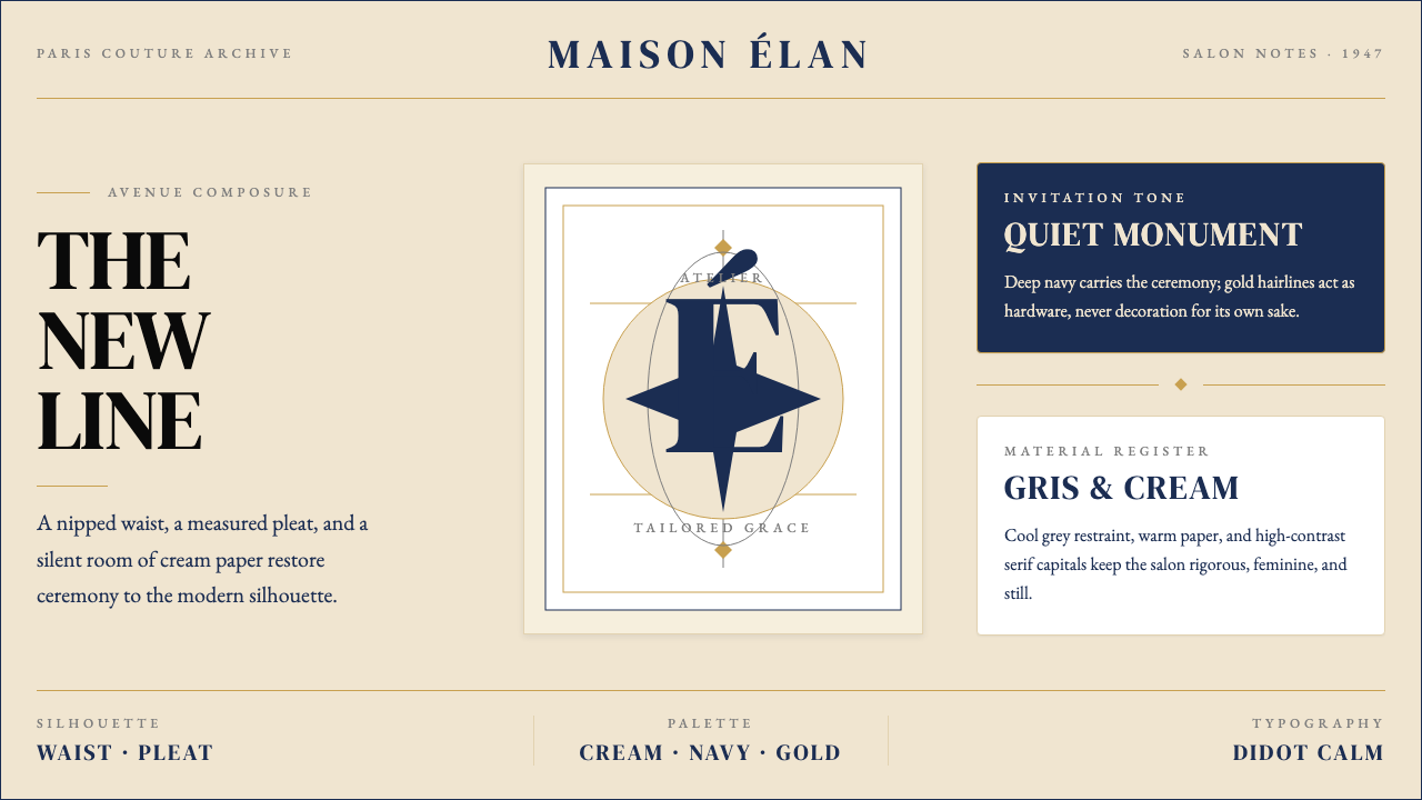 Dior New Look (1947)Couture speaks softly. Cream ground, navy Didot capitals, and gold hairlines…
 Wiener Secession (Klimt)Opulence made modern. Teal grounds, gold inlay, vesica frames and Cormorant d…
 Wimbledon GrassHeritage, not stadium. Championship green ground, purple-and-green livery, go…