What is Valentino Rouge Couture (1959)?什么是 Valentino Rouge Couture (1959)?
A single matte red encountered at a Barcelona opera became the most recognized couture signature of the twentieth century.一抹在巴塞罗那歌剧院邂逅的哑光红,成为二十世纪辨识度最高的高定标志色。
Valentino Rouge Couture (1959) in briefValentino Rouge Couture (1959) 速览
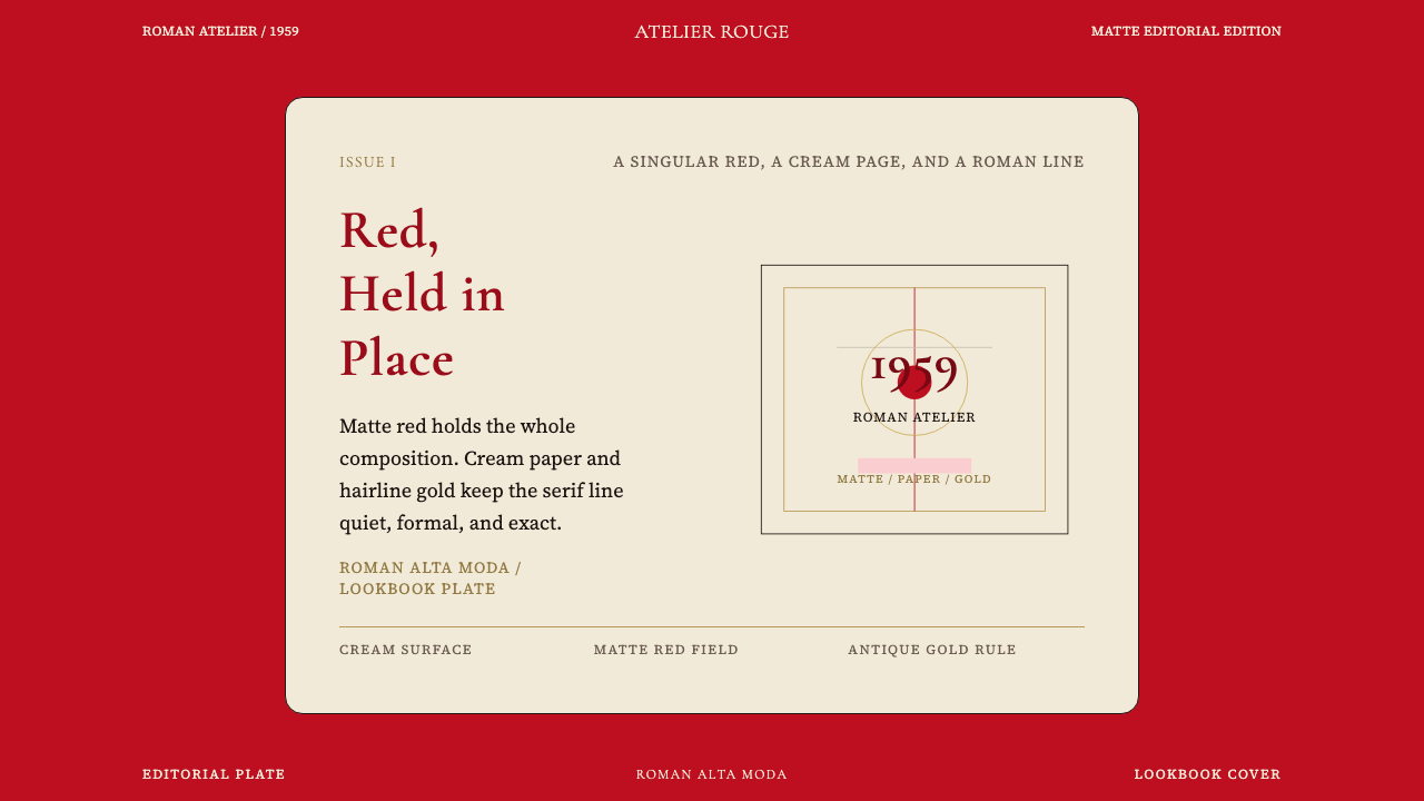
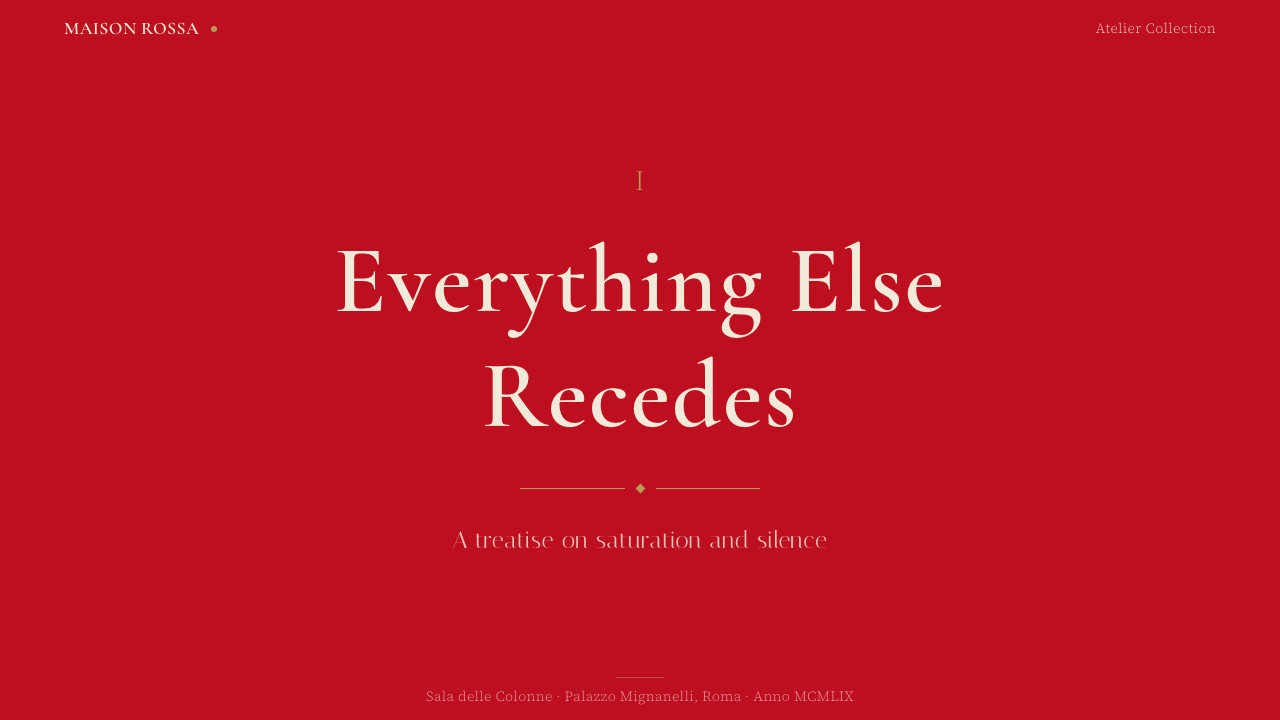
Valentino Rouge Couture (1959) is a design system built around Rosso Valentino — the deep, non-negotiably matte red that Valentino Garavani first encountered at a Barcelona opera performance in the 1950s and formally established as his house signature when he opened his atelier on Via Condotti in Rome in 1959. The system is not simply a color choice; it is an entire editorial sensibility in which one saturated hue dominates, supported by cream paper surfaces, transitional serif letterforms, and the disciplined gold ornament of Roman alta moda.「瓦伦蒂诺高定红(1959)」是一套以罗索·瓦伦蒂诺为核心构建的设计系统——这抹深沉、决绝哑光的红色,是瓦伦蒂诺·加拉瓦尼1950年代在巴塞罗那歌剧院首次邂逅、并于1959年在罗马孔多蒂大街开设工坊时正式确立为品牌标志的色彩。这套系统并不仅仅是一个色彩选择,而是一套完整的编辑美学:一种饱和色调占据主导,奶油纸面、过渡衬线字体与罗马高级定制传统中克制的金色点缀共同托举着这份主调。
What makes the visual language distinctive is the character of the red itself. It is neither the pure primary red of graphic modernism nor the warm orange-shifted red of consumer packaging. It occupies a specific zone — fully saturated, tonally rich, and decisively matte — that reads as ceremonial rather than loud. Everything else in the system exists to preserve and amplify that reading: cream grounds that soften contrast without undermining authority, gold accents that signal craftsmanship without competing for attention, and typography drawn from the transitional serif tradition that bridges classical Roman letterforms with the editorial clarity of modern fashion publishing.这套视觉语言的独特之处,在于那抹红本身的气质。它既非图形现代主义的纯正三原色红,也非消费品包装中偏橙的暖红,而是占据着一个特定的区域——充分饱和、色调丰富、决然哑光——读来是庄严感,而非张扬。系统中的其余一切都为了保存并放大这种感受:奶油底面柔化了对比而不削弱权威,金色点缀传递工艺感而不争夺注意力,源自过渡衬线传统的字体在古典罗马字形与现代时尚出版的编辑清晰度之间架起桥梁。
The system encodes a particular hierarchy of luxury: understatement achieved through restraint, not absence. Where other high-fashion houses have periodically chased trend cycles, the Valentino visual identity has maintained a continuity across six decades that is itself a form of authority. The design language does not shout; it assumes the viewer will recognize what it means, and that assumption is part of the statement.这套系统编码了一种特定的奢华层级:以克制而非缺失来实现低调。当其他顶级时装屋周期性地追逐潮流时,瓦伦蒂诺的视觉识别在六十余年间保持着连续性——而这种连续性本身就是一种权威形式。这套设计语言不高声宣告;它假设观者自会读懂其含义,而这种假设本身就是陈述的一部分。
See the Valentino Rouge Couture (1959) design system查看 Valentino Rouge Couture (1959) 完整设计系统
Where does Valentino Rouge Couture (1959) come from?Valentino Rouge Couture (1959) 从何而来?
Valentino Garavani was born in 1932 in Voghera, a small town in Lombardy, and developed his passion for fashion as a teenager watching American films and copying dress designs from cinema magazines. He trained in Paris — at the Chambre Syndicale de la Couture Parisienne and subsequently at the ateliers of Jean Dessès and Guy Laroche — absorbing the rigorous construction methods and editorial perfectionism of French haute couture. But his visual imagination remained attached to the color world he had encountered as a young man: specifically, to the concentrated, velvety red of operatic stage lighting and velvet upholstery.瓦伦蒂诺·加拉瓦尼1932年生于伦巴第的小镇沃盖拉,少年时代通过观看美国电影、临摹电影杂志上的服装设计萌生了对时装的热情。他在巴黎接受训练——先后就读于法国高级定制工会学校,再至让·戴塞和盖·拉罗什的工坊——汲取了法国高级定制的严格制作工艺与近乎苛刻的编辑完美主义。然而他的视觉想象力始终与年少时邂逅的色彩世界相连:尤其是歌剧舞台灯光与天鹅绒软饰中那种浓缩的、丝绒般的红。
The founding event most frequently cited in accounts of the house is Garavani's visit to the Gran Teatre del Liceu in Barcelona in the mid-1950s, where an entire audience dressed in red — gowns, accessories, flower arrangements — produced what he later described as an overwhelming sensory impression. The red he observed was not a single flat hue but a family of deep, saturated values unified by their refusal of orange-warmth or blue-coolness: a red that existed entirely on its own terms. He returned to Paris and Rome determined to work toward that color. When he opened his Via Condotti atelier in July 1959, the house signature was already implicit in his first collection's palette.在叙述品牌创立时被引用最多的关键事件,是加拉瓦尼1950年代中期造访巴塞罗那利塞乌大剧院时的经历——整个观众席都沉浸在红色之中:礼服、配饰、花艺布置,那种压倒性的感官冲击令他此后多次追忆。他所目睹的红并非单一的平面色调,而是一族深沉、饱和的色值,彼此以拒绝橙暖或蓝冷为统一原则——一种完全自成一格的红。他回到巴黎与罗马,立志要在自己的作品中实现那种色彩。1959年7月,当他在孔多蒂大街开设工坊时,品牌标志色已然隐含在第一个系列的色板之中。
The formal consolidation of Rosso Valentino as a recognized brand identity element came gradually through the 1960s, as Garavani's business partner and lifelong collaborator Giancarlo Giammetti — who joined the house in 1960 — helped develop the operational and visual infrastructure that would carry the color identity into advertising, packaging, and retail environments. The iconic red dress worn by Jacqueline Kennedy at a 1962 White House dinner brought international attention, and from that moment the association between Valentino and a particular register of red became self-reinforcing in the cultural imagination.罗索·瓦伦蒂诺作为可识别品牌识别元素的正式确立,是1960年代逐步完成的。加拉瓦尼的商业伙伴兼终身合作者詹卡洛·贾梅蒂——1960年加入品牌——帮助建立了将这种色彩识别延伸至广告、包装与零售空间的运营与视觉基础设施。1962年,杰奎琳·肯尼迪在白宫晚宴上身着标志性红裙,使瓦伦蒂诺获得国际瞩目;自此,这个品牌与某种特定红色音调的关联在文化想象中形成了自我强化的印记。
The broader context is the post-war renaissance of Italian fashion. In the late 1940s and 1950s, a deliberate effort by Italian industrialists, press, and the government-backed promoter Giovanni Battista Giorgini positioned Italy as a rival to Paris in high fashion. The Sala Bianca shows at the Palazzo Pitti in Florence from 1951 onward gave Italian couture a collective international stage. Into this environment, the Rome-based Valentino house — with its unambiguous reference to the grandeur of Roman history, the quality traditions of Italian tailoring, and the decorative richness of the Baroque — offered a distinct proposition: neither the intellectual rigor of French couture nor the casual sportswear idiom developing in American fashion, but the specific sensory opulence of the Mediterranean alta moda tradition.更广泛的背景是战后意大利时尚的复兴。1940年代末至1950年代,意大利工业界、媒体以及由乔瓦尼·巴蒂斯塔·焦尔吉尼主导推动的政府支持的时尚运动,将意大利确立为挑战巴黎高定的竞争者。从1951年起,在佛罗伦萨碧提宫白厅举办的系列发布会为意大利高定提供了集体性的国际舞台。在这一背景下,以罗马为根据地的瓦伦蒂诺——以无歧义的方式指涉罗马历史的宏大、意大利裁缝的品质传统与巴洛克的装饰丰盛——提出了一个独特的命题:既非法国高定的智识严苛,也非美国时装发展中的休闲运动风格,而是地中海高级定制传统所特有的感官奢华。
What defines the Valentino Rouge Couture (1959) look?Valentino Rouge Couture (1959) 的视觉特征是什么?
The Dominant Red主导红
Rosso Valentino is the system's absolute center of gravity. Its specific character — fully saturated but emphatically matte, neither orange-warm nor blue-cool, carrying the visual weight of velvet without its texture — distinguishes it from every adjacent red in the design spectrum. It is used at commanding scale: as a background that fills the entire field, as an object color applied to the primary garment or product, or as the dominant block in a layout. The system is designed to support this red, not to compete with it.罗索·瓦伦蒂诺是整套系统绝对的重心所在。它的具体气质——充分饱和却决然哑光,既不偏橙暖也不偏蓝冷,携带天鹅绒般的视觉重量却没有其质感——将它与设计光谱中所有相邻的红区别开来。它以主导性的尺度被使用:作为铺满整个画面的背景,作为施于主体服装或产品的物体色,或作为版面中的主色块。系统的其他一切都是为了托举这抹红,而非与之竞争。
Cream and Ivory Ground奶油与象牙底面
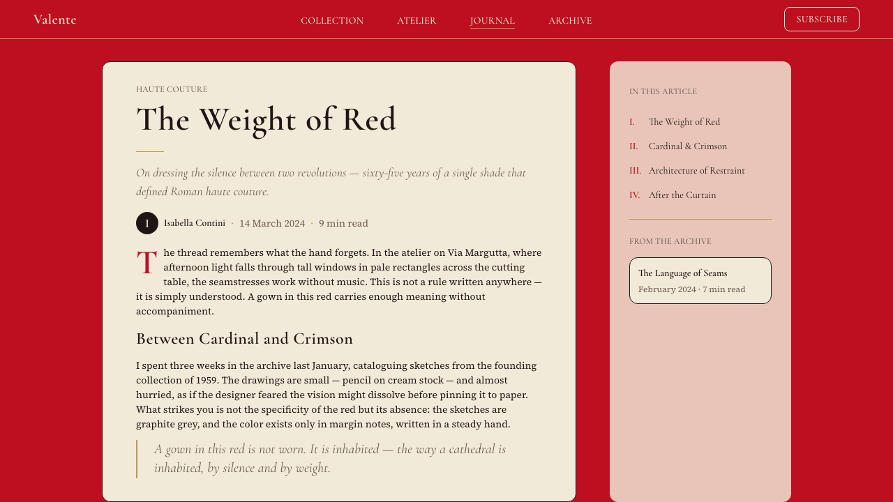
Where the red does not dominate, the ground is cream or warm ivory — never cold white. This choice is not arbitrary: it references the specific warmth of couture paper, the aged surfaces of Roman architecture, and the warm parchment of atelier sketches. Against cream, the red reads with slightly more depth and less harshness than it would against a cold white ground. The cream surface also gives the system its tactile association — the layout suggests a physical material, a letterhead, a certificate, rather than a backlit screen.红色不占主导的地方,底面是奶油色或暖象牙色——绝非冷白。这个选择并非任意而为:它指涉的是高定用纸的特定温度、罗马建筑古旧表面的暖调,以及工坊手稿的羊皮纸质感。在奶油底面上,红色的呈现比在冷白底面上更有深度、少了几分刺眼。奶油底面也赋予了整套系统其触觉联想——版面暗示的是一种实体材质:信笺、证书,而非背光屏幕。
Restrained Gold Accent克制的金色点缀
Gold appears in the system as a fine signal, not a field. It reads in hairline rules, in the fine lines of embossed ornament, in the weight of a letterform at display scale, or in a narrow band that frames rather than fills. The gold is always restrained — it is a mark of craft and ceremony, not a statement of wealth. Used excessively, it collapses into ostentation; used as a hairline or a narrow rule, it elevates the surrounding elements by suggesting the atelier's manual precision.金色在系统中作为精细信号出现,而非底色。它呈现于细如发丝的线条、压印装饰的纤细纹路、展示字号的字形重量,或是用于框架而非填充的细窄带状元素。金色始终是克制的——它是工艺与庄典的标记,而非财富宣言。过度使用会坠入炫耀;作为发丝线或细窄规则线使用时,它以暗示工坊手工精准的方式提升了周围的元素。
Transitional Serif Typography过渡衬线字体排印
The typographic register is the transitional serif — the category of letterforms that emerged in the eighteenth century, characterized by moderate stroke contrast, slightly angled stress, and bracketed serifs that give the type both editorial authority and approachable warmth. This choice anchors the system in a tradition that predates modernism and references the history of European fine printing. Type is set with generous line spacing at display scale, allowing each letterform to be read as an individual object, and with disciplined measure in text settings that conveys deliberateness rather than abundance.字体排印的语域是过渡衬线——这一字形类别兴起于十八世纪,特征是适度的笔画粗细对比、略微倾斜的轴向应力,以及括弧衬线——赋予字体既有编辑权威又不失亲和温度。这一选择将系统锚定于一个早于现代主义的传统,并指涉欧洲精细印刷的历史。展示字号以宽裕的行距设置,让每个字形都可被作为独立对象阅读;正文字号以克制的行宽处置,传达的是审慎而非堆砌。
Matte Surface Aesthetic哑光表面美学
The system refuses shine at every level. The red is matte, not lacquered. The gold is satin, not reflective. Background surfaces carry no gloss. This matte character is not an accident of production but a deliberate signal: in couture culture, a matte finish is understood as more refined than a glossy one, because it asks the viewer to look rather than to be dazzled. Applied to digital surfaces, this means no specular highlights, no gradients that simulate three-dimensionality, no elements designed to catch the eye through surface reflectance.这套系统在每个层面拒绝光泽。红色是哑光的,而非上漆的。金色是缎面的,而非反光的。背景表面不携带光泽。这种哑光特质并非生产上的偶然,而是蓄意为之的信号:在高定文化中,哑光饰面被理解为比光泽饰面更为精致,因为它要求观者「看」,而非被「炫目」。应用于数字表面,这意味着没有高光反射,没有模拟三维感的渐变,没有依靠表面反射率吸引眼球的元素设计。
Ceremonial Composition庄仪式感构图
Layouts in this system observe a formal, centered gravity when a single subject is presented, or a deliberate asymmetric balance when hierarchy must be articulated across multiple elements. There is always significant negative space — the couture atelier does not crowd. White or cream margins are treated as part of the composition, not as empty leftover. Borders, where they appear, are fine rather than bold, suggesting the ruled line of a printed card rather than the assertive frame of a poster.这套系统的版面在呈现单一主体时遵循正式的、居中的重力感;在多元素间需要传达层级时,则保持一种审慎的非对称平衡。负空间始终充裕——高定工坊从不拥挤。奶油或白色留白被视为构图的组成部分,而非空余的剩余。边框若有出现,则是细线而非粗线,暗示的是印刷名片的刻线,而非海报式的宣示性边框。
Roman Alta Moda Reference罗马高级定制传统指涉
The system carries a specific cultural geography: Rome, not Milan, not Paris. Roman alta moda is characterized by a decorative richness inherited from Baroque and Neoclassical visual culture, a sense of historical continuity that manifests as confidence rather than nostalgia, and an alignment with the ceremonial occasions of Italian civic and religious life. These references surface in the choice of ornamental vocabulary — the fine acanthus border, the seal-like logo treatment, the ceremonial red that functions like the red of a cardinal's vestment or the wax seal of a formal document.这套系统携带着特定的文化地理:是罗马,而非米兰,也非巴黎。罗马高级定制以从巴洛克与新古典视觉文化继承而来的装饰丰富性为特征,以一种化为自信而非怀旧的历史延续感,以及与意大利公民和宗教礼仪场合的内在对应。这些指涉浮现于装饰语汇的选择中——细腻的茛苕叶边,印章般的标志处理,以及那种庄典的红——宛如枢机主教法衣的红,或正式文书蜡封的红。
See the Valentino Rouge Couture (1959) design system查看 Valentino Rouge Couture (1959) 完整设计系统
Who shaped Valentino Rouge Couture (1959)?谁塑造了 Valentino Rouge Couture (1959)?
Garavani founded the house on Via Condotti in Rome in 1959 after training at the ateliers of Jean Dessès and Guy Laroche in Paris. His personal aesthetic — shaped by a childhood passion for cinema glamour and a formative encounter with a Barcelona opera audience dressed entirely in red — gave the house its irreducible visual signature. Over the following decades he dressed royalty, film stars, and political figures, and the consistency with which he returned to his signature red established it as one of the most recognized proprietary colors in fashion history. He retired in 2007 after fifty years at the helm of the house.加拉瓦尼在巴黎让·戴塞和盖·拉罗什工坊接受训练后,于1959年在罗马孔多蒂大街创立了这家时装屋。他的个人美学——由少年时代对电影魅力的热情以及在巴塞罗那歌剧院与一片红色观众席的邂逅共同塑造——赋予了品牌无可化约的视觉标志。此后数十年间,他为皇室成员、电影明星与政界人士设计服装,而他对标志性红色的持续回归,将其确立为时尚史上辨识度最高的专属色彩之一。2007年,在执掌品牌五十年后,他宣告退休。
Giammetti met Garavani in Rome in 1960 and joined the house immediately, becoming the business and operational counterpart to Garavani's creative vision. Over nearly five decades of partnership, Giammetti built the infrastructure that transformed the atelier into an international luxury brand — overseeing the visual identity system, the expansion of retail and licensing operations, and the translation of the couture house's aesthetic values into communications and marketing. The consistency and discipline of the Valentino visual identity across its first fifty years owes a substantial debt to his stewardship.贾梅蒂于1960年在罗马与加拉瓦尼相识,随即加入品牌,成为加拉瓦尼创意愿景在商业与运营层面的对应伙伴。近五十年的合作中,贾梅蒂建立了将这家工坊转变为国际奢侈品牌所需的全部基础设施——监管视觉识别系统、零售与授权业务的扩张,以及高定工坊美学价值向传播与市场营销的转化。瓦伦蒂诺视觉识别在头五十年间的连贯性与纪律性,在很大程度上归功于他的管理。
Chiuri served as co-creative director of Valentino alongside Pier Paolo Piccioli from 2008, following Garavani's retirement, and left for Dior in 2016. During her tenure the house maintained the foundational red signature while expanding its vocabulary with influences from Roman art history, folk embroidery, and archival couture references. Her work demonstrated that the Valentino visual identity could absorb new cultural material without losing the gravitational pull of the original color system.2008年加拉瓦尼退休后,基乌里与皮耶尔·保罗·皮乔利共同出任瓦伦蒂诺联合创意总监,至2016年转赴迪奥。任职期间,品牌在保持标志性红色核心的同时,将罗马艺术史、民间刺绣与高定档案参照纳入其视觉语汇。她的工作证明了瓦伦蒂诺视觉识别能够吸纳新的文化材料,而不失去原始色彩系统的引力。
Piccioli became sole creative director of Valentino in 2016 and led the house through a period of significant critical and commercial renaissance. His most commented contribution to the visual identity was the 2022 Pink PP collection, in which the entire range — clothing, set design, accessories, and show environment — was executed in a single ultra-saturated fuchsia pink. The collection demonstrated that the Valentino monochrome strategy — establishing absolute chromatic dominance as a compositional principle — was transferable beyond Rosso Valentino to any hue when applied with sufficient commitment and coherence.皮乔利于2016年出任瓦伦蒂诺唯一创意总监,带领品牌经历了一段重要的批评与商业复兴期。他对品牌视觉识别最受瞩目的贡献是2022年「Pink PP」系列——整个系列的服装、舞台设计、配饰与发布会环境,全部以单一的超高饱和玫瑰粉呈现。这个系列证明了瓦伦蒂诺的单色策略——以绝对的色彩主导作为构图原则——在施以充分的承诺与连贯性时,可以突破罗索·瓦伦蒂诺本身,转移至任何色调之上。
Kennedy's role in the Valentino house's history is as much semiotic as biographical. When she appeared at a 1962 White House dinner in a Valentino red dress, the image was reproduced internationally and permanently linked the house's signature color to a specific register of public, ceremonial authority. The association was reinforced when she wore Valentino for her 1968 wedding to Aristotle Onassis. Kennedy was not a designer or a cultural theorist, but her choices constituted a form of cultural endorsement whose effect on the Valentino color identity was lasting and precise.肯尼迪在瓦伦蒂诺品牌史中的角色,与其说是传记性的,不如说是符号学意义上的。1962年她身着瓦伦蒂诺红裙出席白宫晚宴,这一图像被国际媒体广泛复制,将品牌标志色与某种特定的公共庄典权威永久地联结在一起。1968年她穿着瓦伦蒂诺礼服与亚里斯多德·奥纳西斯完婚,进一步强化了这一联想。肯尼迪不是设计师也非文化理论家,但她的选择构成了一种文化背书,其对瓦伦蒂诺色彩识别的影响是持久而精准的。
How do you use Valentino Rouge Couture (1959) today?今天怎么用 Valentino Rouge Couture (1959)?
Valentino Rouge Couture works best when the red is allowed to be sovereign. The most common error in applying this system is treating it as a red accent scheme — a red button here, a red headline there — when the logic of the system is actually the reverse: red is the ground from which cream, gold, and dark neutral elements emerge. Correct application means committing to chromatic dominance on at least one major element per composition: a full-bleed red cover slide, a red sidebar that occupies a third of the page, a red hero section on a landing page.「瓦伦蒂诺高定红」在红色被允许成为主权者时效果最佳。应用这套系统最常见的错误是将其当作红色点缀方案来处理——这里一个红色按钮,那里一个红色标题——而这套系统的逻辑恰恰相反:红色是底场,奶油、金色与深色中性元素从中浮现。正确的应用意味着在每个构图中至少有一个主要元素上做出对色彩主导的承诺:满版出血的红色封面幻灯片、占据页面三分之一的红色侧栏、落地页上的红色英雄区块。
For presentation slides, the system produces strong cover and section-break pages. A cover built on this system places the title in cream or ivory serif type against a full-bleed matte red field, with a hairline gold rule as the sole decorative element. Section breaks follow the same logic at reduced scale. Content slides should use a cream or warm white background, with the red reserved for a single call-out, a chart series, or a category label — never scattered across multiple elements simultaneously. Data visualizations take on a ceremonial quality when bar series and pie segments are built from the red-cream-gold family, with dark neutral used for text and axis labels.在演示文稿中,这套系统在封面页和章节分隔页上效果出众。以此系统制作的封面,将标题以奶油或象牙色衬线字排印于满版哑光红底之上,以单根金色发丝线作为唯一装饰元素。章节分隔页以缩小的比例遵循同样的逻辑。内容页应使用奶油或暖白色背景,红色保留给单一的强调文本、图表系列或类别标签——绝不同时散布于多个元素之上。当柱状图系列与饼图扇区从红-奶油-金的色系中取色,文字与坐标轴标签使用深色中性色时,数据可视化便会呈现出一种庄典品质。
For web interfaces, the system is well-suited to luxury brand pages, editorial publications, premium subscription landing pages, and high-end service dashboards where the goal is to communicate authority and refinement rather than approachability. The approach: a cream or warm white base for content areas, red used for primary calls to action and hero sections, gold used only as a border or rule element, and transitional serif type for headings. Navigation should be restrained and typographic. Pricing tiers benefit from the system's natural hierarchy: the recommended tier presented against a red card ground, alternatives on cream.对于网页界面,这套系统尤其适合奢侈品牌页面、编辑型出版物、高端订阅落地页,以及目标是传达权威与精致而非亲和感的高端服务仪表板。方法如下:内容区域使用奶油或暖白底色,红色用于主要行动号召和英雄区段,金色仅用作边框或分割线元素,标题使用过渡衬线字体。导航应克制而字体化。定价层级在这套系统的自然层级中表现出色:推荐层级以红色卡片为底色呈现,其他选项置于奶油色之上。
For editorial and marketing work, the system is strongest in contexts that already carry a cultural association with formality and ceremony: invitations, program covers, campaign hero images, annual report covers, fashion editorial spreads, and luxury product photography backdrops. Marketing copy set in this visual environment reads with higher authority because the surrounding visual signals prime the reader for a register of seriousness. For social media cards and email headers, a tight crop of the red field with cream type at large scale produces immediate recognition without requiring the full system to be present.对于编辑与市场营销内容,这套系统在本身就与正式和庄典场合有文化关联的语境中最为有力:邀请函、演出说明书封面、活动英雄图、年度报告封面、时尚编辑大片,以及奢侈品摄影背景。在这种视觉环境中排版的市场文案,读来具有更高的权威感,因为周围的视觉信号已将读者调频至一种严肃性的阅读模式。对于社交媒体卡片和电子邮件头图,红色底场的紧凑裁切配以大字号奶油色文字,无需完整系统在场便能产生即时的识别感。
A common mistake is importing warmth-diffusing elements that undermine the system's matte authority: soft drop shadows, gradient overlays on the red, ambient glows, or photographic elements with heavy warm filtering. Each of these choices softens the red's character and shifts the register from couture authority toward generic luxury warmth. A second mistake is pairing the system with a condensed or geometric sans-serif typeface in the belief that this modernizes it — the transitional serif is not a period detail but a structural choice that balances the red's weight. Removing it destabilizes the system's tonal range.一个常见错误是引入削弱系统哑光权威的「温度扩散」元素:柔和的投影、红色上的渐变叠加、环境发光,或经过大量暖色调滤镜处理的摄影元素。这些选择中的每一个都会柔化红色的气质,将格调从高定权威滑向泛化的奢华温情。第二个错误是将系统与紧缩或几何无衬线字体配对,以为这样能让它显得更现代——过渡衬线并非时代细节,而是平衡红色视觉重量的结构选择,去掉它会破坏系统的音调幅度。
See the Valentino Rouge Couture (1959) design system查看 Valentino Rouge Couture (1959) 完整设计系统
Valentino Rouge Couture (1959) — FAQValentino Rouge Couture (1959) · 常见问题
Is Rosso Valentino just a branded name for a standard red, or is it a genuinely distinct color?罗索·瓦伦蒂诺只是普通红色的品牌名称,还是一种真正独特的色彩?
It is genuinely distinct in character, though its distinctiveness is qualitative rather than reducible to a single technical specification. The Valentino red sits in a specific zone of the red family: fully saturated but not garish, without the orange warmth of tomato reds or the blue undertone of crimson, and consistently rendered in a matte or near-matte finish. What makes it recognizable is less the precise hue than the combination of saturation level, temperature, and surface quality. Applied in the wrong finish — high-gloss, for instance — or shifted toward orange or toward blue-pink, it immediately becomes something else. The identity lives in the whole combination.它在气质上是真正独特的,尽管这种独特性是定性的,而非可化约为单一技术参数。瓦伦蒂诺红占据红色家族中一个特定的区间:充分饱和而不刺眼,没有番茄红的橙暖底色,也没有深红的蓝色底调,并始终以哑光或近哑光的质感呈现。让它可辨认的,与其说是精确的色相,不如说是饱和度、温度与表面质感的三者组合。若以错误的质感呈现——比如高光泽——或向橙色或蓝粉色偏移,它立即会变成别的东西。这种识别感存在于整体组合之中。
How is this system different from other red-based luxury design languages, such as those used in watch or automotive brands?这套系统与其他以红色为基础的奢华设计语言(如钟表或汽车品牌)有何区别?
The key difference is in what surrounds the red and what role the red plays. Automotive and watch brands that use red typically deploy it as an accent against dark grounds — charcoal, black, or deep navy — which gives the red a high-energy, performance-oriented character. Valentino Rouge Couture inverts this: the red is the ground, and it is surrounded by cream, gold, and dark neutrals that soften its energy into something ceremonial. The typographic register is also different: those brands typically use geometric sans-serifs or condensed display faces that suggest engineering precision, while Valentino uses transitional serifs that reference the history of printed culture.关键差异在于红色周围是什么,以及红色扮演什么角色。使用红色的汽车与钟表品牌,通常将其作为点缀色置于深色底面之上——炭灰、黑色或深海军蓝——这赋予了红色一种高能量、性能导向的气质。瓦伦蒂诺高定红倒置了这一关系:红色是底场,周围是将其能量柔化为庄典感的奶油色、金色与深色中性色。字体排印的语域也不同:那些品牌通常使用暗示工程精准度的几何无衬线或紧缩展示字体,而瓦伦蒂诺使用指涉印刷文化历史的过渡衬线字体。
Can this system work in dark-mode or dark-background contexts?这套系统能在深色模式或深色背景下运用吗?
With significant adaptation, yes, but the canonical system is light-ground and the adaptation involves real trade-offs. On a dark ground, the matte red loses some of its ceremonial weight and risks reading as aggressive or overly saturated. The cream tones that moderate the red on a light ground have no equivalent in a dark scheme. The most workable dark variant uses the red as the dominant background element rather than as an accent — a red panel within a dark layout, for instance — with gold used only as a hairline separator and all body text set in cream or warm white. A full dark inversion of the system is possible but should be considered a distinct sub-system rather than the primary mode.经过较大幅度的适配是可以的,但规范系统是浅色底面的,适配涉及真实的取舍。在深色底面上,哑光红会失去部分庄典重量,并有可能被解读为攻击性或过度饱和。在浅色底面上调和红色的奶油色调,在深色方案中没有对应物。最可行的深色变体是将红色作为主导背景元素使用——比如深色版面中的一块红色面板——金色仅用作发丝分隔线,所有正文以奶油色或暖白色设置。系统的完全深色反转是可能的,但应被视为一套独立的子系统,而非主要模式。
What distinguishes this system from generic Italian luxury branding?这套系统与泛化的意大利奢华品牌设计有何区别?
The specificity of the commitment to a single color at commanding scale. Generic Italian luxury design tends to use red as one element among several — alongside gold, black, and cream, all at similar visual weight — which produces a sense of opulent multiplicity. The Valentino system instead achieves its effect through chromatic singularity: one color dominates, and everything else serves it. The matte quality of the red is also specific — it sets the system apart from the lacquered, high-gloss reds common in Italian automotive and accessories design. Finally, the Roman rather than Milanese reference gives the typographic and ornamental register a different historical weight: more ceremonial, less commercial.区别在于以主导性尺度对单一色彩承诺的特殊性。泛化的意大利奢华设计倾向于将红色作为多种元素之一使用——与金色、黑色和奶油色并置,各自视觉重量相近——产生的是一种富丽的多元感。瓦伦蒂诺系统则通过色彩的单一性来产生效果:一种颜色占据主导,其余一切服务于它。红色的哑光品质也是特殊的——它将这套系统与意大利汽车和配件设计中常见的上漆、高光泽红区别开来。最后,罗马而非米兰的参照赋予了字体排印与装饰语域不同的历史分量:更具庄典感,商业气息更淡。
How should this system be applied to data-heavy or information-dense content without losing its luxury register?如何将这套系统应用于数据密集型内容,而不失去其奢华格调?
The key is preserving the hierarchy of the color: the red must remain the most powerful element in the composition even when the layout is complex. In practice this means using the red only for the single most important data category, a primary call-out number, or the dominant chart series — not as a color-coding system across multiple categories. Tables and dense text should sit on cream grounds with dark neutral type, with thin gold rules used as row separators or section dividers. Restraint in the number of chart types used is also important: one dominant visualization per page, treated with the same compositional singularity as the color. The moment the red is distributed across five or six elements of equal weight, the system's authority collapses into clutter.关键在于保持色彩的层级:即便版面复杂,红色也必须在构图中保持最强大的元素地位。实践中,这意味着红色只用于单一最重要的数据类别、一个主要的强调数字,或主导图表系列——而非跨多个类别的色彩编码系统。表格与密集文字应置于奶油底面、深色中性字,以细金色线作为行分隔或段落分割。限制使用的图表类型数量同样重要:每页一个主导可视化,以与色彩相同的构图单一性处理。一旦红色被分散至五六个等量重量的元素上,系统的权威便会瓦解为混乱。
Related design styles相关设计风格
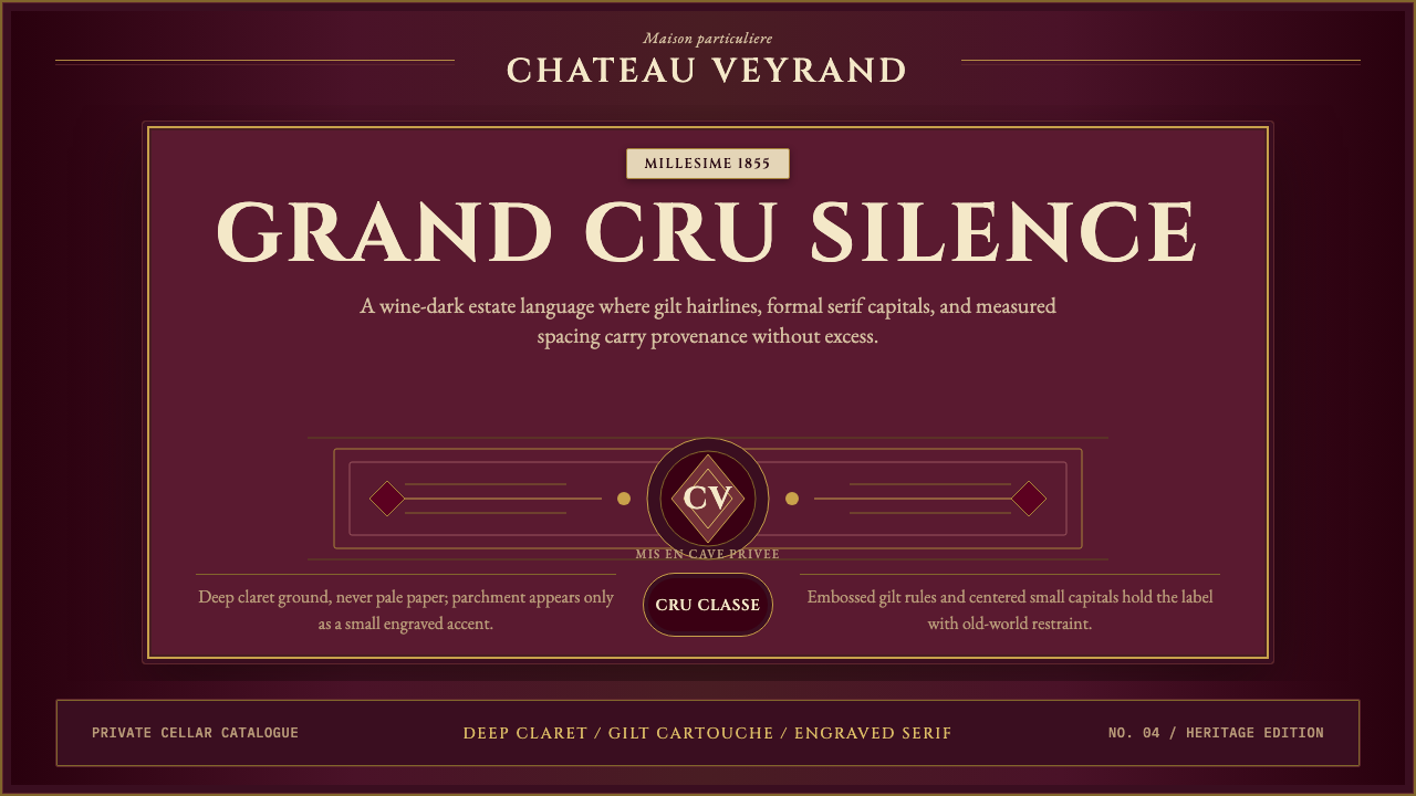 Bordeaux Wine ChâteauAged claret authority. Cinzel capitals, gilt rules, and label symmetry on win…沉静的酒红权威:Cinzel大写、金色细线与酒标式对称。
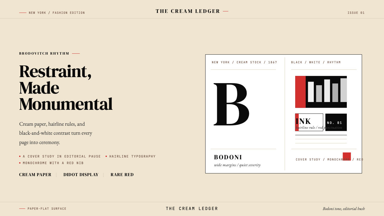 Harper's BazaarLuxury through restraint. Cream paper, Didot scale, and hairline rules carry…克制即奢华。奶油纸底、Didot 尺度与发丝细线撑起戏剧感。
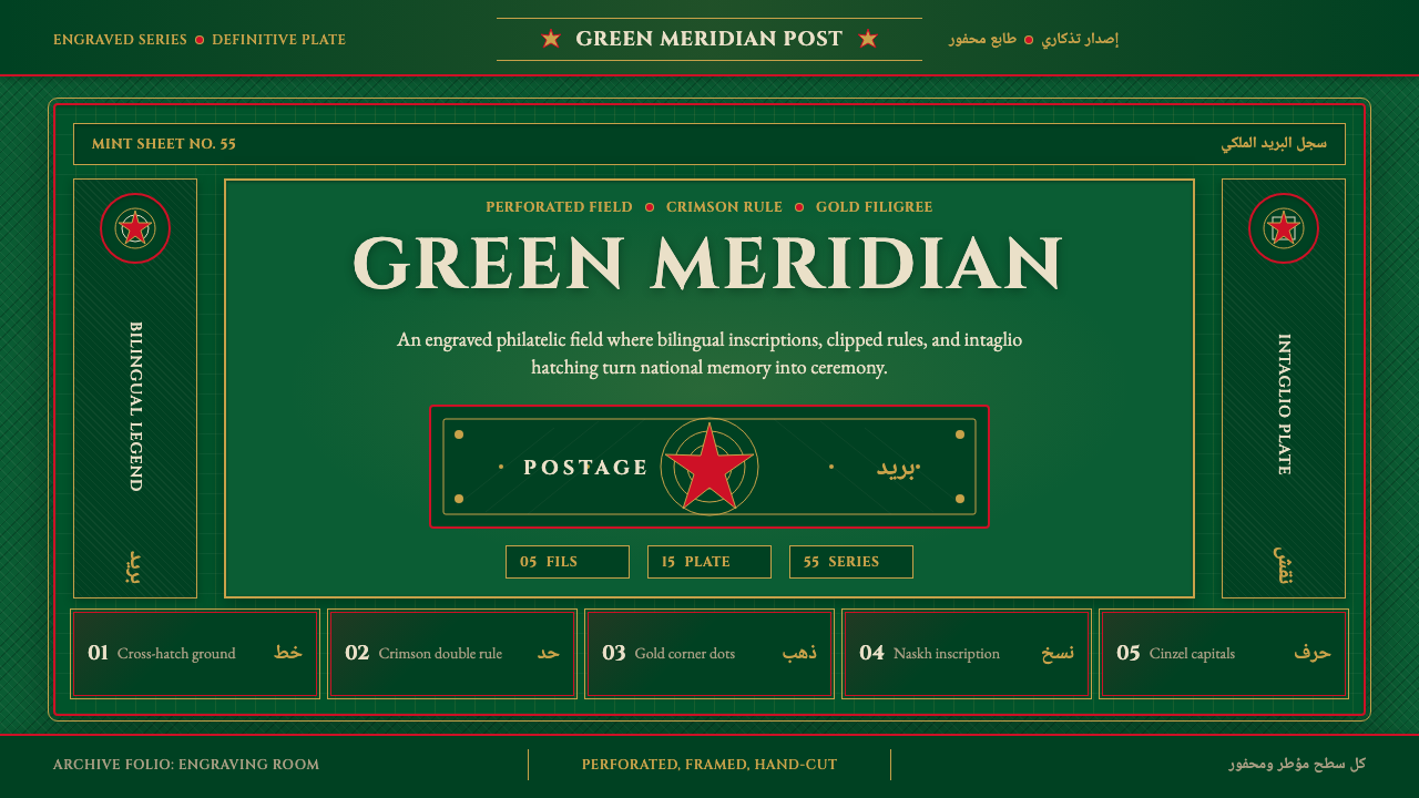 Hashemite Jordan PostageState-postal ceremony. Deep green field, crimson rules, gold filigree, biling…国家邮政的庄重感:深绿底、绯红线、金色花丝与双语票格。
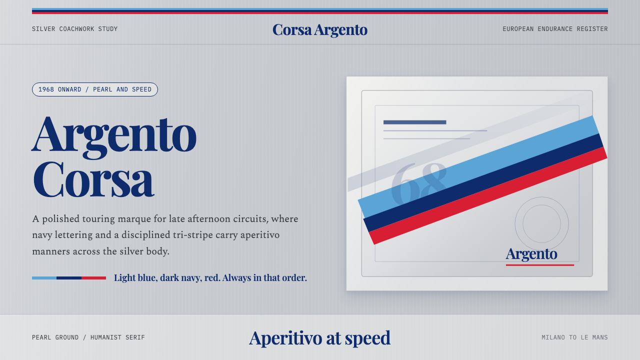 Martini Racing StripesAperitivo elegance at speed. Silver ground, Playfair serif, and a blue-navy-r…速度中的餐前酒优雅:银灰底、Playfair衬线与蓝深蓝红三色带。
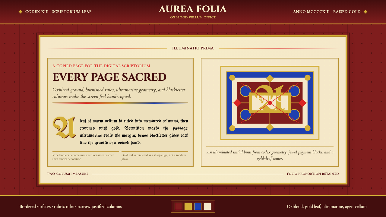 Medieval Illuminated ManuscriptTreats every page as sacred. Oxblood vellum, Cinzel capitals, gold-rule borde…每页皆如圣物:牛血红羊皮纸、Cinzel 大写与金线边框。
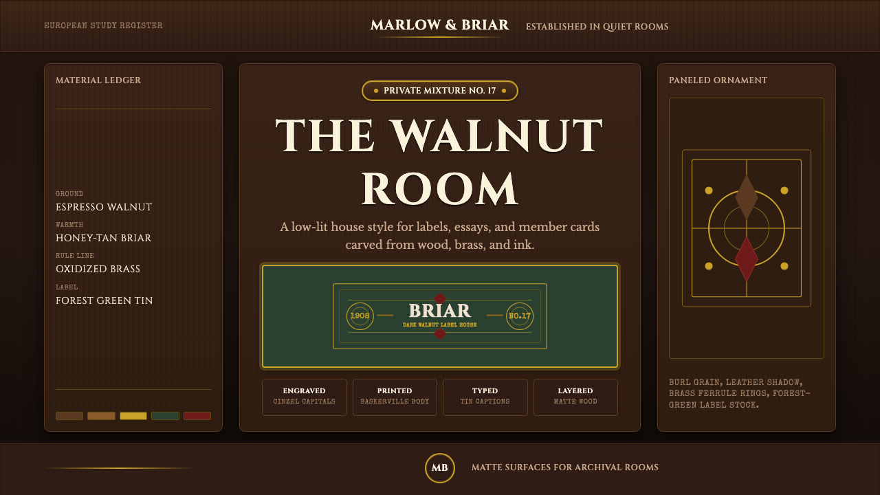 Briar Pipe & TobaccoWarm gloom, precisely aged. Brass rules and Cinzel capitals sit on espresso w…温暖幽暗而考究:黄铜细线与Cinzel大写落在浓咖胡桃木上。