What is Harper's Bazaar?什么是 Harper's Bazaar?
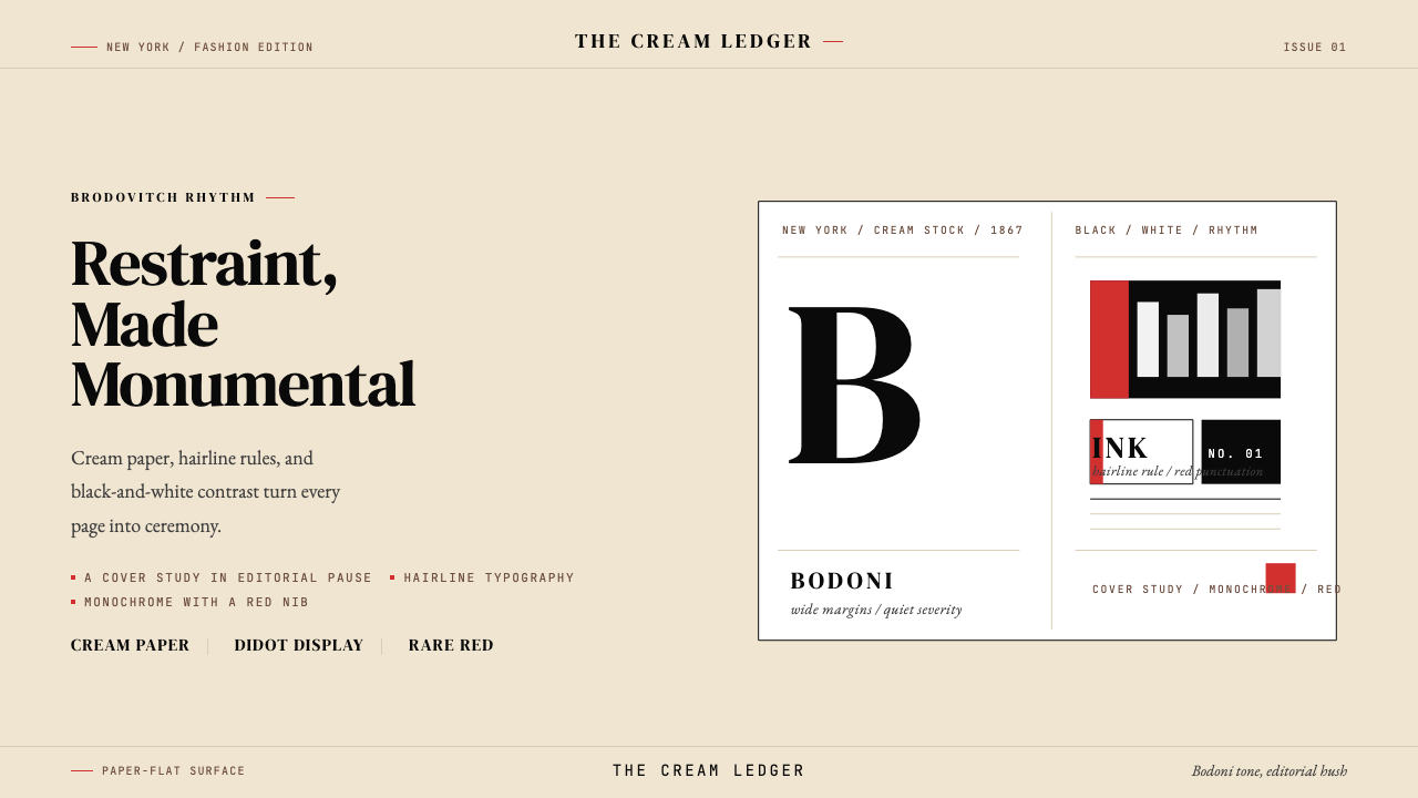
Harper's Bazaar proved that true luxury lives not in decoration but in discipline — cream paper, monumental type, and a single slash of red doing more than a dozen ornaments ever could.《Harper's Bazaar》证明了真正的奢华不在于装饰,而在于克制——奶油纸底、纪念碑式字体与一抹哈泼斯红,胜过无数繁复的装饰。
Harper's Bazaar in briefHarper's Bazaar 速览
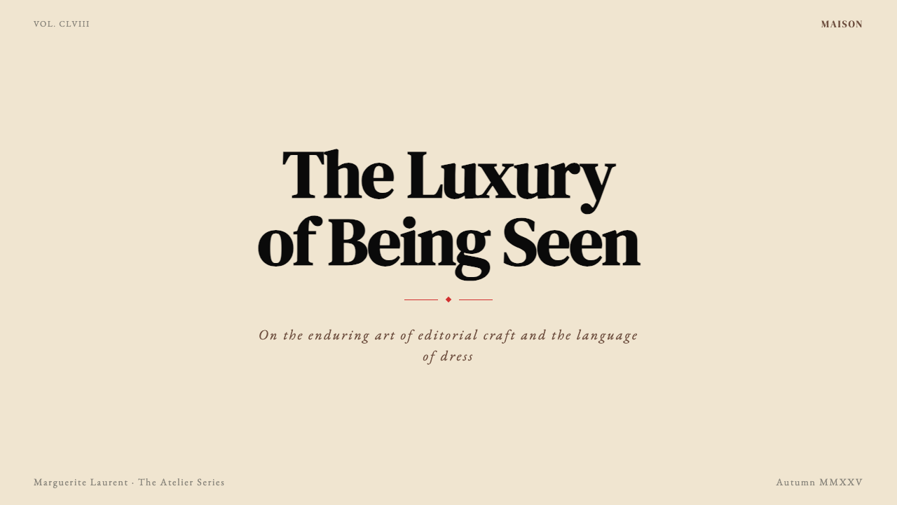
Harper's Bazaar is the visual language of American luxury-fashion publishing — a system in which warm cream paper, monumental high-contrast display type, hairline ruling lines, and dramatic black-and-white photography combine to project authority through restraint rather than abundance. Every element earns its place by carrying weight; nothing exists for decoration alone.《Harper's Bazaar》是美国奢侈时尚出版物的视觉语言——一套以温暖奶油色纸张、纪念碑式高对比度展示字体、发丝般细的分割线与戏剧性黑白摄影共同构成的系统。它靠克制而非丰盛来传递权威感。每一个元素都因承载着分量而存在,没有任何元素单纯为了装饰。
The style is immediately legible: vast white-to-cream fields give the eye nowhere urgent to go except exactly where the layout directs it. A single headline, set wide and light in a high-contrast serif, occupies the top third of a spread with the confidence of a building facade. Below it, a fashion photograph — frequently cropped aggressively or bled to the edge — commands its rectangle without caption clutter. A hairline rule, so thin it barely registers as ink, separates zones. The rare appearance of what is known as Bazaar-red — a saturated, unmodulated crimson — reads as a thunderclap precisely because it has been withheld everywhere else.这种风格拥有即刻可辨的特征:大面积从白到奶油色的底面让视线无处可去,只能落在版面指引的那个唯一焦点上。一行标题以高对比度衬线字体宽设于版面上三分之一处,带着建筑立面般的笃定。其下,一张时装摄影——常常被激进裁切或出血至版面边缘——以整幅矩形坐镇,不受图注的干扰。一条细到几乎不留印迹的直线划分区域。而当那抹「哈泼斯红」——一种饱和、单纯、不做任何调和的深红——偶然出现时,正因它在其他地方被彻底压制,所以轰鸣如雷。
What distinguishes this aesthetic from generic luxury minimalism is its particular relationship to scale and whitespace. Brodovitch-era layouts do not simply use large type — they use type at a scale that feels slightly wrong by conventional magazine standards, and then hold that discomfort inside an ocean of white until it resolves into conviction. The tension between the monumental and the empty is the design.将这种美学与泛泛的奢侈极简主义区别开来的,是它与尺度和留白之间特殊的关系。布鲁多维奇时代的版面并非只是使用大字体——它使用的字体大到按常规杂志标准略显失当的程度,然后将这种不适感悬置于大片留白之中,直至它化解为一种确信。纪念碑式的存在与虚空之间的张力,就是设计本身。
See the Harper's Bazaar design system查看 Harper's Bazaar 完整设计系统
Where does Harper's Bazaar come from?Harper's Bazaar 从何而来?
Harper's Bazaar was founded in New York City in 1867 by the publishing house Harper and Brothers, predating its great rival Vogue by more than two decades. It was conceived from the outset as a vehicle for the fashionable woman of taste, importing European couture news to an American audience that had little other means of receiving it. Its early pages were dense with woodcut illustrations, social reportage, and pattern supplements — visually busy by any contemporary standard, reflecting the Victorian editorial sensibility of its founding decade.《Harper's Bazaar》由哈珀兄弟出版社于1867年在纽约创刊,比其劲敌《Vogue》早了逾二十年。杂志从创刊起便定位为有品位时髦女性的读物,将欧洲高级定制的资讯带给几乎别无他途获得此类信息的美国读者。早期页面密布木刻版画、社交报道与纸样附页,以任何当代标准衡量都相当拥挤,折射出创刊年代维多利亚式的编辑观念。
The magazine's visual identity was fundamentally transformed between 1934 and 1958 by art director Alexey Brodovitch, a Russian-born designer who had trained amid the Paris avant-garde and absorbed the lessons of Constructivism and Surrealism without becoming beholden to either. Brodovitch brought to Bazaar an eye trained by Diaghilev's Ballets Russes — he had designed sets and costumes — and a conviction that movement, surprise, and white space were more powerful editorial tools than decoration or illustration. He laid out spreads in which photograph and type coexisted as equal formal partners, often running images across the gutter or cropping them in ways that violated illustration conventions entirely. He commissioned work from Man Ray, Cartier-Bresson, Richard Avedon, and Irving Penn, giving their photographs the space to function as images rather than documentation.1934年至1958年间,艺术总监阿列克谢·布鲁多维奇从根本上改变了这本杂志的视觉面貌。这位俄裔设计师曾在巴黎先锋圈训练,吸收了构成主义与超现实主义的养分,却未被任何一方所缚。他带来的眼光经过了佳吉列夫芭蕾舞团的磨砺——他曾为其设计布景与服装——以及一种确信:动感、意外感与留白,是比装饰或插图更有力的编辑工具。他将跨页版面设计成摄影与文字作为对等形式伙伴共存的空间,常常让图像跨越订口,或以完全违反插图惯例的方式裁切。他向曼·雷、卡蒂埃-布列松、理查德·阿维顿与欧文·佩恩约稿,给予他们的照片足以作为图像而非文件存在的空间。
Diana Vreeland served as fashion editor from 1936 to 1962, overlapping extensively with Brodovitch and contributing an editorial sensibility as extreme as his visual one. Vreeland's editorial voice — imperious, telegraphic, devoted to the maximally specific — pushed art direction toward ever-greater economy. The words she wanted printed demanded space; the photographs she commissioned demanded space; the tension between those demands and a finite page produced the characteristic Bazaar compression: very little saying a very great deal.戴安娜·弗里兰从1936年至1962年担任时装编辑,与布鲁多维奇有大幅重叠,为杂志贡献了一种与其视觉同样极端的编辑气质。弗里兰的文字——傲慢、电报式、对极端具体性的迷恋——将美术编辑推向更大的经济性。她想印出的文字需要空间;她约来的摄影需要空间;这两种需求与有限页面之间的张力,造就了《哈泼斯》标志性的压缩感:极少的东西诉说着极多。
Later editors and art directors sustained the visual vocabulary while adapting it to successive media environments. Liz Tilberis, who edited the magazine through the 1990s, returned Bazaar to a classical elegance after a period of competition with the louder registers of rival titles, working with photographers including Patrick Demarchelier and Helmut Newton. Glenda Bailey, who edited from 2001 onward, navigated the transition to digital-era publishing while preserving the essential typographic and chromatic commitments: the high-contrast serif at monumental scale, the cream-white ground, the red as punctuation rather than wallpaper.此后的主编与艺术总监们在延续这套视觉词汇的同时,将其适应于不同的媒介环境。利兹·蒂尔伯里斯在上世纪九十年代主编该刊期间,在竞争对手嘈杂的视觉氛围中将《哈泼斯》拉回古典优雅,与帕特里克·德马舍利耶、赫尔穆特·牛顿等摄影师合作。格伦达·贝利自2001年起主编,在数字时代出版转型的浪潮中守住了核心的字体与色彩承诺:纪念碑尺度的高对比度衬线字体、奶油白底面、作为标点而非背景壁纸的红色。
What defines the Harper's Bazaar look?Harper's Bazaar 的视觉特征是什么?
Ground and Paper Feel底面与纸感
The foundational surface is warm cream to off-white — never the clinical cool white of newsprint or the stark brightness of coated stock at full saturation. This warmth gives the layout a tactile implication: it reads as heavy paper, as material cost, as the implicit promise that what is printed here is worth the substrate. The ground is not neutral; it is the first layer of luxury.基础底面是温暖的奶油色至近白色——绝非新闻纸的冷白,也非铜版纸满饱和的刺目亮白。这种温度赋予版面一种触觉暗示:它读起来像厚重的纸张,像材料成本,像一种无声的承诺——印于此处的内容值得这张底材。底面并非中性;它是奢华的第一个层次。
High-Contrast Display Type高对比度展示字体
The headline typeface belongs to the Didot and Bodoni tradition — hairline-thin strokes contrasting with bold stems, pronounced bracketed serifs, and an overall geometry that feels architectural at large sizes. Set wide, at a scale that most publications would consider excessive, these letterforms generate visual drama through pure typographic means. The contrast between the thinnest stroke and the thickest is so extreme that at certain sizes the hairlines seem almost to disappear, making the word appear to float rather than sit.标题字体属于Didot与Bodoni的传统——发丝细笔画与粗茎的强烈对比,明显的托脚衬线,以及在大尺寸下呈现出建筑感的整体几何性。宽松字距、以大多数出版物视为过分的尺寸排列,这些字母形态纯粹通过排版手段制造视觉戏剧性。最细笔画与最粗笔画之间的对比极为悬殊,以至于在特定尺寸下,发丝笔画几乎消失,令文字看起来是在漂浮而非落地。
Hairline Rules发丝分割线
The ruling line in Bazaar layouts is as thin as the printing process will hold — the narrowest possible mark that still registers as deliberate rather than accidental. These lines do not divide the page so much as articulate it, the way a crease in a starched garment articulates the fabric. They separate columns, frame photographs, and provide scale reference for the surrounding type without ever thickening into a structural statement.《哈泼斯》版面中的分割线细到印刷工艺所能保持的极限——最窄的、仍能被识别为刻意而非偶然的标记。这些线条与其说是在分割页面,不如说是在勾勒页面,如同浆洗过的服装上的折痕勾勒出布料的形态。它们分隔专栏、框定摄影,为周围的字体提供尺度参照,却从不增厚为结构性陈述。
Dramatic Black-and-White Photography戏剧性黑白摄影
The photographic aesthetic that Brodovitch cultivated — and that remains the style's primary visual register — privileges high contrast, unusual framing, and the elimination of middle tones in favor of stark blacks and luminous whites. Fashion subjects are photographed in motion or in extreme stillness, never in the documentary repose of catalog imagery. The photograph is treated as a formal object with its own compositional logic, not as an illustration of editorial text.布鲁多维奇所培育的摄影美学——至今仍是这种风格最主要的视觉表达——推崇高对比度、非常规构图,以及以鲜明的黑与发光的白取代中间调。时装拍摄对象或处于运动中,或处于极度静止中,从不呈现目录摄影式的文献性平静。摄影被当作具有自身构图逻辑的形式对象,而非编辑文字的插图。
Bazaar Red as Punctuation哈泼斯红作为标点
The red associated with Harper's Bazaar — a saturated, unmodulated crimson without warmth toward orange or coolness toward burgundy — functions not as a color in the conventional decorative sense but as a punctuation mark. It appears in mastheads, in initial capitals, in a single ruled line, in a typographic pull-quote. Its power is entirely a function of its rarity: a chromatic event against an otherwise achromatic field. Used more broadly, it would cease to be Bazaar red and become simply red.与《Harper's Bazaar》相关联的红色——一种饱和的、不作任何调和的深红,既不偏向橙的温度也不偏向勃艮第的凉意——其功能不是装饰意义上的色彩,而是标点符号。它出现在报头、首字母、单条分割线、一段排版引述中。它的力量完全是其稀有性的函数:一个在其他地方全为无彩色的底面上发生的色彩事件。若更广泛地使用,它就不再是哈泼斯红,而只是红色。
Generous White Space慷慨的留白
White space in Bazaar layouts is not emptiness — it is expensive real estate deliberately left unoccupied, signaling that the publication can afford not to fill every square centimeter with content. Margins are wide; gutters between columns are generous; the space above a headline and below it is treated as structurally essential rather than as filler waiting to be displaced. This use of space is itself a class signal, distinguishing the magazine from busier, more anxious publications that fill every gap.《哈泼斯》版面中的留白并非空洞——而是被刻意闲置的昂贵版面,传递出这本杂志有能力不把每一平方厘米都填满内容的信号。页边距宽阔;专栏间距慷慨;标题上下的空间被当作结构上不可或缺的元素,而非等待被填满的虚位。这种对空间的使用本身就是一种阶层信号,将这本杂志与那些更嘈杂、更焦虑、要把每个缝隙都填满的出版物区别开来。
Asymmetric Elegance非对称优雅
Bazaar layouts are never symmetrically balanced in the classical sense. A photograph bleeds off the left edge while type floats right with generous margin. A headline occupies the full column width on one page while its facing page is nearly blank. The asymmetry is not restless or dynamic in the Bauhaus sense — it is languid, deliberate, aristocratic. The page does not try to balance itself; it assumes that the viewer will accommodate the imbalance as a mark of confidence rather than error.《哈泼斯》的版面从不在古典意义上对称平衡。一张照片从左侧出血至边缘,而文字漂浮在右侧宽阔的页边距中。一行标题在一页上占满整个专栏宽度,而对页几乎空无一物。这种非对称并非包豪斯式的躁动或动感——它是懒散的、刻意的、贵族式的。页面不试图平衡自身;它默认读者会将这种失衡理解为自信的标记,而非错误。
See the Harper's Bazaar design system查看 Harper's Bazaar 完整设计系统
Who shaped Harper's Bazaar?谁塑造了 Harper's Bazaar?
Brodovitch served as art director of Harper's Bazaar from 1934 to 1958, a tenure that defines the magazine's visual identity more than any other single period. Born in Russia and trained in the artistic ferment of post-World War One Paris, he absorbed the lessons of Constructivism, Surrealism, and the Ballets Russes before emigrating to the United States. At Bazaar, he transformed the magazine from a fashionable but visually conventional publication into the international benchmark for editorial design. His methods included commissioning artists and photographers who had never worked in magazines, designing layouts that used white space as a primary element, and insisting that every spread feel like a visual event rather than a page of illustrated content. He also taught the legendary Design Laboratory at the New School in New York, where students including Richard Avedon and Irving Penn developed under his influence.布鲁多维奇于1934年至1958年担任《Harper's Bazaar》艺术总监,这二十四年比任何其他单一时期都更深刻地定义了这本杂志的视觉身份。他生于俄国,在一战后巴黎的艺术激流中受训,吸收了构成主义、超现实主义与芭蕾舞团的养分,后移居美国。在《哈泼斯》,他将一本时髦但视觉上仍属常规的杂志,转变为编辑设计领域的国际基准。他的方法包括:委托从未在杂志工作过的艺术家与摄影师,将留白作为主要设计元素来设计版面,以及坚持每一个跨页都应该像一次视觉事件而非一页图文内容。他还在纽约新学院讲授传奇性的「设计实验室」课程,理查德·阿维顿、欧文·佩恩等学生均在其影响下成长。
Vreeland was fashion editor at Harper's Bazaar from 1936 to 1962, then editor-in-chief of Vogue, and later a special consultant to the Costume Institute at the Metropolitan Museum of Art. Her relationship to the Bazaar visual system was one of mutual amplification: her editorial voice — imperious, hyperbolic, and devoted to specificity — demanded visual layouts with equal conviction. The famous line attributed to her, that the bikini is the most important thing since the atom bomb, captures the register: she dealt in maximum statements, and the visual system Brodovitch maintained was the only one capable of containing them. Her influence on how fashion is written about and photographed extends far beyond any single publication.弗里兰从1936年至1962年担任《Harper's Bazaar》时装编辑,后出任《Vogue》主编,晚年又担任大都会艺术博物馆服装学院特别顾问。她与《哈泼斯》视觉系统的关系是相互放大的:她的编辑声音——傲慢、夸张、对具体性的迷恋——要求视觉版面拥有同等的确信。据说出自她之口的名言——比基尼是自原子弹以来最重要的事物——抓住了她的音域:她只处理最大化的陈述,而布鲁多维奇所维护的视觉系统是唯一有能力容纳它们的系统。她对时尚如何被书写与拍摄的影响,远超任何单一出版物。
Avedon began photographing for Harper's Bazaar in 1945 and continued his association with the magazine for over two decades, becoming the defining photographer of the Brodovitch era. Trained under Brodovitch's Design Laboratory, he absorbed the art director's conviction that a fashion photograph should be an image first and a document second. His Bazaar work is characterized by movement — models caught mid-leap, coats swirling, figures photographed against Parisian street life rather than studio backdrops — and by an emotional directness that conventional fashion photography of the period avoided. He later moved to Vogue and then worked for decades as a portrait photographer and advertising artist, but the Bazaar years defined the terms on which contemporary fashion photography still operates.阿维顿自1945年起为《Harper's Bazaar》拍摄,并延续这种合作关系逾二十年,成为布鲁多维奇时代最具代表性的摄影师。经由布鲁多维奇「设计实验室」的训练,他吸收了这位艺术总监的信念:时装摄影首先是图像,其次才是文件。他的《哈泼斯》作品以动感为标志——模特在跳跃中定格,大衣在旋转,人物在巴黎街头而非摄影棚背景前被摄入镜头——以及一种同时期惯常时装摄影所刻意回避的直接情感。他后来转至《Vogue》,此后数十年作为人像摄影师和广告艺术家持续工作,但在《哈泼斯》的岁月定义了当代时装摄影至今仍在运作的条款。
Tilberis edited Harper's Bazaar from 1992 until her death in 1999, a period in which she positioned the magazine in deliberate contrast to the high-energy maximalism then associated with its competitors. Working with photographers including Patrick Demarchelier and Helmut Newton, she returned Bazaar to an editorial register emphasizing classical elegance, restraint, and the kind of quietly expensive authority that Brodovitch had established decades earlier. Her tenure is remembered as a return to first principles — proof that the magazine's visual identity was durable enough to survive competitive pressure and editorial fashion without essential change.蒂尔伯里斯从1992年主编《Harper's Bazaar》,直至1999年辞世。在这一时期,她将杂志定位为与竞争对手当时盛行的高能量最大主义形成刻意对比的存在。她与帕特里克·德马舍利耶、赫尔穆特·牛顿等摄影师合作,将《哈泼斯》拉回一种强调古典优雅、克制,以及布鲁多维奇数十年前所确立的那种静谧而昂贵的权威感的编辑音域。她的任期被铭记为对根本原则的回归——证明这本杂志的视觉身份足够持久,能够在竞争压力与编辑潮流的冲击下不失其本质。
Man Ray contributed to Harper's Bazaar during the Brodovitch era, bringing the aesthetic strategies of Surrealism — double exposure, solarization, unexpected juxtaposition — into the context of fashion publishing. His Bazaar work demonstrated that the magazine's visual commitment to surprise and tension was not simply a matter of graphic design but extended to a fundamental relationship with avant-garde image-making. The willingness to commission artists operating outside fashion-photography conventions was central to Brodovitch's method and to the identity of the magazine as something more than a trade publication.曼·雷在布鲁多维奇时代为《Harper's Bazaar》供稿,将超现实主义的美学策略——多重曝光、日光曝光效果、出乎意料的并置——带入时尚出版的语境。他的《哈泼斯》作品证明,这本杂志对意外感与张力的视觉承诺,不仅仅是平面设计的问题,而是延伸至与先锋图像创作之间的根本关系。愿意委托在时装摄影惯例之外运作的艺术家,是布鲁多维奇方法的核心,也是这本杂志超越行业出版物身份的关键所在。
How do you use Harper's Bazaar today?今天怎么用 Harper's Bazaar?
The Harper's Bazaar visual system is among the most directly applicable historical styles for contexts where perceived luxury and editorial authority are the core communication goals. Applying it correctly means understanding that every element exists in relation to the space around it — and that the space itself is doing at least as much communicative work as the elements. Stripping out the white space to fit more content is the single most common mistake and the one that most completely destroys the style.《Harper's Bazaar》的视觉系统是历史风格中最直接可应用于核心传播目标为奢华感知与编辑权威的场景之一。正确应用它,意味着理解每一个元素都与其周围的空间处于关系之中——而空间本身所做的传达工作,至少与元素本身相当。为了塞入更多内容而压缩留白,是最常见的单一错误,也是最彻底摧毁这种风格的一个做法。
For presentation slides, the Bazaar approach yields unusually strong cover and section-break designs. A cover slide should be treated as a magazine cover: a single image bled to the edges or positioned to command the majority of the frame, a title in a tall high-contrast serif set at a scale that feels slightly large by conventional slide standards, and a masthead-style element — company name, date, or subtitle — in a hairline smaller weight. Color should be restrained to near-black, cream, and a single red accent, used only once. Content slides work well as two-column spreads in which the left column carries a single large statement or image and the right column holds supporting body text at modest scale. Data slides should treat charts as editorial objects — white or cream background, black axes, bars or segments in the near-black and cream palette, with a single red bar used to mark the most significant data point.在演示文稿中,《哈泼斯》的方式在封面与章节分割页设计上产生异常有力的效果。封面页应当被当作杂志封面来处理:一张出血至边缘或主导画面大部分区域的单张图像,一行以高对比度衬线字体排列的标题,其尺寸按常规幻灯片标准略显过大,以及一个报头式元素——公司名称、日期或副标题——以发丝级别的较小字重呈现。色彩应严格限于近黑色、奶油色与一次性使用的单一红色强调。内容页作为双栏跨页效果很好:左栏承载单一大型陈述或图像,右栏以适度尺寸承载支撑性正文。数据页应将图表作为编辑对象处理——白色或奶油色背景、黑色坐标轴、近黑色与奶油色调的柱条或扇区,以单条红色柱条标记最重要的数据点。
For web interfaces — particularly dashboards, pricing pages, and premium landing pages — the Bazaar system rewards literal application of its spatial logic. Background colors should read as warm near-white rather than pure bright white. Navigation should be typographic and spare: wordmarks and section labels in a high-contrast serif, with no icon decoration beyond the essential. Cards and content modules should have either visible thin borders or hard-edge offsets rather than soft drop shadows. Typography hierarchy should be extreme — the headline type at a monumental scale relative to body text, with little or nothing at intermediate sizes. The red accent color appears at most once per viewport: in a call-to-action button, in the active navigation state, or in a single emphasized label.对于网页界面——尤其是仪表板、定价页与高端落地页——《哈泼斯》系统奖励对其空间逻辑的直接应用。背景色应读起来像温暖的近白色,而非纯粹的明亮白色。导航应简洁而字体化:高对比度衬线字体的文字标识与区块标签,除必要元素外不加图标装饰。卡片与内容模块应有可见的细边框或硬边偏移,而非柔和的投影效果。字体层级应当极端——标题字体相对于正文尺寸呈纪念碑式,中间尺寸极少甚至没有。红色强调色在每个视口中最多出现一次:在号召行动按钮、激活的导航状态或单个强调标签中。
For editorial and marketing work, the style supports brand positions that want to communicate heritage, authority, and discernment without irony. A Bazaar-derived long-form article layout uses wide margins — often wider than the text column itself — to create the sense of a printed luxury publication. Pull quotes are set in the large high-contrast serif, separated from body text by hairline rules rather than color boxes. Marketing campaigns draw on the poster-like quality of the Brodovitch era: a single strong image, a short declarative headline in monumental type, and a logo or brand mark reduced to the scale of a discreet signature. The red should appear at most once in any composition, and only where maximum attention is genuinely warranted.对于编辑与营销工作,这种风格支持那些希望在没有讽刺意味的情况下传递传承感、权威感与鉴赏力的品牌定位。《哈泼斯》衍生的长文排版使用宽阔的页边距——常常比文字专栏本身还宽——以制造一种奢侈印刷出版物的感觉。引述以高对比度大号衬线字体排列,通过发丝分割线而非色框与正文分隔。营销推广借鉴布鲁多维奇时代的海报式品质:单张强烈图像、纪念碑式字体的简短陈述式标题、缩减至低调签名尺寸的标志或品牌标记。红色在任何一个构图中最多出现一次,且只在真正值得最高关注度的位置出现。
A common mistake when working in this aesthetic is mistaking restraint for emptiness. Designers who understand that the style uses very little color and very little decoration sometimes compensate by reducing the scale and ambition of the typography, producing layouts that read as timid rather than confident. The opposite error is correct: the type should be larger than feels comfortable, the white space should be more generous than feels efficient, and the red — if used at all — should appear exactly once and in the position where it will be seen last. The discipline of the style is not in using less; it is in making less do more.在这种美学中工作时常见的错误,是把克制误解为空洞。明白这种风格使用极少色彩和极少装饰的设计师,有时会通过缩小字体的尺度和野心来补偿,产生出读起来像胆怯而非自信的版面。相反的错误才是正确的:字体应该比感觉舒适的更大,留白应该比感觉高效的更慷慨,而红色——如果使用的话——应该恰好出现一次,在最后被看到的那个位置。这种风格的自律不在于用得更少;而在于让更少做更多。
See the Harper's Bazaar design system查看 Harper's Bazaar 完整设计系统
Harper's Bazaar — FAQHarper's Bazaar · 常见问题
How is Harper's Bazaar different from Vogue's visual identity?《Harper's Bazaar》的视觉身份与《Vogue》有何不同?
The two magazines are often treated as interchangeable luxury-fashion references, but their visual systems differ in fundamental ways. Bazaar, shaped by Brodovitch, favors extreme scale contrasts, asymmetric compositions, and a chromatic restraint that reserves color for a single punctuating red. Vogue has historically been more willing to use color decoratively, more formally symmetrical in its cover compositions, and more aligned with the conventions of high-gloss commercial photography. Bazaar feels like a designed artifact; Vogue feels like a curated showcase. The distinction matters when applying either style: Bazaar is the right reference when the goal is editorial authority and quiet confidence; Vogue when the goal is glamour and aspirational fantasy.这两本杂志常被当作可互换的奢侈时尚参照,但它们的视觉系统在根本层面上存在差异。由布鲁多维奇塑造的《哈泼斯》偏爱极端的尺度对比、非对称构图,以及将色彩保留为单一标点式红色的色彩克制。《Vogue》历来更愿意将色彩用于装饰,其封面构图在形式上更趋对称,也更贴近高光商业摄影的惯例。《哈泼斯》感觉像一件被设计过的物件;《Vogue》感觉像一个被策展过的展示。这一区别在应用任一风格时至关重要:当目标是编辑权威与静谧的自信时,《哈泼斯》是正确的参照;当目标是魅力与憧憬式幻想时,则选《Vogue》。
Can this style work for digital interfaces, or is it inherently a print aesthetic?这种风格能用于数字界面吗,还是它本质上是一种印刷美学?
The style translates to digital with some adaptation but not without loss. The qualities that make it powerful in print — the tactile implication of cream paper, the physical thinness of hairline rules at magazine scale, the light-and-shadow quality of high-contrast Didot letterforms — are harder to fully replicate on screens. That said, the spatial logic translates directly: generous white space, extreme typographic scale contrast, color used as punctuation, and asymmetric composition all work on screen. The most successful digital applications treat the style as a set of proportional and spatial principles rather than a direct copy of print conventions, and they choose typefaces whose structural character approximates the high-contrast serif tradition even if the exact historical fonts are unavailable.这种风格通过一定调整可以迁移至数字界面,但不可避免有所失真。使其在印刷品中强大的特质——奶油纸张的触觉暗示、杂志尺寸下发丝线条的物理细度、高对比度Didot字母的光影品质——在屏幕上更难完整复现。尽管如此,空间逻辑可以直接迁移:慷慨的留白、极端的字体尺度对比、作为标点使用的色彩、非对称构图,这些在屏幕上同样奏效。最成功的数字应用将这种风格视为一套比例与空间原则,而非对印刷惯例的直接复制,并选择那些在结构特征上接近高对比度衬线传统的字体,即便特定的历史字体并不可用。
Does this aesthetic work for brands that are not in the fashion or luxury industry?这种美学适合时尚或奢侈品行业以外的品牌吗?
It can work outside fashion, but the stylistic register carries strong connotations of fashion-editorial authority that not every brand wants. It is a natural fit for premium cultural institutions — museums, opera companies, concert halls, literary publishers — where the visual language of discernment and cultural authority is appropriate. It also works for high-end service businesses where perceived expertise and exclusivity matter: law firms, wealth management, private healthcare, bespoke hospitality. It is less suited to technology products that want to project speed, innovation, or democratic access, and it actively undermines brands built on warmth, community, or casual accessibility. The key test is whether a brand genuinely occupies the register of quiet authority; if not, the style reads as pretension.它可以在时尚以外的领域奏效,但这种风格带有强烈的时尚编辑权威内涵,并非所有品牌都希望承载。它天然适合高端文化机构——博物馆、歌剧院、音乐厅、文学出版社——在这些场合,鉴赏力与文化权威的视觉语言是恰当的。它也适合那些感知专业度与排他性至关重要的高端服务业:律师事务所、财富管理、私人医疗、定制酒店服务。它较不适合那些希望传递速度、创新或民主可及性的科技产品,也会主动破坏那些以温暖感、社区感或随意可达性为品牌基础的形象。关键的检验是:品牌是否真正占据静谧权威的那个音域;若不是,这种风格读起来就像在伪装。
How should the red accent be handled — what constitutes using it correctly?如何正确处理红色强调色?什么样的使用才算正确?
The red functions correctly when it appears in exactly one place per composition and marks the single element that most needs to be seen last — or remembered longest. In a magazine cover, it is the masthead. In a slide, it is the key data point or the call to action. In a web page, it is the primary button or the active navigation state. The test is: if you remove the red, does the composition become noticeably weaker in one specific place? If yes, that is where the red belongs. If the composition seems equally valid without any red, either the red was decorative rather than structural — in which case it should be removed — or it has been distributed too widely to register as an event. Red that appears in multiple places simultaneously is no longer Bazaar red; it is simply red, and the system has collapsed into generic color use.红色在每个构图中恰好出现一次、并标记那个最需要被最后看到或被记住最久的单一元素时,才算正确发挥功能。在杂志封面上,那是报头。在幻灯片上,那是关键数据点或号召行动。在网页上,那是主要按钮或激活的导航状态。检验方法是:如果去掉红色,构图是否在某一个特定位置明显变弱?如果是,那就是红色所属之处。如果构图在没有红色时看起来同样成立,那要么红色是装饰性的而非结构性的——在这种情况下应该移除——要么它被分散得太广泛,无法作为一次事件被感知。同时出现在多处的红色不再是哈泼斯红;它只是红色,而整个系统已经瓦解为普通的色彩使用。
What makes the Brodovitch era so frequently referenced compared to other periods of the magazine's history?与杂志历史上的其他时期相比,为什么布鲁多维奇时代如此频繁地被援引?
Several factors converge. First, the Brodovitch period coincided with the emergence of modern editorial design as a discipline — his Bazaar was among the first publications to treat the magazine spread as a designed object with its own compositional logic rather than as a container for editorial content. Second, the photographers and artists he collaborated with — Avedon, Man Ray, Cartier-Bresson, Penn — were simultaneously defining what ambitious photography could be, so the magazine became a record of a particular moment in both editorial and photographic history. Third, the visual system he developed was sufficiently coherent and restrained that it has proved highly durable: it can be applied in contemporary contexts without feeling historical or pastiche because its principles are spatial and structural rather than decorative. Other periods of the magazine's history produced excellent work but did not codify a system with equivalent transferability.几个因素共同作用。首先,布鲁多维奇时期恰好与现代编辑设计作为一门学科的诞生相吻合——他的《哈泼斯》是最早将杂志跨页视为具有自身构图逻辑的设计对象、而非编辑内容容器的出版物之一。其次,他所合作的摄影师和艺术家——阿维顿、曼·雷、卡蒂埃-布列松、佩恩——同时在定义雄心勃勃的摄影可以是什么,因此这本杂志成为编辑史与摄影史上某一特定时刻的记录。第三,他所发展的视觉系统足够连贯而克制,因而被证明具有极高的耐久性:它可以被应用于当代语境而不显得复古或像是仿制,因为它的原则是空间性和结构性的,而非装饰性的。杂志历史上的其他时期产出了优秀的作品,但没有形成具有同等可迁移性的系统。
Related design styles相关设计风格
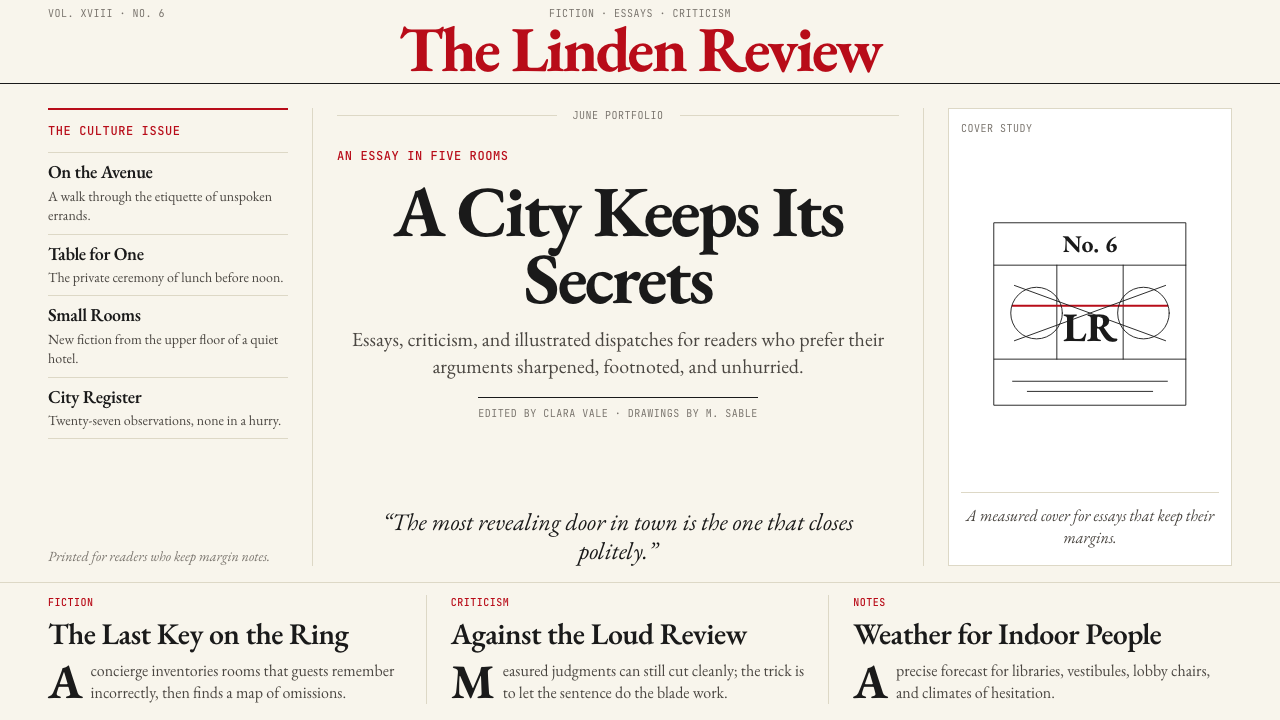 The New Yorker ClassicQuiet authority. Cream paper, EB Garamond columns, ink cartoons, and one red…沉静权威:奶油纸、EB Garamond 栏栅、墨线漫画与一抹红。
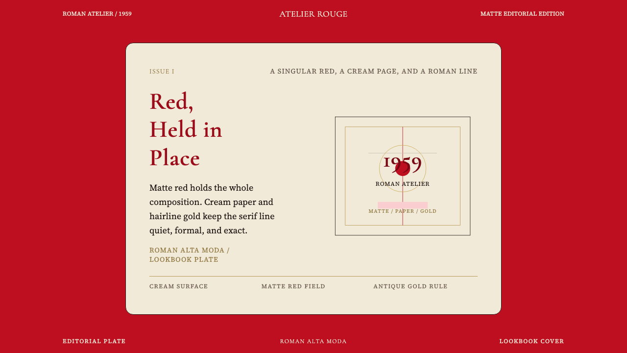 Valentino Rouge Couture (1959)Matte couture red holds the page. Cream paper and hairline gold keep it cerem…哑光高定红统领全页,奶油纸面与细金线让它更庄严。
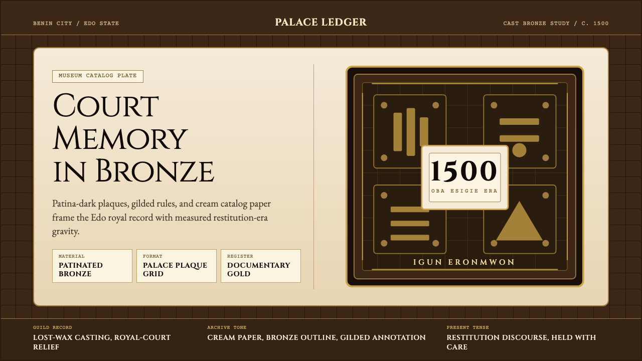 Benin Bronze (Edo, 1500)Royal memory, cast in bronze. Cream plaques and gilded lines carry museum gra…王权记忆铸于青铜。奶油牌板与鎏金线条带出图录庄重。
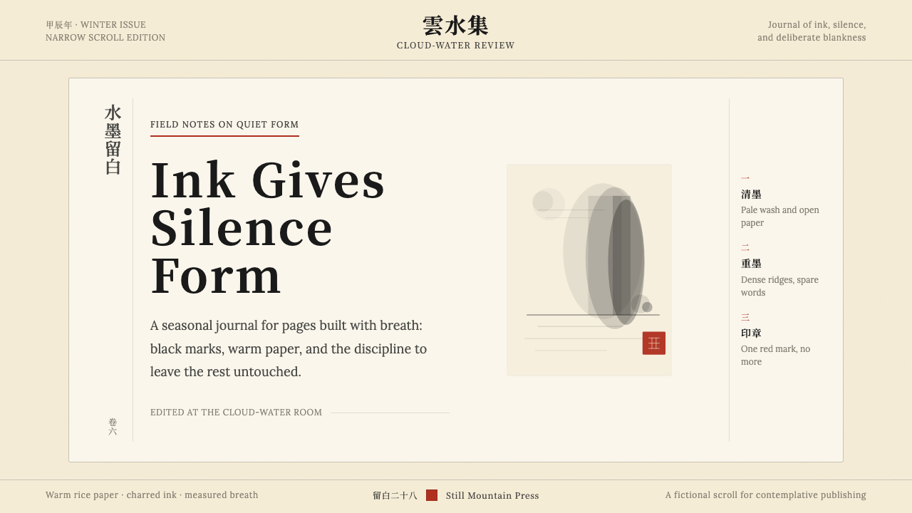 Chinese Ink Wash 水墨A thousand years of restraint. Six tones of ink on rice-paper warmth, a singl…千年单色绘画的精髓:墨分六彩、宣纸暖白底色、一抹印泥红作落款——留白即意。
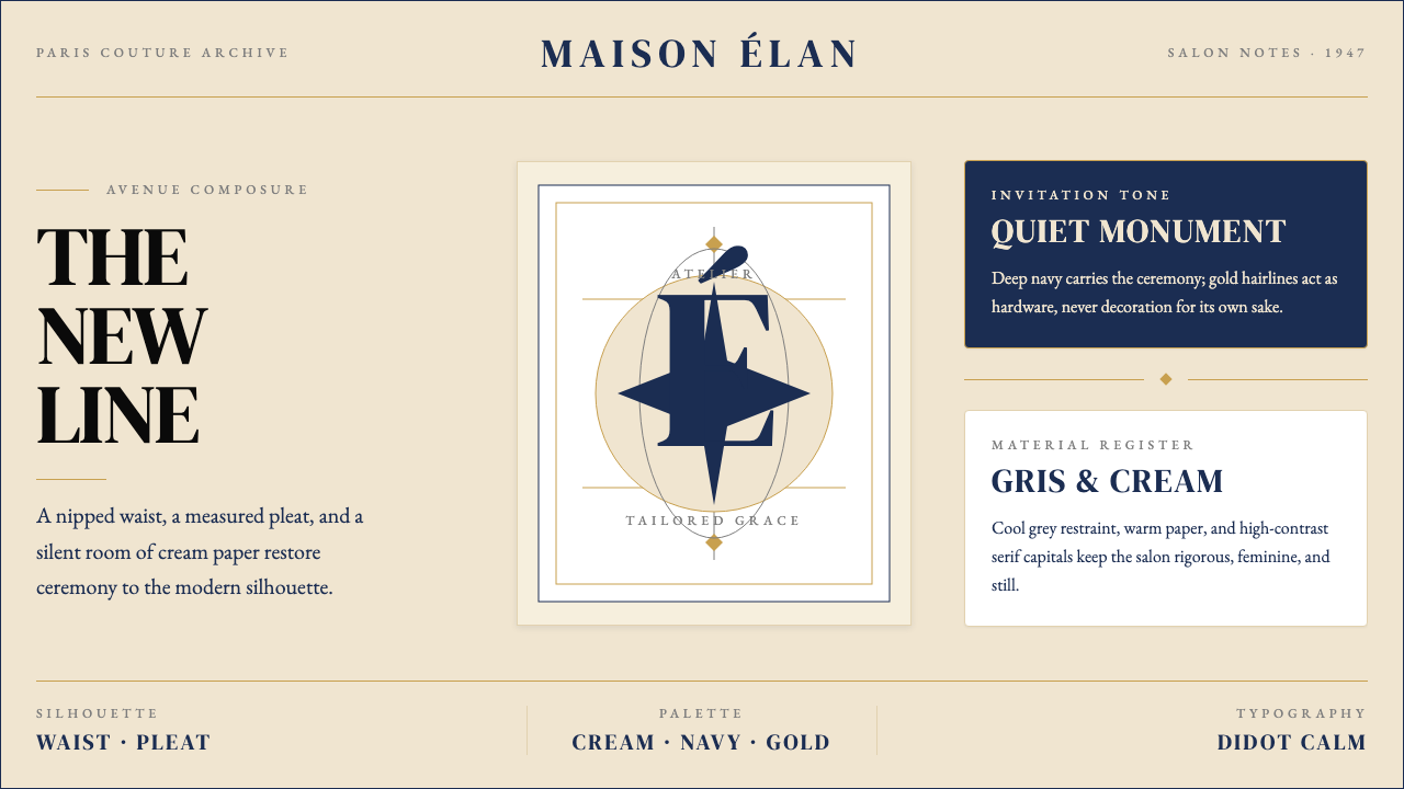 Dior New Look (1947)Couture speaks softly. Cream ground, navy Didot capitals, and gold hairlines…高级订制低声发言:米白底、海军蓝Didot大写与金色发丝线稳住全场。
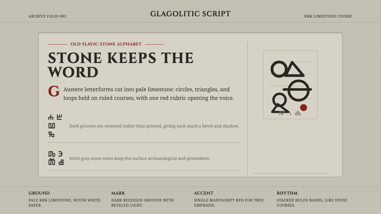 Glagolitic ScriptCarved faith in limestone. Cinzel capitals and red rubrics sit in shadowed gr…石灰岩中的虔敬刻痕。Cinzel 大写与朱砂红嵌入阴影凹槽。