What is Zsolnay Eosin Ceramics?
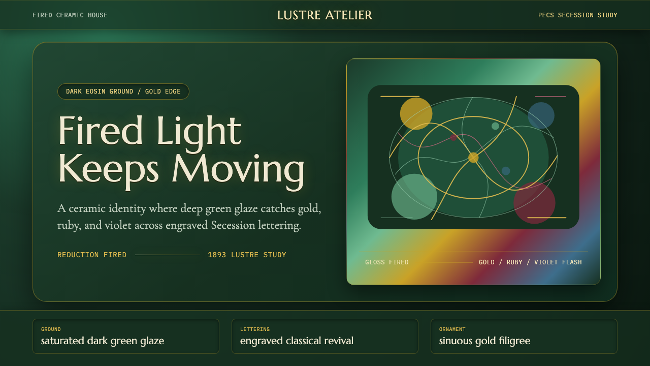
Zsolnay eosin turned a chemistry problem into a design language — a glaze so restless with color that Hungary's Secession architects wrapped entire buildings in it, and asked their pages to shimmer the same way.
Zsolnay Eosin Ceramics in brief
Zsolnay Eosin Ceramics is a design system built around a single, very specific material effect: an iridescent glaze developed at the Zsolnay ceramics manufactory in Pécs, Hungary, in the final years of the nineteenth century. The glaze's defining trick is that it is never one color. A deep, saturated green forms the base, but the surface is coated with a metallic film so thin it behaves like an oil slick — tilt the object, or let the light shift, and the green flashes gold, then ruby-red, then violet, then back again. Applied to roof tiles, architectural reliefs, vases, and figurines, this effect made Zsolnay's output instantly recognizable across the Austro-Hungarian Empire and beyond.
As a visual system for screens and pages, this style asks every surface to behave like that glaze. Grounds are not white or cream — they are a dark, saturated green field that reads as depth rather than blankness. Type is not a neutral sans-serif; it draws on the engraved, classically-proportioned lettering that Hungarian Secession designers favored for building facades and title pages. And ornament, where it appears, follows the same long, whip-like floral curve that defines Art Nouveau across Europe, adapted through a specifically Hungarian sensibility that favored folk-pattern motifs over the more insect-and-vine vocabulary of French Art Nouveau.
The overall effect is meant to feel fired rather than printed — glossy, faceted, catching light rather than absorbing it. This is a maximalist, richly saturated style, closer in temperament to jewelry or lacquerware than to the restrained neutral palettes common in interface design, and it rewards designers willing to commit fully to depth and shimmer rather than applying it as a surface accent.
Where does Zsolnay Eosin Ceramics come from?
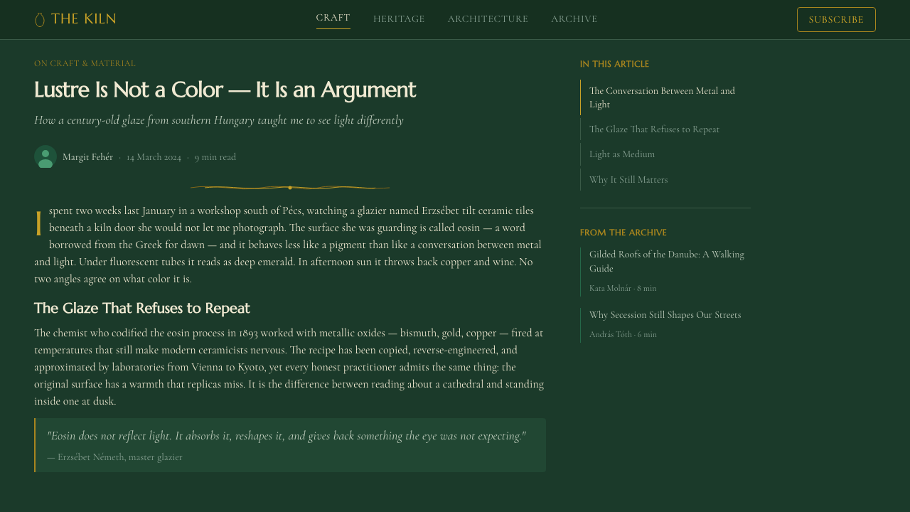
The eosin glaze takes its name from Eos, the Greek goddess of dawn, a nod to the way its surface seems to catch and refract colored light the way a dawn sky does. It was developed around 1893 by the chemist Vince Wartha, working at the Zsolnay manufactory, which had been founded in Pécs in 1853 by Miklós Zsolnay and built into an internationally significant ceramics producer by his son Vilmos Zsolnay. Wartha's breakthrough was a reduction-fired metallic lustre — a technique with roots stretching back to medieval Islamic and Hispano-Moresque pottery, where metal oxides in the glaze are chemically reduced during firing to leave an ultra-thin reflective film on the surface. What made the Zsolnay version distinct was its depth of color and its reliability at industrial scale, letting the factory produce entire architectural facades finished in eosin glaze, not just individual art objects.
The timing mattered as much as the chemistry. The 1890s and 1900s were the height of Art Nouveau across Europe, and Hungary — then a semi-autonomous half of the Austro-Hungarian Empire, pushing for greater cultural distinctiveness ahead of its 1896 millennial celebrations — was especially receptive to a national variant of the style. Hungarian architects and designers, most notably Ödön Lechner, consciously sought a visual vocabulary that could read as modern and international while also asserting a distinctly Hungarian identity, one drawing on Transylvanian folk art, Zsolnay's ceramics, and imagined connections to Hungary's Eastern, Magyar origins rather than looking only to Vienna or Paris for models.
Zsolnay eosin ceramics became the material of choice for this ambition. Lechner used vast quantities of Zsolnay tile and ornament on landmark Budapest buildings — the Museum of Applied Arts and the Geological Institute among them — wrapping stern institutional architecture in glazed color and organic pattern in a way with no real precedent elsewhere in Europe. The resulting style, sometimes called Hungarian Secession to distinguish it from the Vienna Secession it partly overlapped with, treated ceramic ornament not as applied decoration but as an integral part of the building's structure and identity.
The style's active period runs roughly from the 1890s through the years surrounding the First World War, after which Art Nouveau's popularity collapsed across Europe in favor of more austere modernist movements. Zsolnay itself survived — the factory still operates in Pécs today — but the specific fusion of eosin glaze, Secession ornament, and Magyar nationalist ambition belongs to this earlier moment, making it a compact, historically specific style rather than a long-running tradition.
What defines the Zsolnay Eosin Ceramics look?
Color
The ground color is a dark, highly saturated green, deep enough to read almost as black in low light but unmistakably green under any illumination — the base note the eosin glaze is built on. Layered over it are the lustre colors the glaze flashes: warm metallic gold, a deep ruby-red, and a cool violet, used as accents rather than fields of their own. Unlike a flat corporate palette, these accent colors are treated as if they shift depending on where you look, so a single element might carry a gold highlight along one edge and a violet undertone along another.
Typography
Lettering draws on the engraved classical-revival letterforms used on Hungarian Secession building facades and title pages — proportioned closer to a chiseled inscription than to a modern grotesque, with a formality that suggests permanence and craft rather than speed. Headline type carries generous, confident proportions; body text stays legible and restrained by comparison, so the ornamental weight of the system sits in the display type and the glaze-like backgrounds, not in the running text.
Ornament and Curve
Ornament follows the long, whiplash floral curve central to Art Nouveau — lines that swell and taper rather than running at a constant width, evoking stems, tendrils, and unfurling petals. The Hungarian variant leans toward motifs adapted from Transylvanian and Magyar folk embroidery and woodcarving rather than the more insect-and-orchid vocabulary seen in French Art Nouveau, giving the ornament a slightly more geometric, patterned quality even as it retains the organic curve.
Surface and Sheen
Every surface is meant to read as glossy and reflective rather than matte or paper-flat — the visual equivalent of fired, glazed ceramic rather than printed card stock. This shows up as gradients and highlights that behave like light catching a curved, lacquered surface: soft glows along edges, color intensifying toward one side of a shape and cooling toward the other, and an overall avoidance of flat, uniform fills where a shimmering, faceted fill fits the material logic instead.
Composition
Compositions favor a strong central or framed focal element — echoing the way a single Zsolnay vase or architectural medallion commands attention against a plainer field — surrounded by ornamental borders rather than the loose, asymmetric scatter typical of minimalist grids. Symmetry and framing devices are used deliberately, giving pages a sense of ceremony and craft-object presentation rather than a purely functional information layout.
Materiality
Where contemporary interface design typically treats surfaces as neutral containers for content, this system treats every panel, card, or section as if it were itself a fired object with weight and thickness — bordered, framed, and finished rather than simply laid flat on a page. Elevation and depth cues lean toward the lustrous rather than the soft-shadow, flat-material conventions common elsewhere.
Restraint of Application
Despite its richness, the system is not meant to apply the full lustre effect to every element simultaneously — the historical objects it draws on typically reserved the most intense color-shift for a focal band, medallion, or border, while surrounding fields stayed a calmer, more uniform dark green. Translating that discipline means choosing where the shimmer concentrates rather than saturating an entire layout with it.

Who shaped Zsolnay Eosin Ceramics?
Wartha was the chemist who developed the eosin glaze at the Zsolnay manufactory around 1893, working out the reduction-firing process that produced its signature metallic, color-shifting lustre. His technical breakthrough was what made the visual style possible at all — without a reliable industrial process for producing the effect, the glaze would have remained a rare curiosity rather than a material used across an entire generation of Hungarian ceramics and architecture.
Vilmos Zsolnay took over his father's small ceramics workshop in Pécs and expanded it into an internationally exhibited manufactory, investing heavily in chemical research — including Wartha's glaze work — and in architectural ceramics as a distinct product line. His willingness to fund experimental glaze chemistry, rather than treat ceramics purely as tableware production, is what gave Wartha's research a commercial home and a path to architectural scale.
Lechner was the architect most responsible for turning Zsolnay eosin ceramics into an architectural statement, wrapping major Budapest public buildings — including the Museum of Applied Arts and the Geological Institute — in glazed tile and ornament as part of a deliberate effort to build a distinctly Hungarian national style within the broader Art Nouveau moment. His buildings remain the clearest large-scale demonstration of what the eosin glaze looks like at full architectural scale rather than on a single vase or tile.
How do you use Zsolnay Eosin Ceramics today?
Zsolnay eosin's richness makes it a distinctive but demanding choice, and it works best when a project wants to feel crafted, ceremonial, or luxurious rather than efficient. Applying it well means committing to the dark, saturated ground and the lustrous accent treatment as the foundation of the system, not layering a green tint and a gold highlight onto an otherwise conventional light-mode design.
For presentation slides, this style rewards a cover page treated almost like a framed art object: a dark green field, a strong central title set in the engraved classical letterforms, and a thin ornamental border or corner flourish that hints at the whiplash curve without overwhelming the type. Content and data slides should keep the shimmering treatment concentrated in section headers or a single highlighted figure, while body content and supporting charts sit on calmer, more uniform dark-green panels, keeping the data legible.
For web UI, dashboards and pricing pages built in this style benefit from treating card borders and section dividers as the ornamental element — a thin lustrous line or framed edge around a pricing tier card reads as considered and premium. Because the ground is dark, contrast needs real attention: body text and data labels should stay in a lighter, calmer tone against the green field, reserving the full metallic shimmer for headline numbers, plan names, or a call-to-action button rather than dense tables of figures.
For editorial and marketing pages, the style suits brand stories, cultural or heritage-adjacent content, and any positioning built around craft, permanence, or luxury rather than speed or disruption. A hero section can use the full glazed-ceramic treatment — dark ground, lustrous highlight, ornamental border — while long-form body text drops back to a calmer, more legible register so extended reading doesn't fight the shimmer. Pull-quotes and section breaks are a natural place to reintroduce the ornamental curve at a smaller scale.
The most common mistake is treating this as simply 'dark green plus a gold accent' — a flat, corporate-style palette swap that misses the entire point of the source material. Without the sense of color shifting and catching light, and without the engraved lettering and Secession-derived ornamental curve, the result reads as a generic dark theme rather than as Zsolnay eosin. The style depends on shimmer, ornament, and a slightly ceremonial sense of composition working together; removing any one of the three leaves it looking like an unrelated dark UI with a green tint.
Zsolnay Eosin Ceramics — FAQ
Is Zsolnay eosin the same as Art Nouveau in general?
They overlap but are not identical. Art Nouveau is a broad international movement spanning roughly the 1890s to the 1910s, expressed differently in Paris, Brussels, Vienna, Glasgow, and beyond. Zsolnay eosin ceramics is a specifically Hungarian variant — sometimes called Hungarian Secession — defined by a particular material (the reduction-fired eosin glaze developed at the Zsolnay manufactory) and a particular nationalist ambition to build a visibly Magyar visual identity. It shares Art Nouveau's whiplash curves and organic ornament, but adds a material shimmer and a folk-art-inflected pattern vocabulary that most other national variants of Art Nouveau don't have.
Can this style work with a light background instead of the dark eosin green?
It's possible but works against the style's core logic. The dark green ground is what makes the metallic lustre — gold, ruby, violet — read as a dramatic shift rather than a mild tint; on a white or cream background, the same accent colors just look like a conventional warm palette with no sense of catching light. If a lighter treatment is required, it works better to keep the eosin-green ground for focal elements (headers, cards, hero sections) and let only secondary, low-emphasis areas go lighter, rather than inverting the whole system.
How much ornament is appropriate — won't it look cluttered in a modern digital product?
The historical objects this style draws on were disciplined about where ornament concentrated — a border, a medallion, a single focal band — while large surrounding surfaces stayed a calm, uniform color. The same discipline applies digitally: reserve visible curve-and-flourish ornament for borders, dividers, and focal moments like a hero title or a highlighted plan, and let body copy, tables, and dense information areas stay plain against the dark ground. Treat ornament as punctuation, not wallpaper.
What kinds of products or brands does this style suit best?
It suits contexts where craft, heritage, or luxury are the values being communicated — cultural institutions, heritage brands, premium hospitality, jewelry or craft-adjacent commerce, and editorial content about design or cultural history. It is less suited to products that need to feel fast or purely functional, such as productivity tools or high-frequency transactional dashboards, where the dark saturated ground can read as slow rather than efficient.
Does the style require using all three lustre colors (gold, ruby, violet) together?
No — and using all three at equal intensity everywhere tends to muddy the effect rather than intensify it. The historical glaze produces its color shift gradually across a single surface as light and angle change, not as three flat colors applied side by side. A digital treatment reads as more authentic when one lustre tone leads (gold is the most common anchor) with the others appearing as secondary highlights or gradient transitions, rather than all three competing for attention in the same element.
Related design styles
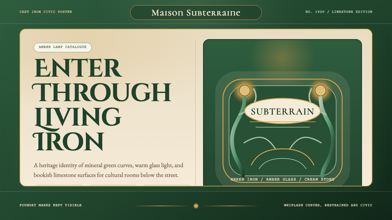 Paris Metro Guimard (1900)Civic sculpture, softly lit. Metro green ironwork frames amber glow and limes…
 Riga JugendstilA facade that argues in relief. Blue brick fields and pale stucco rise in str…
 Art Nouveau (Mucha)Mucha's whiplash arabesques. Botanical halos, muted lithograph palette, no ma…
 Faberge Guilloche EnamelImperial enamel glows. Jade guilloche, gilt hairlines, rose-pink points.
 Herend PorcelainRoyal porcelain, drawn by hand. Cool glaze, écaille fishnet, gilt rim, Playfa…
 Bohemian Cut CrystalOpulence glows in shadow. Ruby and cobalt facets sit on velvet under gilt rim…