What is Budapest Thermal Bath Art Deco?什么是 Budapest Thermal Bath Art Deco?
Budapest's grand thermal bathhouses — peacock-turquoise tile, sulfur-patinated brass, and barrel-vaulted steam — forged a ceremonial design language where civic infrastructure became sacred architecture.布达佩斯宏伟温泉浴场的孔雀蓝绿瓷砖、硫磺蒸汽侵蚀的黄铜与桶形拱顶,将市政基础设施锻造成了神圣建筑般的仪式性设计语言。
Budapest Thermal Bath Art Deco in briefBudapest Thermal Bath Art Deco 速览
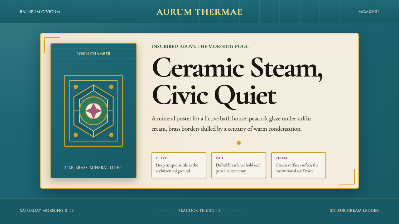
Budapest Thermal Bath Art Deco is a design language distilled from the visual atmosphere of Budapest's great public bathhouses — Széchenyi, Gellért, and Lukács — built between the 1880s and 1930s at the intersection of Hungarian Secession, Art Nouveau, and late Art Deco. Its palette centers on the deep ceramic-glaze turquoise of Zsolnay tiles, set against sulfur-cream card surfaces and punctuated by the dulled warmth of brass and gilt detailing. Typography carries the weight of Habsburg-era inscription: serif letterforms set like Latin dedications above bath entrances, grave and ceremonial rather than editorial.布达佩斯温泉浴场装饰艺术风格,是从布达佩斯几座伟大公共浴场——塞切尼、盖莱尔特与卢卡奇——的视觉氛围中提炼而来的设计语言。这些浴场建于1880年代至1930年代,处于匈牙利分离派、新艺术运动与晚期装饰艺术运动的交汇点上。其色彩以乔尔纳伊瓷砖深沉的陶瓷釉面蓝绿色为核心,铺设在硫磺奶油色的底面上,以黄铜与镀金细节的暗沉暖调点缀其间。字体排印承载着哈布斯堡时代铭刻的分量:衬线字形如同浴场入口上方的拉丁题献,庄重而仪式感十足,而非编辑性的轻盈。
The style is not merely a regional curiosity. It represents a uniquely resolved tension between two normally opposing impulses — the organic, ornamental energy of Art Nouveau and the streamlined geometry of Art Deco — resolved through the mediating influence of Ödön Lechner's Hungarian Secession, which insisted on rooting Central European modernism in Magyar folk motif and Zsolnay ceramic craft. The result is richer than pure Art Deco and more structurally legible than pure Art Nouveau: tile patterns carry geometric discipline, columns bear foliate crowns, and vaulted ceilings breathe with both engineering confidence and decorative warmth.这种风格绝非局限一隅的地域奇观。它代表了两种通常相互对立的冲动之间一次罕见的完满协调——新艺术运动的有机装饰能量,与装饰艺术运动的流线几何——而这一协调正是通过莱希纳匈牙利分离派的中介影响实现的。莱希纳坚持将中欧现代主义植根于马扎尔民俗母题与乔尔纳伊陶瓷工艺。最终呈现的结果比纯粹的装饰艺术更为丰富,比纯粹的新艺术运动更具结构可读性:瓷砖纹样携带几何纪律,柱头冠以叶饰,穹形天花既有工程自信又散发装饰温度。
In contemporary design application, this aesthetic functions as a system of controlled opulence: every element carries patina and ceremony without tipping into kitsch. The dominant ceramic turquoise grounds everything in mineral coolness; the cream and brass lift it with warmth; the serif typography anchors it in institutional gravity. Used well, the style conjures a sensation of stepping into a building that has absorbed a century of steam, light, and collective ritual.在当代设计应用中,这套美学作为一种有节制的华丽系统而运作:每个元素都承载着岁月包浆与仪式感,却不滑向媚俗。主导性的陶瓷蓝绿将一切锚定于矿物质的冷静;奶油色与黄铜以温度将其托举;衬线字体则以机构性的庄重将其稳住。运用得当,这种风格能唤起一种感觉:踏入了一座已吸收了整整一个世纪蒸汽、光线与集体仪式的建筑。
See the Budapest Thermal Bath Art Deco design system查看 Budapest Thermal Bath Art Deco 完整设计系统
Where does Budapest Thermal Bath Art Deco come from?Budapest Thermal Bath Art Deco 从何而来?
Budapest sits above one of the richest geothermal aquifer systems in Europe, with more than a hundred natural springs rising through the limestone bedrock beneath Buda's hills. The Romans, who called the settlement Aquincum, built their first thermal baths here in the second century. The Ottoman occupation (1541–1686) deepened this bathing culture, leaving behind domed hammams — Rudas, Veli Bej — whose spare geometry and filtered dome-light would echo through all subsequent Budapest bath architecture. By the mid-nineteenth century, as the twin cities of Buda and Pest moved toward the 1873 unification that created Budapest, thermal bathing was already woven into the city's civic identity.布达佩斯坐落于欧洲最丰富的地热水层系统之上,布达丘陵的石灰岩基岩之下涌出超过百处天然温泉。罗马人将这片定居点称为阿奎尼库姆,早在二世纪便在此修建了第一批温泉浴场。奥斯曼占领时期(1541—1686年)深化了这一浴场文化,留下了鲁达什、韦利·贝吉等圆顶土耳其浴室——其简洁几何与穹顶漫射光将在此后所有布达佩斯浴场建筑中留下回响。到十九世纪中叶,随着布达与佩斯向1873年的合并迈进,温泉沐浴已深深织入城市的市民认同之中。
The decisive aesthetic era began after 1881, when the Hungarian ceramicist Vilmos Zsolnay — building on eosin-lustre glazing techniques developed at his Pécs factory — began supplying the architectural establishment with tiles and façade elements of an iridescent, mineral intensity unavailable from any European competitor. Zsolnay's pyrogranite resisted frost and pollution, making it ideal for Budapest's climate; his eosin glaze produced the deep peacock turquoise and metallic shimmers that would define the Hungarian Secession palette. The architect Ödön Lechner was the first to understand that Zsolnay ceramics were not decoration applied to a building but a structural skin with its own logic — his Museum of Applied Arts (1896) and Postal Savings Bank (1901) demonstrated what an architecture grounded in Magyar ornament and Zsolnay material could achieve.决定性的美学时代始于1881年之后。匈牙利陶瓷师维尔莫什·乔尔纳伊——依托其佩奇工厂开发的曜变釉彩烧制技术——开始向建筑界供应一种任何欧洲竞争者都无法复制的彩虹矿物质釉面砖与立面构件。乔尔纳伊的耐火花岗岩能抵御冰冻与污染,极适合布达佩斯的气候;他的曜变釉彩产生了那种深邃的孔雀蓝绿与金属光泽,最终定义了匈牙利分离派的色彩基调。建筑师莱希纳是第一个领悟到乔尔纳伊陶瓷并非附加在建筑上的装饰、而是拥有自身逻辑的结构表皮的人——他的应用艺术博物馆(1896年)与邮政储蓄银行(1901年)展示了一种以马扎尔纹饰与乔尔纳伊材料为根基的建筑所能抵达的高度。
The great bath commissions arrived in this context. Győző Czigler's Széchenyi Baths (opened 1913, expanded 1927) introduced a neo-Baroque grandeur softened by Secession detail. Ármin Hegedűs's Gellért Baths (opened 1918) pushed further into Art Nouveau sensuousness — the main pool's barrel vault, its Zsolnay-tiled columns, and its stained-glass ceiling panels became the canonical image of Budapest bath luxury. The Lukács complex, older in origin but repeatedly renovated through the 1930s, absorbed the period's Art Deco rationalism into its arcade and pool surround. Together, these three institutions established the visual vocabulary that this design system codifies.正是在这样的背景下,伟大的浴场委托相继到来。居佐·齐格勒设计的塞切尼浴场(1913年开放,1927年扩建)引入了被分离派细节柔化的新巴洛克宏伟感。阿尔明·赫格迪什设计的盖莱尔特浴场(1918年开放)进一步推向新艺术运动的感官丰盛——主池的桶形拱顶、乔尔纳伊瓷砖柱廊与彩色玻璃天花板,成为布达佩斯浴场奢华的经典图像。历史更为悠久的卢卡奇综合设施在1930年代历经多次翻修,将那个时代的装饰艺术理性主义吸收进其拱廊与泳池围廊之中。这三座机构共同建立了这套设计系统所要编码的视觉词汇。
The cultural moment that produced these buildings was itself unstable. The Austro-Hungarian Compromise of 1867 had given Hungary nominal parity within the Dual Monarchy; the Hungarian Millennium of 1896 prompted an architectural building campaign meant to assert Magyar cultural identity on the European stage. The Trianon trauma of 1920 — which stripped Hungary of two-thirds of its territory — then turned this building stock into objects of intense nationalist feeling. The thermal baths survived as civic monuments precisely because they belonged to everyone: they were places of democratic intimacy, where class distinctions dissolved in the same mineral water. Their aesthetic carries this social memory — ceremonial but not exclusionary, ornate but communal.催生这些建筑的文化时刻本身是动荡的。1867年的奥匈协议赋予匈牙利在二元君主国中名义上的平等地位;1896年的匈牙利千年纪念引发了一场旨在向欧洲舞台宣示马扎尔文化认同的建筑浪潮。1920年的特里亚农创伤——将匈牙利三分之二的领土剥夺殆尽——又将这批建筑遗产转化为强烈民族感情的寄托。温泉浴场作为市民纪念碑得以留存,恰恰因为它们属于所有人:在那里,阶级差异在同一池矿物水中消融。它们的美学承载着这份社会记忆——仪式性却不排他,繁复却属于公众。
What defines the Budapest Thermal Bath Art Deco look?Budapest Thermal Bath Art Deco 的视觉特征是什么?
Ceramic Turquoise Ground陶瓷蓝绿底色
The dominant tone derives directly from the Zsolnay eosin glaze: a deep, mineral turquoise that reads as simultaneously cool and saturated, neither the pale aqua of seaside palette nor the electric teal of digital design. It functions as the primary structural ground — backgrounds, large field fills, and dominant blocks all draw from this register. Its depth absorbs other elements without competing; the surface feels glazed and solid, as if the color has been fired into the material rather than applied over it.主导色调直接源自乔尔纳伊曜变釉彩:一种深沉的矿物质蓝绿,同时呈现出冷静与饱和,既非海滨色调的浅水蓝,也非数字设计的电子青绿。它作为首要结构性底色发挥作用——背景、大面积填充与主导色块均取自这一色域。其深度能吸纳其他元素而不产生竞争;表面感觉如同釉烧,仿佛色彩已被烧入材质内部而非涂抹于其上。
Sulfur-Cream Surfaces硫磺奶油色表面
Card surfaces, text panels, and secondary backgrounds take a warm cream tone that carries the faintest suggestion of mineral sulfur — not pure white, not ivory, but something slightly yellowed by decades of steam and light. This temperature creates the contrast necessary to read against the turquoise ground while maintaining warmth. It is the color of old marble, of aged plaster, of paper that has spent time in a humid reading room — it gives the system its sense of duration and authenticity.卡片表面、文字面板与次级背景采用温暖的奶油色调,带有极轻微的矿物硫磺暗示——不是纯白,不是象牙色,而是被数十年蒸汽与光线略微泛黄的某种颜色。这种温度在与蓝绿底色对比时产生必要的可读性,同时保持暖度。这是旧大理石的颜色,是老旧灰泥的颜色,是在潮湿阅览室中久置纸张的颜色——它赋予整个系统以时间感与真实感。
Brass and Gilt Accents黄铜与鎏金点缀
Metallic warmth enters through dulled brass and gilt elements: borders, rules, ornamental dividers, and small decorative motifs. The brass reads as aged rather than polished — oxidized, patinated, carrying the impression of a handrail that has been grasped by tens of thousands of hands over a century. In two-dimensional applications, this translates to warm gold tones applied sparingly to borders, icon outlines, and typographic ornaments. The metallic element provides the style's only sense of luxury without making the overall palette feel precious or fragile.金属暖调通过暗沉的黄铜与鎏金元素进入:边框、分割线、装饰性间隔与小型装饰母题。黄铜的感觉是岁月沉淀而非抛光崭新——氧化、包浆,携带着一根被万千双手在百年间握触过的扶手所特有的印记。在二维应用中,这转化为温暖的金色调,克制地施于边框、图标轮廓与字体装饰。金属元素为这种风格提供了唯一的奢华感,同时不让整体色板显得珍贵脆弱。
Habsburg Serif Typography哈布斯堡衬线字体排印
Typography draws from the tradition of lapidary inscription — the carved Latin dedications above bath doorways, the tiled lettering of thermal pool names. Serif letterforms are preferred, with a classical, architectural weight: thick-thin contrast that suggests chisel work rather than calligraphic flow. Display text is set with gravitas and generous spacing, as if meant to last in stone rather than scroll past on a screen. Body text balances this monumental quality with legibility, maintaining the sense that every word has been considered before being committed to the surface.字体排印取法碑铭传统——浴场门洞上方雕刻的拉丁题献,温泉泳池名称的瓷砖字母。首选衬线字形,具有古典的建筑分量:粗细对比令人联想到凿刻而非书法流动。展示性文字以庄重与充裕间距排布,仿佛本应铭刻于石而非在屏幕上滚动。正文在这种纪念碑质感与可读性之间取得平衡,维持着每个字词在付诸表面之前都经过深思熟虑的感觉。
Secession Ornamental Logic分离派装饰逻辑
Ornament is present and deliberate — this is not a minimalist system — but it follows Lechner's principle of structural decoration: every pattern element reinforces the architectural reading of the composition. Tile-like geometric repetition, foliate border motifs, and medallion-shaped focal elements derive from the Hungarian Secession repertoire. They appear at the edges and joints of compositions, framing content rather than overwhelming it. The ornamental density is high enough to signal richness but controlled enough to preserve readability.装饰是存在且经过深思熟虑的——这不是一套极简系统——但遵循莱希纳的结构性装饰原则:每一个纹样元素都强化构图的建筑阅读感。类瓷砖的几何重复、叶饰边框母题与勋章形焦点元素均源自匈牙利分离派的装饰词汇库。它们出现在构图的边缘与接缝处,框架化内容而非淹没内容。装饰密度足以传递丰富感,同时经过充分控制以保留可读性。
Vaulted and Domed Spatial Reference拱顶与穹顶空间参照
The barrel vault and dome are the defining architectural experiences of Budapest's thermal interiors. In flat design, this spatial memory translates into compositional structures that suggest enclosure and ceremony: arched frames around key content areas, subtle semicircular motifs, and layouts that concentrate visual weight at the top — evoking a crown or keystone — and let the composition breathe downward. The effect is of looking up at a ceiling rather than across a flat surface: content feels housed, not merely displayed.桶形拱顶与穹顶是布达佩斯温泉室内最具定义性的建筑体验。在平面设计中,这一空间记忆转化为暗示围合与仪式感的构图结构:关键内容区域的拱形框架、微妙的半圆形母题,以及将视觉重量集中于顶部——令人联想到拱顶或拱心石——并让构图向下呼吸的版面布局。效果如同仰望天花板而非注视平面:内容感觉是被庇护的,而非仅仅被展示。
Mineral Muting and Patina矿物质消色与岁月包浆
No color in this system reads as fresh or saturated to a digital extreme. Every tone carries the impression of having been filtered through mineral water, steam, and time. Turquoise is deep rather than bright; brass is warm rather than golden; cream is aged rather than clean. This pervasive muting prevents the palette from reading as tropical or playful — it keeps the atmosphere grave and cumulative, the feeling of a place that has been accumulating meaning for over a century rather than designed last year.这套系统中没有任何颜色读起来是数字极端意义上的清新或高度饱和。每一个色调都带有经由矿物水、蒸汽与时间过滤的印记。蓝绿是深沉而非明亮的;黄铜是温暖而非金黄的;奶油是陈年而非洁白的。这种普遍的消色处理防止色板被解读为热带风情或轻佻感——它将氛围保持在庄重与积累性的状态,那种场所在逾百年间持续积淀意义、而非去年才被设计出来的感觉。
See the Budapest Thermal Bath Art Deco design system查看 Budapest Thermal Bath Art Deco 完整设计系统
Who shaped Budapest Thermal Bath Art Deco?谁塑造了 Budapest Thermal Bath Art Deco?
Lechner (1845–1914) is the founding theorist of Hungarian Secession and the architect who demonstrated that a distinctly Magyar modernism was possible. His central insight was that Central European architecture had been borrowing from Greek, Gothic, and Renaissance sources for centuries without developing a native formal vocabulary — and that the raw material for such a vocabulary existed in Hungarian folk embroidery, ceramic craft, and the geometric ornament of the ancient Magyar migration routes across the Asian steppe. By combining these sources with Zsolnay's industrial ceramic production and the structural lessons of contemporaneous French and British architecture, Lechner created buildings — the Museum of Applied Arts, the Postal Savings Bank — that remain the primary visual references for any designer working in this tradition.莱希纳(1845—1914年)是匈牙利分离派的奠基理论家,也是证明一种独特马扎尔现代主义可能性的建筑师。他的核心洞见是:中欧建筑数百年来一直借鉴希腊、哥特与文艺复兴的形式,却始终未能发展出本土形式词汇——而这种词汇的原材料就存在于匈牙利民间刺绣、陶瓷工艺以及古代马扎尔民族迁徙路线上的亚洲草原几何纹饰之中。通过将这些来源与乔尔纳伊工业陶瓷生产及同时代法英建筑的结构课题相结合,莱希纳创造出了应用艺术博物馆、邮政储蓄银行等建筑——它们至今仍是在这一传统中工作的设计师最主要的视觉参照。
Zsolnay (1828–1900) founded the Zsolnay porcelain manufactory in Pécs in 1853 and over the following decades transformed it into one of Europe's most technically innovative ceramic producers. His development of eosin-lustre glazing — an iridescent metallic surface achieved through a reduction-firing process — gave Hungarian architecture a material that could carry the density and shimmer of Byzantine mosaic at an industrial scale. The pyrogranite he introduced for exterior applications proved uniquely resistant to the freeze-thaw cycles of continental climates, ensuring that Zsolnay-tiled buildings could survive Budapest winters intact. Nearly every major building of the Hungarian Secession era — including all three of the great thermal bath complexes — bears his manufactory's mark.维尔莫什·乔尔纳伊(1828—1900年)于1853年在佩奇创立了乔尔纳伊瓷器厂,在此后数十年间将其转变为欧洲技术最具创新性的陶瓷生产商之一。他开发的曜变釉彩——通过还原烧制工艺实现的彩虹金属光泽表面——赋予匈牙利建筑一种能以工业规模呈现拜占庭马赛克密度与光泽的材料。他为外立面应用引入的耐火花岗岩被证明对大陆性气候的冻融循环具有独特抗性,确保乔尔纳伊瓷砖建筑能够完整地度过布达佩斯的冬季。匈牙利分离派时代几乎每一座重要建筑——包括三座伟大温泉浴场综合体——都印有他工厂的标记。
Hegedűs (1869–1945) was the principal architect of the Gellért Baths (1912–1918), the building that most completely realized the Budapest thermal bath aesthetic as a total interior environment. Working with a brief that demanded both hygienic functionality and civic grandeur, Hegedűs synthesized the barrel-vault structure of Ottoman and Roman antecedents with the sensuous surface language of Viennese Secession and Hungarian folk ornament. The main thermal pool — with its Zsolnay-tiled columns, wave machine, and stained-glass ceiling — represents the high-water mark of the style's ambition: a secular bath that feels like a cathedral, a functional civic facility that reads as ceremonial architecture.赫格迪什(1869—1945年)是盖莱尔特浴场(1912—1918年)的主要建筑师,这座建筑最完整地将布达佩斯温泉浴场美学实现为一个完整的室内环境。面对同时满足卫生功能与市民宏伟感的设计任务,赫格迪什将奥斯曼与罗马先例的桶形拱顶结构,与维也纳分离派及匈牙利民间纹饰的感官表面语言综合为一体。主温泉池——拥有乔尔纳伊瓷砖柱廊、造浪机与彩色玻璃天花板——代表了这种风格雄心的最高峰:一座感觉如同大教堂的世俗浴场,一个阅读为仪式性建筑的功能性市民设施。
Czigler (1850–1905) designed the original Széchenyi Baths (begun 1881, opened 1913 after his death), the largest medicinal bath in Europe at the time of its completion. His approach represented the more academic, neo-Baroque strain within the Budapest bath tradition — classical column orders, symmetrical façades, and monumental domed pavilions — tempered by the decorative vocabularies emerging from the Hungarian Secession milieu. Széchenyi's outdoor pools and yellow Baroque exterior make it the most photographically iconic of the Budapest baths, while the interior's thermal pools established the spatial archetype — the high vaulted pool hall, the cabinet of smaller treatment rooms — that later architects including Hegedűs would develop and intensify.齐格勒(1850—1905年)设计了塞切尼浴场原始建筑(1881年动工,1913年在其身后开放),这是当时欧洲规模最大的医疗浴场。他的方式代表了布达佩斯浴场传统中更为学院性的新巴洛克倾向——古典柱式、对称立面与纪念性穹顶亭阁——并以匈牙利分离派氛围中正在兴起的装饰词汇加以调和。塞切尼的室外泳池与黄色巴洛克外立面使其成为布达佩斯浴场中拍摄最多的图像,而室内温泉池确立了空间原型——高耸拱顶的泳池大厅、一系列较小治疗室的集合——这一原型后来被包括赫格迪什在内的建筑师进一步发展与深化。
Hauszmann (1847–1926) did not design a thermal bath, but as the architect who rebuilt and expanded the Royal Palace of Buda and directed some of the grandest civic commissions of the Millennium building campaign, he established the monumental visual register within which all the bath architects operated. His work defined what civic ceremonial architecture looked like in fin-de-siècle Budapest — the appropriate scale of a column, the weight of a cornice, the relationship between ornament and structural mass — and his influence on the shared atmosphere of Budapest's turn-of-the-century institutional interiors is pervasive even when he is not directly credited.豪斯曼(1847—1926年)虽未设计任何温泉浴场,但作为重建并扩展布达王宫、主持千年纪念建筑运动中若干最宏伟市政委托的建筑师,他确立了所有浴场建筑师在其中操作的纪念性视觉基调。他的作品定义了世纪之交布达佩斯市民仪式性建筑的面貌——柱式的适当比例、檐口的分量、装饰与结构体量的关系——即便不被直接归功,他对布达佩斯世纪转折期机构室内共同氛围的影响也无处不在。
How do you use Budapest Thermal Bath Art Deco today?今天怎么用 Budapest Thermal Bath Art Deco?
Budapest Thermal Bath Art Deco is a style of controlled ceremonial richness: it works best when the brief calls for institutional weight, sensory warmth, and a sense of enduring quality rather than novelty. Understanding what the system is actually doing — grounding everything in ceramic mineral depth, lifting it with cream warmth, accenting it with aged brass, and anchoring it with lapidary typography — is the prerequisite for applying it coherently rather than merely decorating with its surface elements.布达佩斯温泉浴场装饰艺术是一种有节制的仪式性华丽风格:当设计任务需要机构分量、感官温度与经久品质感而非新奇感时,它的表现最为出色。理解这套系统实际上在做什么——用陶瓷矿物深度奠定基础,用奶油暖度托举,用陈年黄铜点缀,用碑铭字体锚定——是连贯应用而非仅仅以表面元素装饰的先决条件。
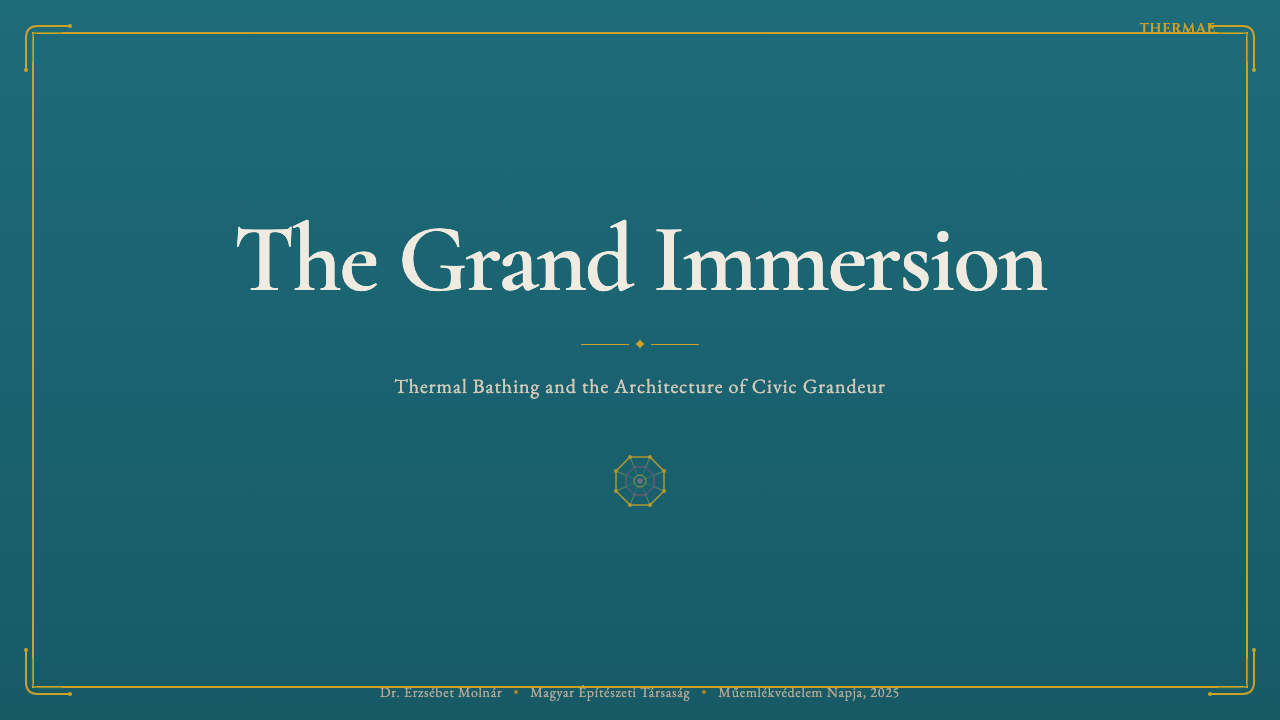
For presentation slides, this style rewards investment in atmosphere on the cover page. A strong cover places the title in weighted serif type at upper-center — echoing the inscribed names above bath entrances — against a deep turquoise ground, with a brass-toned rule or ornamental border framing the composition. Content slides should shift to cream grounds with turquoise used as a structural accent color: section headers, divider rules, and data highlights. Data slides benefit from treating charts as tile-like geometric objects — bar charts given solid turquoise or cream fills, framed by thin brass-toned borders — so that the data visualization feels continuous with the decorative system rather than dropped in from a different visual language.在演示文稿中,这种风格值得在封面页投入对氛围的营造。一个强有力的封面将标题以具重量感的衬线字体置于上中部——呼应浴场入口上方的铭刻名称——衬以深蓝绿底色,以黄铜色调的分割线或装饰边框框架构图。内容页应转向奶油底色,以蓝绿色作为结构性强调:章节标题、分割线与数据高亮。数据页可通过将图表视为类瓷砖几何对象来获益——柱状图给予纯实的蓝绿或奶油填充,以细黄铜色边框框定——使数据可视化感觉与装饰系统连续,而非从另一套视觉语言中植入。
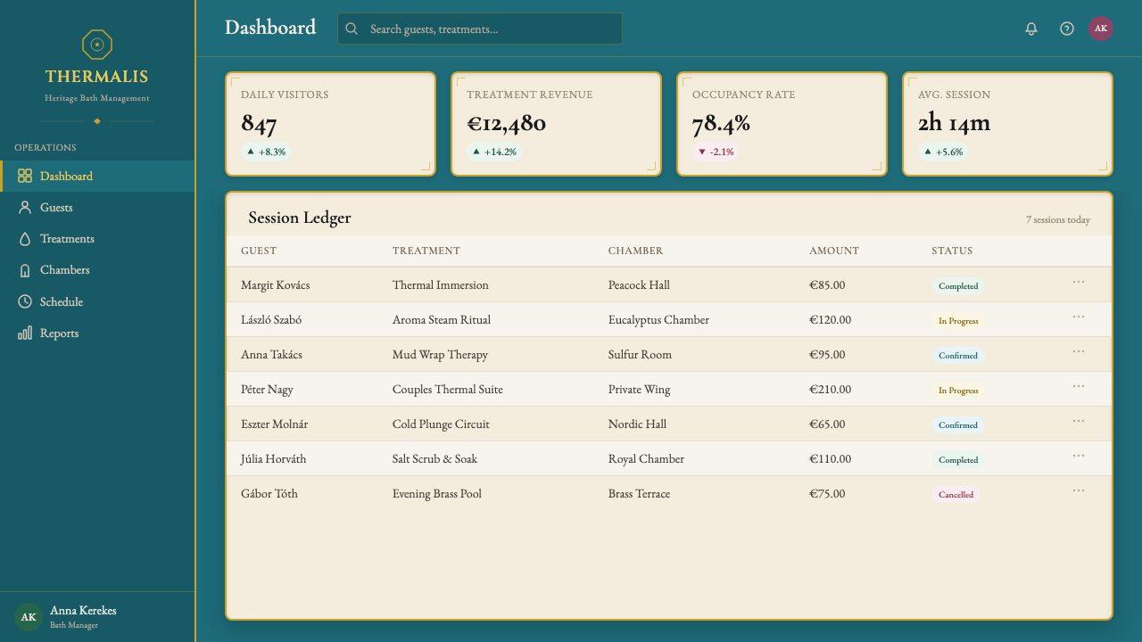
For web interfaces, the style is well suited to premium service dashboards, spa and wellness booking platforms, heritage hospitality brands, and any context where the visual language should communicate longstanding quality rather than startup novelty. The approach: set a near-turquoise or deep cream background depending on section, use serif type for all display headings and section titles, and reserve brass-toned or gilt accents for interactive states, call-to-action borders, and navigational highlights. Card components should feel slightly weighted and solid — subtle inner shadows on their turquoise or cream fills rather than floating drop shadows. Pricing pages work particularly well in this register, where the ceremonial gravity of the style reinforces the perceived value of what is being offered.对于网页界面,这种风格适合高端服务仪表板、温泉与健康预订平台、历史传承酒店品牌,以及任何视觉语言应传达久经考验的品质而非初创新鲜感的场景。方法:根据版块设置接近蓝绿或深奶油色背景,所有展示标题与章节标题使用衬线字体,将黄铜色调或鎏金强调保留给交互状态、行动召唤边框与导航高亮。卡片组件应感觉略具重量与实体感——蓝绿或奶油填充上的细微内阴影,而非漂浮的投影。定价页在这种基调中效果尤为出色,风格的仪式性庄重感强化了所提供内容的感知价值。
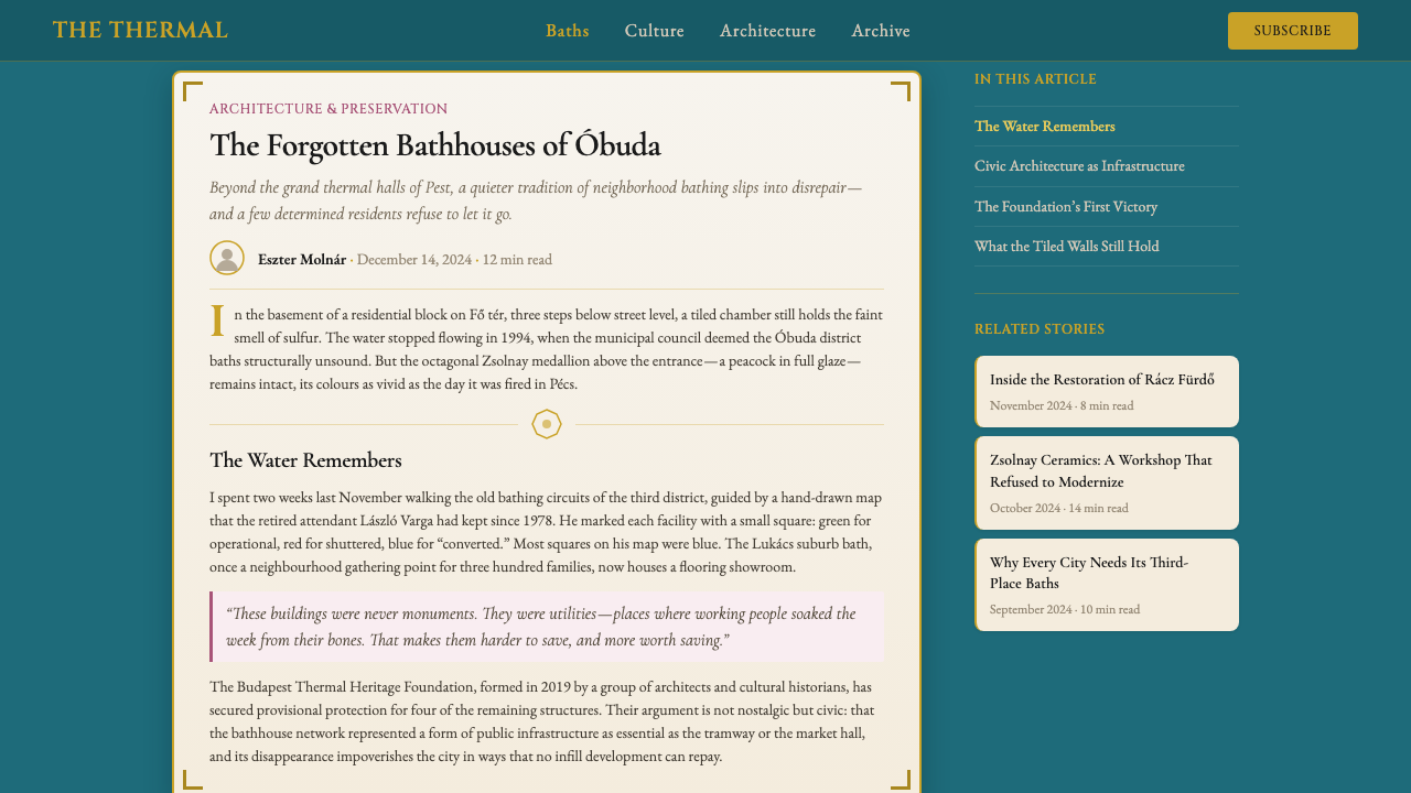
For editorial and marketing applications, the style supports a distinctive poster sensibility: strong typographic hierarchy, ornamental framing, and the visual density of a public announcement rather than the airy lightness of contemporary minimalism. Feature pages and hero sections work well with full-width turquoise grounds bearing large serif headline type in cream. Pull quotes and testimonials can be framed with the Secession-derived ornamental border vocabulary, which lends credibility through visual weight without relying on photography or illustration. For marketing collateral — event programs, printed menus, institutional brochures — the style scales beautifully to print, where its mineral color depth and serif typography translate directly from screen to paper.对于编辑与营销应用,这种风格支持一种独特的海报感性:强烈的字体层级、装饰性框架,以及公共告示的视觉密度,而非当代极简主义的轻盈通透。特色页面与首屏区块适合以全宽蓝绿底色承载奶油色的大型衬线标题字体。引用语与推荐词可以用分离派衍生的装饰边框词汇加以框架,通过视觉分量建立可信度,而无需依赖摄影或插图。对于营销附件——活动节目单、印刷菜单、机构宣传册——这种风格在印刷上表现优异,其矿物色彩深度与衬线字体从屏幕到纸张直接转换而无损失。
A common mistake when applying this style is treating the turquoise as a background-only color while allowing the other elements — typography, ornament, borders — to drift toward generic luxury conventions like pure gold, deep navy, or stark white. Authentic application maintains the ceramic mineral quality throughout: the brass reads as aged, not polished; the cream reads as warm stone, not clinical white; the serif type has architectural weight, not calligraphic elegance. A second mistake is over-ornament: because the historical sources are richly decorated, designers sometimes layer tile patterns, border motifs, and medallion elements simultaneously until the composition collapses into visual noise. The rule is that ornament should frame and articulate, never compete with content.应用这种风格时最常见的错误,是将蓝绿色仅作为背景色处理,同时让其他元素——字体、装饰、边框——漂移向纯金色、深海军蓝或冷白等通用奢华惯例。真实的应用在整体中保持陶瓷矿物质感:黄铜读来是岁月沉淀而非抛光锃亮;奶油读来是温暖石材而非临床洁白;衬线字体具有建筑分量而非书法优雅。第二个错误是过度装饰:由于历史来源装饰繁复,设计师有时会将瓷砖纹样、边框母题与勋章元素同时叠加,直至构图崩溃为视觉噪音。原则是:装饰应当框架与阐明,而非与内容竞争。
See the Budapest Thermal Bath Art Deco design system查看 Budapest Thermal Bath Art Deco 完整设计系统
Budapest Thermal Bath Art Deco — FAQBudapest Thermal Bath Art Deco · 常见问题
How is this style different from general Art Deco?这种风格与一般的装饰艺术风格有何不同?
General Art Deco — as practiced in Paris, New York, or Miami — favors streamlined geometry, stepped forms, and a palette that often runs to black, gold, and accents of jewel-bright color. Budapest Thermal Bath Art Deco shares the period's interest in geometric order and material richness, but its specific palette and ornamental vocabulary are distinct: the Zsolnay ceramic turquoise has no equivalent in the French or American Art Deco tradition, the Hungarian Secession ornament draws from folk textile and Magyar migration-route patterns rather than Egyptian or Aztec sources, and the overall atmosphere is mineral and civic rather than glamorous and commercial. Think of it as Art Deco filtered through a Central European civic bathing culture rather than a Hollywood film set.一般的装饰艺术风格——如在巴黎、纽约或迈阿密实践的那样——偏爱流线几何、阶梯形态,以及常常以黑色、金色与宝石般亮色点缀的色板。布达佩斯温泉浴场装饰艺术与同时期对几何秩序和材料丰富性的关注相通,但其特定色板与装饰词汇是独特的:乔尔纳伊陶瓷蓝绿在法国或美国装饰艺术传统中毫无对等物,匈牙利分离派装饰取法民间纺织品与马扎尔迁徙路线纹样,而非埃及或阿兹特克来源,整体氛围是矿物质感的与市民性的,而非迷人的与商业性的。可以理解为:装饰艺术经由中欧公共沐浴文化过滤,而非经由好莱坞电影布景。
Can this style work for a digital-native product that has no connection to Budapest or spas?这种风格能用于与布达佩斯或温泉毫无关联的纯数字产品吗?
Yes — the connection to the historical source is atmospheric rather than literal. What the style communicates is institutional permanence, sensory warmth, and earned authority: the feeling of a place or organization that has been trusted for a long time. Any digital product whose brand positioning depends on conveying trust, heritage, quality over novelty, or premium service — financial platforms, professional services, cultural institutions, hospitality and travel brands — can benefit from the style's visual registers without any explicit reference to baths or Hungary. The key is to apply the system as a coherent whole rather than borrowing individual elements (the turquoise alone, or the serif alone) without their supporting context.可以——与历史来源的联系是氛围性的而非字面性的。这种风格所传达的是机构永久性、感官温度与经由时间赢得的权威感:一种场所或机构长期以来被信赖的感觉。任何品牌定位依赖于传达信任、传承、品质优先于新奇或高端服务的数字产品——金融平台、专业服务、文化机构、酒店与旅游品牌——都能从这种风格的视觉基调中获益,无需任何对浴场或匈牙利的明确参照。关键在于将这个系统作为连贯整体来应用,而非在缺乏支撑语境的情况下借用单独元素(仅蓝绿色,或仅衬线字体)。
Is this a light or dark style, and can it be inverted?这是浅色还是深色风格?可以反转吗?
The canonical form is light-ground: the deep turquoise functions as the dominant accent and structural fill against cream surfaces, not as an all-over background. A full dark inversion — where turquoise covers the majority of the screen — is possible and can be effective for hero sections, event posters, or premium landing page moments, but it requires restraint with the brass and cream accents, which can quickly become overwrought against a saturated turquoise ground. The most successful dark applications use the turquoise at reduced saturation, letting cream and brass do more compositional work. A full dark-mode implementation of a dashboard or content-heavy interface in this style tends to feel oppressive unless the turquoise is shifted toward a deeper, almost teal-adjacent tone.经典形态是浅色底面:深沉的蓝绿色作为主导强调与结构性填充,衬托在奶油表面上,而非覆盖全域的背景。完全的深色反转——蓝绿色覆盖屏幕大部分区域——是可行的,对首屏区块、活动海报或高端着陆页关键时刻可能效果出色,但需要对黄铜与奶油强调保持克制,这两种颜色在饱和蓝绿底色上很容易显得过度繁复。最成功的深色应用将蓝绿色的饱和度降低,让奶油与黄铜承担更多构图工作。仪表板或内容密集界面的完整深色模式实现,在这种风格中往往感觉压抑,除非蓝绿色被调整为更深沉、接近深青色的色调。
How should ornament be calibrated to avoid looking like a pastiche?装饰应如何校准以避免显得像是风格模仿拼贴?
The distinction between authentic application and pastiche lies in how ornament relates to structure. In the historical bathhouses, ornament occurs at the junctions and boundaries of architectural elements: where a column meets a vault, where a tile field ends, where an arch springs from a wall. It marks the logic of construction. In two-dimensional application, the same principle holds: ornamental borders should appear at the edges of panels and sections, not floating in the middle of a composition; tile-pattern motifs should repeat with geometric regularity that references craft production; medallion or roundel elements should function as focal anchors at compositional centers or corners. Ornament applied without this structural logic — scattered as texture across a background, or layered over typography as decoration — reads as costume rather than architecture.真实应用与风格拼贴之间的区别,在于装饰与结构的关系。在历史浴场建筑中,装饰出现在建筑构件的接合处与边界:柱子与拱顶相遇处,瓷砖区域的终结处,拱券从墙体起拱处。它标记的是建造的逻辑。在二维应用中,同样的原则成立:装饰边框应出现在面板与版块的边缘,而非漂浮在构图中央;瓷砖纹样母题应以参照工艺生产的几何规律性重复;勋章或圆形元素应在构图中心或角落发挥焦点锚定作用。没有这种结构逻辑的装饰——作为肌理散布在背景上,或作为装饰叠加在字体之上——读起来是服装而非建筑。
Which contexts are a poor fit for this style?哪些场景不适合这种风格?
The style's mineral weight and ceremonial register make it a poor fit for products that need to communicate speed, playfulness, or approachable informality. Consumer social apps, youth-facing entertainment platforms, fast-casual food brands, and anything whose UX depends on the user feeling in casual control rather than reverentially attended to will find the style's gravity working against them. It is also a difficult fit for highly technical developer tools or scientific data applications, where the ornamental richness can undermine the impression of rigorous precision. And because the palette is cool-warm rather than warm-warm, it sits uneasily with categories that depend on appetite appeal — food photography backgrounds, cooking and recipe platforms — where the sulfur-cream can read as unpleasantly associated with heat rather than pleasantly associated with age.这种风格的矿物分量与仪式基调,使其不适合需要传达速度感、趣味性或平易近人的非正式感的产品。消费者社交应用、面向年轻人的娱乐平台、快餐食品品牌,以及任何其用户体验依赖用户感到轻松自主而非被恭敬侍奉的场景,都会发现这种风格的庄重感与自身对立。它也难以适配高度技术性的开发者工具或科学数据应用,在那里装饰丰富性会破坏严格精确的印象。此外,由于色板是冷暖混合而非纯暖调,它与依赖食欲吸引力的类别——食品摄影背景、烹饪与食谱平台——也搭配勉强,硫磺奶油色在那里可能被解读为与热度不愉快地关联,而非与岁月感愉快地关联。
Related design styles相关设计风格
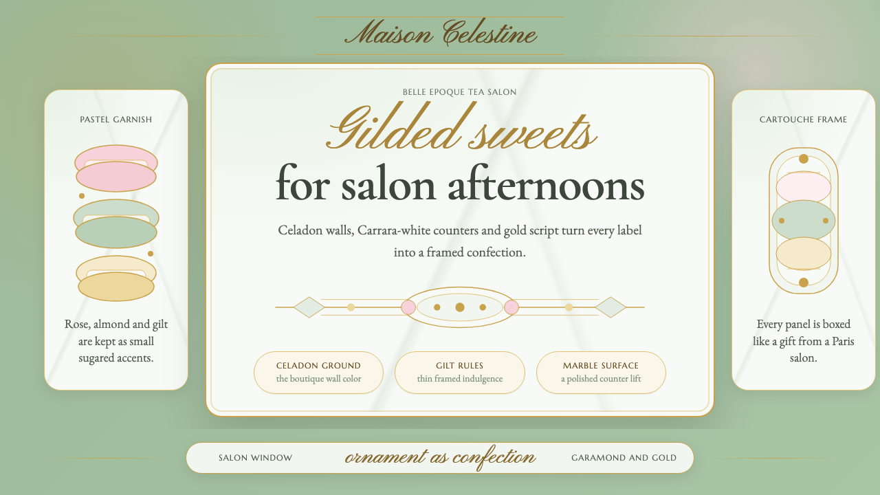 French PâtisserieOrnament is the luxury. Celadon ground, gilt cartouches, Garamond and script…以装饰定义奢华:青瓷绿底、烫金框、加拉蒙与花体字。
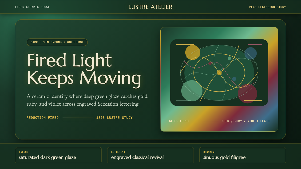 Zsolnay Eosin CeramicsGlaze becomes theater. Dark eosin green flashes gold, ruby, and violet throug…釉色即剧场:深绿釉地在分离派曲线中闪出金、红与紫。
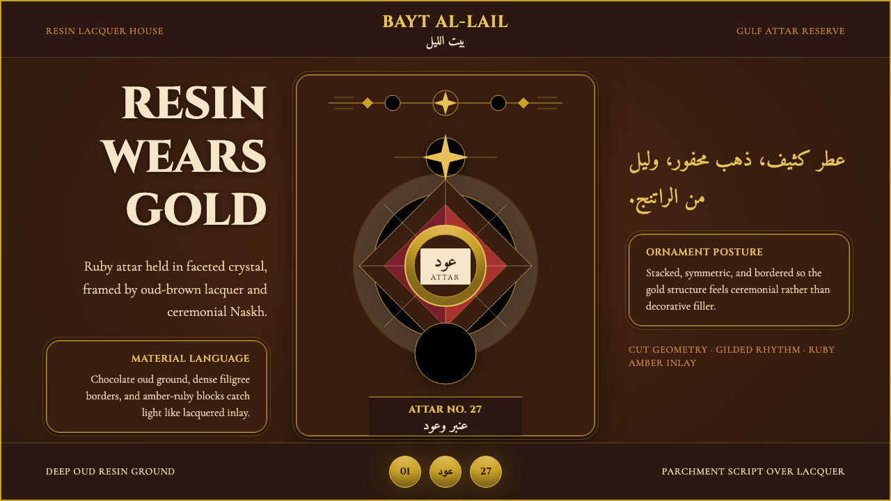 Arabian Oud Attar BottleResinous luxury, gilded. Chocolate oud lacquer frames Cinzel caps and ruby-am…树脂般奢华,通体镀金。巧克力沉香漆底托起金色大写与红琥珀切面。
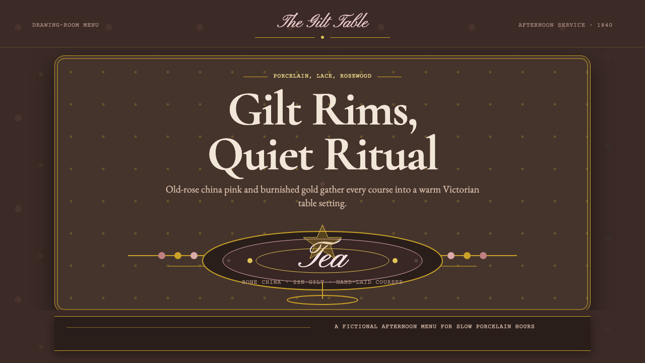 English Afternoon TeaOrnament is the ritual. Old-rose porcelain, gilt rims, and script rest on ros…装饰即仪式。旧玫瑰瓷粉、鎏金边与花体字落在玫瑰木暗底。
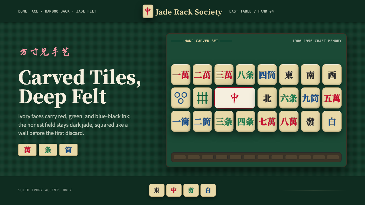 Mahjong Tile SetTactile craft on jade felt. Ivory tiles carry red, green, and blue ink in a h…翠绿毡面上的手工触感:象牙牌面承载红绿蓝三色刻墨。
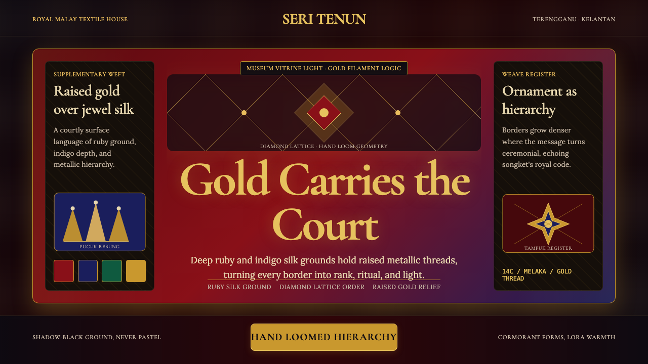 Malaysian Songket (Gold-Thread Weave)Royal textile opulence. Ruby and indigo silk grids lift gold-thread relief.皇家织物的华贵:红宝石与靛蓝格栅托起金线浮雕。