What is Mahjong Tile Set?
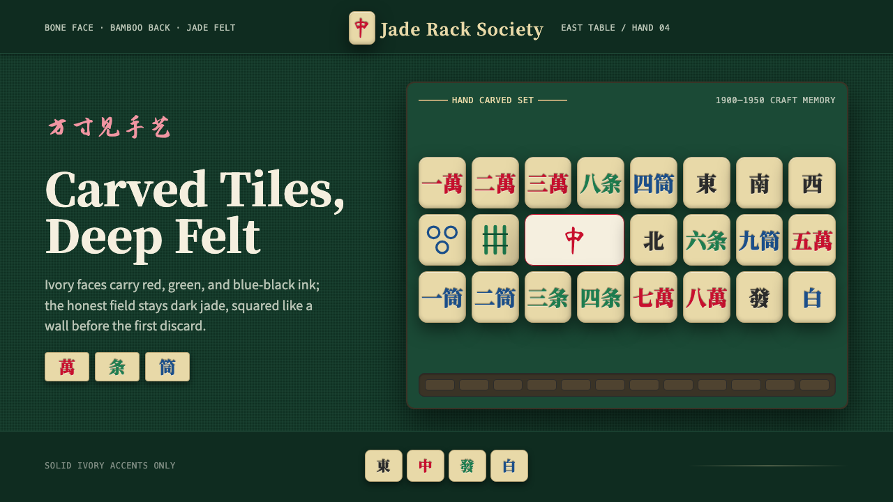
Mahjong Tile Set is a design language rooted in the bone-and-bamboo gaming tiles of early-twentieth-century East Asia — jade-green felt as the ground, ivory tile faces as accent, and hand-carved ink in a disciplined triad of red, green, and blue. It is craft-first, ornamental without being decorative, and carries the unhurried weight of a game played for hours around a hongmu wood table.
Mahjong Tile Set in brief
Mahjong Tile Set takes its visual grammar directly from the physical gaming tile: a pale ivory or bone face set against a deep jade-green ground, with hand-inked suit markings — bamboo sticks, circular discs, and Chinese numerals — rendered in crimson, emerald, and deep blue-black. The felt table surface, not the tile face, is the dominant field; ivory appears only as an elevated accent, the way a tile rests on cloth.
The system is dense with ornamental detail — carved line weights, stylized character forms, repeating geometric suits — yet it is not fussy. The detail is functional craft: every mark on a tile face exists to distinguish that tile from 143 others. Pattern and precision coexist because they must. The aesthetic is gaming logic applied to visual design: clarity under conditions of many simultaneous elements.
Culturally, the style carries the signature of East Asian leisure culture in the early twentieth century — tea-house afternoons, the click of tiles on lacquer trays, the ceremony of racking and drawing. It is neither nostalgic kitsch nor mere exoticism; it is a material culture with its own rigorous internal logic, and applying it well means understanding what made the original object so refined.
Where does Mahjong Tile Set come from?
Mahjong's physical form crystallized in late Qing-dynasty China, most likely during the 1870s and 1880s, though contested origin stories place its invention variously in Ningbo, Shanghai, and among military officers. The early tiles were made from bone laminated onto bamboo backing — a construction that gave the suit names their meaning: the 'bamboo' suit referenced the backing material, while 'circles' and 'characters' referenced the ink markings on bone faces. Each set required the labor of skilled carvers who cut suit marks, wind indicators, and dragon tiles by hand, then filled the incisions with colored ink.
The spread of mahjong through China's treaty-port cities in the early 1900s accelerated the standardization of tile sets and the aesthetics that came with them. Shanghai workshops in particular produced tiles for export alongside the domestic market, and it was a Shanghai-style ruleset that Joseph Park Babcock codified into English in his 1920 rules booklet, which he titled 'Mah-Jongg.' Babcock's codification — which also standardized the tile numbering for Western audiences — touched off a global craze in the 1920s, with mahjong sets manufactured in bone-and-bamboo, celluloid, and eventually Bakelite selling across the United States, Britain, and Japan.
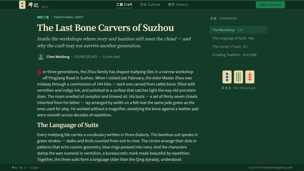
The visual grammar of the tile set — the deep green of the baize table, the ivory of the bone face, the tricolor ink — was fixed well before mahjong became an international phenomenon. Those color choices were not decorative decisions made by a single designer; they emerged from material constraints and cultural convention. Green baize minimized tile glare and signaled that this was a serious game table. Ivory bone was the most available durable material for the face. The three ink colors — red for warmth and luck, green for calm and continuation, blue-black for precision and character strokes — mapped onto established associations in Chinese visual culture.
In Japan, the game arrived in the early twentieth century and was adapted into a faster, simpler ruleset that became standard there by the postwar period. Japanese tile manufacturers developed their own aesthetic variations — cleaner lines, more standardized character forms, eventually the fully plastic tile — while retaining the core color triad. The modern mahjong tile set as a design object is therefore a composite: Qing-era carving traditions, Shanghai export aesthetics, Western mass-production adaptations, and Japanese streamlining, layered across a century of international play.
What defines the Mahjong Tile Set look?
Ground and Field
The dominant field in Mahjong Tile Set is deep jade green — the color of the baize gaming table. This is an unusual reversal: most design systems use a light ground with dark elements. Here the ground is dark and saturated, and the tile face (pale ivory) floats on it as a contained accent. Spatial hierarchy is established by the contrast between the expansive green field and the isolated tile rectangles. Secondary compositions that invert to a light ground work only when the green appears as a concentrated accent, not as an afterthought.
Tricolor Ink Palette
The suit markings use three distinct ink colors: a warm crimson-red for the bamboo suit and most numeral forms, a rich emerald green for circle and character variants, and a deep blue-black for structural line work and wind tile characters. These three colors are not decorative choices — they are functional differentiators derived from centuries of tile-making convention. In a design context, this triad functions best when each color is assigned a distinct semantic role rather than used interchangeably. Red draws the eye first; green sustains it; blue-black anchors the legibility of fine detail.
Ornamental Precision
The carved markings on mahjong tiles are ornamental in that they carry visual richness — stylized bamboo stalks, ring-within-ring circles, brushstroke character forms — yet every element is disciplined by legibility requirements. Nothing is added for pure decoration. The ornament serves identification. This dual nature — visually rich yet functionally strict — is the hardest quality to replicate and the most distinctive when achieved. It rules out both bare minimalism and undisciplined decoration.
Tile Geometry
The tile itself is a portrait-oriented rectangle with slightly rounded corners — a contained, discrete unit. This geometry recurs throughout the design system as the primary organizing shape: content blocks, cards, and frames echo the tile's proportions. Grid arrangements of tiles create a satisfying visual rhythm because each unit is identical in its outer boundary and varied only in its face marking. That combination — uniform container, varied interior — is a structural principle with broad application to card-based interfaces, gallery layouts, and data grids.
Tactility and Depth Cues
The original tile is a three-dimensional carved object: ink fills recessed channels cut into a raised face. This tactile quality translates into design as subtle layering — the tile face elevated above the felt ground, the carved mark sitting within the tile face. Depth is suggested by material contrast rather than by light-source shadows. The green felt has a soft nap texture; the bone face is smooth and hard; the ink sits in the cut. This three-material layering — textile, bone, pigment — informs how spatial depth is communicated without resorting to drop shadows or gradients.
Character and Symbol Systems
Mahjong tiles carry a rich symbolic vocabulary: Arabic-style numerals rendered in Chinese character form, stylized bamboo counts, concentric ring counts, directional characters for the winds, and the three dragon tiles — each a distinct symbolic register. This layered symbol system — combining counting marks, directional signs, and honorific characters — gives the aesthetic its depth. Applied to interface design, it suggests a preference for information-rich components that reward close reading over bare labels, without becoming cryptic or requiring specialized knowledge to navigate.
Dark Elegance
Mahjong Tile Set is one of the relatively rare historical design traditions that is authentically dark — the jade-green ground is not a mode but a core condition. This makes it unusual: most dark-mode aesthetics in contemporary digital design are inverted light modes and carry that inversion's awkwardness. Here, the darkness is primary. It connotes the felt table of a private game room, quality materials in dim interior light, and the quiet ceremony of a game that demands sustained attention. Applying this system in a light-mode context requires inverting a tradition that was never designed for light.
Who shaped Mahjong Tile Set?
The anonymous craftsmen of Shanghai's late Qing and Republican-era tile workshops established the visual conventions that the Mahjong Tile Set aesthetic inherits. Working with bone saws, carving tools, and small ink brushes, these workshops produced sets that exported the aesthetic worldwide. The tricolor ink palette, the specific weight of carved lines, and the proportions of the tile face relative to its margins were all standardized through workshop practice rather than deliberate design invention.
Babcock, an American working in Shanghai for Standard Oil in the early 1920s, codified a simplified ruleset and published it in English under the name 'Mah-Jongg,' a spelling he trademarked. His rules booklet, accompanied by standardized tile numbering for Western players, triggered the global mahjong craze of the 1920s. By placing Shanghai-style tile aesthetics in front of Western consumers, Babcock inadvertently fixed the visual conventions of the Chinese tile set — green table, ivory face, tricolor ink — as the international standard image of the game.
No single person designed the mahjong tile set; it is a collective artifact. But the set as a whole — 36 bamboo tiles, 36 circle tiles, 36 character tiles, 16 wind tiles, 12 dragon tiles, and 8 bonus tiles — is one of the most sophisticated information design systems in pre-digital gaming. Each tile must be distinguishable at a glance under low light, from a short distance, and at an angle. The system uses color, number, and symbolic form simultaneously to encode identity, and it does so within a format barely larger than a domino.
The Japanese riichi mahjong tradition, which became dominant in Japan by the mid-twentieth century, introduced its own refinements to the tile aesthetic: cleaner, more regularized character forms, higher contrast between the tile face and its markings, and eventually the shift to plastic tiles with crisper edges. Japanese tile manufacturers such as Mahjong Museum-affiliated workshops codified these refinements. The result was a slightly colder, more mechanical version of the tile aesthetic that influenced the international tournament standard and is now the most widely reproduced version of the look.
American mahjong, popularized through Jewish-American communities in the mid-twentieth century and formalized by the National Mah Jongg League founded in 1937, diverged from the Chinese and Japanese traditions most visibly through the addition of the Joker tile — an extra wild card with its own illustrated face, often featuring a jester, dragon, or decorative cartouche. This American addition introduced a new visual register to the tile set: illustrated, painterly, and not bound by the tricolor ink convention. American Mahjong tiles are often the most visually elaborate in the tradition.
How do you use Mahjong Tile Set today?
Mahjong Tile Set is a high-specificity style: its visual weight, dark ground, and ornamental detail make it unsuitable as a neutral container for arbitrary content. It works best when the product has genuine thematic alignment with craftsmanship, East Asian cultural heritage, gaming, or premium leisure, and where the audience is expected to recognize or appreciate the reference. The first application decision is always whether the style's cultural specificity serves or constrains the message.
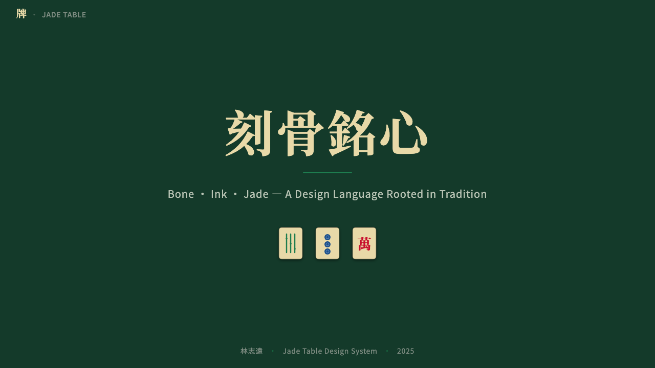
For presentation slides, the dark jade-green ground establishes authority and distinctiveness from the first frame. Cover slides benefit from sparse tile-face elements — isolated symbolic marks, a restrained tricolor accent, and generous dark space. Body slides must resist the temptation to over-ornament: use the tile-face rectangle as a content card format, letting white or ivory text float on the green ground. Data slides can use the tricolor ink logic to assign semantic meaning to categories — one color per data series, never all three at once at equal visual weight.
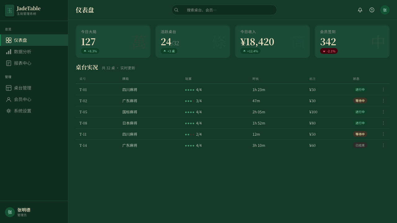
For web interfaces and dashboards, the style is most effective on premium, collector-oriented, or gaming-adjacent products. The deep green ground reads as sophisticated in dark-mode contexts. Card components can echo the tile geometry — portrait rectangles, slightly rounded corners, a visible border or inset shadow to simulate the tile-face elevation. Navigation should use the tricolor sparingly: red for primary action, green for confirmation or success states, blue-black for structural text. Avoid using the full tricolor palette for decorative purposes; it reads as noise.
For editorial and marketing work, the style's poster-like density suits feature announcements, limited-edition launches, and product reveals where the dark, jewel-toned presentation signals exclusivity. A mahjong-inflected editorial layout uses the tile grid as a structural metaphor: equal-width columns containing discrete content units, with ruled borders rather than white-space gutters. Running text should be restrained — the style is not suited to long-form reading layouts; it is better for content that wants to be scanned and admired rather than read linearly.
The most common mistake when applying Mahjong Tile Set is confusing it with generic East Asian decorative motifs — using red and gold, adding cherry blossoms or lucky characters without structural purpose, or treating jade green as a background color while keeping a fundamentally Western layout system underneath. The style's coherence comes from the tile logic: discrete units, tricolor differentiation, ground-dominant dark field, ornamental precision. Remove those structural properties and what remains is costuming rather than style.
Mahjong Tile Set — FAQ
Is Mahjong Tile Set appropriate for non-gaming products?
Yes, but with a caveat. The style's cultural specificity is an asset when it creates authentic thematic resonance and a liability when it imposes an arbitrary cultural frame. It works well for products in luxury goods, collectibles, premium hospitality, East Asian cultural institutions, or any context where the audience has cultural familiarity and the theme earns the reference. It becomes strained when applied to products with no thematic connection — a generic SaaS dashboard or a Western food brand — where the visual language reads as appropriation rather than homage. The question to ask is: does the jade green earn its place, or is it there because it looks interesting?
How does this style relate to other East Asian design traditions?
Mahjong Tile Set occupies a distinct niche within East Asian visual traditions. It is not Japanese wabi-sabi, which values imperfection, asymmetry, and natural materials; the tile set is precise, symmetrical within each tile face, and made from processed materials. It is not the imperial Chinese aesthetic of lacquer and gold, which prioritizes elaborate surface decoration and hierarchical symbolism. It is closer to the vernacular craft traditions of Chinese artisan workshops — skilled, legible, slightly commercial — designed to be handled repeatedly under real conditions of play. Its closest relatives are other game object aesthetics: the dominoes tile, the playing card, the go stone.
Can the style work in a light-mode digital context?
It can, but it requires accepting that the inverted version is a derived interpretation rather than the authentic system. In a light-mode adaptation, the ground shifts to warm ivory or very pale cream, the jade green becomes an accent color rather than the dominant field, and the tricolor ink palette carries forward unchanged. This inversion loses the felt-table depth that gives the dark version its material character, but it gains legibility in contexts where dark-background interfaces are impractical. The light-mode version is essentially a tile-face aesthetic without the table — the ivory and tricolor remain, but the ground that contextualizes them is gone.
How should the tricolor palette be balanced in practice?
The three ink colors — red, green, blue-black — are not equal in visual weight or frequency of use in the original tile set. Red dominates by count: the character tiles, most bamboo tiles, and several wind and dragon tiles use red as their primary marking color. Green appears as a secondary accent on the circle suit and certain character variants. Blue-black is used structurally for fine outlines and certain character forms, never as a dominant hue. Applying this hierarchy in digital work means: red for primary labels and active states, green for secondary differentiation, and blue-black for structure and body text. Using all three at equal saturation and scale simultaneously produces the visual confusion of a mismatched tile set.
What is the most common misreading of this aesthetic?
The most common misreading is treating Mahjong Tile Set as broadly 'Chinese' or 'Asian' and then borrowing elements from other traditions — red lantern shapes, dragon illustrations, lotus patterns, or imperial gold — that have no relationship to the tile-and-felt system. This collapses a specific material culture into a generic regional signifier. The tile set aesthetic is not about Chineseness in the abstract; it is about a specific object, a specific material tradition, and a specific context of use. Accuracy means referencing the tile, the felt table, the bone face, and the tricolor ink — nothing more and nothing less. Anything added beyond those four anchors risks drifting into undifferentiated cultural shorthand.
Related design styles
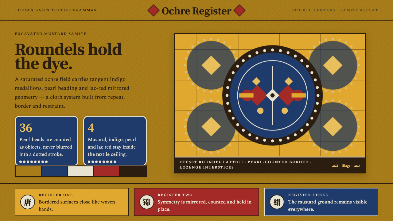 Astana Tomb SilksDye survives as structure. Mustard ground, indigo roundels and pearl beads lo…
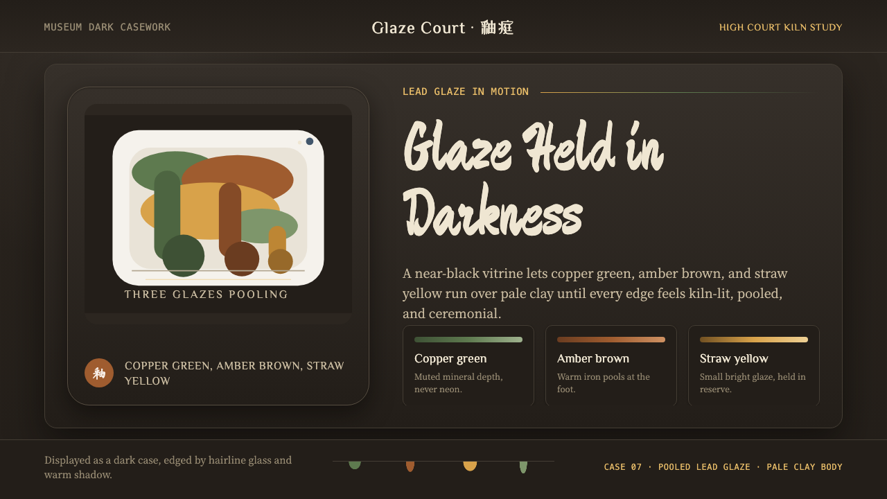 Tang Sancai 唐三彩Museum-dark and molten. Copper green, amber, and straw pools glow in bordered…
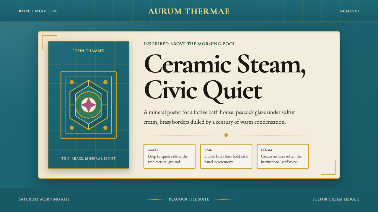 Budapest Thermal Bath Art DecoCivic steam, made ceremonial. Peacock turquoise, brass borders, and Garamond…
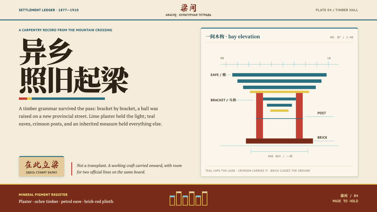 Dungan Settlement CraftCarpentry holds its ground. Teal eaves and crimson posts frame sunlit plaster…
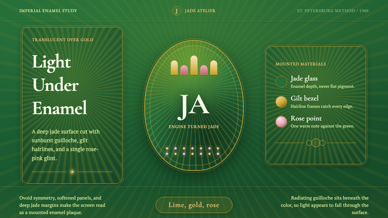 Faberge Guilloche EnamelImperial enamel glows. Jade guilloche, gilt hairlines, rose-pink points.
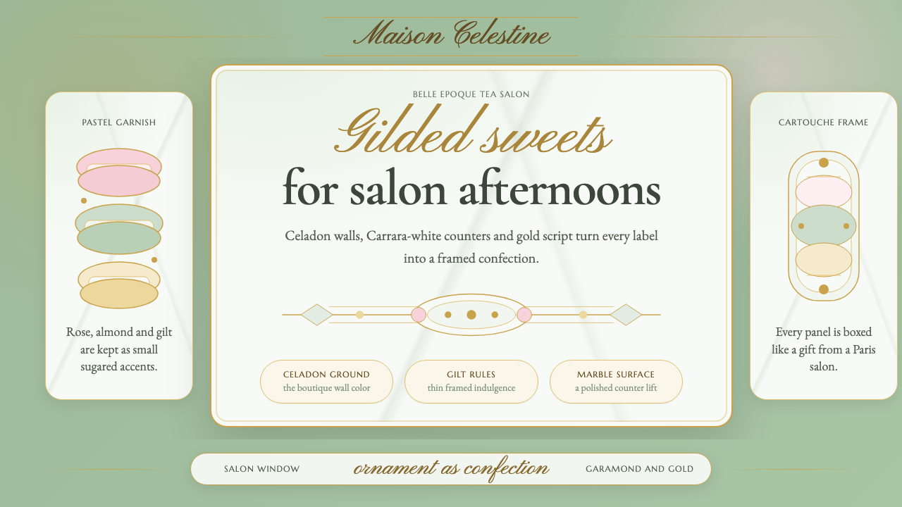 French PâtisserieOrnament is the luxury. Celadon ground, gilt cartouches, Garamond and script…