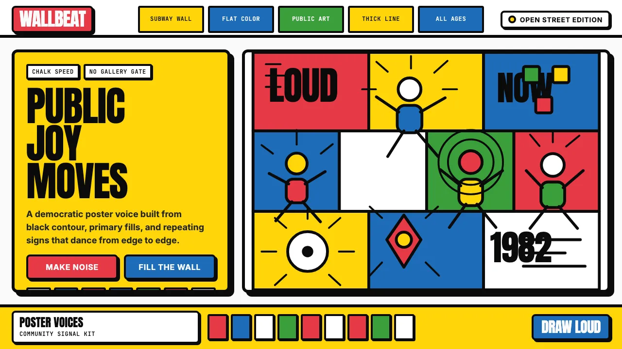
About Keith Haring Pop
Keith Haring's visual language is pure democratic energy — thick black contour lines defining dancing babies, barking dogs, and radiant figures, filled with cadmium red, cobalt blue, chrome yellow, and Kelly green. Born in NYC subway stations as chalk drawings on blank ad spaces, this style rejects gallery exclusivity in favor of rhythmic, edge-to-edge compositions that pulse with movement and joy.
This system captures Haring's flat-color, no-gradient, no-perspective approach: chunky outlined components, saturated primary fills, and comic-book offset shadows that feel hand-drawn and alive.
- Origin
- New York City, United States
- Era
- 1980–1990; peak public-art production 1982–88
- Key figures
- Keith Haring · Andy Warhol · Tony Shafrazi · Jenny Holzer
- Movements
- 1980s East Village art scene · AIDS-era activist visual art · public-art democratization
Keith Haring Pop design spec
Colors
Typography
The other 11 sections — buttons, cards, spacing, motion, techniques and more — open once you unlock. Download the DESIGN.md or send it to your AI in one click. Unlock once, yours forever.
Sign up nowStyles similar to Keith Haring Pop
Also inspired by art & artists, with a close feel.
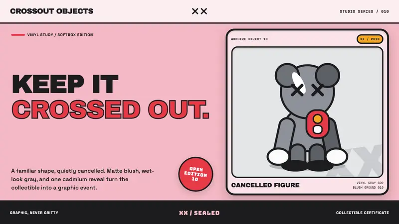 KAWS Companion (2010)Playful, with its eyes crossed out. Blush fields frame glossy gray vinyl and fat black lines.
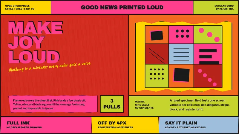 Corita Kent SerigraphJoy printed at full volume. Flame red, hot pink, and misregistered type flood the sheet.
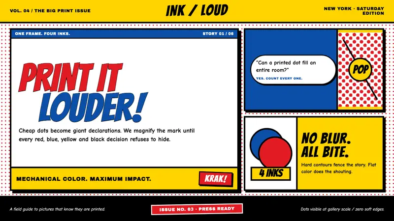 Lichtenstein Ben-Day (1963)Cheap print becomes heroic. Primary inks, giant dots and hard black contours shout at wall scale.
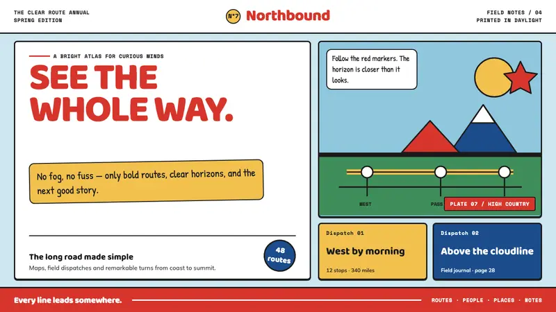 Tintin (Hergé Ligne Claire)Adventure reads at a glance. Flat spot colors and uniform black contours map every turn.