What is Congolese Sapeur (Kinshasa Suit)?
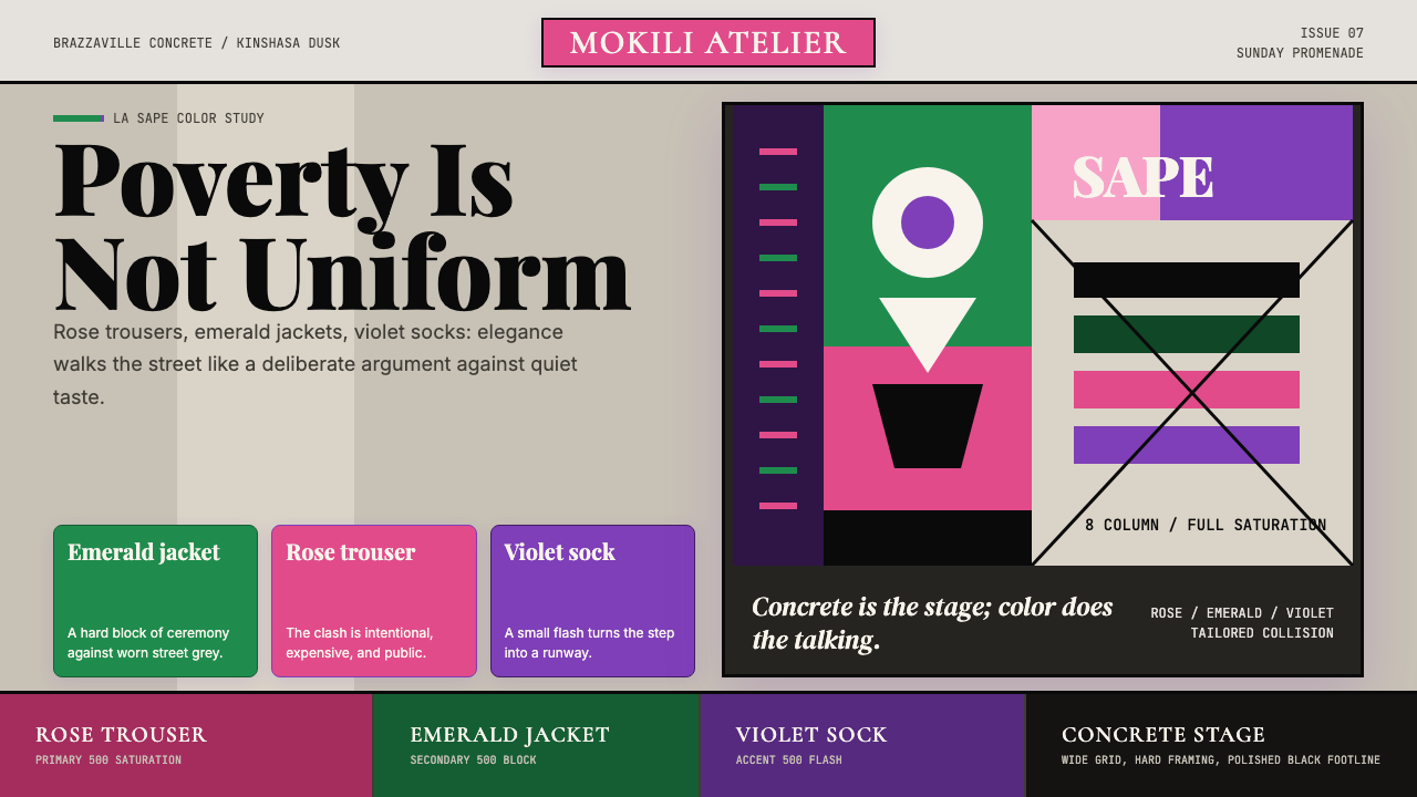
La Sape transforms the suit into a weapon — Congolese men spending months of wages on European couture, then parading sun-baked streets to prove that elegance belongs to everyone.
Congolese Sapeur (Kinshasa Suit) in brief
La Sape — the Société des Ambianceurs et des Personnes Élégantes, the Society of Ambiance-Makers and Elegant People — is a Congolese subculture in which working-class men from Brazzaville and Kinshasa dedicate themselves to the acquisition, display, and philosophical practice of high fashion. The sapeur is not merely a well-dressed man. He is a figure who has weaponized elegance against poverty, against colonial memory, and against any assumption that couture is the property of the wealthy. The suit is simultaneously armor, argument, and artwork.
Visually, the aesthetic is defined by deliberate color collision. Where conventional Western tailoring favors restraint — neutral blacks, navies, and greys — the sapeur embraces rose pink against emerald green, violet against cobalt, mustard against burgundy. These are not accidents or failures of taste. They are studied provocations, each combination curated over months and worn with the bearing of a man who has spent years learning exactly how loud elegance can be. The ground against which all this color explodes is Brazzaville's worn concrete grey, the unpainted walls of Bacongo and Bandal — and that contrast is entirely the point.
The Congolese Sapeur design system captures this visual logic: a palette of high-saturation, unexpected color pairings on a muted urban ground; silhouettes that are precise and tailored to near-theatrical severity; and an overall sensibility that treats every visible surface — lapel, sock, pocket square, shoe — as a deliberate compositional decision. Nothing is incidental. Everything is curated.
Where does Congolese Sapeur (Kinshasa Suit) come from?
The roots of La Sape stretch back to the early twentieth century, when Congolese men working in the French colonial service or traveling to Paris for study returned home with European suits and a new understanding of what dressed authority looked like. In a colonial system that defined Africans as subjects rather than citizens, appearing in impeccable European tailoring was a quietly radical act — a reclamation of dignity through the very symbols the colonizer had claimed as his own. This early gesture of sartorial resistance planted the seed of what would become a formal movement.
The movement crystallized in Brazzaville in the 1950s and 1960s, as musicians and neighborhood men developed increasingly competitive rituals of display. The Congo River waterfront, the outdoor bars of Bacongo, the evening promenades along the Boulevard Marien Ngouabi — these became the stages on which the sapeur performed. The performance had rules: colors must clash deliberately, not accidentally; the label must be visible (or its quality evident to anyone who knew); the walk must convey absolute unconcern with the observer's opinion. This last element — performing elegance as if it required no effort — was and remains the hardest to master.
Papa Wemba, the legendary Congolese rumba singer and style icon, brought La Sape from neighborhood subculture to international awareness in the 1980s. Based between Kinshasa and Paris, Papa Wemba dressed his band members in coordinated high-fashion ensembles and wove sartorial philosophy directly into his lyrics and public persona. His Paris connections gave the sapeurs access to Yohji Yamamoto, Jean-Paul Gaultier, and Azzedine Alaïa. He did not simply wear expensive clothes; he constructed a theology of dress in which the suit was a form of spiritual discipline, an argument that Congolese men deserved to occupy the most elevated space of any room they entered.
The peak years of La Sape as a mass phenomenon ran roughly from 1985 to 2000, when thousands of young Congolese men in both capitals made the acquisition of a single label garment the organizing ambition of a year or more. The sacrifice required was genuinely extreme — months of wages, borrowed money, extraordinary discipline — and this extremity was understood as proof of commitment. During the civil conflicts that tore through both Brazzaville and Kinshasa in the 1990s, sapeurs maintained a non-violence pact, continuing their promenades through streets that were dangerous by any standard. The suit, in those years, was also a statement of refusal: to be reduced to a combatant, to let war define what a man from the Congo could be.
What defines the Congolese Sapeur (Kinshasa Suit) look?
Color Collision
The defining visual principle of La Sape is the deliberate pairing of colors that conventional Western taste would separate. Rose pink alongside emerald green, violet against cobalt, tangerine against sky blue — these combinations are not decorative accidents but studied provocations. The palette is drawn from the most saturated register of each hue family, intensified further by the muted concrete and earth-tone ground of the urban environment that forms the backdrop. The collision creates visual heat, and the sapeur's mastery lies in finding pairings that feel defiant rather than discordant.
Precision Tailoring
The sapeur's suit is not off-the-rack. The silhouette is precisely fitted — jackets that define the shoulder, trousers that break at exactly the right point above the shoe, shirt collars that frame the neck rather than float around it. This precision is partly about quality (the most desirable brands are prized for their construction) and partly about visual argument: a perfectly fitted garment makes color play legible, while a loose or ill-proportioned suit collapses the whole system into costume. Fit is the structural grammar on which everything else rests.
Accessory Orchestration
In the sapeur's visual system, no surface is left unconsidered. Socks are chosen to introduce a third or fourth color into the composition; pocket squares are folded to a specific geometry and selected for their capacity to bridge or contrast the jacket and shirt tones; shoes — typically from heritage European makers — are polished to a mirror finish that catches and concentrates the available light. The walking cane or the precisely angled hat, when carried, functions as a punctuation mark that closes the composition. The full look is orchestrated, not assembled.
The Urban Ground
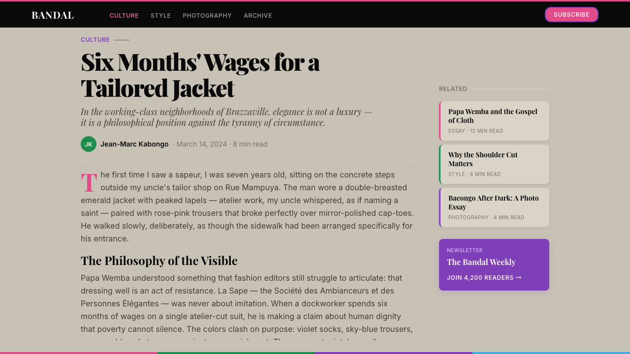
La Sape cannot be understood apart from its setting. The aesthetic is explicitly designed against the backdrop of Brazzaville and Kinshasa's working-class neighborhoods — worn concrete, unpainted walls, packed earth streets, the faded hues of corrugated iron. This ground is not incidental. The gray and ochre of the urban environment function as the neutral field against which the saturation of the sapeur's palette reads as spectacular. Remove the backdrop and the color combinations change in meaning; on a white gallery wall, they would simply be bold. Against Bacongo's concrete, they are defiant.
The Economy of Desire
Part of the sapeur aesthetic's meaning is inseparable from the sacrifice it represents. A single Weston shoe, a single Cerruti jacket can represent months of accumulated savings or wages borrowed against future earnings. This is not hidden; it is part of the public statement. The garment arrives carrying the weight of its acquisition, and the sapeur wears that weight visibly, as an argument about what a man from Congo is willing to invest in his own dignity. The aesthetic cannot be authentically reproduced by simply buying expensive clothes — it requires the full biographical context of sacrifice, aspiration, and deliberate self-elevation.
Theatricality of Bearing
The sapeur does not merely wear a suit; he performs wearing a suit. The walk is slow, deliberate, calibrated to allow the eye to take in each element of the ensemble. The posture is upright to the point of architectural formality. The expression is one of composed indifference to being observed — which is itself a performance of supreme confidence. This theatricality of bearing is as much a part of the aesthetic as the clothes themselves. A sapeur's outfit photographed on a hanger loses more than half its meaning. The body in motion, inhabiting the clothes as though the clothes were inevitable, is the full artwork.
Non-Violence as Aesthetic Principle
La Sape carries an explicit ethical dimension that is also an aesthetic one. Sapeurs maintain a code of non-violence: the suit is the weapon, and elegance is the only combat permitted. During the civil conflicts of the 1990s, this was not a metaphor — sapeurs walked through war zones in their finest clothes, refusing to pick up arms. The refusal is built into the visual system: you cannot carry a gun and keep a suit crease sharp. The aesthetic demands a kind of bodily discipline and deliberate peacefulness that shapes every element of how the style is worn and performed.

Who shaped Congolese Sapeur (Kinshasa Suit)?
The most internationally prominent figure in La Sape's history, Papa Wemba was a Congolese rumba and soukous musician who made La Sape the philosophical and visual center of his artistic identity. Based between Kinshasa and Paris from the late 1970s onward, he dressed his band, the Viva la Musica, in coordinated high-fashion ensembles and articulated a theology of dress in which the suit was a form of spiritual self-cultivation. His Paris connections introduced sapeurs to the highest registers of European fashion, and his prolific recording and touring career spread La Sape's visual codes globally. He remains the movement's prophet and its most quotable theorist.
A near-mythological figure in Congolese popular culture, Stervos Niarcos — born Albert Maxime Niarcos in Brazzaville — was one of the founding archetype-builders of sapeur style in the 1960s and 1970s. His extreme dedication to European fashion and his theatrical public presence helped establish the behavioral codes of the movement: the deliberate walk, the studied indifference to the observer, the principle that the suit is not clothing but a manifesto. Niarcos became a reference point against which subsequent generations of sapeurs measured their own commitment.
A celebrated contemporary sapeur from Brazzaville, Camille Diata represents the movement's post-civil-war revival and its evolution into a form of heritage practice. His ability to source and combine garments from multiple European makers — pairing pieces from different decades and design houses into a single coherent ensemble — exemplifies the advanced compositional skill that La Sape demands. Diata has participated in international photographic projects and exhibitions that have brought La Sape to global fashion audiences, while insisting on the movement's deep Congolese social roots.
A Spanish documentary photographer who spent years embedded in Brazzaville's sapeur community, Hector Mediavilla's photographs are among the most important visual documents of the movement in its peak years. His work captures the full texture of La Sape as lived practice — the promenades at golden hour, the community rituals, the physical neighborhoods that form the backdrop, and the specific quality of attention that sapeurs bring to every element of their appearance. Mediavilla's photographs introduced La Sape to international design and fashion audiences who might otherwise have encountered only distant, decontextualized images of the style.
A prominent sapeur known for his capacity to construct complete ensembles in which every element — suit, shirt, tie, pocket square, socks, shoes, and hat — belongs to a single coherent color and compositional argument. Covary represents the intellectual dimension of La Sape: the sapeur not as a man who simply buys expensive things, but as a designer who works with the body as a canvas, color as a medium, and the street as a gallery. His approach demonstrates that the movement is, among other things, a school of applied color theory conducted entirely outside any formal design institution.
How do you use Congolese Sapeur (Kinshasa Suit) today?
The Congolese Sapeur system is one of the most distinctive and philosophically loaded visual languages available to a contemporary designer. Applying it correctly means understanding its core tension: maximum chromatic intensity against a deliberately restrained, muted ground. The system does not work in environments where everything is vibrant — it requires a base layer of visual silence against which the color collisions can register as the spectacle they are intended to be.
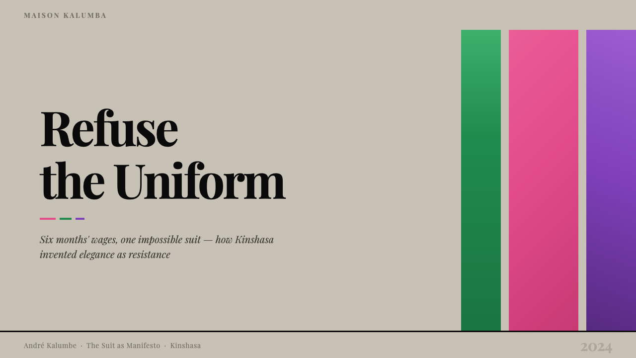
For presentation slides, the system delivers exceptional results when used for cover and section-break pages. A cover built on this aesthetic typically establishes a deep, desaturated background — the urban concrete register — and then introduces one or two high-saturation color areas in unexpected combination: a rose-pink heading block against an emerald accent line, or a violet section marker against a cobalt rule. Content slides should pull back to a near-neutral ground with color used only for emphasis and hierarchy. The key discipline is restraint in the body of the presentation, reserving the full chromatic intensity for structural moments. Data slides benefit from the color collision logic applied to chart segments — bar charts where adjacent bars occupy deliberately contrasting hue families produce the system's characteristic visual heat without sacrificing legibility.
For web interfaces, the system translates most effectively to marketing landing pages, portfolio sites, and editorial platforms rather than dashboard or data-heavy applications. The muted ground should be a warm grey or worn concrete tone rather than pure white — the neutrality needs to carry some weight of its own. Typography should be used boldly: large, confident type at high contrast against the ground, with color applied to headings or calls to action rather than distributed throughout the body. Interactive states and hover effects are an ideal location for the color collision logic — a button that shifts from one saturated tone to an unexpected complementary tone on hover carries the sapeur sensibility directly into the interaction layer.
For editorial and marketing work, the style supports a poster-like boldness that reads well at large scale. Feature spreads and campaign visuals benefit from the full treatment: a deep, muted ground, a precisely dressed figure or compositional element, and color combinations that feel studied rather than accidental. The aesthetic is particularly strong in fashion, culture, and social impact contexts, where its philosophical dimension adds meaning beyond pure decoration. Brand identity work can draw on the system by establishing a color palette of two or three high-saturation hues that are explicitly not harmonious in the conventional sense — chosen for their defiant pairing rather than their comfort.
A common mistake when applying the sapeur aesthetic is using it too evenly — distributing the saturated colors across the entire composition so that nothing reads as ground and nothing reads as figure. The system only works when the muted base is genuinely muted and the color collisions are genuinely concentrated. A second common error is treating the style as purely decorative, importing the color combinations without the structural precision — the fitted silhouette logic — that holds them together. Color collisions without compositional discipline produce chaos rather than spectacle. The sapeur aesthetic is one of the most demanding to apply correctly, precisely because its apparent exuberance is actually the product of extreme rigor.
Congolese Sapeur (Kinshasa Suit) — FAQ
Is La Sape a fashion trend or a social movement?
It is both, and the two dimensions are inseparable. As a visual practice, La Sape has its own rigorous codes of color, fit, and accessory orchestration that function exactly as a design system. As a social phenomenon, it represents a century-long act of collective resistance — working-class Congolese men using the language of European luxury to assert dignity and selfhood against colonial and post-colonial structures that denied both. Designers who borrow from La Sape purely as an aesthetic reference while ignoring its social meaning will produce work that looks appropriative rather than inspired. Understanding the philosophical argument behind the color combinations is what distinguishes respectful engagement from extraction.
How is Congolese Sapeur different from other dandy or peacock aesthetics?
Many cultures have traditions of male elegance and conspicuous dress, from the English dandy to the Italian sprezzatura tradition to the Harlem Renaissance style of the 1920s. What distinguishes La Sape is the severity of the economic sacrifice involved and the explicit political dimension of the practice. The English dandy was typically drawing on genuine wealth; the Harlem Renaissance gentleman was asserting dignity in the face of American racial segregation. The sapeur is doing something specific to the post-colonial Congolese context: using the material culture of the former colonizer as a medium for arguing that Congolese identity deserves the same regard as any European one. The color collision aesthetic also sets it apart visually — where most dandy traditions favor restraint, La Sape favors spectacle.
Can the sapeur color logic work in digital interfaces, or is it too extreme?
It can work, but it requires structural translation. The key is that digital screens emit rather than reflect light, which means high-saturation colors at full intensity on screen can produce visual fatigue in ways that the same colors in fabric do not. The sapeur color system translated to digital should calibrate the saturation slightly — using the color families and collision logic without pushing every value to its maximum. The muted ground becomes even more important in digital contexts: a rich, slightly warm grey or dark neutral gives the color collisions room to breathe. Used on marketing or editorial pages at full intensity for hero sections, with the rest of the interface dialing back, the system translates extremely well.
What is the relationship between La Sape and Congolese music?
The two are deeply intertwined. Congolese rumba and soukous music — which dominated much of sub-Saharan African popular music from the 1960s through the 1990s — provided the social infrastructure of La Sape. Musicians were its most visible practitioners and ambassadors; performances were the primary occasions for sapeur display; and the values of the music — generosity, joy, communal celebration, the transformation of difficulty into pleasure — are also the values of La Sape. Papa Wemba made the connection explicit, treating his concert performances as sapeur parades. The music's international success, especially in France and Belgium, created the Paris networks through which Congolese men accessed European fashion. Dress and music are not separate parts of Congolese popular culture — they are the same argument made through different media.
Is there a risk of cultural appropriation when using this aesthetic?
Yes, and the risk is proportional to how little of the context is carried into the application. The sapeur aesthetic emerged from a specific history of post-colonial resistance, economic sacrifice, and political courage. A designer who uses the color collision logic, the tailored precision, and the muted-ground-versus-saturated-color structure while acknowledging that history — and ideally directing attention back to it — is engaging respectfully with a living tradition. A designer who simply extracts the visual codes for a product that has no connection to that context is doing something closer to appropriation. The distinction is not about permission but about acknowledgment and reciprocity: does the work know where it comes from, and does it give that origin any visibility?
Related design styles
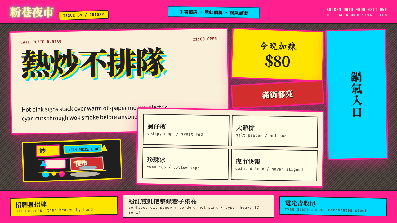 Taipei Shilin Night Market NeonLoud by design. Hot pink, neon yellow, and stacked TC serif signs break the g…
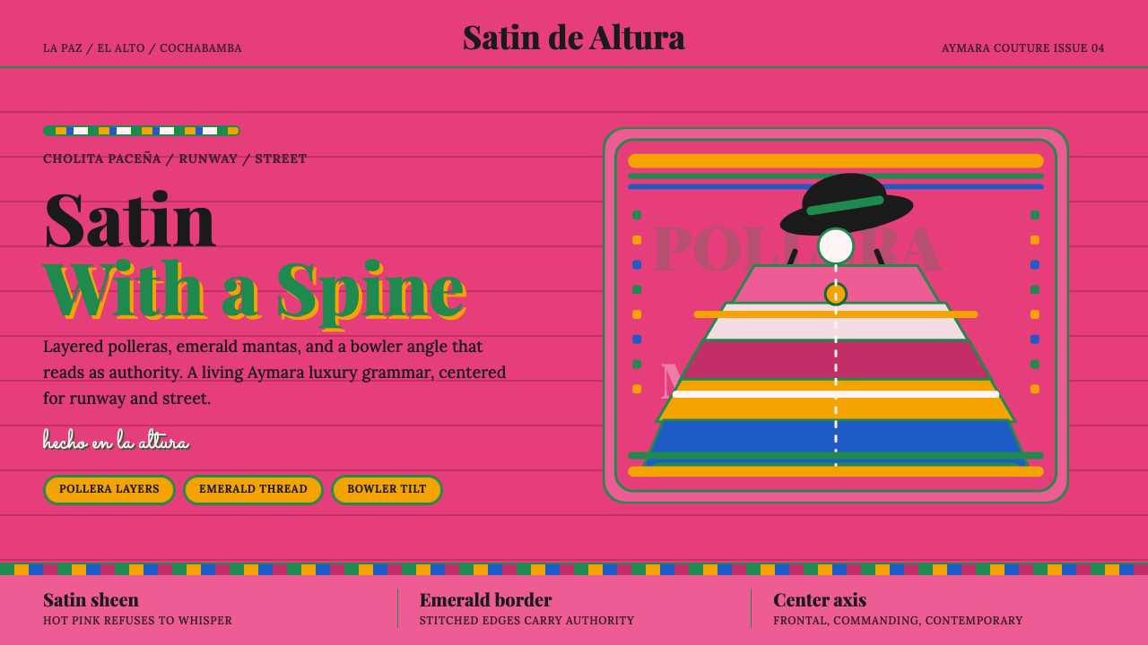 Bolivian Cholita FashionUnapologetic satin power. Hot pink fields, emerald stitches, centered pollera…
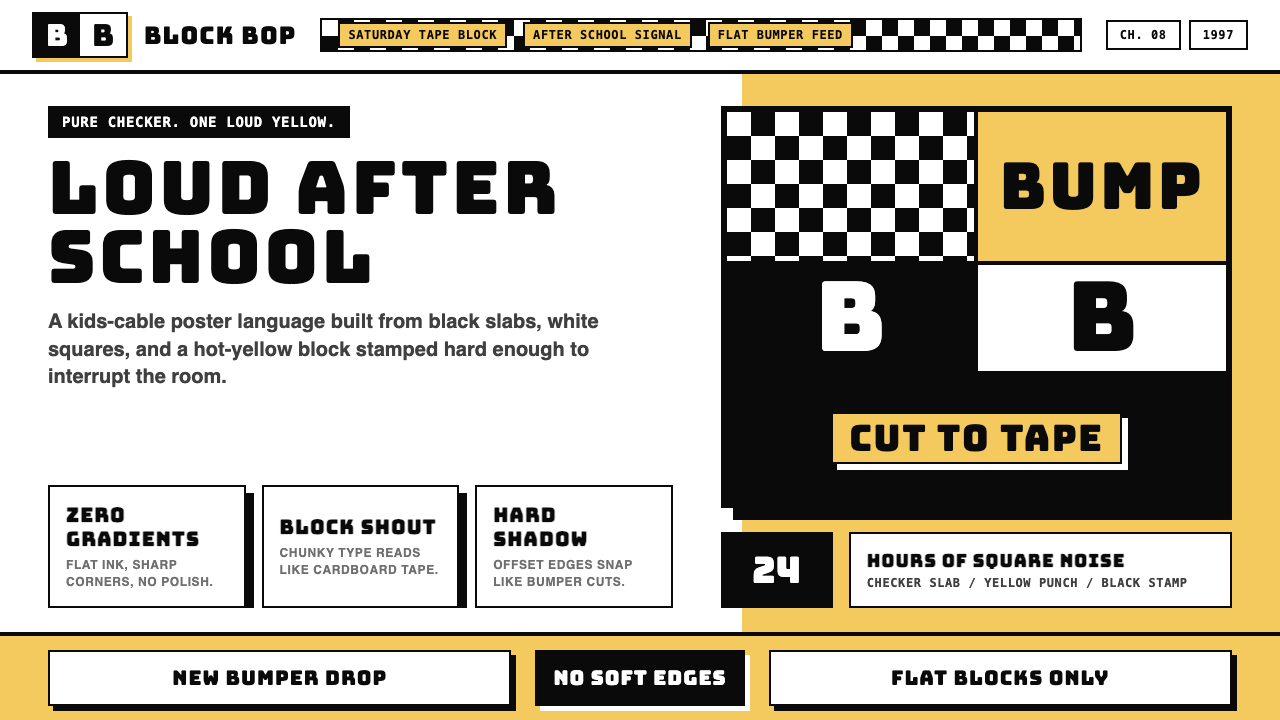 Cartoon Network 90s BlocksKids-cable noise, squared. Black-white checkerboards crash into hot-yellow Bu…
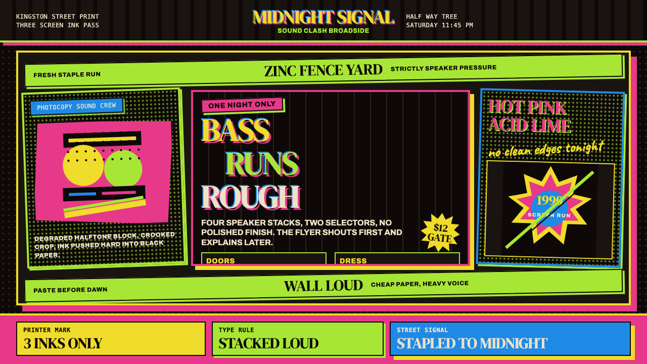 Jamaican Dancehall 1990 PosterMidnight volume. Acid lime and hot pink type stack like screenprint ink on bl…
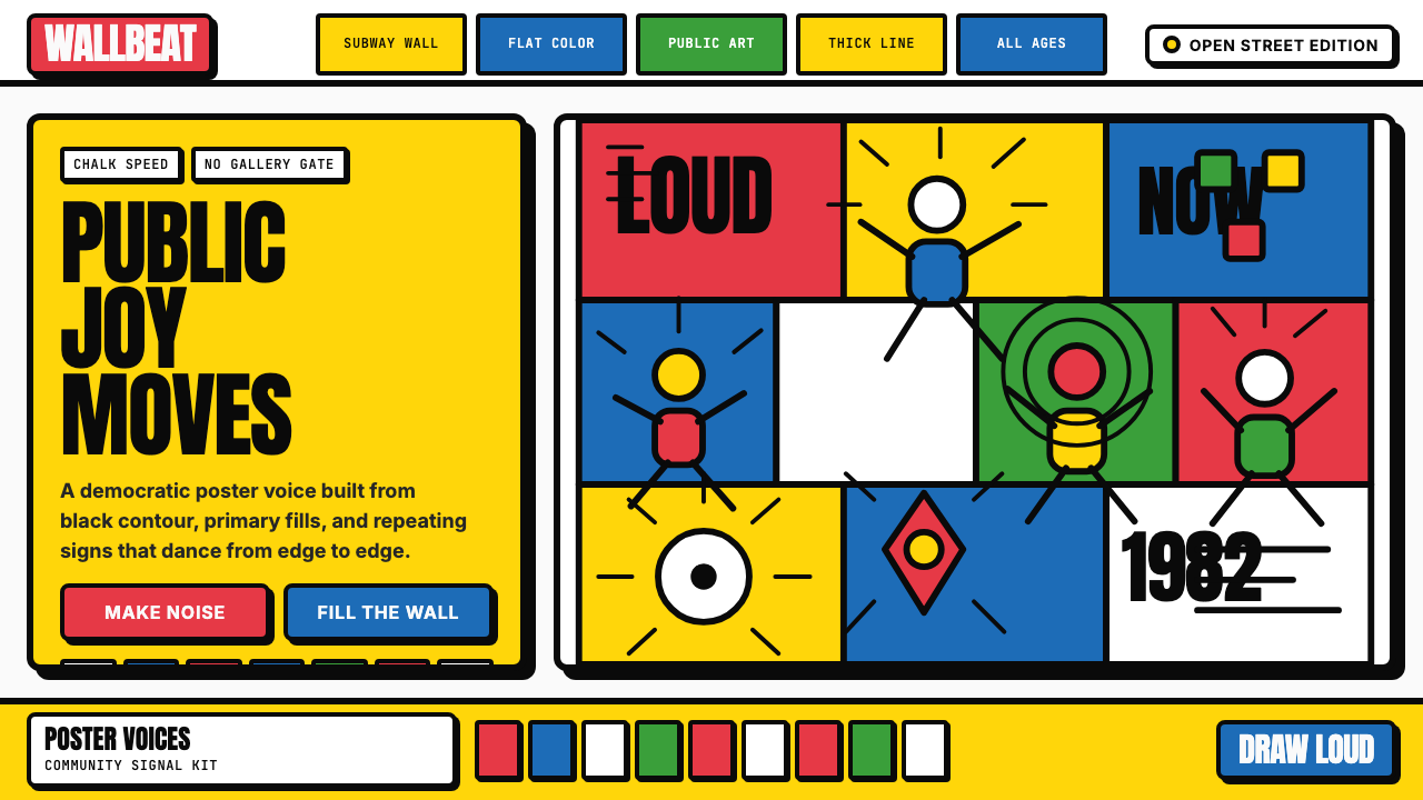 Keith Haring PopJoy refuses the gallery. Thick black contours pack primary color into a danci…
 South Park Cutout (1997)Crude is the charm. Opaque paper shapes, marker-black seams, and snow-bright…