What is Situationist Détournement (1957)?
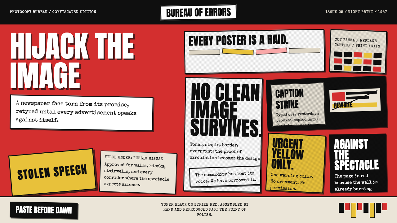
Situationist Détournement turned the mass media's own images into weapons against it — hijacking advertisements, comic strips, and religious paintings to smuggle revolutionary theory into everyday visual life.
Situationist Détournement (1957) in brief
Situationist Détournement is the visual and rhetorical practice of seizing existing cultural material — advertisements, comic panels, film stills, propaganda imagery, religious iconography — and repurposing it with new text or altered context to expose, subvert, or ridicule the original message. The word 'détournement' comes from the French verb meaning to divert, hijack, or lead astray. Coined and systematized by the Situationist International (SI) between 1957 and 1972, it is a visual language built from contradiction: recognizable images carrying unrecognizable meanings.
As a designed aesthetic, the style is defined by the texture of reproduction: photocopy grain, toner-saturated black, smudged halftone dots, and the slight blur that accumulates with each generation of duplication. Text is set in typewriter monospace or blunt sans-serif caps — rarely elegant, always urgent. Color, when it appears, arrives in flat, signal-red floods. Comic panels are borrowed wholesale and redrawn with speech bubbles emptied and refilled with dense theoretical text, making philosophical argument look like pulp fiction. The overall effect is a document that feels both mass-produced and clandestine — something printed in a basement and passed hand to hand.
At its core, Détournement is a theory of cultural sabotage applied to visual communication. The Situationists argued that capitalist society had turned lived experience into a passive spectacle — a stream of images and commodities consumed without critical engagement. Détournement was the counter-move: using the spectacle's own materials to disrupt the spectacle. Every hijacked image was simultaneously a critique and a demonstration of how meaning is constructed and controlled.
Where does Situationist Détournement (1957) come from?
The Situationist International was founded in Cosio d'Arroscia, Italy, in July 1957, when several European avant-garde groups converged: the Lettrist International (Paris), the International Movement for an Imaginist Bauhaus (led by Asger Jorn), and the London Psychogeographic Association. Guy Debord, who had been developing the theory of détournement since the early 1950s within the Lettrist circle, became the SI's dominant theorist and de facto editor of its journal, also called Internationale Situationniste, which ran from 1958 to 1969. The journal was the primary vehicle through which the aesthetic was disseminated — its pages combined philosophical essays, stolen comic strips, altered news photographs, and hand-drawn maps of psychogeographic drifts.
The intellectual roots ran deep into the Parisian avant-garde. The Dadaists had already pioneered collage and photomontage as tools of cultural disruption in the years after the First World War — Debord acknowledged the debt. The Surrealists had explored the shock of incongruous juxtaposition. But where Dada was anarchic and Surrealism was psychoanalytic, Détournement was explicitly Marxist in its theoretical framework, drawing on the young Marx's concept of alienation and on the Frankfurt School's analysis of the culture industry. Debord's 1967 book The Society of the Spectacle systematized these ideas: the spectacle was not just media or advertising — it was the entire social relationship between people mediated by images.
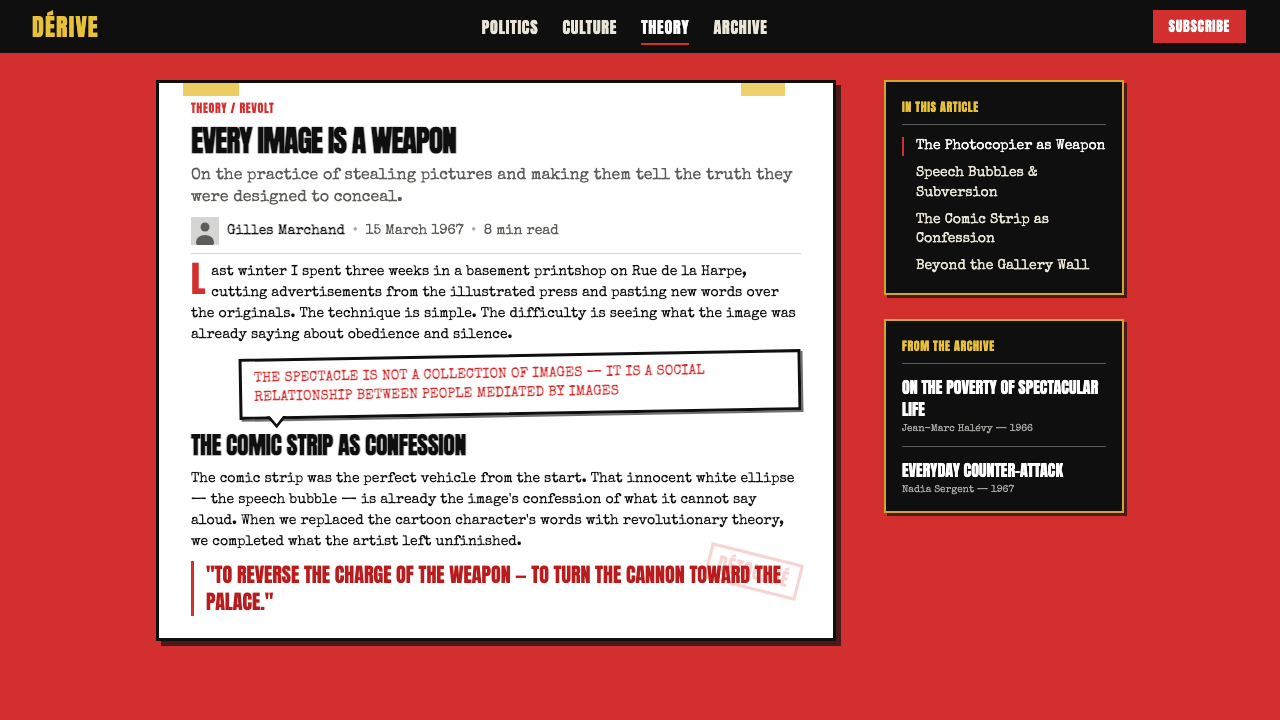
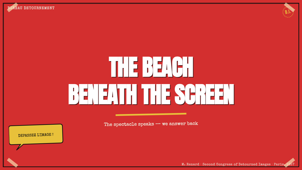
The aesthetic reached its most visible and influential expression during May 1968, when students and workers nearly toppled the French government. The Atelier Populaire — a collective of students and workers operating the occupied printing presses at the École des Beaux-Arts — produced hundreds of silk-screen posters in the Détournement mode: flat red grounds, blocky sans-serif lettering, and stark black imagery. Slogans like 'Sous les pavés, la plage' ('Under the cobblestones, the beach') and 'L'imagination prend le pouvoir' ('Imagination seizes power') captured the movement's fusion of poetic language and direct political demand. These posters were designed to be made quickly, reproduced cheaply, and pasted immediately onto walls — medium and message were inseparable.
After 1968, the Situationists' direct influence dispersed but proved remarkably durable. The British punk scene of the mid-1970s absorbed Détournement through Malcolm McLaren and Jamie Reid, who studied SI theory at art school. Reid's cut-and-paste ransom-note graphics for the Sex Pistols — most famously the safety-pin-pierced portrait of the Queen for the 'God Save the Queen' single cover — were Détournement translated into tabloid culture. From punk, the sensibility fed into zine culture, culture jamming movements of the 1990s, the anti-globalization visual rhetoric of the early 2000s, and the digital meme ecosystem that continues to the present.
What defines the Situationist Détournement (1957) look?
Found-Image Collage
The primary building block is always a stolen image — a panel ripped from a popular comic, a cropped advertisement, a news photograph, a frame from a Hollywood film. The image arrives with its original cultural associations intact, and those associations are precisely the material being worked against. Nothing is illustrated from scratch; everything is appropriated. The skill lies not in making images but in selecting, cutting, and repositioning them so that their original context becomes visible as a construction — something that was made to produce a particular meaning and can be unmade to produce another.
Overwritten Speech Bubbles
The most distinctive formal device of Détournement is the repurposed speech bubble. Comic panels — chosen for their narrative clarity and their status as low, popular, commercial culture — are kept intact while their dialogue is replaced wholesale with philosophical argument, revolutionary polemic, or sardonic commentary. Dense theoretical language delivered through the visual codes of entertainment creates an immediate cognitive jolt: the form promises one kind of reading experience, the content delivers something entirely foreign. This dissonance is the point.
Photocopy and Toner Texture
The surface quality of Détournement work is inseparable from its means of production. Images were reproduced on mimeograph machines and early office photocopiers; each generation of copying increased the grain, deepened the shadows, and softened the edges of halftone dots into pools of black. This degradation was not a limitation to be overcome — it was a marker of authenticity, of the underground circuit through which materials passed. In contemporary applications, this quality is evoked through heavy grain overlays, high-contrast black-and-white conversion, and the deliberate avoidance of clean vector precision.
Strike Red as Signal Color
Color in Détournement work is almost always reduced to a binary: black on a ground that is either white-paper white or strike red. The red does not function decoratively — it is the color of emergency, of labor strikes, of warning. Applied as a flat flood to a background or headline block, it reads before the text is parsed. The absence of intermediate tones is both an aesthetic and a logistical reality: silk-screen and mimeograph printing made full-color reproduction expensive and slow; single-color runs were faster and cheaper, and the constraint was embraced as a formal principle.
Typewriter and Blunt Type
When text is set typographically rather than handwritten, it arrives in one of two modes: monospace typewriter type or blunt, heavy sans-serif capitals. Neither is elegant; both are emphatically non-decorative. Typewriter type carries connotations of the office document, the carbon-copied communiqué, the samizdat manuscript. Heavy sans-serif caps read as signage, as announcement, as the typography of strikes and marches. Both modes prioritize legibility and urgency over refinement, and both maintain the aesthetic of something produced under constraint — in a basement, on borrowed equipment, against the clock.
Rough Borders and Cut Edges
The framing of images is deliberately rough. Comic panels retain the visible border of the original publication. Photographs are cropped with the blunt geometry of scissors rather than the precision of a digital mask. Edges may be slightly ragged, compositions slightly off-kilter. This roughness declares the handmade, improvisatory nature of the production and distinguishes the work from the smooth finish of commercial media. It is also a statement of urgency: there was no time to sand the edges, because the point was to get the message out.
Juxtaposition as Argument
Where Bauhaus organized elements according to geometric logic and Swiss Style organized them according to mathematical grids, Détournement organizes elements according to argumentative logic. Two images are placed together not because they balance each other visually but because their collision produces a meaning that neither contains alone. A smiling housewife in an advertisement placed beside a slogan about alienated labor; a romantic movie still captioned with a sentence about the commodity form. The composition is a rhetorical act — a syllogism made visible.
Who shaped Situationist Détournement (1957)?
Debord was the intellectual center of the Situationist International and the primary theorist of both détournement and the related practice of the dérive (the unplanned drift through urban environments). His 1967 book The Society of the Spectacle — structured, famously, in numbered theses that mimic the form of a philosophical treatise while insisting that theory itself must be a form of action — remains the definitive statement of the SI's project. As editor of the journal Internationale Situationniste, he was also the principal curator of the aesthetic: he decided which comic strips were appropriated, which images were altered, and how the journal's visual argument would be made. After 1972, when he dissolved the SI, Debord continued working in film, producing several feature films that deployed détournement techniques on cinema itself.
Jorn was a Danish painter who co-founded the SI and contributed the movement's most formally inventive visual work. Before joining Debord, he had been part of the CoBrA group, which mixed expressionist painting with Scandinavian folk traditions. His most celebrated détournement works were his 'modifications' — thrift-store oil paintings purchased for pennies, then overpainted with his own crude, energetic marks to turn bourgeois sentimentality into something violent and comic. A pastoral landscape would receive a grotesque face; a dignified portrait would be crowned with a lurid scrawl. Jorn demonstrated that détournement did not require photographic reproduction — it could work directly on the object of its critique.
Vaneigem was the SI's second most prominent theorist, whose 1967 book The Revolution of Everyday Life complemented Debord's Society of the Spectacle by focusing less on macro-economics and more on the texture of daily alienation — boredom, survival, role-playing, the degradation of genuine human encounter. Vaneigem's writing was more lyrical and poetic than Debord's, and many of the most memorable slogans of May 1968 — including those that ended up on the walls of the Sorbonne — drew more from his vocabulary than from Debord's. The Atelier Populaire posters expressed his register: compressed, urgent, poetic.
Bernstein was a founding member of the SI and one of its few prominent female voices. Her contributions included two novels — All the King's Horses and The Night — that applied détournement principles to prose fiction, constructing narratives from lifted fragments and social types rather than psychological interiority. As a journalist, she wrote art criticism under multiple pseudonyms that promoted the SI's positions while disguising their origin. Bernstein's work demonstrates that détournement was not only a visual method but a literary and critical one, capable of operating across media.
Reid was not a member of the SI, but his graphic work for the Sex Pistols in 1976 and 1977 is the most widely seen application of Détournement aesthetics outside the original movement's own publications. Studying radical politics and situationist theory at Croydon College of Art, he developed a visual language of ransom-note typography — letters cut from different typefaces, sizes, and print sources — combined with altered photographs of public figures. The 'God Save the Queen' single cover, with its safety pin through the Queen's lips, brought détournement's juxtapositional logic into mass popular culture. Reid's work is the clearest demonstration of how the aesthetic transmitted from theory into subcultural practice.
How do you use Situationist Détournement (1957) today?
Détournement is one of the most intentional styles in the contemporary design lexicon — it does not work passively or decoratively. Before applying it, ask whether the content supports its core logic: is there a dominant cultural narrative being challenged, subverted, or satirized? The style communicates adversarial energy by default. Used without that adversarial intent, it reads as costume rather than argument — all the tension of an emergency without any emergency.
For presentation slides, the style works best for advocacy, critique, or persuasion decks where a point of view needs to be felt, not just stated. A cover slide using Détournement might appropriate a well-known corporate image or a piece of familiar stock photography and overwrite it with the presentation's central thesis — forcing the audience to read the familiar as strange. Content slides should avoid the clean parallel-column layouts of corporate decks; instead, stack text and image in collision, allowing the friction between them to carry argumentative weight. Data slides can borrow the flat-color, hard-edge graphic quality: charts become poster-like, with strong color grounds and blunt annotation replacing decorative chart furniture.
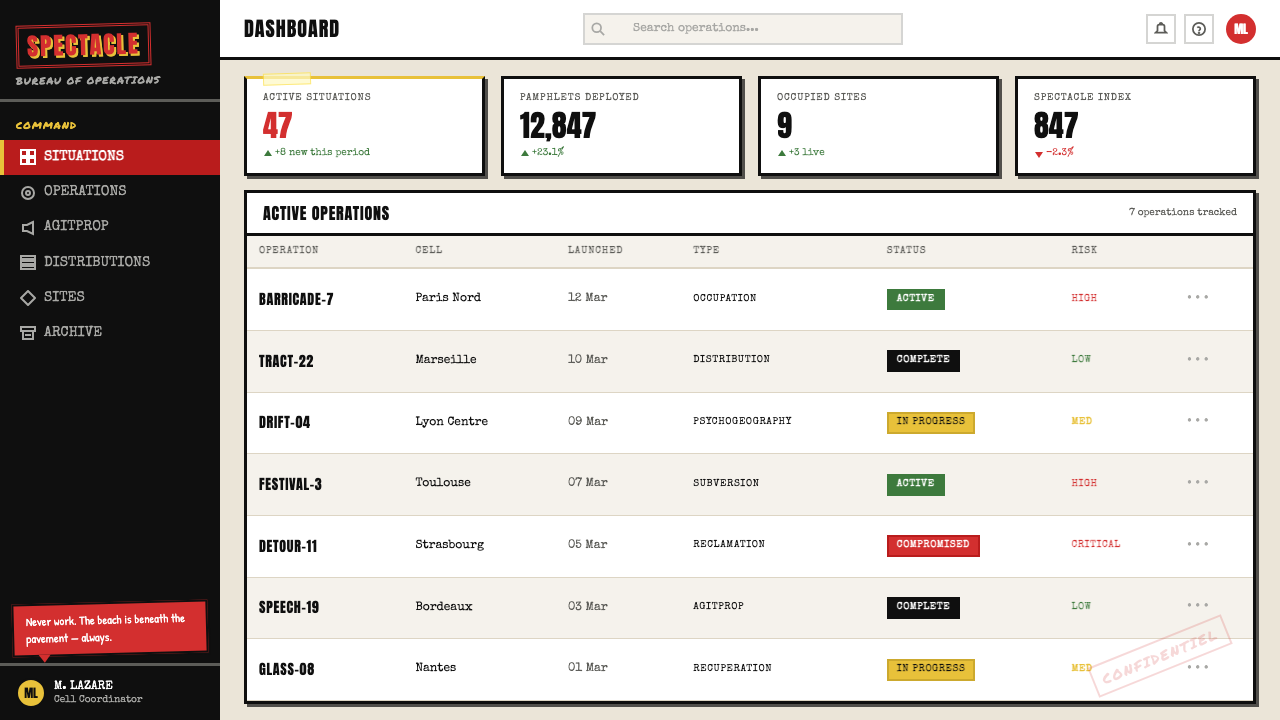
For web interfaces, the aesthetic is most appropriate in editorial contexts — opinion publications, activist platforms, cultural criticism sites — where the medium's attitude toward its subject is part of the editorial stance. A homepage that uses appropriated imagery with overwritten text communicates that the publication will not take received ideas at face value. Dashboard and transactional interfaces are generally a poor fit: the style's deliberate roughness and confrontational energy work against the clarity and neutrality that users need when completing tasks. If applied to e-commerce or SaaS, the risk is that the dissonance between the style's agitprop connotations and the commercial intent reads as incoherent rather than ironic.
For editorial and marketing work, Détournement is most effective in limited-run printed materials — posters, zines, protest graphics, event flyers — where the physical texture of reproduction can be genuinely invoked rather than simulated. A poster designed in this mode should commit to flat color, blunt type, and the logic of collision: find two images or text-and-image combinations whose juxtaposition produces a third meaning neither contains alone. Marketing applications require particular care: brands that use the aesthetic to appear countercultural while selling products risk the exact form of critique the style was invented to make. The irony should be intended, not accidental.
The most common mistake when working in this aesthetic is treating it as a style of visual texture — adding grain, desaturating to near-monochrome, and slapping on a red overlay — without engaging the underlying argumentative logic. Détournement without the détour is just a damaged photograph. The grain is not the point; the collision of meanings is the point. A second common error is applying the aesthetic too smoothly: over-refined kerning, perfectly masked image crops, and mathematically precise layout betray the improvised urgency that gives the style its authority. Deliberate roughness is not sloppiness — it is a formal commitment to the conditions under which the original work was made.
Situationist Détournement (1957) — FAQ
What exactly is the difference between détournement and collage?
Both practices combine existing visual materials, but their logic differs fundamentally. Collage — as practiced by the Cubists and Dadaists — is primarily a formal technique: materials are combined for compositional, textural, or expressive effect. The source of the material matters less than what it contributes to the whole. Détournement is primarily a semantic technique: the source material is chosen precisely because of what it means in its original context, and the manipulation works by forcing that meaning into collision with an incompatible second meaning. The goal is argument, not composition. A Picasso collage uses newsprint for its texture; a Situationist détournement uses the same newsprint because it is newsprint — because invoking the newspaper invokes the news.
Is using copyrighted images in this style legally risky today?
The Situationists were explicit that détournement rejected the concept of intellectual property as part of its political program — they considered copyright a mechanism of the spectacle. In contemporary practice, the legal reality is more complicated. Using recognizable commercial images without permission is legally risky in most jurisdictions, though commentary, criticism, and parody typically receive some protection under fair use or fair dealing doctrines. The safest approach for professional work is to use images from the public domain, to commission or create original imagery that evokes the aesthetic of appropriation without actually appropriating, or to obtain licenses. The visual language of Détournement — grain, blunt type, flat red, collision composition — can be fully achieved without using any specific copyrighted source material.
Does the style only work for explicitly political content?
The Situationist aesthetic emerged from an explicitly political context and carries that connotation wherever it goes. But the formal language — appropriated imagery, overwritten text, photocopy grain, flat red grounds, blunt type — has migrated into contexts that are political only in the broadest sense: punk music, art zines, independent cinema, subculture fashion, critical design education. What the style consistently requires is an adversarial relationship to some dominant norm or received idea — it needs something to push against. The specific content of that resistance can be cultural, institutional, aesthetic, or social rather than narrowly electoral or revolutionary. Applied to pure product promotion with no adversarial dimension at all, the style loses its coherence entirely.
How does this style relate to contemporary meme culture?
The structural logic of the internet meme is almost identical to that of détournement: a widely circulated image is stripped of its original context and recontextualized with new text or juxtaposition to produce a new meaning, which then circulates as a unit through social networks. The Situationists could not have predicted the specific technology, but their theoretical framework describes the process exactly. The key difference is intentionality and craft: Situationist détournement was a conscious theoretical act, carefully chosen in its source materials and deliberate in its argument. Meme culture operates at speed and scale that tends to dissolve individual authorship and critical intent into reflex and pattern. The aesthetic family resemblance is real; the depth of engagement with meaning-making is usually different.
Can this aesthetic work in a light-ground or clean digital context, or does it always need to look degraded?
The grain and photocopy texture are historically accurate but not logically essential. What is essential is the argumentative structure: appropriated or found imagery, overwritten text, and the deliberate collision of incompatible meanings. These can operate in a clean digital environment — a white-ground editorial layout, a high-resolution screen — without the degradation texture, provided the core logic of juxtaposition and subversion is present. The risk of removing the grain is that the work starts to look like pastiche or homage rather than genuine détournement, because the rough texture historically served as a marker of the work's non-commercial, non-institutional origin. In a clean context, the argument has to carry more weight on its own terms.
Related design styles
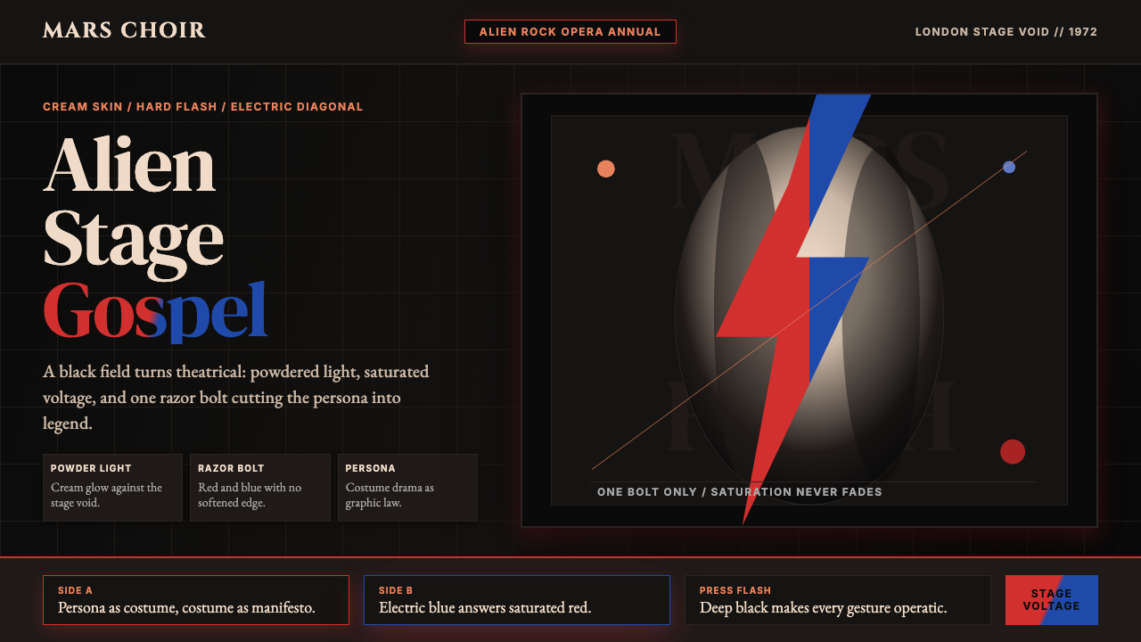 Bowie — Ziggy StardustTheater at full voltage. Cream-on-black portrait cut by one red and electric-…
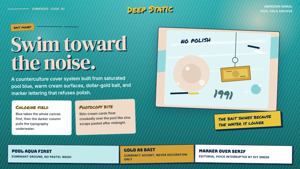 Nirvana — NevermindAnti-pop in pool blue. Cream cards, dollar-gold accents, and marker type roug…
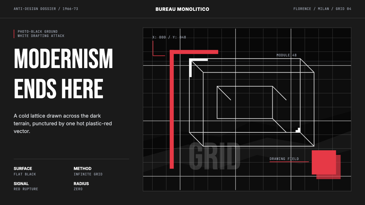 Radical Italian (Archizoom, 1966)Cool rebellion. Photo-black ground, white axonometric grid, one hot red cut.
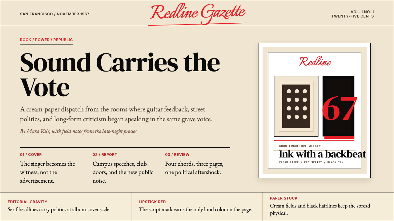 Rolling Stone MagazineCounterculture gets editorial weight. Cream paper, lipstick red script, serif…
 Rotterdam Gabber HardcoreHardcore refuses polish. Acid yellow, neon pink, black grid, and brutal Bunge…
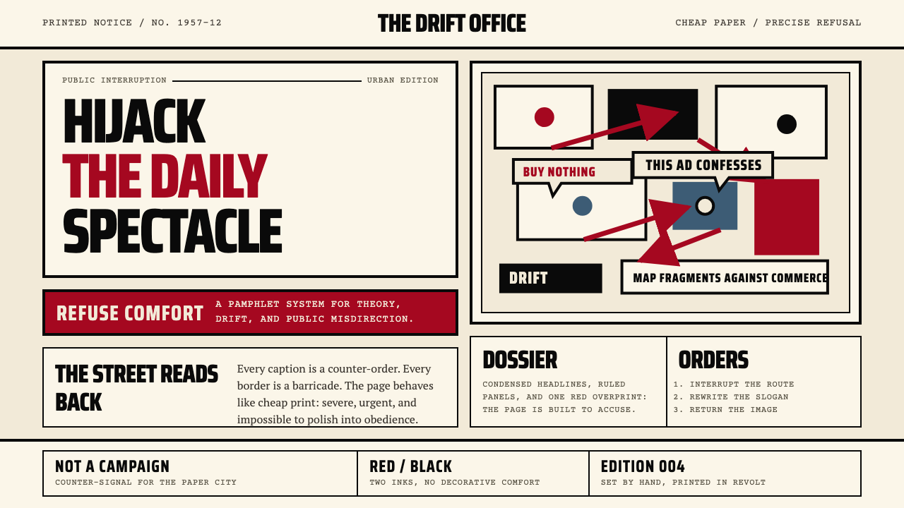 Situationist International (Debord, 1957)Agitation becomes structure. Red-black blocks and condensed type weaponize ne…