What is Radical Italian (Archizoom, 1966)?
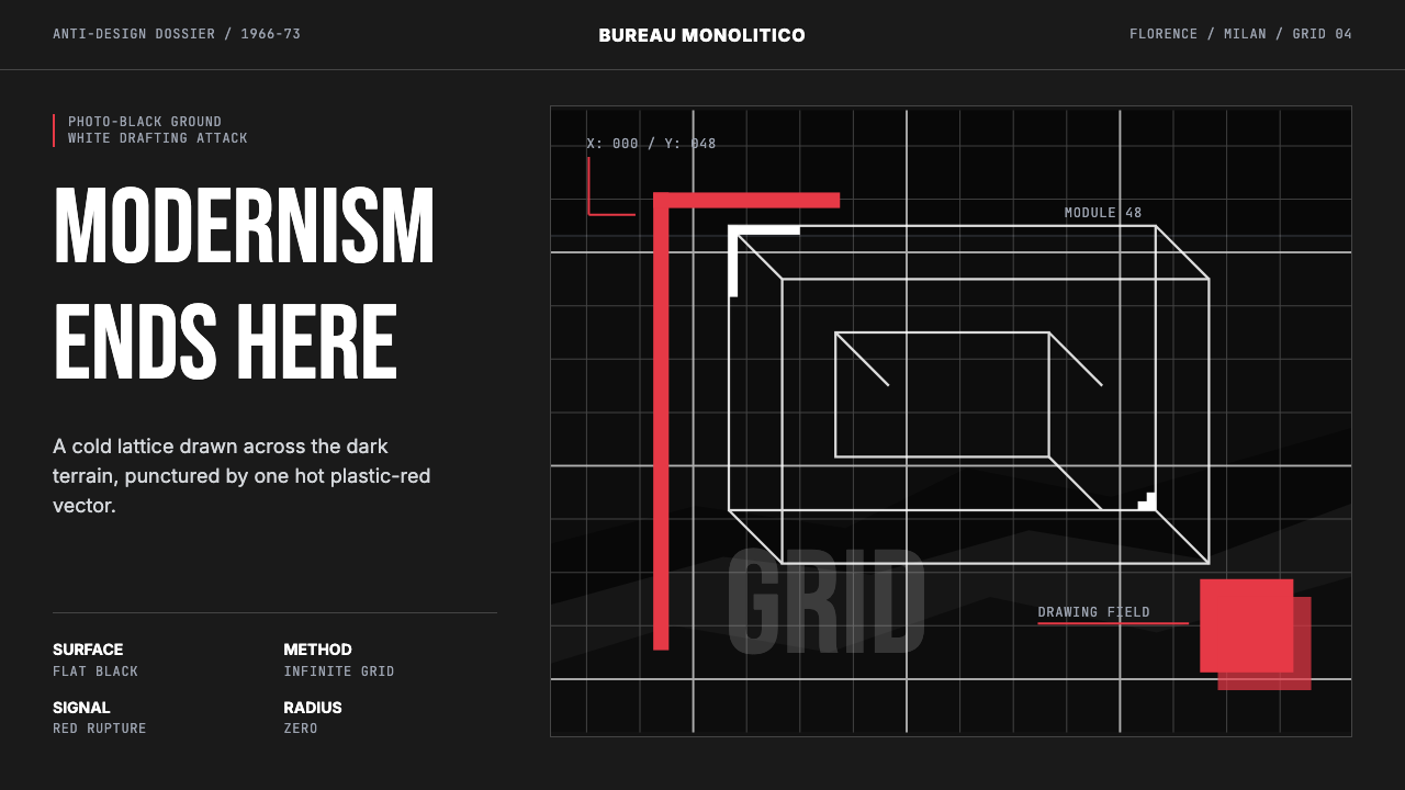
In 1966, a group of Florentine architects declared war on good taste — and the weapons they drew with were axonometric grids, photo-black grounds, and a single slash of hot plastic red.
Radical Italian (Archizoom, 1966) in brief
Radical Italian Design is the anti-movement that emerged from Florence and Milan in the mid-1960s, when a generation of architects and designers — most famously the collectives Archizoom Associati and Superstudio — turned Modernism's own tools against itself. Where orthodox Modernism promised rational progress through functionalist form, the Radicals produced deliberately dysfunctional, apocalyptic visions: endless gridded interiors with nowhere to go, monuments scaled to crush human meaning, consumer objects rendered grotesque by excess. The aesthetic was not nihilist in tone but deeply sardonic — cool, diagrammatic, and deadpan.
Visually, the style is built around a tension between clinical precision and charged symbolism. Photo-black grounds evoke the void of a modernist endgame. White vector grids — axonometric in projection, mechanically regular — overlay those grounds like architectural blueprints run off the rails of utility. The single permitted burst of color is typically a hot, synthetic red that cuts through the monochrome like chrome furniture erupting from a dystopian showroom. Zero-radius geometry and the complete absence of decorative softening reinforce the sense of a system that has abandoned comfort as a design goal.
Unlike the decorative maximalism of Memphis (which grew partly from Radical Design's ruins), or the moral austerity of orthodox Modernism, Radical Italian work uses visual discipline as a vehicle for critique rather than aspiration. The cleaner and more mechanical the drawing, the more unsettling the content it depicts. This double-bind — seductive formal clarity containing genuinely disturbing ideas — is what makes the aesthetic unusually durable. It reads as contemporary because it never pretended to be optimistic.
Where does Radical Italian (Archizoom, 1966) come from?
Archizoom Associati was founded in Florence in 1966 by Andrea Branzi, Gilberto Corretti, Paolo Deganello, and Massimo Morozzi — all architecture graduates of the University of Florence. The name was a riff on Archigram, the British avant-garde group whose pop-inflected technological utopianism the Italians regarded with affectionate contempt. Superstudio, founded the same year in the same city by Adolfo Natalini and Cristiano Toraldo di Francia, shared the theoretical framework but pushed it toward a colder, more geometrically systematic form of provocation. Together they defined what the critic Germano Celant — who would later coin 'Arte Povera' — began describing as Radical Design.
The intellectual context was late-1960s European leftism in collision with mass consumer culture. Italy's postwar economic miracle had made consumer goods widely accessible, and Modernism's promise that rational design would morally improve the masses had never looked more hollow. Milan's furniture trade fairs, the most important commercial stages for design in the world, were pumping out aspirational domestic objects of increasing formal refinement. The Radicals found this entire apparatus obscene. Their counter-proposal was not a better chair but a demonstration that the idea of the better chair was itself a trap.
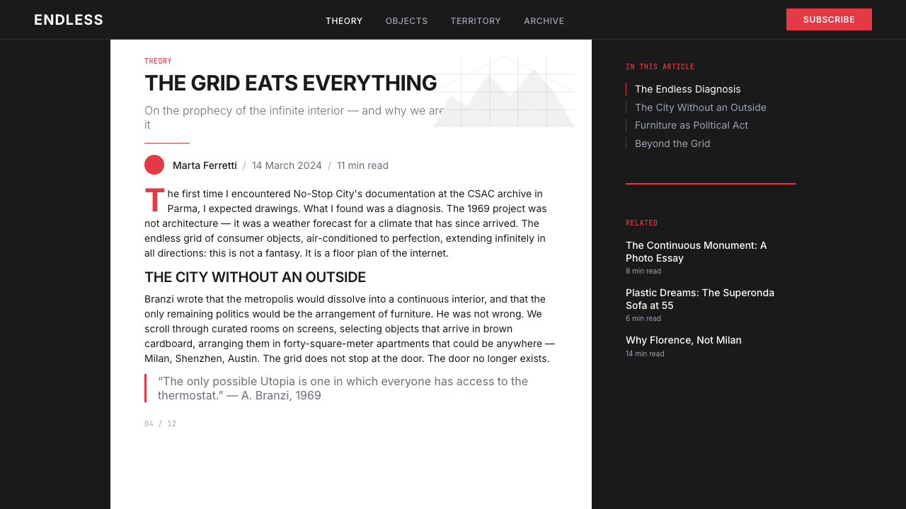
The key projects of this period have an almost literary quality. Archizoom's *No-Stop City* (1969–1972) depicted an endless interior — a featureless, climate-controlled grid extending to the horizon — that was simultaneously a parody of industrial planning and an extrapolation of where functionalism logically led. Superstudio's *Continuous Monument* (1969) proposed a single smooth white structure that would wrap the entire surface of the earth, absorbing all existing cities and cultures into its blank regularity. Both projects were presented in the visual idiom of professional architectural practice — axonometric drawings, photomontages, technical captions — which made their satirical content all the more devastating.
The movement's productive years ran roughly from 1966 to 1974, when Archizoom dissolved. Superstudio continued until 1978. In 1972, the Museum of Modern Art in New York hosted the exhibition *Italy: The New Domestic Landscape*, which gave the Radical Design tendency its most visible international platform and confirmed that the Italians were doing something that could not simply be absorbed into mainstream design commerce. Andrea Branzi, who became the movement's most articulate theorist and historian, later described this period as the moment when design first understood itself as a form of cultural criticism rather than a service to industry. That self-understanding — design as an act of thinking rather than problem-solving — became the lasting intellectual legacy of the Radical Italian moment.
What defines the Radical Italian (Archizoom, 1966) look?
Photo-Black Ground
The ground is not a designer's choice of dark tone but a photographic void — dense, flat, and absolute. Unlike the warm blacks of editorial design or the velvety darks of luxury branding, this black has a mechanical, reproduced quality, as if the surface were a film negative developed past exposure. It eliminates all ambient warmth and forces every element placed on top of it into sharp, almost brutal relief.
Axonometric Grid Overlay
The signature compositional device of Radical Italian work is the white grid drawn in axonometric projection — the drafting convention that shows three-dimensional space without perspective distortion, beloved of architects and engineers for its measurability. Placed over black grounds or photographic source material, the grid reads simultaneously as a design tool, a cage, and an infinity symbol. Its regularity never becomes decoration because it remains legible as a system rather than a pattern.
Hot Synthetic Red Accent
Against the monochrome field of black and white, a single saturated red performs the work of an alarm or a rupture. This red does not carry the symbolic warmth of traditional red pigments — it reads as industrial, plastic, synthetic, the color of safety signage or injection-molded consumer goods. Its temperature is aggressive rather than passionate. Used as a slash, a bar, or a geometric cut, it splits the composition with an energy that the neutral elements resist.
Zero-Radius Geometry
All forms are hard-cornered. Circles, if they appear, are precise mathematical circles — not rounded rectangles or softened shapes signaling approachability. Rectangles have no rounding whatsoever. This is a deliberate refusal of the ergonomic softening that contemporary design often applies automatically to signal friendliness. The hard corner is a formal statement: this system does not solicit your comfort.
Photomontage and Architectural Drafting Idiom
Radical Italian projects were presented as architectural proposals — complete with section drawings, axonometric plans, and technical captions written in the neutral voice of professional practice. This deadpan adoption of institutional visual language was central to the critique: the more formally correct the presentation, the more unsettling the project it described. In contemporary applications of this aesthetic, photography used as ground material retains this quality of found documentary evidence rather than art-directed illustration.
Ironic Scale and Proportion
Scale relationships in Radical Italian work are deliberately wrong by humanist standards. Structures dwarf people; grids extend beyond any human measure; objects are rendered at a size that implies indifference to the body. This disproportionality is not a compositional error but a rhetorical act: it enacts the argument that modernist systems — whether urban planning or industrial production — had ceased to take the individual human as their reference point.
Absence of Ornamental Warmth
Unlike the decorative exuberance that would later emerge from Memphis in the 1980s — itself a reaction partly against Radical Design's austerity — the Radical Italian palette and surface have no inviting qualities. There are no organic curves, no playful pattern, no color used to suggest pleasure. The visual temperature is cold by design. This is not the restraint of Swiss minimalism, which removes ornament to achieve clarity; it is a choice to make the designed artifact feel inhospitable, which is itself the communication.

Who shaped Radical Italian (Archizoom, 1966)?
The most articulate theorist and historian to emerge from the Radical Italian moment, Branzi was a founding member of Archizoom Associati and remained productive as a designer, architect, and critic for decades after the group dissolved. His writings — especially *The Hot House* (1984) — provided the theoretical framework that allowed Radical Design to be understood as a coherent intellectual project rather than a series of provocations. Branzi later contributed to the Memphis group and continued teaching and writing, making him the figure most responsible for transmitting the Radical legacy into the canon of design history.
A founding member of Archizoom, Morozzi was responsible for much of the group's most visually refined work, including the photomontage projects that established the characteristic look of dark grounds and gridded overlays. After Archizoom dissolved, he moved into furniture and product design, working with major Italian manufacturers — a trajectory that embodied the complex relationship between Radical Design's critique and the commercial design industry it criticized. His later career demonstrated that the Radical sensibility was not incompatible with professional practice, only with its complacencies.
Co-founder of Superstudio, Natalini was the more architecturally rigorous of the movement's leading figures, and his influence on the visual grammar of Radical Design — particularly the relentless application of isometric and axonometric projection — was decisive. Superstudio's *Continuous Monument* project, largely driven by Natalini's architectural training, established the white grid as the period's defining symbolic form: both a utopian promise and a totalitarian threat, impossible to read innocently.
The other co-founder of Superstudio, Toraldo di Francia brought a more explicitly philosophical orientation to the group's work. His interest in the phenomenology of space and the relationship between designed environments and human consciousness gave Superstudio's projects their existential weight — they were not only architectural critiques but interrogations of what it meant to inhabit a world designed according to abstract principles. The bleakness of many Superstudio images owes much to this philosophical underpinning.
How do you use Radical Italian (Archizoom, 1966) today?
The Radical Italian aesthetic transfers to contemporary digital design as a posture — a deliberate choice to foreground critique, tension, and intellectual confidence rather than the reassuring warmth that most digital products default to. It works best in contexts where the audience is expected to be sophisticated, where the brand is comfortable being polarizing, and where formal severity itself communicates value. Technology brands positioned as anti-establishment, cultural institutions, architecture and design publications, and editorial projects dealing with difficult or dystopian themes are natural fits.
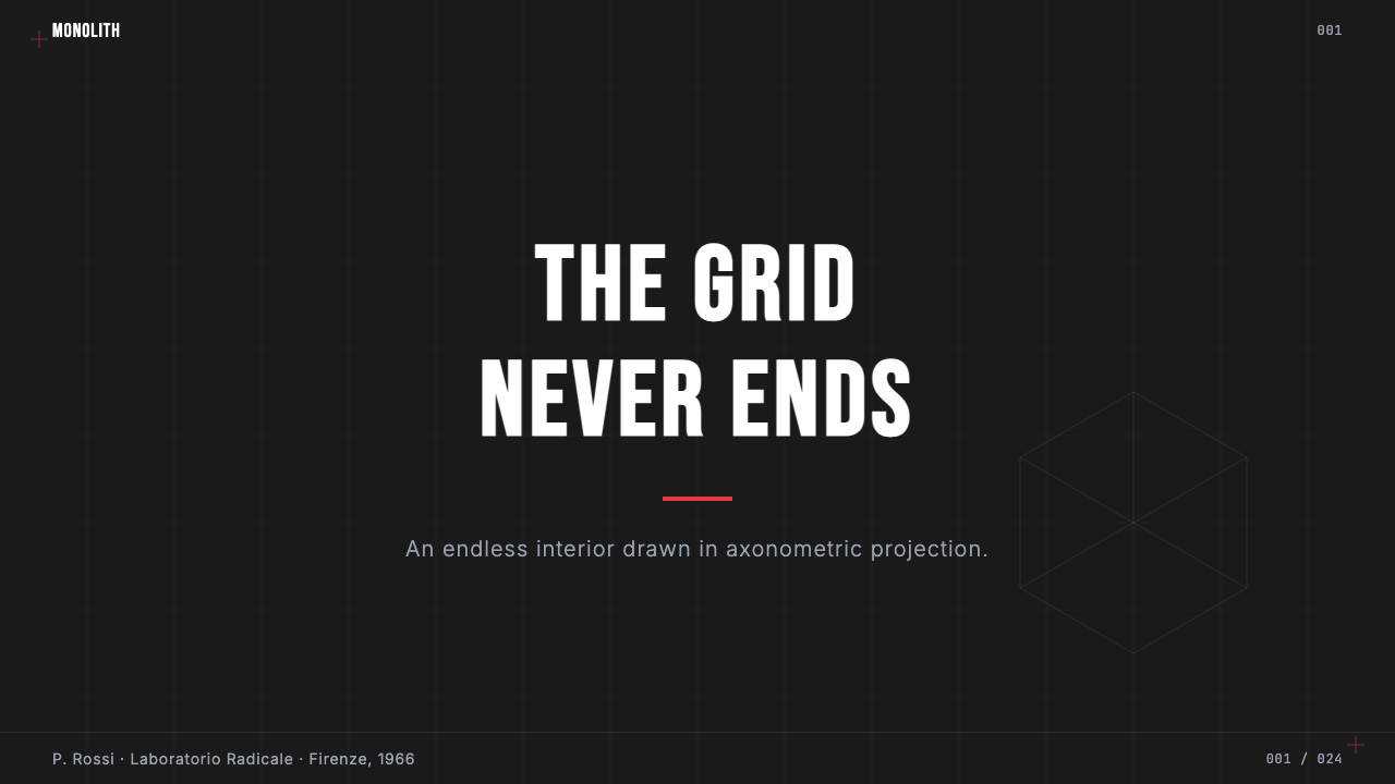
For presentation slides, the style is powerful when used to project authority and deliberate coolness. Cover pages work well with a full-bleed photo-black ground, a white axonometric grid or ruled lines overlaid at low opacity, the title in a large, condensed, all-caps typeface, and a single red geometric element — a bar, a slash, a line — as the only chromatic punctuation. Content slides should maintain the dark ground throughout and use high-contrast white type at strict hierarchical scales. Data visualizations — charts, diagrams, network maps — fit naturally into the gridded, technical idiom, and can be rendered as white line drawings on the dark field, with the red reserved for the single most critical data point or call-out.
For web interfaces and digital products, the approach suits dashboards, portfolio sites, and tools aimed at designers, architects, developers, or anyone who reads visual severity as a signal of seriousness rather than hostility. The foundational choices: a very dark or true-black background as the dominant surface, white or near-white for all primary text and structural elements, and a single saturated accent used sparingly for interactive states and critical alerts. Component borders, if used at all, should be rendered as hard, clean lines with no softening radius. Card elevations replace soft-shadow equivalents with hard offset shadows — or eliminate elevation cues entirely in favor of a strictly flat, ruled-grid approach.
In editorial and marketing contexts, the style supports formats where the argument is the product. Technology manifestos, cultural criticism platforms, exhibition catalogs for architecture or design shows, and brand identity systems for studios that want to position themselves as rigorous rather than approachable all benefit from this vocabulary. The key discipline: resist adding secondary color. The system derives its energy from the tension between the monochrome field and the single chromatic intrusion; a second accent color dissolves that tension immediately and tips the composition into a different register entirely.
A common and costly mistake is confusing the aesthetic with simple dark-mode design. Radical Italian is not dark mode — it is not a neutral inversion of a light layout. The darkness is non-negotiable and loaded: it communicates void, system, and constraint. Similarly, rounding corners, adding soft shadows, or introducing organic texture in the name of contemporary accessibility conventions destroys the argument the style is making. If you need your product to feel warm or approachable, this is not the right aesthetic — and no amount of technical application will make it so. Choosing it means committing to its temperature.
Radical Italian (Archizoom, 1966) — FAQ
Is Radical Italian Design the same as Anti-Design?
They are largely synonymous, though the terms emphasize different aspects. 'Radical Design' foregrounds the movement's ambition to remake design practice from the root — it is a reformist framing, however provocative. 'Anti-Design' foregrounds the movement's explicit rejection of design's conventional social role as a service to industry and consumption — it is a more polemical framing. Critics and participants used both terms interchangeably throughout the late 1960s and 1970s. Both refer to the same cluster of Italian groups — principally Archizoom, Superstudio, Gruppo 9999, UFO, and Global Tools — and the same body of speculative, critical project work produced in that period.
What is the relationship between Radical Italian Design and Memphis?
Memphis (founded 1981 by Ettore Sottsass, with Andrea Branzi among its contributors) is in part a successor and in part a reaction. Both movements rejected functionalist orthodoxy and insisted that design was a cultural act with meaning beyond use. But where Radical Design used formal severity to produce alienation and critique, Memphis deployed decorative maximalism — clashing colors, pattern-on-pattern, tactile surfaces — to produce pleasure and provocation simultaneously. The intellectual genealogy is direct: Branzi himself moved from Archizoom to Memphis. The visual grammar, however, is almost opposite: the cold, monochrome, gridded restraint of Radical work versus the warm, chromatic, ornamental excess of Memphis.
Did Radical Italian designers actually want their dystopian proposals built?
Emphatically not, and this question cuts to the heart of what made the movement so unusual. The proposals were not frustrated architecture — they were arguments presented in architectural form. *No-Stop City* was not a failed urban plan but a logical demonstration of where rational planning leads if taken seriously enough. *Continuous Monument* was not a literal construction proposal but a thought experiment about what it would mean for a single design principle to prevail universally. The professional visual idiom of the presentations — the technical drawings, the measured captions — was itself part of the content: the satire only worked because it mimicked sincerity so precisely.
How does this aesthetic handle light and shadow?
Shadow, in the naturalistic sense, is almost entirely absent. The photo-black ground is not a shadowed surface — it is a void that precedes illumination. Where geometric shapes are placed on top of it, they are rendered as flat, line-drawn, or solid-filled forms with no simulated lighting. The axonometric projection itself provides an apparent spatial depth without perspective or shadow. The only light in the system is implied by the white of the grid and type lines against the black ground — a structural contrast rather than an atmospheric effect. Any introduction of soft shadow or ambient glow would immediately destroy the mechanical coldness the aesthetic depends on.
Can this style work for consumer-facing products, or is it only suited to cultural and institutional contexts?
It can, but the product category matters enormously. Consumer electronics, audio equipment, professional tools, and high-end fashion brands have all successfully deployed elements of this aesthetic — particularly the dark ground, the restrained palette, and the hard geometric precision. Where it consistently fails is in contexts that require the product to signal warmth, play, or accessibility: children's products, food and beverage, wellness, or any category where the purchase decision is primarily emotional and comfort-seeking. The Radical Italian aesthetic communicates intelligence, seriousness, and controlled tension. If those are qualities your product wants associated with it, the style can serve. If your product needs to feel warm in the hand, choose differently.
Related design styles
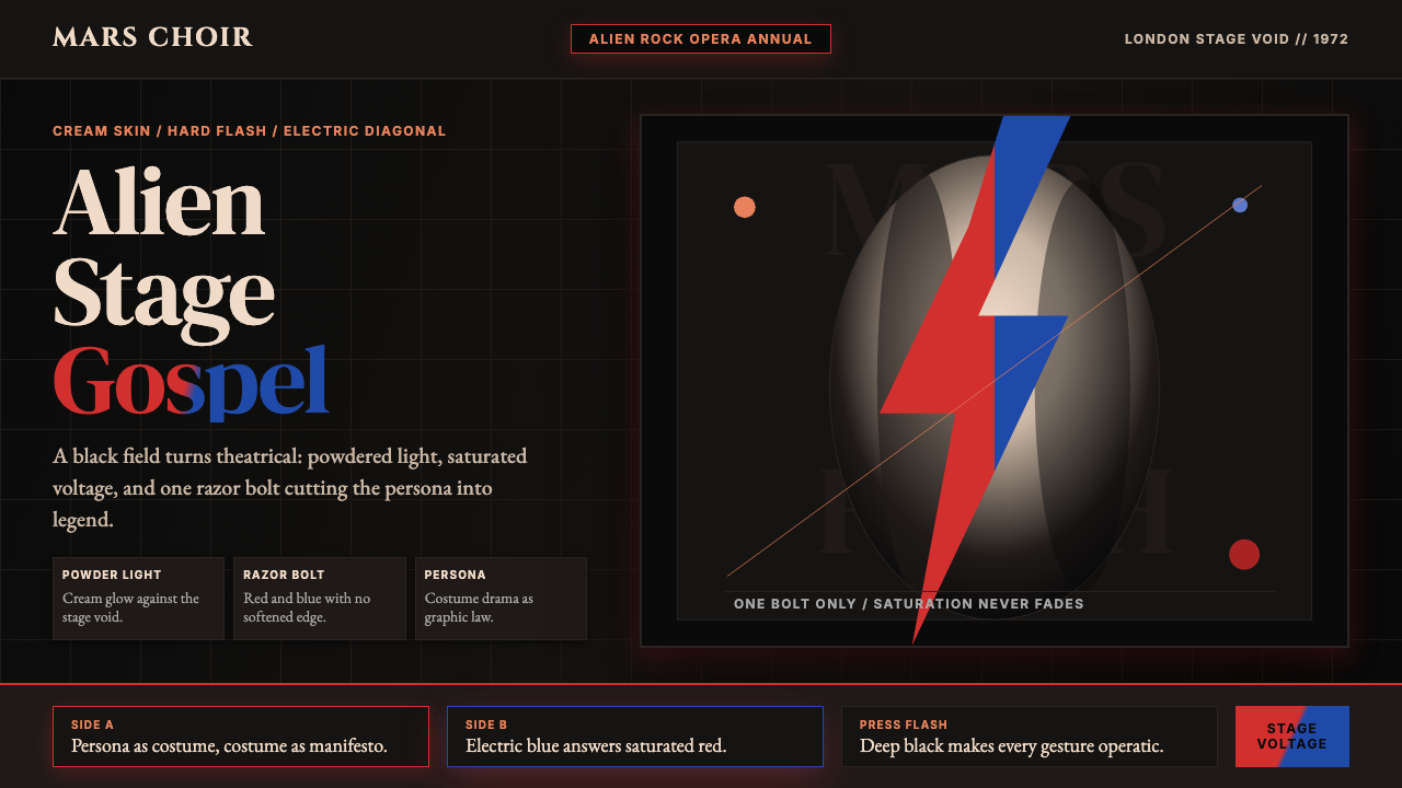 Bowie — Ziggy StardustTheater at full voltage. Cream-on-black portrait cut by one red and electric-…
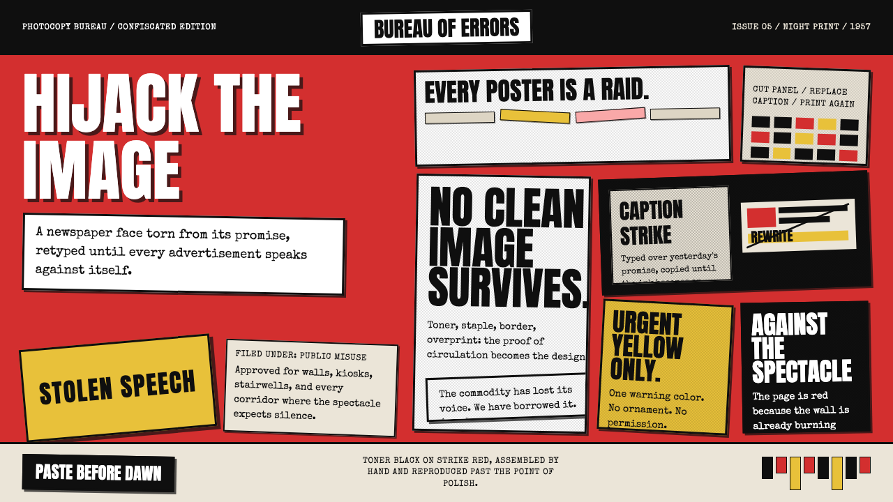 Situationist Détournement (1957)Contraband urgency. Strike red, toner black, and jagged comic panels make the…
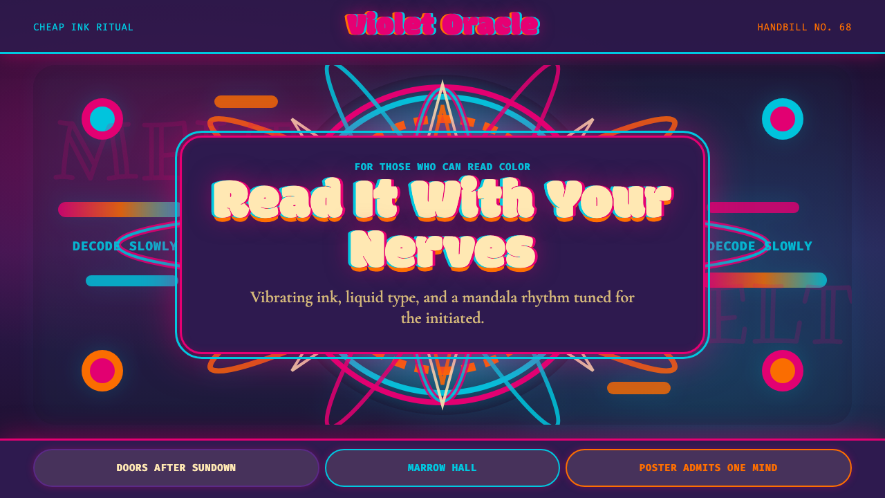 Psychedelic Fillmore (Mouse, 1968)Legibility becomes ritual. Magenta-cyan vibration and bulbous mandalas melt t…
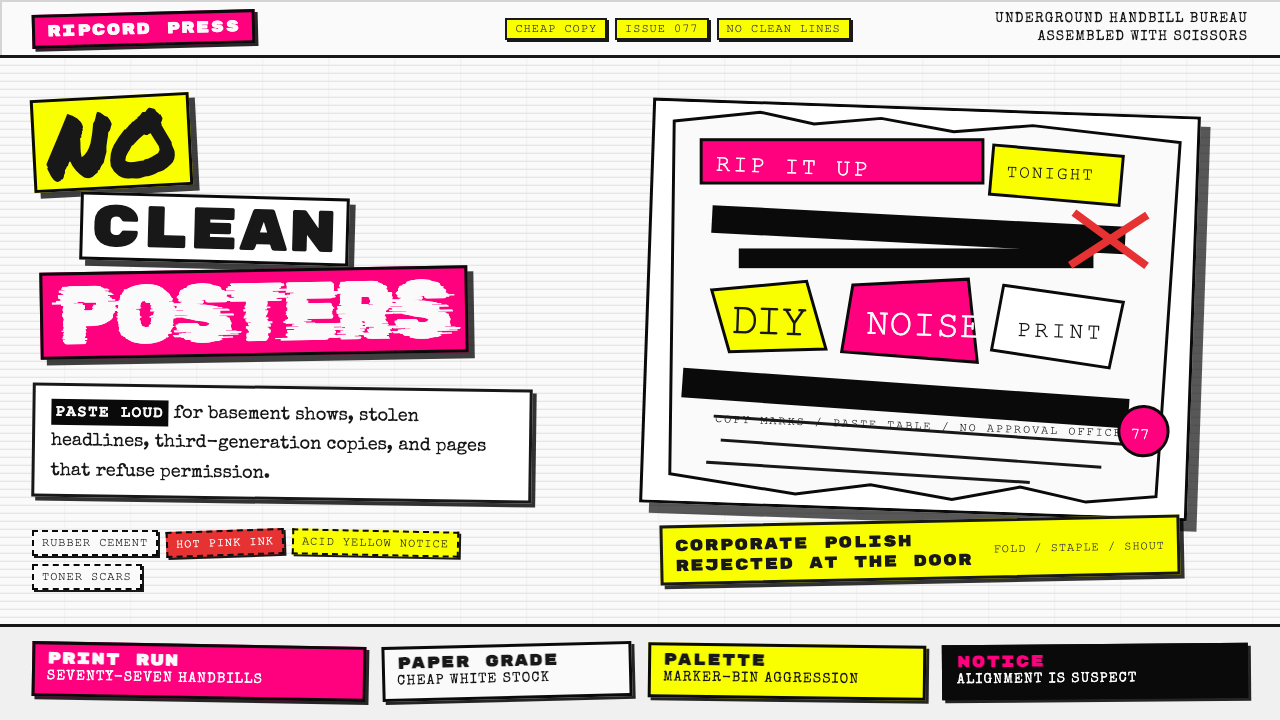 Punk Xerox 1977Anti-design shouts. Hot pink and acid yellow collide with ransom type on Xero…
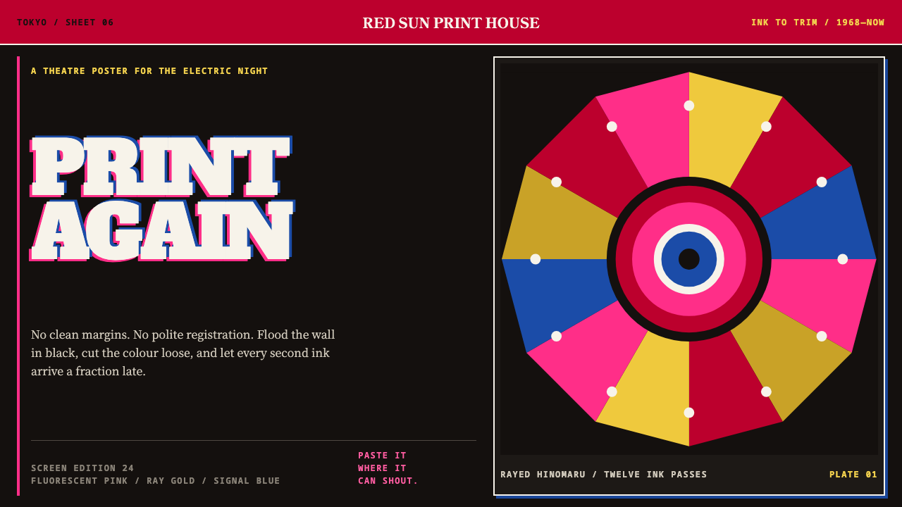 Tadanori YokooPrints against polite order. Fluorescent pink cuts through black with a rayed…
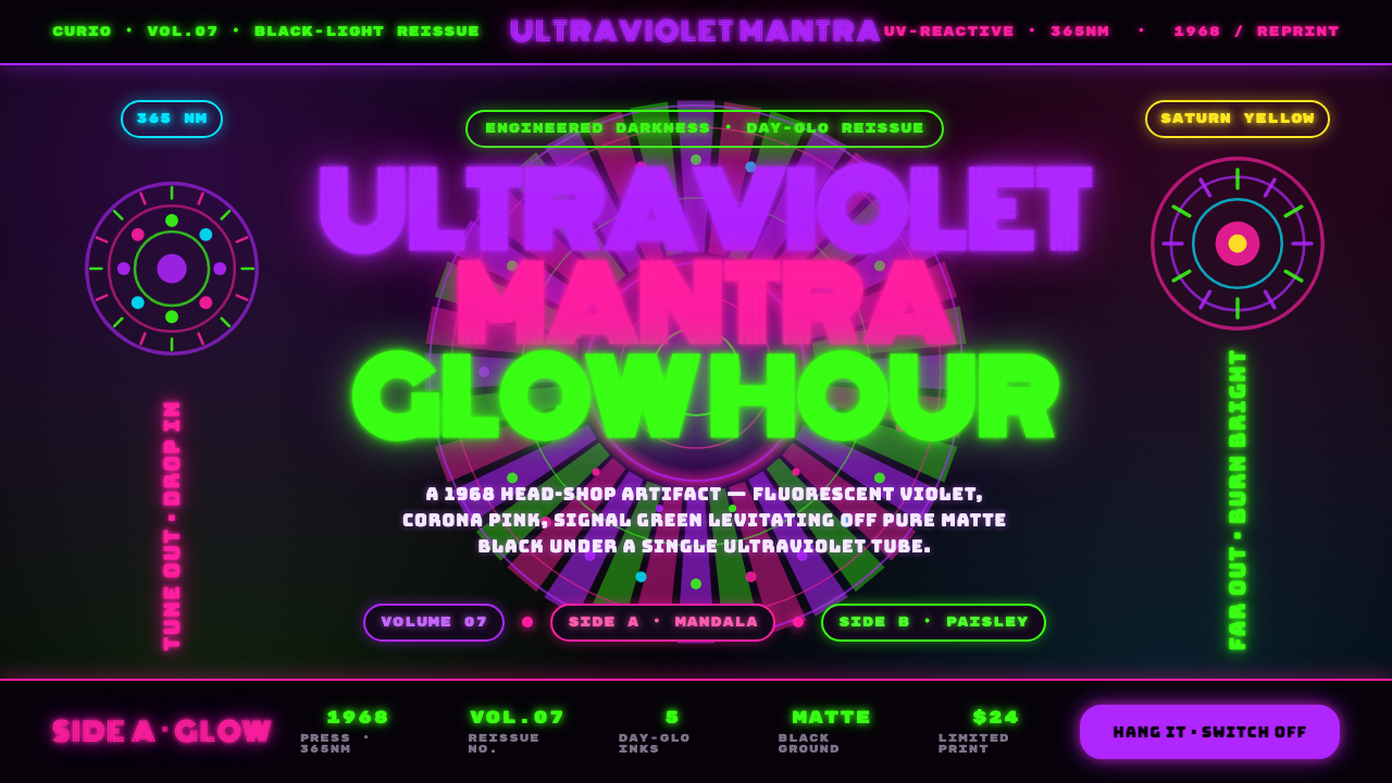 UV Blacklight PosterEngineered darkness. Day-Glo violet, Corona pink, and signal green levitating…