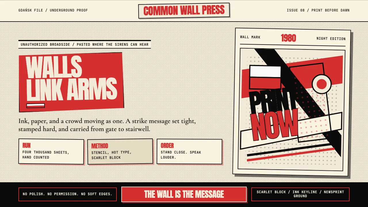
About Solidarność Poland 1980
Solidarność is the most politically urgent typographic gesture of the late 20th century — Jerzy Janiszewski's hand-painted scarlet letters linking arms across a strike-committee banner in Gdańsk, August 1980. Within months the logo had reached every Polish wall and every Western front page.
The broader language draws on the Polish Poster School — Tomaszewski, Cieślewicz, Lenica — with ink-black photomontage, newsprint halftone, and hot-metal serifs set against scarlet blocks. The aesthetic says: the wall is the message; paint loud, paint now.
- Origin
- Poland — Gdańsk, Warsaw, Kraków
- Era
- August 1980 (Gdańsk shipyard strike) — 1989 (Round Table Talks); samizdat continuations through the decade
- Key figures
- Jerzy Janiszewski · Henryk Tomaszewski · Roman Cieślewicz · Jan Lenica
- Movements
- Polish Poster School · Solidarność visual identity · samizdat underground press
Solidarność Poland 1980 design spec
Colors
Typography
The other 11 sections — buttons, cards, spacing, motion, techniques and more — open once you unlock. Download the DESIGN.md or send it to your AI in one click. Unlock once, yours forever.
Sign up nowStyles similar to Solidarność Poland 1980
Also inspired by design movements, with a close feel.
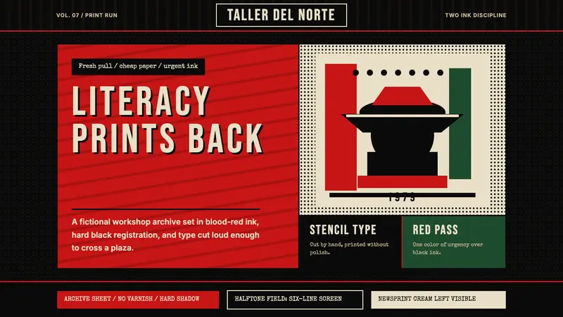 Nicaraguan Sandinista FSLN 1979Urgency in two inks. Blood red, jet black, halftone dots, and cut-stencil type.
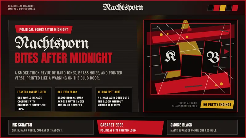 Weimar CabaretMenace at 2 a.m. Blood-red Fraktur, smoke-black grid, acid-yellow spotlight cuts.
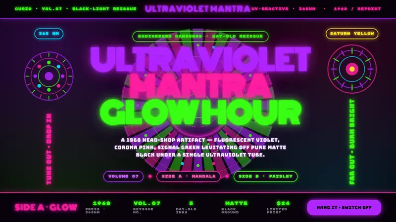 UV Blacklight PosterEngineered darkness. Day-Glo violet, Corona pink, and signal green levitating off pure matte black.
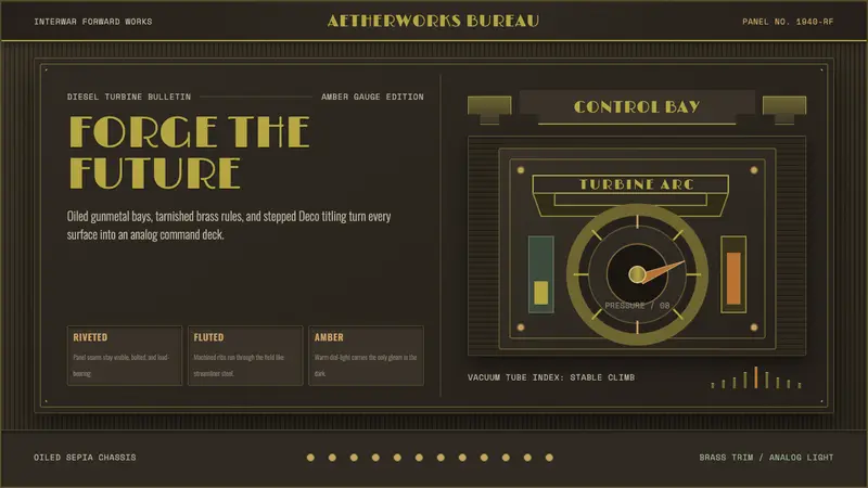 Dieselpunk RetrofutureMachine age, dark and bolted. Gunmetal grid, brass rivets, amber gauge geometry.