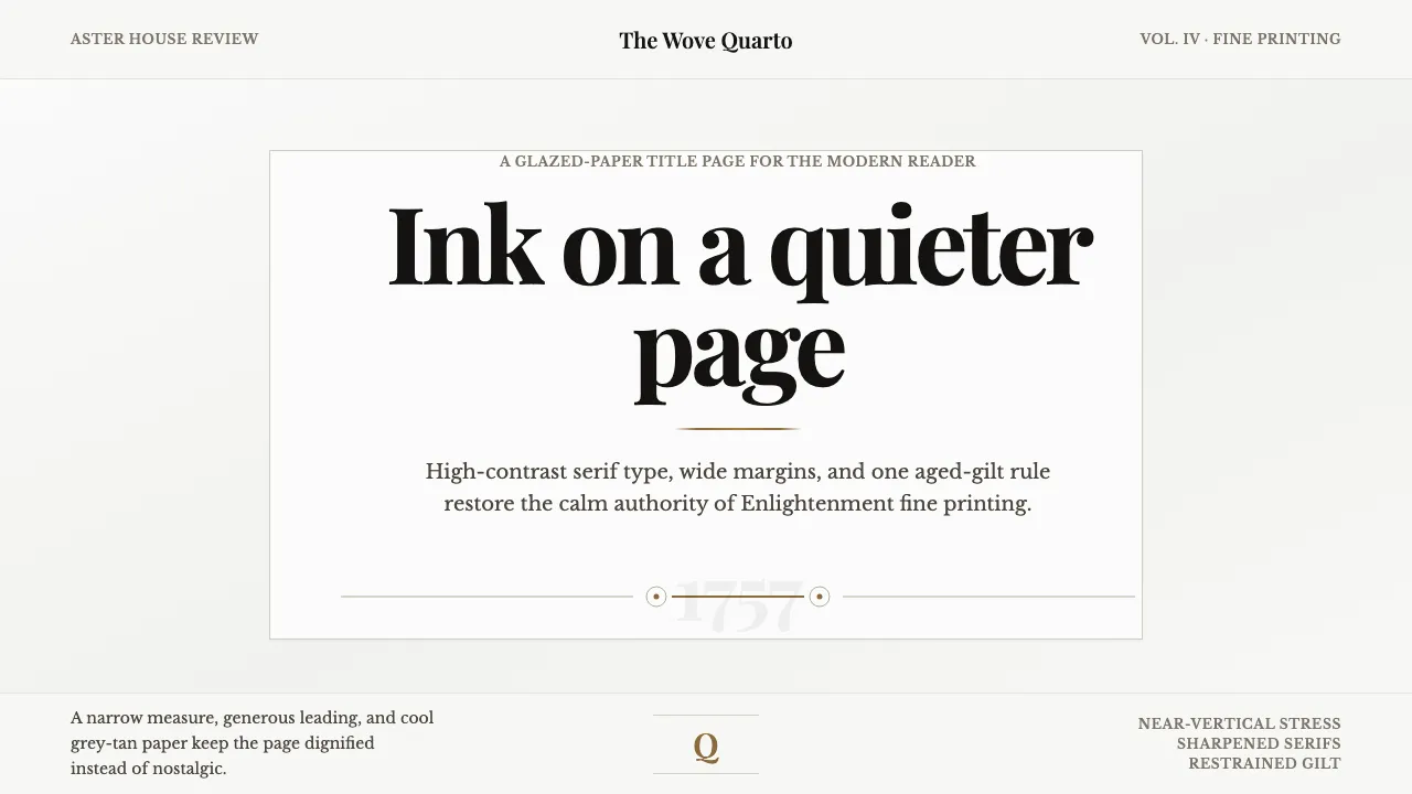
About Baskerville Transitional Serif
In 1757, printer and letter-founder John Baskerville released his quarto Virgil from a Birmingham workshop, its type cut to his design by punchcutter John Handy. The face split Old-Style from Modern: sharpened, tapered serifs, a near-vertical stress and startling stroke contrast for its day. Baskerville pressed each sheet of James Whatman's new wove paper between hot copper plates, glazing it to a smooth, faintly grey sheen rather than the warm cream of laid stock. That glazed grey-tan ground, not ivory, is the authentic surface this system restores. Wide margins, centred title pages and sparkling display type carry the calm authority of Enlightenment fine printing into a modern, editorial register.
- Origin
- Birmingham, England
- Era
- 1757 (the quarto Virgil); type cut c.1750s
- Key figures
- John Baskerville · John Handy
- Movements
- Transitional serif · English Enlightenment fine printing
Baskerville Transitional Serif design spec
Colors
Typography
The other 11 sections — buttons, cards, spacing, motion, techniques and more — open once you unlock. Download the DESIGN.md or send it to your AI in one click. Unlock once, yours forever.
Sign up nowStyles similar to Baskerville Transitional Serif
Also inspired by print & type, with a close feel.
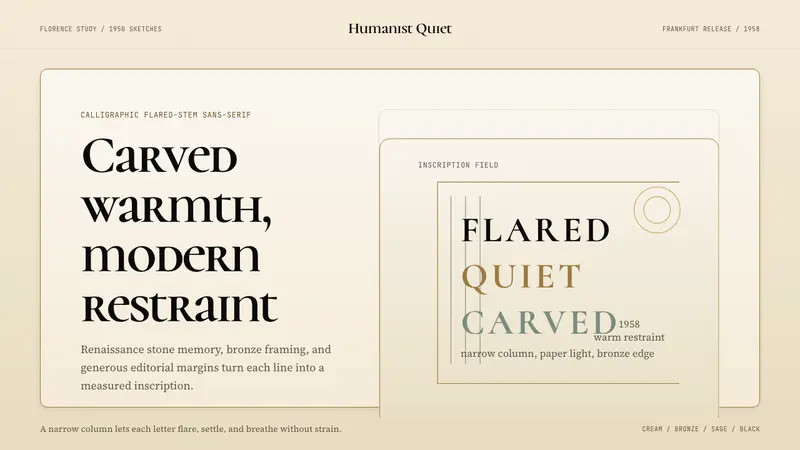 Optima (Hermann Zapf, 1958)Calligraphic calm, cut in cream and bronze. Narrow margins let the letters breathe.
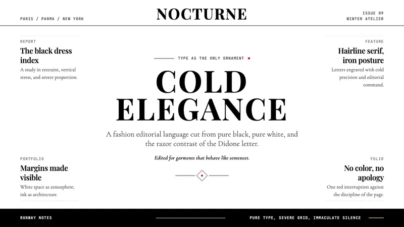 Vogue DidoneCold authority. Black-on-white Didone, red accent, and vast editorial whitespace.
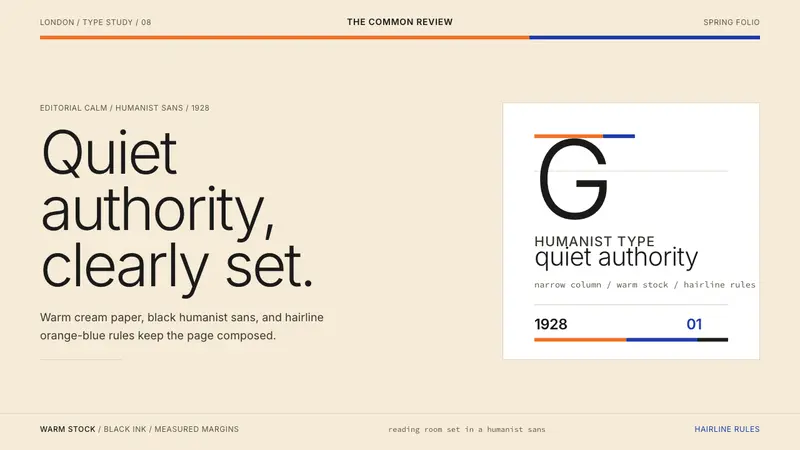 Gill Sans (BBC, 1928)Quiet authority, clearly set. Warm cream, black humanist sans, and hairline orange-blue rules.
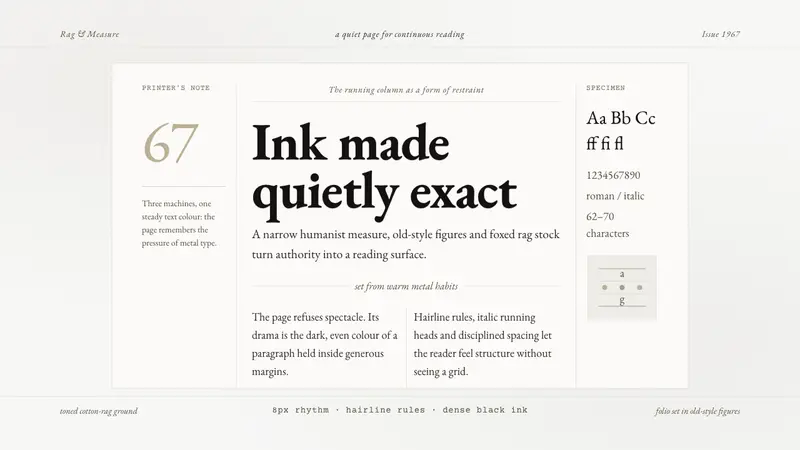 Sabon by Jan TschicholdQuiet authority in print. Dense black Garamond rests on foxed grey-tan rag paper.